#placement and angles and consistent line of movement (if that makes sense)
Text
how do people do little comic things. this shits impossible lmao
#im going to purposefully give up and come back to this tomorrow#maybe start over if im in a silly goofy mood#this stupid little thing is Kicking My Ass#ask *about my au*: hey what happened to barnabys arm#me: okay either i type out a boring answer or i give you over-complicated doodles that probably dont line up well#my visual library when it comes to like....#placement and angles and consistent line of movement (if that makes sense)#is absolute shite. like its terrible. i dont know what im doing haha#im still trying tho! still trying....#might have to thumbnail it first#its like any new art skill - start with all the steps and then later you can Skip them#im trying to skip them immediately and its getting me Nowhere#absolutely unprompted#looking longingly at the art blogs i follow that make wonderful little au comics that Visually Make Sense#someday ill be like them....#whew ok simple rant over. ill work on something else for now
42 notes
·
View notes
Text
Enhypen members as their natal chart Placements
These are based only on my opinions and I am not a professional astrologer and this post is strictly intended for entertainment purposes only.
Though all the aspects and placements in our natal chart make up our personality some of the placements might be very prominently expressed. This is how I relate a placement in each Enhypen members chart to their personality.
HEESEING AS HIS VIRGO VENUS:
Heeseung's Virgo Venus is very prominently expressed in his chart imo due it being at an anaretic degree. From him cooking for the members to him listening to the members concerns are some expressions of his Virgo Venus. Virgo Venus is an amazing placement for any kind of writers. With his Venus conjunct moon, he might be very comfortable with expressing his emotions through songwriting. His Libra mercury is also in Mutual reception with his Virgo Venus that points to him having an amazing voice. Virgo Venus is a placement that shows love and affection through everyday activities and gestures.
JAY AS HIS TAURUS MERCURY:

Jay's Taurus Stellium is very prominent in his chart but one thing that catches my attention is his Taurus Mercury. His love for fashion and how he said that fashion is a way for him to express himself is one way his Taurus Mercury acts out. The importance he places on fashion makes so much sense. .Another way I see his Taurus Mercury playing out is how much stubborn he is with his views and opinions. In which sign our Mercury is situated can point to things that we love learning about and being in the sign of Taurus and his love for learning about fashion just seems about right.
JAKE AS HIS LIBRA MARS:
Jake's Libra Mars is really prominent in his chart. Mars is detrimental in Libra. Mars rules our drive and passion. His Libra mars is in mutual reception with his Scorpio Venus. This placement is a huge indicator of a very hardworking person which is obvious from the fact that he was one of the people who worked the hardest consistently in Iland. Being ruled by an already Pluto dominant chart, it might be easier for him to access these equalities than your usual Libra Mars. His Libra Mars makes him very charming on stage and in real life.
SUNGHOON AS HIS VENUS CONJUNCT MARS:

Sunghoon has his Venus conjunct Mars at a tight angle in the sign of Scorpio. Mars rules movements and Venus rules beauty. Venus conjunct Mars makes up for a person whose movements are very graceful and beautiful and is a very ideal placement for dancing or sports like rhythmic gymnastics and obviously figure skating. Remember when Niki said that Sunghoon's dance lines are really pretty? That's his Venus conjunct Mars playing out. Being in the sign of Scorpio his movements are graceful, elegant and beautiful while still remaining sharp, strong and magnetizing.
SUNOO AS HIS CANCER SUN:

Sunoo's Cancer sun is very much expressed and I first took notice of it in Iland. Sun is what we are known for and forms the base of our personality. He was the most popular contestant in Iland and was popular in his "motherland" for his personality. Cancer Suns are usually the household names in celebrities. With his Sun trine Mars, it adds more power and strength to his personality than the usual Cancer Suns. He also has his Sun conjunct Saturn exactly which adds responsibility and maturity to his personality.
JUNGWON AS HIS ARIES VENUS:
Jungwon's Aries Venus is very prominent in his chart as it is at zero degrees which is the purest expression of that placement. From the way he said that he'd make Enhypen the number one to the time back in Iland when he was annoyed at how people said that they were not scared of "I need you" team are some instances where his Aries Venus came out. Aries Venus is a huge protector placement and will never let the people they love get hurt emotionally or physically. It is a placement that shows love through teasing the people around them.
NIKI AS HIS TAURUS MARS:
As I said earlier, Mars rules movements. Niki has his Mars in a sign that is ruled by Venus. His Taurus Mars is also in mutual reception with his Capricorn Venus. His Mars is affected by Saturn as well as his Venus. Saturn gives the necessary discipline while Venus provides the beauty and grace and with Mars providing the powerful movements, no wonder he is such an amazing dancer. Added to this, is his Mars opposite Jupiter aspect which makes him very competitive and adds to the intensity of movements making his dance captivating.
#enhypen#enhypen astrology#enhypen heeseung#enhypen jay#enhypen jake#enhypen sunghoon#enhypen sunoo#enhypen jungwon#enhypen niki#lee heeseung#park jongseong#jake sim#park sunghoon#kim sunoo#yang jungwon#nishimura riki#kpop#kpop astrology
167 notes
·
View notes
Photo


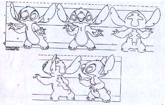
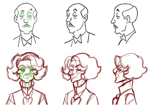


@techmomma upon request for critique and advice. This is basically just me going into troubleshooter info-dump mode, so please pardon any abruptness in tone or phrasing.
So when drawing for animation, simplification of design and silhouette is key because you’re not only going to be doing the same overall drawing SO MANY TIMES in a row, but also need to ensure that the visual remains instantly recognizable to the viewer’s passing glance. Consistency in silhouette is a big thing to work into the overall design of any character.
I’ve put up some solid examples above from Bruce Timm’s Batman, Disney’s Kim Possible, and Disney’s Lilo & Stitch. The highlights accent how a character’s overall outline - or even just key elements that are most prominently used in gesture and expression - and form remains basically the same no matter what angle they’re viewed from. Notice how the shape and position of the various angles remain in basically the same spot regardless of the angle. Notice how even when features are different in anatomy - such as an ear versus a cheekbone - they still tend to occupy the same general shape and position in the turnaround. There’s also cases like Ron Stoppable where his hair is essentially always in the same shape, angle, and direction relative to which way he is facing no matter what angle he’s viewed from. If he’s looking left, his hair shape is always left.
Another concept to always hold in mind with design is subtraction. One of my teachers - Art Leonardi - gave the advice that “a lazy animator is a good animator”. This isn’t to say that you should be sloppy, but that you should be efficient. Every line you put down once is a line you’ll have to put down a million more times, so figure out exactly what needs to be on the page to convey shape, expression, and meaning, and REMOVE EVERYTHING ELSE. If a character’s clothing or hair shape can be fudged so that a portion of its shape that would logically be visible in the real world isn’t there on the drawn version, and doing so doesn’t disrupt the presentation of the character? Then don’t draw it. Look at Harley Quinn’s design where her headpiece, collar, and ankles are in play. We should logically always see both her “horns” even when she’s in profile, her collar should logically have more volume and thus appear lifted away from her body with a visible ridge, and we’d logically see the pointed flares at the back of her ankles more often. But those are more details for the animators to draw, so they’re shuffled out. Whichever “horn” is furthest from the viewer remains exactly the same position and angle in a 3/4th’s view as it is in head-on or from behind, while in profile it’s removed entirely. Her collar is flush with her shoulder line in all positions and extra detail only appears when she’s in a total profile, which is actually rare in the cartoon itself since characters are infrequently shown fully from the side like that when a 3/4th’s angle would better serve the scene. If we don’t need to see her ankle flares, we don’t see them. If we do, they’re identical in profile as from behind, same as her “horns”.
Moving onto TB’s specific design here, this all leads into some fundamentals that can be applied to make the figure easier to animate. TB’s age gives him plenty of wrinkles and lines, but too many causes clutter for the viewer and tons of extra work on the animator. Compare Alfred to TB - both are wizened (albeit to different degrees, admittedly), but Alfred’s deforming facial details (lines above and below his eyes, and his mustache) are limited to a total of six lines that remain fairly parallel with each other. TB, on the other hand, has twice as many in order to convey his age, expression, and depth of his facial structure. Those can be reduced a lot in order to simplify the design. TB’s signature elements would be his cheekbones, smile lines, and heavy-lidded eyes. Things like the extra brow wrinkles and the wither lines on his neck aren’t necessarily as important to convey.
I marked a handful of points that I felt needed attention or removal. The arrows indicate parallax errors; places where exterior lines meet in a way that makes their shape confusing. You want to generally avoid that on the silhouette - it can be okay on interior elements, but you want to keep your overall outline as clean and easily readable as possible. In the basic outline - and especially with the parallax errors in play - we don’t really get a sense of how skinny TB’s neck is because the outline of his high collar and fluffy hair all come together, appearing much bulkier than he actually is. Some easy ways around this would either be to tighten the collar flush along the neck (like Harley’s, as per my previous example) or to lower it away from the jaw and hair line to make the thin neck visible while keeping the sharp angles of the collar itself.
In the profile image, I marked a spot at the neck with an arrow. That’s because you changed the shape of TB’s neckline where it meets the underside of his jaw. In all other angles his neck goes straight up, but in the profile it now has a subtle slope. That’s one extra line and one change in silhouette you don’t need. Similarly, we don’t need to see the fluff of TB’s hair that’s furthest from the viewer in that same profile, as it obscures the shape of his nose and face. It can be removed, thus freeing him up for more expression in profile while speaking or emoting.
The X marks I placed are elements that simply don’t need to be there. Things like shoulder creases or the fluff of his hair from behind are nice in illustrations, but superfluous in animation. Same goes for being able to see TB’s chin at a 3/4th’s rear view, which clashes with the fluffy curve of his hair. Again, more lines and more work. That sort of volume can very easily be done via shading or with far more simpler incidental lines. You don’t need to draw three or four dips to show the volume of his hair when two would suffice.
The final image I placed is a general breakdown of TB’s anatomical structure and outline. In this case I mirrored the general silhouette of his hair, collar, and shoulders, while also mirroring the interior detail of his jawline and neck. Your knack for making good illustrations can work against you when drawing for animation, as every element that differs from its opposite side (such as TB’s hair having slightly different heights and slopes on its right or left sides) makes it that much harder to maintain their relative volume in movement. It’s better to simplify the shapes, mirror them, and match their placement relative to one another. You’ve got a solid hold on anatomy already, so it’s clear TB’s general physical features line up properly as drawn, but when animation is in play you want to anchor features to one another. I picked the base of his collar line as a radial point and drew outward - his physical elements should follow those general lines in order to make for a design that’s easier to replicate consistently. So the same line that starts at the primary dimple in TB’s hair should always go straight down through his eye, along the edge of his nose, along the edge of his mouth, down the shape of his jaw, to that collar base. The center-line of his shirt should go straight up through the center of his jaw, the center of his nose, and the center of the space between his eyes. You should be able to draw a line straight from the point of his lower-most hair curls directly down the outline of his collar, as that makes it easier to maintain their volume and position as well as keeps his overall shape easy to read at a glance.
15 notes
·
View notes
Photo

Magbubulaklak by Antonio
Oil on fiberboard
60 x 81.5cm
1964
Angelito Antonio or “Mang Lito” was born on February 3, 1939 and grew up in a simple farming household in Malolos, Bulacan. His passion for art began at a very young age, he participated in various art contests and had begun earning several big titles and awards to his name as a child. In 1958, he initially took up Architecture at the Mapua Institute of Technology which he then continued at the University of Santo Tomas. However, he eventually shifted due to a scholarship opportunity given to him and studied Fine Arts instead at the University of Santo Tomas, where he met several future colleagues like National Artist Ang Kiukok, Mario Parial, Jaime de Guzman, and Norma Belleza, a woman he later married. During his time at college, Antonio was granted a teaching position for his excellence, which he kept for over a decade even after graduation, by National Artists Vicente Manansala and Galo Ocampo. After that, Antonio only seemed to rise up further into stardom in the art world as he quickly garnered 20 more local and international awards to his name. He’s considered as one of the most influential artists of our country’s Modern Art movement, well regarded as an action painting trailblazer and for proliferating the Cubist style in Philippine art.
That being said, Antonio is best known for his Cubism style, an abstract approach to realism, with his emphasis on strong confident diagonal lines combined with a unique take on figurative distortions, and his use of black juxtaposed with strong primary or muted tertiary colors. He’s regarded as both modernist and expressionist in his approach, his subjects mostly consisting of figure folk. Having grown up a country boy surrounded by farmlands and small towns, there wasn’t much inspiration to draw from, thus, the young Antonio focused on the people that surrounded him. He showcased vendors, farmers, fishermen, and the simple daily lifestyle of his community. He wanted to illustrate an authentic representation of Filipino customs, traditions and way of life to the world, and incorporate the genuine emotions his subjects felt in that image.
Angelito Antonio’s Magbubulaklak was created in 1964, during his teaching years in the University of Santo Tomas. He made it with oil paints, commonly used to bring emphasis to textures and colors used, and a fiberboard base, a type of cheap wood used as roofing and wall sheaths. Which in hindsight, may seem like an atypical choice at first but through deeper analysis, can make sense because it may remind viewers of impoverished, barren walls where one may find forms of vandalization and graffiti in dilapidated areas; a possible contributing factor for interpretations later. The piece itself is a medium-scale painting that depicts a long haired woman holding several white flowers. She’s seated barefoot behind a container of more flowers and has an evident look of unhappiness on her face. She appears to be a flower vendor. Her hands are slightly stretched outward as if she’s anticipating to offer the flowers she’s holding to someone. Her body and clothes have visible contours from the yellow, red, white and even green hues that surround her, like casted shadows from a light source, making it appear as if she’s situated near objects with these different colored lights.
The title of the piece itself, Magbubulaklak, tells a story that can be universally understood by most if not all Filipinos, with a majority of us having experienced seeing something parallel to it in our lives. In translation, it directly means flower vendor or florist, however, the piece falls short on the latter definition as florists typically have a florist shop to professionally arrange and cut flowers. Instead, the woman appears to be selling in an open area with only a container of flowers, and she’s barefoot which is far from being professional.
Looking at the lines in Magbubulaklak, we can see a rough outline which emphasizes the woman’s details and some of the background in the piece, the shapes appearing more organic and life-like in nature. Additionally, the texture of the piece is composed of variously layered brush strokes of different colors purposely on top of one another. These components may represent Antonio’s intention to illustrate an emotional setting and emphasize the reality of the scene. The use of thin, soft curved lines on the woman’s features contribute to her appearance of delicateness and sorrow. A feeling of being fragile or “walking on eggshells” that most of us experience when we are at a low point in our physical, mental or emotional health. The wide contour lines on her face and body also bring emphasis to her emotional state, the dark shadows toward the center of her face adding depth to her grim and frail look. Moreover, the outline of other forms behind the woman bring distinction to her surroundings and environment. This can be attributed to Antonio’s goal of creating a realistic and expressive setting that interacts with the subject, by acting as context and emphasis. He represents the scene as genuine as it can be to the flower vendors we see in most Philippine streets and sidewalks today.
Moving on, the piece holds more positive space than negative as nearly every inch on the painting is filled with shapes. It feels very crowded and chaotic, one might even say there’s a “fear of space” present in this piece. And since there is only one subject, the woman, it seems like the purpose of having no negative space was to somehow bring your attention to her first. By having a mess of shapes in a background that is incomprehensible at first glance, the painting forces oneself to look at something that is clear, stable and coherent which is her. In my opinion, it was a bold yet clever move as it conversely emphasized how the surroundings were unstable and volatile, possibly foreshadowing her metal and emotional state. The overwhelmness from looking at the painting at first glance is really just to draw our attention to the center going out, to first take note of a clear subject then expand our line of focus outward as we investigate her relationship to the chaotic background and vice versa.
Furthermore, the colors in Magbubulaklak are composed of mostly bright primary colors red, yellow, and secondary color green, all of which are juxtaposed to the monochromatic white and black present. Initially, I was surprised to find so many bold and traditionally “happy” colors in what appeared to be a solemn painting judging by the subject’s facial features. The tones were very bright and lively, making the piece very eye catching and immersive to look at. Although my initial thoughts were that the subject would suit duller and darker shades to compliment the seriousness of the painting, but after looking at the whole picture, I understand and commend sir Antonio’s utilization of these specific colors. He used these bright colors as natural representation to our progressive cities and societies. It’s an abstract or distorted version of reality as it looks more chaotic in image but everything it represents is genuine, emotionally and physically. Chaotic streets and troubling emotions that surround the woman trying to sell her flowers, she is outlined with strong black lines and this contrast is what makes her pop out as the painting’s stable focal point, creating a clear distinction between her and her background.
In my opinion, although the piece can be generally interpreted with one common idea, “the subject is an unhappy and poor flower vendor”, the actual specifics may go in several directions. One possible interpretation is that the flower vendor is situated by a busy street, where cars and stop lights can be found, signifying the purpose of the familiar color group, the yellow and red representing a car’s flashing front and tail lights, and the green for “go” on the traffic light. An economic representation of the inequality between the rich and the poor, a gap between people with opportunity and those without; the people who can travel with cars and those limited only to the streets. In relation to the previous paragraph, an additional interpretation may be the background’s relationship to the subject as her emotions and thoughts. The chaos around her possibly represents the true mental state she’s in, underneath her sorrow features, it’s an image of someone with not much options or a way out. Using a traffic light analogy, the yellow and red around her could represent all the restrictions or barriers she continues to face, constantly stopping or slowing her down before she can have the opportunity for a better life while those in the cars can come and go as long as the light turns green. On the other hand, although very small, the presence of green located on her body may represent her spirit and remaining will to fight against the poverty she’s facing. This act of strength may be seen in her slightly stretched out hand where she attempts to sell the flowers to a possibly more fortunate passerby just out of view, a bridging interaction between the poor and the fortunate. Inspite of the piece being two-dimensional, it seems the painting crosses the threshold if we look at the angle of her gaze, because it can be met.
Despite the fact that this piece is currently located in the Ateneo Art Gallery, a private university often referred to as a place of privilege, regardless of the painting’s location, anyone who meets the woman’s sorrowful gaze can recognize by reading her expression and appearance, the story of hardship, poverty and inequality she imparts to her viewers. If one chooses to meet her eyes, it is physically possible, noting painting size and placement, as her gaze is angled in a specific way that allows your eyes to connect if you wish to do so but just slightly out of reach so that you’ll have to actively seek it out yourself. This feature itself can be a play on social action, how recognition of present injustices and gaps in opportunity or privilege is there as long as you accept to see it. Though this interpretation might not be exactly what the artist wished to impart, I feel like this version engages with the country’s current social and economic concerns, especially on how the unfortunate are most affected by it. It provokes my mind about the structure of our own society and the injustices present. The historical divide between social classes but now in a modernized setting, and how we can do something about it if we only open our eyes and recognize that something needs to be done. In the end, this analysis deepened my own understanding and appreciation of the work and the artist’s thought process behind it, effectively motivating me to have more compassion for the other side represented behind the painting.
When we observe sir Antonio’s entire piece of work, we are able to see another side to the daily life he aims to portray in Magbubulaklak. We recognize his clever use of brightcolors to contrast and enhance the seriousness in the painting, a signature technique that he’s used across most if not all his pieces. I commend his level of authenticity for these conjured images, not because he had lived through the hardships firsthand, but for managing to observe time periods and modernize the setting of these experiences. He was able to evolve his perspective as times changed, knowing what current situations are, and manage to still reach the hearts of many people across different generations.
To conclude, from a bird’s eyeview, the piece does not come across as classical, harmonious or traditionally beautiful in nature. At first glance, it all just seems abstract and too complex to comprehend. Due to this, a possibility I see is the piece becoming overshadowed in the near future, maybe several decades from now, as it does not garner enough interest to an average person’s eye. In worst case, it would look irrelevant. And this may be because the work only portrays a current image in society, one that may yet again change in the future, thus, would leave this piece outdated and unrecognizable to any part in the Philippines. As a third world country, it’s only natural for the Philippines to experience dynamic changes every few years. However, the changing times also have an ability to emphasize the beauty in these pieces by classifying them as historical, so they set a reminder to everyone what life in certain time period was like; how society lived and such. If that is done, we will have further enhanced outdated pieces’s relevance to even future time periods, effectively making these historical pieces timeless. It’s honestly amazing how art can be just that, an abstract representation of realities and expressions. Thus, I can wholeheartedly admit that Magbubulaklak is a great piece of high value, as both a viewer and someone who has encountered seeing this representation in real life. Through this painting, I recognized my own experiences and values, it also opened my eyes to the reality of our society and the impoverished community that I don’t often get to see. Having been at tucked away at the safety of my home for the duration of the lockdown and pandemic, Magbubulaklak makes me pause and think about the people struggling right now, financially and in health, making me more aware and appreciative of what blessings I do have, and how simple actions like donating to these people can go a long way to help them. In the painting, the lady looks like she’s anticipating for someone to sell her flowers to. Rhetorically, by “reaching out” my hand to her, maybe then even if it’s just a little, can I make an impact in our society.
References:
“ANTONIO, Angelito.” Heritage Arts & Antiques Gallery. Accessed July 14, 2020. Retrieved from http://heritagegallery.ph/2017/09/antonio-angelito/
“04 1964 Angelito Antonio – Magbubulaklak,” August 25, 2018. https://lakansining.wordpress.com/2018/08/25/katipunan-avenue-quezon-city-the-social-realism-collection-of-the-ateneo-art-gallery/04-1964-angelito-antonio-magbubulaklak/.
1 note
·
View note
Text
Post #3 "Small Martian 'Bee-like' Insectoid Flight" (6-18-2020)
BACKGROUND. Since this post deals with flight, useful background material can be found in an earlier presentation on Researchgate entitled: "Things in the Martian Sky". Here is a summary: "The material analyzed in this report is from NASA-JPL photos sent back to Earth primarily by Curiosity Rover. Two earlier presentations [“Unidentified Aerial Phenomena on Mars” and “Additional Evidence for Unidentified Aerial Phenomena (UAPs; UFOs) on Mars & Possible Grounded Aerial Craft”] on this topic have become outdated in light of evidence of flying insect-like forms on Mars as presented in my poster at the 2019 meeting of the Entomological Society of America. Accordingly, I have merged the two earlier presentations and added material pertinent to the putative presence of flying insect-like life forms. Topics include: (1) Dark objects in contrast with the light sky. (2) Insect-like flying forms. (3) Insect-like Forms Caught in Flight Sequence. (4) An artificial structure on the ground? Grounded aircraft? (5) Mysterious glowing objects. Examples of spherical, disc-shaped, chevron-shaped, and triangular entities in the skies of Mars can be seen in contrast with the Martian sky. Evidence supports the idea that flying insect-like creatures are among these entities, and perhaps account for most of them. Two putatively artificial items are identified that could be vehicles, one ground-based and the other possibly aerial. The idea of artificial vehicles being present doesn’t seem unfeasible since NASA/JPL have accomplished placement of mechanical rovers on Mars. The presence of artificial vehicles is consistent with the idea of some sort of involvement of an advanced civilization." (https://www.researchgate.net/publication/338634304_Things_in_the_Martian_Sky)
INTRODUCTION. On the basis of physical measurements of conditions on the surface of Mars, some critics of my research reject the possibility of higher life forms there because the conditions are simply too harsh. To accept this and then not look because these forms couldn't be there, much less fly, is not logical. It makes better sense to look and if higher forms are observed, then ask how they might be adapted to such harsh conditions. It is also possible that surface conditions on Mars vary temporally and/or spatially more than the physical measurements indicate. Also, it is certainly possible that more hospitable underground habitats could be available.
Though there are physical factors which would have to be considered when trying to understand the physical details of flight mechanisms on Mars, there is valid evidence that at least some types of Martian insectoids do indeed fly.
In this blog, I provide several examples of these creatures (Figure 1), label a few rudimentary Martian "bee-like" insectoid structures, and finally present evidence of flying based on “flight signatures”.
STRUCTURE. Insects typically have an overall “Gestalt” which makes them identifiable by an experienced eye. Even in flying forms, a trained entomologist can easily identify an insect the order of an insect by its overall appearance and flight behavior. Consider a house fly, a dragonfly, and a butterfly which most persons can readily differentiate. An experienced specialist can sometimes carry identification to even more specific levels. I have seen mosquito specialists identify the species of a mosquito in flight!
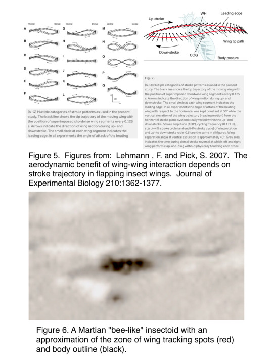
The most general anatomical features of insects on Earth as they can be recognized on Martian insectoids are labelled in Figs. 2 & 3. Please keep firmly in mind that the Martian forms are not necessarily insect in the Earth sense.
The following fundamental insectan structures can be identified in Martian “bee-like” insectoids (Figs 2 & 3) (1) three body regions — head, thorax, abdomen; (2) eyes, antennae, & mouthparts on the head; and (3) wings & legs on the thorax. In addition, a striped pattern around the body and spots on the wings can often be seen.
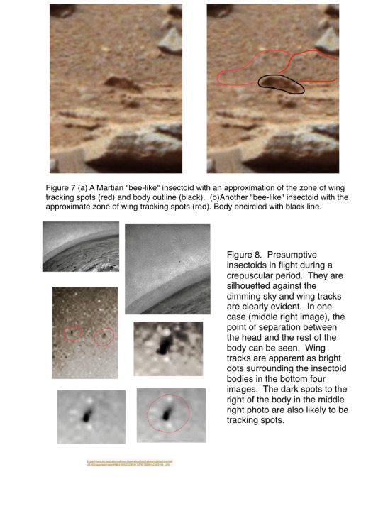
FLIGHT SIGNATURES. The following characteristic “flight signatures”are commonly observable in Martian insectoids, as they are in Earthly insects: (1) a zone of blurring surrounding the body (Fig. 4) which is caused by the rapid movement of wings; (2) somewhat blurry lines that radiate out from the body (Figure 4); (3) wing tracks (due to spots or light reflective region or regions on the wings) somewhat distal to the body (If the flight tracking spot or reflective surface is somewhat well-defined (Figs. 5-8) over short distances the tracking spots may appear to following a more-or-less sinusoidal pattern); and (4) flight paths indicated by multiple, sequential images of the same individual in flight.
The research in the citation in Figure 5 has a lot more information than we need here, but it is useful in portraying the forms of wing tracking, and is worthwhile documentation of the wing tracking phenomenon. After studying the next four slides, you should be able to re-examine Figs. 1-3 and see flight signatures.
FLIGHT PATHS. (Figs. 9-12). When illuminating with a strobe light, fight paths of individuals can be captured in sequential positions (Fig. 9a), but in the case of Martian insectoids, multiple images of the same individual are sometimes captured due to both the camera and insectoid moving. If the insectoid is flying at an angle to the plane of the camera lens, the body size appears to go from smaller or larger, or vice versa, in the direction of flight. This effect can be seen in Figure 9b which is a panning shot of a skier gliding by the panning camera. The same idea, of course, applies to walking/running forms as well. In addition to some major structures being visible in at least some images of a flight path, the concept of "Gestalt" also comes into play in interpreting the flight path, that is some images have an insectoid "Gestalt" despite no evident specific insectoid anatomical feature.
DISCUSSION/CONCLUSIONS. The evidence presented here provides further support for the first hypothesis: "There are fossil and extant higher life forms (metazoans; multicellular organisms composed of eukaryotic cells) on Mars."
The evidence also supports the contention that "bee-like" insectoids can fly. In fact, they appear to be agile fliers with an ability to make sharp turns. This raises questions in regard to how they accomplish flight under the apparently harsh conditions characterize the Martian atmosphere. Atmospheric density should be highest immediately above the surface and then decrease with increasing altitude above the surface. Perhaps near surface atmospheric density plus specific anatomical/physiological adaptations allow flight to occur.
The individual flying away from a cliff face (Fig. 10) suggests the possibility that the "bee-like" insectoids may shelter or nest in cavities accessible from the cliff face.


1 note
·
View note
Text
What Are Our Intentions In Parsvottanasana?
In this post I'll complete my series on the basic standing stances in the Ashtanga vinyasa practice. Parsvottanasana is the last pose in a series of poses that starts the Ashtanga vinyasa design technique that I do. Every one of the stances in that sequence are also foundational stances in many various other designs of technique, so it is worth taking a better take a look at the intentions of these positions and checking out techniques for developing them in your very own method. The positions that I have actually covered in previous posts consist of: standing forward bend, triangle, revolved triangle, side angle, rotated side angle, and also wide-legged onward bend.
General anatomy
Parsvottanasana might appear straightforward, however there is actually a whole lot going on in this pose! Parsvottanasana is carefully associated to revolved triangular posture, which we've already seen.
The foot foundation, legs as well as hips are all set up similarly as revolved triangle. That is, we established the feet as well as legs in such a way that allows us to have our pelvis essentially square with the front or rear of our floor covering. The back leg is externally revolved as well as this is what places the foot at its basically forty-five degree angle. Comparable to rotated triangle, most of our body weight is put onto the front leg. The hamstrings on both legs are eccentrically acquiring to reduce our energy as we fold forward and afterwards extending as we relax right into the forward bend facet of the pose.
One of the one-of-a-kind facets of this pose is what's happening with the top body and also shoulder band. We are internally turning the humerus (arm bone) at both shoulders to bring the arms around behind the back, inevitably intending to bring the hands with each other in a "reverse petition" position. Muscle mass of the rotator cuff are associated with this action. Subscapularis is acquiring to create internal rotation of the upper arm. Infraspinatus and teres small are exterior rotators of the humerus, so they are being lengthened in this action.
The scapulae obtain entailed when we hit completion of variety of activity of the humerus doing its internal rotation. The scapula commonly turns in such a way that we typically describe as winging of the scapula. In this situation it's not a trouble since we're not weight bearing and in demand of stability through the shoulder girdle.
Primary patterns as well as intentions
Developing the foot foundation
As with the various other fundamental standing positions we've looked at, the foundation for parsvottanasana is the feet. Just how we position the feet impacts how steady the hips and torso really feel over them. Exactly how we develop our structure on the ground affects just how much length we are able to create. Getting in touch with our feet in this position is our grounding, or mula, element.
Working around the pelvis
As with triangular, rotated triangular, side angle, and also rotated side angle, this stance is adding to openness of the muscles around the hip joints, which permits the hips to move much more easily. Whether we are trying to find much deeper ranges of motion for future yoga postures, or we are just trying to find a higher accessibility to useful activity in every day life, movement at the hips is essential. The hips sits at the center of our body as well as joins our top and lower fifty percents. So, more liberty of activity around the pelvis gives us access to more motion both listed below and over it.
Developing balance
Folding ahead without our hands offers us a chance to work with aspects of balance. When our hands are put behind us, we have to utilize our sense of proprioception-- our internal sensation of where we remain in space-- to fold up onward and also stay balanced.
Working the shoulder band in a new way
This present is asking for a deeper series of movement in the shoulder band than we have seen in the fundamental standing presents thus far. The action of inside revolving the upper arm to get to behind the back comes up in numerous various other yoga exercise postures. We see this exact same activity often in twisting poses when we reach an arm around to "bind" to the other hand or a foot.
Physiology
As with the various other basic standing positions that we have actually covered, I'll include an older traditional perspective of what this asana may be adding, physiologically, in the body. Really little has been researched, from the perspective of contemporary western medicine, when it involves the physical impacts of yoga exercise asana. While it's worth thinking about the conventional viewpoints, it's difficult to state at this point just how accurate they are from the factor of view of western medicine.
“This asana lowers excess fat on the waist and legs and also strengthens and also tones the muscle mass of the legs. It aids to clear mucous blocking the respiratory tract.”
- Pattabhi Jois in Lino Miele's Astanga Yoga book
Techniques and restrictions
First, the foot foundation
The feet are what you're standing on right here, so it makes sense to me to construct the stance from that base. Where we position the feet effects how we can put the pelvis above them, and afterwards even more up the chain, affects just how we can move the back. Just like rotated triangular present, it's not unusual for pupils to have actually listened to the hint to line up the heel of front foot with either the heel or instep of the back foot. For some pupils, the slim base that is developed by arbitrarily using either of those signs causes an unpredictable, wobbly posture. Where and how you set up the feet is straight pertaining to how adaptable the hips themselves currently are or are not. The tighter the hips are, the bigger (side to side) the position ought to normally be. The more open the hips are, the more narrow the placement can be.
How the base of parsvottanasana is established is also associated with each person's own proprioception as well as capability to balance. If the hips are on the tighter side, after that taking the feet a bit larger apart can allow better security in the pose, and also ultimately allow the trainee to put more attention on producing size through the back since they aren't putting all their interest on not falling over. We intend to challenge balance but also have adequate stability to function with the hips and spine above.
Getting the hands behind the back
One part of this posture that pupils commonly fight with is obtaining the hands behind the back in the reverse petition, or turn around namaste, position. Keep in mind, the hands, wrists, joints, shoulder joints, scapulae, and clavicles are all connected together. Any type of restriction in any type of part of this chain can influence where and just how the hands appear at the end of the chain.
If we look at exactly how this chain features, we will see from the top of the chain that the scapula is mosting likely to extend to give even more space for the shoulder joint itself to do internal turning. As we said, the inner rotators are subscapularis along with the larger pectoralis significant and latissimus muscular tissues. Yet, it's frequently not toughness on the inner potter's wheels that restricts variety of motion, it's the opposing muscular tissues. In this case, inner rotation is limited by the external rotators of the shoulder joint. The external potter's wheels are 2 of the rotator cuff muscles, infraspinatus as well as teres small. Additionally, the posterior area of the deltoids is an outside potter's wheel of the shoulder joint.
As we move down the chain to the arm joint, you can hit limitations in the rotation required to pronate the forearm, which suggests basically, to place the lower arm in a position that has the hand encountering down. As we proceed our means down the chain to the wrist, we can additionally face lots of issues. Primarily, we require to hyperextend the wrist, which is made harder by the pronation of the forearm needed to take the hands behind your back.
So, as I have actually simply shared, there are numerous reasons bringing the hands into reverse prayer setting might be a challenge, but the initial place I would certainly seem the shoulders. Beginning the movement from the shoulders, after that continue the action with movement at the arm joint to move the forearm. Completed with activity at the wrist last.
If the shoulders are tight, or movement is limited in a manner that doesn't allow us to place the hands well behind the back, they trying to require the reverse petition setting is most likely to create wrist pain. If the hands don't fulfill yet, collaborate with an alteration. I often suggest having the hands flat on top of each other with the palms encountering far from each other. This reduces the quantity of pronation required in the forearm and generally enables pupils to work the other elements of the stance, specifically the shoulder rotation itself. You can additionally bring simply fingertips together as well as function there for some time, enabling time for the shoulders as well as muscles of the lower arms to open and also allow the wrists to relocate right into the "ideal" location.
It's additionally possible for the shoulders to enable the hands to enter the "best" area, however to still experience wrist pain. We frequently spend a great deal of time at a keyboard keying these days. This action can overwork the wrist flexor muscular tissues and the extensors may be tight from withstanding this action. Go gently right into the placement of completely expanding the wrists as well as don't force it if it doesn't go.
Should the back be flat in parsvottanasana?
I usually get asked the inquiry in this stance: Should the back be entirely level when we fold forward in parsvottanasana? The brief answer is not necessarily, no. The intent is length in the back, not monotony of the back in itself. The back has natural curves, so some quantity of rounding of the back belongs to its structure. We likewise require to consider the hamstrings. Comparable to various other ahead bends, the pelvis and back will be affected by the versatility of the hamstrings. The tighter they are, the most likely the back will be rounded. The more versatile, the flatter the back will show up. Start the forward fold from the hip joints, after that continue the forward fold with the objective of size in the back, allowing the back be however it is.
1 note
·
View note
Text
2021 NBA Draft Prospect Profiles: Keon Johnson
New Post has been published on https://tattlepress.com/nba/2021-nba-draft-prospect-profiles-keon-johnson/
2021 NBA Draft Prospect Profiles: Keon Johnson
Over the next month, GBB will be profiling various players the Memphis Grizzlies may target in the 2021 NBA Draft. This year we will be breaking it up in to three sections – five to likely trade up for, five potentially available right around pick #17 where Memphis is slotted to pick, and five that surely will be there or perhaps the Grizzlies could even trade back and still select.
Others in this “trade up category”: Scottie Barnes of Florida State — player profile.
Moses Moody of Arkansas.
Josh Giddey of NBL — Australia.
James Bouknight of Connecticut.
Next Up, Keon Johnson of Tennessee.
KEON JOHNSON, GUARD/WING, UNIVERSITY OF TENNESSEE
6’3”, 185 pounds, (6’7” Wingspan), 19 years old, Bell Buckle,TN
One Season at Tennessee- 25.5 minutes per game, 11.3 points per game, 44.9% from the field, 27.1% on threes, 70.3% from the free throw line, 3.5 rebounds per game, 2.5 assists per game, 1.1 steals per game
STATS OF STRENGTH (per Tankathon): Defensive Rating (94.7), Defensive Win Shares (.081), FTA Rate (.409)
STATS TO IMPROVE: Offensive Rating (97.7), Turnovers (3.7 per 36 minutes), 3PFG% (27.1%)
ACCOLADES AND AWARDS: 2020-2021 ALL-SEC Freshman Team
CURRENT BIG BOARD PLACEMENTS: 15th overall (Tankathon), 6th overall (The Ringer), 10th Overall (ESPN), 13th Overall (CBS SPORTS), 9th Overall (Bleacher Report)
youtube
The wing/forward position has certainly and logically been the most talked about area for the Memphis Grizzlies to focus on this offseason in terms of their present and future. Specifically, bigger wings that can shoot are a more concentrated need in terms of a player profile that makes the most sense in terms of fit for the Grizzlies. University of Tennessee guard Keon Johnson is neither a big wing nor an accomplished shooter. However, he offers significant upside as a critical fit in one area the Grizzlies could use: a long-term backcourt mate for Ja Morant.
When it comes to Johnson, perhaps the most enticing aspect of his game is that he likely is one of the first noticeable talents that literally jumps out to an observer due to his athleticism. Being an elite natural athlete is what allows Johnson to have the ability to make a difference on both ends of the court. His aggressiveness and impressive IQ at his age creates the opportunity for him to have “functional athleticism”, which allows him to be a disruptor on defense and a valuable cutter and high-flying finisher on offense.
However, despite his high level of obvious talent, Johnson remains a significant work in progress. Though Johnson is usually found among the top 8 or 12 prospects on any 2021 NBA Draft Big Boards, it could take him longer than other lottery talents to consistently make a significant impact. His upside as an impactful defender outweighs his offensive outlook at the moment, mainly due to his inconsistent ability as a shooter. Along with being smaller than many other prospects with similar profiles, Johnson may not be a fit in as many situations as true wings might be.
Regardless, Johnson’s combination of athleticism, aggressiveness, and a determined attitude should make him an attractive lottery target for any team.
What He Does Well
Jump. Leap. Float. Levitate?
The Keon Johnson 48” vertical is the most amazing testing result I’ve ever seen. Kenny Gregory set the record 20 years ago. Keon shattered it.
Athleticism doesn’t equal NBA greatness (see Gregory) but gotta believe that teams that are on the fence will be influenced by it.
— Chad Ford (@chadfordinsider) June 24, 2021
Johnson’s athleticism rightfully is the most appealing part of his profile as a prospect. He is one of the best athletes in this class, and as the tweets above show one of the best pound-for-pound leapers in NBA Draft History. However, simply being able to leap high into the air is not what makes a player skilled. In Johnson’s case, it is what he does in the air that separates him from many prospects.
youtube
Defensively, Johnson’s leaping ability allows him to impact the game in a variety of ways. First, it allows for him to have an elite ability to alter and block shots at a high rate for a guard. Johnson’s explosion provides a plethora of possibilities-
one-on-one opportunities to block or alter a jump shot
trailing in transition
recovering if beat off the dribble
providing off-ball help to alter or block shots, especially at the rim
The depth at which Johnson can impact a game with his leaping ability allows for him to have a solid base to become an elite defender most prospects his age do not have. His leaping and jumping ability allows for him to be relevant support as a rebounder. As the NBA continues to trend toward smaller lineups, having a guard that can provide reliable rebounding is a clear advantage for any lineup.
youtube
Offensively, Johnson’s leaping ability creates an advantage for him to be in ideal target as a transition finisher, lob threat, and cutter. He can quickly and effectively transfer power in his legs to transition from being on the move to skying above almost any defender to finish a play. His jumping ability also allows for him to be a contributor when it comes to offensive rebounds, either in put back situations or to extend plays.
Along with his general athleticism and leaping ability, Johnson consistently displays fast and effective footwork. It helps him to stay in position to limit space and driving opportunities in one-on-one situations. It allows for him to aggressively pursue angles to disrupt off-ball movement, and also for him to quickly recover if he were to get beat. Offensively, Johnson displays a keen awareness of quickly identifying cutting lanes and areas of space. This sets him up as an effective finisher for a dunk or high percentage look close to the rim or have the ability to quickly get off an accurate shot from distance.
Finally, Johnson’s basketball IQ may well be an underrated part of his game. Though his shooting is certainly a work in progress, he also found success for stretches this season. According to barttovik.com, Johnson was one of only five freshman to shoot 40% or better on far twos this past season. This shows Johnson was able to find some sort of balance as a shooter and scorer beyond just being an option as a cutter.
Johnson’s awareness and intelligence allow for him to significantly impact the game in more ways than most prospects his age. Johnson was one of only seven freshman to produce an assist percentage of 20% or better, a steal percentage of 2.5% or better, and a block percentage of 1.5% or better. This shows that Johnson’s ability to make momentum shifting plays on defense and finding ways to setup his teammates up for scoring opportunities on offense is a consistent part of his game. As the highlight above shows, he can even flash as a primary facilitator at times in transition off a rebound to create a fast break opportunity. In other words, Johnson is one of the best prospects in this class when it comes to making an impact in multiple ways beyond scoring.
Where He Can Improve
Without a doubt, there is plenty of natural ability for NBA teams to work with when it comes to Johnson’s overall game, especially for a 19-year old. However, as with any prospect at his age, there are also many areas of needed improvement for him to realize his full potential at the next level. The main areas are his fouls, turnovers, ball-handling, and shooting.
On a per-40 minute basis his freshman year, Johnson averaged 4.1 turnovers and 3.7 fouls. In his 27 games at Tennessee, he committed 3 or more turnovers in 15 games and 3 or more fouls in 14 games. The fouls are logical, as with the energy, quickness, and aggressiveness that Johnson consistently plays on defense, he likely is prone to ref whistles. As he matures as a player, discipline should help his foul rates decline. Obviously, the turnover rate shows Johnson’s decision making is a work in progress as well. While he will likely never be a primary playmaker over extended stretches for a team, he has some potential as a secondary facilitator. As he gets more confident in his ability to shoot and score, Johnson should become more confident in working off that ability to make the right reads on is passes to help others score.
Mid range work from Keon Johnson yesterday. Under control and balanced with pull up jumpers and floaters. Even more impressive over the contests.
The left to right cross on Petty into the fading jumper was beautiful. Oozed confidence. Real substance w/ his OTD scoring flashes pic.twitter.com/W2xOwXIwzt
— Jam Hines (@jamontheboards) March 14, 2021
Of course, another area where Johnson certainly needs to show improvement is in his ability to create off the dribble. In some games, such as the highlights above, he clearly shows the ability to create his own shot off the dribble. However, in others, he also had stretches where he really hurt the Volunteer offense with multiple turnovers in a small time frame.
Early in his career, Johnson will likely be better on catch-and-shoot opportunities or in situations that require just one or two dribbles. Each of his 48 three point attempts at Tennessee were assisted, indicating a limited ability to create shots off the dribble. It will likely take time for Johnson to get comfortable consistently creating his own shot in isolation or running an offensive scheme. Johnson’s ability to improve his ball-handling to combine with his tremendous leaping ability to become a threat as a pull-up shooter is a critical area of development in his potential as a two way difference maker.
The bounciest leaper in NBA Combine history (48-inch vert), Keon Johnson is far more than just an athlete. Think he’ll open some eyes with his shooting potential throughout the pre-draft process. Great balance. Fan of his no-nonsense approach and competitiveness. Big-time upside. pic.twitter.com/7vdxedBycX
— Mike Schmitz (@Mike_Schmitz) July 1, 2021
Many of the areas of improvement listed above are areas of Johnson’s game that will naturally improve with time. The most pertinent factor in Johnson’s long-term potential and overall production as a player is his ability to shoot. In 27 games at Tennessee, Johnson shot 27.1% from three on 48 attempts and 70.3% on 101 free throw attempts. While these numbers are not horrible, they also are not highly encouraging that Johnson will be a respectable shooter as a rookie, especially with all of his three-point attempts being of the catch-and-shoot variety. However, as a few of the videos above show, there is plenty to work with when it comes to his mechanics and form. The key for Johnson is to develop the feel and confidence to consistently repeat an effective shot as he matures.
The fluidity that Johnson often displays with his movements on defense offers valid hope he can develop that feel and confidence with his shot on offense. There is plenty of effective intent with how quickly and aggressively Johnson moves to create plays on defense. That same quick and fluid motion is a big key to him finding his rhythm as a shooter. If he can fine-tune his shooting form to quickly catch and release his shot from distance, he will create a base to work with to balance out his offensive game.
From there, Johnson will then have a reference point to build off of to build confidence in his ability to mature as a shot-creator. It may take him longer than other lottery prospects to form a reliable shooting game that defenses must respect; however, Johnson has plenty of natural ability to form exactly that in time with proper coaching.
The Fit With The Grizzlies
Does this story not sound familiar?
A young player who offers more value on defense than offense many times due to an inconsistent offensive game, mainly as the result of an unreliable ability to shoot from distance.
Two summers ago, that exact description could logically described the abilities of Dillon Brooks, De’Anthony Melton, and Kyle Anderson.
Due to time working with Taylor Jenkins and finding their fits within his schemes and strategies, each one of these players just experienced career-best seasons in which their overall games gained significant value.
Obviously, the Grizzlies are attracted to these type of two way perimeter talents that are similar to Johnson’s skill set. In fact, since the 2009-2010 season, only 11 freshman guards have produced an assist percentage of 20% or better, a steal percentage of 2.5% or better, and a block percentage of 2% or better in a single season (min. 650 minutes played). A few notable names in this group are Lonzo Ball, Marcus Smart, and Alex Caruso. Melton, Anderson and Johnson are also included in that list.
Johnson obviously fits a profile both that the Memphis Grizzlies prefer and that Jenkins has been able to make the most of during his time in Memphis. However, the Grizzlies already have a surplus of players with Johnson’s skillset and that play his position as an off-ball guard/wing. Though Johnson likely has more long-term potential than any of the current Grizzlies mentioned above, using a valuable pick on a player that will take time to perhaps be better than multiple options you already have on the roster may not be ideal. Johnson could develop into the long-term backcourt option to pair with Morant; the question for the Grizzlies is how strongly do they feel Johnson could become that to select him over players with similar upsides but skillsets that are of greater need for the Grizzlies future.
Randy Sartin-USA TODAY Sports
The Verdict
When it comes to Keon Johnson, the main question is quite simple:
Do the Grizzlies feel his shooting potential will allow for him to become a two-way difference maker to pair with Ja Morant long-term?
It certainly seems the Grizzlies are going to need to have a strong conviction that is highly likely for them to target Johnson in a trade up situation over other targets. The shooting and scoring abilities of prospects such as Moses Moody, Corey Kispert, and James Bouknight make them more logical prospects for the Grizzlies to aggressively pursue, especially with Moody and Kispert as true fowards/wings. Johnson seems more logical as a fallback trade up option the Grizzlies could move up a few spots to get if he slides in the draft.
There is plenty to like about Keon Johnson’s potential as an elite defender and across the board contributor on offense. His development as a young player likely will not be far from how Melton has developed over time. However, since the Grizzlies already have Melton and other wings/guards locked into multiple year contracts, it seems a bigger area of need is a true wing and shooter. Though it makes sense for Memphis to target upside regardless of fit in this strong draft, they should place a preference on shooting and bigger wings to balance out their roster.
As a result, though Johnson would certainly be a fine pick for the Memphis Grizzlies in the 2021 draft, I feel there are more sensible options to pursue in a trade-up scenario. In the rare case that Johnson were to be a player who slides in the draft, whether it be at 17 or by trading up a few spots, he easily could become one of the best values in this draft over time due to the Grizzlies ability to develop players with his abilities.
It seems that Keon Johnson is likely to be picked in the 7 to 12 range in the draft. However, since he may take time to develop on offense, he could slip in the Draft. Though there likely will be a more logical target for Memphis to pursue in a trade-up scenario, if Johnson falls out of the lottery, he may be too good of a value to not take a chance on.
For more Grizzlies talk, subscribe to the Grizzly Bear Blues podcast network on Google Podcasts, Apple Podcasts, Stitcher, Spotify, and IHeart. Follow Grizzly Bear Blues on Twitter and Instagram.
Source link
0 notes
Note
how you draw robo parts? help
!!!
Okay, so, hm… Well, for reference this is how I draw robo parts, I guess…

I look at Murata’s drawings. A lot XD I’ve saved a bunch of screenshots on my computer to use as references as well, such as these:
(Fun fact, when you stare long enough at different shots of Genos in the anime, you notice he’s drawn slightly different in different scenes, probably thanks to different animators at work! And no, Murata is not consistent either - part of the fun with drawing this borg - you don’t need to be consistent because no one else is!! ps. notice the colouring error in the left cap?)
If you’ve got some familiarity with drawing normal human anatomy you can see that Genos’ parts follow the placement of typical human muscle/bone pretty well, so you can use that as a guide for where the different parts go:

Try to think in a 3D shape, if that makes sense. When you draw flesh, you’re working with something that is soft and squishy, which metal of course isn’t, so everything needs to fit together at all angles to allow smooth movement, it’s less forgiving than flesh would be. This is especially going to apply to the arms/hands/legs, since they move around a lot. Try to think about how to fit joints and parts together - “If I draw it like this, what range of movement will it allow?”
There’s a fair bit more, but I’ll add it under a cut so this post doesn’t become super long!
Here are a few examples of how I’ve dealt with arm movement/joints in the past:

Above you can also see how you can draw the edges of the plates/parts to add depth and shape to the different parts, like near the elbow in the top left picture or the light blue edges on the top right image. These sharper edges also helps inform the viewer that this is not flesh that we’re looking at.
Back to range of movement - I have actually found it useful to draw regular fleshy hands/arms by remembering how to draw Genos’! Again Murata’s designs tend to follow RL very closely:
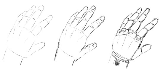
A sketch of my own hand, then transformed into a basic robohand. You can see that the similarities.
As for colouring metal, I’ve learnt a lot from watching timelapses of Murata working! This one is a favourite.
Metal is typically highly reflective with lots of contrast, which I personally find a lot of fun to colour! I normally decide beforehand if I’m going to keep it very simple (base + highlight) like for a chibi perhaps, or do more bold shading and maybe a bit of a glow (aaah

If you feel uncertain where to start when colouring, try to find a reference to look at for help. My suggestion? Google knight armour! It’s great reference for Genos!
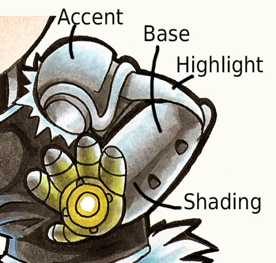
If we use a “standard grey arm” as an example, I usually break it down into four parts:1. A base colour2. A shading colour3. A highlight colour4. An accent colour
I often hint where the shading colour is supposed to go in the lineart, either as thin lines (like the bottom right drawing) or solid areas of colour, which can look very striking and suggests a highly reflective metal.
When I colour I start with the base colour and put it everywhere except where the highlights are, which depends on your light source of course… but a very basic way to go it can be to leave the edges pale - on both sides, given how reflective metal is. If you have room and want a highly reflective area, you can do several dark/light areas next to each other, like chrome.
I then add shading using the dark colour. I usually leave the highlights white (depending on the mood/light of the drawing, of course). You don’t want metal areas to have soft, gradual shading/highlight in general, you want that good contrast.
The accent colour is added last and adds a bit of life to the drawing, rather than leaving everything a dull greyscale. It can also be used to reflect the surroundings a bit - light blue can be a good basic colour if you’re not sure what to use. If you’re feeling brave, try playing with different accent colours, perhaps a pale version of whatever you’ve used for the clothes reflected on the parts nearer to the body?
(LOL that white line on the bunny tail there is a dog hair I didn’t notice until now. Thanks, Kiwi…)
Aaaah, well, I could go on forever but there you have some basics?! If something is unclear or if I didn’t cover something you wanted to see, just send me another ask, ok?
#tutorial#I GUESS#waaaah I hope it can be of help???#I love ranting about this kind of thing so this ask made me very happy yooo
27 notes
·
View notes
Text
unit 35
job roles gallery
In the production of making tv and film there are many jobs/ roles that you may be. These can be in the gallery. The gallery roles usually consist of people who are more in control of the production for example a producer they are more in charge of the production and will usually mange everything that is going on
Some of the jobs that you will see on the gallery:
- sound mixer, this is a usual job that you will find in the gallery as it is found in the control room and these are people who control something that is happening as they are controlling the sound. It is an advantage to have one of these on your team as they are able to control the sound and make sure that it sounds perfect so they are needed as the production will be able to be produced to the highest quality.

-director, a director is most certainly if not definitely needed in the production team as they will be the person in control of most of the things for example they help to position where the cameras are going to be and do many other things as they are directing what is going on. It would be an advantage for you to have one of these on your team as it will mean that you will be able to have someone directing your production which in turn will mean that everything will run smoothly and make sure that all of the camera movement and placement is consistent and well done.

-production assistant, a production assistant is someone who does many things such as counting down timings on things that are airing so that it is know when to be putting the cameras on and things such as that, they are the people who help produce it as they help the producer to make sure that everything runs correctly, it is an advantage to have one of these as they help with producing the show.
Job roles studio floor
In the production of making tv and film there are many jobs/ roles that you may be. These can be on the studio floor which means that you will be there at production and doing something which will be involved in the production. These people are usually heavily involved in the making of the tv or film as they are essential as they operate the equipment that is needed in the production.
Some of the jobs that you will see on the studio floor:
-camera operator, a camera operator is someone who operates the camera so that the production can be filmed. This is obviously a role which you would see on the studio floor as without a camera operator there would be no way you could film the production. If you have a camera operator. this is an advantage to you as then you will be able to produce the production that you want to do. If you want to become a camera operator you would need to be qualified and have some experience in the area, once you become one you will typically be paid around 38,000 per year.

-boom operator, a boom operator are the people who are in charge of sound and will also be on the studio floor as they operate a boom mic or some of form of equipment so that the sound is picked up as clearly as possible, these are also another job role that is essential to the production as without them the sound will not be as clear and then they will not be able to produce it. It is an advantage to have one of these as your production will be the best it can then be. Also the average salary for a boom operator is around £15 per hour for when you are at the production.
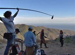
-presenters, a presenters is the person who is presentere the tv show which is being produced and are obviously essential to the production of the show as without them there would be no one to produce the show and therefore be boring and not be watched by anyone. To become a presenter you need to gain experience in the area and usually when you are a well known presenter you can earn a salary in the millions.
Narrative multi camera production
There are different types of production that happen when you are producing your show, these can be of 2 things, these are narrative production and non narrative and are both multi camera meaning that there is more than one camera that is used.
A narrative production is a production in which the storyline is consistent and is told in a narrative way an example of this would be soaps. These are examples of narratives as they follow a storyline and are a narrative told along the way as it is a story.
An example of a soap would be coronation street and this would fit perfectly into this category.this is a it is a narrative as when they are filming and producing it they need to make sure that it is in continuity as if it is not the storyline will not make sense and not be in the correct order, when they are making the filming they need to make sure that they have everything in order for example in set then need to make sure that it looks the same if they are not doing it on the same day.
When they are filming they need to make sure that each of the studio locations are well done so that they stay within continuity as if the film set is tampered with or if it is moved about it will make the set not match with the past ones therefore making your filming not as good as it should be and potentially messing up production
When they are filming the production they will usually have multiple camera, this is good as they are able to get many different angles within the filming meaning it is easier for the editors to put the more together and make it look more professional, however if you choose to have more cameras it may be a disadvantage as you will then need to hire more camera operator to be able to work on the cameras.
They also use lighting to make the scene look as realistic as possible so that it looks good when it is produced as if not it will mean that it may look fake and therefore not look good to the viewers.
Non Narrative multi camera production
A non narrative production is a production that is not storyline line based and is not consistent as it does not follow a storyline
An example of a non narrative would be a game show this is as they are not storyline based and do not have a continuity as it is usually just a one time show each episode so there's really nothing that they will follow on from, this is useful as it means that there is not as much to piece together and that it will flow more smoothly as they don't need to keep everything in time order or the show will be live meaning that it will just naturally for into order
An example of a game show would be the chase this is a good example as it is a non narrative as it is a game show meaning that it is not scripted all of the time and therefore can usually be live or not depending on how it is produced,
Usually on a non narrative production there will be a multi camera set up so that there can get all different angles of the presenters and the contestants. Having multi cameras is also useful for when they are live as they will then be able to switch between the angles and make it more dynamic, they will also usually have a camera set up so you can see the board/scoreboard when you are watching it so you can know what is going on if it is a game show
usually the way that they set the lighting u is so that it is focused on the people for example if it was a gameshow the lighting would mostly be around the constants and the person who is presenting it
0 notes
Text
shot-by-shot, lance and keith
Previously on the shark, I used a scene in S3E2 to give you a sense of how camera angles can communicate (or contradict) a scene’s emotion and tone. Here, I’ll tackle the actual scene @skaylanphear and @avatar-crystal-gemini analyzed. There’s some really subtle stuff going on here, not to mention rule-breaking to a rather interesting effect.
First, I’m going to introduce you to a photographic concept called keystoning. If you’ve ever stood on the street and tried to take a picture of a building, you’ve probably seen the effect.
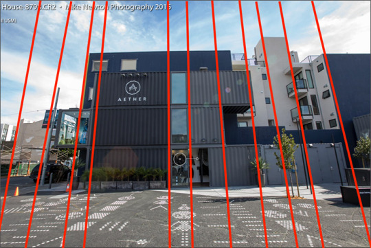
Notice the way the building looks like it’s leaning backwards, somewhat? And the vertical lines -- which should vertical and parallel -- seem to be heading towards converging at some distant point? This keystoning is an artifact of shooting at a wide-angle.
This isn’t saying wide-angle has no value, though, even if it’s too-loved by real estate photographers to make that teeny kitchen look massive. It can make for a dramatic effect, used judiciously in architectural photography. It's also common in horror movies, where you want to give viewers a peculiar sense that’s both isolation (because of the way the wide lens grabs so much more of the area around the focal point) and distortion (from nothing being quite vertical, horizontal, or parallel).
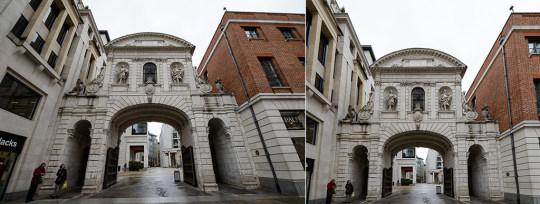
There are two ways to correct for the distortion in wide-angle: shoot at a perfectly level 0′ angle, or do an in-camera or in-photoshop perspective correction. Wide angle is on the left, corrected is on the right.
As you may’ve guessed, I’m explaining this because you’re about to see a whole lot of wide-angle shots in this scene. There’s also some interesting camera movement, but neither the distortion nor the movement are consistent, and that’s where the subtle cues lie.
Establishing shot: Keith hangs up his jacket, someone knocks, he lets them in. Judging by his approximate height in comparison to the room, his quarters are maybe between 14′ to 18′ wide, but it looks real-estate wide-angle massive. He’s isolated in the middle of the frame, a very small figure in relation to his surroundings.
The angles are also all wrong. See the yellow lines?
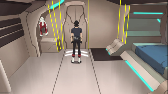
They’re not widely off (yet) but they’re definitely not quite running parallel. The bulkhead to the left camouflages this somewhat, since it is distinctly angled. So it’s like the eye registers some of it as ‘making sense’ (the strong angle on the left) and some of it as ‘not quite right’. It’s not quite as obnoxiously obvious as dutch angles, but it is enough to create a subtle tension.
(They’re also converging below the horizon, because the camera is tilted downwards. In the photographs above, the camera was tilted upwards, so the convergence points were above.)
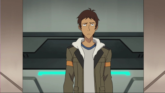
Cut to Lance, at the door. Notice there’s no distortion here, because the angle is perfectly level. The camera's focus is on his sternum, which is also dead-center of the frame, thus even at a wide angle, there’s no distortion.
Then we’re snapped back to the original framing, and I’m not kidding when I say only real estate agents looking to distort small rooms into massive would use a wide-angle lens in this kind of setting. For some reason, the storyboarders (the ‘camera’) wanted this room to seem a vast, cavernous, space despite being a relatively intimate area (both in size and use).
So one possibility is the camera is trying to keep this from feeling like one person stepping into another person’s private, close quarters (pun intended). Another is that it’s not just the room itself, but someone’s perspective. Either way, we’ve got a bit of distortion, lots of space around them, and they’re squared off in the center. It’s also a curiously static shot, due to being so visually balanced.
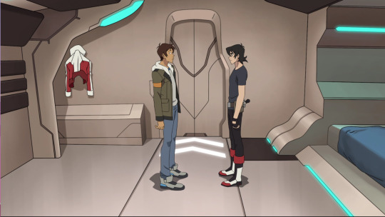
As an aside, I got three coworkers to test the distance with me. If my guess is right that Lance is just beyond the reach of Keith’s outstretched arm, then this is roughly a comfortable speaking distance between two people who are friendly but not necessarily intimate. (This is about the distance for chatting casually in the kitchen at work: close enough you don’t have to yell, not so close anyone thinks you’re up to no good.)
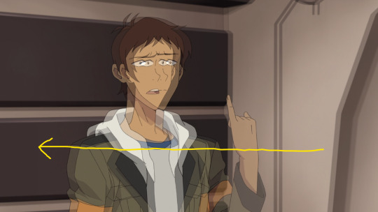
Onto the next framing, and here’s where things get interesting. These next shots appear static and basic, but there is movement. It’s just really subtle, so I’ve layered the first frame with the last so you can see how the camera’s moving.
First, we have Lance explaining his reasoning. The camera starts with Lance slightly off-center to the left, then slowly pans across, cutting away just before Lance reaches the center.
We cut to showing the two facing off again. It’s harder to see ‘cause I’ve again overlaid frames, but there’s no distortion here, either. Again the camera is dead-level with the centerline, so the door in the background has parallel vertical lines.
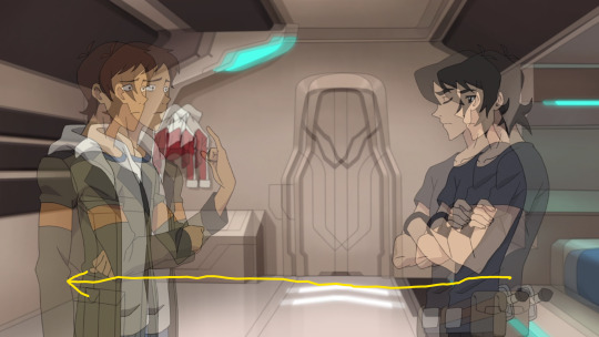
Again, the camera moves on a horizontal plane, slowly shifting towards Lance. This segment is longer, so there’s more ‘travelling’ in between the first and last frames.
There’s one detail in there that I do want to highlight. Look at Lance’s hands.
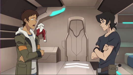
Where Keith’s crossed arms are relatively relaxed -- his fingers grip his upper arm, and his other hand is tucked under his arm to create a crossed-arm effect, Lance isn’t actually mirroring him. Lance’s arms are laid over each other (a more protective gesture) and his hidden hand (on the left, under his elbow) is a fist.
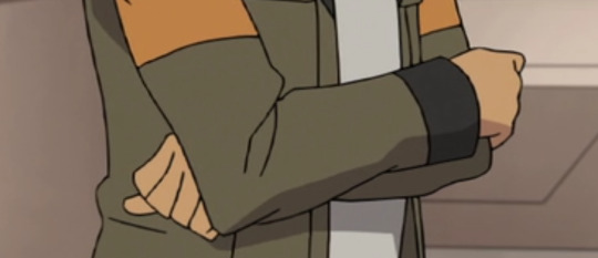
We don’t always mirror as a sign of attraction. It’d be more accurate to say we mirror as a way to signal being simpatico -- and we do it to potential friends and employers as much as we do potential lovers. Lance isn’t mirroring, though, because those small differences -- the arms layered instead of crossed, and the hand in a fist -- say something very different.
First, he layers his arms right as he says he wouldn’t want to take Blue from Allura. His last interaction with Blue was some pretty strong rejection, after all, and the layered arms could be signaling he doesn’t believe Blue would want him back. The protective position -- covering the proverbial underbelly -- could be an unconscious attempt to protect himself from a repeat of that rejection.
At the same time, the clenched fist contradicts this -- we do that when we want to hold onto something: our temper, our pride. He may be saying he won’t take Blue from Allura, but the fist could be signal that he dearly wishes he could’ve held onto Blue, anyway. Or he could be trying to hold onto his pride and not show how much Blue’s rejection hurt.
Then we get a middle-close shot of Lance. This time, the camera is slowly moving upwards and towards him. Between the movement of his head and shoulders, the camera’s pan is hard to see. It took another layering and looking at the background to see the very small amount the camera moves.
But it does move, and if you remember from the other posts about how close-ups can signal intensity, intimacy, and/or vulnerability, this is the point where Lance comes out with his suggestion that he step down as a pilot.
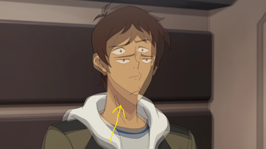
When I watched this with the photographer in the house, this is where we realized the camera work isn’t just slow panning to make up for the otherwise static blocking. It’s saying something.
Because we cut to Keith, and layering the first and last frames of his middle-ground closeup looks like this:
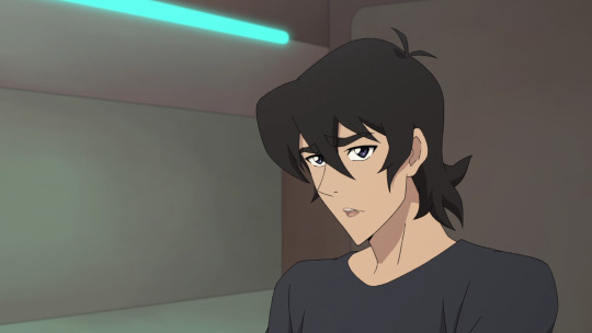
If you look close, you can see the lip-flap is the only difference. Nothing else moves. On top of that, the camera is perfectly on level with Keith, so while we still get the wide-angle effect of a lot of space around him, the vertical lines are at 90′. If they’re off, it’s by barely a degree.
No movement, and no distortion.
Now the camera cuts back to showing both of them, and again we get a slow pan. Except this time it’s travelling in Keith’s direction, which means he’s moving towards the center of the frame, while Lance is slowly moving out of frame.
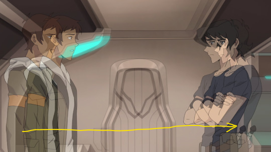
That seems like a significant jump, but there’s an additional action here that’s worth noting. It’s Lance’s abrupt withdrawal as Keith speaks. Keith’s expression sharpens at the move, while the changes in Lance’s expression are much more subtle. Just a tiny difference in the eyebrows, and the mouth flattening. (The gif is slowed down a little; the real thing is a bit faster.)
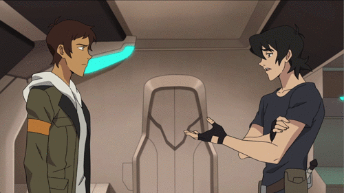
Lance is leaning forward, as Keith says “stop worrying about who flies what” and on the ‘what’, Lance pulls back. Three frames, total. Not enough to blur, but enough to make the action seem kind of sharp.
There’s also a hint of Lance straightening up, which you can see in the elbows and the angle of his shoulder to his neck. Not only is he pulling back, it’s almost like Keith’s dismissive response snaps Lance to attention.
And as Keith finishes speaking, we get this image.
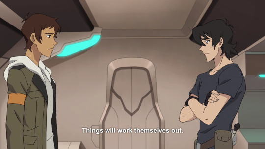
Neither of them really looks all that convinced.
The next shot is actually the first that might be something like a POV shot (over the shoulder) but it’s a really bizarre placement. The ‘lens’ is about the level of the back of Keith’s head, and offset enough that there’s no overlap at all between him (as the subject) and Lance (as the object).
This one also has some of the strongest distortion yet.
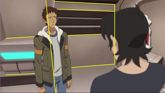
Given how odd and uncomfortable this angle is, why use it?
For starters, Lance himself is keystoned -- which means without actually ‘changing’ anything in his posture, he still gives the impression of leaning back/away from the camera. His spine is actually straight enough that it’s on the same plane as the vertical line of the wall behind him -- that’s the vertical line on I drew down Lance. But since that line is distorted to lean a little left and away... it appears Lance is doing the same.
Secondly, the only reason for using a wide-angle is to get more in the frame than you would with a close-up. What else is this frame containing, that would make the usual level-camera approach not work?
I think it’s the hands, again. Although Lance’s shoulders seem relaxed, both of his fists are clenched. The storyboarders/camera want that detail in the frame.
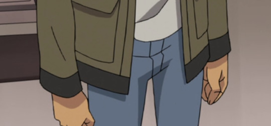
Given the noticeable change in Lance’s posture, the only conclusion that makes sense is that there’s something in the phrase “don’t worry about it” that really bothers Lance. Add in that the only thing moving in this segment is Lance’s expression. It goes from startled to averted to subdued. The rest of him is remarkably still.
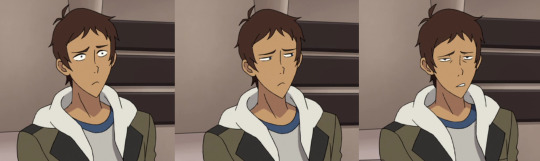
The end of this segment is where the storyboarders/camera broke one of the cardinal rules of framing. At the start, Lance is framed to the left of Keith; by the end of this shot, Lance has walked to the door, pausing when Keith calls him back.
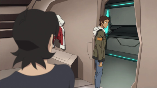
There are two ways this blocking would get treated. Either the camera cuts to be forward of Keith (retaining his POV by holding roughly the same angle, just with Keith now ‘behind’ the camera’s eye), or the camera will watch over Keith’s shoulder. As it turns to follow Lance, that indicates that Keith’s POV is following, too. That keeps Keith in the frame, but without blocking our view of Lance.
But the camera isn’t really looking over Keith’s shoulder, per se; it’s held in that strange spot behind, a little above, and a little to the side. So when Lance moves and the camera follows, we get this.
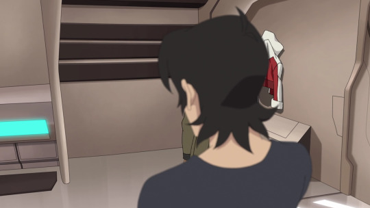
How much more literally can you show that Lance has not only withdrawn, he’s stepped behind Keith and disappeared into Keith’s shadow? There’s no other reason to break the standard rules of blocking/framing unless we’re meant to see Lance as stepping behind (or getting hidden behind) Keith.
As Lance reaches the door, Keith calls Lance back. Lance’s half-turn to look over his shoulder is preface to a jump-cut, where we get this view.
As you’re probably now familiar, the camera is now in Lance’s POV. The camera is level with the center of Keith’s chest, so while it remains wide-angle, once again there’s no distortion. Keith is centered exactly in the middle, as well.
Although (as @skaylanphear pointed out) this shot could’ve been cropped closer, that actually would make it more jarring, because that’d be an abrupt switch away from wide-angle. Additionally, it wouldn’t make any sense, because it would imply the two are physically closer than they are, given that Lance is at the threshold and Keith hasn’t moved at all.
Yes, it is true that ‘seeing someone from a new angle’ implies a change in awareness of someone. (This can work in a negative direction as well as a positive one, btw.) When that new angle is meant as attraction in a physical sense, that’s often when we get the male gaze of the camera starting at the feet, panning up the legs, over the body, with the (usually female) face last.
But when that new angle is meant to indicate attraction in the romantic-love sense, it’s most often done by viewing the same character from below. Think of the classic shot where the previously-plain girl appears at the top of the stairs in a pretty dress; that upward view is meant to imply being overwhelmed. Again, that can be negative, as in looking up at a horror movie’s monster, or positive, where it usually codes as awe (ie Superman) or love (the girl in the dress).
But here, Keith is being viewed on the level, and the distance is due more to blocking than any ‘change in perspective’ from emotion. In fact, given the distortions in the previous shots, and the camera’s subtle but consistent movement during some of the segments, it’s significant that this is simply a more distanced version of the previous lone close-up of Keith, with neither distortion nor camera movement.
Plus, Keith’s final half-joke and his open posture (especially the arms loose and relaxed) are clear sign there’s no malice meant. That’s another reason for the mid-distance, wide-angle shot, to show more of his body language. Between his relaxed posture and open smile, it’s clear he’s trying to lighten the mood, in hope Lance will feel better.
This is Lance’s POV -- and what it’s telling me is that Lance isn’t seeing Keith romantically, so much as he’s seeing Keith clearly.
In fact, it’s Keith’s POV that contains the worst distortions; the near-objective shots (where both are in frame and the camera moves slowly) are simply underlining this odd feeling that things aren’t quite right. There are subtle shifts happening, gentle undercurrents that Keith either misses -- or notices but doesn’t understand, and therefore tries to ignore.
Despite how much it’d be easy to discount Lance’s words as simply his insecurities, the camera seems to be implying that Lance is seeing Keith as-he-is. It’s an open question whether Lance is thinking the clearest, but in this scene he’s certainly the one who’s seeing the clearest.
ETA: or maybe that’s backwards.
Maybe the camerawork isn’t meant to convey Lance’s or Keith’s POV at all, but where each stands in relation to things. That Keith has planted his feet and is holding the ground (no movement, no distortion) while Lance is sliding one way, then the other, tilted back, both distorted and changeable. It would be an unusual use of camera work to be telling us something about the character in the frame (as opposed to the POV character, as personified by the camera), but a lot of the camerawork in this scene is so peculiar that maybe the usual POV is intentionally off, too.
In that case, I’d read it as: we’re meant to feel like Lance is being reflected in a funhouse mirror, while Keith is the one showing a true reflection on things. As the film/photo person said (of the camera movement while Lance is talking), “it’s a sense of uneasiness, like a sudden subtle vertigo and you can’t figure out why.”
Anyway, the last two shots -- both from Keith’s POV -- are Lance’s departing smile, and his back as he stops outside the door. We ended up in two minds about why someone would stop right outside. To let out a breath and consider that done, or, as @avatar-crystal-gemini suggested, to hesitate before writing off a second attempt as pointless?
What we did agree on was that this expression...
...is the smile of someone thinking, ‘well, I'm not sure I feel better but I do appreciate that you tried’. Between the angle of his body that’s more away, the cant of his head, the still-raised brows, and the averted gaze, we got the sense that even if Lance didn’t get the answer he came for, he’s doing his best to roll with it.
Even if that means going back to pretending he’s fine.
#voltron meta#voltron season 3#voltron legendary defender#keith kogane#lance mcclain#cinematography#analysis is my chocolate cake
46 notes
·
View notes
Text
Virtual Sketchbook 2
JOURNALING – Make a visual outline of all the Principles of Design (Chapter 4) and define each one, interpreting the text’s definition of each one in your own words, so you fully understand it. Identify where you see examples of these principles in your everyday life or identify how an artist uses each element and principle by posting an example of an art form or drawing an example that uses that Principle next to the definition. (7 examples TOTAL)
unity and variety
Allan McCollum
This piece of art describes unity and variety to me because of its consistency and it's also diverse pieces. This is one whole piece of art, but its collective pieces and different shapes add to the variety.
balance

Jan Van Eyck
Balance in this art piece is depicted by equality and symmetry on both sides of the scene. The people on both sides are gathered with the people in the front bowing. There are an equal amount of people praying around the table with a centerpiece of a lamb to truly create a sense of balance.
emphasis and subordination
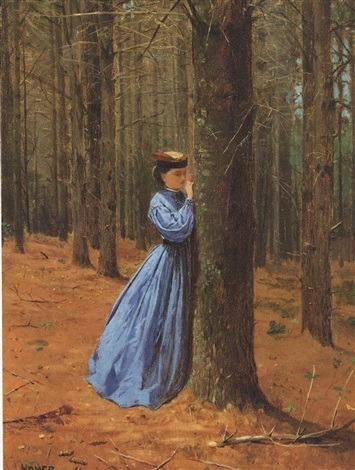
Winslow Homer
Emphasis is drawn towards the woman because of the stark difference between her blue gown and the muted colors in the background. Subordination would be the lack of attention meant for the background of the painting.
directional forces
Vincent van Gogh
I consider this piece of art to have a directional force because of the texture and flow of the sky. The night sky offers a winding path for your eyes to follow and wander on.
repetition and rhythm
Rene Magritte
Repetition and rhythm in the floating men is a noticeable aspect in this piece of art. The men are not irregularly placed, they have a rhythm but a noticeable variation to their placement. The repetition would be the cloning of the floating men all around the piece.
scale and proportion
Clemens Wirth
The size and proportion of the hand to the people is made to look as though the real person is a giant in this photo. Thanks to the miniatures of real people and the camera angle of the person's hand, the photographer is able to capture something that makes the viewer view the relationship differently.
WRITING AND LOOKING – Just as a good cook assembles the perfect ingredients for a delicious recipe, an artist assembles the right elements for a successful artwork. Choose any artwork from your textbook and make a recipe of the composition. For example, Velásquez’s artwork, Las Meninas (figure 17.21, page 295) contains implied lines, linear perspective, a distinct vanishing point, neutral colors, highlights, focal points described by geometric shapes (triangles and rectangles) and achieves balance through placement of figures and rhythm between foreground and background etc. Make sure to include the title of your choice with the figure and page number. Don’t use my example.

Sassetta, The Meeting of Saint Anthony and Saint Paul
Fig. 3.27
3.5 Time and Motion
Sassetta’s painting contains directional forces, movement in time, muted colors, and emphasis and subordination.
CONNECTING ART TO YOUR WORLD – Share a personal experience of how color has affected you (one paragraph). Make sure to use some of your new vocabulary (hue, value, intensity, saturation). If you had to pick a “color scheme” for your life, what would it be?
A color scheme for my life would be muted hues of orange, burgundy, green, grey, black, and other colors in that spectrum. I do not like the saturation and of bright and intense colors. Muted tones make me feel calm and natural, and wearing them makes me feel more confident. Having a pop of color can make me feel strange if it isn't in a muted tone, it seems to be too much for my eyes to handle at times.
ART PROJECT – ARTIST’S CHOICE - Draw a cartoon or make a painting. The form: If you choose the cartoon (comic) it must be at least 3 panels. The size is not important. The painting can be executed with any of the materials (media) outlined in your textbook (see Chapters 6 and 7) and note that painting involves the use of WET media, drawing usually refers to dry media – I want to see PAINTING if you choose to make a painting, DRAWING is NOT the same thing). The content: The subject matter should be something that you are passionate about – something that has a deep personal meaning for you. The comic or the painting should be able to tell some type of story that relates your feelings about your chosen subject matter. Post pics of the finished product (in-process photos are also interesting!).
I created this painting with the idea in mind of who I have become vs. who I was. My style and colors I associate myself with have changed so much in the past few years and I have never been happier with the person I am becoming.
PHOTO/DESIGN - Using magazines or the internet, each person needs to find two solid examples of photojournalism. Paste your examples in your Tumblr sketchbook and clearly label them – Photojournalism. Also in your sketchbook, please answer the following questions about your favorite of the two examples: What is the event being depicted? How does the photograph visually represent the story to the reader/viewer? (4 sentences total)
Franz Krieger
Group 5
This photo depicts two soldiers on the Eastern Front. These images are used to show people WWII from a german photographers perspective. This image shows an inside look at soldiers to the public. The event being depicted shows how soldiers would present themselves, and their serious but almost afraid facial expressions.
This image shows prisoners in WWII, it shows their neglected appearance and the effects of WWII on these people. Franz helped to release photos of the effects and reality of WWII. Without these images, we would have fewer sources of the depth to WWII.
0 notes
Last Seen Blogs
mrrrchn
ugh

telphie-blog
Любите шиншилл

ashxheartxant
I'm living a life inside a broken life

lcmoores-blog
Untitled

jhonnyjackson
viver sem limites