#incontext2
Text
Evaluation
Throughout this unit, I feel like I focussed a lot of my ideas around illustration as I really wanted to improve on using illustrator. I used my skills with a pencil and translated that onto illustrator, although I would like to improve over time by finding a more unique art style to my illustrations to fit a purpose. Alongside this, I found myself spending a lot of time practising After Effects and enjoyed getting a better understanding of the programme and all its capabilities. Subsequently, I discovered that there were things I wanted to achieve on After Effects that weren’t possible like 4D rendering and animating a 3D object, so I’d like to dive more into that in the future.
Unfortunately, I had quite a rough term due to family emergencies which negatively impacted my mental health, leading to my absence being higher than usual. This meant that I missed a lot of crucial parts of the unit in terms of development, I feel as if my ideas would’ve progressed a lot more if I had made tutorials. Nevertheless, all I can take from this term is that I need to look after myself more and make sure I’m prioritising my time management to ensure I am getting the most out of my studies. I felt that I fell behind too much this term and am determined to be more mindful in the new year.
In regards to my design process I feel I should’ve researched a lot more to influence my final design choices, especially as part of the 15 minute city project which felt slightly rushed. My design didn’t develop enough for where I would’ve liked it to have been. I also feel I need to focus more on layout and type, that seems to be my weak spot in VisCom as I come from such a Fine Art background, but I’d say it’s coming along gradually. From this unit I have learnt that support is always there if I need it and I must learn to seek it if necessary as it’ll benefit me and my studies.
Upon reflection, I would’ve liked to have spent more time on my process book as I feel it’s very bland and plain, I didn’t consider the amount of work there actually was from this term. I should’ve begun it earlier in the term. Alongside this, I wish my group and I experimented more with the interpretation project as I feel it didn’t reach a good standard as a final piece. Despite this, I really enjoyed working with that group and made a couple of good friends who have supported me through this term keeping me up to date.
0 notes
Photo
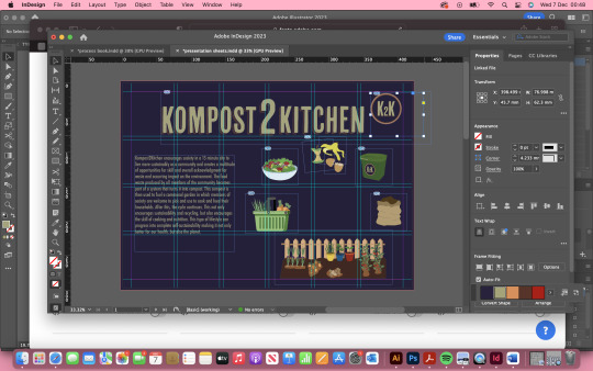
These are my final presentation sheets ready to print on A3. Overall I am happy with the final result of these and would say that there is a good flow amongst them with a clear brand identity. I highlighted most importantly the key values of the concept and tried to display it clearly throughout the presentation. The language I use in the body copy speaks a lot about the importance of sustainability and community and how the two can co-exist in a beneficial way. Cooking and food is one of the biggest tools for bringing people together and so I try to highlight this by adding social media presence. I like the subtleness of the colour palette and how the colours all came together in the end.
0 notes
Photo
This was my first general idea for the layout but I decided it was too crowded and confusing so I knew I needed to spread the illustrations throughout the pages rather than cramming them all together on the first page. I also knew that I needed to give the communal garden more on its own page to highlight the main component of the overall concept. I knew that the title was also too big and needed to shrink that down by a lot. Also needed to remind myself to not feel obligated to fill empty space and to not be afraid of having a small amount of information on one page. Less is more.
0 notes
Text
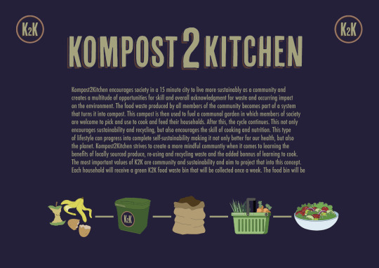
Kompost2Kitchen encourages society in a 15 minute city to live more sustainably as a community and creates a multitude of opportunities for skill and overall acknowledgment for waste and occurring impact on the environment. The food waste produced by all members of the community becomes part of a system that turns it into compost. This compost is then used to fuel a communal garden in which members of society are welcome to pick and use to cook and feed their households. After this, the cycle continues. This not only encourages sustainability and recycling, but also encourages the skill of cooking and nutrition. This type of lifestyle can progress into complete self-sustainability making it not only better for our health, but also the planet.
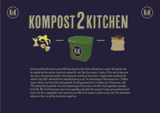
Each household will receive a green K2K food waste bin that will be collected once a week. The food bin will be emptied and the contents turned into compost for soil. Once the compost is ready, it’ll be used to help grow the crops in the communal garden. Encouraging the recycling of food waste is integral when considering the statistics from 2021 referenced from materialsrecovery.co.uk. The total amount of food wasted was 1.3 billion tonnes, which is one third of the food produced. The UK generated over 9.5 million tons of food waste, with 70% coming from households. The most frequent type of food waste in the UK is fresh vegetables and salad. In the UK, 28% of all food waste comes from vegetables and salad. The amount of carbon generated by wasted food in the UK is comparable to that released by one fifth of the country’s vehicles on the road. This information enhances a focus on putting food waste to good use.
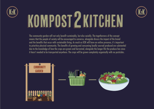
The community garden will not only benefit sustainably, but also socially. The togetherness of the concept means that the people of society will be encouraged to converse, alongside discuss the impact of the brand and the benefits that occur with sustainable living. As much as K2K will have an online presence, it’s important to prioritise physical community. The benefits of growing and consuming locally sourced produced are substantial due to the knowledge of how the crops are grown and harvested, alongside the longer life the produce has because it hasn’t needed to be transported anywhere. The crops will be grown completely organically with no pesticides.
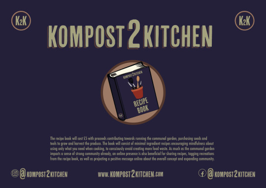
The recipe book will cost £5 with proceeds contributing towards running the communal garden, purchasing seeds and tools to grow and harvest the produce. The book will consist of minimal ingredient recipes encouraging mindfulness about using only what you need when cooking, to consciously avoid creating more food waste. As much as the communal garden impacts a sense of strong community already, an online presence is also beneficial for sharing recipes, tagging recreations from the recipe book, as well as projecting a positive message online about the overall concept and expanding community.
______________________________________________________________
I wrote out my content for my presentation highlighting each important factor of the concept. Each paragraph would feature on the four sheets I produced explaining in detail.
0 notes
Photo

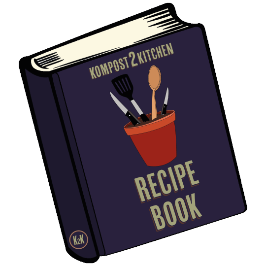
I then decided to add a recipe book to the narrative and used the graphic from earlier on as a feature on the cover. I knew I wanted to add a recipe book to help the community make the best choices for their health but also their environment when it comes to ingredient uses and serving ratio. Cooking using the exact amount for 1 or 2 servings can help the environment by stopping extra/accidental food waste. Having access to a communal garden and only picking what is needed for a household does a ginormous amount for the environment, juxtaposing supermarket chain produce packaging. At a supermarket you will given one size punnets/bags for produce when sometimes only a small amount of that ingredient is necessary for the recipe, causing a lot of food waste.
0 notes
Photo

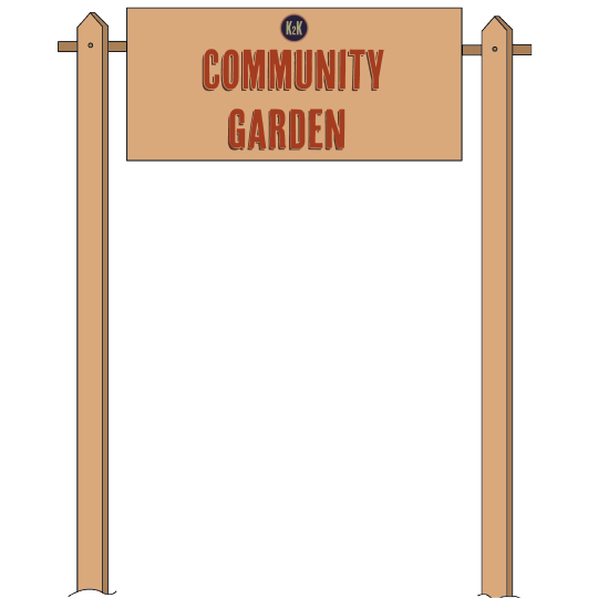
I designed the sign to match the aesthetic of the picket fence in the communal garden and added the logo. I chose the red from the coolers.co colour palette for the sign and felt like this was definitely needed to complete the small fraction of the communal garden that I’m displaying in my presentation sheets. The sign adds a sense of venue rather than just a patch of soil with some plants.
0 notes
Photo
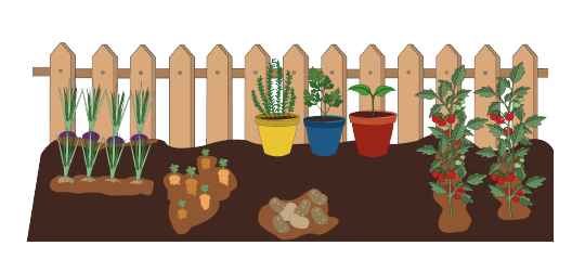
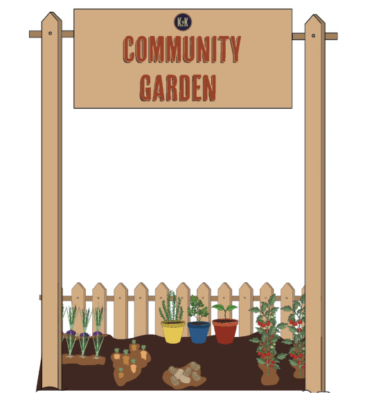
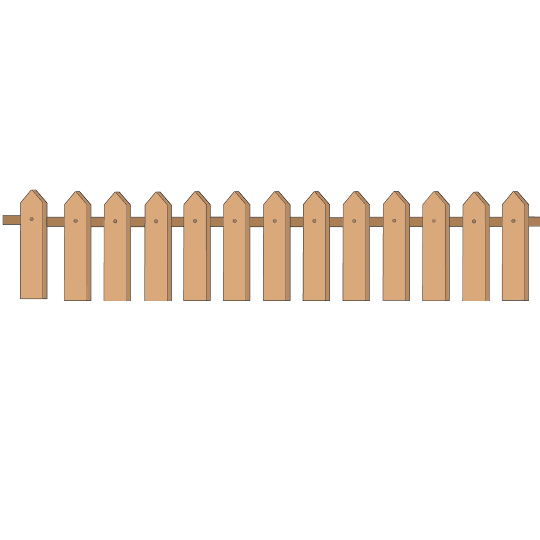
Once I had all the assets for the communal garden, I decided to organise them on a bed of soil and added the picket fence behind. I feel like a picket fence creates a warm and inviting feel due to the stereotypical use of them in American films in happy, friendly neighbourhoods. I added lighter soil around where the produce is planted. I didn't feel like it looked very convincing, it seemed quite out of place and without much context. So then I decided to design a sign that would be at the entrance to the communal garden. I wanted to leave the background plain to avoid over complicating the scene and to keep focus on the important factors in the illustration.
0 notes
Photo
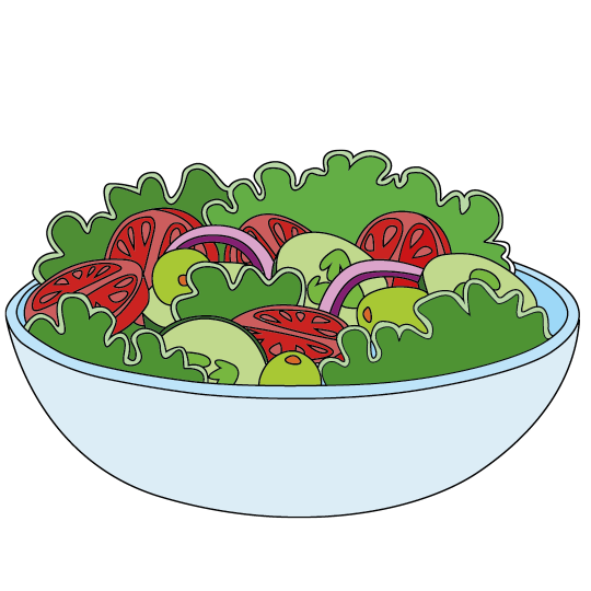
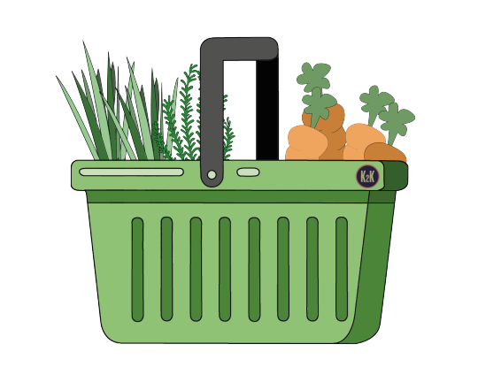
I then decided to illustrate the steps after the produce is picked from the communal garden. The produce will be picked into this basket which members of the community use to collect their vegetables and herbs, a basket will also ensure the monitoring of how much people are taking. I also illustrated a salad to represent the end of the cycle in which the process of the concept is complete.
0 notes
Photo

Illustrating the plant pots as part of the communal garden inspired me to experiment and generate this illustration which I would like to use further on in my design process. As I develop my ideas further I think this is a good representation of the brand identity in a nutshell.
0 notes
Photo
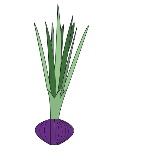
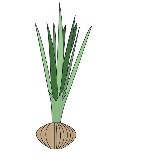
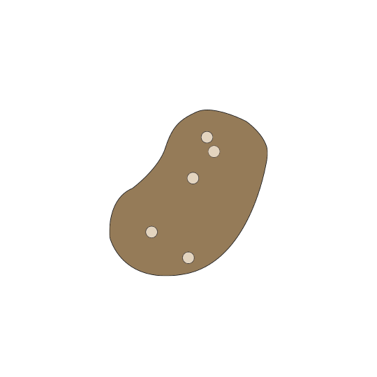
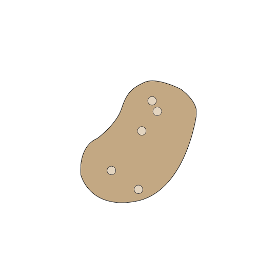
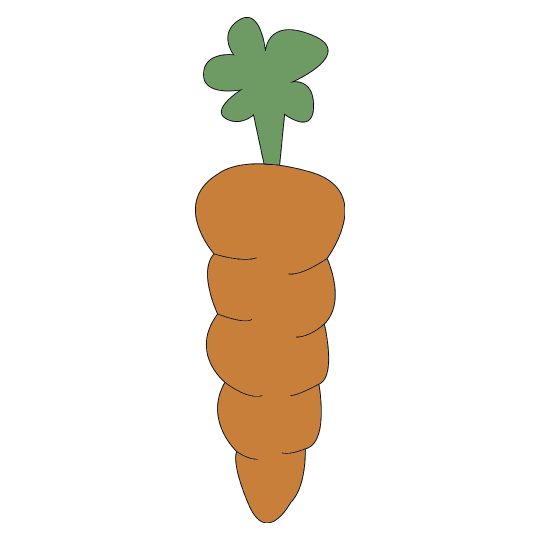
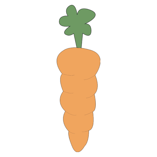
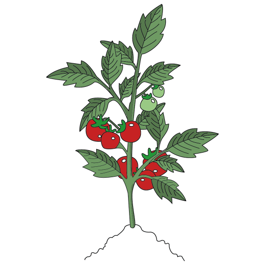
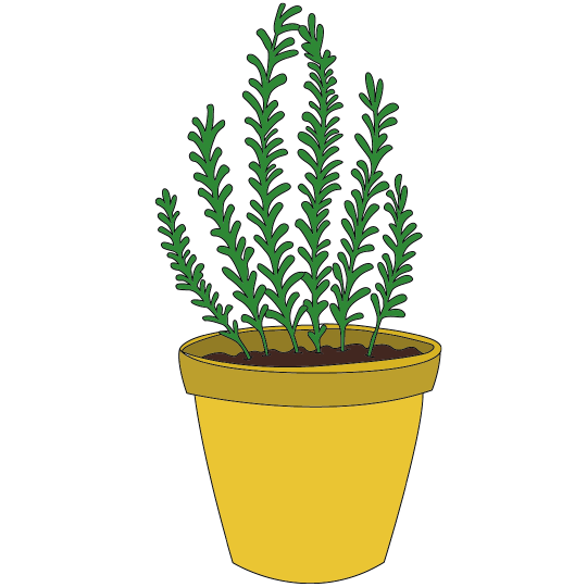
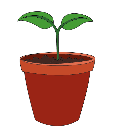
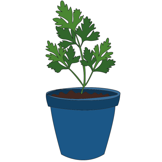
The most intricate and difficult part of this was the design of the communal garden as I wanted it to truly show the amount of crops that would grow in this garden. I took a lot of time illustrating all these separate assets on illustrator and photoshop to eventually combine them all creating a scene. I only selected a few vegetables and herbs to display as it would make sense for these to be together in close proximity. These are also the main ingredients that are used in cooking no matter the culture or cuisine. Tomatoes, carrots, parsley, basil, potatoes, rosemary, and white and red onions.
0 notes
Photo
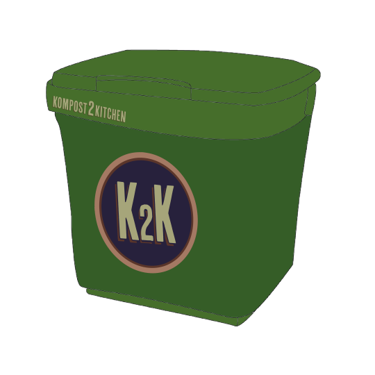
Since I knew that my concept would consist of a food waste bin, I wanted to curate one using illustrator. I used the generic food/recycle colour for the bin and added the logo on the side. I wanted to get all my illustrations and content completed before arranging my layout and the way I want the narrative to flow in the presentation sheets. I intended on designing each asset to represent the flow of the concept.
0 notes
Photo

I started off by doing some food waste illustrations as I knew that I needed to begin with showing the process of my concept. I wanted to generate basic illustrations throughout the presentation to best show the concept, it would've been difficult to use realism to show my concept so I thought illustration was the best way forward. Since I knew I’d be using a lot of illustrations as part of this project, I wanted to keep the designs simple for a two week long project. This way I can effectively portray my idea and show the narrative of the concept clearly and directly.
0 notes
Photo
After designing my logo I decided to focus on a title for the presentation sheets, I felt this was a nice visual extension of the logo and decided to use alliteration for the title. This font seemed really suitable to the rustic aesthetic I wanted to add to this concept.
0 notes
Photo
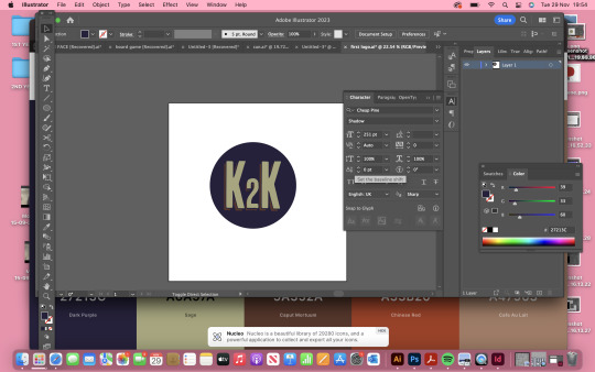

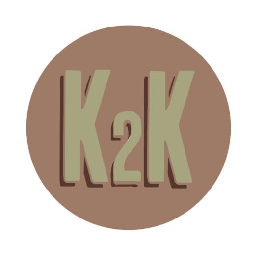


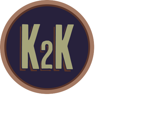
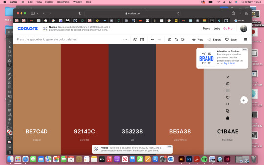
This was the process of my logo design. I found that I really liked this font for my brand as it felt more rustic and relaxed. It felt more organic to the brand and really feel like it shows that the brand isn't just about the compost idea, that it also has a broader story which is the kitchen/cooking element. I wanted to keep the logo simple and not too complicated to look at and feel it appears quirky and unique. I tried to design it with intent to be versatile within the concept so that it can be used on multiple elements of the design. I experimented with the different colour ways that I generated on coolers.co and felt that the navy blue worked the best with the beige and brown outline and appeared like quite a neutral colour to use amongst other colours in the design.
0 notes
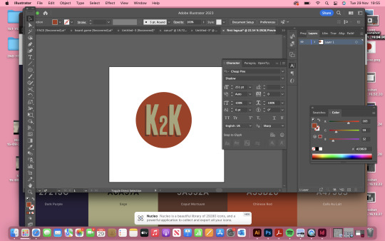
Photo
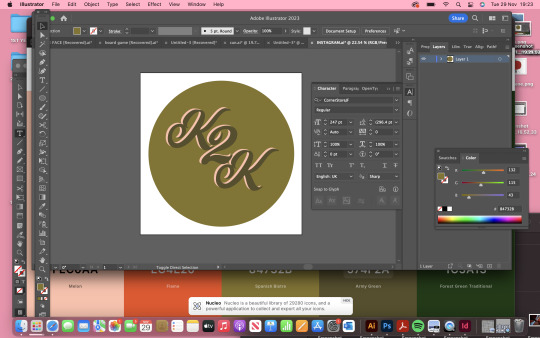
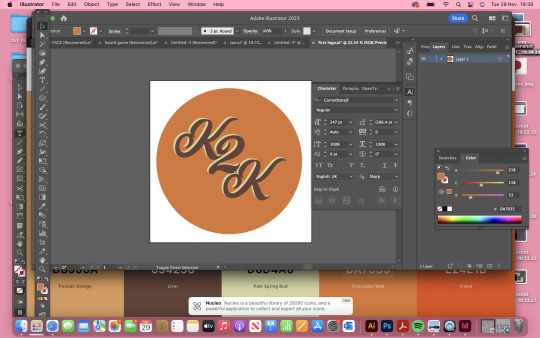
I decided that I really liked the name ‘Kompost2Kitchen’ therefore thought a suitable logo concept would be K2K. I tried CornerStoneJF as I had a more hand-written idea in my head but after experimenting with these I felt like they represented more of a bakery/cupcake brand. I wanted something that felt slightly more earthy, rough and rustic to fit the brand identity better.
0 notes
Photo
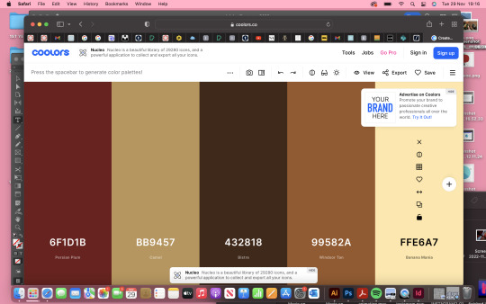
I began my 15 minute city concept by researching some colour ways I liked as I find that quite difficult during the design process so used coolers.co to generate some interesting arrangements. I wanted some earthy, nudey tones to correlate well with the compost/garden theme, yet I also wanted a colour to pop in its own right so that the pallet didn't just conform to generic earth tones and could come across stylish and interesting. I find I get a lot of inspiration from the colours themselves so hoped this would've helped me mentally generate some ideas for layout, content, themes and aesthetics.
0 notes
Last Seen Blogs

s-pig-comics-blog
Spig

ruby-roxx
Ruby Roxx

jungkookjeon0007
» Jungkook Junkie.

kuskorealestatephotographyworld
KuskoRealEstatePhotography

theodorepavlikovsky
Untitled