#i made some editor up to dunk in the ship with another editor
Text
i got sick the last three? four? days, istg gonna lose my marbles
there are a lot of tags, mainly me ranting a bit, sorry about not updating my canary story btw mind is a bit scrambled eggs currently n brain rot powers go to my comfort ytuber
#bad at tagging#wattpad : idunnousername2#discord : idunnousername2()1842#binge watching among us videos by my comfort ytuber lmfao#daithi de nogla for the win boyz#*slams head against wall*#anyways i thought of a coffee/flower shop au where himicane and speedy are involved haha totally not putting them into a boat#ah who cares tumblr is tumblr#but like#daithi de speedy cane sounds fugging awesome#imagine that 4 me really quickly#daithi de speedycane#i am going to write this coffee/flower shop fic and no one's stopping me#sure im cringe but I AM FREE#let's hope they don't have tumblr#i made some editor up to dunk in the ship with another editor#this author is aegosexual aroflux btw#k bye#actually m' probably gonna post that coffee/flower shop fic on ao3#see how that does#:3
7 notes
·
View notes
Text
What is Developer Experience (DX)?
Developer Experience¹ is a term² with a self-declaring meaning — the experience of developers — but it eludes definition in the sense that people invoke it at different times for different reasons referring to different things. For instance, our own Sarah Drasner’s current job title is “VP of Developer Experience” at Netlify, so it’s a very real thing. But a job title is just one way the term is used. Let’s dig in a bit and apply it to the different ways people think about and use the term.
People think of specific companies.
I hear DX and Stripe together a lot. That makes sense. Stripe is a payment gateway company almost exclusively for developers. They are serious about providing a good experience for their customers (developers), hence “developer experience.” Just listen to Suz Hinton talk about “friction journals”, which is the idea of sitting down to use a product (like Stripe) and noting down every single little WTF moment, confusion, and frustration so that improvements can be made:
Netlify is like Stripe in this way, as is Heroku, CodePen, and any number of companies where the entire customer base is developers. For companies like this, it’s almost like DX is what UX (User Experience) is for any other company.
People think of specific technologies.
It’s common to hear DX invoked when comparing technologies. For instance, some people will say that Vue offers a better developer experience than React. (I’m not trying to start anything, I don’t even have much of an opinion on this.) They are talking about things like APIs. Perhaps the state is more intuitive to manage in one vs. the other. Or they are talking about features. I know Vue and Svelte have animation helpers built-in while React does not. But React has hooks and people generally like those. These are aspects of the DX of these technologies.
Or they might be speaking about the feeling around the tools surrounding the core technology. I know create-react-app is widely beloved, but so is the Vue CLI. React Router is hugely popular, but Vue has a router that is blessed (and maintained) by the core team which offers a certain feeling of trust.
> vue create hello-world
> npx create-react-app my-app
I’m not using JavaScript frameworks/libraries as just any random example. I hear people talk about DX as it relates to JavaScript more than anything else — which could be due to the people in my circles, but it feels notable.
People think of the world around the technology.
Everybody thinks good docs are important. There is no such thing as a technology that is better than another but has much worse docs. The one with the better docs is better overall because it has better docs. That’s not the technology itself; that’s the world around it.
Have you ever seen a developer product with an API, and when you view the docs for the API while logged in, it uses API keys and data and settings from your own account to demonstrate? That’s extraordinary to me. That feels like DX to me.
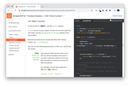
Airtable docs showing me API usage with my own data.
“Make the right thing easy,” notes Jake Dohm.
That word, easy, feels highly related to DX. Technologies that make things easy are technologies with good DX. In usage as well as in understanding. How easily (and quickly) can I understand what your technology does and what I can do with it?
What the technology does is often only half of the story. The happy path might be great, but what happens when it breaks or errors? How is the error reporting and logging? I think of Apollo and GraphQL here in my own experience. It’s such a great technology, but the error reporting feels horrendous in that it’s very difficult to track down even stuff like typos triggering errors in development.
What is the debugging story like? Are there special tools for it? The same goes for testing. These things are fundamental DX issues.
People think of technology offerings.
For instance, a technology might be “good” already. Say it has an API that developers like. Then it starts offering a CLI. That’s (generally) a DX improvement, because it opens up doors for developers who prefer working in that world and who build processes around it.
I think of things like Netlify Dev here. They already have this great platform and then say, here, you can run it all on your own machine too. That’s taking DX seriously.
One aspect of Netlify Dev that is nice: The terminal command to start my local dev environment across all my sites on Netlify, regardless of what technology powers them, is the same: netlify dev
Having a dedicated CLI is almost always a good DX step, assuming it is well done and maintained. I remember WordPress before WP-CLI, and now lots of documentation just assumes you’re using it. I wasn’t even aware Cloudinary had a CLI until the other day when I needed it and was pleasantly surprised that it was there. I remember when npm scripts started taking over the world. (What would npm be without a CLI?) We used to have a variety of different task runners, but now it’s largely assumed a project has run commands built into the package.json that you use to do anything the project needs to do.
Melanie Sumner thinks of CLIs immediately as core DX.
People think of the literal experience of coding.
There is nothing more directly DX than the experience of typing code into code editing software and running it. That’s what “coding” is and that’s what developers do. It’s no wonder that developers take that experience seriously and are constantly trying to improve it for themselves and their teams. I think of things like VS Code in how it’s essentially the DX of it that has made it so dominant in the code editing space in such a short time. VS Code does all kinds of things that developers like, does them well, does them fast, and allows for a very wide degree of customization.
TypeScript keeps growing in popularity no doubt in part due to the experience it offers within VS Code. TypeScript literally helps you code better by showing you, for example, what functions need as parameters, and making it hard to do the wrong thing.
Then there is the experience outside the editor, which in the browser itself. Years ago, I wrote Style Injection is for Winners where my point was, as a CSS developer, the experience of saving CSS code and seeing the changes instantly in the browser is a DX you definitely want to have. That concept continues to live on, growing up to JavaScript as well, where “hot reloading” is goosebump-worthy.
The difference between a poor developer environment (no IDE help, slow saves, manual refreshes, slow pipelines) and a great developer environment (fancy editor assistance, hot reloading, fast everything) is startling. A good developer environment, good DX, makes you a better and more productive programmer.
People compare it to user experience (UX).
There is a strong negative connotation to DX sometimes. It happens when people blame it for it existing at the cost of user experience.
I think of things like client-side developer-only libraries. Think of the classic library that everyone loves to dunk: Moment.js. Moment allows you to manipulate dates in JavaScript, and is often used client-side to do that. Users don’t care if you have a fancy API available to manipulate dates. That is entirely a developer convenience. So, you ship this library for yourself (good DX) at the cost of slowing down the website (bad UX). Most client-side JavaScript is in this category.
Equally as often, people connect developer experience and user experience. If developers are empowered and effective, that will “trickle down” to produce good software, the theory goes.
Worst case, we’re in a situation where UX and DX are on a teeter totter. Pile on some DX and UX suffers on the other side. Best case, we find ways to disentangle DX and UX entirely, finding value in both and taking both seriously. Although if one has to win, certainly it should be the users. Like the HTML spec says:

In case of conflict, consider users over authors over implementors over specifiers over theoretical purity.
People think about time.
How long does a technology take to adopt? Good DX considers this. Can I take advantage of it without rewriting everything? How quickly can I spin it up? How well does it play with other technologies I use? What is my time investment?
This kind of thing makes me think of some recent experience with Cloudflare Workers. It’s really cool technology that we don’t have time to get all into right here, but suffice to say it gives you control over a website at a high level that we often don’t think about. Like what if you could manipulate a network request before it even gets to your web server? You don’t have to use it, but because of the level it operates on, new doors open up without caring about or interfering with whatever technologies you are using.
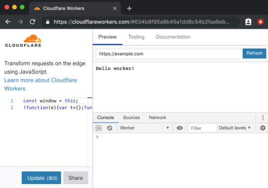
Not only does the technology itself position itself well, the DX of using it, while there are some rough edges, is at least well-considered, providing a browser-based testing environment.
A powerful tool with a high investment cost, eh, that’s cool. But a powerful tool with low investment cost is good DX.
People don’t want to think about it.
They say the best typography goes unnoticed because all you see is the what the words are telling you, not the typography itself. That can be true of developer experience. The best DX is that you never notice the tools or the technology because they just work.
Good DX is just being able to do your job rather than fight with tools. The tools could be your developer environment, it could be build tooling, it could be hosting stuff, or it could even be whatever APIs you are interfacing with. Is the API intuitive and helpful, or obtuse and tricky?
Feel free to keep going on this in the comments. What is DX to you?
Are we capitalizing Developer Experience? I’m just gonna go for it.
Looks like Michael Mahemoff has a decent claim on coining the term.
The post What is Developer Experience (DX)? appeared first on CSS-Tricks.
What is Developer Experience (DX)? published first on https://deskbysnafu.tumblr.com/
0 notes
Text
Community Re-Watch Season 1: Debate 109
Community Re-Watch: Season 1
Hello everyone! Sorry about the delay. A large part of why it's been so long is because I was getting my ducks in a row for a Master's degree program. The other reason? Doing two of these a week eats up a lot of time. Transcribing is hard, y'all! So, I'll do better, but I really can only do one of these a week. If I can do two, I'll post two.
But don't despair! Because this week is "Debate 109"! So, shipper-y goodness for all! C'mon in and play!
Debate 109
Commentary by Dan Harmon, Joel McHale, Alison Brie, and Joe Russo
Joel makes a joke about the fact that Alison is not wearing any pants to do the commentary. Alison counters that she’s wearing shorts. Joel complains he can’t see them because they’re so short. Alison jokes that she enjoys doing commentaries half-nude.
Dan reads a Twitter question, “Did you know it would be so awesome when you had them [Jeff and Annie] kiss or was it an accident?” Dan says that they kind of knew going in.
Joe adds that this is the episode that sent the show down the path to “Pascal’s Triangle Revisited.” Alison says that this episode marks a pivotal moment in Annie’s life (side note: which is kind of sad when you think about it). Joe agrees, and says that Jeff and Annie have interesting chemistry. He quotes something that he read online that states that what makes Annie “attractive” in this scenario is that she is Jeff’s opposite. Joel and Alison go “huh” at that. Dan jokes that he thought it was because of Annie’s Boobs (not the monkey). (Side note: Really, Dan? REALLY?) Joel de-escalates and says that he thought it was because of all the viral Jeff/Annie shipper videos that started cropping up after the episode.
Alison says that Gillian was the one that broke the news to her that she’d be kissing Joel. She initially thought Gillian was joking...until she read the script.
Abed’s Community College Chronicles cast is made up of people from Channel 101, except for “Pierce,” who is actually played by Chevy’s stand-in, John. John apparently has been Chevy’s stand-in for years.
During the scene where Annie, Professor Whitman, and Dean Pelton gang up on Jeff to get him to agree to the debate, Joel remarks that the sheer amount of improve going on between Jim Rash and John Michael Higgins is incredible. Alison adds that this episode was the most fun for her because of Rash and Higgins, especially since she was standing between them while standing on the debate stage as the two of them kept feeding off of each other for the entire day. Joel adds that it was really funny.
Jeff’s fakeout as he attempts to escape was Joel’s idea. Neither he nor Alison thought that it would make it into the final cut. Joel says that it was the best “juke” that he ever pulled on anyone, including the times he played basketball and football.
Both Joe and Joel tell Dan that they hope that Higgins will be back for S2 (spoiler alert: he doesn’t). Although Higgins was part of this episode, apparently getting him for the episode was not a sure thing.
Joe gives props to Chevy because he does every stunt and pratfall himself. Alison adds that Chevy will often suggest it if there isn’t one in the script. Joe points to the moment when Chevy stumbles into the drum set and adds, “That shit hurts!”
Dan says the Pierce-Britta stop smoking through hypnosis storyline is based on a true story. Rob Schrab (whom Dan calls his occasional writing partner in this commentary) had “the world’s worst hypnotherapist” (no word on why Rob was seeing one). At one point, the hypnotherapist fell over and hurt his leg, but Rob didn’t want to hurt the guy’s confidence. So, he pretended to stay hypnotized because he felt so sorry for the guy.
Joel remarks that Chevy is often stiff in the morning. He adds that it’s no wonder because Chevy’s been doing pratfalls for years. Dan adds that it’s roughly 20 years. Joe remarks that Chevy doesn’t use any padding or protective gear when he does it. Alison recalls a scene (which is in the outtakes) where Chevy falls backwards while seated in a chair and Gillian screams because she was taken by surprise (it wasn’t in the script). She adds that everyone thought Chevy really fell (as opposed to doing a pratfall…which is what it was). “We were terrified,” Alison says.
In the scene where the Study Group confront Abed, Joel remarks that there was a big debate about his shirt because the socks had to match the shirt. Dan says he was mad about the joke because Jeff was supposed to protest that he wasn’t vain and then put his foot up on the table to reveal the matching sock. That little bit was cut for time.
The debate portions of the show were shot over three days in a high school in Hollywood. Alison says that it was supposed to be a day-and-a-half, but there was a shooting at the school and the cast and crew were on lock-down in the gymnasium.
Joe talks about how Simmons represents the depths to which Jeff has fallen. Simmons is the quintessential antagonist for a guy like Jeff, because he snotty, arrogant, and intelligent.
There was some talk about bringing Simmons back for S2 (which obviously didn’t happen) and Simmons was supposed to be a love interest for Annie. Alison mentions that in this episode there was a subplot where Annie is obviously attracted to Simmons in a love-hate-he’s-so-sexy kind of way. Joe says that got toned down a lot in the final cut (i.e., as Alison notes, “it got cut”) because it got too confusing/complicated and because the chemistry between Alison and Joel in the episode worked out so well. Joel’s reaction to “the kiss” at the end of the episode was actually a set-based discovery (My reaction: Ummm, so you didn’t expect it? That’s…huh.).
Cue Alison teasing Joel, resulting in Joel mumbling about “it’s called acting” and accusing Alison of eating an onion sandwich before shooting the kissing scene. Alison denies the onion sandwich but cops to wearing lip plumper. Joel says he thought her lips wore swollen because she was suffering from some kind of outbreak.
Dan says the Jeff’s attempt at flirting with the blonde debate judge was to give the audience some insight in who Jeff used to be and what he did that made him “blow up the world.” Dan finds it interesting to watch Jeff pull out his old tricks only to see him fail, not because he’s necessarily doing something wrong, but because he’s not playing by the rules in the world he’s currently inhabiting. You can picture Jeff pulling these stunts in a courtroom and getting someone off on a DUI, but in a world of nerds, Type A personalities, teachers, judges, and coaches, Jeff has to humble himself, shut up, and actually do the work.
Joel adds, “You need to debate.”
Dan says, “No, you have to make out with Alison Brie. Otherwise, you’re not going to…”
Alison jumps in, “…win. You’re not going to win. It’s just a good lesson in life.” (Side note: It’s at this point that I suspect Alison’s enjoying poking the bear — the bear in this case being Joel — a little too much.)
Joel says that he’s been emailed by a number of church groups that show this episode to students (Side note: He’s trying not to laugh as he says this), because of the whole “is man evil” debate. Everyone’s really surprised by that. Joel decides to poke back with, “And the church is a really big fan of Alison.”
Dan says that he took his hands off the script for this episode.
Everyone gets distracted by the entrance of the gay basketball team. Joe says it was a tricky joke. Dan says that he had an “oh, c’mon man, for real” reaction when he saw it in the edit bay. He comments that if it was him, he'd have the basketball team be really awesome, like doing these amazing trick shots and dunks. Joel agrees with Dan.
Dan says he took a step back on this episode because he was overworked and he was irritating writers/production because he was nitpicking everything. Dan says that he decided at one point during production of the episode that he’d loosen his grip, In short, he says, he passively-aggressively boycotted the episode. However, the episode turned out great, which (he jokes) “was a slap in the face to me.”
Dan says when he sat in the edit bay with Joe, he was complaining that he said he wasn’t going to be that involved and then when he saw the gay basketball team he got sucked into a debate with Joe about it. Like how gay should the basketball team be, and other nitpicky stuff around the gay basketball team joke.
Dan remarks that the hallway confrontation between Simmons and Jeff and Annie was the only thing people had for a long time to draw on to make their Jeff/Annie shipping videos, aside from the limited shots of Jeff and Annie looking at each other. Joe states that the vidders did a damn fine job with what limited footage they had. Dan and Alison agree.
Joel says that he feels sorry of Yvette Nicole Brown because she has to wear so many wigs on the show. All of her wigs are named “Shirley.”
Alison starts laughing when she sees Abed’s video where Shirley is running from a werewolf right by a kissing Jeff and Annie. Alison remarks that this episode spawned the running joke in the cast of “I’ma gonna die by werewolf.” She also says that she loves the cheap Annie wig on Annie’s fictional counterpart.
Joe says the study room scene between Jeff and Annie came out of a conversation (he doesn’t remember who with). Joel jokes that he’s pretty sure that everyone conspired to take as long as they could shooting this scene. Dan says that they should’ve seen the editor’s cut of the scene. Alison says she remembers a lot of very specific conversations about her boobs.
Joe says the study room scene was actually re-written on the set. The scene as originally written moved too fast, so the re-write slowed it down. He adds that a lot of the chemistry between Joel and Alison was basically being discovered during the course of the episode, which was another driver behind the rewrite.
Dan admits that he does love the episode.
During the part where Annie leans over Jeff, Joel says, “The crew had never been more quiet and concentrated.” Alison said they kept doing it over and over again. Joel adds that no one was trying to hurry up the process and telling them they had to get moving on to the next set-up.
Dan says there was one cut where there was practically a close-up of Alison’s cleavage and Joel basically looking practically down her shirt doing a double-take.
Alison says that for all the joking they’re doing, there was actually a lot of conversation and how she needed to stand and her placement at Joel’s shoulder and how close she needed to be standing.
Meanwhile, back in the Britta-Pierce storyline…
The second hypnotherapy scene was actually stolen from the previous scene. They changed the color of the shirt Gillian was wearing in editing to make it look like the whole thing was happening on a different day.
Everyone is impressed with Chevy’s “slow” pratfall in this scene. Joe says that at first Chevy wasn’t sure how to do it, so he told Joe where to put the drum and the instruments and said that he’d figure it out as they went.
Back at the debate…
With regards to potentially bringing Simmons back (which didn’t happen), Dan says that it’s important to write up to the characters, don’t let there be real villains. They can be villains to each other, depending on their circumstances, but if they bring back Simmons they have to break the rule that he’s a villain. He’s not just an asshole. There’s a reason why he’s an asshole, so the audience understands what it’s like to be that guy.
Joe asks if Troy tearing up at Simmon’s speech was the point where they latched on to “When Donald is crying it’s hilarious.” Dan doesn’t really answer, but he says that NBC gave him notes that they needed to guard Troy’s football masculinity, which evoked a “give me a break” response from him. Joel jokes that there must be some adept network executive saying, “Tell Dan to do this and he will do the opposite.”
Alison says the debate montage was shot weeks later. They were standing in a crazy rig that involved ladder, a chair, and a platform. Joe says that’s because the high school location in Hollywood where they shot the scenes was crazy expensive so they couldn’t shoot it where they had the wide shots of the debate. So the debate snippets were shot in very tight close-ups against a backdrop on the Paramount sound stage. Joel asks why they had to shoot in the rig they had, and Joe says it was because they needed a very specific perspective on the character’s faces to make it work.
The point where Jeff trails off with “like great seeeeeee….” was an on-set joke by Joel. Joe remarks that it was part of the great chemistry they were uncovering in the episode and they just wanted to keep playing with it.
Joe says the whole closing bit starting with Simmons revving his wheelchair and ending with Jeff and Annie kissing was tricky, largely because they didn’t know if it would come across as hilarious or ridiculous.
Joe continues and says that what made filming S1 so much fun is that everyone was experimenting and adventurous about trying different things and seeing how far they could push the edges.
Joel and Alison start cracking up about Simmons flying out of his chair.
Dan says the bit where Simmons risks himself makes him not a villain because he’s so dedicated to winning.
Joe says the use of “Home” by Edward Sharpe and the Magnetic Zeroes was “genius.” Alison says that she hears the song everywhere now and she credits the episode for that. Joe credits editor Peter Ellis for pulling the song out for the closing scenes.
Alison points out Jeff’s “look” after the kiss and says “good acting!”
The wrap-ups at the end of the episode were another on-set re-write. Dan says the dovetailing of all the storylines in the episode was brilliant. Joe says the various cross conversations between the non-Jeff-and-Annie members of the study group was supposed to take place in the stands, but they had been kicked out of the gymnasium and had to shoot in the hallways. Also, Joel had to leave the set so he could work on The Soup (which Joel completely forgot).
The closing scene between Jeff and Annie was actually shot later and was a last-minute add-on to the episode.
Alison likes the head pat.
Joe says that even the Jeff-Annie closing scene they were discovering the chemistry between Jeff and Annie and what worked about it. Joe says they all felt they needed a button on the episode to touch on their chemistry one more time, which is why the head pat added at the last minute.
15 notes
·
View notes
Text
Agua Bendita, AZ
Prior to the 2016 Election, Chris and I wrote a short speculative fiction for a competition. We were to imagine a reality in which Donald Trump wins the election, and well... he won. So now I’m posting it to see the accuracy of our prediction. I hope that it’s not entirely accurate, but only time (and your voices) will tell.
Agua Bendita, AZ
by Chris L Smith & Exal Iraheta
I find myself in an unintentional town built from scraps, and broken backs. Three years ago this was only tumbleweeds and rocks, but thanks to Combover, people found themselves forced to make shelter near this bust of a wall. Long story short, the wall started strong, support from both sides, but then people got pissed. The cost started to fuck everyone over, and after one year, construction stopped; and these people were left stranded in the shadow of the relics of a failed wall. Things really went to hell.
The motel where I’m staying is a little thing, closer to the border than I would like to be.
“This is it,” a middle-aged, woman with graying hair, says to me as she opens the door to the room. A twin bed sits in the middle, facing a three drawer dresser made of particleboard and duct tape. The walls are a bright orange.
“What brings you all the way out here?” she asks.
“I’m writing an article.”
She looks me up and down, “Big city?”
“Yeah. The biggest.”
“Humph,” she says.
“How long have you been here?” I ask her, ready to find the first leg of my story.
She gives me a smirk, hands me the keys and closes the door after her.
“Thanks,” I say, hoping not everyone in this town is as skittish around outsiders.
The small window on the other side of the room adorns a mustard yellow curtain, I can’t tell if the yellow is intentional or a result of years of filtering second hand smoke. As I push it aside I can see a fence enclosing what looks like a skeleton. The skin of the beast has been stripped away like a sunken ship, left to be consumed by the very dirt it was meant to divide.
After a couple of aspirins chased by a shot of tequila, I make my way into town to take a look around. There is a cluster of houses stacked on top of each other like coffins, a small convenience store at the corner, a dive diner, a liquor store; the necessities I suppose. Two kids kick around a brick like a soccer ball, wearing presumably, their father's steal toed boots. Behind them sits a blue-eyed, bald, old man - his shoulders broader than I could ever wish for.
“If you’re looking for a construction job, you’re a few months too late,” the old man says. “Not that you’d be any good in those.”
I look down at my black loafers, fully covered in dirt. I don’t know why, but this makes me feel a bit embarrassed.
“No sir, mister....” I walk up to him and extend my hand. He takes it, a firm grip, gives it a tug and lets go. “I’m here to interview some of the locals, get a sense of—”
“Another goddamn story huh?” The man spits into a Coke can. “Well, if you’re looking to talk to someone, you should pay a visit to Maria Soledad. She loves getting her name in print.”
I clumsily reach for my phone to write down her name, but keep fucking up my damn code. “Is she the forewoman?”
“Nah. She’s a butch dike who probably wanted to be a goddamn movie star.” He points off to the east. “You’ll find her up there.”
I finally jot down her name. “Well what about you? Why did you come down?”
He spits again, some of the tobacco spit mixture catches the rim of the can.
“The same reason 300 other motherfuckers moved down here. A goddamn contract.”
I turn to leave. “I didn’t catch your name.”
“I ain’t give it to you.” He says with a satisfied smile.
The next day, I make my way down the fork at the end of the dirt road. I only have three days, three fucking days to come up with something. I figure, fine, I’ll talk to some folks, make a piece about desperate eccentric people. They have to be batshit crazy to stay in this town. Right?
A woman, probably around my age, beautiful tan skin, with obviously bleached blonde hair, waters a pathetic garden. She dunks a cracked plastic bucket into a 55 gallon water drum. Her small frame could easily be swallowed whole by the damn thing.
“Excuse me?” I say forcefully, making my voice friendlier, a little skill I acquired from my telemarketer days before being replaced by laptops.
“Oh my lord!” She says, keeping a steady foot on the ground. “You scared the bejesus out of me!”
Her voice is oddly comforting, maybe it’s the subtle hint of midwestern in her, but she reminds me of a relative, maybe my grandma.
“Not many people say ‘Excuse me?’ around here?” I say.
“Not unless they’re wrestling you over a glass of whisky,” she says, with a laugh.
I look behind her, to a small house with a stucco exterior which blends into the dirt and rocks that surround them.
“Lovely place,” I give a nod.
“Oh that? Ain’t it? Isn’t mine though, but thank you.”
“Oh.”
“I live over there, next to that tent park.”
Her sooty finger points towards a cream colored camper, probably ten years old.
“A camper huh? I’ve never been in one of those.”
She pauses and with a raised brow, “Aren’t you a little too young to be hitting on me?”
I can feel my face blush, but I’m sure my brown skin doesn’t show it. “Oh no, sorry. No, I was just trying to think of a compliment, but realized I didn’t have one about campers, because I’ve never been in one.”
She wipes her forehead and takes a deep breath. The dirt on her face leaves a dark mud streak.
A group of children run by, including the two boys from yesterday. They chase each other, tossing stones and rocks found by the wayside.
“Hey, if you little bastards don’t quit that I’m gonna sick Lenny and Carl on you!” she yells.
The kids freeze.
“That’s right, now get a move on.”
The eldest boy, probably around 12, gives her the finger as they run off. “Oh you little punk. Fuck you!” She gives it right back to him.
“Damn kids. I swear, parents get a whiff of money and suddenly you got desperate people, who don’t know what the hell a condom is, moving their illiterate asses down here.”
I take out my phone, and jot a few notes down. This gives her pause.
“Another reporter? Damn it. We’ve spoken to everyone about everything already,” she turns to leave.
“Wait, no, I mean, yes, I’m a reporter. I mean, my name is Travis,” I raise my hand in a weak wave. It makes me feel like a first grader. Now I remember, not grandma, teacher. “Look, I only have a couple of more days left here, and honestly I just need a few interviews, doing a sort of catch up piece, see where things are now, three years after Pumpkin-head in charge started this fiasco.”
“Where you from? Fox News, CNN... The Daily Show?”
“No, I can’t stand cameras.”
“Oh not the Huffington—”
“Look, this is just a small post, not even a blog worthy length. My editor thought it would be a great fucking idea, and well—”
“What the heck did you do? It must have been really terrible to be sent out here on assignment. In the three years since we scraped together this little town, they have not once sent out a reporter of quality. Not once. Each and every one of them did something stupid to get sent down here. Can you believe that? Your kind uses our town as punishment.”
I stand speechless. I could tell her about how I got super high at our office Christmas party. I could tell her how I got so drunk the night before the last presidential debates, I got kicked out and arrested for disorderly conduct. I could tell her, but what’s the fucking point?
“My name is Maria, I’m the one with a green thumb ‘round here.” I look over to her sparse garden. “You try growing tomatoes in the g-damn desert,” she says, before motioning me to follow her.
She swings open the small door, followed by a gust of hot air.
“The space is small, but I make do,” Maria says, tossing some of her torn jeans aside from the entrance. “Excuse my mess, I wasn’t expecting company.”
I get an odd feeling in my head, as if my brain is working extra hard to take note of everything inside. The way she drapes her small window with a red scarf, giving the room a magenta hue. Her stacks of books, teetering on the edge of a two person kitchen table, only inches away from the sink that could probably hold three dishes.
“Do you mind if I record our conversation?” I say, trying my best to hide my judgement, but I’m sure it’s of no use.
“I don’t mind,” she says.
“So, before, you mentioned Lenny and Carl, are those other residents?”
She gives a boisterous laugh that catches me off guard. For a moment there, I question her sanity.
“Oh, no no,” she says, shaking her head. “Those are Simpsons characters, but I may have told those little turds they were escaped prisoners from the construction groups they brought down here from Buckeye, talk about story, that’s what you all should be writing about.”
“Prisoners? Working on the wall?”
“Yes!” She reaches into her single serve fridge and hands me beer. “Imagine, 300 of us, leaving lives behind to come down to this pile of shit to get some work, and what do we find? A chain gang, already here. I only saw two months of pay the entire year we built.”
The beer sizzles, some of the foam falls on my hand. I unthinkingly suck it up. “How long did that last?”
“Up until we started to fight back. I don’t care if the Mexicans or the 99 percent were paying for this damn wall, I just wanted to be able to pay for my kid’s lunches. They owe me about thirty-eight thousand, am I ever going to see that? Probably not.”
I look over to a small counter protruding off the sink. There are piles of documents, receipts, trash, but in the midst of all that, perfectly centered, is a single frame of two little girls.
“Those your daughters?” I ask her.
She nods, “Cindy and Vicky.”
“Wait, I thought - the old man said you were a lesbian.”
“It is 2019 Mr. Travis, ‘LESBIANS’ can have children you know.”
“Sorry, that came out wrong. I meant to ask about your spouse. Where is she?”
Maria goes silent for a moment. She takes a long swing of her beer.
“Well, up until two years ago, she was my wife, but laws change I suppose. Afterwards it was just fights, disagreements, and bitterness. You know how these things go don’t you? What are you like 32, 33?”
“36,” I say, sipping on my beer, fighting the temptation to chug the whole thing, and have a second.
“36? Were you married? Wife? Assuming you’re straight.”
I can feel my body for some reason swaying. “I am.” I say with an odd quiver. “Was married for a year. Divorced now. She was from Texas, not that that matters.”
“Well, what happened?”
“I guess the same reasons I find myself researching a fluff story here,” I say, wondering where that honesty came from. She must have slipped something in my beer.
“Well, Mr. Travis, at least you had a choice in the matter. Carey and I, well, the fucking country decided we were over.”
Maria drinks the rest of her can, and effortlessly crushes it with her hands. “But what’s the use in dwelling on that. The way I see it, I’m stuck here. I could move somewhere I suppose, but every time I get the nerve too we get told that work is about to start up again. I dunno. I guess I don’t have anywhere to go back to.”
“How do you afford living here if they—”
“I knew our conversation would eventually get here. I’ll tell you what, Mr. Travis, the wall may not be very profitable but women have always found a way to make it at the expense of lonesome men.”
I want to ask the obvious question, but something holds me back. I drink to fill the silence.
“I’ve got a few more question for you, Mr. Travis,” she says, “How long has it been since you’ve felt the warmth of a woman?” Maria reaches over and takes the can out of my hand.
I begin to panic and stand. “I think this will be enough.”
“Wait, don’t get the wrong idea. I don’t enjoy fucking men.” Maria takes another swig. “This town isn’t the innocent, pathetic little place the country thinks it is.” She looks at her phone stowed away in a cupholder. “About that time, why don’t you go and take a look. Really look. You’ll see what I mean.”
I leave the little camper behind, and make my way back to my rental car. As I sit with my key in the ignition, I soak in Maria’s words. I look around. The boys from before continue their chase a little way down the path. Out of a little box house, a girl, probably only 15, walks out with her bike, I don’t know why but something tells me to follow her. She doesn’t ride far, maybe about 15 minutes down to the construction site. The road turns to concrete, some of the few pieces of concrete I’ve seen all day, it leads into what looks like a motel. I figure it’s housing built for the workers. The girl drops her bike out front, walks to the farthest door on the right, and knocks. A man in his 50s, jet black hair, opens the door. He waits for her with a big smile. His heavy hand grazes her little face. She walks in and the door shuts behind her.
Is this it?
I turn my car around, my heart racing. A part of myself that I have ignored for years suddenly erupts. This pit in my stomach filled with anger, disgust, the shit of the world, overflowing as I rush to a halt at Maria’s camper.
She stands at the door waiting for me, smoking a cigarette. “This ain’t the first place like this, Mr. Travis. Three years, shit reporters.” Maria sits down on the small steps that lead into her camper. “So, what would you like to talk about?”
1 note
·
View note
Text
Former NBA Center Jim McIlvaine’s 1969 Mercurty Cyclone GT is a Slam Dunk Street Machine
It’s hard to miss Jim McIlvaine and his Grabber Blue 1969 Mercury Cyclone GT. At 7 foot 1 inch, the 46-year-old former NBA Center towers over most, and his Merc, dubbed “Confucius,” makes an equally powerful appearance. McIlvane played pro ball from 1994-2001, in fact his first field goal was a dunk against Shaq. Following his career, McIlvaine moved into the automotive field, signing on as a part-time freelance writer, penning stories for a host of automotive titles and then as a social media specialist for Optima Batteries.
“When I was in the NBA, I had a lot of down time on the road, and that gave me the chance to think about what car I’d like to own. I wanted to get a modern performance car, one I could modify and take to the next level. I couldn’t fit in a Corvette, so I looked Mustangs including the Roush’s Stage 3, but ultimately I ordered a 1999 Z/28 with a six-speed. It was a convertible because I couldn’t fit in the T-top or hardtop. It was bright green metallic and got dropped shipped to Buds Chevrolet in St. Mary, Ohio.
“It was the first LS-1 F-body that Lingenfelter built with 383 stroker. It got Kenny Brown subframe connectors, produced 440 hp at the crank, and had Fiske FM5 17-inch wheels. I signed up on Camaroz28.com in April 1999 and became friends with Chris Frezza and Jason Debler who started the forum. Not long after that, John Hunkins (then editor of the now-defunct GM High Tech Performance and now editor of Car Craft) showed up on-line. He was provocative and controversial and happened to be based in New Jersey. At the time I was playing for the Nets in New Jersey, so they asked if I would connect with Hunkins, and we hit it off. He started reading my posts and asked if I wanted to write for the magazine.
“After basketball, I ended up getting at 2002 Anniversary Camaro that was built by Lou Gigliotti. LG Motorsports did a roll bar, Kirky seats, G-stop rotors, Earl’s lines, black SS five spoke wheels, transmission cooler, and carbon driveshaft. It had an auto transmission and that’s the car I was running at Road America in the early 2000s.
“Optima moved to Milwaukee and Cam Douglass, Director of Product Development and Marketing, was at Road America running a Corvette. He needed help getting the car home, so I offered to haul it back. He worked a deal for me to haul SEMA show vehicles, and later on, I came on to help with social media. We really clicked, and it morphed into a full-time job,” said McIlvaine, who has been with Optima for ten years.
While the F-Body was fun, McIlvaine had his heart set on a full-blown Pro Touring machine. “Pro Touring was really picking up steam, and I wanted to build something, but not another Camaro. I gave a lot of thought to what the perfect car would be. I always liked old Mopars, especially the General Lee, but the prices were so high. It was too much money just to get the car. So I started thinking, what’s the opposite of a General Lee?
“And that would be General Grant and a Mercury Cyclone,” said McIlvaine. “These cars all raced in NASCAR, so I decided on a 1969 Mercury because that’s what ran against the Chargers. In the early 2000’s I started looking for a Cyclone and about 10 years later Jeff Schwartz of Schwartz Performance found a 390, auto-equipped Cyclone. I just didn’t want a Cobra Jet or a number-matching car. I knew I was going to modify it so this car was perfect.
“As for the build, I knew it was going to be set up for the Optima Ultimate Street Car Invitational that started in 2008. I wanted to run the car hard on the street and track and to qualify for the OUSCI. Even though I work there, I wanted to really qualify like any other participant.”
After securing the car, McIlvaine turned to Randy Johnson of D&Z Customs of Kewaskum, Wisconsin. “He’s built a succession of cars that were nicely done and built to run,” said McIlvaine. “So if you’re going to spend serious money to have a car built, you want it to do anything and everything. That’s what I wanted.”
Johnson accomplished the goal, giving the Mercury legit Pro Touring performance, a stylish NASCAR look, and a surprise under the hood: one that sends Ford purists into a tizzy. While he stuck with Ford Grabber Blue, the engine is not exactly Blue Oval, can you see why?
“The engine is easy to explain,” said McIlvaine, “I looked at the Ford engines and honestly, if you’re looking at the Ford Coyote you need forced induction or nitrous to keep up with what you can do with a naturally aspirated LS engine. There was really nothing comparable that wasn’t really expensive, either, so we went with a Lingenfelter Performance aluminum 427 LS.
“It was [Randy’s] idea to disguise the LS to look like Ford engine, and it’s fooled a lot of people. To create the look, D&Z Customs fabricated his own valve covers and added a distributor up front. Under the dual-snorkel air cleaner lurks a Holley 1,000 cfm throttle body and GM aluminum single-plane intake that’s mated to the LS7. A Holley LS Terminator EFI controls the 50 lb/hr injectors and ignition is fired by an Accel coil and Taylor wires. Ultimate Headers custom-fabricated a set of 1 7/8-inch tubes that flow to a 3-inch Magnaflow system. Other components include a Wagner accessory drive, Power Master alternator, All Star Performance oil cooler and of course there’s an Optima Yellow Top in there.
The engine produces 558 horsepower and 497 lb-ft of torque at the wheels. It sounds fantastic at idle and when the throttle is kicked open, look out. Love it or hate it, the engine is interesting and a unique design feature of the build. “In the [Optima] series there’s a Lingenfelter design and engineering competition. Points are awarded based on build quality, fit, and execution. At the end of the year, all the cars that do well get put on display at SEMA. It’s progressed to when you walk through Optima Alley you see some of the nicest cars at the show and they run as good as they look. The whole series was done to promote the aftermarket.”
Backing the LS is a Centerforce 10.5-inch DYAD twin-disc clutch that sends power to the Tremec T-56 Magnum gearbox. McIlvaine chose a 4-inch aluminum driveshaft from Dynotech that connects to the Ford 9-inch from Detroit Speed.
Randy wanted a name for the car, so we went with “Confucius” because the look of the engine fooled a lot of people. He liked the look of the Torino more than a Cyclone, even though the wheel wells are Cyclone. Randy, again, went with the Mustang taillights. “When you hire someone like Randy, you hire them and then you have to turn them loose. The Grabber Blue is the opposite color on the color wheel from the General Lee. I wanted a Ford color and something that popped. The original goal was to put a roll bar in, but fitment was an issue. We had to extend the steering wheel, drop the floor two inches, and allow the seat to go back almost to touching the rear seat,” McIlvaine stated.
Supreme handling was a major goal so they removed the front factory rails and grafted in a Detroit Speed 1965-70 Mustang front suspension. The front also uses 600-lb springs, JRI double-adjustable shocks and a Detroit Speed rack and pinion. Out back is a Detroit Speed Quadra Link designed for a Mustang, but modified to fit the big Merc. It uses floater axles with C7 hubs, 175-lb springs, and JRI double-adjustable shocks.
Confucius has lots of go, so naturally it needed major “woah.” Wilwood got the call with Spec 37 14-inch rotors and six-piston Aero Lite calipers up front and the same out back with four-piston calipers. Rolling stock consists of Forgeline 18×12-inch wheels with 335/30/18-inch BFGoodrich Rival S tires at each corner.
Along with an amazing list of parts, this Cyclone GT has a bevy of body mods that give it a look of it’s own. “We started in the front with modified front fenders and hood (with heat extractors) and we fit a ’69 Torino grille in there. We installed mini tubs and pulled out the wheel wells for tire clearance. To clean up the lines, we removed the drip rails. There are custom bumpers, the quarter-extensions are hand-made, and we used 1970 Mustang taillights. You’ll note the gas filler door is removed, and there’s extensive work to ensure the door gaps are perfect.”
The interior includes Auto Meter gauges, an NRG suede steering wheel and Cobra seats with custom stitching. As we stated earlier, the original plan called for a roll bar, but it wasn’t feasible considering the location of the driver’s seat, which accommodates McIlvaines, seven-foot plus frame.
“It drove a lot easier then I thought it would, says McIlvanie. “It has 335 series tires all the way around, but Randy did such a good job making it fast and drivable. This car just turns easy It takes getting use to a lopy cam, and it makes me feel good when I drive it. Even from the first time we took it out, it was competitive. So, for 2019, I want to get to some autocrosses and [track events] at Road America, NCM Motorsports Park, and NOLA, which are all Optima Search for the Ultimate Street Car Series events.”
Like any project, it takes great people and dedication to see it through. Jim would like to offer special thanks to his wife Gwendolyn McIlvaine and friends, Tobie Johnson, Cam Douglass, Ken Lingenfelter, Jeff Schwartz, Johnny Hunkins, and Pedro Gonzalez.
The post Former NBA Center Jim McIlvaine’s 1969 Mercurty Cyclone GT is a Slam Dunk Street Machine appeared first on Hot Rod Network.
from Hot Rod Network https://www.hotrod.com/articles/former-nba-center-jim-mcilvaines-1969-mercurty-cyclone-gt-slam-dunk-street-machine/
via IFTTT
0 notes
Text
The weirdest things we learned this week: Sheep on meth, hopping space robots, and the economy of “Frozen”
New Post has been published on https://nexcraft.co/the-weirdest-things-we-learned-this-week-sheep-on-meth-hopping-space-robots-and-the-economy-of-frozen/
The weirdest things we learned this week: Sheep on meth, hopping space robots, and the economy of “Frozen”
What’s the weirdest thing you learned this week? Well, whatever it is, we promise you’ll have an even weirder answer if you listen to PopSci’s newest podcast. The Weirdest Thing I Learned This Week hits iTunes, Soundcloud, Stitcher, PocketCasts, and basically everywhere else you listen to podcasts every Wednesday morning. It’s your new favorite source for the strangest science-adjacent facts, figures, and Wikipedia spirals the editors of Popular Science can muster. If you like the stories in this post, we guarantee you’ll love the show. Check it out:
Fact: Ice was once a hot commodity
By Eleanor Cummins
In 2018, ice is everywhere. You can make it yourself by putting a tray of water into the freezer. Or you can find one of those special fridges with an in-unit ice machine and wait for the cold stuff to simply plop out into your cup. But ice used to be much, much harder to get your hands on—and in the era before A/C, it was desperately desired. That’s why, for much of the 19th century and into the 20th, ice was the cold, hard heart of an international economy called the “frozen water trade.”
How did it work? In New England and other northerly regions, ice would be cut up from frozen lakes or brought down from mountain peaks. It would be insulated (though 90 percent was still somehow lost) and transported by ship, and later, in some places, by ice, around the globe. Boom towns arose on the banks of frosty rivers, the hardy carvers besieged by frostbite and knee injuries. Ever wonder what those singing Swedes were doing in the opening sequence of Frozen? They were carving ice. In the dead of winter. (Probably to be shipped to India!)
Today, when an unchilled beverage is a rare offense and there’s so much ice to go around we can do YouTube-d dunk challenges, the frozen water industry has a twinge of ridiculousness. But for Frederic Tudor, the industry’s founder, the Ice King himself, the man who was (probably) the first to say, “Stop, collaborate, and listen, ice is back with my brand new invention,” it was the foundation a fortune.
Fact: These robots are hopping around an asteroid and sending pictures home
By Mary Beth Griggs
When I got to write about this amazing picture I was instantly charmed by its photographer: a hopping robot currently bouncing around on another world like a tiny, majestic mechanical bunny rabbit.
Rover 1B—and its twin, Rover 1B—are part of the Japanese Hayabusa-II mission. They’re currently leaping around on the surface of the crystal-shaped asteroid Ryugu taking pictures and temperature measurements. They’re autonomous, which means they decide where and when to jump. But why jump? It turns out that because the gravity on asteroids is so low, rolling wheels would just send rovers floating off into space. So instead, internal motors push the little Roomba-like bots into the area above the asteroid and send them gliding for 15 minutes, taking them about 50 feet from their last position.
This is especially exciting for Japan, which had a rover planned for its first asteroid-visiting mission, Hayabusa, back in 2005. Sadly, the rover was released from the spacecraft and tumbled off into space. (If you click on that link, the rover is circled in yellow, floating away).
The current mission to Ryugu is just getting started. A more-powerful lander was just released to the surface today and while it won’t hop around as much as the rovers, it will still be able to right itself on the asteroid surface.
Fact: Octopuses on MDMA are way better than sheep on meth
By Rachel Feltman
After editing an article about a truly delightful study about how octopuses act on ecstasy, I found myself wondering what other research on critters and recreational drugs I could dig up. I found one example that intrigued me and another that totally horrified me! We’ll start with the bad news: back in 2010, researchers (funded in part by Taser International) shocked a bunch of methamphetamine-addled sheep to show that tasers don’t pose life-threatening risks to human drug users. Some animal research is important, and some is arguably harmless (those octopuses, for example, just got very huggy and then went back to normal), but this study definitely made me squirm.
On a less disturbing note, I was excited to learn that those super-meme-able photos of spider webs made under the influence are actually exactly what the internet advertises them to be. But does a spider’s inability to weave a normal web while hopped up on caffeine mean that drinking coffee is bad for your workflow? Not exactly.
If you like The Weirdest Thing I Learned This Week, please subscribe, rate, and review us on iTunes. You can also join in the weirdness in our Facebook group and bedeck yourself in weirdo merchandise from our Threadless shop.
Written By Rachel Feltman, Mary Beth Griggs, Eleanor Cummins
0 notes
Text
Patterns and Purpose, an Excerpt from Animation at Work
A note from the editors: We’re pleased to share an excerpt from Chapter 2 of Rachel Nabors's new book, Animation at Work, available now from A Book Apart.
So we can use animations to tap into users’ visual systems and give them a cognitive speed boost, terrific! But before animating every element of our designs, we must learn when and how to use this new tool: with great power comes great responsibility, and so forth. And as animation must vie with many other concerns for development and design time, it makes sense to spend our resources where they’ll go the farthest.
This chapter sets you up with some core animation patterns and shows you how animation applies to a greater system. Then you’ll learn how to spot cognitive bottlenecks and low-hanging fruit, maximizing the impact of the animations you do invest in.
Common Animation Patterns
If you’ve looked at as many examples of animation on the web and in app interfaces as I have, certain patterns start to emerge. These patterns are helpful for identifying and succinctly verbalizing the purpose of an animation to others. Here are the categories I’ve found myself using the most:
Transitions take users from place to place in the information space, or transition them out of one task into another. These tend to have massive impacts on the content on the page, replacing large portions of information.
Supplements bring information on or off the page, but don’t change the user’s “location” or task. They generally add or update bits of additional content on the page.
Feedback indicates causation between two or more events, often used to connect a user’s interaction with the interface’s reaction.
Demonstrations explain how something works or expose its details by showing instead of telling.
Decorations do not convey new information and are purely aesthetic.
Let’s have a look at each of them and see how they impact the user’s experience.
Transitions
The web was originally designed as a series of linked documents. Clicking on a link caused the browser to wipe the screen, often causing a telltale flash of white, before painting the next page from scratch. While this made sense in the context of linked text-based documents, it makes less sense in an era where pages share many rich design elements and belong to the same domain. Not only is it wasteful of the browser’s resources to be recreating the same page layout over and over, but it also increases users’ cognitive load when they have to reorient and reevaluate the page’s content.
Animation, specifically motion, can facilitate the user’s orientation in an information space by offloading that effort to the brain’s visual cortex. Using a transition between changes in task flow or locations in information architecture ideally reinforces where the user has been, where they are going, and where they are now in one fell swoop.
For example, on Nike’s SB Dunk page, when a user clicks a navigation arrow, the current sneaker moves out of the way while the next sneaker moves in from the opposite direction (Fig 2.1). These transitions clearly show the user how they are navigating along a linear continuum of sneakers, helping them keep track of their place and reinforcing the spatial model of perusing a real-world row of sneakers.
Fig 2.1: On this Nike page, transitions are used to navigate forwards and backwards along a linear continuum of sneakers. (Watch the accompanying video.)
On another shoes site, fluevog.com, transitions move the user from task to task (Fig 2.2). After a user starts typing in the search field, the results are animated on top of a darker backdrop. This transitions the user from the browsing context to refining their search results, streamlining their focus while also reassuring them that they can get back to browsing without much effort.
Fig 2.2: On Fluevog’s website, transitions move users from the browsing context to the searching context. (Watch the accompanying video.) Supplements
While transitions move the user from state to state, supplemental animations bring ancillary information to the user. Think of times when information complementary to the main content of the page appears or disappears in view: alerts, dropdowns, and tooltips are all good candidates for a supplemental animation on entry and exit.
Remember that these animations need to respect the user’s Cone of Vision: will they be looking directly at a tooltip appearing next to their cursor, or will their attention need to be directed to an alert on the side of their tablet?
When a user adds a product to their shopping cart on glossier.com, rather than taking them to a whole new shopping cart page, the site merely updates the user as to their cart’s contents by popping it out as a sidebar (Fig 2.3c). While a transition would snap the user out of browsing mode, this supplemental animation lets the user dismiss the shopping cart and continue shopping.
The shopping cart sidebar uses an additional supplemental animation to quickly and subtly attract the user’s eye: a progress meter gradually fills to show how much the user needs to spend to get free shipping (Fig 2.3d).
Fig 2.3: Glossier.com uses supplemental animation to show and hide the user’s shopping cart, keeping them in the shopping context longer without forcing them into the purchasing context. (Watch the accompanying video.)
This shopping cart process has a third animation pattern going on: the Add to Bag button gains a spinning icon when clicked, which gives the user feedback as to its loading state (Fig 2.3b). Speaking of feedback…
Feedback
Animation can give users direct feedback about their interactions. A depressed button, a swiping gesture—both link a human action to an interface’s reaction. Or the flip side: a loading spinner on a page indicates that we’re waiting on the computer. Without visual feedback, people are left wondering if they actually clicked that “pay now” button, or if the page is really loading after all.
On the Monterey Bay Aquarium’s site, hovering over a button causes its color to fade from red to blue, indicating that the element is interactive and ready to react to user input (Fig 2.4). Button hovers are classic examples for this kind of animation, partly because the gain of giving users visual feedback on buttons is so measurable and important to business.
Fig 2.4: On the Monterey Bay Aquarium’s site, hovering on a button triggers an animation that gives the user feedback that the element is interactive. (Watch the accompanying video.)
Design studio Animal’s site uses a bar of color across the top of the page as well as an animated version of their logo to indicate the page’s loading and loaded states while providing interest and reinforcing their “wild” branding (Fig 2.5).
Fig 2.5: Design studio Animal uses a progress to let users know how much of the page has loaded, and an animated logo to indicate when it’s fully loaded. (Watch the accompanying video.) Demonstrations
Demonstrations are my personal favorite use of animation. They can be both entertaining and insightful. These animations put information into perspective, show what’s happening, or how something works. This makes demonstrative animations perfect partners for infographics. One thing all demonstrative animations do is tell a story, as you’ll see.
“Processing…” pages are an opportunity to explain what’s happening to users while they wait. TurboTax makes good use of these processing pages (Fig 2.6). After users submit their US tax forms, it banishes any remaining anxiety by showing them where their information is headed and what they can expect—all while reinforcing their brand’s friendliness and accessibility. (It also helps that the animation distracts users from a rather lengthy page load with something visually engaging!)
Fig 2.6: TurboTax both informs their users and masks long page loads by demonstrating what’s going on after the user submits their US tax forms. (Watch the accompanying video.)
Coin famously uses demonstrative animations to explain their consolidation card’s value proposition to curious visitors as they scroll through the site (Fig 2.7)—no need to press play and sit through a video ad or wade through paragraphs of expository content. This page is the very essence of “show, don’t tell.”
Fig 2.7: As visitors scroll through Coin’s site, the company’s value proposition plays out in front of them. (Watch the accompanying video.) Decorations
It’s not hard to mistake decorative animations for demonstrative animations. But there is a key difference: where demonstrations bring new information into the system, decorative animations do not. They are the fats and sugars of the animation food pyramid: they make great flavor enhancers, but moderation is key.
The best way to spot a purely decorative animation is to ask, “What can a user learn from this animation? Does this guide them or show them something they wouldn’t know otherwise?” If the answer is no, you might have a decorative animation on your hands.
Even though they get a bad rap, decorative animations can help turn the ordinary into the extraordinary. Revisionist History’s site uses decorative animations judiciously to bring flat illustrations to life. The animations add just enough interest to allow for the visual content on the page to be more austere, letting users focus on the podcast (Fig 2.8).
Fig 2.8: Revisionist History’s site uses decorative animations to add visual interest to non-visual media. (Watch the accompanying video.)
Polygon.com epically used animated illustrations to create centerpieces for a series of console reviews. These decorative animations may not have added new information, but they crucially reinforced the Polygon brand. They also helped each console review stand out from the competition, which at the time sported indistinguishable photographs of the same devices.
Fig 2.9: Polygon uses decorative animations as a showstopping feature to stand out from the competition. (Watch the accompanying video.) Want to read more?
This excerpt from Animation at Work will help you get started. Order the full copy today, as well as other excellent titles from A Book Apart.
http://ift.tt/2xi0V7f
0 notes
Text
What is Developer Experience (DX)?
Developer Experience¹ is a term² that has one somewhat obvious meaning — the experience of developers — but it eludes definition in the sense that people invoke it at different times for different reasons referring to different things. For instance, our own Sarah Drasner’s current job title is “VP of Developer Experience” at Netlify. But a job title just one way the term is used. Let’s dig in a bit and apply it to the different ways people think about and use the term.
People think of specific companies.
I hear DX and Stripe together a lot. That makes sense. Stripe is a company almost exclusively for developers. They are serious about providing a good experience for their customers (developers), hence “developer experience.” Just listen to Suz Hinton talk about “friction journals”, which is this idea of using a product (like Stripe) and noting down every single little WTF moment, confusion, and frustration so that improvements can be made:
Netlify is like Stripe in this way, as is Heroku, CodePen, and any number of companies where the entire customer base is developers. For companies like this, it’s almost like DX is what user experience (UX) is for any other company.
People think of specific technologies.
It’s common to hear developer experience invoked when comparing technologies. For instance, some people will say that Vue offers a better developer experience than React. (I’m not trying to start anything, I don’t even have much of an opinion on this.) They are talking about things like APIs. Perhaps the state is more intuitive to manage in one vs. the other. Or they are talking about features. I know Vue and Svelte have animation helpers built-in while React does not. But React has hooks and people generally like those. These are aspects of the DX of these technologies.
Or they might be speaking about the feeling around the tools surrounding the core technology. I know create-react-app is widely beloved, but so is the Vue CLI. React Router is hugely popular, but Vue has a router that is blessed (and maintained) by the core team which offers a certain feeling of trust.
> vue create hello-world
> npx create-react-app my-app
I’m not using JavaScript frameworks/libraries as just any random example. I hear people talk about developer experience as it relates to JavaScript more than anything else — which could just be due to the people who are in my circles, but it feels notable.
People think of the world around the technology.
Everybody thinks good docs are important. There is no such thing as a technology that is better than another but has much worse docs. The one with the better docs is better overall because it has better docs. That’s not the technology itself; that’s the world around it.
Have you ever seen a developer product with an API, and when you view the docs for the API while logged in, it uses API keys and data and settings from your own account to demonstrate? That’s extraordinary to me. That feels like DX to me.

Airtable docs showing me API usage with my own data.
“Make the right thing easy,” notes Jake Dohm.
That word, easy, feels highly related to DX. Technologies that make things easy are technologies with good DX. In usage as well as in understanding. How easily (and quickly) can I understand what your technology does and what I can do with it?
What the technology does is often only half of the story. The happy path might be great, but what happens when it breaks or errors? How is the error reporting and logging? I think of Apollo and GraphQL here in my own experience. It’s such a great technology, but the error reporting feels horrendous in that it’s very difficult to track down even stuff like typos triggering errors in development.
What is the debugging story like? Are there special tools for it? The same goes for testing. These things are fundamental DX issues.
People think of technology offerings.
For instance, a technology might be “good” already. Say it has an API that developers like. Then it starts offering a CLI. That’s (generally) a DX improvement, because it opens up doors for developers who prefer working in that world and who build processes around it.
I think of things like Netlify Dev here. They already have this great platform and then say, here, you can run it all on your own machine too. That’s taking DX seriously.

One aspect of Netlify Dev that is nice: The terminal command to start my local dev environment across all my sites on Netlify, regardless of what technology powers them, is the same: netlify dev
Having a dedicated CLI is almost always a good DX step, assuming it is well done and maintained. I remember WordPress before WP-CLI, and now lots of documentation just assumes you’re using it. I wasn’t even aware Cloudinary had a CLI until the other day when I needed it and was pleasantly surprised that it was there. I remember when npm scripts started taking over the world. (What would npm be without a CLI?) We used to have a variety of different task runners, but now it’s largely assumed a project has run commands built into the package.json that you use to do anything the project needs to do.
Melanie Sumner thinks of CLIs immediately as core DX.
People think of the literal experience of coding.
There is nothing more directly DX than the experience of typing code into code editing software and running it. That’s what “coding” is and that’s what developers do. It’s no wonder that developers take that experience seriously and are constantly trying to improve it for themselves and their teams. I think of things like VS Code in how it’s essentially the DX of it that has made it so dominant in the code editing space in such a short time. VS Code does all kinds of things that developers like, does them well, does them fast, and allows for a very wide degree of customization.
TypeScript keeps growing in popularity no doubt in part due to the experience it offers within VS Code. TypeScript literally helps you code better by showing you, for example, what functions need as parameters, and making it hard to do the wrong thing.
Then there is the experience outside the editor, which in the browser itself. Years ago, I wrote Style Injection is for Winners where my point was, as a CSS developer, the experience of saving CSS code and seeing the changes instantly in the browser is a DX you definitely want to have. That concept continues to live on, growing up to JavaScript as well, where “hot reloading” is goosebump-worthy.
The difference between a poor developer environment (no IDE help, slow saves, manual refreshes, slow pipelines) and a great developer environment (fancy editor assistance, hot reloading, fast everything) is startling. It essentially makes you a better and more productive programmer.
People compare it to user experience (UX).
There is a strong negative connotation to DX sometimes. It happens when people blame it for it existing at the cost of user experience.
I think of things like client-side developer-only libraries. Think of the classic library that everyone loves to dunk: Moment.js. Moment allows you to manipulate dates in JavaScript, and is often used client-side to do that. Users don’t care if you have a fancy API available to manipulate dates because that is entirely a developer convenience. So, you ship this library for yourself (good DX) at the cost of slowing down the website (bad UX). Most client-side JavaScript is in this category.
Equally as often, people connect developer experience and user experience. If developers are empowered and effective, that will “trickle down” to produce good software, the theory goes.
Worst case, we’re in a situation where UX and DX are on a teeter totter. Pile on some DX and UX suffers on the other side. Best case, we find ways to disentangle DX and UX entirely, finding value in both and taking both seriously. Although if one has to win, certainly it should be the users. Like the HTML spec says:

In case of conflict, consider users over authors over implementors over specifiers over theoretical purity.
People think about time.
How long does a technology take to adopt? Good DX considers this. Can I take advantage of it without rewriting everything? How quickly can I spin it up? How well does it play with other technologies I use? What is my time investment?
This kind of thing makes me think of some recent experience with Cloudflare Workers. It’s really cool technology that we don’t have time to get all into right here, but suffice to say it gives you control over a website at a high level that we often don’t think about. Like what if you could manipulate a network request before it even gets to your web server? You don’t have to use it, but because of the level it operates on, new doors open up without caring about or interfering with whatever technologies you are using.

Not only does the technology itself position itself well, the DX of using it, while there are some rough edges, is at least well-considered, providing a browser-based testing environment.
A powerful tool with a high investment cost, eh, that’s cool. But a powerful tool with low investment cost is good DX.
People don’t want to think about it.
They say the best typography goes unnoticed because all you see is the actual thing it’s telling you. That can be true of developer experience. The best DX is that you never notice the tools because they just work.
Good DX is just being able to do your job rather than fight with tools. The tools could be your developer environment, it could be build tooling, it could be hosting stuff, or it could even be whatever APIs you are interfacing with. Is the API intuitive and helpful, or obtuse and tricky?
Feel free to keep going on this in the comments. What is DX to you?
Are we capitalizing Developer Experience? I’m just gonna go for it.
Looks like Michael Mahemoff has a decent claim on coining the term.
The post What is Developer Experience (DX)? appeared first on CSS-Tricks.
What is Developer Experience (DX)? published first on https://deskbysnafu.tumblr.com/
0 notes
Text
Patterns and Purpose, an Excerpt from Animation at Work
A note from the editors: We’re pleased to share an excerpt from Chapter 2 of Rachel Nabors's new book, Animation at Work, available now from A Book Apart.
So we can use animations to tap into users’ visual systems and give them a cognitive speed boost, terrific! But before animating every element of our designs, we must learn when and how to use this new tool: with great power comes great responsibility, and so forth. And as animation must vie with many other concerns for development and design time, it makes sense to spend our resources where they’ll go the farthest.
This chapter sets you up with some core animation patterns and shows you how animation applies to a greater system. Then you’ll learn how to spot cognitive bottlenecks and low-hanging fruit, maximizing the impact of the animations you do invest in.
Common Animation Patterns
If you’ve looked at as many examples of animation on the web and in app interfaces as I have, certain patterns start to emerge. These patterns are helpful for identifying and succinctly verbalizing the purpose of an animation to others. Here are the categories I’ve found myself using the most:
Transitions take users from place to place in the information space, or transition them out of one task into another. These tend to have massive impacts on the content on the page, replacing large portions of information.
Supplements bring information on or off the page, but don’t change the user’s “location” or task. They generally add or update bits of additional content on the page.
Feedback indicates causation between two or more events, often used to connect a user’s interaction with the interface’s reaction.
Demonstrations explain how something works or expose its details by showing instead of telling.
Decorations do not convey new information and are purely aesthetic.
Let’s have a look at each of them and see how they impact the user’s experience.
Transitions
The web was originally designed as a series of linked documents. Clicking on a link caused the browser to wipe the screen, often causing a telltale flash of white, before painting the next page from scratch. While this made sense in the context of linked text-based documents, it makes less sense in an era where pages share many rich design elements and belong to the same domain. Not only is it wasteful of the browser’s resources to be recreating the same page layout over and over, but it also increases users’ cognitive load when they have to reorient and reevaluate the page’s content.
Animation, specifically motion, can facilitate the user’s orientation in an information space by offloading that effort to the brain’s visual cortex. Using a transition between changes in task flow or locations in information architecture ideally reinforces where the user has been, where they are going, and where they are now in one fell swoop.
For example, on Nike’s SB Dunk page, when a user clicks a navigation arrow, the current sneaker moves out of the way while the next sneaker moves in from the opposite direction (Fig 2.1). These transitions clearly show the user how they are navigating along a linear continuum of sneakers, helping them keep track of their place and reinforcing the spatial model of perusing a real-world row of sneakers.
Fig 2.1: On this Nike page, transitions are used to navigate forwards and backwards along a linear continuum of sneakers. (Watch the accompanying video.)
On another shoes site, fluevog.com, transitions move the user from task to task (Fig 2.2). After a user starts typing in the search field, the results are animated on top of a darker backdrop. This transitions the user from the browsing context to refining their search results, streamlining their focus while also reassuring them that they can get back to browsing without much effort.
Fig 2.2: On Fluevog’s website, transitions move users from the browsing context to the searching context. (Watch the accompanying video.) Supplements
While transitions move the user from state to state, supplemental animations bring ancillary information to the user. Think of times when information complementary to the main content of the page appears or disappears in view: alerts, dropdowns, and tooltips are all good candidates for a supplemental animation on entry and exit.
Remember that these animations need to respect the user’s Cone of Vision: will they be looking directly at a tooltip appearing next to their cursor, or will their attention need to be directed to an alert on the side of their tablet?
When a user adds a product to their shopping cart on glossier.com, rather than taking them to a whole new shopping cart page, the site merely updates the user as to their cart’s contents by popping it out as a sidebar (Fig 2.3c). While a transition would snap the user out of browsing mode, this supplemental animation lets the user dismiss the shopping cart and continue shopping.
The shopping cart sidebar uses an additional supplemental animation to quickly and subtly attract the user’s eye: a progress meter gradually fills to show how much the user needs to spend to get free shipping (Fig 2.3d).
Fig 2.3: Glossier.com uses supplemental animation to show and hide the user’s shopping cart, keeping them in the shopping context longer without forcing them into the purchasing context. (Watch the accompanying video.)
This shopping cart process has a third animation pattern going on: the Add to Bag button gains a spinning icon when clicked, which gives the user feedback as to its loading state (Fig 2.3b). Speaking of feedback…
Feedback
Animation can give users direct feedback about their interactions. A depressed button, a swiping gesture—both link a human action to an interface’s reaction. Or the flip side: a loading spinner on a page indicates that we’re waiting on the computer. Without visual feedback, people are left wondering if they actually clicked that “pay now” button, or if the page is really loading after all.
On the Monterey Bay Aquarium’s site, hovering over a button causes its color to fade from red to blue, indicating that the element is interactive and ready to react to user input (Fig 2.4). Button hovers are classic examples for this kind of animation, partly because the gain of giving users visual feedback on buttons is so measurable and important to business.
Fig 2.4: On the Monterey Bay Aquarium’s site, hovering on a button triggers an animation that gives the user feedback that the element is interactive. (Watch the accompanying video.)
Design studio Animal’s site uses a bar of color across the top of the page as well as an animated version of their logo to indicate the page’s loading and loaded states while providing interest and reinforcing their “wild” branding (Fig 2.5).
Fig 2.5: Design studio Animal uses a progress to let users know how much of the page has loaded, and an animated logo to indicate when it’s fully loaded. (Watch the accompanying video.) Demonstrations
Demonstrations are my personal favorite use of animation. They can be both entertaining and insightful. These animations put information into perspective, show what’s happening, or how something works. This makes demonstrative animations perfect partners for infographics. One thing all demonstrative animations do is tell a story, as you’ll see.
“Processing…” pages are an opportunity to explain what’s happening to users while they wait. TurboTax makes good use of these processing pages (Fig 2.6). After users submit their US tax forms, it banishes any remaining anxiety by showing them where their information is headed and what they can expect—all while reinforcing their brand’s friendliness and accessibility. (It also helps that the animation distracts users from a rather lengthy page load with something visually engaging!)
Fig 2.6: TurboTax both informs their users and masks long page loads by demonstrating what’s going on after the user submits their US tax forms. (Watch the accompanying video.)
Coin famously uses demonstrative animations to explain their consolidation card’s value proposition to curious visitors as they scroll through the site (Fig 2.7)—no need to press play and sit through a video ad or wade through paragraphs of expository content. This page is the very essence of “show, don’t tell.”
Fig 2.7: As visitors scroll through Coin’s site, the company’s value proposition plays out in front of them. (Watch the accompanying video.) Decorations
It’s not hard to mistake decorative animations for demonstrative animations. But there is a key difference: where demonstrations bring new information into the system, decorative animations do not. They are the fats and sugars of the animation food pyramid: they make great flavor enhancers, but moderation is key.
The best way to spot a purely decorative animation is to ask, “What can a user learn from this animation? Does this guide them or show them something they wouldn’t know otherwise?” If the answer is no, you might have a decorative animation on your hands.
Even though they get a bad rap, decorative animations can help turn the ordinary into the extraordinary. Revisionist History’s site uses decorative animations judiciously to bring flat illustrations to life. The animations add just enough interest to allow for the visual content on the page to be more austere, letting users focus on the podcast (Fig 2.8).
Fig 2.8: Revisionist History’s site uses decorative animations to add visual interest to non-visual media. (Watch the accompanying video.)
Polygon.com epically used animated illustrations to create centerpieces for a series of console reviews. These decorative animations may not have added new information, but they crucially reinforced the Polygon brand. They also helped each console review stand out from the competition, which at the time sported indistinguishable photographs of the same devices.
Fig 2.9: Polygon uses decorative animations as a showstopping feature to stand out from the competition. (Watch the accompanying video.) Want to read more?
This excerpt from Animation at Work will help you get started. Order the full copy today, as well as other excellent titles from A Book Apart.
http://ift.tt/2xi0V7f
0 notes
Text
Patterns and Purpose, an Excerpt from Animation at Work
A note from the editors: We’re pleased to share an excerpt from Chapter 2 of Rachel Nabors's new book, Animation at Work, available now from A Book Apart.
So we can use animations to tap into users’ visual systems and give them a cognitive speed boost, terrific! But before animating every element of our designs, we must learn when and how to use this new tool: with great power comes great responsibility, and so forth. And as animation must vie with many other concerns for development and design time, it makes sense to spend our resources where they’ll go the farthest.
This chapter sets you up with some core animation patterns and shows you how animation applies to a greater system. Then you’ll learn how to spot cognitive bottlenecks and low-hanging fruit, maximizing the impact of the animations you do invest in.
Common Animation Patterns
If you’ve looked at as many examples of animation on the web and in app interfaces as I have, certain patterns start to emerge. These patterns are helpful for identifying and succinctly verbalizing the purpose of an animation to others. Here are the categories I’ve found myself using the most:
Transitions take users from place to place in the information space, or transition them out of one task into another. These tend to have massive impacts on the content on the page, replacing large portions of information.
Supplements bring information on or off the page, but don’t change the user’s “location” or task. They generally add or update bits of additional content on the page.
Feedback indicates causation between two or more events, often used to connect a user’s interaction with the interface’s reaction.
Demonstrations explain how something works or expose its details by showing instead of telling.
Decorations do not convey new information and are purely aesthetic.
Let’s have a look at each of them and see how they impact the user’s experience.
Transitions
The web was originally designed as a series of linked documents. Clicking on a link caused the browser to wipe the screen, often causing a telltale flash of white, before painting the next page from scratch. While this made sense in the context of linked text-based documents, it makes less sense in an era where pages share many rich design elements and belong to the same domain. Not only is it wasteful of the browser’s resources to be recreating the same page layout over and over, but it also increases users’ cognitive load when they have to reorient and reevaluate the page’s content.
Animation, specifically motion, can facilitate the user’s orientation in an information space by offloading that effort to the brain’s visual cortex. Using a transition between changes in task flow or locations in information architecture ideally reinforces where the user has been, where they are going, and where they are now in one fell swoop.
For example, on Nike’s SB Dunk page, when a user clicks a navigation arrow, the current sneaker moves out of the way while the next sneaker moves in from the opposite direction (Fig 2.1). These transitions clearly show the user how they are navigating along a linear continuum of sneakers, helping them keep track of their place and reinforcing the spatial model of perusing a real-world row of sneakers.
Fig 2.1: On this Nike page, transitions are used to navigate forwards and backwards along a linear continuum of sneakers. (Watch the accompanying video.)
On another shoes site, fluevog.com, transitions move the user from task to task (Fig 2.2). After a user starts typing in the search field, the results are animated on top of a darker backdrop. This transitions the user from the browsing context to refining their search results, streamlining their focus while also reassuring them that they can get back to browsing without much effort.
Fig 2.2: On Fluevog’s website, transitions move users from the browsing context to the searching context. (Watch the accompanying video.) Supplements
While transitions move the user from state to state, supplemental animations bring ancillary information to the user. Think of times when information complementary to the main content of the page appears or disappears in view: alerts, dropdowns, and tooltips are all good candidates for a supplemental animation on entry and exit.
Remember that these animations need to respect the user’s Cone of Vision: will they be looking directly at a tooltip appearing next to their cursor, or will their attention need to be directed to an alert on the side of their tablet?
When a user adds a product to their shopping cart on glossier.com, rather than taking them to a whole new shopping cart page, the site merely updates the user as to their cart’s contents by popping it out as a sidebar (Fig 2.3c). While a transition would snap the user out of browsing mode, this supplemental animation lets the user dismiss the shopping cart and continue shopping.
The shopping cart sidebar uses an additional supplemental animation to quickly and subtly attract the user’s eye: a progress meter gradually fills to show how much the user needs to spend to get free shipping (Fig 2.3d).
Fig 2.3: Glossier.com uses supplemental animation to show and hide the user’s shopping cart, keeping them in the shopping context longer without forcing them into the purchasing context. (Watch the accompanying video.)
This shopping cart process has a third animation pattern going on: the Add to Bag button gains a spinning icon when clicked, which gives the user feedback as to its loading state (Fig 2.3b). Speaking of feedback…
Feedback
Animation can give users direct feedback about their interactions. A depressed button, a swiping gesture—both link a human action to an interface’s reaction. Or the flip side: a loading spinner on a page indicates that we’re waiting on the computer. Without visual feedback, people are left wondering if they actually clicked that “pay now” button, or if the page is really loading after all.
On the Monterey Bay Aquarium’s site, hovering over a button causes its color to fade from red to blue, indicating that the element is interactive and ready to react to user input (Fig 2.4). Button hovers are classic examples for this kind of animation, partly because the gain of giving users visual feedback on buttons is so measurable and important to business.
Fig 2.4: On the Monterey Bay Aquarium’s site, hovering on a button triggers an animation that gives the user feedback that the element is interactive. (Watch the accompanying video.)
Design studio Animal’s site uses a bar of color across the top of the page as well as an animated version of their logo to indicate the page’s loading and loaded states while providing interest and reinforcing their “wild” branding (Fig 2.5).
Fig 2.5: Design studio Animal uses a progress to let users know how much of the page has loaded, and an animated logo to indicate when it’s fully loaded. (Watch the accompanying video.) Demonstrations
Demonstrations are my personal favorite use of animation. They can be both entertaining and insightful. These animations put information into perspective, show what’s happening, or how something works. This makes demonstrative animations perfect partners for infographics. One thing all demonstrative animations do is tell a story, as you’ll see.
“Processing…” pages are an opportunity to explain what’s happening to users while they wait. TurboTax makes good use of these processing pages (Fig 2.6). After users submit their US tax forms, it banishes any remaining anxiety by showing them where their information is headed and what they can expect—all while reinforcing their brand’s friendliness and accessibility. (It also helps that the animation distracts users from a rather lengthy page load with something visually engaging!)
Fig 2.6: TurboTax both informs their users and masks long page loads by demonstrating what’s going on after the user submits their US tax forms. (Watch the accompanying video.)
Coin famously uses demonstrative animations to explain their consolidation card’s value proposition to curious visitors as they scroll through the site (Fig 2.7)—no need to press play and sit through a video ad or wade through paragraphs of expository content. This page is the very essence of “show, don’t tell.”
Fig 2.7: As visitors scroll through Coin’s site, the company’s value proposition plays out in front of them. (Watch the accompanying video.) Decorations
It’s not hard to mistake decorative animations for demonstrative animations. But there is a key difference: where demonstrations bring new information into the system, decorative animations do not. They are the fats and sugars of the animation food pyramid: they make great flavor enhancers, but moderation is key.
The best way to spot a purely decorative animation is to ask, “What can a user learn from this animation? Does this guide them or show them something they wouldn’t know otherwise?” If the answer is no, you might have a decorative animation on your hands.
Even though they get a bad rap, decorative animations can help turn the ordinary into the extraordinary. Revisionist History’s site uses decorative animations judiciously to bring flat illustrations to life. The animations add just enough interest to allow for the visual content on the page to be more austere, letting users focus on the podcast (Fig 2.8).
Fig 2.8: Revisionist History’s site uses decorative animations to add visual interest to non-visual media. (Watch the accompanying video.)
Polygon.com epically used animated illustrations to create centerpieces for a series of console reviews. These decorative animations may not have added new information, but they crucially reinforced the Polygon brand. They also helped each console review stand out from the competition, which at the time sported indistinguishable photographs of the same devices.
Fig 2.9: Polygon uses decorative animations as a showstopping feature to stand out from the competition. (Watch the accompanying video.) Want to read more?
This excerpt from Animation at Work will help you get started. Order the full copy today, as well as other excellent titles from A Book Apart.
http://ift.tt/2xi0V7f
0 notes
Last Seen Blogs

ituca
お寿司帝国398円

csabyssallight
Little Victorian Boy

red-lie-blog
Talk. Play. Love

tenxcious-a-blog
Inhale fire, exhale desire. ( ap. )

chrisbiker
Hello World, I'm here :-)