#i lub u meg i give u a huge hug feel free to read my rant nd please enjoy if u do . u can also ignore it it doesnt make much sense
Note
HI miwwie...... please post your all time favorite junseo(s).... and........ will u rank. wei album covers. <3
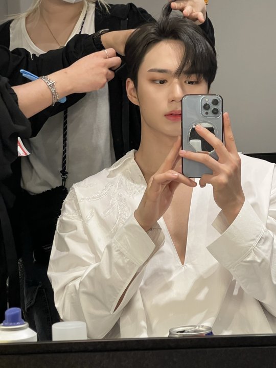
HI megmeg <3 ok this is not an exhaustive list but: concert junseo (w an emphasis on red), marie claire black shirt my beloved, whatevers going on in these pcs i need them or i will die (i will die), <COAT3 . also im Very normal abt these.


also are we going w music sites covers . if sooo then: love pt.1: first love = youth > identity: challenge > identity: action = identity: first sight > starry night
i think youth is just like a basic cover but it's simple and easy on the eyes and just... u know there's not much to say abt it but that's also why i don't have much to critique... it's not the best cover of all times by all means but it's alright, basically!!
it is tied with first love because i think this one had the potential to be the best one by far, but as much as i Understand the colour palette in relation to the music (like...it makes sense it rlly does) it's just...not fully satisfying?? like i get it but also i dont u know...like i LOVE pink and i LOVE purple but something about this hurts my eyes in a way? i do think that the design is really nice tho and it Does fit the music it comes with!! (and also despite what i said about the colours this pink/purple version is still my fabourite out of the 3 colour palettes it comes in w the different versions? maybe because of how it relates to the songs. or maybe i'm just used to it)
challenge comes next, being also pretty basic (they all are.) but something about her is very satisfying? i love the purple tint she has to her and i think what she has going for her that sets her higher than the other identity covers are the mics in the bottom third of the picture? idk if im making any sense (nd u didnt ask for my rant) but i think it Frames them really nicely? making like a natural frame or like naturally directing ur sight to the group like it's just nice... i like what they did there . shes still a bit boring other than that but like shes fine shes not Bad
action & first sight are both v basic and pretty boring but they both have distinct points they have going for them!! i just personally really enjoy the fancy concept they set for action, that's a personal preference ig & i am a fan of the peach tone it has to itself!! it is also The wei album that i ownbfjevwk i do however dislike how the colour they chose for the text/logos blends into the picture, im not sure if it was the best choice they couldve made!
as for first sight, i See the vision and i do like her, and i guess from an objective standpoint she should be above action, but once again i just enjoy the aesthetic for action much more. but i do think the colour palette is more balanced here, it's more...hitting?? less of a visual mess??? that sounds like im bad mouthing action but it's just like... action's cover is one big fancy peachy mess when u look at it without paying much attention to it, u know? (??) . this one is very clear?? if it makes sense?? it also feels bolder? i really like the text/logo just like . the colours the fonts nd how its all positioned i rlly do enjoy it!!
nd finally starry night (which i almost forgot to include). i DO GET THE VISION i don't like the execution tho . shes a bit of a mess . very unsure about the fonts. the frame makes it feel way too . squeezed . its too big for the picture its framing . maybe just not the best idea to have such a big frame when ure trying to also present all 6 members of the group. it feels like the clocks are an important setail in there but u can barely see them. also the outfits are a bit of a mess esp colour-wise . maybe im just a hater bc i dont like starry night . but idk its a mess meg it is just a mess .
#i lub u meg i give u a huge hug feel free to read my rant nd please enjoy if u do . u can also ignore it it doesnt make much sense#thank u for asking 💕💗💖💞💗💕💗💕💖💗💞💓💗💕#theres always at least one (1) person asking abt a fave junseo in these . do u all like coordinate to take turns or#meg tag#millie's rep
4 notes
·
View notes
Last Seen Blogs

sydneytownsendx
Drawing blog

voy-llorar
BellaDama

ellyintown-blog
elly in town

okanulker20
OKAN ÜLKER