#i draw each one on a new layer in the centre of my digital canvas and then resize them at the end
Photo
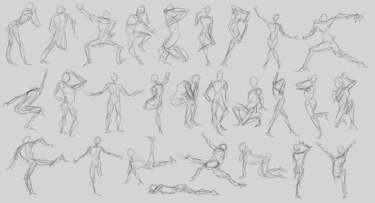
2023-04-14 // timed figure drawing // 30 secs each - posemaniacs
remember last year when I said I was going to try and do more figure drawing consistently? yeah lmao. but trying to do that actually for real this year. I’ve also been skipping doing warm ups and its really affected the quality of my work so I should do figure drawing to get started when I sit down to draw.
I need to work on my gestures and proportions, I forgot to do the line of action and it shows but hey it’s a start. some of these really aren’t that bad tho for being done in just 30 seconds, gotta give myself some positive credit
#;; my studies#i draw each one on a new layer in the centre of my digital canvas and then resize them at the end#im going to eat lunch and then maybe keep going#i need to shake off this rust
2 notes
·
View notes
Text
Process-Illustrations and Inside of Book
This is some of the process, for making my illustrations and the other bits that I decided to add in the book.
Unfortunately, I forgot to take that many pictures of the process. I know how important it is to back up your process with screenshots but the limited time for the project really made me subconsciously work on all the illustrations without thinking about anything else.
However, I decided to add the timelapse for two of my illustrations. The process for all of them is quite similar anyways so I don't really see this as too big of a problem.
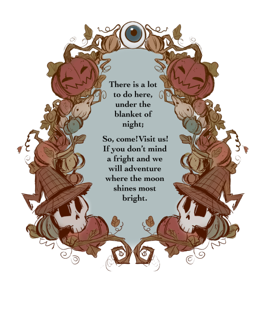
First Page
I wanted something special for the first page. In the show Over The Garden Wall, they sometimes put up images or text in these beautifully ornamented frames. They are usually made of the faces/ silhouettes of a character, a very important object for the story, or just intricate patterns and shapes.

I decided to create my own illustration in this style that would serve as the first page in my book.
Since I wanted to capture that old, folklore-inspired, fairy tale book style, I decided to refine the sketch and use it as line art. I mostly made the frame out of pumpkins, vines and leaves, with only two of my characters in it since I think they fit the best with the aesthetic I was going with. This was very easy and fun to make. I used the symmetry and mirror tools to speed up the process.
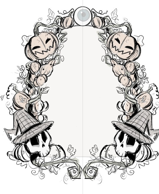
For the colours, I wanted something very soft and earthy that would suggest autumn. I mainly used browns, oranges and dark greens with just a few of blue-ish tones here and there.
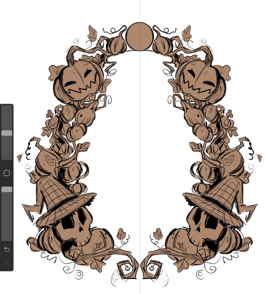
I wanted to make the illustration look like it was made with watercolours so I used a big air brush to fill in all the colours and shading. This made the whole thing look a lot softer, hand-made and as if the colours were mixing together.
I used a desaturated shade of blue for the centre and then put in the first verse of my story.
I absolutely love how it turned out. The only thing I would've added was some more watercolour texture here and there, to further emphasis the traditional aesthetic of it but in the end, I think it looks passable enough for what It is trying to look like.
Illustrations
I decided to make 3 of my illustrations on the same canvas which means I have all the process in the same video. Working on these was an absolute pleasure and I am very grateful for the techniques and useful things I have learned while painting (digitally) in this style.
As I have mentioned before, I wanted to go with a very sketchy, paint-y look for the illustrations. This gave me a lot of freedom and actually made me more confident in my ability of creating interesting shapes and brush strokes.
Up-close, you can really see how rough and unpolished everything is, and I thing this only adds to the charm, originality and character that children's books usually have.

After I finished the 3 illustrations I had that were on the same canvas. I moved each one on it's on page, where I added any finishing details.
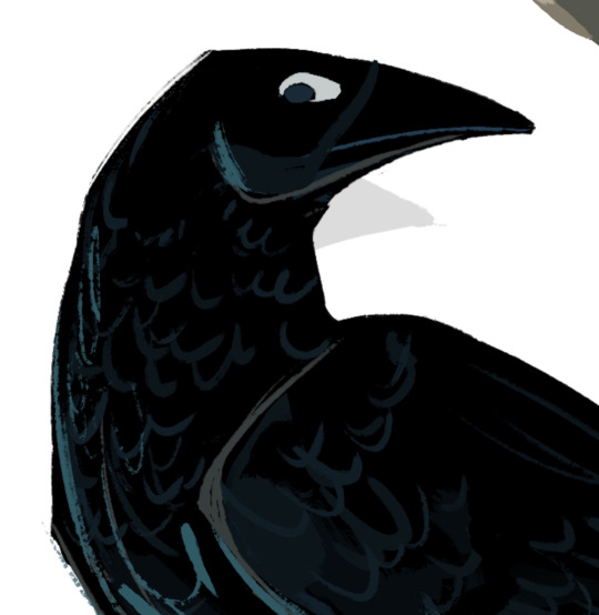
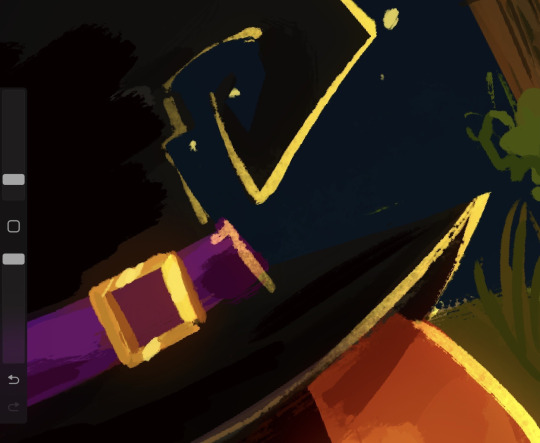
For example, I decided to add a nights sky behind the crow and a stone wall covered in ivy to sit on. I also tried to make some kind of animation/sequence by having the crow drawn three times while it took on flying . I added a white line of action to further emphasis the movement .
Since the crow and the background are both very dark, I decided to add some rim light along the edges of all the crow drawing with a muted shade of yellow, to make it look as if the moon was reflecting on its feathers.
This really separated the background from the crow and really added a lot of dimension.

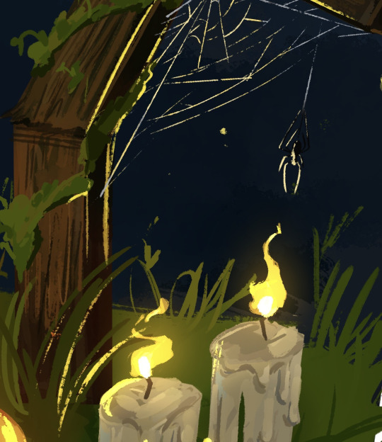
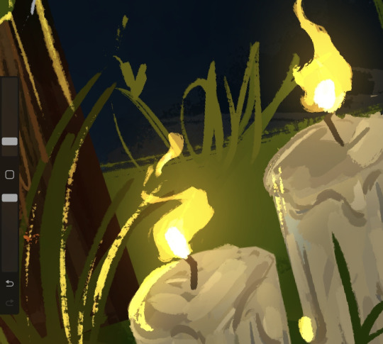
I did something similar for one of the others illustrations as well. Since I had the lit candles in , I had to make them glow and reflect on all the objects around it.
I started by creating a new layer, on which I added a very dark shade of blue-ish purple over the whole drawing. I put the layer on the blending mode ''HARD LIGHT'' which made everything darker and in harmony with the sky.

After that, I added some highlights all over the place with a bright yellow. This is also where I made the flames of the candles. For this, I used the blending mode ''ADD'' which made everything bright . I also erased the edges of the highlights with a textured brush to make them blend better with the objects they were hitting.

After that, I made another layer with the blending mode add and added a very subtle glowing effect with an air brush on all the highlights and the candle flames.
I loved working on the flames. Thinking about how the wind would hit the flames making them move was so fun and it added a nice touch of realism to the piece.
This illustration was made separately from the others. I decided to draw a cake and some dog paw prints in tune with the verse that it was representing.
I took a slightly different approach for drawing the cake. I made the ''sketch'' out of squares and rectangles using the ''rectangle tool''. I decided to go with a very generic design for the cake, I didn't want to spend too much time on the initial sketch.
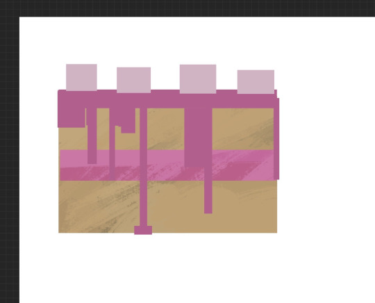
After that, I started carving into the shapes, adding shading and dimension. This is where I decided to replace the pink icing with chocolate just to have more variation in colour. The wiped cream on top was a bit hard to do since the shapes was not something I have done much of before, but I think I managed to figure it out.

I added a lot of highlights on the icing to make it look shiny.

As a last, slightly gory detail, I decided to add eyes around the bottom of the cake. They were very easy and quick to do and they really accentuated the Halloween theme in the page.

This is a comparison between the ''sketch'' and the finished drawing.

As always, there is a lot of texture everywhere. This technique of adding random lines and strokes everywhere really became a signature element in my style that I have used for my other project was well. It is something I have learnt from movies like Spider-Man Into The Spider Verse and digital artists like Sam Does Art.

Bonus Illustration
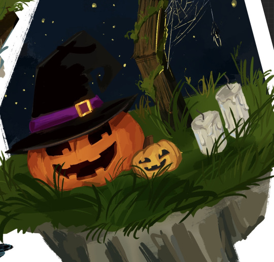
I made also made this final illustration as a son of conclusion for my story, with the skeleton siblings having a fun time with the ghosts in the cemetery.
I was really inspired by the show Cuphead to make this illustration. In the show, all the background are made separately from the characters in a soft, hand drawn style, while the characters and the objects they interact with are made to look a lot more crisp and clean.

This is a technique that Disney used for very old animated movies like Snow White and Cinderella, where the background would be done on plastic sheets and the characters would be added on top of them.

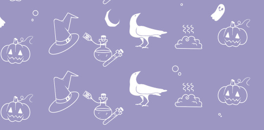
Pattern End/Start Pages
While studying the components of a children's book, I have noticed that all of them would have the first and last 2 pages be made completely out of patterns of drawings or shapes on a simple coloured background.

The functional purpose of these pages is to hold the book's interior to its cover and protect the insides of the book. However, this doesn't mean that they have to be blank, The can have little drawings, repetitive shapes, patterns and other visually interesting elements.
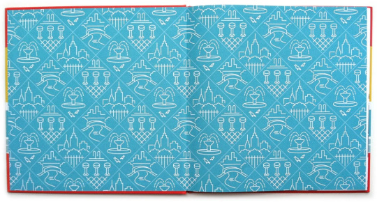
I decided to create my own end pages. This only took around 20 minutes to make. I decided to go with this beautiful violet for the background. I thought this colour worked nicely with the blues of the front and back covers.
Then, I started sketching the little drawing pattern. decided to stick to the Halloween-y theme and have a crow, a witches hat, zombie brains, a few potion bottles and a pumpkin.
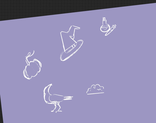
After that, I made the outline for all the objects. I decided against adding any other colours. After that, I simply duplicated the 4 objects and filled the whole page in. I duplicated the whole thing 3 more times after that.
0 notes
Text
Colin MacGregor: A Portrait
The cover artist for Doomed & Stoned in Scotland shares his craft and journey.
Last month, Doomed & Stoned revealed its latest survey of the heavy underground by zeroing in on the Scotland rock and metal underground, with our usual anchor to doom metal and stoner rock, but showcasing several genre blenders to boot.
We assembled an enthusiastic team of musicians, artists, and local media types to help us vet each of the submissions so we had the most authentic picture of the Scottish scene's character, as well as a listening experience of the utmost excellence.
Doomed & Stoned in Scotland by Doomed & Stoned
We're thankful to each of the bands who participated, and especially grateful for the enthusiastic participation of Colin MacGregor, whose striking dark, rich colors on canvas of an ancient druid captured the spirit of the project so succinctly, and inspired many a casual peruser to give the 40-band compilation a good and thorough hearing.
Following is a virtual gallery of his work, with commentary by Mr. MacGregor himself, from Colin MacGregor Maker Art. (Editor)
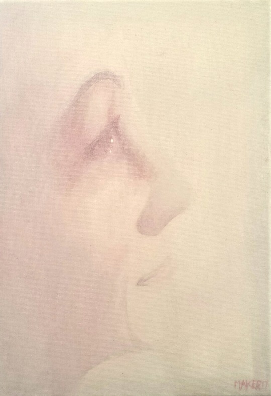
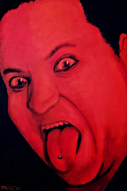
SELF PORTRAIT IN RED (2009)
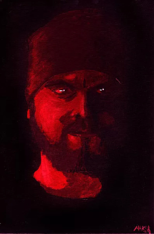
9x6” acrylic on board
This is pretty much how it all began.
I was living in a flat in the centre of Edinburgh with next to no furniture, no television, no internet connection (no landline!) or working radio, I had to think of a way to keep myself occupied in the evening when I wasn’t working. This is when I found a box of 20 small acrylic paint tubes I’d bought years before and never really used, along with about 5 paintbrushes of dubious quality.
Using a photo from my rather poor mobile phone at the time, I set about creating this painting on a piece of board that I had.
The colour comes basically through how I see people I meet, depending on circumstances. This is how most of my early paintings were executed.
THOMAS BLACKLOCK “THE BLIND POET” (2013)
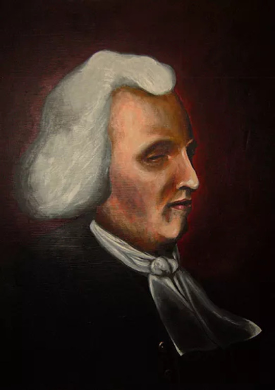
20x16” acrylic on canvas
This one was painted for the then bar manager of a long-gone Edinburgh pub called The Blind Poet, and the portrait is of Thomas Blacklock, of the aforementioned moniker, who lived in Pear Tree House for most of his life and was an influence on both Sir Walter Scott and Robert Burns, despite losing his sight as a child through smallpox.
The painting itself I don’t have much recollection of as I’d had extensive knee surgery at the time and was on quite a number of strong painkillers, but safe to say this painting led me to my first paid commission, where I produced two more paintings for Pear Tree House, one of which is still on display in their basement bar.
This one and the largest of the three, of Andrew Usher II, are currently in storage, I believe, in the south side of Edinburgh.
MAGGIE (2014)
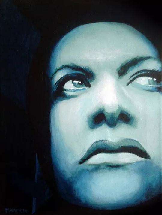
12x9” acrylic on canvas
This was painted for my friend who was moving from Edinburgh to Bremen. She wanted something to put in her new home and also something to mark our friendship so I painted this in about 3 days.
It’s also quite rare in my canon as it actually has a bit of background in it, usually my backgrounds are just solid black.
This colour was actually quite difficult to get right, and it was applied in very thin layers and built up gradually, which is why I think it has quite a diffused, soft image overall.
ARANCHA (2017)
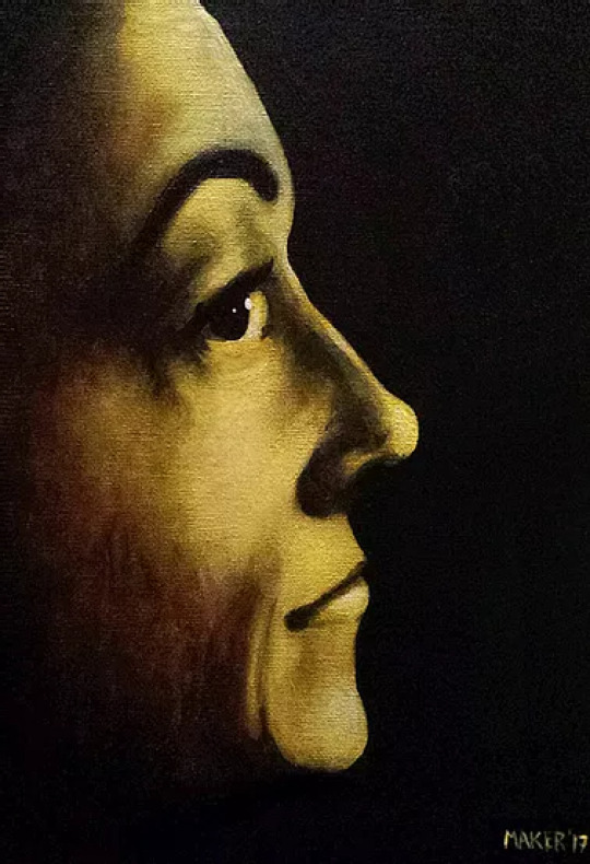
12x9” acrylic on canvas
This one is of my girlfriend and is based on a photo I took of her whilst walking through a park in Amsterdam. The photo itself was quite blurry as I took it on the fly whilst walking, but her face ended up on the whole in focus so I thought I could get something out of it.
There is a second version of this painting which is done in very pale pink and white paint, which was a bit of an experiment, but I kind of liked the challenge of doing something different
DAVID BOWIE (2016)
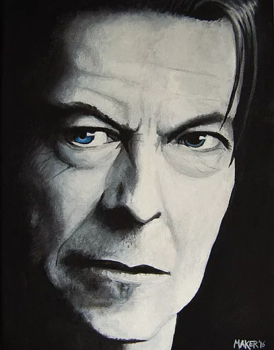
12x9” acrylic on canvas
This was painted within two weeks of the announcement of his death. I’d painted a few musicians before this one but they were all plain black and white, whereas this one actually had colour in the eyes, something a bit different to my usual stuff.
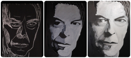
It was also the first painting I’d done by painting the canvas black first and drawing the basic shape on in chalk, something I’ve only done again once, and that was the recent Druid painting.
FRANK ZAPPA (2019)
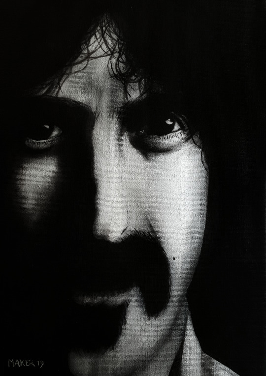
12x9” acrylic on canvas
As mentioned above, this was actually started in 2016 and sat in various states of… started-ness, for around 3 years.
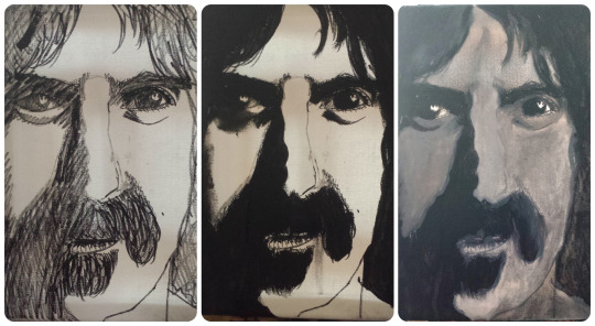
The painting actually spent most of its life as a scribbly mess of marker pen and gun-metal grey paint, and was almost scrapped entirely until I reassessed it in October 2019 and decided to attempt to salvage it, which I’m glad I did really as it’s been used on my business cards and as the “face” of the exhibition it was included in!
LEMMY (2019)
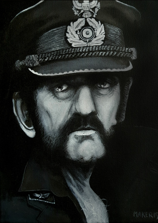
12x9” acrylic on canvas
I actually started this one, along with Frank Zappa, back in 2016 but the pair of them languished in various states of unfinishedness for a long, long time due to a variety of circumstances.
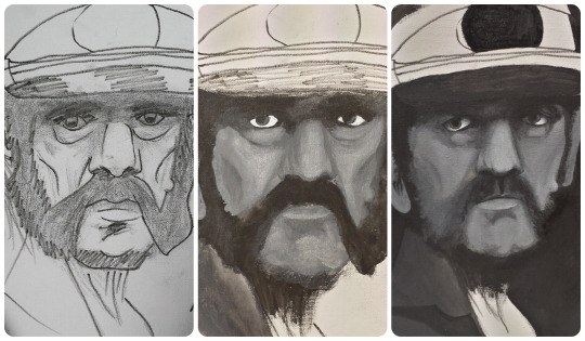
I eventually got them both back out of storage and managed to find the focus to finish them both in time for a week-long exhibition in Bannerman’s Bar, Edinburgh, which also featured Wraith, Cronos, Ozzy Osbourne, Chris Cornell, Nick Cave, David Bowie, Mark E. Smith, the aforementioned Frank Zappa and a rendition of the Xenomorph from the Alien movie franchise. This exhibition coincided with a Bismuth gig which had been organised by Bailey Junior, who was instrumental in dragging me out my block and getting these completed.
CRONOS (2019)
15x11” acrylic on canvas
Bailey Junior approached me with the idea of producing a poster for an upcoming gig he’d organised with a heavy doom band from England called Bismuth, expecting a fairly quick Photoshop effort.
I hadn’t painted in a while maybe a year or two, having suffered a drop in confidence and not being able to find the time or motivation, but I’d long wanted to create a poster which was almost entirely in paint, rather than digital text over the top, so this proved to be the spark needed to push myself into painting again.
Loosely based on the Ancient Greek myth of Cronos and partially based on “Ivan the Terrible and His Son Ivan'' by Ilya Repin (1885) it took two or three evenings to complete. The text for the poster was hand painted on separate canvases and then put together using Photoshop to give the impression it was a completely painted poster. The only thing not painted was the Scapegoat.tv logo which was added later, just before the gig took place.
OZZY OSBOURNE (2019)

12x9” acrylic on canvas
This one was really, really quick. Probably about 2 ½ hours from start to finish, maybe 3 at a push. Painted roughly about 7 days before I was due to open my first exhibition at Bannerman’s Bar, it was a last-minute decision, but turned out really great.
The acrylics were almost used like watercolors here, being as there were large light areas and deep, deep blacks.
I’m especially proud of the mouth area, it really has an almost 3D effect, something I rarely managed to get right.
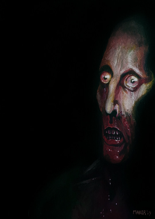
WRAITH (2019)

16x12” acrylic on canvas
This was the second collaboration with Bailly and Scapegoat.tv after the Bismuth gig. This was designed for Japanese band Friendship but sadly due to the rapid spread of COVID-19 the gig was eventually cancelled.
The painting itself was based on a number of different sources for reference for cloth, lighting and the hand gesture. I’m not actually that much of a fan of painting hands to be perfectly honest.
The painting itself is currently still in Bannerman’s Bar. We were planning to hold another exhibition for all the paintings in the Bismuth gig exhibition again, but the day after putting them all up Lockdown began and the pub had to close, so I’ve not seen any of the exhibition paintings in person in about a year now.
Hopefully things will change soon.
MIKEY LAWLESS (2020)
12x9” acrylic on canvas
This one was painted in the first week of January 2020 for Mikey’s mother after Mikey himself sadly passed away from cancer just days after the new year began.
I think it took me roughly about 11-12 hours from start to finish and ended up being the only painting I completed that year, despite the coronavirus lockdown and other things happening.
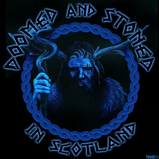
DRUID (2021)

16x16” acrylic on canvas
And so it brings us to this one, again it took a nudge from Bailey to get me kick-started enough to unbox the paints again, and it took a bit of time to get started.
I’m not going to lie, after over a year of being nowhere near a paintbrush and canvas I was nervous and unsure if I could even do it, but once the canvas was primed and the blue paint started drawing out the shapes it started to come together.
It took about 4-5 days, give or take, spaced over a number of evenings, to complete and use references from a number of different sources.
The blue colour was chosen as a representation of Scotland in general, trying to capture the colour of the Saltire, but also evoke moonlight.
Follow Colin MacGregor
Get Colin MacGregor's Art
#D&S Presents#Colin MacGregor#Colin MacGregor Maker Art#art#stoner art#Doomed & Stoned in Scotland#Ozzy Osbourne#Lemmy Kilmister#David Bowie#Frank Zappa#Wraith#Cronos#Doomed and Stoned
3 notes
·
View notes
Text
15/09
Today we learned how to use Photoshop to manipulate our art and enhance it to create a new composition which looks completely different. For this work we took inspiration from David Carson and used many techniques seen commonly in his work.
David Carson
David Carson is a graphic designer who is best known for his work in Ray Gun magazine. The main features that reoccur in his work are a prominent use of type and lots of overlapping. There isn't much blank space and that is something I really like about Carson’s work as personally I think the overall “business” of all his art is very eye-catching and appealing to look at. We used him as our inspiration this lesson because we were experimenting with type and tools on Photoshop and his work contains a lot of the techniques we were experimenting with.

This piece contains black and white type on a colourful collage of photos in the background. By doing this, the message in the type stands out due to the contrast created. All of the type is very clear to understand and the font isn't abstract or chopped up to make it difficult to understand, which is another contrast to the background, due to its blurring nature making it difficult to understand what the photographs are of. Carson may have done this because the words he is using in the foreground are the most important part of the composition, as they may be advertising something or displaying an important message. While clear to read font is common within Carson’s work he does also like to overlap and cut the type up to make it almost abstract, as shown below.

This piece contains another blurry image in the back which would make the viewer believe that the type contains the message, which is correct, but this type is also like a selection of small irregular shapes that vaguely make words than easy to read words like the previous poster. There is a very small amount of colour within this piece but it is on the type to draw the audience’s attention to it. This also contains smaller but more regularly shaped font underneath the abstract font, to provide further information about the message and project he is promoting. This variation in type is very interesting and is a unique way to have more information in type without it drawing away from the main image.
This piece differs from the previous two as the imagery shown seems to have come from some sort of stencilling technique. The limited colour palette and solid shapes in this reminds me of Nate Kitch’s work. I really like how the only colours are the primary colours as it serves the purpose of being eye-catching, which is presumably something Carson would’ve had in mind when making this due to it being a magazine cover. This piece moves in a certain direction, with everything pointing towards the top right hand corner, which may have been done to make the overall composition of the cover cohesive and not have certain elements of it contradicting eachother and working against one another, being unappealing to the consumer. He plays around lot with the tracking of the letters within this piece and includes some very big spacing, especially on the word “on”. It appears to have been done to make all the type fit into a rectangular shape and therefore it fits the geometric theme of the piece.
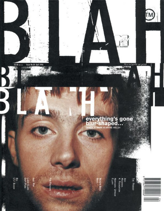
The main focus of this piece is a famous celebrity, Damon Albarn, which will have been made the focal point of the magazine cover to attract fans of him or his bands to the magazine when they see it on the shelves. However, Carson’s graphic design and typography makes this much more visually interesting, as this cover is an example of him really being creative with scaling and tracking. The type at the top is large and close together compared to the rest, and the tracking is regular. By having different size spaces between the repeating words Carson has created an effect which is similar to a glitching electronic. This could be foreshadowing the contents of the magazine as it states on the cover that it contains a conflict and a glitch in a computer is also an issue which needs resolve. He also has turned some of the type 90 degrees and displayed a list that way, which may have been done so that overall the type on the cover frames the central image of the face.
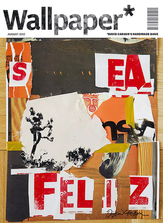
While the other pieces appear to be made digitally, this seems to be a collage made with real paper. Many of the colours are very muted and don’t seem to stand out too much, which makes the red type on it’s white background very striking. The tracking of this type is split up with gaps in the paper where the colour behind shows through, so the overall image doesn’t appear too crowded.
After looking at David Carson’s work I thought about ways I can digitally add type to my art to portray the message and narrative of my chosen articles. Adding type that faces in a different direction to the norm is a staple within his work and is definitely something I want to experiment with more, as it could fit with many of my articles themes of “all is not as it seems”, such as the CIA dragonfly and brain implant articles. Different scaling is also something I want to use as the size of something on the page can be used to indicate it’s importance to the message and therefore I could include some sort of context to parts of the image which aren’t as easy to interpret.
Using Photoshop to manipulate my collage
In my lesson I took the collage that i made the previous day and used elements from it, and some new type, to create a new composition, taking inspiration from David Carson and his use of graphic techniques and typography.
To begin with, I chose to make my work A5 as that is the size of a postcard and the final product of this project is meant to be 6 postcards and A5 is postcard size. I also set the colour mode to CMYK, as this will mean that my colours will be tailored to be printed since these are meant to be postcards and therefore will need to be printed.
I then went online to find a more diverse range of fonts and I downloaded some which I thought fit the idea of robotics and CIA, the one I used most is called “Distortion dos Analogue” and I picked this one as it was cut up in a similar way to some of David Carson's work, but it was still readable and it’s clear block letter roots make it feel very futuristic, just like a robot spy fly.

When adding the type to my canvas I thought about the tracking and arrangement of the individual letters. I really liked the way David Carson would flip letters and arrange them in an unconventional way, so to begin with I made the top of the page reflected at the bottom by reversing the text. I then made each letter of the word “robot” it’s own layer an played around with flipping them and having them diagonally across the centre of the canvas
By having individual layers for them i could really experiment with their placement on the canvas and how they looked layered and flipped individually. They worked well in this placement at the time but after I added some elements from the collage I scanned in I removed these letters as they made the overall page look too cluttered for my liking and they made some things difficult to distinguish.
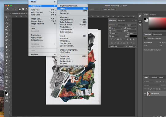
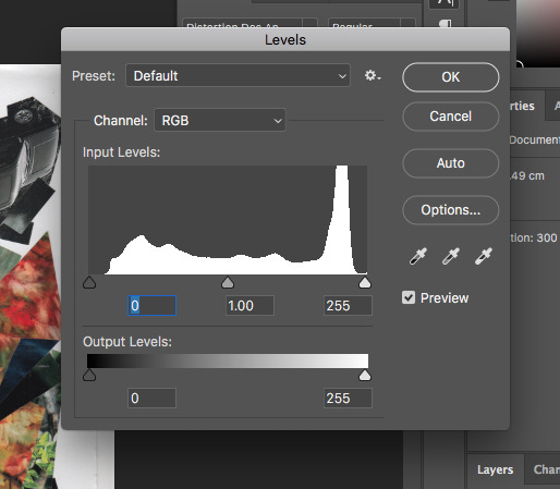
When I scanned in my work from the previous day I adjusted some of the levels to make the colours vibrant and increase contrast, as some of the quality of the colour and the contrast was lost in the scan.
After I did this, I lassoed some elements of my collage so I could add them to my typography. I chose to take the letters and the bug from my collage as then I am sticking with the overall theme and appearance of mainly typography whilst also include an image to be the centre. With the pieces I took I experimented with the threshold, creating a high contrast black and white, almost silhouette effect . I then layered the same images over the thresholded images but in a lesser opacity so the thresholded elements could be seen through them.
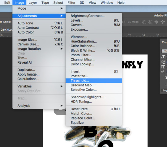
At this point I removed the word “robot” from the centre of the canvas and replaced it with the bug extremely large, taking up a majority of the space. I also moved the type saying “robot dragonfly” to the side of the image and rotated it 90 degrees so it would fit down the side of the page. I think this made everything fit much more cohesively together as it filled a space where there wasn't any type with some type. The outcome of this was a piece which heavily differs from the collage I started with and also shows my inspiration from David Carson’s work.
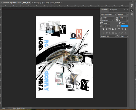
I am very happy with my outcome although I believe it is unfinished and I would like to add some smaller scaled type which contains some extracts from the news articles in the white space which is left, and experiment with more tools on Photoshop to see what various effects I can achieve. I particularly enjoy the effect that changing the threshold has as it looks very futuristic and fits the theme of robotics and technology. I also really like how changing the opacity can almost make two images join together instead of overlapping on top of one another.
0 notes
Text
Concept Art 2 Process
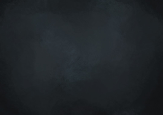
I drew it digitally on a 4092 x 2893 pixel canvas and when I was finished I exported it as a 300 DPI PNG. To start I painted the canvas a plain dark blue, and then over the top I used a soft pastel brush with 36% opacity to paint darker and lighter shades on top. My plan was to make the edges dark and the centre light as I planed the trees to be arranged in a circle so the light escaped through the centre.
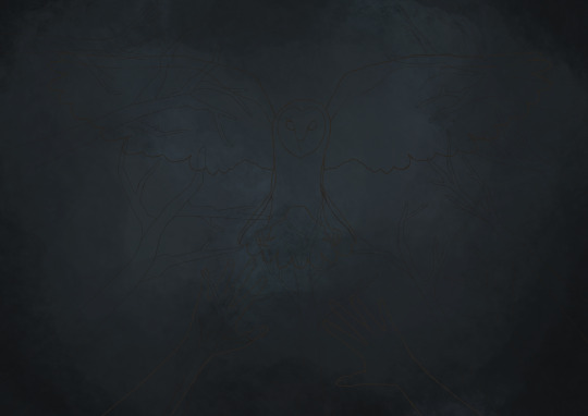
I then sketched in the trees, owl and hands. For the owl I used the same brush on 100% opacity in brown. I did this because I wanted the owl to be the focus of the piece, so by using a high opacity brush as an outline more focus would be drawn to it. The trees are in the background so I used a lower opacity brush.
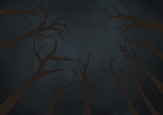
I then hid the hands and owl in order to focus on the trees. To start I used a dark brown as I planned to paint lighter tones on top of it in order to bring out the darker shades. Also, the trees are angled so the person is lying on the ground. I did this to make it seem like the person is trapped and has no hope as they’ll be attacked by the approaching owl.
I then used the same soft pastel brush with an opacity of 23% to paint in the main light and dark tones. I wanted the strokes to twist around the tree to give the impression of real tree bark.
I decided that the browns I used were too bright so I painted over the trees in a darker brown using a very low opacity brush.
Then I added lighter strokes to make the trees stand out more and to create highlighted areas.
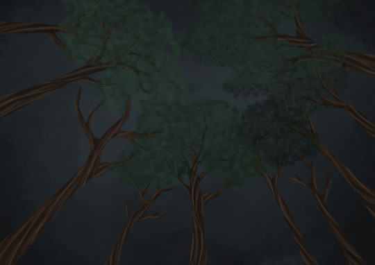
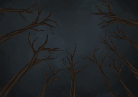
Next, I started to add leaves. I used a leaf brush, however I had to dot the brush and not stroke. This was because if I used strokes the leaves turned out in one colour, however if I dotted the colours would change shades. My plan was to alternate the trees so to give a layered effect, furthermore to create more variance I used a different shade of green each time. I tried to keep the leaves close to the branches but I also wanted them to appear a little elongated towards the end of each clump. Finally, I lowered the opacity of the layer once I was done to 70% just so the leaves weren’t in focus too much.
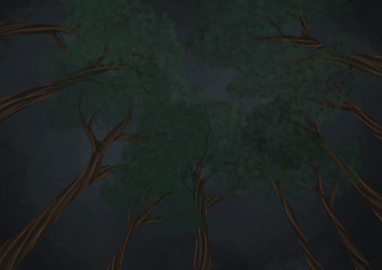
I then used the same brush and technique but on a new layer for the rest of the trees in order to create depth.
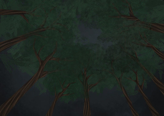
On a layer behind the tree trunks I used the leaf brush to create large leaves in the background. By doing this I filled in empty space, but it also made the trees look less naked.

I did the same towards the bottom, but this time I made the leaves darker in order to to draw the viewer’s attention towards the centre and not the edges.
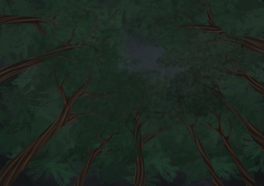
Finally, I used a low opacity brush to paint the edges a dark blue in order to create a shadowy effect.
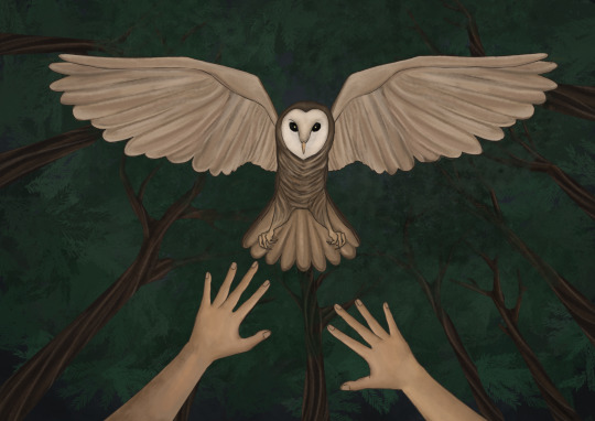
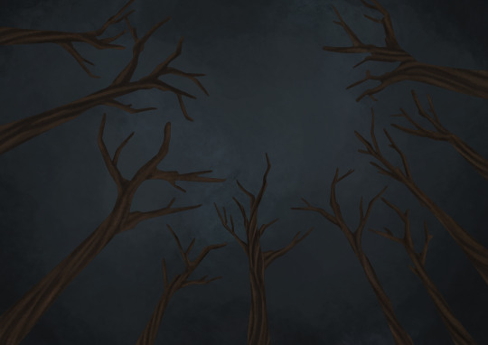
I then returned to the owl and hands. I used the soft pastel brush with a 24% and 34% opacity to paint. When painting the owl’s wings I just painted one side then copied and flipped it.
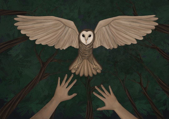
Finally I darkened the hands as I thought the colours I used were too bright for a dark forest. Overall I’m very pleased with this piece, especially the background and composition. I think the composition really gets across my intentions, as the person comes across as very vulnerable as the trees tower over them as an owl comes towards them. I’m very happy with how I painted the trees and owl, however if I were to do this again I would use darker colours as well as lighter colours in order to create a larger contrast. Also, I think shadows and dramatic lighting would really be effective in making the owl appear more intimidating.
0 notes
Text
what i saw in ebisu, roppongi, and ginza
As usual, I made a tentative plan earlier in the week for my gallery and museum hopping, but as always things change. After seeing a number of posts on Thursday night about the 10th Yebisu International Festival for Art and Alternative Visions, I decided that would be my starting point since the theme was "Mapping the Invisible" where there could be some potential discoveries. The main venue is the Tokyo Photographic Art Museum in Ebisu and I began to work my way through the works which were mostly video installations. Given that I had arrived at the museum just shortly after opening, I had plenty of time and decided to try and give each work my fullest attention. After almost two hours of wandering through the three floors of works, here are a handful that stick in my mind.
Gabriel Herrera Torres' "How to Reach God Thru Proper Exercise" single channel video offered a strange yet absorbing experience centered around a Polish recreation centre, dream transference, and color blindness.
The Cuttingly Fairy Photographs and Related Materials was by far the most fascinating work in the exhibition. I had not known about these photographs and the story behind them. From the Museum of Hoaxes website.
"In 1920 a series of photos of fairies captured the attention of the world. The photos had been taken by two young girls, the cousins Frances Griffith and Elsie Wright, while playing in the garden of Elsie's Cottingley village home. Photographic experts examined the pictures and declared them genuine. Spiritualists promoted them as proof of the existence of supernatural creatures, and despite criticism by skeptics, the pictures became among the most widely recognized photos in the world. It was only decades later, in the late 1970s, that the photos were definitively debunked."
The exhibition consisted of the five photographs along with various ephemera relating to those photographs, other fairy photographs, and research that debunked the authenticity of those photographs. As it turns out, the Cottingley fairies in the photographs were cut outs from an illustration book. Of the five photographs on exhibit, four of the photographs visibly included these cut outs. But the fifth one "Fairies and Their Sun-bath" was much more intriguing and ambiguous and which Frances insisted as genuine.
This analogue photographic deception that took place almost 100 years ago resonates with me because of the fervour that it caused during that time and how the images were widely accepted as genuine and that it took decades to discover the true nature of the images. Our current digital technologies offer the same dilemma in terms of trying determine what is genuine and what is altered. A century from now, or sooner, will we see the images from this period more clearly for what is genuine and what is altered?
Mako Idemitsu's "At Yukigaya 2" single channel video was interesting for me in terms of materiality. The work utilised high contrast film to provide stark contrast and abstraction to images from nature.
Natsumi Aoyagi's "Incubation Diary" installation gave me the opportunity to contemplate the presentation of research-based work and documentation.
I have mixed feelings about the installation. I do like the specimens or materials enclosed in an acrylic case, but I also find it inaccessible for the viewing audience. The non-ordered display of the acrylic boxes felt like a good way to move the viewer around the space. On the other hand, having the installation displayed with the back side of a constructed wall in all its unfinished glory was confusing to me. Seeing this installation made me think that I have to look more at the display strategies that Mark Dion and Fred Wilson have employed in their work.
The final work from the 10th Yebisu International Festival for Art and Alternative Visions that I wanted to mention was a collaborative research project by Natacha Nisic and Ken Daimaru into "itako" who are blind women who became spiritual mediums through apprenticeship. This video installation centres on the last itako, Take-san and her stories. More of a documentary to me, I found it deeply fascinating to discover spiritual mediums in a Japanese context. The works sits well next to my current fascination with the spirits and the after life.
From the 10th Yebisu International Festival for Art and Alternative Visions, I headed over to the National Art Centre Tokyo to see the 16th New Artist Unit exhibition and the DOMANI exhibition. I headed into the 16th New Artist Unit (also known as NAU21) exhibition first and I was struck by the size of the exhibition space and the size of the works in this exhibition. Over fifty artists displayed their works in this exhibition with most artists having a pair of works. As with these larger exhibitions, there is a bit of something for everyone. I found a handful of works to be interesting and lingered over those for a bit although most did not relate to my studio practice. My favourite piece in that regards would be Satoko Shimokawara's paper dress which was pocked with seemingly thousands of holes obsessively made by burning through the material.
From the NAU21 exhibition, I headed over to the DOMANI exhibition which I have not seen for a couple of years. Keith Mori's architectural drawings made by stretching thread and gluing them directly to paper, canvas, or the wall was the highlight of the exhibition for me. I had a chance to take photographs, but it does not do the work justice. The smaller works were what drew me in and here is one of the pieces that was in the exhibition.
Michiko Nakatani's negative relief plaster sculptures in the shape of "paintings" filled with layered images of crows or ravens that are brought to life by filling in the negative space with different transparencies of dyed resin were an absolute feast for the eyes. Her work had me thinking about how one can and should continue to look for new ways to apply tried and true mediums.
I spent a good amount of time taking in the work by both these artists because I realised that photographing them would not give me a sense of what these works transmitted. If you are in Tokyo, I recommend stopping by to see the exhibition if only for these two artists.
From the National Art Centre Tokyo, I headed to another DOMANI-themed exhibition at the Hibiya Library & Museum entitles "Artists Meets Books" with another group of Japanese artists who have participated in the Program of Overseas Study for Upcoming Artists. It is always good to see the gorgeous works of Aiko Miyanaga.
Masahiro Hasunuma's multiple Kinora works were a pleasant discovery in terms of forms for an artist books. The Kinora is an predecessor to the motion picture projector in which hundreds of pages are animated by turning them against small steel plate. The best thing about it was discovering a Kinora about Ogijima which was the island in the Setouchi Inland Sea where I participated in the 2013 Setouchi Triennale. In the image below, you can see a picture of the Meon ferry that takes you to and from the island and Takamatsu port.
I finished my long day of gallery and museum hopping in Ginza. Tomo Hirai's "Pottery Fragments and Reminiscences" at the LIXIL Gallery had me thinking back to my Memory Walks eggshell drawings and thinking about future possibilities.
From a few other stops which included Gallery Natsuka and the Tokyo Institute of Photography 72Gallery, I finished up the day at the Okuno Buildings. As the elevator was being used for a delivery, I ambled my way up the stairs and took a leisurely peek around each floor. On the fourth floor, this postcard announcement lured me into Gallery 403.
In the gallery, I found a series of photographs by Jun Sato whom creates patterned and repeating models based on geometric forms and then photographs them to create works like you see in the above left. As it turns out, the glass object on the right is by Yumiko Kimura who also uses numerical sequences like the Fibonacci sequence and other geometric and mathematic patterns to create her works. They are a couple who are based in France and have been working for years in this field of geometric art. I had a chance to speak with both of them and learn more about MADI community in Europe. What is Madi art? From Wikipedia,
"Madí (or MADI) is an international abstract (or concrete) art movement initiated in Buenos Aires in 1946 by the Hungarian-Argentinian artist and poet Gyula Kosice, and the Uruguayans Carmelo Arden Quin and Rhod Rothfuss.
The movement focuses on creating concrete art (i.e., non-representational geometric abstraction) and encompasses all branches of art (the plastic and pictorial arts, music, literature, theater, architecture, dance, etc.). The artists in the Madí movement consider the concrete, physical reality of the art medium and play with the traditional conventions of Western art (for instance, by creating works on irregularly-shaped canvases). Artwork of Madí movement appeared in eight issues of its magazine, Arte Madí Universal, published between 1947 and 1954."
There is currently an exhibition of Madi artists in Kanazawa and Yumiko Kimura had a copy of the catalog and the work in the exhibition was gorgeous. I will not make it up to Kanazawa in time to see the exhibition, but I am hoping that Yumiko Kimura can find me a copy of the digital version and I will share some works at the time.
My final stop was Gallery Camellia to see the abstract paintings by Satoshi Yoshida who was in the gallery and we had a good conversation about making daily drawings, John Zurier, Laura Owens, Ingrid Calame, and Thomas Nozkowski. I am feeling a bit of an itch to getting back to painting or at least more brush-based work which might be evident in my current batch of Daily Drawings.
A long but fruitful day of gallery and museum hopping in which I managed to cover quite a range of works and ideas. My next planned day of gallery hopping is next Thursday although I do not expect it to be as intensive as this past Friday. I am hoping to see one or two exhibitions here and there before next Thursday.
0 notes
Last Seen Blogs

snaptik4
Untitled
manaohu
hi
sapphicteeth
page 28
shehasbigfeet
SHE HAS BIG FEET
probleboble
Hehe :)