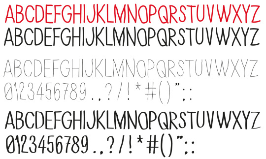
#handwritten font tattoos
Text
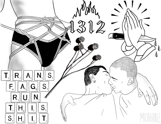
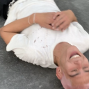
another queer flash sheet. top left referenced from @kinkyfemqueer ‘s heart harness tutorial (insta)
[Image description: A flash tattoo style line art collection including several images around each other containing:
A black and white lineart drawing of a person with rope fastened against their stomach and hip area, looped around between their legs and the back of their thighs. The rope is thin and arranged with a heart below their belly button.
A simple flame design with “1312” written below it in a gothic style font.
A pair of praying hands with a knife going through them. Three blood drops are dripping from the knife tip, and there are lines around the tops of the hands in a decorative highlight.
Square scrabble pieces arranged to spell “TRANS FAGS RUN THIS SHIT”
A stalk of craspedia variabilis, with four flower heads that resemble a spherical bundle. The plant is casting a dark black shadow.
Two masculine people embracing in a kiss. They have their arms wrapped around each others shoulders. The person on the left has short hair and a small hoop earring. The person on the right has a shaved head.
In the bottom right corner, there is a watermark with the artist’s name, MICAH RUIZ, handwritten in all caps. END ID.]
#digital art#flash tattoo#shibari#ropeart#lgbtq#line art#procreate art#commissions open#queer art#botanical
106 notes
·
View notes
Note
yaya sis i need a handwritten font that's cute for a saying tattoo pliz
if i had a dollar every time i got this
13 notes
·
View notes
Note
idk what is worse: awsten using his sharpie handwriting for everything or fans tattooing it. thats NOT a good handwritten font for a tattoo it just looks like ur friend drew on you with a sharpie during math class
eh i think there's worse things and handwriting to put on your body but i do question how people are willing to tattoo songs that don't even have an official recording out yet - iz
9 notes
·
View notes
Text
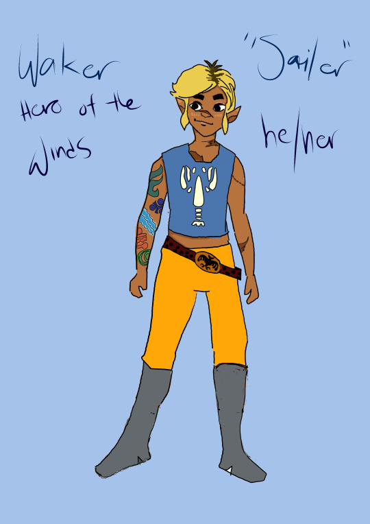
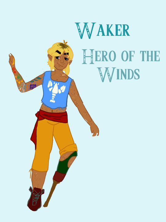
shout out to the ECU's digital collection of civil war artifacts for providing examples of the single wooden peg prosthetics soldiers and sailors used in the mid 1800s. i based waker's prosthetic after those but also altered the design to be more comfortable, as the original prosthetics would just have the leg sitting on a block of wood on top of the peg/stake and held in place with wooden pegs. ow!
[Image description: Two digital drawings of Waker from Heroes Gate, a 'Links meet' Legend of Zelda au. The leftmost drawing is noticeably simpler. In it, Waker, a brown-skinned 19 year old boy. His hair is black blonde and fluffy, with black roots beginning to show. He looks to the left with a small smile, dark eyes, and large dark eyebrows. He wears his blue lobster shirt with the sleeves removed and the mid-drift cut off, exposing his stomach. He wears bright orange pants tucked into grey boots, and a knights crest belt. He has a tattoo sleeve on his left arm made up of symbols of the Great Sea and Din, Nayru, and Farore's pearls. He stands on a periwinkle background with 'Waker' 'Hero of the Winds' handwritten in dark blue to his left and 'Sailer' 'he/her' written to the right.
In the second photo, Waker stands in a more dynamic pose, leaning to the side with his prosthetic leg tucked behind him. He is heavily freckled and his hair is messier. He smirks, brows even bigger. His pants are a darker, more muted orange and go to mid-shin, and Waker's right leg at the mid-shin has been replaced with an 1850's style wooden peg prothetic with a more modern cup to attach to his shin. He wears a brown ankle boot on his left leg. He stands against a bright, pale blue background and 'Waker' 'Hero of Winds' is written to his right in green-blue in the official Zelda font. End description.]
2 notes
·
View notes
Text
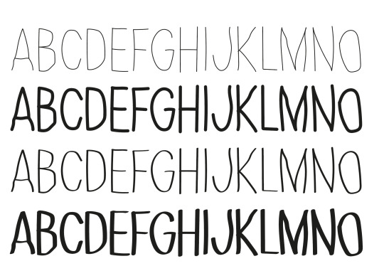
CVL- Fixing the letter forms
Thinner letterforms make more sense with the theme of tattooing but heavier letterforms go better with the symbols- experiment with this more and figure out which to go with or if two weights could also work. Handwritten letterforms, less technically correct than conventional fonts, could this be detrimental to my typeface or will its intention be understood? Consider taking this further and using my tattoo machine to create these letterforms physically and then potentially scan them in and digitise.
2 notes
·
View notes
Note
I rly wanna get that truism you wrote 'don't dwell too long on what fucking me means for your sexuality' like, under my tits like a ribcage tattoo, but I wanted to ask your permission first bc ur the artist AND ask your opinion on how you think I should style it, if you have ideas 💕 ty for making the best art on the internet
Go for it, idk about design tho go with what u think is gonna look best on ur body. I personally either like bold minimal fonts or something handwritten and lil messy. Also thank u aa
20 notes
·
View notes
Note
hi! is there an "official" model for the iconic handwritten libertines tattoo?
Hello! The rule is basically to do it in Carl’s handwriting as both Peter and Carl’s one is in Carl’s handwriting. Many fans get Carl to write it out for them in person so there is a lot of variation - mine for instance he did in a fancier way than normal but I love it to death because it’s unique to me but still in the same font. Carl’s own tattoo on his arm is the most commonly used template overall. It’s easy to find images of Carl’s tattoo (which is much clearer than Peter’s) but I will reblog some for you x
1 note
·
View note
Text
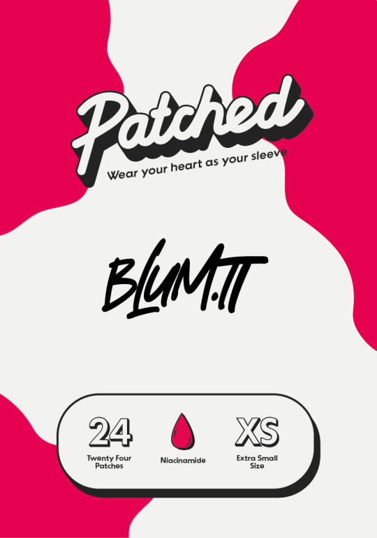
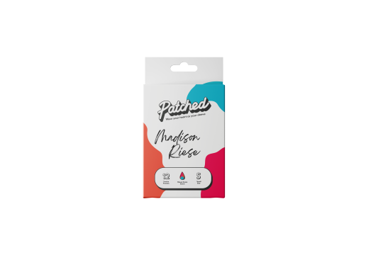
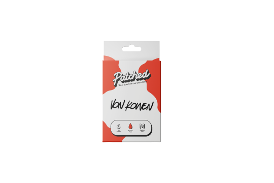
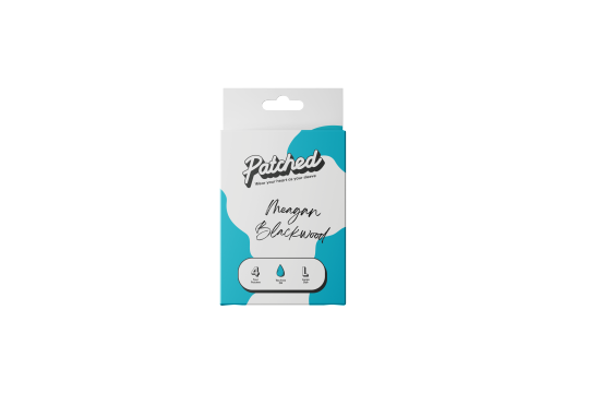
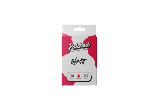
SP-RSA: Packaging Development
Week 9
After tutorial feedback on my packaging designs, I was suggested some areas for improvement. I was told to consider environmental effects of having so many different variants of packaging. If there is a different packaging design for every artist, this will amount to a lot of waste, and a lot of production efforts. My visiting lecturer Dot told me about how some brands use handwritten elements to give a friendly personal feel.
By using this technique for the different artists it will be more environmentally conscious, further hitting the brief. It will also hit Gen Z’s needs of personalisation and a customised solution that works for them, further inforced with hand written personal touches. Additionally, Gen Z demands environmental efforts from their brands, and Patched considering this in their packaging methods, will make them a more desirable brand.
Packaging front faces before:
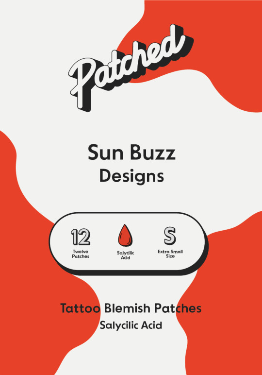

Packaging front faces after:
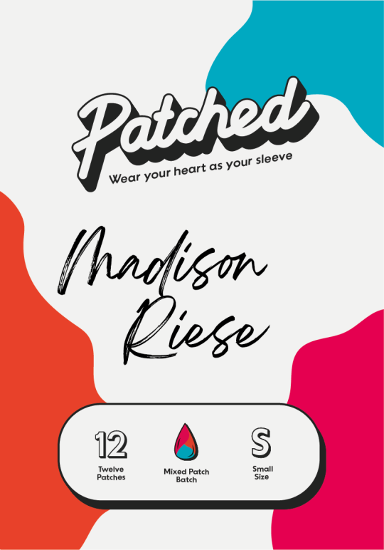
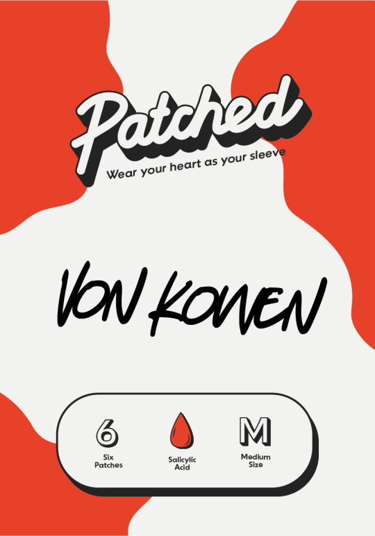

The hand written elements give a personalised and artsy feel, they are personal, and fit the brands feeling of expression and uniqueness aesthetically.
The change in logo makes the design feel bolder. It gives more information about the brand using the slogan, which adds to the design, and enforces our brand values. The titled logo that is now more horizontal also fits better in the space and has better relationships with the other assets with space.
I simplified the design by only using 1 type of system to categorise the types of patches. In my previous design I used the quantity, ingredient and size system in the box, as well as written text. In my final designs I took out the text, that added clutter and no additional information.
I made each pack represent a different variant, in size, quantity and ingredient, to show the full scape of products for my proposal presentation.
I created the look of hand written autographs with handwriting fonts. If this were to be realised in real life however, artists would be signing them themselves. I used examples of tattoo artists names, from the ones I used designs from on InkBox.
I actually much prefer how they look now, they look more creative and expressive as packaging solutions, with the hand written touch and expressive writing style.
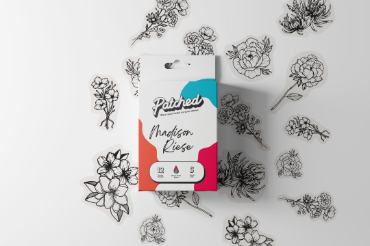
For mock-ups, I used a box close to that I had looked at when I was prototyping. I created mock-ups with no backgrounds that I could easily apply to my pitch boards, as well as a mock-up that showed designs by Madison Riese, the designer of the fine line botanical tattoos. This shows how a box might look if you unpacked it and took the patches out.
I also showed each box in a packaging box that I can include in my slides.
0 notes
Text
How to Master Traditional Calligraphic Techniques
The art of calligraphy has been around for centuries, and its beauty is still captivating and timeless. Have you ever been curious about how to create beautiful, traditional calligraphic lettering? If so, you're in luck! In this blog post, we'll be covering traditional calligraphic techniques and providing step-by-step instructions so that you can easily master them. You'll learn the basics, as well as more advanced techniques, and we'll even discuss the tools and materials you'll need to get started. For more info about Truly Madly Ink Calligraphy click here.
Definition of traditional calligraphic techniques
Traditional calligraphic techniques are the practice of writing and lettering styles that have been used throughout time. These techniques involve a combination of techniques and tools to create beautiful letterforms that have a distinct look and feel. The techniques involve a combination of pens and brushes that are used to create a variety of strokes and shapes. This can include the varying of pressure, movement, and angle of the pen or brush to create different effects. Additionally, traditional calligraphic techniques take into account the spacing between letters and words to create a pleasing overall composition. These techniques are still used today for both artistic and practical applications, with some of these techniques also being used to produce digital typefaces.
Overview of the importance of mastering traditional calligraphic techniques
Mastering traditional calligraphic techniques can be an incredibly rewarding experience and a great way to express your creativity. From mastering the basics of the art form to adding unique touches of flair, traditional calligraphic techniques are an important part of the history of writing. Learning these techniques gives you the ability to create beautiful, unique works of art that stand out from the mass-produced fonts we see everywhere today.
Traditional calligraphy has been used throughout history to create stunning works of art, from medieval manuscripts to modern day tattoos. It requires skill, patience, and practice to master the strokes and techniques needed to create a beautiful piece of art. With practice, you can develop your own style and create works of art that are truly unique and personal.
Calligraphic techniques can also be useful for making personalized cards and invitations, or for creating logos or other design elements. It can even be used to write beautiful handwritten letters to be treasured for a lifetime.
The importance of learning these traditional techniques goes beyond simply creating beautiful art. It is an important part of preserving the history of writing, and can be a great way to connect with past generations and connect to your own creative side.
Conclusion
In conclusion, traditional calligraphic techniques can be a great way to create unique, hand-crafted artwork. With the right instruction, materials, and practice, one can master these techniques and create beautiful works of art.
0 notes
Text
Doctors handwriting font generator

#Doctors handwriting font generator generator
#Doctors handwriting font generator free
New: now an Editor for single-line fonts is included. And this version can now create arcs not only line segments as output (G-Code commands G02 and G03). Our handwritten fonts are an opportunity to address personal and loving issues.
#Doctors handwriting font generator generator
Version 3 can output the G-Code for your NC machine directly. Our super easy tattoo script font generator is a snap to use. What's new in the single line vector fonts? With the single line vector fonts you can not only render the outline of True Type fonts but also the mid line of the characters. Technically, the ‘font’ you see is not truly a font, but rather a symbol. When you type in your text, our custom font generator then seeks out similar (but ‘fancier’) glyphs within the Unicode Standard. Essentially, they are symbols assigned with a Unicode value. What is a text generator font? As mentioned, the text generator fonts you see are not actually fonts. It also includes a TTF 'Stick Style' font - Stick40. It can convert a single line of text into the required toolpaths for engraving, aligned on an arc or a straight line. She struggles and writhes around as if shes fighting with the. How can I convert a single line of text to vector? DeskEngrave is a simple to use True Type Font to vector convertor, the results being saved as a dxf file, or G-codes. In NabelFabel (1984), Mara Mattuschka, an Austrian avant-garde filmmaker, contorts her face by stretching nylon tights over her head. These are ordinary fonts which have a relatively constant stroke width. After you generate the fancy text, click the copy button and it will immediately Copy the fancy text you generated.FAQ about Single Line Font Generator Convert What is a single-line font? These are normal font files (TTF, OTF, PFM etc) which have either a single line or two overlapping lines and count as "true" single-line fonts. Each type of fancy text has a copy button. Using this font generator is very simple, you only need to enter the text you want to convert in the input box, and you will immediately display 84 kinds of fancy texts. Since these texts are not real fonts, they don't need font support when used, so these fancy text is popular on social platforms (like facebook, twitter, Instagram). The Signature Generator takes your name and transforms it into something special with an exciting typeface From elegant to edgy, there's a font to suit your name and personality. The standard is maintained by the Unicode Consortium, and as of June 2018 the most recent version, Unicode 11.0, contains a repertoire of 137,439 characters covering 146 modern and historic scripts, as well as multiple symbol sets and emoji. Unicode is a computing industry standard for the consistent encoding, representation, and handling of text expressed in most of the world's writing systems. It replaces "ASCII" and actually contains all the ASCII symbols in its specification. The Handwritten font has slightly skewed letters that lean both right and left.
#Doctors handwriting font generator free
Unicode is an international standard for symbols in computer-related industries. Here are 50 free handwriting fonts you can incorporate into your designs to give them a unique, handwritten feel (without the time and hassle necessary to actually write things out): 1. Each letter in the table has many forms, and the text combined by these various forms of letters looks cool, like new fonts, and is therefore popular. For those people looking for the next level of handwriting font realism there. In fact, these "fonts" are composed of symbols from unicode, a set of codes that collect characters from various countries around the world. 4 days ago Inline Text Generator True single-stroke-font text creator The. The following is generated fancy text, in fact they are symbols, to generate fonts, please click me Hand Writing 1įont generator, also known as Text Font Generator, Online Font Generator, Free Font Generator, Cool Text Generator, this generator can convert your text into cool "fonts", these cool "fonts" are not real fonts, are completely different from the "arial" fonts on your computer.
0 notes
Text
Minimalist mountain tattoo on hip

#Minimalist mountain tattoo on hip skin
It started off as a tiny tattoo at the side of his shoulder but it expanded into a full back because he trusted me.Ģ Haji started out by chance. I completed a full back piece recently and it’s the first large-scale black and grey realism I’ve done – it means a lot to me. If I’m doing handwritten scripts, I’ll just write two or three options on the spot and the clients will pick from there. I would love to delve more into black and grey realism in future. It works best on very fair or Caucasian skin.
#Minimalist mountain tattoo on hip skin
Watercolour tends to dull over time, especially on Asian skin because of the yellow undertone, and sometimes people cannot accept that. I love doing watercolour, but I try not to promote it. I can change my handwriting depending on what the client wants – sometimes thicker, more illegible or more carelessly written. He posted it online and people started coming in because they like the simple handwriting that almost looks like a signature. I wrote it, she liked it and Joseph tattooed it. When I was still an apprentice, Joseph asked me to write a few words for a walk-in customer, who didn’t like any Photoshop font. I do a lot of handwritten scripts and that’s what I’m known for right now. I started having my own clients (a couple of) years ago, but I’m still learning new things from seeing Joseph tattoo. In 2011, my friend Joey Ong, who is also a tattoo artist at Visual Orgasm, introduced me to Joseph Siow. I love animals but I wanted to pursue art to express myself. Was helping out at an animal clicnic and performing surgery on animals.
0 notes
Text
Reflection
Overall I am really happy how my publication turned out (printed and online version). I learnt so much over the past 12 weeks in studio class and Raul, Paul and Oliver has been an amazing teachers guiding us, teaching us everything about design. The most importantly showing their passion for design and order to be a good designer you truly need to be passionate about design and really love it, learn it. And I really did throughout this 12 weeks in class I liked design but throughout this semester I really love it with a passion and I am willing to learn more about it and research about it.
The most challenge part in this semester was understanding the brief. At the beginning of the semester when we did the festival assignment I didn’t really understand the brief but, I started to get it 2 weeks before the assignment was due. I take longer than others to understand things but during this 24 page publication assignment I understood the assignment even more than the festival because I asked more questions and help. And the teachers helped me and explained every bit of question I didn’t understand about, the most importantly for me I kept asking questions about the brief until I fully understand it, and I read the brief over and over again, asking questions to my classmates and teachers.
Another challenging part was doing a design and layout for the font cover, content pages, introduction pages, acknowledgment pages and back cover. It was definitely challenging designing and producing something from scratch. It was really hard trying to think of ideas and turn them into a design. I went on pinterest and behance to look for some inspiration although it was useful I still didn’t had any ideas. Until an idea popped in my head during dinner to hand draw chairs for my front cover because the chair represent each interview also like interview chairs. I hand drew it because I realised all four interviews DPS has an drawing element to it, from my mums handwritten note, Holly’s tattoos, Xiaoyan’s handwritten note and Cassidy’s hand written notes. So I included the drawing element for my front cover, content pages and intro pages. I wanted to keep the acknowledgment pages and back cover plain because I like the minimalistic finish/ ending of the publication
This semester was definitely a huge learning experience with trials and errors which is okay because the most important thing is you learn from your mistakes through trials and errors and it is the only way to learn to be better.
I really enjoy learning different kinds of tools and techniques in photoshop, illustrator and indesign, and I love learning about it. Like the impose the pdf file in indesign, Paul showed me how to do it and when I got home I forgot how he did so I went on youtube and searched how to do it. I didn’t get it at first but a few days before the publication was due I practised how to impose it and after a few fails I finally got it and I got really excited of course, after I got it I did it a couple times every time I edited my publication to see if I still remember how to do and I got it every time I got proof on my blog hhehehhe.
0 notes
Photo

By Boom Zodat, done in Bangkok. http://ttoo.co/p/285114
#rib tattoos#tattoo lettering#font tattoo#handwritten font tattoos#word tattoos#english word tattoos#gratitude tattoo#languages#english tattoos#small tattoos#boomzodat#tiny tattoos#little tattoos#tattoos#small tattoo#tiny tattoo#little tattoo#tattoo#ifttt
62 notes
·
View notes
Photo
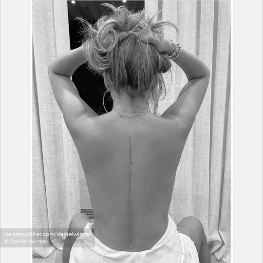
Tattooed American Female Celebrities | By Daniel Winter, done in Los Angeles. http://ttoo.co/p/296979
#spine tattoos#celebrity tattoos#tattooed models#tattooed female celebrities#tattooed american celebrities#chrissy teigen tattoos#tattooed american female celebrities#tattoo lettering#font tattoo#handwritten font tattoos#big tattoos#danielwinter#celebrity tattoo#tattoos#tattoo#ifttt
3 notes
·
View notes
Photo
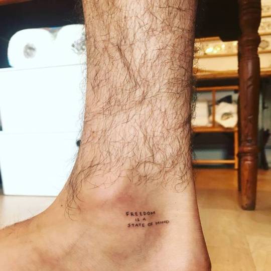
By Naraishikawa, done at Die-Monde Tattoo, Wadebridge. http://ttoo.co/p/29841
#ankle tattoo#hand poked tattoos#font tattoo#handwritten font tattoos#tattoo quotes#english tattoo quotes#freedom is a state of mind tattoo#languages#english tattoos#micro tattoos#naraishikawa#tattoo art#art#tattoos#tattoo#ifttt
14 notes
·
View notes
Last Seen Blogs

loudpagespost
Untitled

sithvvitch
trevor fucking belmont
oflex
ʟɪᴛᴛʟᴇ ᴛʀᴏᴜʙʟᴇ

ersinf
Untitled

questnex
Questnex Technologies