#don't tell any 1960s tv critics!!
Text
Comic books that you should read!!! Yes you!!! Right now!!!

These are comics I really enjoy! I'm trying to stick to slightly more obscure comics, preferably stuff that's a little newer, but that's by no means a rule! This is my list baby, I make the rules!
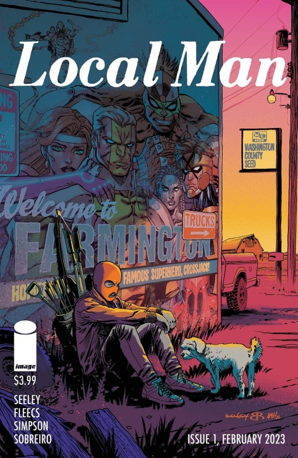
#1: Local Man (Image Comics, 2023)
Local Man follows Jack Xaver, who was once known as the superhero Crossjack before being unceremoniously kicked out of his team and legally barred from any vigilante activity. Moving back in with his parents in his destitute former hometown, Jack starts to unravel a conspiracy that has ties to both his old team and his old town.
It rules! It's funny and heartfelt and thrilling and if it were a TV show you'd never stop hearing about it. It's also one of the few modern original Image series that actually takes place in the "Image Universe", so it's packed with references to characters like Darkhawk. You don't need to know all these guys to enjoy the comic by any means, but it's fun for long-time fans.
Most of all, I'm a fan of the basic conceit of this comic: it looks at The Dark Age of Comic Books with the same reverent-yet-critical eye that so many other comics used on the golden and silver ages. I think that rules! A lot of this stuff deserves reappraisal!

#2: The Wrong Earth (Ahoy Comics, 2018)
The concept for this is pretty simple: what if Adam West's Batman got sent to the world of the Nolan trilogy, and Christian Bale's Batman got sent to the world of the 1966 TV show?
They hit all the dramatic and comedic beats you could imagine coming from this premise, and a few you probably couldn't think of. It's not just a one-dimensional parody, though: really sharp writing and an engaging mystery elevate what could easily be, like, a Dorkly video into something special. Which is to say: if you think this premise sounds good you'll love this comic, and if you think it sounds stupid you'll probably still like this comic.
There are some cool character designs here, but my favorite is the villain in both universes:
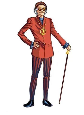
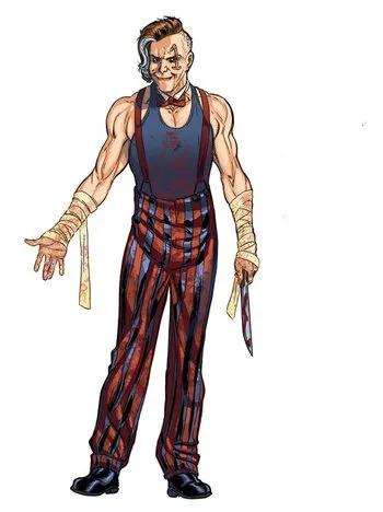
His name is Number One, and he's a crime boss with an egomania/numbers gimmick. (Sorry for the compressed jpegs)
I imagine "design an original 1960s villain, and then design his edgy 2000s reboot version" would be a difficult prompt for an artist, but Jamal Igle knocks that shit outta the park. Number One really feels like he could fit into Batman's rogues gallery, but he's not a riff on anyone in particular- he's kind of like all of them. The "1"-shaped scar is an especially great touch.

#3: Ice Cream Man (Image Comics, 2018)
(This image isn't from any cover as far as I can tell, it was posted on instagram by writer W. Maxwell Prince.)
Hey, another from Image Comics! And it's my favorite genre, too: horror anthology. If the pic I chose didn't tip you off, this one gets SPOOKAY! The basic premise is that every issue is a one-shot that features a character going through some kind of horrible misfortune. Tying all these tales of woe together is the enigmatic Ice Cream Man, who seems to be somehow torturing all these humans for his own amusement. We eventually learn that he's an evil god-type thing named Riccardus, and he has a good counterpart who's trying to stop him- all the lore stuff is a little vague, but that doesn't mean it's not interesting! The art style used by artist Martin Morazzo is almost uncanny-valley, it reminds me of The Shivering Truth.
Some of the "horror" in this comic is really personal and upsetting, by the way- the one about dementia made me cry. Actually, a lot of these made me cry. Full on snotty gasp-sobbing. 10/10. Riccardus has real sexyman potential if the freaks on this site would ever read something besides fuckin Wayne Family Adventures.

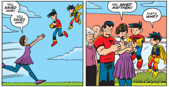
#4: Wayne Family Adventures (DC/Webtoon, 2021)
What? It's cute, fuck you. "eeuuuhhh it's out of character" you sound like a dweeb man

#5: Eight Billion Genies (Image Comics, 2021)
Just like The Wrong Earth, this has a killer elevator pitch: what if every single person on Earth got exactly one wish, all at the same time? Also like The Wrong Earth, it takes it's premise in every angle you can think of- there's wish trading, wish stealing, cities that are kept safe from the chaos of the outside world but you have to give the city government your wish to get in, you name it. No wonder Amazon bought the rights. Keep an eye out for that movie/series, I guess.
Ok, I need some non-image comics.
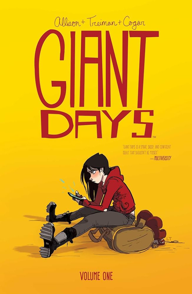
#6: Giant Days (Boom! Studios, 2015)
Anime fans, this one's for you: you know all those series you love about groups of cute girls just going through their daily lives? Well imagine if those cute girls were over eightee- hey wait where are you going come back
Giant Days is a slice-of-life story about three young women facing the challenges of college life. Apparently it's a spin-off of a webcomic with like 15 years of strips, but I don't care about all that and neither should you! It's a little like gilmore girls in terms of tone. The dialogue is snappy, all the characters play off each other in ways that's fun to see, and there's this 7 foot tall Australian rower chick who's completely obsessed with her reedy loser boyfriend. It's just comforting. It's like a big plate of mashed potatoes, this comic.
Hey, speaking of slice-of-life:

#7: Megg, Mogg and Owl (Indie/Fantagraphics, 2013ish)
This has the honor of being the only comic on this list that's been adapted to another type of media, in the form of a segment on Justin Roiland's weird kinda-shitty Hulu halloween special. Not much of an honor, I guess.
Anyways! MM&O is about a group of "friends" who live together in drug-addled squalor. Megg is a chronically depressed witch just waiting to die. Mogg, Megg's boyfriend, is a talking cat who just wants to keep the degenerate lifestyle they've built for themselves stable, and Owl is a neurotic sex addict who wants to make something of himself but doesn't want to lose his only companions, and Werewolf Jones is a drug-dealing sociopath. It's like Peep Show! I absolutely love this comic, I reread it constantly, but I'm having a hard time pitching it.
If Giant Days is a plate of mashed potatoes this is like... a gas station hot dog eaten over a storm drain or something. Still kind of comforting, just in a different way. Let's cleanse our palette with some capeshit.
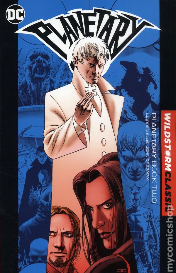
#8: Planetary (Wildstorm/DC, 1998)
Planetary rocks. We follow an amnesiac immortal named Elias Snow as he travels the globe with his top-secret Planetary Investigations team to uncover the secrets of the Wildstorm universe. Think of it like... The X-Files crossed with The Venture Brothers. X-Files in that they investigate weirdo mysteries, Venture Brothers in that every genre of speculative fiction- from Doc Savage-style pulp heroes to Kaiju to James Bond superspies- all exist, or existed, in some form.
Also on the team besides Snow are The Drummer (who has some kind of information-based power I never really understood) and Jakita Wagner, the super-strong ADHD daughter of a Tarzan expy. It's hard to do it justice in a post like this, buy a copy! Or pirate it, if you don't want to give Warren Ellis any money!
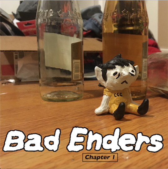
#9: Bad Enders (Indie, 2020)
Hey, this one is free! Check it out here: https://beany-tuesday.itch.io/bad-enders-pilot-issue
Bad Enders is a shonen pastiche with all the humor and charm you could expect from a @beanytuesday joint. It's great! It follows a burnt-out twentysomething who once had ambitions of becoming a demon hunter, but has since resigned himself to a life of filling out excel spreadsheets. Beanytuesday has stated there probably won't be any more Bad Enders content, but he has another comic called GUE (https://beanytuesday.tumblr.com/tagged/gue/chrono) that takes place in the same universe.

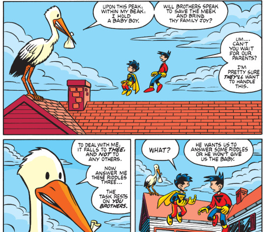
#10: G-Man (Image Comics, 2009)
i bet you thought i was done with image huh
Anyways, this was my jam back in like 3rd grade and you know what? It holds up. When they say "all-ages" they fuckin mean all ages, I'm a grown man and I can enjoy this.
The story of this entry is that I wanted to end on 10 instead of 9.
The story of this comic is that a kid named Mikey G gets his hands on a magic blanket that allows him to fly, but his brother ALSO uses the magic blanket to fly with and they become, like, rivals, but this other kid can also fly and he starts fucking with them... better than it sounds. There's also this crazy arc later in the series where they have a baby brother but- hold on, I'll show you

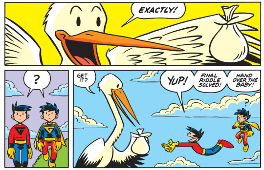
See? Nuts.
Ok, that was all of them bye
#Comics#Comic Books#Image Comics#Ahoy Comics#Local Man#The Wrong Earth#Ice Cream Man#Eight Billion Genies#Giant Days#Wayne Family Adventures#Megg Mogg and Owl#Planetary DC#Bad Enders#G-Man#(not the g-man you're thinking of sorry)#Comic recommendations
8 notes
·
View notes
Note
Can you explain to me the point of music reviews? Like that one white YouTuber guy who does them lol. I get movies and tv shows because that's more of a time investment and I think there's a more technical understanding of how a movie or TV show is ""good"", but isn't music more subjective? I don't get how people can listen to a song and not know whether or not they like it enough and they have to listen to someone else's opinion to tell them what to think. It's just a song, what do they lose from a song being "bad" besides not listening to it?
What's the point in any type of art review, really? Movie reviews, TV reviews, visual art reviews, music reviews, video game reviews, they're all kind of doing the same thing, right? They're not really telling people if they'll like a piece or not. They're looking at the technical aspects of the piece, the meaning of the piece, the larger cultural context for the piece and how it fits into that context, the aesthetics and emotions of the piece, and overall, they try to help people understand how to engage with the piece. Regardless of the medium, it's not really about whether the reviewer personally enjoys the piece or thinks that other people will enjoy it. It's more about the external cultural value of the piece. That's how you can get 13 hours worth of cultural criticism about the Nickelodeon TV show "Victorious", a show that got generally mixed reviews for its entire run. To reviewers, it doesn't matter whether people liked it or not. What matters is the show's cultural legacy and what we can learn about our culture through the lens of this piece.
Taking movies as an example, "The Godfather" is widely recognized as one of the best movies of all time. Personally, I don't care for it as a movie. But I can still accept that it's culturally valuable- that it's "a good film". It transcended and reinvented the gangster movie genre, it was both commercial and artistic at the same time, it took a cynical look at the American Dream, it used innovative shots and filmmaking techniques, it managed to be captivating for the entirety of its 3 hour long run... I don't need to like it to see the appeal or to "get" why it's important.
Similarly, with music, you don't necessarily have to like a song, album, band, or musician to be able to appreciate its cultural value. For example, a lot of people don't like The Beatles. But I think it would be hard to argue that their music has no cultural value. They made a huge impact on music, both when they were making music and in their legacy. They have the most #1 hits of any band, which showed that they could be commercially successful, but also wrote very complex and artistic songs that are valuable from a composition and technical standpoint. They made huge innovations in artistic presentation, recording techniques, and production techniques. It's hard to overstate the impact they had on culture, not just in terms of music, but also in terms of 1960s counterculture and political activism. Generally, I think music reviewers exist to help us understand the cultural value that music has more than they exist to tell us whether or not we "should" like a piece.
On a kind of separate but more practical note, music reviewers are holdovers from a pre-internet world. Before you could easily listen to an album on Spotify or find a rip of it on YouTube, you had to decide whether or not to buy an album before ever hearing it. Up until 2000, when LimeWire and Napster started allowing people to illegally download music for free (or 2008, when Spotify launched and this practice became legal), there was real money on the line. Each album cost about $33 in today's money. Music reviewers helped people to guess whether they would like an album or not so that they could make better decisions about whether it was worth it to spend their money to be able to listen to the album.
These days, I think the practical value in music reviewing is helping people narrow down the content that's available to them. There are 70 million songs on Spotify. Assuming each song is 3 minutes long, it would take you 400 years to listen to them all if that's the only thing you ever did. And of course, the music on Spotify isn't even all the music that exists; Taylor Swift, The Beatles, Coldplay, Adele, and other big artists have pulled their music from Spotify. And there are millions of other indie artists out there whose music is only on TikTok or BandCamp.
Music critics can help us to decide which out of those 70 million songs are worth paying attention to, and which we might enjoy. Sure, that's not super helpful if you're trying to decide if you like Billie Eilish's latest album or whatever, you'll just listen to it and decide. But it's really helpful if you're trying to find new artists to listen to since otherwise you would never be exposed to the musicians they're talking about. For example, right now I'm looking at NME's list of 100 Essential Emerging Artists for 2022. I never would have heard of any of these artists otherwise, but now I know that I might be interested in Anz, whose music is "kaleidoscopic dance music from a club culture polymath", and that a good song to start with is "You Could Be" (update: this song is actually a bop. Glad I looked it up). Or I might be interested in Eades, because NME suggests them for fans of the Talking Heads and they describe themselves as “David Byrne and Lou Reed’s dyslexic child playing out of a Motorola Pebl”, which sounds like a vibe I would like (update: it is).
Of course, you don't have to like music criticism or care about it. If you prefer to discover music organically and make your own assessments about whether it's good or not, that's totally fine. But I do think it has a point, both in terms of the larger culture and just practically speaking.
4 notes
·
View notes
Note
Haah, funny thing... I was just seeing another post on Tumblr calling you out (struck-thru vowels and everything) for "propagating racism" on AO3. I think it was some years old, but it did drop something interesting. Apparently, the "real" mass-exodus to AO3 happened because too many writers on LJ were getting into fights over racism-in-writing?
--
Oh, I'm sure there are many. People often make me the posterchild, which I suppose is somewhat justified now that my tumblr is so much more popular than before but was pretty dumb in the past when I was no longer working for OTW and not yet popular with randos. (TBH, I sometimes wonder if people spreading my name around pointlessly and advertising me is what made me popular. If so, congratulations, I guess?)
I've been criticized by at the very least Rukmini Pande for not talking more about Racefail. She's an academic who talks about racism in fandom but who mega sucks on the topic of Asian media and who conflates a lot of things I don't, including ye olde SF book fandom and fanfic fandom.
It's true that Racefail was a huge deal on LJ, but it was "fandom" in the 1960s sense where the word sans modifier means WorldCon type SF book spaces. When I say "fandom", I don't mean that community because, like most fanfiction fans today, I was never in it.
I don't even come from K/S fandom, actually. I come from X-Files fandom (one of the first "digital native" fandoms that made up its own rules) and (US, English-speaking) anime fandom. Those are my actual cultural forebears, and I haven't wasted my time on the racist, sexist, homophobic oldschool SF book publishing world since I was like 13. I do consume sff canons, but they're TV or movies or manga or self-published m/m novels that are also sff.
Why would I waste my time on trying to fix that community that isn't even mine?
Anyway, when people try to tell you that fandom left LJ over something to do with race, they're talking about a massive wankfest called "Racefail" or "Racefail 2009", which enveloped all of SF fandom on LJ and inevitably spilled into lots of more fanficcy spaces because we were all adjacent and overlapping. It largely consisted of clueless white liberals going "But I'm one of the good ones!!!" and being shocked and appalled that anyone could find them racist. People spent a lot of time "defending" their friends in unproductive ways. There was a lot of self-righteous stupidity on all sides, but it was the culmination of years of completely justified anger at the SF establishment being hella fucking racist. (So the two sides were most certainly not equal. A lot of the racist stuff being pointed out was indeed extremely racist.)
Racefail was deeply unpleasant, like any wank that rips through supposed ~civil communities of friends~. In reality, of course, a lot of the people who were pissed had been pissed about micro and not-so-microaggressions for years. It was something like one of those plays or movies about suburban morality where all of the simmering tensions boil up towards the end, destroying the façade of middle class propriety. It's deeply traumatic for people who did not realize the tensions existed, but it's hard to have much sympathy for their feelings if you've been the one suffering all that time.
It is not, however, the reason people moved to AO3. AO3 had already been in the works for a couple of years by the time Racefail was everywhere in 2009 and 2010, and AO3 was not popular at that point and continued to not be popular.
What popularized AO3 was FFN fucking up in 2012.
You know why LJ fic writers moved to AO3 in 2009? Because that's the first time it opened to users.
Moreover, while Racefail certainly affected many individual fans who like fanfic, it was primarily about oldschool US SFF publishing, a thing that 99% of AO3 users could not care less about. A far higher percentage of old LJ users care, of course, but even there, it's a mistake to think fandom=fandom.
"Fandom" in the supposedly-unmarked "book SF" sense and "fandom" in the also supposedly-unmarked "fanfic fandom" sense have never been the same thing. In the early days of Star Trek fic zines, they largely overlapped, sure, but by the early 90s, they had heavily diverged, and by 2009, they were completely distinct.
The reason they keep being conflated is that some of the loudest meta writers are in both and care deeply about that SF-->K/S zines-->AO3 history.
It's fine that they do, but it is not my history, and I see no reason to pretend it is.
The people who spread this lie about AO3's origins have an agenda, and it is not to educate the current tumblr masses about Racefail.
212 notes
·
View notes
Note
I saw your post on Kinsey. Are you familiar with famous lit critic Michel Foucault's more unsavory details? He was such a hardcore S&M freak that he once allowed a car to hit him because he could no longer feel pain through other means. But that's pretty mild compared to his pedophile activism, and taste for pre-teen boys. His theories are pretty famous and respected in most literary fields, sadly enough.
I can't help but laugh at the idea of Foucault being such a degenerate scrote he willingly caused a car crash to get sexual arousal LMAOOOOOO
Yeah Foucault along with Simone de Beauvoir are a few of the many French scrotes (philosophers, writer, politicians, artists) who vocally supported & pushed pedophilia. I really don't get what's the thing with France with pedophilia.....
Off the top of my head :
- Foucault was known to go to Tunisia and hook up with 17-18 y.o "ephebe" (when the legal age was 20 years old) in the late 1960s.
- French designer Yves Saint Laurent and his handler partner in crime Pierre Bergé had a villa in Marrakech (there's definitely a thing in Maghreb attracting flocks of pedophiles) where they were raping kids. One of his former toy boy released a tell all book where he said he once caught a friend of YSL/Bergé in the garden of their villa doing a fellatio to a kid.
- One of our former minister of culture (and brother of one of our former President), Frederic Mitterrand wrote a book where he bragged about having sex with male underage/children prostitute in Thailand. He never got prosecuted - just made a wishy washy backtracking but everyone knows what he said in the book was true.
- Daniel Cohn Bendit, a french-german politic (who's very active here), is infamously known for saying on a TV show in the 1980s "The sexuality of a kid, that's absolutely fantastic, let's be honest. I worked before with kids who were between 4 and 6 years old. When a 5 years old little girl starts taking your clothes off, that's fantastic, that an erotico-maniac game". He never took back this statement and even got elected as a deputy at the European Parliament.
- Gabriel Matzneff is a self-proclaimed pedophile author (who still gets published) and bragged in many of his books about raping children as young as 8 years old and entertaining kiddie porn magazines. He's an unrepentant professional pedophile AND one of the most vocal promoter of pedophilia in France AND he's roaming free in Paris right now. I am not a violent person, but I'm not sure how I could refrain myself if I meet him at the corner of a street... Dirty grandpa better run.
- In the 1970s, a left leaning very popular newspaper ("Libération") made a cover with a manifesto from a group called "The Pedophile Liberation Front" asking for the legalization of pedophilia:
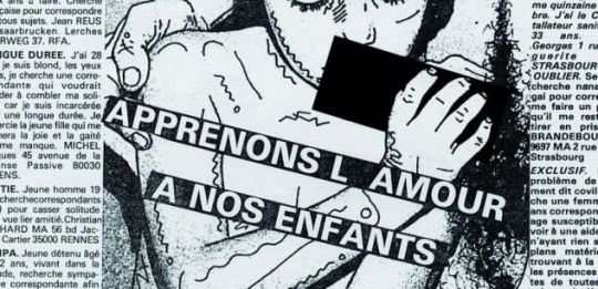
The text says "Let's teach love to our children" SMH
- In France the sexual majority is of 15 years old but it's not officially written in the law. Actually, the only law that got adopted is about the age of consent which got fixed at 13 years old. So technically, me, or an adult from any age, could LEGALLY have sex with a 13 years old kid without being prosecuted :D Vive la France!
*sigh* France is super weird... every other day a pedo is being exposed whether it's an actor, a politician, a TV anchor, etc (lately the director of a famous political school director got busted for raping is adopter son FOR YEARS. And you know what? he didn't get prosecuted because the abuse happened too far back. In France, we have thing called "prescription" that makes that when an offense was made too long ago, charges cannot be pressed lmao). This country breeds pedophile like any other place, and we ALSO have to import them (Polanski) I-
Tumblr hates on France for the most stupid (and often inaccurate) shit but I agree that when it comes to sexual abuse and pedophilia, we totally deserve it tbh lol Just don't conflate the degenerate scroted elites with the regular people (like me) who did nothing to bear with them and actually actively fight against pedophilia and child sexualization/abuse (one good victory was the banning of children beauty contest for example)
26 notes
·
View notes
Text
Even in the Dark: How Packaging Persuades You to Buy
This week we will explore how product packaging affects what we buy.
If you go back to the sixth grade biology class, you will have some knowledge of birds and bees.
You may remember that they need to be pollinated in order for the flowers to breed.
The work was given to a variety of creatures, such as birds and bees.
This is a reciprocal relationship.
The brightly colored flowers attract the bees, which stick the pollen to the lower leg, then fly to the next flower and put the pollen down.
The flowers will give the bees sweetness, which is their annoyance.
This is a good deal.
But some orchids have shortcomings.
They have no nectar.
Therefore, orchids must use different techniques to attract pollinators.
Some orchids give off nectar-like scents.
Produce plants that attract bees to visit.
Some orchids emit mating scents like female insects, attracting affectionate males.
Some orchids have parts similar to the body of female insects, with body hair and tentacles, attracting male insects by score.
The flowers give off a scent telling the bees whether other insects have collected nectar.
As a result, some orchids can emit a variety of scents, so they can attract a variety of bees.
In order for the pollen to even attach to the bee\'s knee, the Bee must land in the correct position of the flower.
Nectar attracts them to the right place.
But there are many orchids, no nectar.
So they use the upper and lower petals as guides, just like a helicopter landing pad-forcing the bees to land in a very specific place and bump into the pollen.
In an orchid, when the bee touches it, the flower closes and the insect has only one way out-directly through the pollen.
Nature offers excellent packaging for orchids, able to overcome a wide variety of problems and problems, enabling orchids to compete with thousands of other flowers and still be able to attract rewards --seeking bees.
The world of marketing has its own orchids.
In the field where thousands of product competition is noticed, brands need multiple pollinators, rewards-
There are a lot of options for seeking customers, and marketers have to use clever packaging to overcome shortcomings and attract attention.
Some attract with shape, some promise attract with sex, some attract with convenience, some seduce you with unique beauty.
But at the end of the day, they all want the same thing.
Create a lot of sensational effects . . . . . . The practice of using packaging design to influence what you buy has been around for a long time.
During the Industrial uprising , as the population began to move from farm to city, people stopped themselves
Enough, so the product suddenly has to be transported long distances.
Steam trains transport most of the consumer goods across the country.
With the development of railway transportation, the demand for product packaging also follows.
The goods can no longer be shipped in unopened barrels and baskets.
In 1896, uneda biscuit company invested more than $1 million to design a package to wrap the cookies on protective wax paper inside the carton.
Outside is a colorful illustration of a boy wearing a bright yellow raincoat.
The raincoat is a very special choice because it emphasizes the unique moisture-proof ability of uneda.
This is the first time that the packaging has a dual use-it allows the company to keep the product fresh from a long distance, and the colorful raincoat packaging gives uneda a unique brand.
Is the birth of consumer packaging.
Around the same time, on 1886, Coca-Cola began to serve as a soda fountain drink.
You can walk into a pharmacy and sit at the counter and a soda jerk will pull the long fountain handle and fill your glass with cold Coke.
But Coca-Cola will not be a huge world.
If it is not a specific innovation, it is today\'s famous brand. The bottle.
Once Coke can be transported and sold outside the soda fountain, sales will surge.
Coca-Cola\'s 1915 success has attracted many competitors.
As a result, the board decided that it needed to further differentiate its brand and invited eight glass companies to submit the design of a unique Coke bottle.
I like the briefings Coca-Cola has given to these companies.
It simply says: we want such a unique design that it can be identified by feeling in the dark or lying on the ground broken.
That says everything.
The final winner is the Root Glass Company in Terre Haute, Indiana.
The company decided to design based on two main ingredients of Coca-Cola.
Coke and Coke.
But they can\'t find any pictures when they go to the library to look for pictures.
But they did find a picture of the gourd.
The cocoa pods were created in Encyclopedia Britannica-and inspired by that.
For the next 24 hours, employee Earl Dean outlined a design-gently bent, flat at the bottom and slender at the top.
This is the classic Coke bottle we know today.
The first prototype proved to be unstable on the conveyor belt, so the belly of the bottle was slightly reduced.
The design was warmly adopted by Coca-Cola.
Big Coke Company
As a thank you, Earl Dean was offered a $500 bonus option or found a lifetime job at the Root Glass Company.
He chose the latter.
Coke bottles have sold more than 1928 of soda fountains.
This unique shape is often referred to as the \"Mersey bottle\"-which refers to the famous curve of the actress. Handy six-
The packaging was launched in the \"20 S\"-designed to convince shoppers to take more Coke home. 1949, 30-
Three years after Coke was launched, 99% of North Americans can identify it by the outline of the Coke bottle.
When the TV entered the living room in 1950, the audience saw the first TV advertisement to broadcast the Coke bottle: in the same year, the Coke bottle became the first commercial product on the cover of Time magazine.
Then, on 1960, a curved Coke bottle containing the word Coca
Coca-Cola was registered as a trademark and became the second packaging in history to receive such protection.
The uniqueness of the Coke bottle will continue to be its most powerful brand, and although it is difficult to buy the Coke bottle again, its silhouette remains an important part of the Coke bottle advertisement.
2015 marks 100 anniversary of design. Coca-
Coca-Cola will launch a big event this year to celebrate its iconic bottle, which includes a bottle of 8-
The monthly Coke bottle exhibition at the Atlanta museum of higher art.
Recently, Coca-Cola has been rated as the most valuable brand in the world.
In marketing, it is very important to shape the image.
The tempting curved shape of the Coke bottle has a lot to do with convincing you to buy a soft drink, overwhelming the fact that this is not the healthiest option you can make.
In fact, studies have shown that the design we like to bend is hard wired.
The Journal Fast Company cites research from the University of Toronto to put people into brain imaging machines and then show images of curved and linear products.
The results suggest that men and women prefer curved items, and that parts of the brain that are highly correlated with \"emotion\" trigger activity.
\"In another Harvard brain imaging study, sharp objects such as Square watches and sharp sofas were seen.
These images trigger activity in another part of the brain-the part that handles fear.
Sharp objects have long been a sign of physical danger, so our brains begin to associate sharp lines with threats.
While there are obvious exceptions to each rule, this helps a lot to explain the general appeal of Coke bottles.
The curved design uses our brains to pull our hearts.
It\'s not just the curve that affects your shopping decisions.
Function is very important.
How easy it is to open a package, how easy it is to exit every time, how easy it is to store, and how easy it is to handle everything that affects your purchase.
One of the most important factors is portability.
In other words, how easy a product is to grasp has a huge impact on your purchase.
In Issue 2008, New York magazine noted that Coca-Cola changed its 2-
To make it easier to hold and dump, one bottle per liter.
This change led to a substantial increase in sales-more than 2-
Experienced Pepsi bottle per liter.
When a product is easier to buy than other products-when all other products are equal-you will buy this product more often.
This means that your purchase decision can be influenced by seemingly insignificant things like the shape of the package.
A factor you may not even know.
Manufacturers of diapers understand this concept.
They provide a big economy.
The size of the diaper is packed, but it also provides small ones.
Now-Why would parents choose smaller packages when larger packages clearly offer better value?
The answer is that many parents in the grocery store have a child on one arm.
Smaller paper urine bags are easier to carry with their free hands.
Most liquid detergents have handles.
The same is true of large bottles of milk and juice.
The handle is not only to make pouring easier, but also to make shopping easier.
Packaging design can have a huge impact when you\'re shopping at grocery stores.
Today, a typical grocery store has about 45,000 items, and customers buy an average of 50 items in 50 minutes.
At this rate, the decision is made in nanoseconds.
It\'s interesting because most shoppers-64% of them-say they will buy from the shelves because of the packaging of the product-don\'t know in advance.
My wife mentioned that she bought her hands.
The soap dispensers in our bathroom are completely based on the packaging design-she just wanted them to look good.
This is why packaging is critical when buying on impulse.
The best design injects functionality into emotions.
Show the product well and create a little desire.
But this is not all that has to be done.
A good package must contain the product in an efficient way
Both liquid and solid.
It must protect the product from damage during transportation.
It must protect the product from pollution, moisture, insects and temperature fluctuations.
It must communicate ingredients, cooking instructions, origin, size, weight, quantity, warning, company information and bar code.
Packaging must be sustainable.
In 7 seconds or less, this package lightens any fear of it-especially if you \'ve never tried it before.
Color psychology must be applied.
Packaging must meet the needs of shoppers from purchase to processing.
It has to be packaged with a unique brand.
The best packaging encourages you to touch it.
Because once in contact, the possibility of buying will soar.
90% of consumers
Use boxes and bags after purchase, so it takes a long time for good packaging.
According to the Harvard Business Review, less than 3% of new products can produce enough first
Sales for a year to survive.
This is why packaging design is an art.
Many product designs have stood the test of time.
Put . . . . . . Triangle chocolate bar.
Its unique triangle has a history of more than 100 years. (
Prove that some sharp objects do work! )
As you can imagine, it\'s not easy to stand out from the crowded chocolate market.
Founded in Bern, Switzerland, in 1909, Theodor Tobler filed a patent for the formula and triangle.
For a long time, it has been thought that he was shaped from the Swiss Alps, just like Matt Horn, pictured on the package.
But it\'s more sexy.
Tobler is inspired by Paris\'s Folies Bergere, where charming female dancers always end their performances by forming a human pyramid. Who knew?
The unique style also has the same unique marketing strategy.
Toblerone is mainly sold at the airport.
It\'s said to be the third.
Best-selling products on duty
Free shops after alcohol and tobacco account for more than 40% of Swiss chocolate exports.
The success of Toblerone can largely be attributed to an overwhelming design concept-which can be identified even in the dark.
The product design can also change a category completely.
When Tide launched Tide Pods in 2012, it took an amazing 68% of the market in less than a year.
This is a major innovation.
The small and round Tide Pod means that there is no measurement, no pouring, the container is easy to carry, and it provides great convenience for throwing the pod into the washing machine.
The time for the renovation of laundry is ripe.
That\'s why P & G launched Tide Pods, which has a marketing budget of $0. 15 billion.
This is one of the few categories with a penetration rate of 100%.
Everyone has to wash clothes.
Great success in new product design.
Until the unique shape of the product becomes a problem.
According to a report by CBS, in the first year alone, more than 17,000 children under the age of 6 took in tidal pods or squeezed liquid into their eyes.
There is a child every hour.
The problem is the new packaging.
Small, round, colorful pods are like candy or teething toys.
P & G had to make major changes in design.
First of all, they make the tide pool opaque, so the kids are tempted to not see the pods.
They have three bathtubs.
Lock the covers to make them more difficult to open.
Tide later launched a new commercial: this is a very unusual commercial advertisement because it does not sell innovative products, but warns parents of the harm of innovative products.
The launch of the tide became a warning.
Sometimes, product design has unexpected consequences.
There are many reasons to update existing product designs.
Sometimes, the composition of the product changes.
Some products need cosmetic surgery.
At other times, the product needs to change the negative perception.
Manufacturers of tropical orange juice are facing the latter.
Although Tropicana is a 800-pound gorilla with a market share of 33% and more than 8 feet of frozen space in grocery stores, research shows that orange juice is thought to contain sugar-added ingredients.
But according to Tropicana, it is 100% pure orange juice with no sugar added.
In order to strengthen the existing interests, the company decided to update the packaging.
For decades, Tropicana\'s carton and kettle have been designed in a simple way.
So the company hired a top design company to develop a new look: The new design was awarded 20 different trademarks and developed 30 in 5 months.
When the new Tropicana was put into the market, it immediately responded.
Between January 1 and February 22, sales fell by 20%.
The decline is a bit shocking for a category leader.
So in February 23, Tropicana made a big decision-it re-used the old packaging.
Tropicana not only lost 20% of sales, but also spent $35 million on design changes and advertising.
There is another urgent reason.
Competitors like Minute Maid have already doubled. digit gains.
Tropicana did a about-
Faced so quickly, it had to act quickly to recover its customers. It was a case-
Research what is wrong with product design.
When the brand makes a huge change in the familiar packaging, it usually also makes the shopper feel that there is also a huge change in what is inside.
This creates a problem of trust.
But Tropicana did not change its juice.
In fact, the reason for the redesign is to reassure customers that Tropicana has not changed at all-it is still sugar --
100% pure orange juice free of charge.
Also interesting is the enthusiastic connection of the customer with the old \"straw\"in-the-
The \"orange\" graphic is not shown in the study.
This powerful visual effect has made such a big contribution to Tropicana\'s income, but internally, it is thought to be outdated and consumable.
When all this has been said and done again, many critics compare the tropical packaging disaster to the New Coke.
A huge change, then a massive retreat.
This is a proper analogy.
Because Tropicana is ours. by Pepsi.
Like orchids, brands have to overcome many shortcomings.
This could be a grocery store with a bad shelf location, possibly a price war, maybe a competitor with a deeper pocket, or maybe a new brand that follows.
But excellent packaging design is a silent salesperson.
This is the lesson Tropicana learned on the difficult road.
Simple and undervalued strawin-the-
Orange graphics are a huge emotional attraction for shoppers.
The Pyramid shape of Pyramid lerone makes it stand out in a crowded market, working hard at work
40% of the Swiss chocolate exports are free shops.
This silent marketing technique also highlights the subtle way that design speaks to us on a subconscious level.
How easy it is to grab a product to influence your decision to buy it.
You may think it\'s the price and the taste, but the decisive vote may be the fact that it has the handle.
There are also famous Coke bottles.
Curves, iconic, are designed to pass the final Test.
This may be the key to all excellent packaging designs.
It is even sold in the dark when you are affected.
0 notes
Text
even in the dark: how packaging persuades you to buy
This week we will explore how product packaging affects what we buy.
If you go back to the sixth grade biology class, you will have some knowledge of birds and bees.
You may remember that they need to be pollinated in order for the flowers to breed.
The work was given to a variety of creatures, such as birds and bees.
This is a reciprocal relationship.
The brightly colored flowers attract the bees, which stick the pollen to the lower leg, then fly to the next flower and put the pollen down.
The flowers will give the bees sweetness, which is their annoyance.
This is a good deal.
But some orchids have shortcomings.
They have no nectar.
Therefore, orchids must use different techniques to attract pollinators.
Some orchids give off nectar-like scents.
Produce plants that attract bees to visit.
Some orchids emit mating scents like female insects, attracting affectionate males.
Some orchids have parts similar to the body of female insects, with body hair and tentacles, attracting male insects by score.
The flowers give off a scent telling the bees whether other insects have collected nectar.
As a result, some orchids can emit a variety of scents, so they can attract a variety of bees.
In order for the pollen to even attach to the bee\'s knee, the Bee must land in the correct position of the flower.
Nectar attracts them to the right place.
But there are many orchids, no nectar.
So they use the upper and lower petals as guides, just like a helicopter landing pad-forcing the bees to land in a very specific place and bump into the pollen.
In an orchid, when the bee touches it, the flower closes and the insect has only one way out-directly through the pollen.
Nature offers excellent packaging for orchids, able to overcome a wide variety of problems and problems, enabling orchids to compete with thousands of other flowers and still be able to attract rewards --seeking bees.
The world of marketing has its own orchids.
In the field where thousands of product competition is noticed, brands need multiple pollinators, rewards-
There are a lot of options for seeking customers, and marketers have to use clever packaging to overcome shortcomings and attract attention.
Some attract with shape, some promise attract with sex, some attract with convenience, some seduce you with unique beauty.
But at the end of the day, they all want the same thing.
Create a lot of sensational effects . . . . . . The practice of using packaging design to influence what you buy has been around for a long time.
During the Industrial, as the population began to move from farm to city, people stopped themselves
Enough, so the product suddenly has to be transported long distances.
Steam trains transport most of the consumer goods across the country.
With the development of railway transportation, the demand for product packaging also follows.
The goods can no longer be shipped in unopened barrels and baskets.
In 1896, uneda biscuit company invested more than $1 million to design a package to wrap the cookies on protective wax paper inside the carton.
Outside is a colorful illustration of a boy wearing a bright yellow raincoat.
The raincoat is a very special choice because it emphasizes the unique moisture-proof ability of uneda.
This is the first time that the packaging has a dual use-it allows the company to keep the product fresh from a long distance, and the colorful raincoat packaging gives uneda a unique brand.
Is the birth of consumer packaging.
Around the same time, on 1886, Coca-Cola began to serve as a soda fountain drink.
You can walk into a pharmacy and sit at the counter and a soda jerk will pull the long fountain handle and fill your glass with cold Coke.
But Coca-Cola will not be a huge world.
If it is not a specific innovation, it is today\'s famous brand. The bottle.
Once Coke can be transported and sold outside the soda fountain, sales will surge.
Coca-Cola\'s 1915 success has attracted many competitors.
As a result, the board decided that it needed to further differentiate its brand and invited eight glass companies to submit the design of a unique Coke bottle.
I like the briefings Coca-Cola has given to these companies.
It simply says: we want such a unique design that it can be identified by feeling in the dark or lying on the ground broken.
That says everything.
The final winner is the Root Glass Company in Terre Haute, Indiana.
The company decided to design based on two main ingredients of Coca-Cola.
Coke and Coke.
But they can\'t find any pictures when they go to the library to look for pictures.
But they did find a picture of the gourd.
The cocoa pods were created in Encyclopedia Britannica-and inspired by that.
For the next 24 hours, employee Earl Dean outlined a design-gently bent, flat at the bottom and slender at the top.
This is the classic Coke bottle we know today.
The first prototype proved to be unstable on the conveyor belt, so the belly of the bottle was slightly reduced.
The design was warmly adopted by Coca-Cola.
Big Coke Company
As a thank you, Earl Dean was offered a $500 bonus option or found a lifetime job at the Root Glass Company.
He chose the latter.
Coke bottles have sold more than 1928 of soda fountains.
This unique shape is often referred to as the \"Mersey bottle\"-which refers to the famous curve of the actress. Handy six-
The packaging was launched in the \"20 S\"-designed to convince shoppers to take more Coke home. 1949, 30-
Three years after Coke was launched, 99% of North Americans can identify it by the outline of the Coke bottle.
When the TV entered the living room in 1950, the audience saw the first TV advertisement to broadcast the Coke bottle: in the same year, the Coke bottle became the first commercial product on the cover of Time magazine.
Then, on 1960, a curved Coke bottle containing the word Coca
Coca-Cola was registered as a trademark and became the second packaging in history to receive such protection.
The uniqueness of the Coke bottle will continue to be its most powerful brand, and although it is difficult to buy the Coke bottle again, its silhouette remains an important part of the Coke bottle advertisement.
2015 marks 100 anniversary of design. Coca-
Coca-Cola will launch a big event this year to celebrate its iconic bottle, which includes a bottle of 8-
The monthly Coke bottle exhibition at the Atlanta museum of higher art.
Recently, Coca-Cola has been rated as the most valuable brand in the world.
In marketing, it is very important to shape the image.
The tempting curved shape of the Coke bottle has a lot to do with convincing you to buy a soft drink, overwhelming the fact that this is not the healthiest option you can make.
In fact, studies have shown that the design we like to bend is hard wired.
The Journal Fast Company cites research from the University of Toronto to put people into brain imaging machines and then show images of curved and linear products.
The results suggest that men and women prefer curved items, and that parts of the brain that are highly correlated with \"emotion\" trigger activity.
\"In another Harvard brain imaging study, sharp objects such as Square watches and sharp sofas were seen.
These images trigger activity in another part of the brain-the part that handles fear.
Sharp objects have long been a sign of physical danger, so our brains begin to associate sharp lines with threats.
While there are obvious exceptions to each rule, this helps a lot to explain the general appeal of Coke bottles.
The curved design uses our brains to pull our hearts.
It\'s not just the curve that affects your shopping decisions.
Function is very important.
How easy it is to open a package, how easy it is to exit every time, how easy it is to store, and how easy it is to handle everything that affects your purchase.
One of the most important factors is portability.
In other words, how easy a product is to grasp has a huge impact on your purchase.
In Issue 2008, New York magazine noted that Coca-Cola changed its 2-
To make it easier to hold and dump, one bottle per liter.
This change led to a substantial increase in sales-more than 2-
Experienced Pepsi bottle per liter.
When a product is easier to buy than other products-when all other products are equal-you will buy this product more often.
This means that your purchase decision can be influenced by seemingly insignificant things like the shape of the package.
A factor you may not even know.
Manufacturers of diapers understand this concept.
They provide a big economy.
The size of the diaper is packed, but it also provides small ones.
Now-Why would parents choose smaller packages when larger packages clearly offer better value?
The answer is that many parents in the grocery store have a child on one arm.
Smaller paper urine bags are easier to carry with their free hands.
Most liquid detergents have handles.
The same is true of large bottles of milk and juice.
The handle is not only to make pouring easier, but also to make shopping easier.
Packaging design can have a huge impact when you\'re shopping at grocery stores.
Today, a typical grocery store has about 45,000 items, and customers buy an average of 50 items in 50 minutes.
At this rate, the decision is made in nanoseconds.
It\'s interesting because most shoppers-64% of them-say they will buy from the shelves because of the packaging of the product-don\'t know in advance.
My wife mentioned that she bought her hands.
The soap dispensers in our bathroom are completely based on the packaging design-she just wanted them to look good.
This is why packaging is critical when buying on impulse.
The best design injects functionality into emotions.
Show the product well and create a little desire.
But this is not all that has to be done.
A good package must contain the product in an efficient way
Both liquid and solid.
It must protect the product from damage during transportation.
It must protect the product from pollution, moisture, insects and temperature fluctuations.
It must communicate ingredients, cooking instructions, origin, size, weight, quantity, warning, company information and bar code.
Packaging must be sustainable.
In 7 seconds or less, this package lightens any fear of it-especially if you \'ve never tried it before.
Color psychology must be applied.
Packaging must meet the needs of shoppers from purchase to processing.
It has to be packaged with a unique brand.
The best packaging encourages you to touch it.
Because once in contact, the possibility of buying will soar.
90% of consumers
Use boxes and bags after purchase, so it takes a long time for good packaging.
According to the Harvard Business Review, less than 3% of new products can produce enough first
Sales for a year to survive.
This is why packaging design is an art.
Many product designs have stood the test of time.
Put . . . . . . Triangle chocolate bar.
Its unique triangle has a history of more than 100 years. (
Prove that some sharp objects do work! )
As you can imagine, it\'s not easy to stand out from the crowded chocolate market.
Founded in Bern, Switzerland, in 1909, Theodor Tobler filed a patent for the formula and triangle.
For a long time, it has been thought that he was shaped from the Swiss Alps, just like Matt Horn, pictured on the package.
But it\'s more sexy.
Tobler is inspired by Paris\'s Folies Bergere, where charming female dancers always end their performances by forming a human pyramid. Who knew?
The unique style also has the same unique marketing strategy.
Toblerone is mainly sold at the airport.
It\'s said to be the third.
Best-selling products on duty
Free shops after alcohol and tobacco account for more than 40% of Swiss chocolate exports.
The success of Toblerone can largely be attributed to an overwhelming design concept-which can be identified even in the dark.
The product design can also change a category completely.
When Tide launched Tide Pods in 2012, it took an amazing 68% of the market in less than a year.
This is a major innovation.
The small and round Tide Pod means that there is no measurement, no pouring, the container is easy to carry, and it provides great convenience for throwing the pod into the washing machine.
The time for the renovation of laundry is ripe.
That\'s why P & G launched Tide Pods, which has a marketing budget of $0. 15 billion.
This is one of the few categories with a penetration rate of 100%.
Everyone has to wash clothes.
Great success in new product design.
Until the unique shape of the product becomes a problem.
According to a report by CBS, in the first year alone, more than 17,000 children under the age of 6 took in tidal pods or squeezed liquid into their eyes.
There is a child every hour.
The problem is the new packaging.
Small, round, colorful pods are like candy or teething toys.
P & G had to make major changes in design.
First of all, they make the tide pool opaque, so the kids are tempted to not see the pods.
They have three bathtubs.
Lock the covers to make them more difficult to open.
Tide later launched a new commercial: this is a very unusual commercial advertisement because it does not sell innovative products, but warns parents of the harm of innovative products.
The launch of the tide became a warning.
Sometimes, product design has unexpected consequences.
There are many reasons to update existing product designs.
Sometimes, the composition of the product changes.
Some products need cosmetic surgery.
At other times, the product needs to change the negative perception.
Manufacturers of tropical orange juice are facing the latter.
Although Tropicana is a 800-pound gorilla with a market share of 33% and more than 8 feet of frozen space in grocery stores, research shows that orange juice is thought to contain sugar-added ingredients.
But according to Tropicana, it is 100% pure orange juice with no sugar added.
In order to strengthen the existing interests, the company decided to update the packaging.
For decades, Tropicana\'s carton and kettle have been designed in a simple way.
So the company hired a top design company to develop a new look: The new design was awarded 20 different trademarks and developed 30 in 5 months.
When the new Tropicana was put into the market, it immediately responded.
Between January 1 and February 22, sales fell by 20%.
The decline is a bit shocking for a category leader.
So in February 23, Tropicana made a big decision-it re-used the old packaging.
Tropicana not only lost 20% of sales, but also spent $35 million on design changes and advertising.
There is another urgent reason.
Competitors like Minute Maid have already doubled. digit gains.
Tropicana did a about-
Faced so quickly, it had to act quickly to recover its customers. It was a case-
Research what is wrong with product design.
When the brand makes a huge change in the familiar packaging, it usually also makes the shopper feel that there is also a huge change in what is inside.
This creates a problem of trust.
But Tropicana did not change its juice.
In fact, the reason for the redesign is to reassure customers that Tropicana has not changed at all-it is still sugar --
100% pure orange juice free of charge.
Also interesting is the enthusiastic connection of the customer with the old \"straw\"in-the-
The \"orange\" graphic is not shown in the study.
This powerful visual effect has made such a big contribution to Tropicana\'s income, but internally, it is thought to be outdated and consumable.
When all this has been said and done again, many critics compare the tropical packaging disaster to the New Coke.
A huge change, then a massive retreat.
This is a proper analogy.
Because Tropicana is ours. by Pepsi.
Like orchids, brands have to overcome many shortcomings.
This could be a grocery store with a bad shelf location, possibly a price war, maybe a competitor with a deeper pocket, or maybe a new brand that follows.
But excellent packaging design is a silent salesperson.
This is the lesson Tropicana learned on the difficult road.
Simple and undervalued strawin-the-
Orange graphics are a huge emotional attraction for shoppers.
The Pyramid shape of Pyramid lerone makes it stand out in a crowded market, working hard at work
40% of the Swiss chocolate exports are free shops.
This silent marketing technique also highlights the subtle way that design speaks to us on a subconscious level.
How easy it is to grab a product to influence your decision to buy it.
You may think it\'s the price and the taste, but the decisive vote may be the fact that it has the handle.
There are also famous Coke bottles.
Curves, iconic, are designed to pass the final Test.
This may be the key to all excellent packaging designs.
It is even sold in the dark when you are affected.
0 notes
Text
even in the dark: how packaging persuades you to buy
This week we will explore how product packaging affects what we buy.
If you go back to the sixth grade biology class, you will have some knowledge of birds and bees.
You may remember that they need to be pollinated in order for the flowers to breed.
The work was given to a variety of creatures, such as birds and bees.
This is a reciprocal relationship.
The brightly colored flowers attract the bees, which stick the pollen to the lower leg, then fly to the next flower and put the pollen down.
The flowers will give the bees sweetness, which is their annoyance.
This is a good deal.
But some orchids have shortcomings.
They have no nectar.
Therefore, orchids must use different techniques to attract pollinators.
Some orchids give off nectar-like scents.
Produce plants that attract bees to visit.
Some orchids emit mating scents like female insects, attracting affectionate males.
Some orchids have parts similar to the body of female insects, with body hair and tentacles, attracting male insects by score.
The flowers give off a scent telling the bees whether other insects have collected nectar.
As a result, some orchids can emit a variety of scents, so they can attract a variety of bees.
In order for the pollen to even attach to the bee\'s knee, the Bee must land in the correct position of the flower.
Nectar attracts them to the right place.
But there are many orchids, no nectar.
So they use the upper and lower petals as guides, just like a helicopter landing pad-forcing the bees to land in a very specific place and bump into the pollen.
In an orchid, when the bee touches it, the flower closes and the insect has only one way out-directly through the pollen.
Nature offers excellent packaging for orchids, able to overcome a wide variety of problems and problems, enabling orchids to compete with thousands of other flowers and still be able to attract rewards --seeking bees.
The world of marketing has its own orchids.
In the field where thousands of product competition is noticed, brands need multiple pollinators, rewards-
There are a lot of options for seeking customers, and marketers have to use clever packaging to overcome shortcomings and attract attention.
Some attract with shape, some promise attract with sex, some attract with convenience, some seduce you with unique beauty.
But at the end of the day, they all want the same thing.
Create a lot of sensational effects . . . . . . The practice of using packaging design to influence what you buy has been around for a long time.
During the Industrial , as the population began to move from farm to city, people stopped themselves
Enough, so the product suddenly has to be transported long distances.
Steam trains transport most of the consumer goods across the country.
With the development of railway transportation, the demand for product packaging also follows.
The goods can no longer be shipped in unopened barrels and baskets.
In 1896, uneda biscuit company invested more than $1 million to design a package to wrap the cookies on protective wax paper inside the carton.
Outside is a colorful illustration of a boy wearing a bright yellow raincoat.
The raincoat is a very special choice because it emphasizes the unique moisture-proof ability of uneda.
This is the first time that the packaging has a dual use-it allows the company to keep the product fresh from a long distance, and the colorful raincoat packaging gives uneda a unique brand.
Is the birth of consumer packaging.
Around the same time, on 1886, Coca-Cola began to serve as a soda fountain drink.
You can walk into a pharmacy and sit at the counter and a soda jerk will pull the long fountain handle and fill your glass with cold Coke.
But Coca-Cola will not be a huge world.
If it is not a specific innovation, it is today\'s famous brand. The bottle.
Once Coke can be transported and sold outside the soda fountain, sales will surge.
Coca-Cola\'s 1915 success has attracted many competitors.
As a result, the board decided that it needed to further differentiate its brand and invited eight glass companies to submit the design of a unique Coke bottle.
I like the briefings Coca-Cola has given to these companies.
It simply says: we want such a unique design that it can be identified by feeling in the dark or lying on the ground broken.
That says everything.
The final winner is the Root Glass Company in Terre Haute, Indiana.
The company decided to design based on two main ingredients of Coca-Cola.
Coke and Coke.
But they can\'t find any pictures when they go to the library to look for pictures.
But they did find a picture of the gourd.
The cocoa pods were created in Encyclopedia Britannica-and inspired by that.
For the next 24 hours, employee Earl Dean outlined a design-gently bent, flat at the bottom and slender at the top.
This is the classic Coke bottle we know today.
The first prototype proved to be unstable on the conveyor belt, so the belly of the bottle was slightly reduced.
The design was warmly adopted by Coca-Cola.
Big Coke Company
As a thank you, Earl Dean was offered a $500 bonus option or found a lifetime job at the Root Glass Company.
He chose the latter.
Coke bottles have sold more than 1928 of soda fountains.
This unique shape is often referred to as the \"Mersey bottle\"-which refers to the famous curve of the actress. Handy six-
The packaging was launched in the \"20 S\"-designed to convince shoppers to take more Coke home. 1949, 30-
Three years after Coke was launched, 99% of North Americans can identify it by the outline of the Coke bottle.
When the TV entered the living room in 1950, the audience saw the first TV advertisement to broadcast the Coke bottle: in the same year, the Coke bottle became the first commercial product on the cover of Time magazine.
Then, on 1960, a curved Coke bottle containing the word Coca
Coca-Cola was registered as a trademark and became the second packaging in history to receive such protection.
The uniqueness of the Coke bottle will continue to be its most powerful brand, and although it is difficult to buy the Coke bottle again, its silhouette remains an important part of the Coke bottle advertisement.
2015 marks 100 anniversary of design. Coca-
Coca-Cola will launch a big event this year to celebrate its iconic bottle, which includes a bottle of 8-
The monthly Coke bottle exhibition at the Atlanta museum of higher art.
Recently, Coca-Cola has been rated as the most valuable brand in the world.
In marketing, it is very important to shape the image.
The tempting curved shape of the Coke bottle has a lot to do with convincing you to buy a soft drink, overwhelming the fact that this is not the healthiest option you can make.
In fact, studies have shown that the design we like to bend is hard wired.
The Journal Fast Company cites research from the University of Toronto to put people into brain imaging machines and then show images of curved and linear products.
The results suggest that men and women prefer curved items, and that parts of the brain that are highly correlated with \"emotion\" trigger activity.
\"In another Harvard brain imaging study, sharp objects such as Square watches and sharp sofas were seen.
These images trigger activity in another part of the brain-the part that handles fear.
Sharp objects have long been a sign of physical danger, so our brains begin to associate sharp lines with threats.
While there are obvious exceptions to each rule, this helps a lot to explain the general appeal of Coke bottles.
The curved design uses our brains to pull our hearts.
It\'s not just the curve that affects your shopping decisions.
Function is very important.
How easy it is to open a package, how easy it is to exit every time, how easy it is to store, and how easy it is to handle everything that affects your purchase.
One of the most important factors is portability.
In other words, how easy a product is to grasp has a huge impact on your purchase.
In Issue 2008, New York magazine noted that Coca-Cola changed its 2-
To make it easier to hold and dump, one bottle per liter.
This change led to a substantial increase in sales-more than 2-
Experienced Pepsi bottle per liter.
When a product is easier to buy than other products-when all other products are equal-you will buy this product more often.
This means that your purchase decision can be influenced by seemingly insignificant things like the shape of the package.
A factor you may not even know.
Manufacturers of diapers understand this concept.
They provide a big economy.
The size of the diaper is packed, but it also provides small ones.
Now-Why would parents choose smaller packages when larger packages clearly offer better value?
The answer is that many parents in the grocery store have a child on one arm.
Smaller paper urine bags are easier to carry with their free hands.
Most liquid detergents have handles.
The same is true of large bottles of milk and juice.
The handle is not only to make pouring easier, but also to make shopping easier.
Packaging design can have a huge impact when you\'re shopping at grocery stores.
Today, a typical grocery store has about 45,000 items, and customers buy an average of 50 items in 50 minutes.
At this rate, the decision is made in nanoseconds.
It\'s interesting because most shoppers-64% of them-say they will buy from the shelves because of the packaging of the product-don\'t know in advance.
My wife mentioned that she bought her hands.
The soap dispensers in our bathroom are completely based on the packaging design-she just wanted them to look good.
This is why packaging is critical when buying on impulse.
The best design injects functionality into emotions.
Show the product well and create a little desire.
But this is not all that has to be done.
A good package must contain the product in an efficient way
Both liquid and solid.
It must protect the product from damage during transportation.
It must protect the product from pollution, moisture, insects and temperature fluctuations.
It must communicate ingredients, cooking instructions, origin, size, weight, quantity, warning, company information and bar code.
Packaging must be sustainable.
In 7 seconds or less, this package lightens any fear of it-especially if you \'ve never tried it before.
Color psychology must be applied.
Packaging must meet the needs of shoppers from purchase to processing.
It has to be packaged with a unique brand.
The best packaging encourages you to touch it.
Because once in contact, the possibility of buying will soar.
90% of consumers
Use boxes and bags after purchase, so it takes a long time for good packaging.
According to the Harvard Business Review, less than 3% of new products can produce enough first
Sales for a year to survive.
This is why packaging design is an art.
Many product designs have stood the test of time.
Put . . . . . . Triangle chocolate bar.
Its unique triangle has a history of more than 100 years. (
Prove that some sharp objects do work! )
As you can imagine, it\'s not easy to stand out from the crowded chocolate market.
Founded in Bern, Switzerland, in 1909, Theodor Tobler filed a patent for the formula and triangle.
For a long time, it has been thought that he was shaped from the Swiss Alps, just like Matt Horn, pictured on the package.
But it\'s more sexy.
Tobler is inspired by Paris\'s Folies Bergere, where charming female dancers always end their performances by forming a human pyramid. Who knew?
The unique style also has the same unique marketing strategy.
Toblerone is mainly sold at the airport.
It\'s said to be the third.
Best-selling products on duty
Free shops after alcohol and tobacco account for more than 40% of Swiss chocolate exports.
The success of Toblerone can largely be attributed to an overwhelming design concept-which can be identified even in the dark.
The product design can also change a category completely.
When Tide launched Tide Pods in 2012, it took an amazing 68% of the market in less than a year.
This is a major innovation.
The small and round Tide Pod means that there is no measurement, no pouring, the container is easy to carry, and it provides great convenience for throwing the pod into the washing machine.
The time for the renovation of laundry is ripe.
That\'s why P & G launched Tide Pods, which has a marketing budget of $0. 15 billion.
This is one of the few categories with a penetration rate of 100%.
Everyone has to wash clothes.
Great success in new product design.
Until the unique shape of the product becomes a problem.
According to a report by CBS, in the first year alone, more than 17,000 children under the age of 6 took in tidal pods or squeezed liquid into their eyes.
There is a child every hour.
The problem is the new packaging.
Small, round, colorful pods are like candy or teething toys.
P & G had to make major changes in design.
First of all, they make the tide pool opaque, so the kids are tempted to not see the pods.
They have three bathtubs.
Lock the covers to make them more difficult to open.
Tide later launched a new commercial: this is a very unusual commercial advertisement because it does not sell innovative products, but warns parents of the harm of innovative products.
The launch of the tide became a warning.
Sometimes, product design has unexpected consequences.
There are many reasons to update existing product designs.
Sometimes, the composition of the product changes.
Some products need cosmetic surgery.
At other times, the product needs to change the negative perception.
Manufacturers of tropical orange juice are facing the latter.
Although Tropicana is a 800-pound gorilla with a market share of 33% and more than 8 feet of frozen space in grocery stores, research shows that orange juice is thought to contain sugar-added ingredients.
But according to Tropicana, it is 100% pure orange juice with no sugar added.
In order to strengthen the existing interests, the company decided to update the packaging.
For decades, Tropicana\'s carton and kettle have been designed in a simple way.
So the company hired a top design company to develop a new look: The new design was awarded 20 different trademarks and developed 30 in 5 months.
When the new Tropicana was put into the market, it immediately responded.
Between January 1 and February 22, sales fell by 20%.
The decline is a bit shocking for a category leader.
So in February 23, Tropicana made a big decision-it re-used the old packaging.
Tropicana not only lost 20% of sales, but also spent $35 million on design changes and advertising.
There is another urgent reason.
Competitors like Minute Maid have already doubled. digit gains.
Tropicana did a about-
Faced so quickly, it had to act quickly to recover its customers. It was a case-
Research what is wrong with product design.
When the brand makes a huge change in the familiar packaging, it usually also makes the shopper feel that there is also a huge change in what is inside.
This creates a problem of trust.
But Tropicana did not change its juice.
In fact, the reason for the redesign is to reassure customers that Tropicana has not changed at all-it is still sugar --
100% pure orange juice free of charge.
Also interesting is the enthusiastic connection of the customer with the old \"straw\"in-the-
The \"orange\" graphic is not shown in the study.
This powerful visual effect has made such a big contribution to Tropicana\'s income, but internally, it is thought to be outdated and consumable.
When all this has been said and done again, many critics compare the tropical packaging disaster to the New Coke.
A huge change, then a massive retreat.
This is a proper analogy.
Because Tropicana is ours. by Pepsi.
Like orchids, brands have to overcome many shortcomings.
This could be a grocery store with a bad shelf location, possibly a price war, maybe a competitor with a deeper pocket, or maybe a new brand that follows.
But excellent packaging design is a silent salesperson.
This is the lesson Tropicana learned on the difficult road.
Simple and undervalued strawin-the-
Orange graphics are a huge emotional attraction for shoppers.
The Pyramid shape of Pyramid lerone makes it stand out in a crowded market, working hard at work
40% of the Swiss chocolate exports are free shops.
This silent marketing technique also highlights the subtle way that design speaks to us on a subconscious level.
How easy it is to grab a product to influence your decision to buy it.
You may think it\'s the price and the taste, but the decisive vote may be the fact that it has the handle.
There are also famous Coke bottles.
Curves, iconic, are designed to pass the final Test.
This may be the key to all excellent packaging designs.
It is even sold in the dark when you are affected.
0 notes
Text
even in the dark: how packaging persuades you to buy
This week we will explore how product packaging affects what we buy.
If you go back to the sixth grade biology class, you will have some knowledge of birds and bees.
You may remember that they need to be pollinated in order for the flowers to breed.
The work was given to a variety of creatures, such as birds and bees.
This is a reciprocal relationship.
The brightly colored flowers attract the bees, which stick the pollen to the lower leg, then fly to the next flower and put the pollen down.
The flowers will give the bees sweetness, which is their annoyance.
This is a good deal.
But some orchids have shortcomings.
They have no nectar.
Therefore, orchids must use different techniques to attract pollinators.
Some orchids give off nectar-like scents.
Produce plants that attract bees to visit.
Some orchids emit mating scents like female insects, attracting affectionate males.
Some orchids have parts similar to the body of female insects, with body hair and tentacles, attracting male insects by score.
The flowers give off a scent telling the bees whether other insects have collected nectar.
As a result, some orchids can emit a variety of scents, so they can attract a variety of bees.
In order for the pollen to even attach to the bee\'s knee, the Bee must land in the correct position of the flower.
Nectar attracts them to the right place.
But there are many orchids, no nectar.
So they use the upper and lower petals as guides, just like a helicopter landing pad-forcing the bees to land in a very specific place and bump into the pollen.
In an orchid, when the bee touches it, the flower closes and the insect has only one way out-directly through the pollen.
Nature offers excellent packaging for orchids, able to overcome a wide variety of problems and problems, enabling orchids to compete with thousands of other flowers and still be able to attract rewards --seeking bees.
The world of marketing has its own orchids.
In the field where thousands of product competition is noticed, brands need multiple pollinators, rewards-
There are a lot of options for seeking customers, and marketers have to use clever packaging to overcome shortcomings and attract attention.
Some attract with shape, some promise attract with sex, some attract with convenience, some seduce you with unique beauty.
But at the end of the day, they all want the same thing.
Create a lot of sensational effects . . . . . . The practice of using packaging design to influence what you buy has been around for a long time.
During the Industrial Trend, as the population began to move from farm to city, people stopped themselves
Enough, so the product suddenly has to be transported long distances.
Steam trains transport most of the consumer goods across the country.
With the development of railway transportation, the demand for product packaging also follows.
The goods can no longer be shipped in unopened barrels and baskets.
In 1896, uneda biscuit company invested more than $1 million to design a package to wrap the cookies on protective wax paper inside the carton.
Outside is a colorful illustration of a boy wearing a bright yellow raincoat.
The raincoat is a very special choice because it emphasizes the unique moisture-proof ability of uneda.
This is the first time that the packaging has a dual use-it allows the company to keep the product fresh from a long distance, and the colorful raincoat packaging gives uneda a unique brand.
Is the birth of consumer packaging.
Around the same time, on 1886, Coca-Cola began to serve as a soda fountain drink.
You can walk into a pharmacy and sit at the counter and a soda jerk will pull the long fountain handle and fill your glass with cold Coke.
But Coca-Cola will not be a huge world.
If it is not a specific innovation, it is today\'s famous brand. The bottle.
Once Coke can be transported and sold outside the soda fountain, sales will surge.
Coca-Cola\'s 1915 success has attracted many competitors.
As a result, the board decided that it needed to further differentiate its brand and invited eight glass companies to submit the design of a unique Coke bottle.
I like the briefings Coca-Cola has given to these companies.
It simply says: we want such a unique design that it can be identified by feeling in the dark or lying on the ground broken.
That says everything.
The final winner is the Root Glass Company in Terre Haute, Indiana.
The company decided to design based on two main ingredients of Coca-Cola.
Coke and Coke.
But they can\'t find any pictures when they go to the library to look for pictures.
But they did find a picture of the gourd.
The cocoa pods were created in Encyclopedia Britannica-and inspired by that.
For the next 24 hours, employee Earl Dean outlined a design-gently bent, flat at the bottom and slender at the top.
This is the classic Coke bottle we know today.
The first prototype proved to be unstable on the conveyor belt, so the belly of the bottle was slightly reduced.
The design was warmly adopted by Coca-Cola.
Big Coke Company
As a thank you, Earl Dean was offered a $500 bonus option or found a lifetime job at the Root Glass Company.
He chose the latter.
Coke bottles have sold more than 1928 of soda fountains.
This unique shape is often referred to as the \"Mersey bottle\"-which refers to the famous curve of the actress. Handy six-
The packaging was launched in the \"20 S\"-designed to convince shoppers to take more Coke home. 1949, 30-
Three years after Coke was launched, 99% of North Americans can identify it by the outline of the Coke bottle.
When the TV entered the living room in 1950, the audience saw the first TV advertisement to broadcast the Coke bottle: in the same year, the Coke bottle became the first commercial product on the cover of Time magazine.
Then, on 1960, a curved Coke bottle containing the word Coca
Coca-Cola was registered as a trademark and became the second packaging in history to receive such protection.
The uniqueness of the Coke bottle will continue to be its most powerful brand, and although it is difficult to buy the Coke bottle again, its silhouette remains an important part of the Coke bottle advertisement.
2015 marks 100 anniversary of design. Coca-
Coca-Cola will launch a big event this year to celebrate its iconic bottle, which includes a bottle of 8-
The monthly Coke bottle exhibition at the Atlanta museum of higher art.
Recently, Coca-Cola has been rated as the most valuable brand in the world.
In marketing, it is very important to shape the image.
The tempting curved shape of the Coke bottle has a lot to do with convincing you to buy a soft drink, overwhelming the fact that this is not the healthiest option you can make.
In fact, studies have shown that the design we like to bend is hard wired.
The Journal Fast Company cites research from the University of Toronto to put people into brain imaging machines and then show images of curved and linear products.
The results suggest that men and women prefer curved items, and that parts of the brain that are highly correlated with \"emotion\" trigger activity.
\"In another Harvard brain imaging study, sharp objects such as Square watches and sharp sofas were seen.
These images trigger activity in another part of the brain-the part that handles fear.
Sharp objects have long been a sign of physical danger, so our brains begin to associate sharp lines with threats.
While there are obvious exceptions to each rule, this helps a lot to explain the general appeal of Coke bottles.
The curved design uses our brains to pull our hearts.
It\'s not just the curve that affects your shopping decisions.
Function is very important.
How easy it is to open a package, how easy it is to exit every time, how easy it is to store, and how easy it is to handle everything that affects your purchase.
One of the most important factors is portability.
In other words, how easy a product is to grasp has a huge impact on your purchase.
In Issue 2008, New York magazine noted that Coca-Cola changed its 2-
To make it easier to hold and dump, one bottle per liter.
This change led to a substantial increase in sales-more than 2-
Experienced Pepsi bottle per liter.
When a product is easier to buy than other products-when all other products are equal-you will buy this product more often.
This means that your purchase decision can be influenced by seemingly insignificant things like the shape of the package.
A factor you may not even know.
Manufacturers of diapers understand this concept.
They provide a big economy.
The size of the diaper is packed, but it also provides small ones.
Now-Why would parents choose smaller packages when larger packages clearly offer better value?
The answer is that many parents in the grocery store have a child on one arm.
Smaller paper urine bags are easier to carry with their free hands.
Most liquid detergents have handles.
The same is true of large bottles of milk and juice.
The handle is not only to make pouring easier, but also to make shopping easier.
Packaging design can have a huge impact when you\'re shopping at grocery stores.
Today, a typical grocery store has about 45,000 items, and customers buy an average of 50 items in 50 minutes.
At this rate, the decision is made in nanoseconds.
It\'s interesting because most shoppers-64% of them-say they will buy from the shelves because of the packaging of the product-don\'t know in advance.
My wife mentioned that she bought her hands.
The soap dispensers in our bathroom are completely based on the packaging design-she just wanted them to look good.
This is why packaging is critical when buying on impulse.
The best design injects functionality into emotions.
Show the product well and create a little desire.
But this is not all that has to be done.
A good package must contain the product in an efficient way
Both liquid and solid.
It must protect the product from damage during transportation.
It must protect the product from pollution, moisture, insects and temperature fluctuations.
It must communicate ingredients, cooking instructions, origin, size, weight, quantity, warning, company information and bar code.
Packaging must be sustainable.
In 7 seconds or less, this package lightens any fear of it-especially if you \'ve never tried it before.
Color psychology must be applied.
Packaging must meet the needs of shoppers from purchase to processing.
It has to be packaged with a unique brand.
The best packaging encourages you to touch it.
Because once in contact, the possibility of buying will soar.
90% of consumers
Use boxes and bags after purchase, so it takes a long time for good packaging.
According to the Harvard Business Review, less than 3% of new products can produce enough first
Sales for a year to survive.
This is why packaging design is an art.
Many product designs have stood the test of time.
Put . . . . . . Triangle chocolate bar.
Its unique triangle has a history of more than 100 years. (
Prove that some sharp objects do work! )
As you can imagine, it\'s not easy to stand out from the crowded chocolate market.
Founded in Bern, Switzerland, in 1909, Theodor Tobler filed a patent for the formula and triangle.
For a long time, it has been thought that he was shaped from the Swiss Alps, just like Matt Horn, pictured on the package.
But it\'s more sexy.
Tobler is inspired by Paris\'s Folies Bergere, where charming female dancers always end their performances by forming a human pyramid. Who knew?
The unique style also has the same unique marketing strategy.
Toblerone is mainly sold at the airport.
It\'s said to be the third.
Best-selling products on duty
Free shops after alcohol and tobacco account for more than 40% of Swiss chocolate exports.
The success of Toblerone can largely be attributed to an overwhelming design concept-which can be identified even in the dark.
The product design can also change a category completely.
When Tide launched Tide Pods in 2012, it took an amazing 68% of the market in less than a year.
This is a major innovation.
The small and round Tide Pod means that there is no measurement, no pouring, the container is easy to carry, and it provides great convenience for throwing the pod into the washing machine.
The time for the renovation of laundry is ripe.
That\'s why P & G launched Tide Pods, which has a marketing budget of $0. 15 billion.
This is one of the few categories with a penetration rate of 100%.
Everyone has to wash clothes.
Great success in new product design.
Until the unique shape of the product becomes a problem.
According to a report by CBS, in the first year alone, more than 17,000 children under the age of 6 took in tidal pods or squeezed liquid into their eyes.
There is a child every hour.
The problem is the new packaging.
Small, round, colorful pods are like candy or teething toys.
P & G had to make major changes in design.
First of all, they make the tide pool opaque, so the kids are tempted to not see the pods.
They have three bathtubs.
Lock the covers to make them more difficult to open.
Tide later launched a new commercial: this is a very unusual commercial advertisement because it does not sell innovative products, but warns parents of the harm of innovative products.
Sometimes, some product design has unexpected consequences.
There are many reasons to update existing product designs.
Sometimes, the composition of the product changes.
Some products need cosmetic surgery.
At other times, the product needs to change the negative perception.
Manufacturers of tropical orange juice are facing the latter.
Although Tropicana is a 800-pound gorilla with a market share of 33% and more than 8 feet of frozen space in grocery stores, research shows that orange juice is thought to contain sugar-added ingredients.
But according to Tropicana, it is 100% pure orange juice with no sugar added.
In order to strengthen the existing interests, the company decided to update the packaging.
For decades, Tropicana\'s carton and kettle have been designed in a simple way.
So the company hired a top design company to develop a new look: The new design was awarded 20 different trademarks and developed 30 in 5 months.
When the new Tropicana was put into the market, it immediately responded.
Between January 1 and February 22, sales fell by 20%.
The decline is a bit shocking for a category leader.
So in February 23, Tropicana made a big decision-it re-used the old packaging.
Tropicana not only lost 20% of sales, but also spent $35 million on design changes and advertising.
There is another urgent reason.
Competitors like Minute Maid have already doubled. digit gains.
Tropicana did a about-
Faced so quickly, it had to act quickly to recover its customers. It was a case-
Research what is wrong with product design.
When the brand makes a huge change in the familiar packaging, it usually also makes the shopper feel that there is also a huge change in what is inside.
This creates a problem of trust.
But Tropicana did not change its juice.
In fact, the reason for the redesign is to reassure customers that Tropicana has not changed at all-it is still sugar --
100% pure orange juice free of charge.
Also interesting is the enthusiastic connection of the customer with the old \"straw\"in-the-
The \"orange\" graphic is not shown in the study.
This powerful visual effect has made such a big contribution to Tropicana\'s income, but internally, it is thought to be outdated and consumable.
When all this has been said and done again, many critics compare the tropical packaging disaster to the New Coke.
A huge change, then a massive retreat.
This is a proper analogy.
Because Tropicana is ours. by Pepsi.
Like orchids, brands have to overcome many shortcomings.
This could be a grocery store with a bad shelf location, possibly a price war, maybe a competitor with a deeper pocket, or maybe a new brand that follows.
But excellent packaging design is a silent salesperson.
This is the lesson Tropicana learned on the difficult road.
Simple and undervalued strawin-the-
Orange graphics are a huge emotional attraction for shoppers.
The Pyramid shape of Pyramid lerone makes it stand out in a crowded market, working hard at work
40% of the Swiss chocolate exports are free shops.
This silent marketing technique also highlights the subtle way that design speaks to us on a subconscious level.
How easy it is to grab a product to influence your decision to buy it.
You may think it\'s the price and the taste, but the decisive vote may be the fact that it has the handle.
There are also famous Coke bottles.
Curves, iconic, are designed to pass the final Test.
This may be the key to all excellent packaging designs.
It is even sold in the dark when you are affected.
0 notes
Last Seen Blogs

mrsfoone
🏳️🌈 mrs foone 🏳️🌈

twwlf
Under your spell

tbsoftbrave
Untitled

jewishjunkie
Work In Progress.

music4thebasshead
Music 4 the basshead