#but when i cropped it with the ui bars and other things in the background ir was suddenly cool with it???
Text
testing a new pen out for fun.
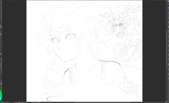
#SMOKES THE HOOPS I HAD TO JUMP TO GET THIS POSTED WAS WILD#i guess tumblr thinks my shit is flag worthy or evil because no matter what i did this picture would not upload#but when i cropped it with the ui bars and other things in the background ir was suddenly cool with it???#does tumblr think my dragon is a bad sign or something LAUGHINF#well anyways yeah just wanted to post this because i was testing a new brush#i'm so mad though because i WANT to do something for year of the dragon because i have THIS CONCEPT#which is so perfect#but ever since i came home from the birthday party i've been hit with some real bad body aches#like i'm not sick but gosh i haven't been feeling top form#so only now i doodled#I WILL ATTEMPT TO BEAT THE TENTH BUT I DOUBT IT#LOOK AT MITSRURI LOOKS AT MY HINAMITSURI ARTWORK TETO TOO SCREAMS
4 notes
·
View notes
Text
MID Review (finally)
Now that I’ve had a while to reflect on MID, I feel like I can give an honest, spoiler-free review. This turned out to be a much more in-depth review than I had planned on doing, but you can just read the italics at the end of each section if you just want the gist.
Controls: Okay, so for like the first fifteen minutes (or however long it takes you to adjust), the controls are frustrating. Once you get used to how to move (and it is still point-and-click), you’ll be fine. The only thing that I still didn’t have a solid grasp of by the end of the game was moving Nancy’s head around with the right mouse button--it might have helped to slow the mouse down for this function. That being said, the controls offer a lot to the game. The environments and navigation feel more realistic, and instead of jumping from scene to scene, Nancy slides through the space. It’s weird at first, but it’s ultimately superior. (Just for kicks, I went back and played a bit of LIE as a comparison, and the jumpy movement felt so weird after the smoothness of MID). Controls get a 8/10 for the steep learning curve and the more realistic movement.
Graphics: They’re not that bad, okay? On high render, the environments actually look really good and the characters are decent (low render is an understandably different story). Given the technical reasons behind the graphics looking as the do (full 3D render here versus painstakingly painted video files before), I don’t think that they’re really that bad. Puzzle renders and zoomed-in items/POIs really shine, appearing arguably better than previous games. It’s also important to consider what SCK/STFD look like compared to SEA--MID obviously looks better than SCK/STFD, but it has room for improvement. Just like the development team refined the graphics on their proprietary engine, they will refine the graphics on Unity over time. Again, looking back to the first three games, there is a huge jump in graphics quality between each game, indicating their ability to improve quickly. I’m willing to best that the next game (yes, I believe there will be a ‘next game’) will look much better than MID, and so on from there. Character renders are not as great, but this, too, is likely to improve and is probably also due to the fact that it’s 3D and not a painted video file. Their movements may be awkward, but the fact that they are mo-cap means that they may improve in future games. The only real gripe I have about the characters is the lack of facial expressions. Graphics get a 7/10 for up-close realism and room for improvement.
Performance: If you have a gaming PC or a relatively new device, you should be golden. The game runs smoothly at high render on my 2018/i7/SSD PC, but has some lagging issues at high render on my 2014/i5/HDD PC (issues that all but disappear by adjusting to low render). For those with older PCs or PCs with less processing-power, you may have to deal with way-off lip-syncs and choppy cut scenes if you also want to see the best possible graphics. The game only crashed once on my older PC (and it was more likely due to unrelated background processes I was running), but the autosave feature prevents crashes from being anything more than a brief annoyance. Performance gets a 6/10 for high requirements and the Sophie’s Choice of graphics or speed.
UI: I love the sleek, full-screen appearance and minimalist inventory/phone bar. If I had to ask for any improvements here, I might suggest that the inventory collapse into a bag icon when it’s not in use. UI gets 10/10 for maximizing space and minimizing distractions.
Environment (independent of graphics): HeR definitely stepped up their game (heh) on this front. While there are arguably no more locations to explore than in SEA, the environment is far more expansive and cohesive. You feel like you are in a small town (Salem), and you have the freedom to explore all the relevant places without jumping around or magically transporting. There’s only one location that is distant from the town center, and Nancy travels via car to get back and forth, which adds a dose of realism. We have our usual forest navigation (though it is mercifully straight-forward, unlike DOG or CAP), with the added bonus of looking around and using it to get from one place to another. The game makes good use of each space, though it’d be nice if there was more to do in certain lesser-used locations. Some of the locations really only seemed to be present to flesh out the whole environment--which is fine--but it’d be nice to utilize those locations a bit more. And when graphics are set high, the environments are quite stunning. The lighting and weather also do a good job of reinforcing the current atmosphere in-game. Environment gets a 9/10 for cohesion and light usage.
Characters (independent of graphics, story): This is probably one of the spots where MID won me over. Not only do we have eleven (11!) official characters, we have background characters that make the setting real! I didn’t count, but there were probably 10+ background characters that were present for minor commentary and realistic liveliness. For the first time in a Nancy Drew game, I wasn’t questioning where the rest of the world was. Yes, their movements were awkward and if your computer couldn’t handle the graphics, then their lips were flapping in mysterious ways, but they moved around and interacted with each other in semi-human ways. It is absolutely baffling to me that there are people who think there were too many characters. For one thing, we as fans asked HeR for more characters and that’s what they gave us. For another, the game never felt crowded. There were seven characters that were considered “main” that you interacted with often, three side characters that you interacted with occasionally, and one character that you only interacted with once. If they hadn’t been fully-formed characters with solid backstories, I might be persuaded that the number was an issue, but almost all of the characters were fully- or mostly-developed. Characters gets a 10/10 for quantity and quality.
Puzzles: This is probably the one facet of the game where it is most clear that HeR listened to fans’ requests. We asked for more realistic puzzles that were integrated into the game play and not totally irrelevant. That’s what we got. For some people, I think this made it seem like there were fewer puzzles, but I think there were just as many as before, it just wasn’t always super obvious that you were solving a puzzle (and they all but eliminated chore-type puzzles). The cooking mini game and serving mini game were both fun, nostalgic time-wasters in the best of ways. Another nice thing about the puzzles was that they weren’t super difficult as long as you were paying attention, so there wasn’t any need to google solutions or get frustrated. Puzzles get a 9/10 for fan service and perception (after all, perception is reality).
Story: MID really shines when it comes to the story line. The game delves into the full history of Salem, rightfully choosing to discuss topics that were always skirted in earlier games (prejudice, discrimination, slavery, torture, etc.). My only issue regarding the presentation of history is that a lot of the learning is optional, and can be easily ignored or missed. The actual story line of the game is well-established and doesn’t have any gaping plot holes (at least that I noticed on my first play through). There are multiple crimes to solve, multiple items to recover, and thus multiple endings/outcomes to achieve. I can’t go into too much more detail without spoiling parts of the game, but suffice it to say that the story has depth and gravity that might even place it ahead of previous games. Story gets a 10/10 for more mature themes and multiple, successfully interweaving story lines.
Dialogue: While the content of the dialogue is great and forms the foundation for much of the story, it loses me in presentation. First, the line-by-line captioning system is awkward at best, and a monologue behind at worst. I see no reason not to present the player with sentences or paragraphs at a time as before. Second, dialogue options are not so much options as dialogue tasks. You have questions you can ask, but there is no choice of how to ask them or how to respond to an answer. For the most part, you are just choosing the order in which to ask things. This, in my opinion, is a step backward from the previous games, where Nancy could be optimistic, pessimistic, direct, or passive-aggressive. Lastly, there is a strange lack of subject in Nancy’s sentence structure at times. She says “should do xyz” instead of “I should do xyz,” or “wanted to ask about abc” instead of “I wanted to ask you about abc.” While this isn’t really too weird in the context of modern speech patterns, it is still a little awkward. There are examples of this in previous games when Nancy speaks to herself, but never in dialogue with other characters. Again, this isn’t a big deal, but it crops up enough to make it noticeably strange. Dialogue gets a 6/10 for solid content and poor presentation.
Music: At first, the music seems to be nothing special; the main theme is quiet, unassuming, and a bit repetitive at times. But much like the rest of the game, it gets better as you progress. The music in Luminous Infusions and at the end of the game really stick out as great pieces, although the rest of the tracks are also very well-composed. There is thematic continuity between tracks and the tracks also reflect the game’s current atmosphere well. The music, while from a new composer, is still reminiscent of the old games, particularly the mystical tracks in CUR. I’m hoping HeR releases a soundtrack for MID in the future, but I do know there are no current plans for an official soundtrack (though you can find unofficial ones on YouTube pretty easily). Music gets a 10/10 for quality and cohesion.
Nancy: Nancy finally sounds like the late teen that she is meant to be! Nancy is witty and assertive, no longer speaking with the voice of a thirty-year-old and expressing the thoughts of a thirteen-year-old. The new voice actress is just what Nancy’s voice needed, in my opinion, though I have admittedly been a supporter of replacing Lani since about DED/GTH (don’t get me wrong, I love Lani and she will always be the classic voice of Nancy in my head, but I could also admit that her voice was losing its spark and pep). It takes a little while to get used to the new voice, but once it stops sounding different, it’s easy to fall in love with. Another great aspect of Nancy 2.0 is that she’s willing to get into it with other characters, even if they are in a position of authority. Nancy has always been an assertive character who stands up for what is right, even if it’s not easy to do. We see the return of this kind of Nancy in MID, and I hope we don’t lose her in future games. The only thing that I found a tad bit odd was how sugar-sweet Nancy was toward Deirdre. I like how their relationship was updated in order to model more appropriate/healthy female friendships, but it is a little weird considering the canon interaction model set forth by ASH and DED. Nancy’s other relationships have also matured and improved. Nancy gets a 10/10 for assertiveness and expressiveness.
Physical Copy: Well, almost two weeks after the release date, I finally got my physical copy of MID. This is unprecedented, as I always received physical pre-orders the day of or even the day before release. The long wait drove me to buy the digital download, which I didn’t mind doing, but this could be very frustrating for those not willing to pay for the game twice. I was disappointed to find that the disc art is just a copy of the cover art (which is minimalist at best), and not a characteristic color like the other games. The box art seems like it was put together at the last minute, not unlike the cover art. If it weren’t for my compulsive need to own all of the physical copies, I probably would have skipped it. Physical copy gets a 1/10 for slow delivery and lackluster appearance.
Weird Things to Complain About: Yes, there is one background character whose voice sounds like it was recorded on a Motorola Razr, but she says one sentence that you don’t even have to listen to. Yes, some of the background characters are overt clones, but we’ve never even had background characters to complain about before. Should there have been more to do in the Hathorne House or other one-off locations? Yeah, probably, but we were given a ton of locales to visit. The characters were always bobbing around and breathing, but--surprise!--this is something that real humans do. Did their feet/hands occasionally meld with other objects or the environment? Sure, but why were you looking at their feet during a conversation? Admittedly, Teegan sometimes looked like she was trying to scare off a bear or prepare for flight, even I can’t argue that that wasn’t odd. But for the most part, these are minor, petty issues. There weren’t gaping plot holes, there was actually a mystery to solve (looking at you, MED), and we got a lot of the things that we asked for over the years. There is always room for improvement, and this game is certainly no exception. I expect that the next game will make refinements based on our feedback and be even better. HeR completely changed the Nancy Drew game formula, but they used our input as a guide. They’ll take what we say about MID into consideration with the next game, and hopefully over time we will see the same level of improvement we saw from SCK to SEA. They started from scratch, and even though they had five years to work on it, the first time you try something new is almost always the worst. I don’t condone the way they treated us over the hiatus or how they treated their own staff, but I don’t think it’s time to abandon ship yet. If you play this game with nostalgia goggles on and a closed mind, you’re going to hate it, you’re going to ask for a refund. If you go into it with an open mind and excitement for something new, you might just find that you like MID more than you’d care to admit. Weird things to complain about gets an 8/10 for minor oddities that should be expected in a pilot endeavor.
Conclusion: Change is inevitable. If you were around when TMB came out, you might remember the absolute uproar that came with the UI change. People threatened to walk away from the series because of the new menu screen and bulkier interface. If you’ve played the original SCK and STFD, then you know how drastically the games improved over the span of a single year. And compare those games to SEA and it’s clear that the games are always improving. But you have to start (or in this case, restart) somewhere, and MID is our new starting point. The games will get better, and we’ll still find things to complain about (like we always do), because there is always room for improvement. There’s no point in lamenting about how good the game would have looked on the old engine, because that misses the point. The old engine could not deliver what we as fans desired. It could not handle more than six characters or more than eight hours (this is being generous) of game play. It couldn’t give us more expansive environments or smoother navigation. The new engine gave us all of these things, but sacrificed a bit of graphics. Big whoop. I’m willing to bet that none of us got into the games for their graphics, especially those of use who became fans early on in the games’ history. Bottom line? HeR gave us a good game. Not their best game, maybe not even one of their better games, but it’s certainly better than MED or SCKR. And hey, at least we finally got the game. Midnight in Salem gets an 80%, an admirable B-, because the effort and progress is there, but there are definitely things that they could have done better.
#nancy drew#clue crew#midnight in salem#mid#review#open to feedback#wow this was way longer than i intended it to be
65 notes
·
View notes
Text
Have some Android apps
A list of Android apps I keep on my phone. This list primarily exists for me to share with friends, and is otherwise pointless. Note that F-Droid apps do not have ads, and are open source. F-Droid is therefore devoid of bloat or spyware or other useless things that plague the Google Play store, and F-Droid is the repo I first search when looking for apps.
I've noted only the widgets I care about. I don't care about most widgets. All of the apps I use either have no ads, or can be removed by purchasing the ad-free version. I tried my best to find apps with true black themes for AMOLED displays. Coming from Windows Mobile, it's strange to me that black themes aren't just inherently in every single app. In fact, on Android black themes even seem unpopular!
The List
AnkiDroid
F-Droid - Google Play
Black theme (enable night mode)
Flashcard app. Truthfully I haven't used this yet, but I used the desktop version in college.
Article Reader
Google Play
Black theme (in articles only, luckily that's where it counts)
Share webpages to this app for future offline reading. Only pictures and text are saved. I use this as my "read it later" list. Sometimes I use it just to extract content from ad-ridden websites: "read but don't save" is a second share target in addition to "save for later".
Audio Recorder
F-Droid
No black theme, only "dark" (grey) theme
Nothing much to say here. A simple app to record audio. I feel this should be a basic feature of all phones, and coming from Windows Mobile I was surprised this is not included with Android.
Calendar (aka Simple Calendar)
F-Droid - Google Play
Black theme (choose dark theme, set custom background color to black)
Simple black transparent widget
Honestly, I haven't set up my calendar on Android yet. I will be using this app more once I do. It's a strange thing that stock Calendar app doesn't have anything other than a blinding white theme.
Call Recorder
F-Droid
No black theme, only "dark" (grey) theme
From the same author as "Audio Recorder". This is yet another basic feature of Windows Mobile that I'm missing on Android. This app can function without root access, but it's very hard to hear the caller. Apparently root access is required to actually record calls properly. I also dislike that all calls are always recorded: on Windows Mobile, there was simply a "record" button on the call screen.
Car Report
F-Droid - Google Play
No black theme, but the dark UI makes significant use of the color black
Record the mileage, gas cost, gas consumtion, etc for your car. Also allows you to record general expenses, and create reminders based on time, distance, or mileage.
Clover -F-Droid
Black theme
If you want an imageboard browser, this is as good as any. Supports webm with audio, does anything I'd ever expect such an app to do.
Custom Navigation Bar
Google Play
Requires some configuration by ADB
This is the app I use to enable persistent "immersive mode". It also allows you to add extra buttons to the navigation bar. I've added a button to mine that toggles "immersive mode", for the few buggy apps which don't behave without it. "Immersive mode" hides the navigation bar (and optionally the status bar), which is useful to prevent the status bar from burning in on the display. I also like the way true fullscreen looks.
DAVdroid
F-Droid - Google Play
Sync your calendar, contacts, and tasks to a personal server.
Edge Gestures
Google Play
The navigation bar is old news. It's too hard to reach on bigger phones and takes of screen real estate. Use gestures from an edge of the screen to control your phone instead.
File Manager (aka Simple File Manager)
F-Droid - Google Play
Black theme (choose dark theme, set custom background color to black)
I bounced between a few file managers before eventually settling on this one. It's slightly uglier than the competition, but it's also very solid, fast, and fully featured. Everything from this developer Simple Mobile Tools is fantastic.
Flym
F-Droid - Google Play
Dark theme
RSS readers on android have not been kind to me. I was using the FOSS app Feeder for quite a while, but the dev is not in a hurry to implement full text article retrieval. Flym got a recent mid-2018 major revamp, and it has all the features I want but it just doesn't feel as lightweight as Feeder. It also seems a bit less reliable in its background updater, and I really dislike the UI page separation of Unread / All items. I'll probably return to Feeder if the dev starts working on it again.
ForRunners
The current stable version is rather broken, I'm running a beta build for version 1.2.x. Since the working version isn't readily available, I won't share links.
A little more than basic FOSS app for recording your run/bike/whathaveyou. It's the only FOSS option I could find.
Gallery (aka Simple Gallery)
F-Droid - Google Play
Black theme (choose dark theme, set custom background color to black)
Another entry from Simple Mobile Tools. I tried to use the built in google photos, but it's just so bad. It's confusingly laid out, it's confusing when you're trying to have folders and it keeps making virtual albums that don't necessarily correspond to folders. It's confusing to tell which folder / album you're currently in. And worst sin of all: when invoked from another app, the back button does not exit+return to previous app. No, that makes too much sense for google photos. I also have issues with playing videos via google photos for some reason. I digress. Gallery is great! It does exactly what it should, and even has an extra feature to hide your porn. It even has a built in editor with basic functions like "crop". Gasp! Can google photos crop? No. No it can't. Fuck google photos. Update: I have been informed google photos can in fact crop. The confusingly hidden location was revealed to me. I still hate it.
K-9 Mail
F-Droid - Google Play
Black theme
Widget is a simple small unread counter
GMail and Outlook don't even have dark themes, let alone black. K-9 is great... once you've gone through the trouble of configuring it. Configuration is tedious. On the plus side, it can probably do anything you'd ever want to do with email. Back up that config.
KISS Launcher
F-Droid - Google Play
Transparent themes
For all the hype about "Android lets you change your home app to whatever you want!", most of the launchers are exactly the same idea with implemented with varying degrees of competence. Every launcher is some variation on: paginated left/right scrolling + an App drawer. What about scrolling vertically? Why does scrolling have to be paginated? Well, KISS completely bucks this paradigm and does something entirely new. KISS is just a list of my recently used apps/contacts + favorites bar. I love it.
Loop Habit Tracker
F-Droid - Google Play
Black theme
Simple black transparent widget
A simple app where you log your progress in forming new habits. For example, I'm trying to read more. If I've read today, I tap the widget I've created for my "read" habit. Within the app this data is used to generate graphs from the collected data.
Materialistic
F-Droid - Google Play
Black theme
Hacker news reader.
Media Merger
F-Droid - Google Play
This is a background process which helps deal with Android's hideous trend of permanent, unchangeable folder creation. It monitors selected folders for files. If files are found, they are moved to the preconfigured destination folder. I use this to move pictures from various apps into the Pictures folder. Where they belong. Fight me, every android dev.
MuPDF
F-Droid - Google Play
No black theme, but it sort of doesn't matter
I wanted a PDF reader that wasn't google drive. This one works well. Yay.
NewPipe
F-Droid
Black theme
This is a YouTube client that supports background playback for just audio, and supports playing videos in a tiny window over other apps. Basically, it has all the YouTube Red features. It's a bit clunky for me, but this has the potential to replace the official YouTube app.
Notes (aka Simple Notes)
F-Droid - Google Play
Black theme (choose dark theme, set custom background color to black)
Another entry from Simple Mobile Tools. I've had really bad luck with typing into web pages and apps. Not even just on phones, on the computer too. I've lost a wall of text wayyyy too many times. If I'm going to type more than a line, I'm going to type it in a dedicated app that will not lose what I've typed even if the app or the phone crashes. Here's a good app for that.
OpenScale
F-Droid - Google Play
Dark theme
I'm a fatty, trying to lose weight. Logging my weight data in here gives me a nice graph to track my progress.
Password Store
F-Droid - Google Play
No black theme
Password manager for use with pass.
Peace of Mind+
F-Droid - Google Play
Enable "Do Not Disturb" mode for set periods of time, after which the ringer is enabled again.
Podcast Republic
Google Play
Black theme
Like RSS readers, Android has a dearth of good podcast apps. Podcast Republic is the least worst podcast app I could find, and the playlist management here is still insane. The good news is that, while the developers did not respond to my email, my two talking points were addressed in the very next update. Coincidence? Maybe. Maybe they'll listen to me if I send them another email about making playlists not stupid. Other than issues with playlists, this app is rock solid and does everything you'd ever need a podcast app to do.
QKSMS
F-Droid - Google Play
Black theme
Stock Google messenger uploads your SMS to some server somewhere, so I dumped it. QKSMS seems to have had a reboot/revival in 2018. This new version is solidly stable, pleasant to use and has all the basic features one would expect in SMS/MMS.
QuickDic
F-Droid - Google Play
Dark theme
An offline dictionary. Quickly reference words and phrases. An example phrase I was surprised to find in this app was "Halcyon days".
Scrambled Exif
F-Droid - Google Play
This app works in-line with the share menu. The function is to strip exif data from images for further sharing. The original image is not touched, instead a temporary image is created and the share menu is reopened which acts upon this temporary image.
Share via HTTP
F-Droid - Google Play
Share files to this app, and they will be hosted via HTTP server. A simple and effective way of moving files to another device.
Slide for Reddit
F-Droid - Google Play
Black theme
I actually don't remember why the official Reddit app offended me. I think I just got tired of seeing ads or recommended posts and subreddits. Slide is a good replacement.
Stitchcraft
Google Play
No black theme
An app to stitch screenshots together into one picture. Also adds a "take screenshot" button to the tiles above the Android notification center, something I really like since I find the pwr+voldown button combo tedious. This app comes in both ad-supported and paid. I've linked to the paid version above.
Turbo Client
Google Play
No black theme, only dark (grey)
Contributes to the hideous trend of permanent, unchangeable folder creation
Transfers files over SCP/SFTP with easy UI. Shockingly, I can find no other competent Android apps for this. Fat-fingering scp in Termux is not a solution.
Twidere
F-Droid - Google Play
Black theme
Transparent theme!
I got sick of Twitter showing me promoted tweets and ads. This is better than the official Twitter app, with the caveat that it does not yet organize replies into neat threads the way Twitter does, nor does it have the "popular things you missed" section that Twitter sometimes shows you. Otherwise, great app. One other thing you should know: notifications for retweets and likes are limited to the official Twitter app. Luckily, Twidere can pretend to be the official real deal, but it requires a little know-how on your part.
Updated 2018-08-20
Added and removed some items.
2 notes
·
View notes
Text
5 Laws That'll Help the Shine Hair in Photoshop Industry
youtube
How to Create Shiny and Voluminous Hair in Photoshop
In the course of the tutorial, I’ll be showing you how you can easily make hair glow with that commercial kind of shine you get with shampoo by using Adobe Photoshop. Website: https://ephotovn.com/creating-shiny-hair-photoshop/
YouTube Video Tutorial: Shine Hair in Photoshop
Majority of people know when doing a search for a certain product will understand that there isn't any shortage of data especially relating to a professional photo editing software program - free obtain. 13. Be protected Finally, don't embrace any personal info in your profile, e.g. your e-mail tackle, dwelling tackle, work tackle or telephone quantity. Many of those forum members are searching for buttons, icons and lot of different artistic pictures for his or her web sites, blogs etc. They provide nice pay for the work you do for them. The main instrument bar is extra prominent and legible while the library panel is available in with many inbuilt icons, which saves the designer, the extra work of creating his personal icons. Improved Layout: The brand new model of Axure comes in with a totally modified structure with main modifications in the main instrument bar, proper hand side panels and library panels. Optimum person controlled design facility: Marvel allows creating wireframes, websites and apps from any given device, proper from the browser. With the suitable exposure, composition and photo color, you'll be able to go a great distance. You do not need to fret about how many pictures you undergo the length of the strains of music, Muvee Reveal will give good ideas or recommendation if the photo you submit roughly.
However, we will merely copy the unique shadow if that is good enough in any other case we should create it manually as it is mentioned. Balsamiq comes with some real good advantages which helps designers in making a classic UX design. The latest version launched is Axure 8, which comes out with few additional features, in comparison with a few of its earlier versions. UI Designers have found the features of Balsamiq, extraordinarily user pleasant, as in comparison with some of the other instruments in the neighborhood. These things can frequently be found online. Most of those various effects can easily be positioned within the filter menu. Another fashionable choice is to make use of a photograph as your background, enlarged to fit the web page, and edited with perhaps just a little fading or different effects. Additionally, a cool option out there on some cameras is the colour enhancer. While growing prototypes, with naked minimal coding or virtually no coding at all, Designers have a look at ProtoPie, a prototyping tool for sensible units, as one of the best possibility.
These are interactive prototypes, built with no coding. In distinction to physical prototypes, which entail manufacturing time within the design. A Design Manager can view the undertaking developments in actual time with Figma. So just delete the wrinkles of the thoughts, undertake a positive perspective and let photo-retouching present one of the best profile view. Opening the file in Photoshop 7.0, I crop, rotate and zoom out in order that I have the biggest view doable on my display of the whole image. The function is just too time-saving if in case you have hundreds of picture files in your drives. Figma uses ‘Slack’ as a communication channel as Figma files get updated at each occasion, in actual time throughout development. Light and Efficient Tool: Balsamiq is a gentle device which effectively handles wireframes and prototype development effectively. Designer can relaxation the complete control of these designs with himself in addition to sync his designs with other growth tools like Sketch or Photshop.
Designers can even count on fast feedback on their designs with a centralized feedback facility which accompanies the marvel tool. Many of the widely used digital products have been constructed round Marvel. Many programs immediately have a one click right of crimson eye. Probably the greatest features of Adobe Creative cloud is the remote help and managing of files. Designers can now share their designs on the web via interactive PDF recordsdata or as photos as PNG format. Building a bridge between two or more good units so designers can facilitate steady interactions between them is now a reality. However, the protoptypes developed using ProtoPie, may be tested on actual units. Using hashtags can easily expose your content material and create a buzz about it throughout social media. Using the advancement of know-how your previous photographs could be enhanced by repairing blotchy skin variations or eliminating pores and skin discolorations. Being an online based mostly instrument and working as a GUI for building mockups and wireframe wireframes, Balasmiq is on the market as a desktop version or as a plugin which can used with Google Drive.
Export to PNG or PDF: The Balsamiq wireframe software supports multiple codecs. Supports straightforward edits, modifications and fast modifications. In different phrases, any adjustments made in a reference merchandise might be reflected in the snap shot as nicely. Snap shot widget: The snap shot widget is a useful facility which helps the UX designers to enclose the preview of a web page on one other page. Axure comes with some attractive which helps designers in creating a traditional UX design. In addition Balsamiq as a useful gizmo helps in a fast prototype person check too, before it's shared for customer evaluation. Another necessary feature of Balsamiq is its drag drop feature which makes it a designer’s delight. Include Clipping Path, Photoshop Masking, Drop Shadow, Retouching, Raster to Vector and Other Image Manipulation Services. Use conditional logic, dynamic content, animations, drag and drop and calculations. You may make them both on paper or with the use of devoted packages.
0 notes
Text
Development Tutorial for iPhone X
Everyone’s excited about the iPhone X, the “iPhone that is entirely screen” — and what a screen! Plus Face ID, TrueDepth selfie/animoji camera, 12-megapixel wide-angle and telephoto rear cameras, A11 Bionic neural engine chip, and wireless charging. But the amazing new screen requires a few changes to your app design. In this tutorial, you’ll explore the new aspect ratio, and build an app with a search controller integrated into the navigation bar. Then you’ll explore how to fix an app that was created shortly before the iPhone X announcement: is it enough to just turn on safe area? Read on to find out.
What’s Different?
First, a quick rundown on what’s different about the iPhone X screen:
Screen size is 375 x 812 points, so the aspect ratio is 9:19.5 instead of 9:16. That’s 145 pts more than the iPhone 6/7/8’s 4.7″ screen but the status bar uses 44 pts, and the home indicator almost doubles the height of the toolbar.
Screen resolution is 3x: 1125 x 2436 pixels.
Screen design must take into account the sensor housing, home indicator and rounded corners.
In portrait, the navigation bar is 88 pts, or 140 pts for large titles. The toolbar is 83 pts instead of 44 pts. In landscape, the toolbar is 53 pts, and layout margins are 64 pts instead of 20 pts.
In portrait, the status bar is taller — 44 pts, not 20 pts — and uses space not used by the app, either side of the sensor housing. And it doesn’t change size to indicate phone, location-tracking, and other background tasks.
Geoff Hackworth’s Medium article has super-helpful diagrams of the new screen anatomy, courtesy of his Adaptivity app.
Getting Started
Download the starter package, and unzip it.
First, see for yourself what happens when you load a 9:16 image into an iPhone X screen. Open AspectRatioSample, then open Main.storyboard. Set View as to iPhone X, and select the image view. In the Attributes Inspector, switch Content Mode between Aspect Fit and Aspect Fill:
The 8Plus image were created by stacking two image views, building and running in the iPhone 8 Plus simulator, then taking a screenshot. So the image’s aspect ratio is 9:16.
The image view’s constraints are set to fill the safe area, so its aspect ratio is 9:19.5.
In Aspect Fit, the black view background shows above and below the image (letter-boxing). Aspect Fill covers the view, but crops the sides of the image.
In landscape orientation, Aspect Fit would pillar-box the image (show the background view on the sides), and Aspect Fill would crop the top and bottom.
Assuming you don’t want to create different images just for iPhone X, and you want to cover the view, then you’re going to get cropping.
Rule: Compose your images so you don’t lose important visual information when Aspect Fill crops them.
Designing a New App
Close AspectRatioSample, and open NewCandySearch. Build and run on the iPhone X simulator:
This is a master-detail app with a list of candies. The detail view shows an image of the selected candy.
I’ll wait while you get your favorite snack! ;]
Scroll the table view, to see that it makes no attempt to avoid the home indicator. This is perfectly OK for vertically scrollable views and background images.
Rules:
Avoid the sensor housing and home indicator, except for background image and vertically scrollable views.
Avoid placing controls where the home indicator overlaps, or corners crop.
Don’t hide or draw attention to sensor housing, corners or home indicator.
Use Auto Layout
Open Main.storyboard, select either view controller, and show the Identity Inspector:
New projects created in Xcode 9 default to using Auto Layout and Safe Area Layout Guides. This is the simplest way to reduce the work needed for iPhone X design.
Rules:
Use safe area layout guides.
Use margin layout guides.
Center content or inset it symmetrically.
Use Standard UI Elements
Now you’re going to add a search bar with scope bar. And you might as well opt for the new large title, too.
Select Master Scene/Navigation Bar, show the Attributes Inspector, and check the box for Prefers Large Titles:
While you’re here, select the table view’s cell, and set its background color to light gray:
Next, open MasterViewController.swift: it already has most of the search controller code. You just have to replace the TODO comment in setupSearchController() with this:
// In iOS 11, integrate search controller into navigation bar if #available(iOS 11.0, *) { self.navigationItem.searchController = searchController // Search bar is always visible self.navigationItem.hidesSearchBarWhenScrolling = false } else { tableView.tableHeaderView = searchController.searchBar }
If the device is running iOS 11, you set the navigation item’s searchController property; otherwise, you put the search bar in the table view’s table header view.
Build and run on the iPhone X simulator. Admire the large title, then rotate the simulator to landscape, and tap the search field to show the scope bar:
The search field, cancel button and scope bar are all nicely inset from the rounded corners and sensor housing. The cell background color extends all the way across, and the table view scrolls under the home indicator. You get all these behaviors free, just for using standard UI elements.
Recommendation: Use standard UI elements.
Note: If you rotate back to portrait while the scope bar is showing, it collapses messily onto the search field. Fortunately, you can still tap the cancel button to get rid of the scope bar. This seems to be an iOS 11 bug: the same thing happens when the search bar is in the table header view, but doesn’t happen in the same app running in iOS 10.
Build and run the app on the iPhone 8 simulator, to see that it looks fine there, too:
Note: The iPhone X is compact width in landscape orientation, so it behaves like the iPhone 8, not the 8 Plus.
Here are some other recommendations:
Status Bar
The iPhone X status bar is higher, so dynamically position content based on the device type, instead of assuming a fixed 20-pt height.
Always show the status bar unless hiding it adds real value to your app.
3x Screen Resolution
Use PDF for flat vector artwork; provide @3x and @2x of rasterized artwork.
An app doesn’t use 3x if it doesn’t have a LaunchScreen.storyboard.
Home Indicator Special Cases
If your app uses the swipe-up-from-bottom gesture, turn on edge protect with preferredScreenEdgesDeferringSystemGestures(): the user must swipe up twice to access the home indicator.
If your app includes passive viewing experiences, turn on auto-hiding with prefersHomeIndicatorAutoHidden(): the home indicator fades out if the user hasn’t touched the screen for a few seconds, and reappears when the user touches the screen.
iPhone X Simulator vs Device
Use the simulator to check portrait and landscape layout.
Use an iPhone X device to test wide color imagery, Metal, front-facing camera.
Other Stuff
Don’t reference Touch ID on iPhone X. Don’t reference Face ID on devices that support Touch ID.
Don’t duplicate system-provided keyboard features like Emoji/Globe and Dictation buttons.
Updating an Existing App
What if you want to update an existing app for iPhone X? First, update its assets, including background images, to PDF or add @3x images. Then make sure it has a LaunchScreen.storyboard, and turn on Safe Area. Safe area layout guides change top, bottom and edge constraints, so check these, and fix them if necessary.
Check for any layout that depends on a 20-pt status bar or 44-pt tool bar, and modify it to allow for different heights. Or, if your app hides the status bar, consider unhiding it for iPhone X.
Next, set View as to iPhone X, and check every layout configuration. Move controls away from the edges, corners, sensor housing and home indicator.
Consider integrating search view controllers into the navigation bar.
Build and run the app on the iPhone X simulator, and check every layout configuration. In landscape, check that table view cell and section header content is inset, but the background extends to the edges.
Here’s a simple example to work through. Download the (original) finished sample app from UISearchController Tutorial. This app was built with Xcode 9 beta, before Apple announced the iPhone X, so Tom Elliott couldn’t test it on the iPhone X simulator.
Build and run it on the iPhone X simulator. In portrait, it looks like NewCandySearch, plus the navigation bar has a candy-green background color and a fancy title image instead of a large title:
But there’s a line between the navigation bar and the search bar, because the search bar is in the table header view. It gets worse: tap in the search field to show the scope bar:
The search bar replaces the navigation bar, removing the background color from the status bar. The search bar is still candy-green, so it just doesn’t look right.
To see more problems, cancel the scope bar, then rotate to landscape:
The title image is slightly clipped, and the sensor housing cuts a bit off the lower left corner of the search bar. But the table view isn’t customized, so its cell contents are well clear of the sensor housing.
Again, tap in the search field to show the scope bar:
Now the rounded corners clip the search bar.
Note: You probably noticed that showing the scope bar hides the first table view cell Chocolate Bar. Although this didn’t happen in NewCandySearch, it’s not a reason to move the search bar into the navigation bar. This is an iOS 11 bug that Tom Elliott reported to Apple on August 2, 2017. At the time of writing this tutorial, its status was still Open.
Turning on Safe Area
Open Main.storyboard, select one of the view controllers, and show the File Inspector:
This app doesn’t use safe area layout guides! So check that checkbox, then check the constraints now refer to Safe Area:
Build and run, and see how it looks in landscape, with the scope bar:
It’s even worse! The table header view extends far beyond its superview, although the table footer view is fine. This is possibly another iOS 11 bug, which might be fixed by the time you read this tutorial.
Even if Safe Area prevented the corner clipping, it’s not a good look for the status bar to lose its background color when the search bar replaces the navigation bar. You can fix that by moving the search bar into the navigation bar, so that’s what you’ll do next.
Integrating the Search Bar
Well, this is easy — just copy the NewCandySearch code that sets the navigation bar’s searchController into CandySearch. Open MasterViewController.swift in both projects, and copy these lines from NewCandySearch:
// replace tableHeaderView assignment with this if #available(iOS 11.0, *) { self.navigationItem.searchController = searchController // Search bar is always visible self.navigationItem.hidesSearchBarWhenScrolling = false } else { tableView.tableHeaderView = searchController.searchBar }
In MasterViewController.swift of CandySearch, paste these lines in viewDidLoad(), and comment out this line:
tableView.tableHeaderView = searchController.searchBar
Now open AppDelegate.swift, and find these lines:
UISearchBar.appearance().barTintColor = .candyGreen UISearchBar.appearance().tintColor = .white UITextField.appearance(whenContainedInInstancesOf: [UISearchBar.self]).tintColor = .candyGreen
Delete or comment out the first line: the search bar will get its tint color from the navigation bar.
Build and run, and tap in the search field to show the scope bar:
So that’s fixed the status bar background color, but now the text field is also green, making it hard to see the search field prompt text and icon. The insertion bar is also green, but you can fix that — change the third appearance setting in AppDelegate.swift to:
UITextField.appearance(whenContainedInInstancesOf: [UISearchBar.self]).tintColor = .white
Below this, add the following line:
UITextField.appearance(whenContainedInInstancesOf: [UISearchBar.self]).backgroundColor = .white
This should make the text field background white but, at the time of writing this tutorial, it doesn’t work, which suggests another iOS 11 bug. As an interim fix, you could change the color of the search field prompt text and icons. For example, to make the prompt text white, add the following code to AppDelegate.swift in application(_:didFinishLaunchingWithOptions:):
let placeholderAttributes: [NSAttributedStringKey : Any] = [NSAttributedStringKey(rawValue: NSAttributedStringKey.foregroundColor.rawValue): UIColor.white, NSAttributedStringKey(rawValue: NSAttributedStringKey.font.rawValue): UIFont.systemFont(ofSize: UIFont.systemFontSize)] let attributedPlaceholder: NSAttributedString = NSAttributedString(string: "Search", attributes: placeholderAttributes) UITextField.appearance(whenContainedInInstancesOf: [UISearchBar.self]).attributedPlaceholder = attributedPlaceholder
To make the search icon and clear button white, add the following code to viewDidLoad() in MasterViewController.swift:
let textField = searchController.searchBar.value(forKey: "searchField") as! UITextField let glassIconView = textField.leftView as! UIImageView glassIconView.image = glassIconView.image?.withRenderingMode(.alwaysTemplate) glassIconView.tintColor = .white let clearButton = textField.value(forKey: "clearButton") as! UIButton clearButton.setImage(clearButton.imageView?.image?.withRenderingMode(.alwaysTemplate), for: .normal) clearButton.tintColor = .white
Again, this doesn’t work at the time of writing this tutorial, but it might be fixed by the time you read this.
Where To Go From Here?
You now have a good idea of how to design apps that look great on the iPhone X, as well as the other iPhones. Here is a bundle of the two sample projects, with all the code from this tutorial. If you want to dig deeper, check out these resources:
Apple
Designing for iPhone X: Mike Stern presents the iPhone X Human Interface Guidelines
Building Apps for iPhone X: Paul Marcos updates the WWDC app, fixing three issues by using safe area layout, setting background color for background view instead of content view, and moving search bars into the navigation bar.
iPhone X Design Resources: Templates for Photoshop, Sketch and Adobe XD.
raywenderlich.com
If you’re new to auto layout, or just need to brush up, check out our tutorial and video course:
Auto Layout Tutorial in iOS 11: Getting Started: Updated to iOS 11, Xcode 9 and Swift 4, but pre-iPhone X-announcement.
Beginning Auto Layout video course: At the time of writing this tutorial, this video course was up-to-date for iOS 10, Xcode 8 and Swift 3.
Adaptive Layout Tutorial in iOS 11: Getting Started: Updated to iOS 11, Xcode 9 and Swift 4, but pre-iPhone X-announcement. Create a single layout that works on all iOS devices, without platform-specific code. Adaptive layout will also look good on future devices that haven’t even been released yet.
I hope you’ll soon have your apps running beautifully on the iPhone X. If you have any questions or comments, please join the forum discussion below!
The post Development Tutorial for iPhone X appeared first on Ray Wenderlich.
Development Tutorial for iPhone X published first on http://ift.tt/2fA8nUr
0 notes
Last Seen Blogs

stem-at-art
STEM@Art

lora-ns-world
Луни и звезди

lowdenfordays
Jack Lowden Imagines

harlequin-headquarters
HQ♦️HQ

themadnessgoddess
nereita