#but the design choices like the spot foil and guilding is just
Text
listen i have a LOT of really pretty smut books but i think the one i got in the mail this week takes the cake
[the chromatic fantasy by H.A.]

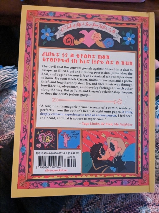

beautiful spot foil on the front cover plus guilded pages??? hell yes. hes a weighty boy for his size and *feels* incredibly luxurious in ways book nerds are sure to appreciate plus the art is absolutely gorgeous
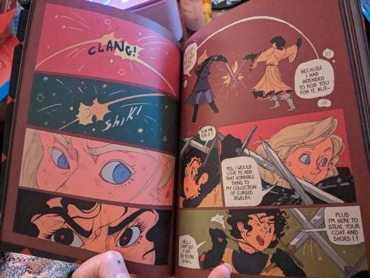
very soft, sketchy style evocative of like 60s and 70s animation. every bit ive peeped at so far has been gorgeous but not super tightly cleaned like a lot of modern comics, so it feels really organic and raw, even at a glance. vvv refreshing
i preordered on a whim back in like, march when the announcement from @silversprocket crossed my feed and i have Zero regerts. i cannot wait to dive in and actually read it
#mochi rambles#mochi's bookshelf#is this a review???#i guess sort of huh#like i am incredibly easy to please so just cos i like something does not mean its some perfect product#but damn for a small pub title from a company AND author i had never heard of i am *impressed*#like its a perfect bound paperback the binding is basically the same as any others i have#but the design choices like the spot foil and guilding is just#clenches fist#so good for the art and story concept#and the paper weight and manu were both obviously chosen with care for the final product#like my only complaint is that my copy arrived a bit dinged up#but the box was a little crunched too so im sure it happened durring shipping#it happens nbd#but man i am like three seconds away from ordering a bunch more from silver sprocket now that i have a feel for em#if i can stop fondling the chromatic fantasy lmao
6 notes
·
View notes
Text
Specialist Practice Evaluation
ISTD
For me, I feel like the best thing that I learnt and understood during this project was the power of theory in design. In previous years the research side of my work has been lacking but finding a passion for applying theory into design has been really fun and engaging.
I think the research in general for this part of specialist practice went really well for me. I consistently revisited and initiated research throughout the project, both visual and theoretical, rather than in one go. The theoretical research I also developed into conceptual ideas and then I translated those into two different approaches to my design as my project progressed too. I found this to be a much more organic way to work, rather than following research-execute as I have before. It also enabled me to expand and improve on my ideas, rather than getting stuck in ruts and losing sight of the brief.
In regards to research, if I’m honest, early on I got lost in the research and finding of the content. Gathering first-hand research from people I didn’t know in Guildford and hearing their stories was wonderful, but it slowed down my progress, even though it enriched the project. If I were to do this again, I would begin designing much earlier and give myself the chance to research and design before the idea was whole, just to get things on a roll.
During the later part of my project, I looked at more contemporary design work and this helped massively in pushing the style and design choices in my work. I bought Make it Now! by Anthony Burrill and referred to how he laid out his book, while I worked on my grid and type. For example, I noticed that he had set a 4 window grid for the majority of the book, but rotated content to keep it interesting. Something which was useful as I got to the later parts of the book and the design started to get repetitive, prompting me to change image sizes and make the choice to add ephemera for context and to help the book feel more varied. I also read most of ‘Know your onions’ by Drew de Soto and used the advice in that to critique my work and help move it forward, as noted in my development notes. Additionally, I looked at Printed Pages for hierarchy references, as I struggled to develop an effective hierarchy in my earlier versions. I feel that towards the end that I achieved a much more successful design thanks to this, taking the risk with underlines, even though I wasn’t sure it would work, to now very successfully break up the two bottom levels of hierarchy.
In terms of time management for this project, it has been varied. Before my mitigation, I was spending a lot of time fiddling with details and not progressing fast enough. This is part of the reason that I didn’t develop my work enough for the original hand-in. Since I got my mitigation, however, I’ve taken a much more pro-active approach making, rather than trying to perfect and have used as much of the advice from tutorials, showing work to friends and considering it myself, as I can. Admittedly, my situation which I got mitigation for has got much worse since Christmas and I am struggling to get anything done some days, let alone work, so pro-active designing has been pro-active when I’ve been having a good day. Using the urgency grid and week planning as suggested by all the different people I’ve seen at Student Services has helped a lot and I’ve included some of my urgency grids and plans in here to show how I’ve been planning since December every week. What I would like, is to be able to work with more consistency. Moving onto my D&AD and FMP, I’m already spending more time at uni and around peers to help develop my work at a faster rate and keep up with the deadlines. I think If I can remain diligent with making earlier and researching as I go, then my time management will improve.
In regards to development, I’m very pleased with how far the ideas and execution have come and I think that my final outcome is one which more effectively and precisely tackles my core concept of lost memories of a place. I’ve acted diligently in response to feedback on my work from peers and tutors and have taken notes, made many many test prints refining my work as part of my process, rather than as an afterthought. Developing work with physical prints for editorial is also, I’ve found, a much quicker and easier way to work. I’ve spotted things I’ve wanted to fix, like hierarchy, type legibility or layout changes much faster than before. The improvements that I made to the design of the book from the original jigsaw mock-ups all the way through to choosing the right underline weight have all added up to something I’m happy with.
Finally, in regards to my final piece. I am very happy with the outcome. I think that the design is now much more robust and leaving my previous memory concept for my new one has helped massively in freeing up the design. I think it reads much better now as a book thanks to this.
Looking at the design, if I had even more time on it, I’d like to have tried Gold Foiling on the cover or throughout the book to make use of the ‘Guild’ in Guildford and linking that and the gold of the town clock with the design. I’d also like to have tried more premium materials. I think this book could have benefitted from a case or something harder to just add a bit more, to make it feel like even more of a precious object. I considered case binding for this book, but it ended up being too thin, simply because collecting content for this took a long time and I decided that perfect binding was a happy medium, as it still looks premium and allows the design to speak for itself. Also, I would try out more typefaces if I had more time, but I did feel that this typeface worked well for legibility and kept the design more closely tied to Guildford’s print history, which was important to the content of the book.
Penguin
I’m happy with my Penguin Cover and would like to continue developing it. I think that the concept was playful and appropriate for its audience and was a more interesting take than just illustration. The development I did, to help with how easily the face was recognised was a good start and based on the feedback I had in crit, helped set me on the right track in improving it. How I developed the idea since then was simple, but made a world of difference to the outcome. If I had more time I would try out different type again, and look at more research to understand how I could make the face more obvious.
Sig. of No.
My significance of numbers was a great start to the year and I learnt a lot from doing it! I researched and learnt how to use an After Effects gravity plugin called Newton 3. It was nice to try something new and integrate a concept into it. If I had more time on it I would have improved the visuals, just to make them more engaging.
During the project, I also did a lot of research into population meters and growth and that definitely helped to build out the idea into something interesting. My concept of ‘now’ and how so much is happening right now, could have been taken in any direction, but I’m glad that I looked at poverty as I wanted to do something with more of an impact for this short project. Separating the final screen on poverty at the end from the world population was the only key point that mentioned for feedback, however, I chose to leave it in as I felt the world population context helped to show the relevance of the poverty meter. If I had more time though, I would work out a way to make this moral of the story more subtle. I’m happy with the outcome and think that given the timeframe for this project I managed to achieve a lot!
Process Book
I ran out of time to work much more on my process book. However, lots of my process and development is explained in detail on my scamps and test sheets and well as in my sketchbooks. My process book now contains the curated content from the previous submission as well as a few key turning points since then, with comments.
0 notes
Last Seen Blogs

packjoker2
Pop go the stars...again!

loudprofessorzonkpsychic
Sharon F Luna

podcastclasico
Sin título

bringbacktimreblogs
fic recs

oldlovekira
love, kira