#and in the end i just used a font from clip studio paint instead of writing it myself aksdljhfkalsdjhf
Text
That's our town, our highway town!
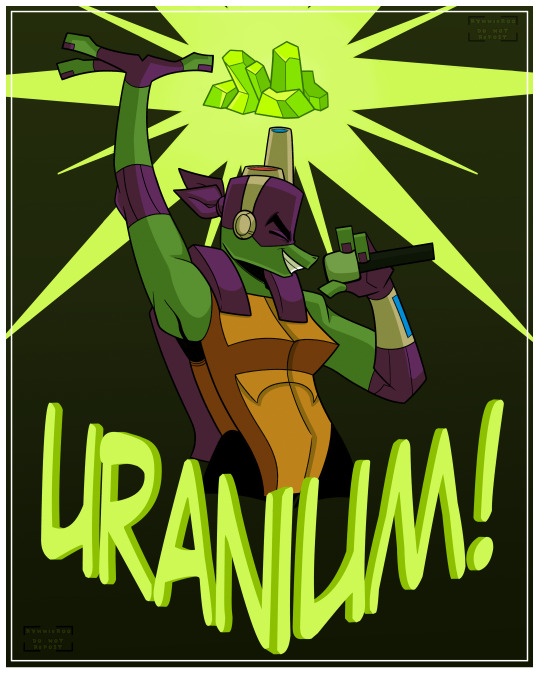
you cannot tell me that this boy would not absolutely adore Ride the Cyclone and The Uranium Suite specifically
#my art#tmnt#tmnt 2018#2018 tmnt#tmnt 2k18#2k18 tmnt#rottmnt#rottmnt donnie#rottmnt donatello#tmnt donnie#tmnt donatello#i was so in the trenches with this drawing#it took me all day to figure out how to write uranium and make it look nice#and in the end i just used a font from clip studio paint instead of writing it myself aksdljhfkalsdjhf#but im so happy with how donnie looks here#my musical theatre boy
699 notes
·
View notes
Photo
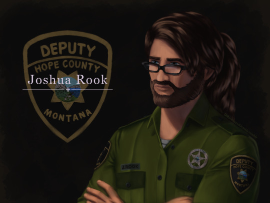
IT IS FINISHED no seriously, this took ages. First couple of days were fine and motoring along with progress, then I was laid out for a week-ish with health problems. Then once I was well enough again I was back to being fixated on finishing this piece of my lad Joshua here for another handful of days, so I’m super glad this is done now.
More talk about the painting, details and process under the cut:
Art Entry 01, Joshua Rook, Junior Deputy of Hope County. Regarding the painting’s execution, stylistic choices, practiced methods, and speculation on further experimentation for skill and stylization.
_____________________________
Honestly I thought that the uniform’s large swatches of green fabric would be more difficult than it actually was. Turns out that was the easier part compared to the shoulder patch and metal badge. x’D The metal badge design is based off of and inspired by a custom-ordered cosplay badge design I found while looking for references, in this post here (link,) from v-i-d-e-n-o-i-r’s blog and Far Cry 5 cosplay. There are some differences in the painting’s rendition above, namely I flattened the middle section and made it all concentric polished metal instead of painted and the great seal rendition in the middle doesn’t have silver lineart either. Those choices are as much for aesthetic reasons of eliminating the blue ring so it was all a fairly simple mono-material-looking surface as it was for simplifying having to forego painting the foreshortening that a spherical dome might entail. Also just because the rest of the metal turned out looking good enough that an additional bit of shiny metal seemed like it’d fit right in for this. That being said, the badge design that inspired this one is rad and awesome looking—and I totally didn’t realize it wasn’t quite like the badges from in-game assets until after I’d painted it. x’D So, I decided to stick with this one since it’s simpler and has cleaner lines, and less engraving to pick out highlights on. Metal is very hit or miss for me to get right, so I’m very pleased with how this one came out! :D I think I did well on that one.
The shoulder patch originally I was looking at real world references and ended up changing the shape once I actually looked at in-game references on Staci and Joey—who I discovered have slightly different details on their uniforms, like the font for their name tags—Staci’s has an old-timey-looking-font with serifs, Joey’s is a non-serif more modern-style font. Some pictures have them having different buttons on their uniforms either in color or shape (the former being exported assets, the latter being in-game gifs/screenies/etc.) This is also how I learned that the little landscape with the shovel, pickaxe and plough/plow are part of the great seal of Montana. I had no flipping idea that was what it was, looking at the patches in-game. The cosplay community does some great work for that, for which I’m grateful. I ended up looking up references of what the state seal’s design was so as to see the smaller details, and to find out what the motto meant ”Oro y Plata,” meant, leading to etymology googling adventures from there, as usual. All important details to paint though I think here, since Joshua’s deputy uniform is symbolically significant to him and will remain so throughout his story as part of his internal conflict for a couple of reasons.
One thing I knew I should’ve done from the start, and reminded myself to do, was the fact that I should paint all skin sections at the same time, so as to ensure they all came out the same shades. I did not do this. x’D I’ll have to actually try to do that next time honestly. Same with the hair sections, while I like how they came out, I do feel the differences between the three major segments in terms of brushwork is not as coherent as I’d like, even if beard hair is not necessarily similar in how it lays to scalp hair, particularly with length and such taken into consideration. Still, not bad. Could’ve used more refs for the backlighting and figuring out how the highlights would fit best on the ponytail, but I think the hair curves turned out nice there in particular. Overall, Joshua’s hair ended up messier than I’d thought with how the locks all end up looping this way and that across his head, but it does actually fit him well as a character for his hairstyle to be messy and loosely held together, but functional. It did end up longer than I’d intended, so we have him likely ending up with a nerdy Jesus hairstyle when it’s down. x’D (Thanks to @undead-gearhead for that mental imagery, I shall take great amusement in that should I get around to drawing Joshua with his hair down.)
Aside from that, I think I’m slowly improving on figuring out how to paint glasses, though I’m thinking in the future I should test more layered reflective light on them or something where the frames are in contact or close to skin, particularly around the glasses’ bridge across the nose and such.
Then there are the other deviation details added—like using dark green instead of the black for the uniform accents. The faded black looks great in-game, but I do think the buttons pop more against dark green instead for this painting. I’m a little bit surprised how well the button-placket section came out, Clip Studio Paint crashed when I painted the first rendition of it, sadly losing all that work. I thought it’d be okay but turns out it didn’t quite get to auto-save that recently enough, but the second go around turned out quite well I think, possibly better. I was originally planning to try to put more textured brushwork across the flat sections of the uniform material, but decided to skip it for speed—I’ll test that elsewhere perhaps, though I think it came out well with the watercolor brushes layered on top of one another like that as is. Among the other smaller details, there’s some tweaks and such for how Joshua’s eye shape, eyebrows, nose shape, hairline etc came out compared to references of Greg Bryk in his role as Joseph Seed. I think Joshua did come out looking like he’s obviously related to the Seeds as I was hoping for, but I’m kind of on the fence that people would look at him and automatically assume it’s Joseph specifically that he’s descended from. I hope so, but either way, that’s how he’s written in-fic. x’D
Overall, I would consider this painting a success, though as usual I do wish it’d been faster to finish. I do think this was good practice for detail work, and metal shading, also: buttons. Still haven’t figured out how to paint lips with more pink or red tones, I don’t like the way they look when painted sadly, unless it’s lipstick. That may end up being a stylistic element perhaps, along with how I paint the lines for fingernails and other such details. Fun fact: I have to leave the shading on the eyes for last, or else my brain goes “The eyes are done! We’re done! Call it a day.” I’m not sure why, but so far, leaving them as flats until the end seems to work a treat for keeping me focused on finishing the rest of the work with less mental dissonance.
Now if only I could figure out why despite knowing I should do all the exposed skin portions at the same time, I don’t follow through on that naturally as far as inclinations go. Maybe it’s a layer organization thing and perception of wanting, say, the cloth to be done first before working “down” to the hands and such in the sense of working from the head down? I’ll have to think on that some more and test things in the next painting. Perhaps color coding the order of layers to paint will help? CSP does have a nice layer-icon-color function that I’ve dabbled with here and there. There are so many brushes, I really do need to test out more of them, I use, what, four or five total, but primarily somewhere around two or three. Hm, but what to do with texture, and how to utilize it so?
Hmmm, as far as personal appeal for methodology goes, I might prefer to use textures in select pieces for more emotional emphasis? If I can figure out how to do that in a messier speed-paint style of things. Rougher textures for conflict, for example. That sounds like an interesting idea to explore, I’ll have to remember that for a later piece. Maybe more heavily textured brushes will also help with the mental itch to refine things to a cleaner-level of refining instead of leaving it in a more organically rough state. Hm, maybe it’s a “mental texture” aversion or something, as far as an interplay between the brush’s texture and the flow of the linework/brushstroke. Perhaps more uneven brushes echo that in a complimentary fashion to better allow less mental discomfort for me personally when trying to paint in a faster, looser fashion?
Honestly, very tempting to go try that out sooner rather than later on some art ideas I have, but I’ve been missing my writing very much of late with two time-demanding paintings back to back. So, ideas for a later time to experiment with.
#Far Cry 5#FC 5#Far Cry 5 AU#FC 5 AU#deputy joshua rook#my art#ofravensandgenesis's art#art talk#chatter#writing about art#writing about fanart#queue
23 notes
·
View notes
Last Seen Blogs

aleksandrelo
Без названия
yomogi-mogi-mochi
Twisted Wonderland Hyperfixation
ultimatebabeleo
Leonardo DiCaprio
nbcnews05
227's YouTube Chili' NBC News (Jamaal Al-Din TV) Spicy' NBA Mix!

temiree
Temiree's Tumblree