#and finally... OTL when the horse is better then the human
Text
After Cyn's done tryna kill him, she'll eventually relent and they can get to work... whatever that is.
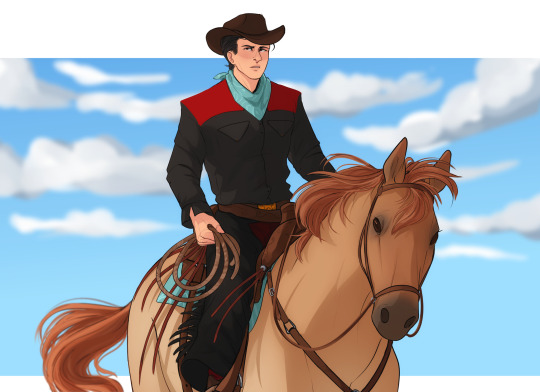
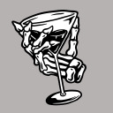
I didn't do the outfit any justice, but the second i saw the Cowboy!Curt mega @ricky-mortis made i was literally like, "yes, that is IT."
This is, in my heart, a cannon fit for this au
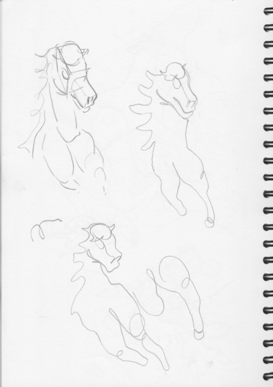
#And if you disagree... well i cant hear you#K but i really am bad at clothes lol! and this weird pose kinda threw me off pretty hard so i will also blame that...#but i will do better next time#I am again letting people know his horse is 100% named after Cynthia because of the occasional attempts on his life 👍#I think i'll dub this a Try hard Doodle because thats what it is actually#and now for me talking way to much in that tags because i'm a terror:#I was going to pair this with another drawing that actually features curtwen btw#but my wrist said “No”#so maybe tomorrow?#(also... i have never actually drawn a person ON a horse before so this was really weird to do#this was actually a full body image... and then i halved it but then i couldn't do his foot? so i halved it again!)#Saf#spies are forever#cowboys are forever#<- WOULD watch the shit outta that [laughing at the idea of all the songs made really really country]#Cowboys your spies#Also some fun but also pretty dumb Au stuff: my vers of this au has always taken place in the wildwest in my head#so around 1865 to 1895#Art#and finally... OTL when the horse is better then the human#is the fact i drew animals for a majority of my life really obvious yet
129 notes
·
View notes
Photo


Final Outcomes & Evaluation
Process & experimentation?
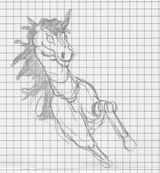
My general basic process of exploring formal elements of visual language was to draw out my icons and experiment with different mediums from workshops and then transition to digital. Going from loose mediums like pencil to very deliberate and intentional mediums that are very unforgiving like illustrator can be tough because and I found that I lost a lot of character from my sketches, but I tried my best to add that back with some loose negative space.
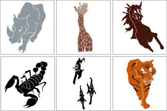
why did black and white end up better?
black and white ended up better because it was more simple and gave the viewer less information to absorb making it easier to read.
what were the aims of the brief?
The Aims of the brief were to create 6+ icons for Colchester Zoo that could communicate the animals and would help for navigation on signage. In addition to this, the icons had to be universally recognisable so that a person of any age would be able to understand the information. And Lastly the icons had to be consistent and uniform not only
practical sense
design sense
Did I meet the Aims & objectives from the brief?
Although I feel like I met the aim of the brief I also feel that i made my icons a little too complicated and difficult. From a normal distance they’re fairly readable, but when I shrink them down to simulate distance for navigation they become harder to read and this is a problem as my icons should convey information even at a small scale. One thing i will do next time when creating icons is stay simple and try to find a sweet spot with detail and readability.
Context
Otl Aicher WW2 was limited to only black and white because getting other colours was too hard or they were just unavailable. When it comes to Susan Kare she was a female in a predominately male industry and designing for the Apple Mac as it was just coming to the front of the tech industry.
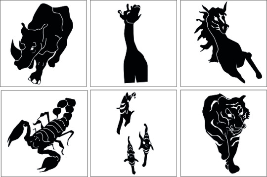
Lion
The mane didn’t communicate correctly and this ended up making the lion harder to read. In addition to this the angle made it harder as it broke the silhouette and i need to get the negative space correct, but if i was to create the lion again i would bunch the mane together a bit more so that it doesn’t seem as stylised and keeps the icon uniform and linked to my other final outcomes.
Fish
For my fish icon I wanted to experiment with what a group of animals would look like and if it would affect this icons readability. Ultimately in the end i think it did end up effecting the icons and how they read at a small scale or at a distance.
Giraffe
I really liked how my giraffe developed over time and how I experimented with space to emphasise how they would tower over a human. Additionally, this is the only icon of mine that colour ended up working on and I think its because the pattern and the angle work in harmony to communicate the space, but in black and white the gap between the two front legs gets lost and this takes away from the sense of space.
Horse
My horse icon ended up being the most dynamic of all my icons as it looks like its running forward with its hair flowing in the wind because I used the pen tool to try and keep the sketch characteristics from my early developments. The hair isn't laying flat on the horses neck and head is horizontal giving the icon some movement. Additionally, the front right leg is extending forward, while the front left leg is down and out of frame and this contributes to adding movement into my final outcome. Horses are know for their speed and strength so I’m really happy i was able to communicate this in the final outcome.
Conclusion
why?
Make examples of my icons to give examples of navigation.
0 notes
Last Seen Blogs
hissizviski
All I Need Is Me
los-muertos-vivientes
zoombieland

denverlloyd
Untitled

voyagerguitars
ギター工房ヴォイジャーギターズ

cottonfog
Untitled