#Reflection Symmetrical Art Radial
Text
youtube
📺 Kaleidoscope Visuals Classical Romantic Lofi Acoustic Piano Music 4K Kaleidoscope Visual Art Video
Digital kaleidoscope art is a way to see the world in a new way. The patterns and shapes created by digital kaleidoscope art can be abstract and otherworldly, and they can help us to see the world in a new and different light. Digital kaleidoscope art can be a tool for meditation and introspection, and it can help us to connect with our inner creativity.
#romantic music#lofi music#pianomusic#visual art#art#artwork#abstract art#circular art#kaleidoscope#kaleidoscope visuals#万華鏡#symmetry#patterns#kaleidoscopeart#digitalart#kaleidoscopevisuals#Youtube#Reflection Symmetrical Digital Artwork#Reflection Symmetrical Digital Artwork Design#Reflection Symmetrical Digital Artwork Design Inspiration#Reflection Symmetrical Digital Artwork Design Pattern#Reflection Symmetrical Digital Artwork Balance#Reflection Symmetrical Digital#Reflection Symmetrical Digital Artwork Radial#Reflection Symmetrical Digital Artwork Rotational#kaleidoscope background#🎵 📺 Kaleidoscope Visual with Music#🎵 📺 Kaleidoscope Art with Music#🎵 📺 Kaleidoscope Visual with Ambient Music
0 notes
Text
ELEMENTS (7)
POINT - A point is the visual element upon which all other elements in a composition are centralized. Points and lines are used to create more complex shapes, and in design, they’re often used to direct a viewer’s attention towards a certain area in an image.
LINE- A line is a geometric element generated by a moving point that has extension along the path of that point. Lines can be curved, straight, or both. They can be solid or dashed, implied or psychological.
SHAPE- Shapes are 2-dimensional and can be measured by height and width. Shapes can be the outline of an object, and sometimes, the shape of a familiar object can become unfamiliar depending on the photographer’s perspective. In photography, the silhouette is the most recognizable type of shape.
FORM - As opposed to shape, form is 3-dimensional. It has height, width, and depth. It can be organic or geometric, and like shapes, forms create positive and negative space. When a form is captured by a camera, it becomes 2-dimensional; we differentiate forms from shapes with shadow.
TEXTURE - A texture refers to the visual or tactile surface characteristics of something. Texture can be smooth, rough, slimy, bumpy, etc. Like form, texture in photography is 2-dimensional and is revealed by variations in value. Smooth objects may have reflections, while rough objects may have highly contrasting areas of lights and darks.
COLOR - Color is a phenomenon of light or visual perception enables one to differentiate otherwise identical objects. Color can also be defined as a specific combination of hue, saturation, and value. Light alone has no color, but when you direct it through a prism or water, it separates into bands of color that form a rainbow.
SPACE/DEPTH - The depth of a scene relates to its size and the space within it. Most photos have a foreground, middle ground, and background; the clearer the boundary between these grounds is, the more depth an image will have. Additionally, space can refer to the use of an area within a plane, such as positive/negative space.
PRINCIPLES (8)
VARIETY - Adding variety to an image keeps it from becoming monotonous. Artists utilize variety by placing contrasting elements close to each other: bright colors next to muted or lighter colors, text next to images, organic shapes next to geometric shapes, and so on.
EMPHASIS - Emphasis is used to focus a viewer’s attention onto a specific area of an image. An artist can accomplish this by adjusting certain elements, such as line or color, so that they help make one part of a composition stand out more than the rest.
BALANCE - Balance creates visual harmony and prevents an image from feeling too chaotic to the viewer. A balanced image is one that holds the same amount of weight on either end; for example, one “heavy” big object on one side, and multiple “light” little objects on the other. Asymmetrical, symmetrical, and radial are the three types of balance that artists can utilize in their artwork.
SYMMETRY - Symmetry refers to a piece of artwork that mirrors itself on either side, or around a point (called radial symmetry.)
MOVEMENT - In art, movement refers to elements of a composition arranged in a way that encourages the viewer’s eye to take a certain path as they look at the image. An artist can guide the viewer’s eyes through use of line, shapes, and colors to encourage a specific way of seeing the artwork.
PATTERN - A pattern is composed of numerous different elements repeated in the same way within a composition. Colors and shapes are often the main elements used in the creation of patterns.
RHYTHM - Rhythm gives an art piece a feeling of action through the repetition of lines, shapes, and colors that creates a flowing path for the eye to follow. Random, regular, flowing, and progressive make up the different types of rhythm. Rhythm is what encourages a viewer’s eyes to traverse the entire piece, rather than staying in one place.
UNITY - Unity adds a sense of wholeness to a piece of art through the careful placement of elements that creates a harmonious composition.
1 note
·
View note
Text
Exploring the Serenity: The Mandala Coloring Book Experience
Unveiling Tranquility Through Intricate Patterns
The Mandala Coloring Book is a calming light in the world of creative expression and stress alleviation. This coloring book, designed for individuals looking to escape the craziness of contemporary life, takes users on a peaceful journey via intricately crafted mandala designs. It offers a doorway to creative inquiry and relaxation with its sophisticated yet approachable designs.
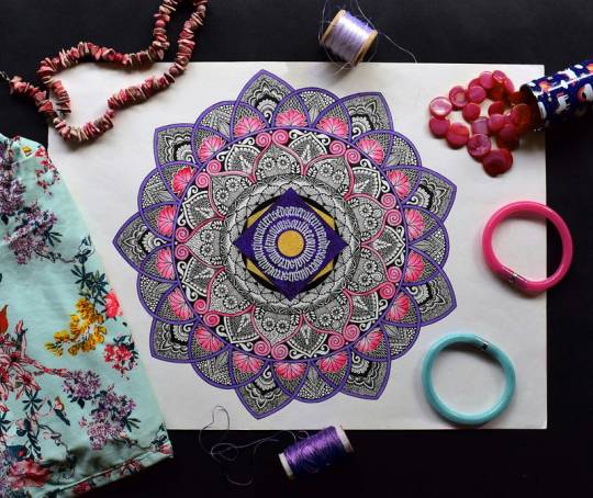
Embracing the Essence of Mandala Art
The complex, hypnotic patterns that enthrall the mind and calm the spirit are the core of mandala art, and they are central to the Mandala Coloring Book. A mandala, which means “circle” in Sanskrit, is a symbol of completeness and oneness in many spiritual traditions. These geometric patterns, which frequently have radial symmetry, are used as meditation and self-discovery aids.
A Haven of Peace Amidst Complexity
It is harder and harder to find quiet moments in a world full of noise and distraction. The Mandala Coloring Book provides a haven where people may re-establish their inner connections and detach from the outside world. Every page has a different mandala just waiting for color to bring it to life, enticing participants to lose themselves in a healing creative process.
Bridging the Gap: From Novice to Expert
The Mandala Coloring Book is designed for people of all ability levels, even though mandala patterns are recognized for their intricacy. This coloring book offers a moderate introduction to the art of mandala coloring for people who are intimidated by complex designs. Its simple coloring patterns are ideal for novices, kids, adults, elderly people, and everyone else looking for a relaxing creative outlet.

Nurturing Creativity Through Relaxation
It has long been known that coloring is a therapeutic pastime that encourages awareness and relaxation. People may embrace a sense of calmness and let their imagination run wild with the Mandala Coloring Book. Coloring promotes a state of flow when anxieties vanish and inner calm rules by allowing the mind to concentrate on the here and now.
The Healing Power of Artistic Expression
The human soul may be remarkably healed and elevated via the power of art. People can use the Mandala Coloring Book to tap into the therapeutic benefits of artistic expression. This coloring book provides a creative outlet for individuals to unwind and revitalize, whether it’s through a focused coloring session or a few minutes of coloring throughout a busy day.
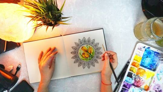
Embracing Mindful Living, One Stroke at a Time
Mindfulness emerges as a ray of hope in a society where the stimulus is constant and life moves quickly. The Mandala Coloring Book invites people to calm down and appreciate the present moment, which promotes mindful living. Every color stroke turns into a deliberate act, a conscious moment of admiration for the mandala’s beauty as well as the creative process in general.
Unlocking Inner Harmony and Balance
Participants go on a voyage of self-discovery and inner peace as they turn the pages of the Mandala Coloring Book. The mandalas’ symmetrical patterns elicit a feeling of harmony and order, reflecting the balance people aspire to in their lives. Through coloring, kids discover a method to achieve harmony — where calmness triumphs and turmoil recedes into the background.

“Click here to buy this book now!”
Conclusion: A Gateway to Serenity
The Mandala Coloring Book provides a straightforward yet deep solution in a world full of complexity and uncertainty: coloring. It offers a doorway to tranquility with its elaborate patterns and healing properties, encouraging people to go on a path of self-care and artistic discovery. This coloring book is a beacon of peace in an increasingly busy world, whether you’re looking for relief from the stressors of everyday life or just taking a minute to unwind.
1 note
·
View note
Text
Elements & Principles of Art & Design - Definitions
Elements of Design
Line: A straight or curved mark that connects two points or manifests a path of a moving point; they can vary in weight, direction, and length, and can also be visually implied
Shape: A two-dimensional enclosed space that represents an organic or geometric shape
Form: A three-dimensional enclosed space that demonstrates height, width, and depth; either organic or geometric
Space: The areas and distances around, between, and within a composition; there are two kinds:
Negative Space: Space that isn’t occupied/ filled
Positive Space: Space that is occupied by a shape or form
Color: The perception of light reflected from the surface of a shape or form; color has three characteristics:
Hue: Pigments/colors
Value: Light/dark
Intensity: Bright/dull
Value: Gradation of light or dark in a color
Texture: The surface quality of an object that can be sensed through touch; can be tactile or visual
Principles of Design
Balance: The distribution of objects, colors, texture, and space; there are three types:
Symmetrical: Even arrangement of elements in composition
Asymmetrical: Different/uneven arrangement of elements yet still coordinated
Radial: Elements arranged around a central point
Unity: Elements of the design arranged harmoniously/ feeling of oneness
Variety: The use of several elements of design to hold the attention of the viewer and guide their eye through and around the image
Emphasis: Defines the most prominent area in a composition; can be identified by size, color, texture, shape, etc.
Movement: The path that carries the eye of the viewer through the design; is communicated visually and guides the viewer to focal areas or creates the look/feeling of action
Pattern: Repetitive imagery in art/design
Proportion: Defines the comparative size between objects in the composition; evident difference in scale in elements/subjects of a composition
Rhythm: The repetition of visual elements to establish a pattern
0 notes
Text
DESIGN & LIGHT DEFINITIONS
SPACE: The area that accompanies a subject. Positive space is what the subject(s) takes up, while negative is is the area around and between subject(s).
COLOR: Red, orange, yellow, green…etc. Reflected or absorbed light - white light is made up of all colors.
SHAPE: 2D panes, flat.
FORM: 3D shapes, take up space and have depth.
VALUE: The lightness or darkness of a color/subjects relative to surrounding values.
TEXTURE: The appearance of how a subject looks or feels were you to physically touch them. Scratchy, bumpy, smooth, fluffy, etc.
LINE: An elongated mark - can be straight, wavy, zigzag, dashed, curly, and implied.
BALANCE: A design indicating there is visual weight in a piece. Can be symmetrical, asymmetrical, radial.
UNITY: A piece feeling cohesive, with parts coming together.
VARIETY: Showing different variations of similar types of a subject.
EMPHASIS: A design that has a portion of it intended to grab the attention form the viewer, usually through different elements of art.
MOVEMENT: The implication of motion in work, whether through repetition, rhythm, etc.
PATTERN: Repetition of shapes, colors, lines, symbols that decorate surfaces or planes within a work.
PROPORTION: Size relationship and scale between subject matter or portions of a subject matter.
CONTRAST: Light against dark, with little range between the extremes.
RHYTHM: repetition of shapes, lines, and forms, and movement. Are not limited to surface matter.
0 notes
Text
Home Decor Accents | Unveiling the secrets for adding enchanting charm to your space
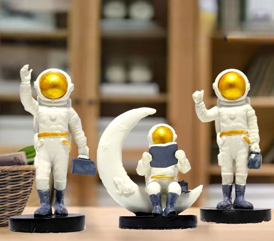
Home Decor Accents | Unveiling the secrets for adding enchanting charm to your space
Understanding Home Decor Accents
Home decor accents are much like the final flourish of garnish on a well-prepared dish; they enhance the overall beauty and bring out the best in the room's design. These elements can be as grand as a full-size sculpture or as simple as a delicate vase, but their impact on a space is unmistakably profound. The versatility of home decor accents lies in their ability to adapt to a room’s existing style, enriching it without overwhelming the core design principles.
Decor accents range from:
Traditional flower vase
Artistic sculptures
Contemporary wall art
Chic throw rugs and more
The ability to blend these varied elements seamlessly is what differentiates a space that merely looks furnished from one that feels thoughtfully designed and inviting.
Why Timeless Home Decor Items are the Best Acquaintances for your Home?
In the quest for home beauty, choosing Timeless Home Decor Items is akin to choosing lifelong friends. These are the pieces that stand the test of time, both in craftsmanship and style. By investing in such items, homeowners can create a space that is not only a reflection of their individuality but also one that maintains elegance and relevance regardless of the shifting sands of home fashion trends.
The benefits of timeless home decor include:
Keeping up with changing trends while maintaining a classic look
Offering both aesthetic and functional value
Being economical over a long term period
Providing irreplaceable beauty and appeal
With the right timeless pieces, you can craft a home environment that carries a unique personality and charm for years to come, making these items truly the best companions for your space.
How to Select the Right Home Decor Accents?
The right home decor accents are akin to finding the perfect accessory for an outfit; it must complement, enhance, and complete the look. Selecting the right pieces for your home requires a delicate balance of intuitive design sense and strategic planning. The process is not entirely subjective; certain guidelines can help navigate through the vast world of decor choices to find the perfect match for your home.
Guideline for selecting the right decor accents:
Define the ambiance you're aiming for—modern, artistic, bohemian, or minimalist.
Decide on a consistent theme—tropical, vintage, coastal, or Nordic.
Choose a suitable color palette that complements your room's current scheme.
Pick decor accents that align with and enhance your chosen ambiance, theme, and color palette.
The Power of Symmetry in Home Decor
Symmetry in home decor can be the thread that holds the design canvas together, creating a cohesive and harmonious environment. It is a tool that can be manipulated to bring tranquility or energy into a room. When elements are arranged in a symmetrical fashion, the room has a formal and ordered look. Conversely, an asymmetrical arrangement provides a more modern and dynamic feel to the space.
Types of symmetry in decor:
Symmetrical setup that mirrors one side to the other
Asymmetrical setup that achieves balance through varying elements
Radial symmetry that arranges identical elements around a common center
Understanding and utilizing symmetry can greatly enhance the aesthetic appeal and the feel of a living space.
Mixing Decor Items to Create Visual Interest
The alchemy of mixing home decor items lies in the art of creating contrast and cohesion at once. By pairing unexpected textures, materials, colors, and shapes, one can curate a space that brims with character and visual interest. This curation is not random; it requires an eye for detail and knowledge of how different design elements interact with each other.
Mixing decor elements to consider:
The interplay of different materials such as metal with wood or fabric with leather
Pairing contrasting colors that range from bold to nude palettes
Combining varying shapes such as round, square, and rectangle to create a dynamic space
Expert Tips on Placing Home Decor Accents
To avoid the common pitfall of overcrowding a room with decorative items, it is essential to place home decor accents thoughtfully. Expert interior designers often cite the importance of negative space—the empty areas between decor elements—as being just as crucial as the accents themselves. Additionally, constantly refreshing the arrangement can give a room a new lease of life.
Tips for placing decor accents:
Avoid cluttering spaces to let each accent shine
Shift your decor regularly to rejuvenate the room's ambiance
Employ odd groupings for a pleasing visual composition
The Role of Lighting in Accentuating Home Decor Accents
Lighting is the unseen hand that can make or break the visual impact of your home decor accents. It is responsible for setting the mood, highlighting textures, and dictating the focal points within a room. The interplay of light and shadow can significantly enhance the aesthetic elements of your decor, making lighting an essential aspect of interior design.
Lighting considerations:
Utilize natural light to its full advantage during daytime
Employ artificial light strategically to craft desired highlights and ambiance
The Magic of Wall Art as a Home Decor Accent
Wall art is not merely about filling an empty wall; it is a dialogue between the artist and the inhabitant, each piece conferring a certain energy and narrative to the space. Wall art provides an opportunity to make bold statements, introduce color, and harmonize with the existing decor theme. Its transformative power is such that it can alter perceptions of a room's size and scale, making it feel either more expansive or intimate.
Styling Your Bookshelves Smartly with Home Decor Accents
Bookshelves offer a canvas for storytelling within your home. They are not solely towers of literary collection but a stage for showcasing intriguing artifacts and personal treasures. By styling bookshelves with carefully selected decor accents, you can elevate them from mere storage solutions to captivating visual points that draw the eye and invite conversation.
How to Care for Your Home Decor Accents?
Preservation of the beauty and integrity of your home decor accents is pivotal to ensure they continue to elevate your space. This care includes routine maintenance and cleaning that varies from material to material. Simple acts of diligence such as dusting, wiping, and periodic detailed cleaning can prolong the life and lustre of your decor pieces.
Maintenance tips for your home decor accents:
Clean regularly to avoid accumulation of dust and dirt
Perform timely maintenance to prevent minor damages from becoming serious issues
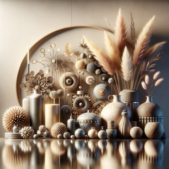
Your home decor accents are jewels that adorn your living space. When chosen with care and maintained properly, they infuse your home with lasting vibrancy and style.
0 notes
Text
7 Key Principles in Interior Design : Farstudio
Interior design is an intricate craft that marries functionality with aesthetics, relying on key principles and elements to create captivating and cohesive spaces. As professionals in the vibrant hub of farsudio, we approach design with a unique perspective, valuing both the practical and the beautiful. Every aspect, from color palettes to furniture arrangement, is meticulously considered in crafting spaces that resonate with our clients’ individual styles and needs.
The Key Principles of Interior Design
1. Balance: The Art of Equilibrium
Balance in design ensures visual harmony, achieved by distributing furniture and decorative elements evenly within a space. Three types of balance exist: formal (symmetrical), informal (asymmetrical), and radial, each offering distinct ways to create equilibrium while preventing monotony.
2. Unity and Harmony: Coherence in Diversity
Unity is the harmonious fusion of furnishing, style, and decor elements to establish a cohesive whole. It’s the unified flow of patterns, hues, and textures that lend grace and coherence to a design. Harmony, on the other hand, focuses on coordinating objects and colors to evoke integrated aesthetics, often achieved through thematic coherence or focal points.
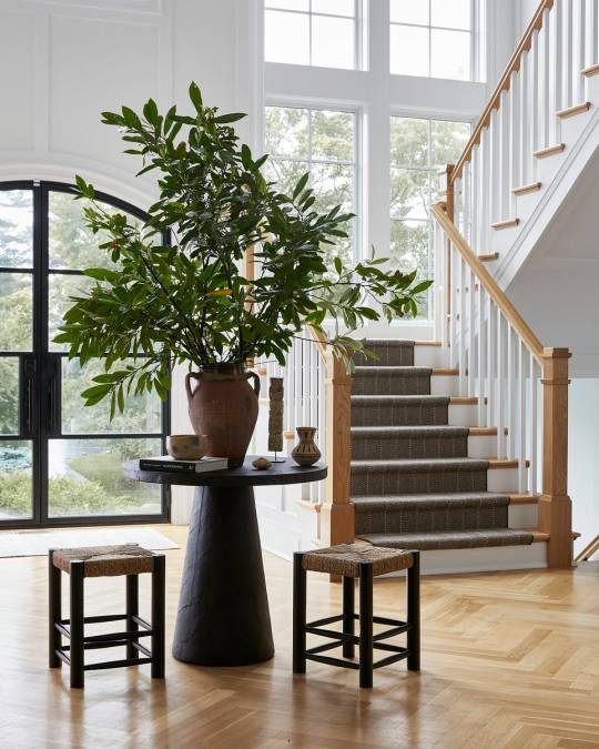
4. Proportion and Scale: Balancing the Sizes
Proportion and scale dictate the sense of belonging among objects within a space. Ensuring balance among sizes, shapes, and colors is crucial to harmonizing elements with the surrounding area, be it a cozy nook or a vast expanse.
5. Emphasis: Crafting Focal Points
Emphasis creates a focal point by drawing attention to specific components, whether through color, texture, or pattern. This principle accentuates existing features or establishes new highlights, enriching the visual narrative within a space.
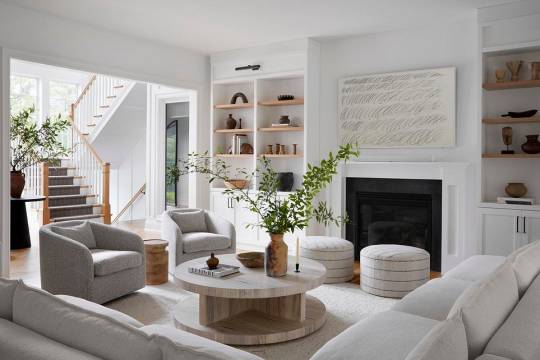
7. Details: Personalizing the Space
Attention to detail crowns a well-designed space. This final touch allows personalization, adding character and uniqueness to a room. It’s the subtle yet impactful elements that infuse soul into a space, reflecting individual tastes and interests.
Application Across Spaces
These seven principles serve as the cornerstone for crafting visually appealing and functional interiors, applicable across diverse spaces — from living rooms to bathrooms. Mastering these principles empowers designers and homeowners alike to curate spaces that transcend mere functionality, becoming inviting sanctuaries that speak volumes about personal style and taste.
Conclusion
Understanding and implementing the fundamental rules of interior design are pivotal in transforming spaces into curated works of art. Each principle contributes to the holistic visual experience, ensuring that every element within a space complements and harmonizes with the others. Whether it’s achieving equilibrium through balance or infusing personality through details, these principles lay the groundwork for crafting spaces that captivate and inspire.
#luxury interior designer#main line interior designer#philly interior designer#bryn mawr interior designer#interior designer#interior design
0 notes
Text
Photography
Elements of Design
Line
Definition: The path of a moving point is a mark made by a tool or instrument as it is drawn across a surface.
Types: Vertical, Horizontal, Curved, ZigZag, Diagonal
Notable Example: "The Eiffel Tower" by Henri Cartier-Bresson - showcasing elegant vertical lines.
Shape
Definition: The area stands out from the shape next to or around it because of a defined boundary or because of value, color, or texture.
Notable Example: "Migrant Mother" by Dorothea Lange - illustrating the emotional impact of the human shape within its surroundings.
Color
Definition: A visual sensation caused by light.
Notable Example: "Afghan Girl" by Steve McCurry - using vibrant color to convey the subject's striking gaze.
Components: Hue, Value, Intensity
Hue refers to the pure, basic colors of the color wheel. It is what distinguishes one color from another, such as red, blue, or yellow.
Example: In a rainbow, each band of color represents a different hue.
Value represents the lightness or darkness of a color. It is determined by the amount of light reflected by a color. A range of values creates contrast and depth in an image.
Example: In a grayscale image, the variations from black to white represent different values of gray.
Intensity, also known as saturation, refers to the purity or vividness of a color. A highly saturated color is pure and vibrant, while a desaturated color is more muted or grayish.
Example: A highly saturated red will be bright and vibrant, while a desaturated red will appear more subdued.
Space
Definition: The area occupied by form. The main area is positive, everything else is negative.
Notable Example: "Moonrise, Hernandez, New Mexico" by Ansel Adams - masterfully using negative space to emphasize the moonrise.
Value
Definition: How light or dark a given color or hue can be.
Notable Example: "The Old Guitarist" by Pablo Picasso (photographed by André Villers) - utilizing value to evoke emotion in a monochromatic context.
Form
Definition: Where light and shape collide to create images with depth and a sense of touchability.
Notable Example: "Nude Descending a Staircase, No. 2" by Marcel Duchamp (photographed by Man Ray) - playing with form and movement in a surreal way.
Texture
Definition: The visual depiction of variations in the color, shape, and depth of an object's surface.
Notable Example: "Migrant Mother" by Dorothea Lange - highlighting the weathered texture of the subject's face and hands.
Practice:
Take 5 photos demonstrating lines or explore more variations.
Principles
Balance
Definition: Feeling of equality in weight.
Types: Symmetrical, Asymmetrical, Radial
Notable Example: "The Birth of Venus" by Sandro Botticelli - showcasing symmetrical balance in a classic painting.
Proportion
Definition: Deals with the ratio of one part to another. Ratio implies comparison and is expressed in size, number, position, and space.
Notable Example: "Vitruvian Man" by Leonardo da Vinci - exploring the proportions of the human body in a meticulous drawing.
Harmony
Definition: Creates unity by stressing the similarities of separate but related parts.
Notable Example: "Starry Night" by Vincent van Gogh - achieving harmony through the use of color and swirling patterns.
Variety
Definition: A change or contrast within one or more elements to add interest and to avoid monotony.
Notable Example: "Les Demoiselles d'Avignon" by Pablo Picasso - introducing variety through diverse and unconventional forms.
Movement
Definition: Where your eyes look in a picture.
Notable Example: "Dance at Le Moulin de la Galette" by Pierre-Auguste Renoir - capturing the lively movement of dancers in a joyful scene.
Unity
Definition: The whole or total effect of a work of art that results from the combination of all its components.
Notable Example: "Guernica" by Pablo Picasso - achieving unity in a powerful anti-war painting.
Rhythm
Definition: A continuance, a flow, or a feeling of movement achieved by the repetition of related visual units; the use of measured accents.
Notable Example: "The Dance" by Henri Matisse - creating a sense of rhythm through repeated, flowing shapes.
Emphasis
Definition: The stressing of an element to make it more interesting or important through one position, color, object, or texture.
Notable Example: "Girl with a Pearl Earring" by Johannes Vermeer - emphasizing the subject's enigmatic gaze and the play of light on the pearl.
Composition
The way the principles of art are used to organize the elements of art. It determines the movement or direction it takes your eyes around the picture. There are many types of compositions; some of them resemble an S, O, U, T, L, S, and more. Understanding composition enhances the overall impact and storytelling in your photographs.
Composition in photography refers to the arrangement and organization of visual elements within a frame to create a compelling and harmonious image. It involves making deliberate choices about how to position and combine various elements like lines, shapes, colors, and textures. A well-composed photograph not only captures the subject but also guides the viewer's eyes in a way that enhances the overall impact and storytelling of the image.
Key Aspects of Composition:
Framing:
Choosing what to include within the frame and what to leave out is crucial. The frame acts as a boundary, focusing attention on the subject.
Rule of Thirds:
Dividing the frame into a 3x3 grid and placing key elements along these lines or at their intersections can create a visually pleasing balance.
Leading Lines:
Lines within an image (like a road, river, or architectural elements) can guide the viewer's eyes toward a focal point or create a sense of movement.
Symmetry and Asymmetry:
Symmetry can create a sense of balance, while asymmetry adds visual interest. Both can be used to guide the viewer's focus.
Contrast:
Contrast in color, tone, or texture helps certain elements stand out, drawing the viewer's eyes to specific areas of the photograph.
Depth and Perspective:
Creating a sense of depth enhances the three-dimensional feel of a photograph. This can be achieved through techniques like using leading lines, overlapping elements, or varying focus.
Balance:
Achieving balance ensures that no single element dominates the composition. Balance can be symmetrical, asymmetrical, or radial, depending on the desired effect.
Guiding the Viewer's Eyes:
Visual Hierarchy:
Establish a hierarchy of importance within the image. This can be achieved through the use of size, color, or contrast to make certain elements more prominent.
Focal Point:
Clearly define a focal point to which the viewer's eyes are naturally drawn. This can be the main subject or a strategically placed element within the composition.
Leading Lines:
Utilize leading lines to guide the viewer's eyes toward the main subject or a specific area of interest within the frame.
Contrast and Color:
Use contrast and color to create emphasis. A pop of color or a high-contrast element can immediately attract attention.
Positioning and Flow:
Consider how the viewer's eyes will move across the image. Arrange elements to create a natural flow that leads the eyes from one point of interest to another.
In summary, composition is about purposefully arranging elements within the frame to create a visually pleasing and impactful image. By understanding the principles of composition, photographers can effectively guide the viewer's eyes, control the narrative, and evoke specific emotions or reactions.
Practice:
Here are three famous photographs where you can circle or draw an arrow to the focal point:
"Migrant Mother" by Dorothea Lange:
Assignment: Circle to highlight the focal point. Consider how the photographer uses the expressions and gaze to create a compelling focal point.
"Afghan Girl" by Steve McCurry:
Assignment: Circle or draw an arrow pointing to the focal point. Notice how the intense gaze creates a powerful focal point and draws the viewer into the subject's emotions.
"The Falling Soldier" by Robert Capa:
Assignment: Draw an arrow pointing to the focal point. Reflect on how this focal point captures a decisive moment in the chaos of war, conveying both action and vulnerability.
For each photograph, consider the composition techniques that contribute to the effectiveness of the focal point. Pay attention to factors like framing, contrast, and the placement of elements within the frame. This exercise can help enhance your understanding of how photographers use focal points to guide and engage the viewer.
#photography notes#notes#class notes#photo#photography#elements of design#composition#focal point#guiding lines#photos#rule of 3#color#shape#line#texture#homework#class#practice#artist
0 notes
Text
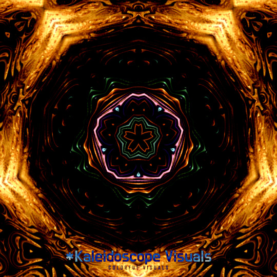
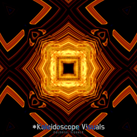
📌📺 Kaleidoscope Visuals Reflection Symmetrical Digital Art Radial
#art#artwork#abstract#kaleidoscope#digitalart#万華鏡#symmetry#patterns#kaleidoscopeart#kaleidoscopevisuals#digitalkaleidoscope#カレイドスコープ#만화경#曼荼羅#digital kaleidoscope#abstractart#kaleidoscope with music#kaleidoscope video with music#kaleidoscope background#Reflection Symmetrical Digital#Reflection Symmetrical Digital Art Radial#Reflection Symmetrical Digital Art Rotational#Reflection Symmetrical Digital Art Project#Kaleidoscope Design Graphics#Digital Kaleidoscope
1 note
·
View note
Text
What are the seven photography guiding principles?
Fundamental ideas that can create or destroy a shot are photography principles. They also incorporate symmetry, contrast, and copy space in addition to composition. Let's first examine the foundations of each. After that, we'll discuss how these ideas can be used in photography. Check out The Elements of Art for more details. In a photograph's composition, form is the critical component of design. Photographers can manipulate shadows, highlights, and other features of light to achieve the desired look. These factors generate shapes. The form is frequently utilized to portray an individual in portrait photography. However, these images are also used for various things, including social media profiles, websites, and resumes. A model must sign a model release form, similar to the one used when hiring a photographer, to make these photographs.
Using contrast in your photography is an excellent approach to add interest and make your photos stand out. This idea can be utilized to develop a whole narrative or highlight particular scene elements. Additionally, it can be used with other photographic conventions like color, tone, texture, or concept. Using contrast, you may engross the spectator in the scene, capturing their attention and leaving an impression. Contrast draws attention naturally, so make use of it to your advantage. A crucial component of the composition is copy space. It provides adequate space for the designer to reposition, trim, insert text, and alter the background's aspect ratio. It's simpler to modify and rearrange images with lots of copy space than those without. You can also experiment with the concept by using a blurred background. You can, for instance, rotate, trim, and remove things. It will also assist you in framing the picture. Negative space is unemphasized space around things or locations. For composition, this area is essential since it helps balance heavier areas. Additionally, this area is frequently referred to as copy space by photographers. White space and copy space are not the same, and inserting a copy into white space will unbalance the composition.
A subject appears more lifelike in a shot that strongly emphasizes form. Paper lighting is a component that gives the picture additional depth. Subtle tonal gradations are produced by soft light. Hard light, on the other hand, results in lifeless and flat photos. In pictures, symmetry is a crucial component of the composition. A balanced design with an equal number of vertical and horizontal lines is said to be symmetrical. It strikes a balance between the backgrounds and the objects. A picture of a water puddle, for instance, has symmetrical lines going through it. Radial symmetry, produced by reflections around a point, is another illustration. Both nature and architectural design exhibit symmetry. It is a fantastic technique of photography for developing a beautiful image. Additionally, it can give your photos more depth and vibrancy. Contrast is how a photo's colors combine to convey a visual statement. On the other hand, excellent colors reduce a composition, whereas warm colors emphasize it. In photography, this idea holds for both light and color. Numerous techniques, such as harsh lighting or switching to black and white mode, can be used to accomplish this. It can also be improved by using editing tools or post-processing. Contrast is one of photography's core aesthetic concepts, and its application dates back to the medium's beginning.
An excellent way to explore pattern design is through photography. Both biological and artificial structures come in a wide variety. For instance, a straightforward rock formation or the spiral of a shell might offer a pattern that motivates many photographers. Natural ways can also be used in plant or tree leaf photography. The use of special effect filters can be used to create pattern photography. You can utilize filters, such as the multi-vision filter, which has two rotating components. With no need to cut the picture, you can multiply a subject by six in this way. You may also use cross-star filters to record patterns with the shape of stars. The proper use of backgrounds is one of the fundamental foundations of photography. The location should be carefully constructed to draw attention to the main subject because it is a crucial scene element. Additionally, choosing the appropriate hues and designs might improve your picture portfolio. The most common contrast colors are black and white, but different colors give your images vivid interplay. Movement is another crucial design tenet. Movement includes both the subject's direction and the speed of your shutter. Lines are also essential for photograph design since they figuratively create a "route." Another fundamental idea in photography is balance. The components of a balanced image should have an equal amount of weight. If they are not, the pictures won't look cohesive. A flat image will provide the viewer with a sense of security. An unbalanced view will also cause division.
0 notes
Text
Graded Unit Evaluation
EVALUATION
For my project I planned to shoot outdoors. Studio photography has never really appealed to me. I had many ideas such as landscape, street photography and architectural photography. The advice provided was shoot something you enjoy but at the same time go out of your comfort zone. When I am out on my own, nature is where I go, trees, rivers, waterfalls. They all make my photography experience enjoyable and comforting. Leading lines are a source of comfort, they are pleasing to the eye and make sense to me. As a result of this I decided to shoot perspective/symmetrical photography.
After doing the research I knew this was the one, this felt right and felt excited by the challenge. The style of symmetrical photography, vertical, horizontal, and radial encompass all I enjoy. Planning for this shoot was a big piece of work, for instance, a market for the work I created would be for galleries or private collections as I was considering my work to be Fine Art Photography, however, it was suggested that I consider photography stock libraries such as Alamy. When I explored this further I found out that it is a website, you type in what can of image (waterfall) you want to see and it brings up all these images. Basically, you can buy and sell images. I have seen these websites before but never paid much attention up until now.
Initially when it came to planning the timetable, I was doing it as though there was a normal college timetable and that I would be working weekends. Therefore, I would only be out shooting 2 or 3 days a week and there was only 3 weeks to shoot after handing in the Project Plan. This changed as a result of the Coronavirus Lockdown, at the time I was unsure if I could go out and shoot, fortunately I could, I had more days to go out and shoot. Fortunately I required very little in the way of equipment, I only required a camera and a tripod, no special lighting equipment, just natural light.
As mentioned above the research into other photographers such as Aaron Sisland, Ola Kolehmainen and Angie McMonical made me feel more confident in that the style of photography I was wishing to achieve was right for me. With Sisland’s leading lines and vertical symmetry in his work as too with Kolehmainen and the use of McMonical’s perspective when taking her images which gave them an abstract feel. I liked this concept of abstract photography with the help of perspective and symmetry.
My first couple of days going out shooting, I wasn’t expecting anything good, I was just making a start, experimenting. I was fortunate to get a nice shot of Bells Bridge,
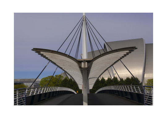
I waited quite a while to get this shot and was hoping to get a shot with no one on it. This wasn’t possible even with the lockdown restrictions. This image works for me as a result of the vertical symmetry of the bridge, also the light hitting of the Armadillo and the blue sky.
As I had the car I could travel to various locations in and around Glasgow and as I was on my own the Police didn’t bother with me. I ventured to various places such as The Quay, West End of Glasgow, City Centre, Dams to Darnley and Port Glasgow. Many of my shots were taken in Glasgow City Centre. As I was in the City Centre much of the time and there were very few people and transport around, I made the decision (with advice from my lecturer) to change my project ever so slightly. I was still going to take perspective/symmetrical (they were more vertical symmetry) shots but to capture the empty streets of Glasgow along with the surreal feeling of a bustling city in lockdown. This was achievable as previously mentioned I could wander about without the police stopping me. Having said that I did find this an anxious experience, I knew I wasn’t doing anything against the law but when there is a police presence I felt sure that I would be stopped. Thankfully I wasn’t as I captured images that produced a feeling of sadness. My project has went from Fine Art to Documentary Photography, a genre that hasn’t necessarily interested me. Having said that I did enjoy this, it was exciting (not because of the Police) I was documenting how the Covid crisis has had an effect of Glasgow City Centre and every city across the world. There were one or two people in a couple of my final shots but for me that adds to the desertedness of the city.

This shot of the entrance at Buchanan Subway is one I like because of the symmetry of the escalators and lights. The eyes follow the lights. This image begins to tell the quietness of a city.

I took this image initially for the shot of the ambulance then when I looked back at my contact sheets I noticed the young man walking across the street. No other traffic but an ambulance, no other people apart from the young man.

I like the perspective of this image, again an empty street (Hutchison Street). There is darkness in the foreground with the trees and shadows but if you keep looking there is light, optimism.

This image of the entrance to the footbridge, I like simply because of the bright colours and again it documents the impact of the virus on people’s daily lives, gates that a normally open to the public are now closed. after looking at this image again, i think if i had stepped to the left slightly, the image would have a more vertical symmetry appeal.

Kelvin Way is normally a busy road for traffic, cyclists and pedestrians. On that day, as with other days, there was a police presence in Kelvingrove Park. This particular road was closed off at either end. I specifically took this shot for the perspective of the road and the police van.

North Hanover Street, deserted, normally busy with cars and buses. There is an air of doom and gloom in this shot with the help of the dark clouds.

St Enoch Subway, only sign of life there were 3 pigeons. Aside from the pigeons this works from a vertical symmetry point of view and of course the fact that the place is deserted at 6.30pm.

Portman Street Suspension Bridge, I love the perspective/symmetry of this shot. Plus I managed to take this shot with no one on the bridge.

To get this shot I had to stand in the middle of the road, this is looking up towards Cathedral Street. I like the fact that I have captured the ‘no entry’ painted on the road. Some’s up the situation at present.
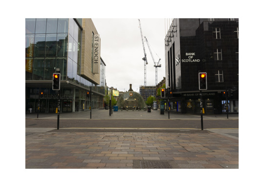
I took this image on Buchanan Street, again to illustrate the emptiness of the city. There is only one person standing at St Enoch centre in that entire vicinity.

Glasgow Green, there were cyclists, joggers and dog walkers going about their way but I managed to take this shot with no one in it. I like this image as there is a focal point, the Glasgow Commonwealth Statue), the eyes are drawn to it with the help of the trees at either side.
Of course, I complied a workbook detailing everything I had shot on each day, any changes to original idea, further research, contact sheets, my thoughts on each. Similar to a journal. This was a big piece of work in itself, I actually found this more daunting than the photoshoots as I do not consider my self to be artistic/creative. As daunting as it was, the workbook was a therapeutic process and reflecting on the day’s work enabled me to explore other ideas. When completing the workbook and looking at the contact sheets I could see my mistakes which made me critical of my work, this wasn’t a bad thing as it gave me the push to do better the next day. This could be considered a positive. Another positive aspect in the project was the Plan. More so the feedback I received. This gave me the confidence and the boost to start. My biggest downfall my research or rather lack of research. However, for the purposes of my Plan, research was a requirement and in doing so gave me the drive and excitement for my Graded Unit. Areas than have been successful? The fact that I have found a new genre of photography that I like, this too is a positive. I do like street photography, but this was different, hardly a soul to be seen, hardly traffic to be heard. This made me look at Glasgow in a different way
With everything there are always opportunities for improvement and photography is no exception. The main area I feel I need to improve on is retouching (Photoshop) I can do the basics, adjusting black, whites, shadows etc in Lightroom. A tool I did come across was a tool called Transform which fixes any perspective distortion. That came in handy when the image didn’t quite look level. I try to avoid Photoshop as much as possible as layer masks and the like confuse me. Therefore, I use either Lightroom or Bridge. Another area of improvement is composition, I always thought I had that covered. I started using 3x3 (in camera) rule of thirds to see if that would help. It did but I don’t want to use that tool. The issue with composition was brought to my attention my lecturer, I would maybe have to much sky or road in my shots. Fortunately, I can easily work on that. For me, the big issue is retouching.
CONCLUSION
I feel that I cannot properly write this evaluation without bringing in the impact of the Covid – 19 virus. This didn’t have an impact on me in that I had to re-think my Graded Unit. I could still go outside; I wasn’t relying on college equipment such as studio lights, cameras, tripods. I knew from the very beginning my photography would be completed outside. The impact on me was my mental health, more so motivation to do the work. Everything was up in the air. But I did it, got out the house with my camera and got on with it.
I was lucky, the only change I made was what I was going to shoot and where. It was going to be city based not based amongst nature. The main emphasis would be the surreal loneliness of a once busy city. As I have a car, I had no issues with getting to locations. As mentioned above, there was a police presence in the city centre and as such felt rushed into taking the shots, this may have contributed to some poor quality images that I took and the fact that the tripod I used was not very sturdy for the camera (Nikon D7100 and Canon 700d). To combat this I started using my monopod and mirrorless cameras (Canon m100 and Sony a6000). I also purchased a sturdier tripod which is yet to be used.
Some of the time I felt I was taking photographs just for the sake of taking an image, just to have something to show and in doing that would maybe only have one or two images I was happy with. Some days I would have nothing but rubbish shots but determination/learning/growth come from failures. The rubbish days gave me the push to do more and not give up. The big lesson there was and is not to give up and believe I can do this. That is another area that is in need of improvement, my self-belief in my photography. When I’m not under pressure I can produce good shots but when I am feeling the pressure my nerve goes, I don’t feel confident. Now that that I have completed my Graded Unit I feel a sense of achievement as this was a big and important project. This was achieved in strange and difficult times. I can learn much from this experience for when I go into year 2 of my HND. Buy a bigger workbook, do more research, learn more about Photoshop and most of all believe in my ability as a photographer.
3 notes
·
View notes
Text
Principles and Practice of Graphic Design
The Principles of Design
Balance - (def.) a situation in which different elements are equal or in the correct proportions.
Balance in design works just as it does in the physical world, large objects may be balanced by small objects, black with white etc. balance provides stability and structure to a design, by evenly distributing the elements on the page so that they complement each other and make the design aesthetically pleasing.
There are 3 types of balance:
- Symmetrical
- Asymmetrical
- Radial
Symmetrical Balance
Symmetrical balance is mirror image balance, all the visual elements on one side of the line of reflection are mirrored on the other side. They don’t have to be identical visual elements but can be similar in number, colour, shape and scale. When visual elements are equal in weight, they are said to be in balance.
This type of balance tends to create more formal looking designs. Structured, ordered, sensible.
example: A Big picture balanced out by a box of text covering the same area
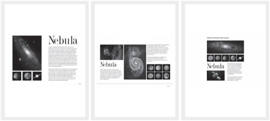
Asymmetrical Balance
Asymmetrical balance is achieved by positioning several smaller elements on one side of a page, and balancing them with a larger visual element on the other side. It creates a feeling that is more casual and less formally structured. It often comes across as more dynamic because elements may be placed in an unorthodox way, with elements overlapping and/or being placed at an angle rather than just horizontally.
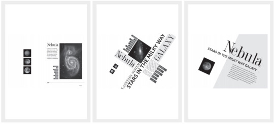
Radial Balance
As the name suggests, radial balance refers to design where all the elements radiate out from a centre point in a circular fashion. This can make it very easy to establish a focal point, as the elements are composed in a way that draws your eye towards the centre.
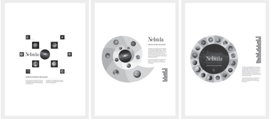
Proximity - (def.) nearness in space, time, or relationship.
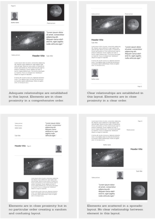
Proximity is used to create connections between elements, or to establish a lack of connection between elements. Moving objects closer or further away from each other is applying the proximity design principle.
These four page layouts have all used proximity in different ways, and the clearest is the top right, because the images and their respective bodies of text are positioned within close proximity to each other
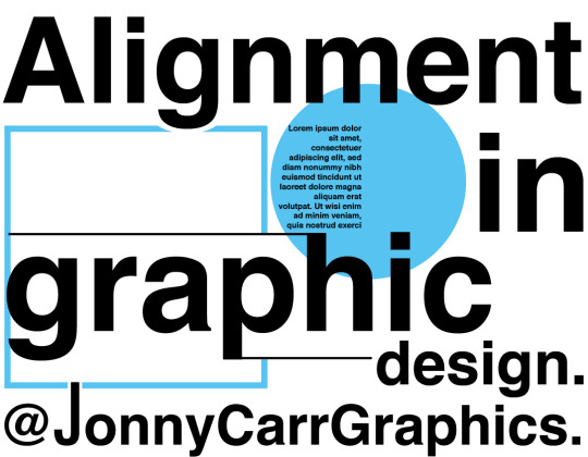
In the image below, 3 individual elements have been placed with a specific proximity to each other, creating a completely new shape made up of negative space

Alignment - (Def.) arrangement in a straight line or in correct relative positions.
Alignment refers to the way in which elements are placed on a page so that they line up in relation to each other and to the composition. There are two alignment principles in graphic design; centre alignment and edge alignment.
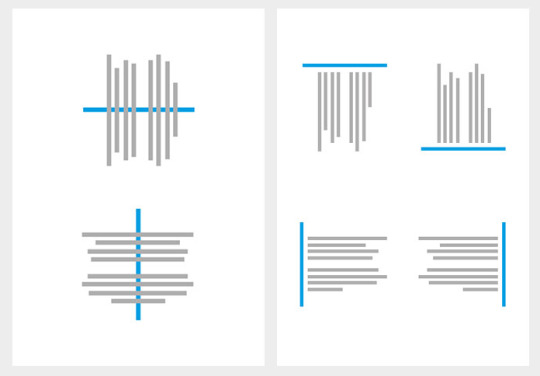
Centre alignment (left) is where elements are distributed and spaced out along a central horizontal or vertical line. This line is imaginary in most cases but is often noticeable when done correctly (or incorrectly!)
Edge alignment (right) refers to elements that are aligned to the top, bottom, left or right
NOTE: ‘Justified’ text refers to text that is aligned to the left margin, but where the word spacing is adjusted so that the text falls flush on both the left and right margins, leaving no gaps on either side.
Repetition - (def.) The action of repeating something that has already been said or written.
If the goal of graphic design is to make a long lasting impression, and repetition can achieve this by showing a viewer something multiple times, so that it sticks in their head (almost like brainwashing.)
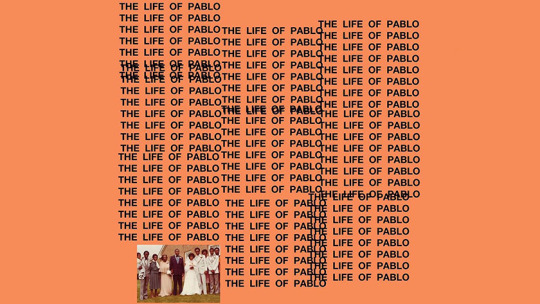
Repetition can be regular or irregular, even or uneven, it can also create patterns that make the design seem more active and dynamic, especially when paired with other principles of design like alignment and proximity. Here are some examples of creative work that use repetition.

Contrast - (def.) the state of being strikingly different from something else in juxtaposition or close association.
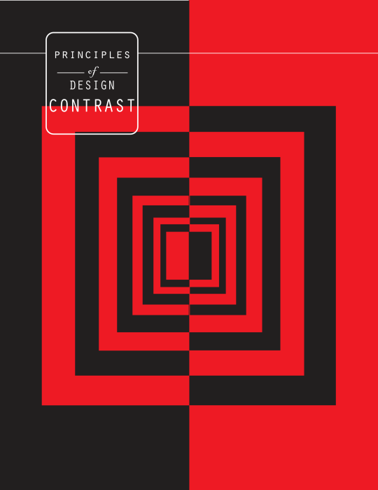
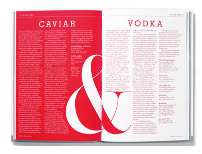
Contrast occurs when two or more visual elements in a composition are different. Contrast can be used for lots of different things, to create impact, highlight key points, create dynamic and exciting pieces and to highlight the difference between two ideas. Context is of paramount importance when it comes to contrast, one visual element may say something about itself, but we learn much more about it when we see it compared with other elements within the composition.

This circle, for example, says very little on its own. We can’t really judge its size or purpose because there are no other elements around it

by adding other elements, we can begin to associate the circle as being big and bold, and standing out from its surroundings.
here are some other design works that use contrast in their approach.

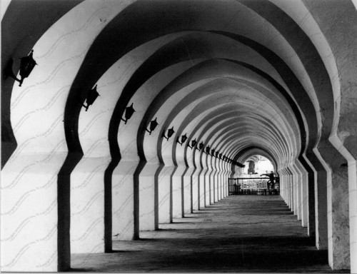
Space - (def.) A continuous area or expanse which is free, available, or unoccupied.
Space in art refers to the distance or area between, around, above, below, or within elements. Both positive and negative space are important factors to be considered in every design.
Positive space respects to objects within the composition, usually referring to anything that is considered the main focus of the page
negative space is the empty space between the designs, it can also refer to the background. Negative space connects shapes and helps frame a composition. It also prevents visual clutter.
Space can create beautifully minimal art. it can also make a design seem gritty and to the point because the central focus isn’t hidden or surrounded by other design elements that take away from its meaning.
Here are some examples of designs that use space in their approach:


1 note
·
View note
Text
Magazine Proposal Final Idea+Layout Sketch
The first idea for a magazine I had was that of an art analysis magazine that focuses on artworks that influenced peoples’ opinions and ways of looking at the medium those works were created with. As this idea revolves around human perception and experience with art, the artworks analyzed will be those that have revolutionized the general way of interpreting said work’s medium by exploring themes of human behavior by putting into question the methods that have led to that prior way of looking at the medium in the first place. I was heavily inspired by articles such as Véronneau Pierre’s “Quebec Film History: 1896 to 1969” which detailed different advancements and films that changed the course of how film was regarded in the province.
Due to how I intend to lay out this magazine in a dualistic manner, the most appropriate format for it would be that of a saddle stitch binding print magazine. As for the magazine print itself, I plan for it to be 9 by 12 inches. The page sets will be heavily center balanced, with images lining the middle in a layout symmetrical to the other page and text lining the middle and the edges of each page. As the general theme throughout this magazine issue is that of choice and human behavior, and how those decisions can change depending on previous actions, the overall layout strategy will reflect that through both bilateral symmetry and a chaining/helical structure, with the page split acting as the vertical axis, possibly adding a horizontal axis if needed (Samara). Alongside some helical chaining, I will incorporate some elements from the Radial Network design on page 205 of the Making and Breaking the Grid textbook (Samara). Both styles combined will work to illustrate the concept of branching and rediscovered possibilities, with the text explaining those different possibilities oftentimes portraying their contradictions through their positioning. If the content allows for it, there’s the option to pictorialize the text to fit the shape of the prevalent element of the content being discussed in each set of pages.
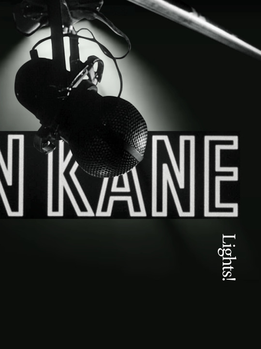
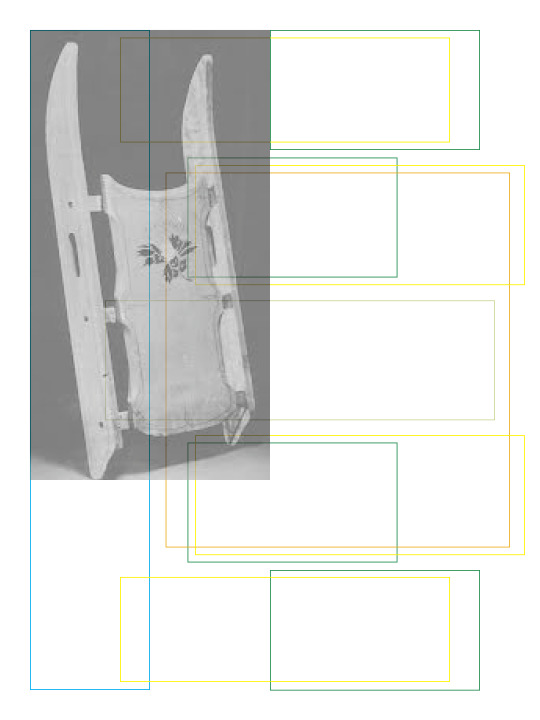
So far, I have selected 3 works: Citizen Kane by Orson Welles, Rhythm 0 by Marina Abramović, and Undertale by Toby Fox. The first is a film about the rediscovery of the past life choices of one deceased Charles Foster Kane, focusing on the innovative editing and filming techniques that the film introduced while touching on the importance of this character’s choices (Brownell). The second is about the choices of the audience when presented with the option to either perform silly acts with the items laid out in her performance piece and how they escalated into more sadistic ones, providing insight on human nature when given complete freedom (Wood). The third will also involve player choice using games to juxtapose different realities to present different worldviews (Tuersley). It simultaneously puts into question how people make decisions in games (Tuersely). This selection should have enough content to talk about to make up several pages, enough variety in terms of mediums discussed, and enough similarities throughout in their respective themes relating to personal choice and human behavior.
All in all, I’m aiming for a magazine that uses symmetrical techniques to help visualize contrasting points in the content of the magazine, which in and of itself revolves around contrasting choices.
Works Cited:
Brownell, Richard. “Why You Should Care about Citizen Kane.” Medium, Medium, 5 Jan. 2019, https://medium.com/@rickbrownell/why-you-should-care-about-citizen-kane-19d98346317b.
Samara, Timothy. Making and Breaking the Grid (Revised and Updated): A Graphic Design Layout Workshop. 2nd ed., Rockport Publishers, 2017.
Tuersley, Andrew. “Patrician Perspective: Reading Undertale - Youtube.” YouTube, 5 Feb. 2019, https://www.youtube.com/watch?v=5vK5qg2R588.
Wood, Catherine. “'Rhythm 0', Marina Abramovic, 1974.” Tate, DCMS, Mar. 2010, https://www.tate.org.uk/art/artworks/abramovic-rhythm-0-t14875.




P.S. Proposal for Idea 2 is in the Work-in-progress post, it didn't change. Except I added a works cited to it.
0 notes
Text
Unit 05 “The Great Masjid of Cordoba & Iqbal” Class 10 Notes

Unit 05 “The Great Masjid of Cordoba & Iqbal” Class 10 English Notes 2021 for KPK, Fbise, Sindh, and Punjab boards.
Unit 05 “The Great Masjid of Cordoba & Iqbal” Class 10 English Notes 2021

Allama Iqbal poem on great Mosque of Cordoba
A. Answer the following questions.
Q1: Where did Abdur Rehman 1 import fruit trees & other plants from? Why?
Ans: Abdur Rehman 1 imported fruit trees & other plants from Damascus to Cordoba because he wanted to make Cordoba a glorious place.
Q2: What can we achieve again if we enkindle in ourselves the master-passion (Ishq)?
Ans: We can achieve the past glory & greatness if we enkindle in ourselves the passion of Ishq.
Q3: What is the view of Iqbal about the Masjid of Cordoba? Explain
Ans: The view of Iqbal about the Masjid of Cordoba is that the Masjid Cordoba is a symbol of faith and dominance of Islamic civilization in Europe. The existence of Masjid is due to Ishq and its foundations are everlasting.
Q4: What, in your opinion, is the significance of the Masjid of Cordoba to present-day Muslims? Explain.
Ans: The Masjid Cordoba is a symbol of the past glory & greatness of the Muslims & their dominance over Europe. It takes us to the golden age of Islam which provided enlightenment to the dark ages of Europe.
Q5: Why did Iqbal greatly appreciated a faraway Masjid in Spain, when there were superb buildings of the Muslim era in the sub-continent?
Ans: Iqbal greatly appreciated the great Masjid of Cordoba to tell the present-day Muslims the glory, strength & greatness of Muslims and Islam in Europe. The Masjid is the outstanding symbol of faith and also the finest work of Muslim Art.
B. Choose the correct option.
- (c) Christians
- (c) Exalted state of moral and spiritual character
- (b) Metaphor
- (d) Skillful
- (b)The glory of Muslim rule in Spain.
Grammar
Choose the correct type of adjectives to fill in the blanks.
- (c) Demonstrative adjective
- (b) Indefinite adjective
- (c) Demonstrative adjective
- (a) An adjective that modifies the pronoun
- (a) ) An adjective that modifies the pronoun
D. Use the nouns given in parenthesis to form adjectives.
- I wish I had (magic)……......….. powers. (Magical)
- My sister is (allergy)……........ to cats. (Allergic)
- That bird has a (love)…........… voice. (Lovely)
- Akram has a (Friend)…........…. Relationship with his customers. (Friendly)
- The project has been brought to a (success)….…… conclusion. (Successful)
Grade 10 English Notes for KPK Textbook Updated 2021
Where did Abdur Rehman I import fruit trees and other plants from?Why?Abdur Rehman I after the fall of the Ummayad Dynasty, came and settled in Southern Spain. He wanted to recreate the glory of Damascus in the Iberian Penisula that's why he imported fruit trees from his own land i.e. Damascus in order to promote agriculture in the Iberian Peninsula.What can we achieve again if we enkindle in ourselves the master-passion (Ishq)?We can achieve the exalted state of moral and spiritual character if we enkindle in ourselves the master-passion (Ishq).What is the view of Iqbal about the Masjid of Cordoba? Explain his view in your own words.According to Iqbal, the Masjid of Cordoba is built by those who were in deep love or had Ishq with their Creator, Allah Almighty. Iqbal considered Ishq as a feeling that has a burning desire to one'e utmost in order to achieve one's ideal of perfection and self realization through the moral teachings of Islam. Iqbal says that it is this passion of that era Muslims and the power and glory of the Masjid of Cordoba that extend their dominance to far off lands. Iqbal is of the view that the beauty and grandeur of the Masjid reflects the intense love and reverence of Mard-e-Khuda towards the ultimate Creator.What, in your opinion, is the significance of the Masjid of Cordoba to present-day Muslims? Explain.The Masjid of Cordoba is of vital importance to the present-day Muslims because when they pay a visit to it or just get a chance to read about it, they will be moved not only by its architecture and glory but they are able to feel the glory of Islam and dominance of Muslim in the European world.Why did Iqbal greatly appreciate a faraway Masjid in Spain, when there were superb buildings of the Muslim era in Sub-Continent?Iqbal greatly appreciated a faraway Masjid in Spain i.e. the Masjid of Cordoba because he had a desire to pay tribute to the Ishq of the builders of the Masjid. It was a sort of pilgrimage that he paid to an outstanding symbol of faith. He wanted to experience the grandeur and glory of Muslim era when Muslims ruled Spain which further became a source of providing roots to the enlightenment of Europe. He was so moved with the architecture and glory of the Masjid that he expressed his feelings in the form of a poetic piece 'the Masjid-e-Qurtaba.'
Writing Skills English 10th Notes
Q.1) Imagine yourself to be standing in the middle of the prayer hall of the Masjid of Cordoba; now develop a paragraph in spatial order on what you see around you.
While standing in the middle of the prayer hall of the Masjid of Cordoba one can be amazed to be around 857 columns of the Masjid with a superb view of two-tiered symmetrical arches. These arches are made of stone and red bricks. In the prayer hall, the horseshoe arched mihrab is the center of attraction for the visitors along with the Qibla wall of the mihrab. Two lines of calligraphy in kofic style catches the attention of people that are inscribed on the arch and Qibla wall of the mihrab both on the top and either side of the arch.
The two lines of calligraphy have a mosaic of a blue background with gold letters, on the other hand, the single line of calligraphy over the arch is mosaic having a golden background with blue letters. The beauty of the mihrab is enhanced by the repeated floral designs of plants in dark blue, reddish-brown, yellow and golden rays of light. One can identify a dome over the mihrab that is built of crisscrossing ribs creating pointed arches. They are all extensively and beautifully covered with gold mosaic in a radial pattern.
Write an expository essay showing comparison and contrast between the Masjid of Cordoba and the Badshahi Masjid.
For Muslims Masjid is the most important place where they can pray and find peace of mind and soul. All over the globe, wherever the Muslims make their move, they establish either a simple or a lavish masjid that facilitates them in their daily five times prayer. In Indo-Pak subcontinent, one of the outstanding landmarks is the Badshahi Masjid built during Mughal era some 400 years back. Similarly, the Masjid of Cordoba in the European state of Spain stands with all its glory and grandeur representing the architecture of 784 C.E.
The Masjid of Cordoba served as a Church before Muslim Amir Abd-ur-Rehman I who converted it into a masjid. The most notable element of the Masjid of Cordoba is its giant arches with over 1,000 columns made of jasper, onyx, marble, and granite. What distinguishes the Majid of Cordoba from any other Masjid of the world are the double arches as they were considered a new architectural feature.
Not only this, the rich and exquisite design patterns mark it standing as one of the most alluring masjids that exist. Apart from this, another outstanding feature of Masjid of Cordoba is the horseshoe arched mihrab present in the prayer hall. It was basically a common feature in the architecture of the Visigoths. Later it eventually spread across North Africa from Morocco to Egypt and is an easily identified characteristic of Western Islamic architecture. The dazzling dome above the mihrab catches the attention of the visitors as it is built of crisscrossing ribs that create pointed arches all lavishly covered with gold mosaic in a radial pattern.
The Badshahi Masjid of Lahore is a clear representation of Muslim architecture. The mosque's full name "Masjid Abul Zafar Muhy-ud-Din Mohammad Alamgir Badshah Ghazi" is written in inlaid marble above the vaulted entrance. The main entrance gateway is the unique feature of the masjid, it is a two-storey edifice built of red sandstone elaborately decorated with framed and carved panelling on each of its facades. Red sandstone is a notable feature that makes this masjid different from others. Prayer hall, courtyard, minarets all are made of red sandstone. The masjid has three white domes that are the signature of Mulsim architecture of a masjid.
The double-arched columns differ the Masjid of Cordoba from Badshahi Masjid. On the other hand, the red sandstone architecture of Badshahi Masjid helps to make it stand out in architecture and style. The Badshahi Majid has four octagonal minarets in the four corners whereas the Masjid of Cordoba has one of its kind that contained two staircases. Floral patterns and intricate floral Mughal frescoes of the Badshahi Masjid differentiate it from the Masjid of Cordoba.
Masjid holds a significant place in the life of Muslims therefore, they must be built keeping in view their glory and grandeur and people must offer their prayers in a masjid to make it alive in true letter and spirits.
Related Post:
- Unit 1 Simplicity and Humility of Hazrat Muhammad (PBUH) Class 10 Notes
- UNIT 03 POEM DREAMS LANGSTON HUGHES
- UNIT 04 POPULATION GROWTH AND ITS IMPACT ON ENVIRONMENT”
- UNIT 05 “THE GREAT MASJID OF CORDOBA & IQBAL” CLASS 10 NOTES
- UNIT 6 IN SPITE OF WAR ANGELA MORGAN ENGLISH NOTES CLASS 10
- UNIT 07 THE AGED MOTHER ENGLISH NOTES CLASS 10
- UNIT 08 WOMEN ROLE IN THE PAKISTAN MOVEMENT
- UNIT 09 POEM EQUIPMENT EDGAR GUEST
- UNIT 10 WATER SCARCITY IN PAKISTAN
- UNIT 11 GENETICALLY MODIFIED ORGANISMS (GMOS)
- UNIT 12 THEY HAVE CUT DOWN THE PINES MARY LISLE
- UNIT 13 HAZRAT UMAR (RA) CLASS 10 ENGLISH NOTES
- UNIT 14 THE MODEL MILLIONAIRE CLASS 10 NOTES
- UNIT 15 POEM OPPORTUNITY WALTER MALONE
First stepVisit Google search engine type Unit 05 “The Great Masjid of Cordoba & Iqbal” Class 10 Notes visit perfect24u.com and belw pdf file download now.
Click here download buttonand open googledrive click here top corner download option.
Updated Class 10 English Handwriting Notes KPK TEXTbook
Donwload Now Pdf
PARAPHRASES OF POEM Class 10 English Notes PDF
- PARAPHRASES OF POEM DREAMS CLASS 10 ENGLISH NOTES
- PARAPHRASES OF POEM 2 IN SPITE OF WAR CLASS 10 ENGLISH NOTES
- PARAPHRASES OF POEMS 3 EQUIPMENT CLASS 10 ENGLISH NOTES
- PARAPHRASES OF POEM 4 THEY HAVE CUT DOWN THE PINES CLASS 10 ENGLISH NOTES
- PARAPHRASES OF POEM 5 OPPORTUNITY CLASS 10 ENGLISH NOTES
STANZA COMPREHENSION Class 10 English Notes Downalod PDF
- STANZA COMPREHENSION POEM 1 dream LANGSTON HUGHES CLASS 10
- STANZA COMPREHENSION POEM 2 IN SPITE OF WAR CLASS 10
- STANZA COMPREHENSION POEM 3 EQUIPMENT EDGAR GUEST CLASS 10
- STANZA COMPREHENSION POEM 4 THEY HAVE CUT DOWN THE PINES MARY LISLE CLASS
- STANZA COMPREHENSION POEM 5 OPPORTUNITY WALTER MALONE CLASS 10
English Essay Class 10th KPK Textbook
Visit Now
Read the full article
#10th#2021notes#adamjee#aiou#cbse#class10englishchapter6notes#Class10EnglishNotes#class10englishnotesptb#classtenenglishnotes#du#englishlanguage#englishnotesofclass10#FBISE#federalboard#Grammar#kpk#literature#practicalcentrenotes#Punjab#punjabuniversity#sindh#sol#speaking#standardnotes#thegreatmasjidofcordobaandiqbalthemosqueofcordobaallamaiqbal#writing#xclassenglishnotes
0 notes
Text
Unit 05 “The Great Masjid of Cordoba & Iqbal” Class 10 Notes

Unit 05 “The Great Masjid of Cordoba & Iqbal” Class 10 English Notes 2021 for KPK, Fbise, Sindh, and Punjab boards.
Unit 05 “The Great Masjid of Cordoba & Iqbal” Class 10 English Notes 2021

Allama Iqbal poem on great Mosque of Cordoba
A. Answer the following questions.
Q1: Where did Abdur Rehman 1 import fruit trees & other plants from? Why?
Ans: Abdur Rehman 1 imported fruit trees & other plants from Damascus to Cordoba because he wanted to make Cordoba a glorious place.
Q2: What can we achieve again if we enkindle in ourselves the master-passion (Ishq)?
Ans: We can achieve the past glory & greatness if we enkindle in ourselves the passion of Ishq.
Q3: What is the view of Iqbal about the Masjid of Cordoba? Explain
Ans: The view of Iqbal about the Masjid of Cordoba is that the Masjid Cordoba is a symbol of faith and dominance of Islamic civilization in Europe. The existence of Masjid is due to Ishq and its foundations are everlasting.
Q4: What, in your opinion, is the significance of the Masjid of Cordoba to present-day Muslims? Explain.
Ans: The Masjid Cordoba is a symbol of the past glory & greatness of the Muslims & their dominance over Europe. It takes us to the golden age of Islam which provided enlightenment to the dark ages of Europe.
Q5: Why did Iqbal greatly appreciated a faraway Masjid in Spain, when there were superb buildings of the Muslim era in the sub-continent?
Ans: Iqbal greatly appreciated the great Masjid of Cordoba to tell the present-day Muslims the glory, strength & greatness of Muslims and Islam in Europe. The Masjid is the outstanding symbol of faith and also the finest work of Muslim Art.
B. Choose the correct option.
- (c) Christians
- (c) Exalted state of moral and spiritual character
- (b) Metaphor
- (d) Skillful
- (b)The glory of Muslim rule in Spain.
Grammar
Choose the correct type of adjectives to fill in the blanks.
- (c) Demonstrative adjective
- (b) Indefinite adjective
- (c) Demonstrative adjective
- (a) An adjective that modifies the pronoun
- (a) ) An adjective that modifies the pronoun
D. Use the nouns given in parenthesis to form adjectives.
- I wish I had (magic)……......….. powers. (Magical)
- My sister is (allergy)……........ to cats. (Allergic)
- That bird has a (love)…........… voice. (Lovely)
- Akram has a (Friend)…........…. Relationship with his customers. (Friendly)
- The project has been brought to a (success)….…… conclusion. (Successful)
Grade 10 English Notes for KPK Textbook Updated 2021
Where did Abdur Rehman I import fruit trees and other plants from?Why?Abdur Rehman I after the fall of the Ummayad Dynasty, came and settled in Southern Spain. He wanted to recreate the glory of Damascus in the Iberian Penisula that's why he imported fruit trees from his own land i.e. Damascus in order to promote agriculture in the Iberian Peninsula.What can we achieve again if we enkindle in ourselves the master-passion (Ishq)?We can achieve the exalted state of moral and spiritual character if we enkindle in ourselves the master-passion (Ishq).What is the view of Iqbal about the Masjid of Cordoba? Explain his view in your own words.According to Iqbal, the Masjid of Cordoba is built by those who were in deep love or had Ishq with their Creator, Allah Almighty. Iqbal considered Ishq as a feeling that has a burning desire to one'e utmost in order to achieve one's ideal of perfection and self realization through the moral teachings of Islam. Iqbal says that it is this passion of that era Muslims and the power and glory of the Masjid of Cordoba that extend their dominance to far off lands. Iqbal is of the view that the beauty and grandeur of the Masjid reflects the intense love and reverence of Mard-e-Khuda towards the ultimate Creator.What, in your opinion, is the significance of the Masjid of Cordoba to present-day Muslims? Explain.The Masjid of Cordoba is of vital importance to the present-day Muslims because when they pay a visit to it or just get a chance to read about it, they will be moved not only by its architecture and glory but they are able to feel the glory of Islam and dominance of Muslim in the European world.Why did Iqbal greatly appreciate a faraway Masjid in Spain, when there were superb buildings of the Muslim era in Sub-Continent?Iqbal greatly appreciated a faraway Masjid in Spain i.e. the Masjid of Cordoba because he had a desire to pay tribute to the Ishq of the builders of the Masjid. It was a sort of pilgrimage that he paid to an outstanding symbol of faith. He wanted to experience the grandeur and glory of Muslim era when Muslims ruled Spain which further became a source of providing roots to the enlightenment of Europe. He was so moved with the architecture and glory of the Masjid that he expressed his feelings in the form of a poetic piece 'the Masjid-e-Qurtaba.'
Writing Skills English 10th Notes
Q.1) Imagine yourself to be standing in the middle of the prayer hall of the Masjid of Cordoba; now develop a paragraph in spatial order on what you see around you.
While standing in the middle of the prayer hall of the Masjid of Cordoba one can be amazed to be around 857 columns of the Masjid with a superb view of two-tiered symmetrical arches. These arches are made of stone and red bricks. In the prayer hall, the horseshoe arched mihrab is the center of attraction for the visitors along with the Qibla wall of the mihrab. Two lines of calligraphy in kofic style catches the attention of people that are inscribed on the arch and Qibla wall of the mihrab both on the top and either side of the arch.
The two lines of calligraphy have a mosaic of a blue background with gold letters, on the other hand, the single line of calligraphy over the arch is mosaic having a golden background with blue letters. The beauty of the mihrab is enhanced by the repeated floral designs of plants in dark blue, reddish-brown, yellow and golden rays of light. One can identify a dome over the mihrab that is built of crisscrossing ribs creating pointed arches. They are all extensively and beautifully covered with gold mosaic in a radial pattern.
Write an expository essay showing comparison and contrast between the Masjid of Cordoba and the Badshahi Masjid.
For Muslims Masjid is the most important place where they can pray and find peace of mind and soul. All over the globe, wherever the Muslims make their move, they establish either a simple or a lavish masjid that facilitates them in their daily five times prayer. In Indo-Pak subcontinent, one of the outstanding landmarks is the Badshahi Masjid built during Mughal era some 400 years back. Similarly, the Masjid of Cordoba in the European state of Spain stands with all its glory and grandeur representing the architecture of 784 C.E.
The Masjid of Cordoba served as a Church before Muslim Amir Abd-ur-Rehman I who converted it into a masjid. The most notable element of the Masjid of Cordoba is its giant arches with over 1,000 columns made of jasper, onyx, marble, and granite. What distinguishes the Majid of Cordoba from any other Masjid of the world are the double arches as they were considered a new architectural feature.
Not only this, the rich and exquisite design patterns mark it standing as one of the most alluring masjids that exist. Apart from this, another outstanding feature of Masjid of Cordoba is the horseshoe arched mihrab present in the prayer hall. It was basically a common feature in the architecture of the Visigoths. Later it eventually spread across North Africa from Morocco to Egypt and is an easily identified characteristic of Western Islamic architecture. The dazzling dome above the mihrab catches the attention of the visitors as it is built of crisscrossing ribs that create pointed arches all lavishly covered with gold mosaic in a radial pattern.
The Badshahi Masjid of Lahore is a clear representation of Muslim architecture. The mosque's full name "Masjid Abul Zafar Muhy-ud-Din Mohammad Alamgir Badshah Ghazi" is written in inlaid marble above the vaulted entrance. The main entrance gateway is the unique feature of the masjid, it is a two-storey edifice built of red sandstone elaborately decorated with framed and carved panelling on each of its facades. Red sandstone is a notable feature that makes this masjid different from others. Prayer hall, courtyard, minarets all are made of red sandstone. The masjid has three white domes that are the signature of Mulsim architecture of a masjid.
The double-arched columns differ the Masjid of Cordoba from Badshahi Masjid. On the other hand, the red sandstone architecture of Badshahi Masjid helps to make it stand out in architecture and style. The Badshahi Majid has four octagonal minarets in the four corners whereas the Masjid of Cordoba has one of its kind that contained two staircases. Floral patterns and intricate floral Mughal frescoes of the Badshahi Masjid differentiate it from the Masjid of Cordoba.
Masjid holds a significant place in the life of Muslims therefore, they must be built keeping in view their glory and grandeur and people must offer their prayers in a masjid to make it alive in true letter and spirits.
Related Post:
- Unit 1 Simplicity and Humility of Hazrat Muhammad (PBUH) Class 10 Notes
- UNIT 03 POEM DREAMS LANGSTON HUGHES
- UNIT 04 POPULATION GROWTH AND ITS IMPACT ON ENVIRONMENT”
- UNIT 05 “THE GREAT MASJID OF CORDOBA & IQBAL” CLASS 10 NOTES
- UNIT 6 IN SPITE OF WAR ANGELA MORGAN ENGLISH NOTES CLASS 10
- UNIT 07 THE AGED MOTHER ENGLISH NOTES CLASS 10
- UNIT 08 WOMEN ROLE IN THE PAKISTAN MOVEMENT
- UNIT 09 POEM EQUIPMENT EDGAR GUEST
- UNIT 10 WATER SCARCITY IN PAKISTAN
- UNIT 11 GENETICALLY MODIFIED ORGANISMS (GMOS)
- UNIT 12 THEY HAVE CUT DOWN THE PINES MARY LISLE
- UNIT 13 HAZRAT UMAR (RA) CLASS 10 ENGLISH NOTES
- UNIT 14 THE MODEL MILLIONAIRE CLASS 10 NOTES
- UNIT 15 POEM OPPORTUNITY WALTER MALONE
First stepVisit Google search engine type Unit 05 “The Great Masjid of Cordoba & Iqbal” Class 10 Notes visit perfect24u.com and belw pdf file download now.
Click here download buttonand open googledrive click here top corner download option.
Updated Class 10 English Handwriting Notes KPK TEXTbook
Donwload Now Pdf
PARAPHRASES OF POEM Class 10 English Notes PDF
- PARAPHRASES OF POEM DREAMS CLASS 10 ENGLISH NOTES
- PARAPHRASES OF POEM 2 IN SPITE OF WAR CLASS 10 ENGLISH NOTES
- PARAPHRASES OF POEMS 3 EQUIPMENT CLASS 10 ENGLISH NOTES
- PARAPHRASES OF POEM 4 THEY HAVE CUT DOWN THE PINES CLASS 10 ENGLISH NOTES
- PARAPHRASES OF POEM 5 OPPORTUNITY CLASS 10 ENGLISH NOTES
STANZA COMPREHENSION Class 10 English Notes Downalod PDF
- STANZA COMPREHENSION POEM 1 dream LANGSTON HUGHES CLASS 10
- STANZA COMPREHENSION POEM 2 IN SPITE OF WAR CLASS 10
- STANZA COMPREHENSION POEM 3 EQUIPMENT EDGAR GUEST CLASS 10
- STANZA COMPREHENSION POEM 4 THEY HAVE CUT DOWN THE PINES MARY LISLE CLASS
- STANZA COMPREHENSION POEM 5 OPPORTUNITY WALTER MALONE CLASS 10
English Essay Class 10th KPK Textbook
Visit Now
Read the full article
#10th#2021notes#adamjee#aiou#cbse#du#englishlanguage#FBISE#federalboard#Grammar#kpk#literature#practicalcentrenotes#Punjab#punjabuniversity#sindh#sol#speaking#standardnotes#writing
0 notes
Text
Business Card Project - Part 1
Around the time this module started, I got back into contact with someone by the name of Josh Hitchcock who I met and worked with back in college. We met when we were 16 and worked on several projects with each other during our year studying photography together, I learned a lot from Josh and we’ve stayed loosely in contact ever since leaving school but haven’t collaborated on anything for around 5 years despite having always had similar interests, styles and aesthetics. Josh is also still pursuing his passions and talents in visual communication and is beginning to build a portfolio with the aim of applying for a BA, just like I was doing this time last year. Alongside getting himself prepared to do a degree, he has been expanding his online presence and slowly establishing a business and brand identity for himself. He reached out to me originally to ask if I could potentially create him a logo that he could use across all of his platforms which he needed fairly quickly as he was building a website, unfortunately I couldn’t meet the turnaround deadline and so he commissioned someone else to do a logo, later reaching out to me again to ask if I might be able to create business cards instead.
Josh had already started sketching out ideas and so he sent me his drawings as a starting point for the design
After some discussion and a little bit of time, Josh came to the decision that this was his favorite prospective card design and even began experimenting with it's colors.
It was at this point that I asked him to create a Pinterest board to help gather all of the ideas together which he promptly delivered on. Pinterest’s description of the board “Clean, simple doodles. Photography orientated based on nature and ancient art. A perfect combination of tech, nature and aesthetic.” sums it up perfectly. This was a really strong starting point for the overall design as it includes everything from small decorative graphic details such as flowers, vines and suns; to a concise range of colors for the palette of the art itself. The board isn’t overcrowded, it's clearly well thought through and does good job of clearly communicating the kind of style that I was expected to reflect in my design.
Coincidentally around the same time I started this project, I decided to treat myself to an iPad Pro and Apple Pencil to support my University work, these have become increasing popular in the art world because they are incredibly powerful creative tools, I chose to invest in it mainly for it’s capabilities in creating digital art using the Adobe suite and Procreate using the pencil which is exclusive to iOS and has is slowly becoming the standard for digital drawings.
Having recently attended the Illustrator workshop, I thought that I would experiment with using this software both on my iPad and computer as I figured if I could learn to use them in conjunction with one another from the get go, I would be in a better position overall later on; but in doing so, I threw myself two learning curves at once as I was not only dabbling in software I wasn’t comfortable with but also using that software on a device that I am a complete beginner to which was a definite challenge for myself.
I started out by doing a Google search to find out what the standard size is for business cards and found out that is generally 3.5 x 2 inches (1050 x 600 pixels at 300 DPI, which is the standard DPI for printing). This is how I decided to set my document up which is what gives me the white rectangular shape that you see me working on to start off with.
To begin the design, I picked out my favorite things from Josh's sketch which were the wavy line details and the bohemian style sun. I created some simple outlines using the line tools on iPad Illustrator starting with the border and dividing horizontal line where I intended the design to end, from this I was able rough out where patches of lines would go and add the sun. For the sun, I originally tried to draw one with wavy points but I was struggling to get it proportionate, even when I'd figured out how to use the reflect tool to make my drawing symmetrical, it seemed to be throwing the design off and so I threw this idea out and went for a pointed sun design instead. I chose triangles for the points as a subtle reference to the exposure triangle which is a rule that dictates camera settings when it comes to photography so it ties in with the business well and was also a concept that Josh was trying to reflect in his logo. I achieved the geometrically accurate shape of the points around the sun by creating the very top triangle and then using the Radial Reflect tool whilst using my iPad which automatically created the rest of the points for me with even spacing and perfect symmetry; all I had to do then was resize the points as I pleased. Once I had done this, I decided to repeat the process but with a small line between each point to give it an extra beaming sunshine look, this also fits in with how some of the sun's and graphics are drawn on the Pinterest board that I'm referring to as I design this.
Once the outlines were complete, I started experimenting with filling in the patches with lines, this is an effect that is featured on the album art of one of my favorite albums of all time, Currents by Tame Impala which I previously learned how to do using a vector pack from Spoon Graphics as I did work inspired by it for my University portfolio. Although I have used these particularly line textures before, I have only used them in Photoshop and not Illustrator so I haven't actually used the vector versions of them up until this point. I inserted these into my work using my computer as that's where they were saved, I was able to use Adobe Cloud to sync my work between my PC and iPad making it easy and convenient to switch between the two whilst working. Adjusting the waves worked similarly to how it does when I use them in Photoshop, I just added them in as a layer and then used direct selection mode to delete the extra lines around the outlines and border that I’d drawn in leaving me with what you see above. At this point, I sent what I’d done so far to Josh so that I could begin to get his feedback and make sure that what I was doing was in line with his vision.
Whilst I was waiting for him to reply, I started experimenting with adding color to the design hoping that it would help us visualize it better; I used colors directly from the Pinterest board for my palette by taking a screenshot of the webpage, opening it up in Illustrator, swatching all of the colors and adding them to my Color Library so that they could be easily accessed whenever I needed them.
At this point, I just filled in the colors according to what made sense to me, blue for the sky, yellow for the sun and something contrasting for the wavy lines, honestly, I chose orange because it’s my favorite color and I really like the way that the purple looks next to it, especially against the blue background where it appears slightly more subtle whilst still being effective at breaking up the image in the way that it needs to.
I continued to add colour, changing every other point on the sun to be red to give it more dimension and incorporate more of the colours from the chosen scheme; I then added green to the bottom section which I chose because I thought it would represent grass and fit in with the sun and sky theme that seemed to be emerging. I also added some small stars as I was experimenting with the shape tools dotting them into some small empty spaces on the design so that they line up in a triangular shape which is another subtle reference to the expose triangle.
Then I started experimenting with adding text and social media icons, Josh had told me that he wanted his name, website and social media information on the card, we decided to leave his phone number out as he only has a personal mobile number and didn’t want to risk handing it out to strangers. I chose this Art Deco style font for the name because I liked the lines in it and thought it went well with the lines in the top half of the design which are probably my favourite thing about it at this point. I didn’t use the same font for the website because it doesn’t look as good when it’s small, you can’t really see the lines and it made the website hard to read so instead I chose this glyph font which I thought Josh would like based on some of the imagery from the Pinterest board; I was unsure about this choice at first but it quickly grew on me as it’s subtle and yet it makes the website look bold on the bottom of the image which draws your eye down to it when you’re reading the information. I also added some social shapes to the front keeping Josh updated on my progress as I went along.
It was at this point that I started to receive some feedback from him, he was really happy with the first impressions of the design but did want to make a few changes. He started out by asking if I could change the green on the bottom to the orange colour in the waves with the hope of giving the card a more uniform look which we both agreed looked much better. He then asked me if I’d started designing the back which I hate to admit that I hadn’t actually thought about at this point and so we started discussing the layout; collectively agreeing to move the social media information to the back of the card and have that there along with some sort of bio which I much preferred the idea of as I wasn’t too keen on how the social shapes looked on the front of the card and I was worried about how I was going to fit all of the contact details on without making it look messy.

Originally we thought it might be nice to add some floral details to the front of the card where the space had now been freed up but we quickly decided that this didn’t look quite right.
0 notes