#ProjectSatisfaction
Text
"𝐂𝐥𝐢𝐞𝐧𝐭-𝐝𝐫𝐢𝐯𝐞𝐧 𝐝𝐞𝐬𝐢𝐠𝐧 𝐚𝐝𝐣𝐮𝐬𝐭𝐦𝐞𝐧𝐭𝐬 𝐫𝐞𝐟𝐢𝐧𝐞 𝐚𝐧𝐝 𝐞𝐧𝐡𝐚𝐧𝐜𝐞 𝐩𝐫𝐨𝐣𝐞𝐜𝐭, 𝐞𝐧𝐬𝐮𝐫𝐢𝐧𝐠 𝐭𝐚𝐢𝐥𝐨𝐫𝐞𝐝 𝐬𝐚𝐭𝐢𝐬𝐟𝐚𝐜𝐭𝐢𝐨𝐧."
Official website, link below ⤵️
🌐 www.skillboatlearning.com
Business phone number :
Call 📞+91 7717427009
#skillboatlearning#WebDesignCourse#LearnWebDesign#ContinuousLearning#DesignSkills#ClientDrivenDesign#RefineAndEnhance#TailoredSatisfaction#DesignAdjustments#ClientSatisfactionMeme#EnhancedProjects#ProjectPerfection#DesignMeme#ClientFeedback#CustomizedDesign#MemeMagic#ClientFocusedDesign#ProjectSatisfaction#MemeHumor#MemeCreativity#coding#codingmeme#memeoftheday
0 notes
Text
DAY-IN-THE-LIFE OF A SPACE UTILIZATION STUDY
DAY ONE OF #PROJECTSATISFACTION
FacilityQuest started a two-week utilization study for a well-known tech company in one of its European offices. A utilization study gathers data about "how many people are doing what activities in what types of spaces." This study covers 14-floor plans in three locations, and we're very happy to have our partner MovePlan taking good care of the ten observers over the two weeks of the study.
We've never before told the data gathering story as it unfolds day-by-day, but this project might be a good one to try it on. Stay tuned for more updates in the next two weeks. To help track this story on LinkedIn, we’re code naming this #ProjectSatisfaction, since Keith Richards laid down one of the greatest pop hooks of all time on this day--May 7--in 1965.
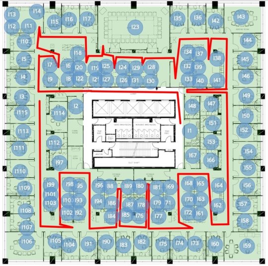
The graphic on the right is the setup for one floor of a space utilization study, with the blue dots overlaying a floor plan to represent observation points, and red lines as visual markup to indicate the walking path. The blue dots also contain data about the space, such as space type, room identifiers, department/building information, capacity, and more. Observers walk the space with an iPad or other tablet and take data about the activity going on in the space. As the data accumulates, you can start to see statistics on how many people doing what activities in each space type.
Day One is a training day, a route validation day, and an adjustment day. We walked the routes to make sure they matched what we assumed from the floor plans. A few adjustments were made. Observers on this project were re-shuffled a bit between routes, and generally out-performed expectations. By the second or third hour, consistency and efficiency were achieved.
DAY TWO OF #PROJECTSATISFACTION
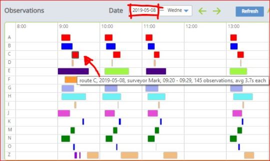
This observations dashboard shows that the temp workers have hit their groove and are now very efficient. So efficient that some are asking for more to do, and we asked one observer to take test data in an open cafe area not originally part of the study.
The colors in the grid below the map to the observers, and floating over any colored cell offers who, when, how many, and average time per observation. “Mark” is on both Route A and Route C, with a lot of consistency. Route E is being shared with two observers each taking every other hour.
Interestingly, multiple observers have told us what a beautiful space it is, how nice it must be to work here, how friendly the staff is, and how this company seems to really care about their employees. I guess that’s also what workplace strategists want to hear!
DAY FOUR OF #PROJECTSATISFACTION
Yes, we skipped Day Three. Lots of good data were gathered.
For Day 4 (a Friday) we’re taking a mid-stream look at data coming in to see how enclosed meeting rooms are used. Often, companies want to see a comparison of how the SUPPLY of enclosed meeting spaces is meeting the DEMAND of the group sizes that use them. In the data story below, we see how many of what size meeting rooms are available (the SUPPLY), and compare that to the size of groups that meet.
SUPPLY
The “supply” of meeting rooms is derived from static data, i.e. information for each observation point that doesn’t change from hour to hour. This data is usually part of the setup of a utilization project, but it can also be validated and updated on site. Floor plans sometimes get out of date, don’t they?
This is a breakdown of the supply of meeting rooms, shown as a percent of more than one hundred enclosed meeting spaces observed.
DEMAND BY SIZE OF MEETINGS (AS OBSERVED ANYWHERE)
When “meetings” happen, how many people are in those meetings? Note that “Meeting” is an observed primary activity, and this perspective on DEMAND shows all meetings wherever they happen, and not necessarily in enclosed meeting rooms. But that also means that when only one person is observed in a meeting room, it isn’t usually tagged as a “meeting.” Therefore, the 3% of 1-person meetings were observed as virtual online meetings.
This is a breakdown of all activity tagged as “Meeting”, regardless of where it was observed.
DEMAND BY GROUP SIZE OBSERVED IN ENCLOSED MEETING ROOMS
Important question: what is considered a meeting room? Would a “training room” also be used for meetings? We don’t know yet, so what you see below is the best guess from an outsider’s perspective. But for this example, we excluded phone booth rooms and phone pods. So, “40% of enclosed meeting room space used by 1 person” means that either the phone booth rooms were filled, or people preferred to camp out in meeting rooms to get their individual work done.
For all activity observed in enclosed meeting rooms, this shows the breakdown of group size, regardless of room capacity.
By looking at these three analytics, what else would you want to know about meeting space demand that would impact decisions for changing up the supply? Ask us. There are so many good questions.
DAY FIVE OF #PROJECTSATISFACTION
Monday, May 13 is now sealed and delivered, which completes a full five days since the project started after a Monday holiday last week. But we still have a week to go!
A few more adjustments: One observer called in sick this morning, so we quickly shuffled the routes to re-allocate. An observer named Michelle requested to switch routes just to get a change of environment. Ellie kindly agreed to swap with her and they both completed their new routes averaging 3.8 seconds or less. This is fast! They are getting very good at reading floor plans while taking data.
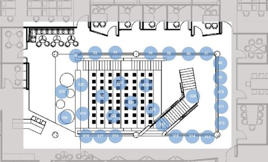
A new route gets added on the fly to capture behavior around a stairwell during and after meetings.
Lean in to lunch: The observers have become so quick (and thus finishing routes with significant time to spare) that we decided to collect data through the lunch period. This gives the client information on where and when staff is taking their lunch break.
On-the-fly experiment: After noticing some interesting behaviors in and around the core stairwell of the building, we added yet another short route to capture the patterns. People were stepping out of meetings to take phone calls, and it looked as if groups were forming “post meetings” to close out meetings that needed more time. Our observer Olivia has been documenting the types of behaviors and interactions in this space and making thorough notes. Also, instead of following the dots numerically (letting the software advance to the next space), she touches the dots according to where the interactions are happening. Interestingly, we’ve brainstormed scenarios for this “inverted” method of taking data in recent weeks, so I’m curious to see how the new data story takes shape.
Make hay when the sun shines: This should close up Monday on a happy note… sunshine is causing a lot more activity out on the terrace, so we extended the café route on the 5th floor to capture the sun seekers.
DAY SIX OF #PROJECTSATISFACTION
A snapshot preview: aggregated observations of activity over the length of the study so far can be seen as colors representing percent ranges of utilization.
Tuesday, May 14 saw the sun still shining! One of our observers is a Yoga instructor and had the idea of involving the team in a Yoga session in the park today at 2.30pm between surveys. How’s that for a revitalizing break! Also, we did another quick shuffling of routes when an observer had to leave early today for an appointment.
Wi-Fi reliability: We had a few issues with the Wi-Fi recently, resulting in observations data not uploading immediately and automatically when the route is finished. We are prepared for this, and it happens more frequently than one might imagine. Even though the FacilityQuest app is software-as-a-service (available via a website), the data gathering mode is fully expecting to be in a non-connected stand-alone environment. Data remains safely on the device for as long as needed. The only damage to the device itself (or unavailability, if the device is stolen, for instance) is a threat for lost data. We train the on-site point person to check all devices at the end of the day for any remaining data that needs uploading. But in fact, the data for the entire length of the survey would be safe if no Wi-Fi was available, even at the end of the day.
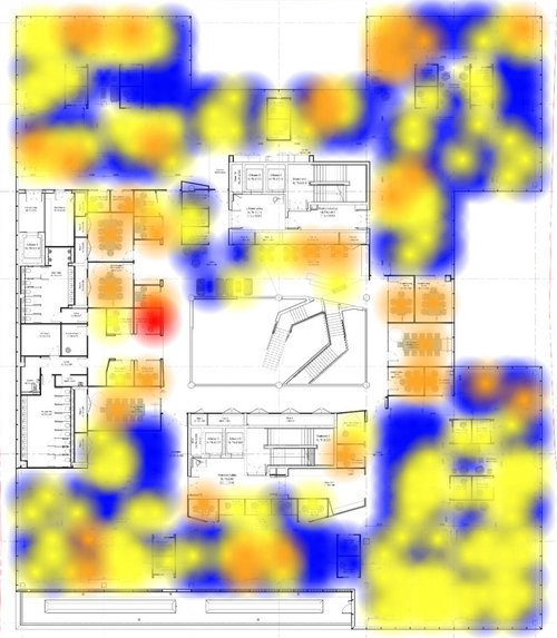
Heat maps: We took a peek at some of the very initial data presented as “heat,” i.e. showing the utilization in colors on the floor plans based on the aggregated utilization. While the colors and data ranges they represent are dynamically adjustable, our default defines blue as the least utilized (under 30%), yellow is between 30-49%, orange is 50% - 69% and red is the highest (over 70%). It’s also fun to scroll through the hours to see how it changes over the course of the day; maybe we’ll show that a bit later on.
A new experimental route, added just a day ago, already shows some interesting patterns of utilization in an area intended as circulation space (not designed to support work or collaboration).
Remember the new route created to track activity around a stairwell, outside of a bunch of conference rooms? Here it is with just one day’s worth of data. Those red hot spots are pretty impressively utilized for a space that is not intended for gathering or working. However, because this is an experiment, and because the data is being captured when activity is noticed (not once per hour, as in the rest of the study), it is not an apples-to-apples comparison with other routes. That said, each observed activity is time-stamped, and can be analyzed separately to glean an understanding of this unique space.
0 notes
Last Seen Blogs

chocolatemilk19
Böğürtlen

kukutoto-mantap
KUKUTOTO SITUS SLOT & TOGEL TERBESAR 2024

delineate-creates
Where Hyperfixations Go To Die 🖤

horonterapi
Horon Evi Kadıköy

micaas-world
micaa