#I never read any of these books but love the detailed diorama aesthetic of these photos!
Text

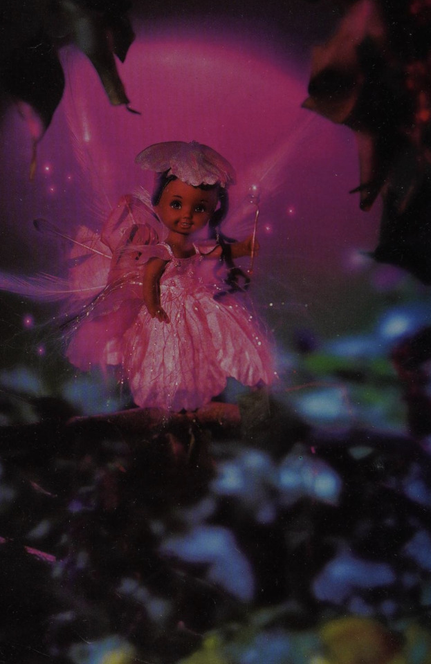


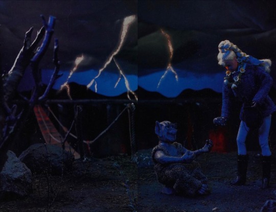


Diorama photos from the picture book Barbie: Rescue of the Unicorn (1999) by Rita Balducci
#Barbie#dollblr#book#kids books#books#dolls#picture books#fashion dolls#1999#1990s#I never read any of these books but love the detailed diorama aesthetic of these photos!#might upload a few more of these if anyone else is interested
100 notes
·
View notes
Text
Thoughts on art comps
I’ve been meaning to do some reflection on my comprehensive project and how it came into being, but it’s been hard to sit down and take the time to do it. Well, now I’m opting to do this instead of my homework, so here goes.
From my artist statement, because probably 2% of people actually read them when the show opened:
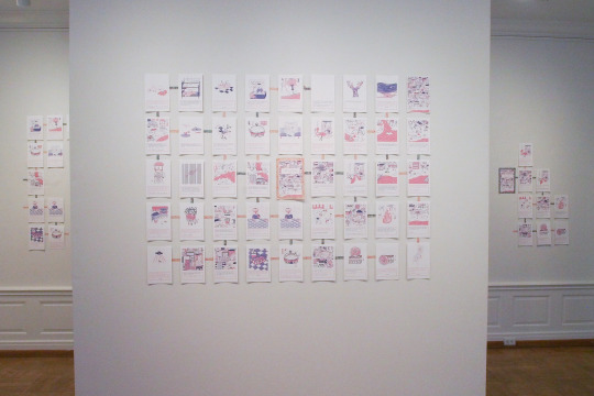
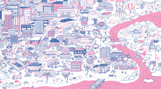
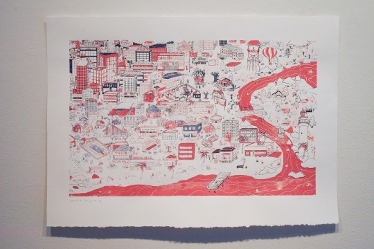
My project consists of a single silkscreen print of an imaginary town, accompanied by a branching-path narrative "book," which takes the form of 45 individual digital prints. The screen print features a sprawling, densely layered beach suburbia. The illustrations feature details extracted from the larger screen print, which allows the viewer to closely inspect and make sense of the cityscape. I intend for both the large print and the print series to be visually overwhelming: in the screen print's miniscule detail, and in the print series' meandering layout, inviting viewers to get lost in this fictional world.
Much of my work stems from a nostalgia for the media from my childhood, particularly books, cartoons and video/computer games geared towards a young audience. This project is largely influenced by print and media from the 90s—in the textual style of gamebooks, which offer branching paths for the reader to decide on multiple possible endings, and in the visual style of 8-bit games, especially "Pokémon" and "The Oregon Trail.” There are many contemporary influences as well, including: children's television shows “Steven Universe,” “Arthur,” “The Aquabats! Super Show!” and more recently released, the role-playing computer game "Undertale," through its nostalgic 8-bit style and complex writing. Children's media in particular has a simplicity, security, and innocence that I try to emulate. There is a sense of magic in the imaginary, in creating a fantastic and dreamlike world cast in pastel colors and where animals humorously act as stand-ins for humans.
My illustrations are packed with detail and a sense of playfulness, likely inspired by the Where's Waldo? books. The density sets up an interactive experience for discovery by the viewer. Everything is drawn from imagination, however, there are many obscure cultural references. This town is rooted in my ideas of Americana and kitsch: plastic lawn flamingos, unconventionally decorative buildings, tropes such as a UFO abduction, etc. There is a certain charm to what may be considered tasteless, fanciful and overdone, and I draw attention to their irony: the symbol of the lawn flamingo is exaggerated into an existence far beyond its role of suburban decoration; the impractical, decorative giant donut on the roof falls without warning; and the UFO reveals an unexpected alien form.
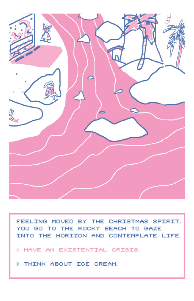
My goal is to make art that elicits positive feelings by evoking senses of nostalgia and humor. The style and subject may be naive and childlike, but there are complexities that demand closer examination. In the print series, the writing can be absurd and non sequitur, at times shifting into a metanarrative. It asks the reader to consider ethical choices, although this rarely impacts any endings. There is tension between the 8-bit narrative text and the "cute," pleasant aesthetic of the images. None of the endings are overtly violent or gruesome; deaths are lightened, tamed, and made absurd enough to work with the overall whimsical tone. However, the writing challenges the notion that this is an idyllic utopia.
And so, that’s the concise version of what I’m about to say. I guess I’ll start by saying: I never intended to be an art major, or to seriously pursue art. I drew silly comics and made birthday cards for my friends, having always been a doodler, but I didn’t have access to any formal training. I didn’t have AP Art at my high school. I find it weird that other people do.
I started my etsy my senior year in high school and did a variety of crafts for it that were largely unsuccessful. I experimented with a lot of different mediums, but I never really got good at any one thing. I see that now as my blessing—I love learning new skills and trying to grow as much as I can. 80% of what I do is self-taught. I’m actually pretty proud of that. I’m a designer-illustrator-printmaker-zinester-publisher(working on it)-sculptor(ish)-crafter-entrepreneur. Maybe a writer? (I definitely put that on the backburner—I knew I wanted to major in English and I was really interested in creative writing, but I never got the chance to take a class in it....) I feel like to be an artist these days it’s necessary to be multi-talented. Part of it is because I’m just trying to survive as an artist. Another part of it is I genuinely love finding ways to use my creativity and imagination. Another part of it is I care about accessible/affordable art and I don’t believe that selling thousand dollar works in a high-end gallery would ever make me happy.
The past few years have been a hell of a ride. I’ve been focusing on printmaking at school, working on comics, making tiny clay dogs, etc. And it just feels really weird to think of how much I’ve grown. I can’t pretend that it feels utterly bizarre and egoistic to call myself an artist sometimes. I’ve been really lucky though, and I know that I work really hard to do what I do.
I had the ambitious idea to do a branching-path narrative zine a few months prior, but I would get stuck thinking about what sort of subject matter and setting could be compelling enough. And then suddenly it was time to decide on a project for comps as fall semester started up, and I was planning to build a 3D miniature town. I love miniatures, dioramas, cityscapes, etc. I was inspired largely by: Sean Chao, Yoskay Yamamoto’s installations, a diorama of a bunch of birds in the LA Natural History Museum I saw once (which I tried googling desperately but to no avail), fictional worlds like in Animal Crossing, The Simpsons, Arthur, and of course, Steven Universe. And yet I hadn’t built anything to that effect before, and as I was experimenting with paper buildings from templates I found online, I was realizing quickly that none of this came from any of my studio art practice or knowledge from school, and really, comps should be about what I’ve learned over the past few years, so I abandoned that idea. To build a huge diorama would require some technical practice, otherwise I’m convinced that it would have just looked like a child’s project. And as much as I am invested in children’s media, it’s frankly insulting to call my work “childish” or “naive,” two terms that kept cropping up to describe my “aesthetic.” (I mean yeah I can’t draw realistically and yeah my colors are typically pastels, but that doesn’t mean my artwork is like that of a child’s, or somehow inferior and not “real” art?)
I thought about my interests, which revolve around print culture, books, and children’s media. I had just bought a diptych risograph print by my favorite artists in Tiny Splendor, Kenny Srivijittakar, which really inspired my project as it was a weird (slightly apocalyptic?) beach cityscape (Tuff Town). So I started drawing digitally (even though that’s something I haven’t learned in school either, oh well), hoping for a huge scale project, a series of multiple giant prints that together would form a large map of sorts. Well, I spent ages trying to finish drawing just one, which was 20x30 in. so that idea got scrapped.
(finished digital illustration—cropped into equal sections for the book where you start in the far left center and travel to the opposite side, then up or down and back towards the left—and converted into a silkscreen print)
Then, after weeks, it was finally ready to screenprint. I figured that silkscreen printmaking would allow me to do something I learned in school. And yet it was also the biggest challenge I came across. I took silkscreen printmaking my very first semester at Oxy, three years ago, and haven’t touched it since. It was difficult, and I wasn’t happy with the work I produced then, but it was in that class that I knew I had to become an art major. And so I did. Thus, It feels significant for me to return to it, and it also made the most sense as a means to reproduce the image I had drawn digitally. Well, no matter how many hours I spent in the studio, I could not get it to print right. I won’t go into all of the horrible details, but essentially the ink was drying up as soon as I printed just one, and so I only managed to get one half-decent print, and that’s the one on display. The professors kept asking me why I chose to do printmaking when it’s a medium suited for churning out multiples, but I just physically couldn’t. They wanted me to wallpaper the room with these prints. I wasn’t really sure what that would mean, but I couldn’t do it anyway. So here we are, with probably a month or so left until the show opens, and all I have is one single print to show for myself. Even though it took ages to draw, it didn’t feel like enough (everything I do never feels like enough). So then I started working on cropping sections of the image into a book, and the rest sort of fell into place.
(also didn’t anticipate my colors being that far from what I intended)
As mentioned in my statement, I wanted to draw on the visual/textual style of early videogames, because I LOVE pixel art and I love being immersed in other worlds. I like things where everything is nice and happy, and that’s what draws me to children’s media. But I also want it to be weird and campy. When it comes down to it, everything in this project is really just a bunch of things that I like, with a lot of hidden references that probably no one except for me would get (Temmie from Undertale, The Aquabats, some bunny versions of Karamatsu fishing with a love letter as bait, etc). But I wanted this to be interactive, where viewers notice certain details and feel a connection to it. That’s my favorite kind of art, that which is accessible and relatable and makes you go like “oh! this person is a real human being who also likes this—game/TV show—I wasn’t expecting to see that type of cultural reference and humor in a piece of art.” Okay well maybe that isn’t your reaction, but that’s how I feel when I identify with something. Maybe it’s just something to do with fan culture though. Discovering that you have mutual interests. And for a lot of ~fine art~ you likely wouldn’t find that. Probably because it’s copyright infringement on some level. But anyway, it’s nice to know that artists are real people and not some edgy/misunderstood person placed on a pedestal?
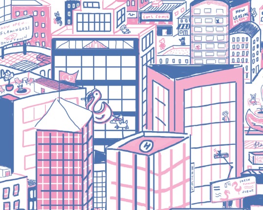
(cropping from the top right corner—still laughing at Fresh Flamingo Scent and Flamingo21)
Even if it does rely on pretty obscure cultural references, the image still boils down to a pleasant little town with anthropomorphic animals walking around wearing clothes. I wanted it to be funny and silly. I’m honestly really unsure where all the existentialist writing came from, but I guess it seemed like the easiest and funniest road to go down?
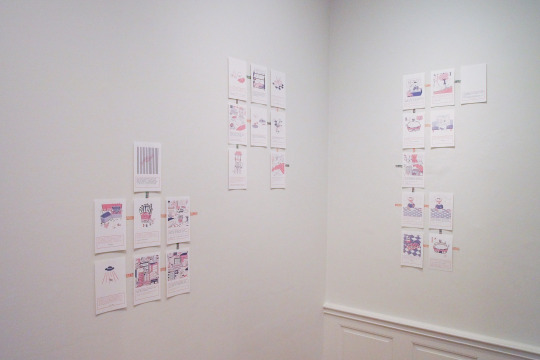
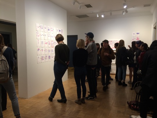
I wanted it to be a book, but I also wanted it to be displayable, for multiple people to view it at once, rather than feel like it’s a precious object that a single person had to handle at a time. This became one of the most difficult issues, the question of how to display this “book.” I thought about it for a really long time and AB came up with some complicated diagrams and mock-ups with me during a late night at the studio. I was leaning towards an accordion fold book that stretched across the wall, but the issue is that options A and B for a gamebook cannot be in a linear book sequence. Gamebooks solve that issue by relying on scrambled page numbers, but that was not suitable for displaying everything at once. Option A would go down and then there would be an entire sequence stemming from that, while option B would continue to the right and then go down, right, down, right, right, etc. It very nearly took that format, where it was either down or to the right with multiple accordion folds. My prof liked the idea of The Book as a Sculptural Object and Installation, but the book would have been impossible to close or to read, really. So I designed it to form a perfect grid, where each option branched in a particular direction indicated by arrows, and when I installed it, I connected each page with color-coordinated washi tape (with flamingos on them) so that the direction might be more obvious. A week before the show, I was still drawing new pages to fill up the missing space to create the grid, then I sent all of the files off to Catprint (my go-to printer). It ended up being 45 pages long, and granted, many of the new illustrations are pretty sloppy, but I am for the most part pretty pleased with the writing.
Then it was installation day, and a whole slew of problems arose. I didn’t know the best way to adhere them to the wall. I opted for blue tape because it was on hand, but they were falling off by next morning. I was advised to do these difficult but professional methods, or buy obscure expensive materials, or to just stick a tack in it, but I didn’t want to puncture them and I didn’t have the means nor the money nor the time to do much else, so I just bought different types of mounting squares and hoped that they wouldn’t be so strong so as to tear the paint off the walls. You’d be surprised how complicated it can be. So I had everything ready to go, and then I was told that the grid layout was a bad idea, not to mention lopsided because I eyeballed it, the washi tape was the wrong shade of color, etc. etc. I did my best to compromise with my prof who was pushing for a more immersive experience, so I installed a second set of prints to make it more installation-like and utilize the full space I had. I wasn’t really happy about it because it felt utterly redundant to have 2 sets of the same prints right next to each other, because you’d start reading when you walked in and then get to the other standalone wall and think that’s a separate piece. I kept nervously asking viewers if it made sense and if they could figure out the direction of the writing, which they could, thankfully. Or so they said.
In the end, though, it worked out. The opening was lovely and many friends and strangers said incredibly nice things about my work, and they laughed and followed along and were impressed that I was able to do all of this in a short amount of time. I can’t say how much it warmed my heart to have that validation from peers and professors, and I am so thankful that my project was, for the most part, entirely my vision and what I truly love and care about, and that I got to do something so silly and personal. I’m also pretty impressed with myself that the writing came fairly naturally to me and I never spent too long getting stuck.
So thanks for reading this, if you actually did, and I’m not really sure anymore why I wanted to say all of this for the world to see, but I think it’ll be good for me to look back on.
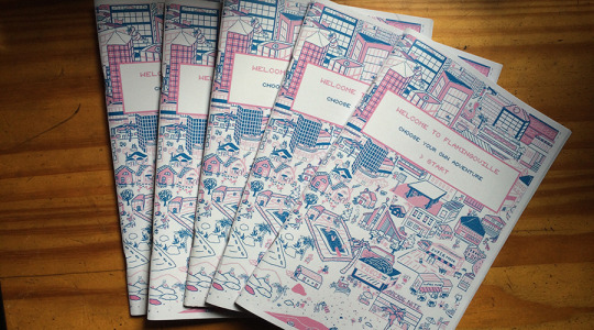
Edit: the prints are finally compiled and bound into a 52 page zine with directional page numbers. Snag a copy from me in person, on my etsy, or my new shop for my new PRESS. I can’t stop thinking about the projects I want to do and zines I want to publish but alas I must first finish school. Honestly, it’s my pipe dream to be able to run and live off my own publishing press, making books and prints for myself and other people. In the meantime though if anyone knows who will hire me for design/publishing/illustration/etc... :^)
*EDIT: I’ve had to replace every instance of the words “choose your own adventure” with “gamebook” and “branching path narrative” because of intellectual property infringement, including replacing the covers for the latest edition... you live and ya learn
1 note
·
View note
Last Seen Blogs

nutritionist-harika
Nutritionist Harika
thebridgedaily
The Bridge: Every body is connected
nginiamhim
Ask N.Gin!

goth-feedee
🎀 Chubby Lexi 🎀

arezou-5996357
دنیای آرزو_wishworld