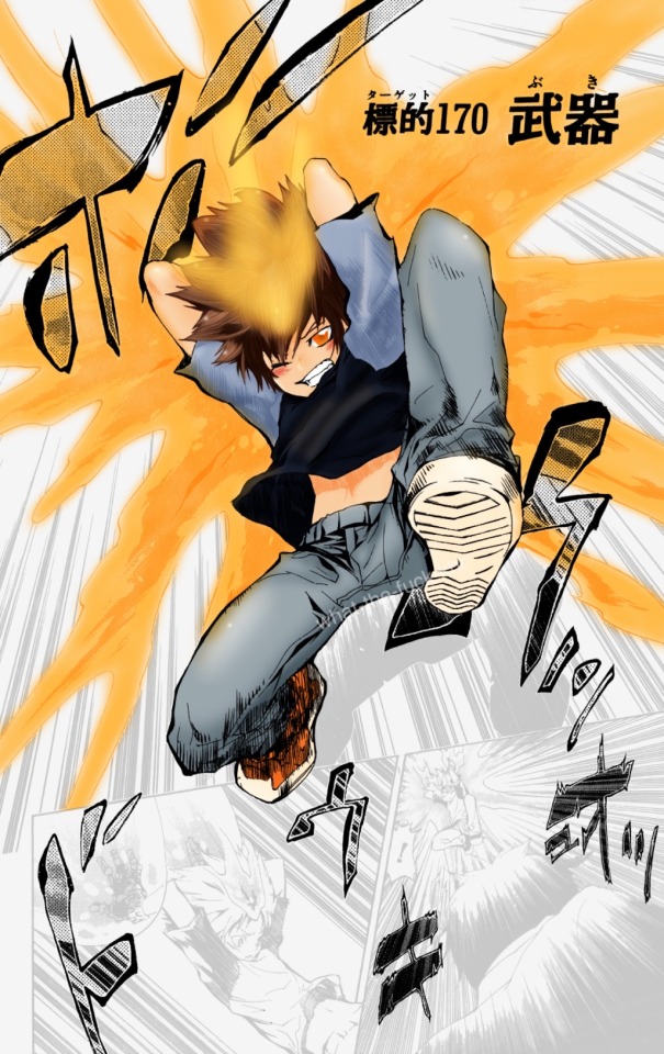
#I also chose a panel to test me!! it’s been a while y’know
Text
what-the-fuck-khr’s most popular sky is tsunayoshi! he won with 38.6% out of 10 characters!
#sawada tsunayoshi#khr#katekyo hitman reborn#27#72#my shit#manga coloring#manga colouring#khredit#khrgraphics#teehee hi. the winner got a prize congrats#‘most popular’ is generous obviously but I figure that’s about the gist of it anyway!#it’d be nice to do a much longer one#y’know to get a better look at the answers but for now#this is just for fun!!#I also chose a panel to test me!! it’s been a while y’know#so I chose a panel/page I would typically avoid at all costs HAHA so I had to do some work#had to clean him up a bit. fiddle with the shadowing bc of his forehead flame#his hair………….. not fond of but alas#is it my best work ever on planet earth?#absolutely not lmfao. but I’m pleased with it nonetheless at least#additionally I don’t usually add watermarks on my shit#and if I do I do it on Instagram with a different username#but I wanted to for this bc. y’know. obviously#also yes leaving the Japanese characters black was a stylistic choice#didn’t wanna deal with them and fiddling with them next to the flames so…….
111 notes
·
View notes
Text
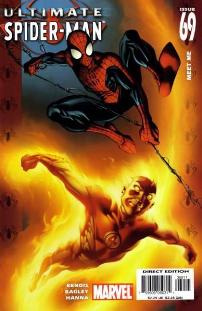
PAGE x PAGE ANALYSIS — ULTIMATE SPIDER-MAN #69 (2005) with special guest AUD KOCH
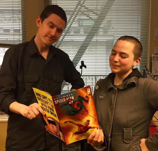
Dan Schkade and Aud Koch (right)
ULTIMATE SPIDER-MAN #69
PUBLISHED: Marvel Comics, January 2005
SCRIPT: Brian Michael Bendis
PENCILS: Mark Bagley
INKS: Scott Hanna
COLORS: J.D. Smith with Chris Sotomayor
LETTERS: Chris Eliopoulos
EDITORIAL: Ralph Macho with Nick Lowe
Brian Michael Bendis and Mark Bagley wrote and drew ULTIMATE SPIDER-MAN for one hundred and eleven consecutive monthly issues. Can you even imagine.
(I, by contrast, drew WILL EISNER’S THE SPIRIT for twelve consecutive monthly issues and barely made it out with all my fingers still intact.)
Neither or them went into this cold — Bendis cut his teeth on a long series of hard-edged indie crime thrillers like AKA GOLDFISH and TORSO, while Bagley had been a regular Marvel Comics fixture since the eighties, with a strong history drawing Spider-Man in particular. But they both hit their stride on ULTIMATE SPIDER-MAN, kicking out a new version of the character that felt fresh and familiar and, in the process, creating one of the most consistently entertaining superhero comics this side of EMPOWERED. My personal MVPs: their new versions of Aunt May, Daredevil, and the surprisingly affecting mega-narrative of the Ultimate Green Goblin. And that ending — ho man, that ending.
The issue we’ll be looking at this week, ULTIMATE SPIDER-MAN #69: “MEET ME,” takes place more or less in the middle of their mammoth hundred and eleven issue run. And that’s part of why I chose it — the goal of this feature is to take solid, workmanlike comics from professionals who know what they’re about and see what makes them tick, but also to see what we can learn from their mistakes. Mister Bagley’s credentials are unimpeachable; I’d place him up with John Romita JR and Andy Kubert as one of my top living artists of straight-up old-school Marvel-style Super Hero Comics. But mid-run slippage is inevitable, and sometimes the shortcuts of a good artist can be just as useful to pick apart as the abject failures of a bad one.
I also picked this issue because I thought it’d be a good fit for my guest: comic artist Aud Koch, one my favorite people to talk theory with and someone whose output I’m both impressed by on a peer level and super into on a fan level. Even though this is the first time I’ve had a guest on this feature and I only half know what I’m doing, Aud was still willing to sit down and help me beta test the tandem Page X Page Analysis experience like a mensch. Now, Aud’s the nicest person you’ll meet in a year, but she’ll also tell you exactly what she thinks and damn the torpedoes. She’ll make some poor young artist cry one of these days. She’ll feel just awful about it, too. My point is: I didn’t exactly pick her name out of a hat for this, y’know?
With that, let’s go to the transcript!
ULTIMATE SPIDER-MAN #69 and all characters contained therein are property of Marvel Comics, reproduced here solely for educational purposes.
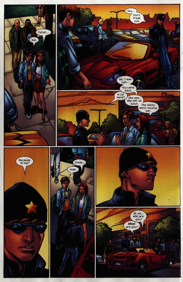
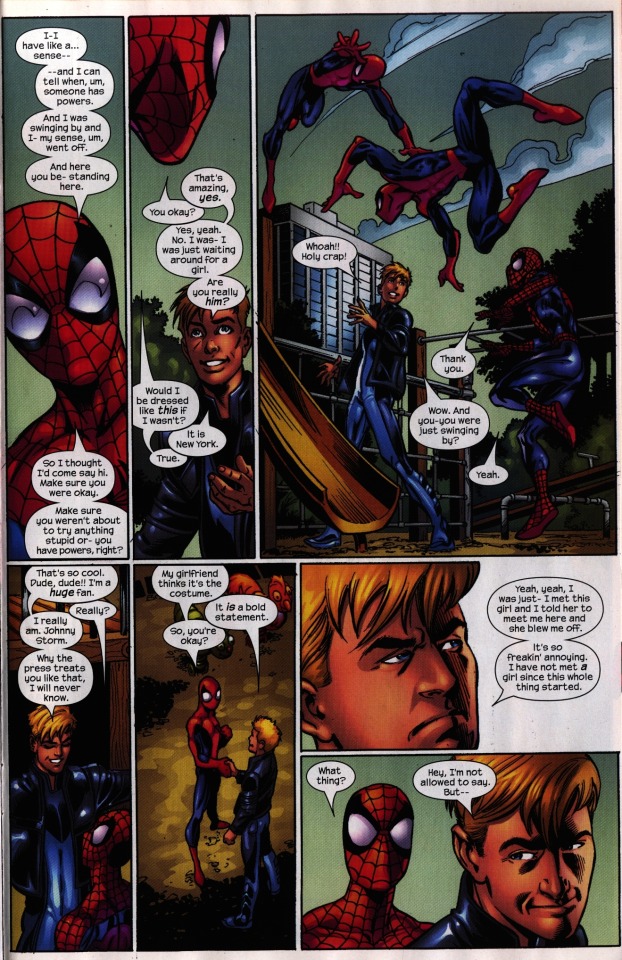
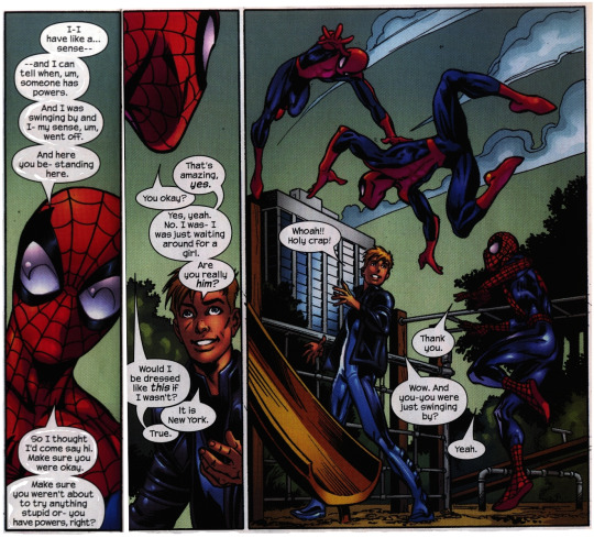
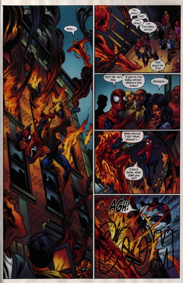
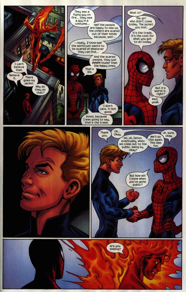
PAGE ONE
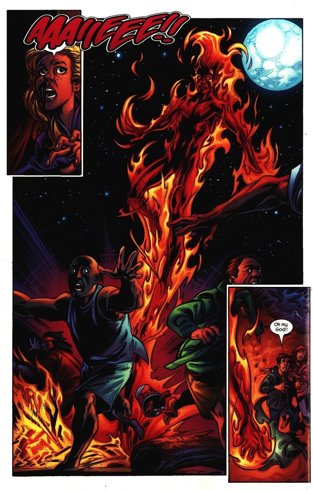
DAN: So, Aud: are you of the opinion that a single issue should be a complete story in and of itself?
AUD: That depends on what the intention of the writer is. I think this one is fine without being that way — I mean, this whole series is set up like a teen drama show. They always have cliffhangers.
DAN: And “previously ons…”
DAN: There’s certainly a lot more boring ways you could start an issue off.
AUD: It’s definitely eye-catching, but an immediate problem is: who’s the main character? You’d think from the first panel that it’s Liz. Or Johnny, who’s the one with the big action shot. But no, it’s actually those tiny little figures in the corner.
DAN: We’re not really getting much from her expression in panel one.
AUD: Which is a problem that I had throughout a lot of the comic. The expressions felt slightly off to me.
DAN: I would have to agree. The point of this exercise is not to nitpick, but sometime small details really do go a long way towards keeping a page from working.
AUD: Later on, there’s that scene that’s entirely just Peter and MJ standing around talking to Johnny for like four, five pages, so it entirely rests on the acting that Bagely does through characters, but there’s no movement happening at all. Bagley doesn’t do the thing where he makes everything a soap opera, which is good, but he also can leave his figures rather flat.
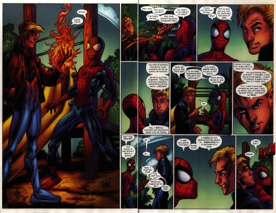
PAGE TWO
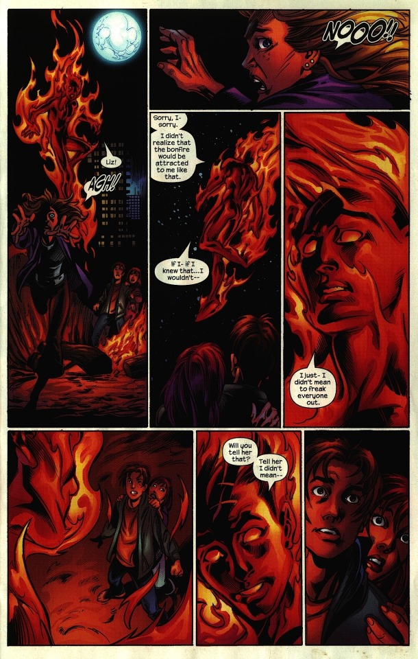
DAN: The game’s upped quite a bit here. I feel like we get a lot more from the expressions. Bagley has a great model for the Human Torch — he’s able to suggest emotions and facial details even though he’s all flamed up.
AUD: The artistry of the flames on Johnny is really beautiful. Looking at it now, these last three panels should have been the first ones of the issue.
DAN: Mm, yeah! We’d start off with Johnny looking down at our main characters. Because it really is Peter and Johnny’s interaction that the issue hinges on — Liz’s story is a secondary thing, even though she’s the first character we see in this issue.
Bagley and inker Scott Hanna do a good job of suggesting the city in the panel one background, giving the scene a good sense of pace; They’re not in the Mojave desert, they’re on a beach near New York.
AUD: Something I found a bit distracting though is — what the hell is going on with that moon? Like, that’s not a moon! It’s a warty… mass!
DAN: Fair enough. And it’s funny because the city’s so nicely abstracted, while the moon is — I feel you there.
AUD: It’s like a giant tumor in the sky!
DAN: I also have a little problem with Liz’s motion in panel two.
AUD: Yes! She should be be running away from Jonny and off the page. That way she’d be looking back at him as she make her exit off the page.
DAN: Yeah, I think that would be better.
PAGE THREE
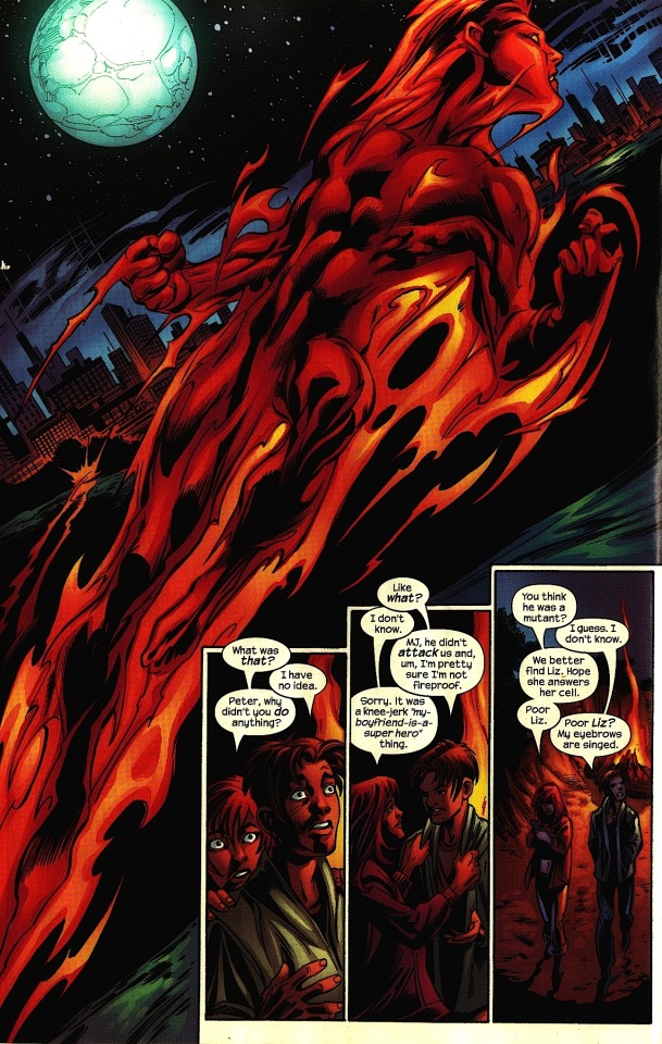
DAN: Here we have another juicy Human Torch splash image…
AUD: See, that’s another money shot — storytelling-wise, it would have made more sense if it was us looking up at Johnny from where Peter and MJ were standing, seeing him him shooting off into the distance from their point of view. This one looks like we’re about to follow Johnny off on some… flame adventure.
DAN: You’re right, it really does feel like we’re transitioning to his POV, when that’s clearly not what’s going on.
AUD: Bagley also didn’t take into account where speech bubbles would go. you can see that the letterer was like “what the fuck am I supposed to do?”
DAN: Yeah, they’re spillin’. He could’ve dropped the figures a little bit.
AUD: The only reason it doesn’t fit is because Bagley wanted to leave room for this image of Johnny shooting off, which again, storytelling-wise, doesn’t really work.
DAN: One thing I do really like about those bottom three panels — they’re this nice narrative unit, small and cramped and comic booky in the corner to offset the splashy sci-fi spectacle of Johnny shooting off into the night above. It makes MJ’s dialogue, which is think is pretty funny here, even funnier by comparison — it’s like a small comedy aside.
AUD: But then, they are the main characters…
DAN: They are the main characters! Good point.
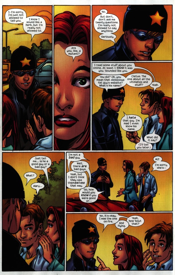
PAGE FOUR
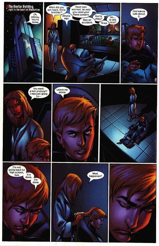
DAN: Alright, here we are back in the Baxter Building.
AUD: This is one where it was really, like, these expressions are so flat… it doesn’t carry the scene.
DAN: One art thing I have trouble with here… I don’t know if Sue is his mom or the same age as him. I have trouble placing her.
AUD: Well, the only reason you’d know that is because she says “little brother,” which I feel like Bendis might have added because it wasn’t clear.
DAN: It’s a problem when you have a character who’s supposed to be a teenager, which Sue clearly is —
AUD: Wait, she’s a teenager?
DAN: I mean, is she not?
AUD: [Laughs] She probably is…!
DAN: I mean, that’s a problem, we should know! And she’s wearing lipstick and whatnot…
AUD: It’s that hollywood syndrome! Women don’t wear makeup when they’re in let-down at home clothes. Ack.
DAN: That said, I think Bagley does a good job of moving the camera around. Even though there’s not a lot happening on this page, it’s not static. After Johnny says “leave me alone” in panel five, we cut to this nice, lonely panel with heavy shadows.
AUD: I don’t like the way they’re facing inward in that panel necessarily, though.
DAN: You’re rather maintain Johnny’s rightward positioning from the earlier panels, to maintain a sense of space?
AUD: I want his face to keep facing the bottom right corner, so if Sue’s off to the side, she’d be closer to the outside of the page, since she’s on the outside of him in the conversation.
DAN: Yeah! Johnny’s sitting still and staring in one direction, so we really should we moving around with Sue, not moving around with Johnny, who’s stationary. That’s a really good point.
Also — I like the hot pretzel line in panel four. That was something specific to them that nicely places them as siblings. Sometimes that little element of specificity can really help sell a scene.
AUD: The devil is in the details!
DAN: The devil’s in the details.
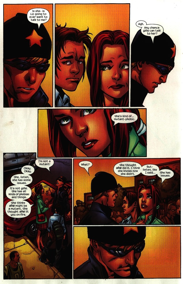
PAGE FIVE
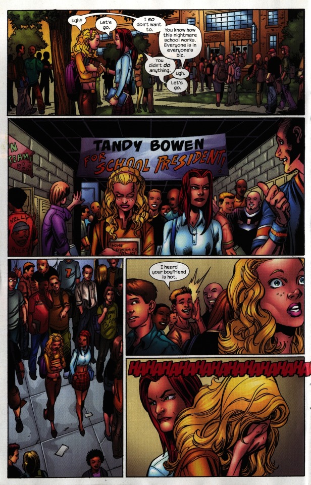
AUD: Bagley does do really good backgrounds. That feels like a school.
DAN: Mm! What are the elements that cement that for you?
AUD: Well, it’s not generic. The front of that building is really nice. That’s a building that I’ve never seen before, and that I haven’t seen in movies, which is good because that means he isn’t doing the pruned-down, basic idea of what a school should look like.
DAN: Yeah! And it’s still got the cement walls, it’s got the low ceilings and whatnot.
AUD: All of the people in the backgrounds are doing things, which is awesome. They’re not just standing around like props.
DAN: It’s true. And then also, they’re not overacting. You’re right, he’s really good at that. A couple nice little touches — the back of this guy’s t-shirt, the Home Ec textbook. We didn’t need those details to place it as a school, but they do add some variety.
I feel like the pacing in these last three panels are not as good as the writing is. The panels three and four are setting up her reaction in panel five, so it’s weird to me that panels four and five in this sequence are sub-panels of panel three. I would rather have the first two take place in the same plane. Setup, setup, then payoff.
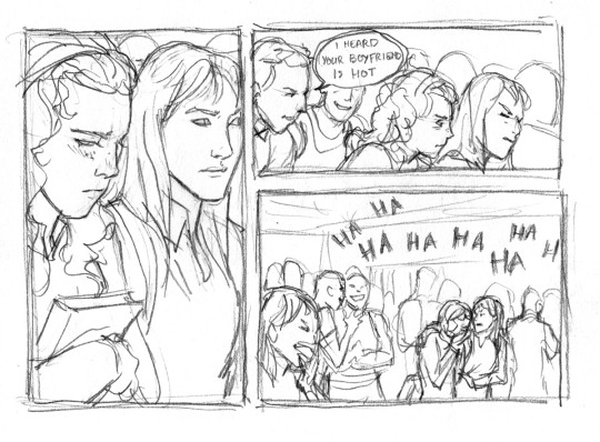
AUD: My major beef with the sequence is: the reason that she feels so bad is everyone’s laughing at her, right, but we can’t see the people laughing at her.
DAN: We should see them laughing! It might even be better if we switched it so we don’t see many people in the panel three, and then see them all in panel five.
AUD: Yeah, do it so it’s just MJ and Liz at first, and you get the growing sense of her being surrounded by these glaring entities.
[Aud’s edit, version 1:]
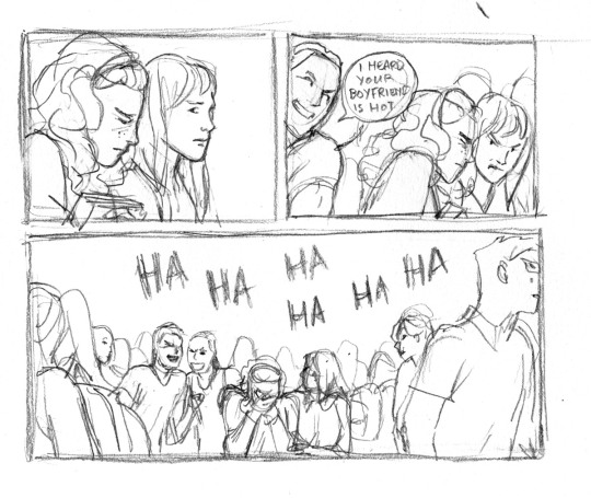
DAN: Or! Have panels three and four right next to each other in their own row, then have panel five be a wide panel along the bottom of the page. I think that would be a superior version of an already fairly solid page.
[Aud’s edit, version 2:]
DAN: The scene is also very mid-2000s, which I appreciate.
AUD: That’s another thing with his setting! It does really look like the time period it was drawn in, which is fun.
DAN: Yeah, it’s not just the stock comic book teenagers. I think that’s why this series was so popular when it came out. It really did feel like high school, despite the fact nobody working on it was… matriculating.
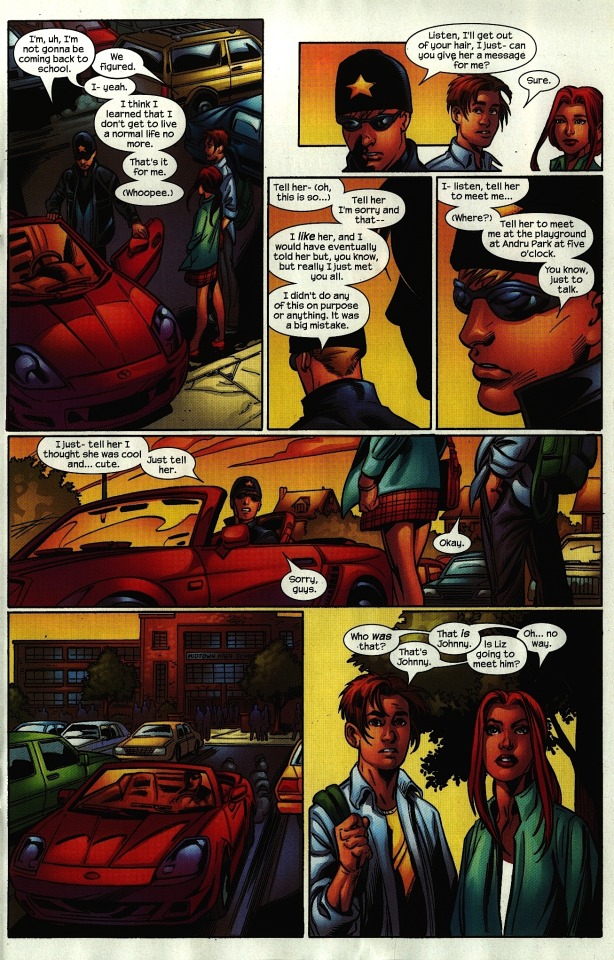
PAGE SIX
DAN: I like that Johnny’s car is red. I think that’s a slick color cue.
AUD: The only thing I have to say is… Bagley consistently does these weird perspectives that throw you out of following who the main characters are supposed to be. Like, I don’t like that opening panel. There’s something off about looking down on them.
DAN: Ohh, yeah. That’s a good point. The camera isn’t down with them, it’s distant, it’s above. There’s a nice line of motion where Peter and MJ in panel one lead into Peter’s position in panel two, but then Bagely breaks it immediately by switching the camera around in panel three.
That said, I do really like Johnny’s incognito-wear.
AUD: [Laughs] Talking about early 2000s…
DAN: Right? I love it.
PAGE SEVEN
DAN: So, like you said earlier, these Peter and MJ talking to Johnny pages are a little bit — well, there’s not a lot happening.
AUD: I feel like the scenes where there’s just people standing around give you the most room to, like, wander and throw in creative things. Do fun acting, have them fidget. This does not do that.
DAN: I do like that close-up of MJ in panel two. It helps us identify with her; it sells her curiosity and her sympathy. A different version of this panel might have had her farther away, in which case that line could have sounded a lot more accusatory. I feel like this averts that.
AUD: All of these pages are superficially fine. There’s a good variation of sizes of faces… I don’t look at this like, “I don’t know how to read this,” which is nice.
DAN: Being able to read the comic is very important. Yeah, the drawings are all really attractive, the coloring is good as well — it works together well as a package. I think what we’re harping on here is unfulfilled potential.
AUD: Yes!
DAN: Speaking of color, I like what colorist JD Smith did with the sky. It sells the end of the school day really nicely and avoids being just “sky colored!”
PAGE EIGHT
DAN: I like the negative space on this page.
AUD: Yeah, that is interesting…
DAN: Really nice flow of action from panels one to three. Johnny’s head turns slightly between the first and third panel, which sells this beat of silence in panel two. And I like dropping out the panel border in three; it makes him feel alone and insecure. I wish there was more stuff like this in the issue.
AUD: And I wish there was more stuff like Peter’s stance in panel five.
DAN: Yeah! One foot up on the curb, one in the gutter. That’s really nice.
AUD: Whereas in all these other panels, they’re just standing straight.
DAN: This is a very attractive final panel.
PAGE NINE
DAN: More great negative space on this page. You almost feel like Bagley started to get bored in this scene and started to change things up.
AUD: Which yeah, if only he had… done that earlier?
DAN: Same thing with Peter’s silhouette in panel three. It’s a really intelligent use of Peter’s design, indicating him by just his the line of his floppy hair.
AUD: Which, if I remember correctly, there was quite a bit of mocking of throughout every comic he appeared in.
DAN: And I like that! I like that Peter has goofy nerd hair. Because he’s a goofy nerd — that’s a big part of his appeal. When Peter Parker is too cool, he starts to fall apart, I think.
AUD: Panel six is bad.
DAN: [Laughs] Why is panel six bad, Aud?
AUD: Okay, so, once again, we’re coming from Peter and MJ’s perspective, but we’re in front of Johnny’s car. He’s driving into where we’re standing! Why would you not have him be driving away from the viewer? Bagley consistently puts the motion of action towards the viewer, and that doesn’t make sense to me.
DAN: It makes for a more dynamic image, but… it can make for muddy storytelling.
AUD: Yeah, it makes the motion come to a halt, because there’s nowhere for your eye to go.
DAN: I feel like this comic really thinks Johnny’s the main character. And I just… don’t… think he is. Maybe that’s on me.
PAGE TEN
DAN: More of that curious downward angle. Yeah, I’m with you — I’d rather have more environment shots from the ground. Because this doesn’t really tell me anything about the environment — all I get from this is that they’re still approximate to the parking lot. And as an artist, if you’re in a rush, you’re just begging to make technical mistakes if you keep shooting things from this angle.
AUD: Yep.
DAN: But, again, credit where it’s due, good job moving the camera around the characters. Nice full body acting in panel three — which is shot from the ground, and is super attractive. Maybe he should do more of that! I dunno! And Peter and MJ’s dialogue continues to be funny.
AUD: It’s delightful!
DAN: Bendis is aware this is magic, and he gives us a good amount of it.
AUD: Yes! Going back to the teen drama — what makes this so good is the personality of the characters and how much they come through. The dialogue carries it a whole lot.
DAN: This comic has a nice small cast — you understand all their motivations, they all have distinct voices and personalities. The human element is really well put together.
PAGE ELEVEN
AUD: This page — I hate this page.
DAN: [Laughs]
AUD: Okay, I don’t hate it, but I have major issues reading it.
DAN: Tell me!
AUD: The first two panels are fine, but then — where the hell are you supposed to go??
DAN: That’s a good point! That’s a very good point. Now, If I block out panel three—
AUD: It works! You don’t need that panel!
DAN: Really, all we’d need is to change Johnny in panel four, from looking around to looking up at Peter. The reason why he’s looking around isn’t super clear — since Johnny is supposed to be under wraps, I’m assuming that when he sees Spider-Man, he’s looking around to see if there’s other costumed people who’re gonna jump him. We can do without that.
AUD: Okay, other funny thing — as you said, Bagley thinks that Johnny is the main character. This is supposed to be from Spider-Man’s point of view, right? So the first shot should be from where Spider-Man is seeing him. Even if you don’t see Spidey in the shot.
DAN: Well, yeah, that would be a nice shot/reverse shot from panel two to panel three. It’s funny; in panel two, we actually WANT Bagley to do the down angle.
AUD: Yeah!
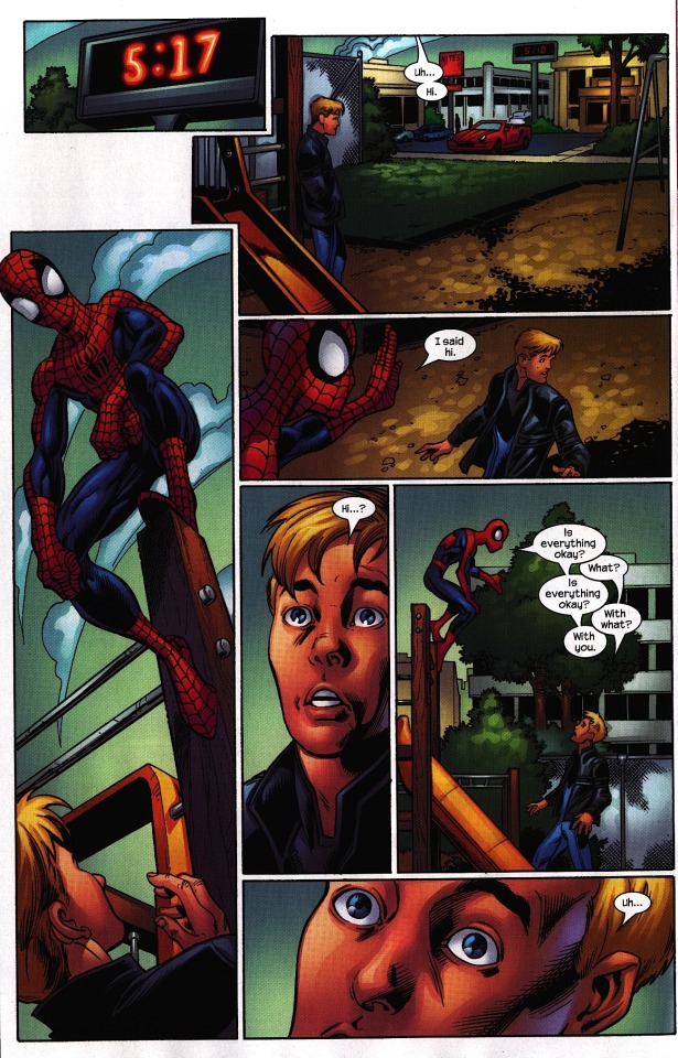
DAN: There’s an easy fix for this wonky reading order that keeps all the panels:
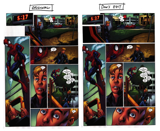
You drop panel three half an inch and make panel two a page-wide environment shot. It’s a subtle difference, but I think it strengthens the flow of the scene.
AUD: And also, why do we even need the time? Just to show it’s been a while since school got out?
DAN: It’s shows — He’s supposed to meet Liz at 5:00, and this shows it’s been… longer. It also shows that Spidey was allowing for the possibility that Liz would show up. He doesn’t just pop up at 5:00.
AUD: Ahhh, right. Okay. Yeah. But why is Johnny wearing the costume? Like, if he’s incognito, why is he wearing the Fantastic Four costume?
DAN; Well… I guess, in this universe, nobody knows it’s a Fantastic Four costume yet.
AUD: But he’s still obviously wearing some kind of uniform.
DAN: I dunno, maybe he just came from, y’know, street luging.
AUD: [Laughs]
DAN: Still rocking his street luge gear.
AUD: “…Street luge…”
PAGE TWELVE
DAN: Okay, so I really like the arc of Spider-Man’s movement on this page. It starts mid panel one, comes up and down in a nice arc across the top three panels. That’s really cool.
AUD: However; it would’ve made more sense to me if it started with his face pointing in some way towards the right.
DAN: I agree that would be a little bit better; even if his head was just cheated that way a little bit. I still think this works fine, but that would’ve been a slight improvement.
AUD: Even if the body was just flipped.
DAN: Ah, yeah, yeah! That’s good. Even just inverting Spidey’s position in panel one makes it that much smoother:
AUD: It still trips my letting thing. You want to read straight down from panel one into panel four.
DAN: Yeahhhh, that is unfortunate.
PAGE THIRTEEN-FOURTEEN
DAN: So, this is great.
AUD: Yes, except… okay, I do like it. But for me, it was another lettering issue. I feel like they were hesitant to put any dialogue in in panels two, four, and seven because there was so little room to the left of the fold. Maybe if those panels had been extended half an inch, they could’ve… I don’t know…
DAN: I think I disagree with you on this one. I think that they chose to make it a quasi double-page splash because Bendis wanted this moment to exist all at once, without risking it being split up by ads. I think that’s why it’s cheated over the fold this way. That said… the balloon placement in panel four is distracting.
AUD: Yeah, you can tell there’s all this space above Spider-Man’s head where the dialogue was supposed to go.
DAN: It really shoulda been there. If this were a digital comic, that would’ve been perfect. I does weirdly work quite well in panel seven…
AUD: Because they put dialogue there!
DAN: There you are, then. Even if Spidey had said “um” in panel four, just to full in that space, that would’ve been an easy fix.
AUD: So, okay, this is a big moment; but why is it a big moment? Peter’s already seen his powers. We already know that’s what Johnny does. Is it that he’s revealing his “Human Torch” name?
DAN: Well, It’s a big moment for Johnny. Again, this issue thinks Johnny is the main character. So it’s a big moment for him… Peter’s reaction is still genuine, it’s still surprising to see a person, y’know, light their hand on fire. And also, it’s the first time in this universe where The Human Torch and Spider-Man are on the same page, so there’s a little bit of a fan nod there, plus a little bit of this being Johnny’s moment to reveal himself to, he thinks, a new person. Some of it is just a nice juicy visual on which to hang the rest of the scene.
The dialogue in this scene is great. I like the idea of this scene. Johnny’s life is actively inconvenienced by Spider-Man — the way his life is set up is a direct reaction to Spider-Man’s existence. But he likes Spider-Man a lot, so they’re being friendly.
AUD: I like… I think I have a thing against power imbalances. Like, Peter and Johnny are on the same level, but with this scene, it’s like hero worship. Johnny’s like a fanboy, and Peter just allows that imbalance to continue. That’s a personal thing, I just don’t like it — except that at the end of the scene, it switches, where Peter becomes the fanboy for Sue Storm. So I did like that.
DAN: Yeah! You see it in panel five, which is where Peter and Johnny actually become friends, but it’s also where you see Peter changing the subject of him being rich, trying to protect the idea of him being rich — read, “cool.” But here in panel seven, he can’t help but reveal he’s not cool, because he’s such a big fan of Sue Storm.
AUD: I will say, throughout a lot of these scenes of pure dialogue — again, this is just a personal preference — you get these panels where there’s so much back and forth in the same panel, and I don’t like it. I like it when you get more of a focus on what the characters look like when they’re saying each individual line, so there’s more emotional hit to it. Here it’s all consolidated, so you don’t get as much personality from the characters.
DAN: Would you’ve liked if this comic had, let’s say, five more pages to it that just allowed a little more space for the back and forth between the characters?
AUD: Well, either prune down the dialogue, or… yeah, extend it, give the artist more room. But then again, I don’t know if Bagley would’ve really wanted more room — he doesn’t really seem to enjoy drawing these still dialogue moments.
DAN: Or maybe at this point he’s so used to them that he just kinda bangs ‘em out without thinking too hard. Which we could hardly fault him for.
AUD: Yeah! Issue… sixty-nine of a series?
DAN: Jeezy Petes.
I don’t know if I already said something nice about JD Smith, but the colors are real swell here. The glow on Spidey’s chest in panel one.
AUD: One detail I really like is that his coat is actually on fire in panel two.
DAN: Oh yeah! That is a nice little touch.
And now, this is an excellent final panel; an onomatopoeia leading off the page, they’re both looking in the same direction, off the page, towards the page turn, you gotta turn the page, you gotta know what’s gonna happen next…
PAGE FIFTEEN
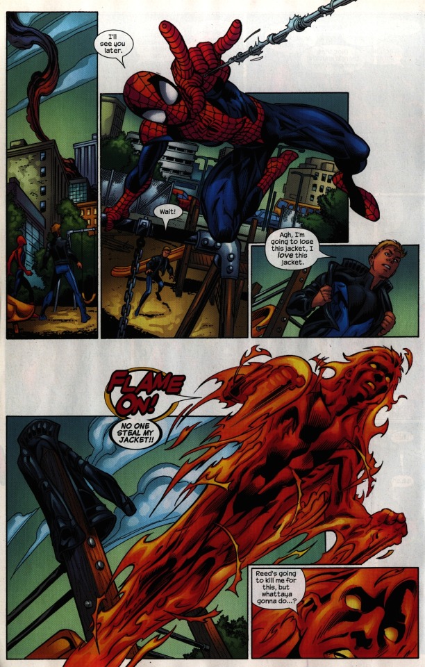
DAN: I love this page.
AUD: Rrrrrreally.
DAN: I do! I do, and I’ll tell you why: It does the handoff of POV from character to character really effectively. So, this page is split into two equal circuits of storytelling. They have roughly the same layout; the first one is Spidey vaulting off — the webline’s going off the page in the right direction, he’s going off the panel into the negative space, it’s really dynamic. This is where Bagley’s ‘everything comes towards you’ thing really works. And then we end on Johnny’s reaction to this, which then transitions into the second circuit; this nice juicy Human Torch moment that mirrors Spider-Man’s. There’s a little joke, and then we stay on Johnny’s reaction in the last panel, a reaction that follows through from his other reactions on the page. So it’s a really effective handoff. And then, from the perspective of somebody who’s maybe meeting these characters for the first time, it’s cool to see how Spider-Man has to jump off the jungle gym and shoot a web and, y’know, he moves in THIS way, and meanwhile Human Torch can just straight up fly, he’s made of fire, he moves in THIS way… I mean, I could see experiencing this for the first time and really getting excited for these characters, the way they’re depicted on this page.
What do you think?
AUD: That’s interesting, because I really disliked this page.
DAN: Ooh, tell me! Tell me why.
AUD: Well… I guess one of the things I’m personally most concerned about is the way the lines of action move within the structure of a single page. Not just the way that the characters are moving, but all of the composition. This page feels really cluttered to me; there’s all these different directions, and there’s so many different moments happening too, and none of them are given enough space.
DAN: In a way, I think you’re sort of right… what makes this page work for me is that there’s the two complete circuits, but a page is typically only supposed to be one.
AUD: What you said about Spider-Man having to climb off the jungle gym — I didn’t even realize that that’s what had happened there because there’s such a gap. I want to see him moving onto the jungle gym. In the first panel, I want more of a pause as they look at the smoke. I would’ve preferred smaller bits of them both going off.
DAN: Maybe we coulda cut down on some money shot panels and reallocated that space to give these two moments bigger moments on their own pages. I still really like this page, but I totally agree with your criticisms.
AUD: I also feel like that last panel should have maybe been the back of Johnny’s head, so we’re following him as he’s going somewhere? As it is, it’s just a static image of his face.
DAN: Mmm, yeah, I could see that.
PAGE SIXTEEN
AUD: It’s beautifully drawn. I really like the swoop of the smoke.
DAN: Yeah, Bagley’s smoke is really cool; all whispy and tendrily. It is a little bit weird to me that Spidey’s swinging left, into the page fold. I would rather have flipped Spidey’s figure so he’s facing right, maybe just jumping down with her in his arms, or with his web attached to the roof ledge. There’s some nice contrasting movement between Spidey and the smoke, but it’s still a little muddy to me.
AUD: Once more, who’s the main character on this page? You actually think it should be Johnny this time, carrying over from the last page.
DAN: Also: modern comics artists have finally stopped drawing that high-riding underwear on women, which I personally appreciate. Nobody liked that.
AUD: That was also never, like, a real thing that happened, even in the early 2000s.
DAN: This is a type of page layout I like a lot; you’ve got a tall, scene-setting panel, and then everything that follows is sort of a detail of that main setting.
Panel two is nice; we’re clearly from Johnny’s perspective, looking down…
AUD: Except that time, it shouldn’t be! It should be focusing on Spider-Man!
DAN: Crap, you’re right! You’re totally right. The perspectives in panels one and two should be switched. We should be on the ground with Spider-Man and her looking up in panel two, and we should be with Johnny looking down on the scene in panel one.
PAGE SEVENTEEN
[Long, thoughtful shared pause]
DAN: Nice line of motion along those bottom panels… I hate this baby. I’m sorry.
AUD: That’s not a terrified baby! That’s a hungry baby opening its mouth for food.
DAN: I dunno, maybe she’s got a Spider-Man-colored bottle or something, so when he comes in the room she’s like, “oh thank god, I’m parched.”
AUD: I also don’t think panel four is entirely clear enough about what Johnny’s doing.
DAN: What if this panel were framed by the window? So we could see the fire going away from us, from inside the building, and towards Johnny.
AUD: Oh, that would be clever…
DAN: And then we can skew panel five just a little bit so it’s not just the same shot twice.
Panel six is a really good panel.
AUD: It is a really good panel, yeah. Unfortunately, it is followed by a weird baby.
DAN: Oy. Such a weird baby.
PAGE EIGHTEEN

AUD: Panel one immediately gave me the feeling that it should be flipped. The direction of motion — it doesn’t look like he’s jumping out of the building.
DAN: He’s just coming down from heaven with a baby.
AUD: That’s what this looks like. Also, it would have helped a whole lot of his suit was singed.
DAN: Or if smoke was trailing off him, yeah.
AUD: In panel two, why are we looking at this from the very above again? Do it from Peter’s point of view! Actually, wait — if you move panel four up next to panel one…
DAN: Oh, yeah, that’d work. Because the Torch panels don’t tell us… much. And Bagley and company have my sympathies here, because showing a contiguous stream of flame coming out of the building and towards Johnny? I don’t know how I would show that.
AUD: I think the flames themselves are fine, but the swoop of the smoke around the border of panel two gets me.
DAN: This is an instance where the old Marvel style of captions talking about what’s happening would really help you out.
AUD: I mean, you need to be really careful with captions… actually if he were muttering something…
DAN: Oh yeah! Like, “Oh my god, he’s drawing the flame out of the building” or something.
AUD: Yeah! Yeah, that would work.
DAN: Or a panel where the babysitter like “What’s going on” and Peter’s like “I-I-I-I think he’s drawing the flame out of the building” and she’s like “How is he doing that” and he’s like “[weird noise plus awkward shrug]”
AUD: See, and that would have been awesome, just to add more personality and some nice moments between Peter and the crowd.
DAN: I mean, sure, he’s amazed at the Torch in panel four, but this would really sell the — well, anyway.
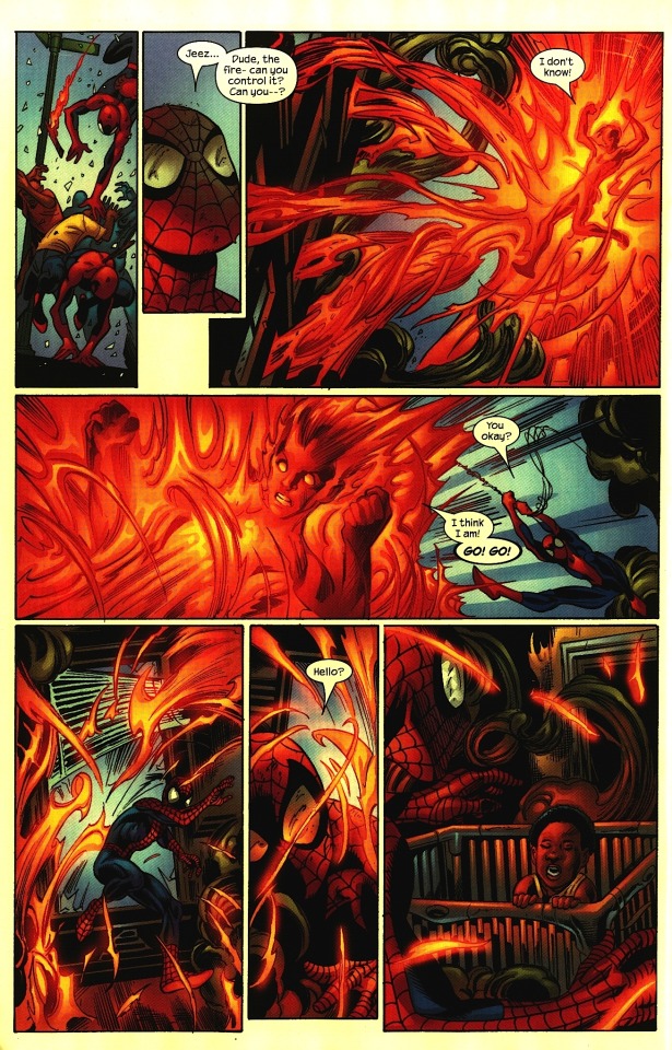
PAGE NINETEEN
AUD: We've talked about unfortunate ad placements before; I’d just like to point out that those are DC characters in a Marvel comic.
DAN: Right as things seem at their most dire — Batman and Superman pop up!
AUD: Come to save the day!
DAN: We got this, guys, don’t even worry about it.
So, this page: I understand what’s happening here, but I wouldn’t if I hadn’t read a bunch of other comic books.
AUD: …Yes, because there’s not a sense of him getting rid of anything, it’s more like he’s channeling the energy to blow something up.
DAN: Yeah. That said, I like the sweeping top left/bottom right motion of the clouds, which adds a nice parallax to the bottom left/top right motion of the flames. And at least there, it’s popping off the the page, away from us.
AUD: And up where people are looking.
DAN: Yes! They’re following the line of action. That’s quite good.
AUD: And the colors on this panel are beautiful.
DAN: They really are. JD Smith clearly knows how to bring out the warmth and energy of the flame with these nice cool background colors. I have no idea why the cough was lettered like that —
AUD: I thought it was hilarious. It was for comedy, right, ‘cause he’s actually saying “cough?”
DAN: Oh! [Laughs]
AUD: At least that’s how I interpreted it, as a humor beat.
DAN: But then as we go on, we see that he’s actually coughing ‘cause of smoke inhalation.
AUD: Is he?
DAN: Here, put a pin in that, we’ll come back to that. That’s mostly a nitpick on what is overall a very strong page.
PAGE TWENTY
AUD: What the…?
DAN: What is happening in this first panel?
AUD: I think that’s Johnny flying off.
DAN: Oh!
AUD: To the park, to meet him again?
DAN: Yes.
AUD: But.
DAN: Maybe Johnny could have been smoldering there a little, in panel two?
AUD: You could have just not had panel one and have them just meet up again in the park.
DAN: Again, my sympathies to Bagley, because this flame stuff is… it doesn’t exist in the real world, so he’s gotta hack it out.
AUD: I do love the trails of the smoke in panel one. And that looks like a fucked up building.
DAN: Although! I think the colorist let us down a little there. This flamey bit coming out of the building should be smoke. It shouldn’t still be on fire.
AUD: That’s… definitely true!
So: who’s the main character in this scene?
DAN: On this page, it seems like they’re both the main character. And after the scene we just had, I’m cool with them being equally important on this page.
AUD: Yeah. The jump between here and the next page wasn’t clear to me, though.
DAN: No. I mean, it’s a funny bit! I get it. But.
AUD: The ending on his face at the end of the page just didn’t hit right. I do like that body movement in panel three.
DAN: Again, when Bagley chooses to do acting, he does a really good job.
PAGE TWENTY ONE
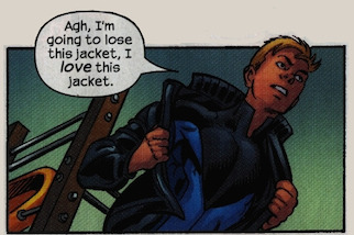
DAN: Okay, so here’s where the downward angle really works. Again, I would have liked to have a little flame coming off him in panel two to show the transition from Torch to normal. Overall, I like this scene a lot. Like, Johnny having to lose his jacket is a nice narrative device to show the sacrifice of heroism.
AUD: Plus a metaphor of the police getting him. I will say that in all the comments about the acting, all of it was passable — except for panel four.
DAN: Really! Why?
AUD: Just bad acting!
DAN: You just think it’s, what, cheesy?
AUD: It’s cheesy and it does the soap opera thing.
DAN: Ah, fair enough. The script description, I assume was “Johnny lets the moment land, feels proud of himself.” Tough to pull off. But I hear ya.
AUD: And also he’s facing…
DAN: Yeah, have him face the other direction. Although, I do kind of like him looking off, taking this moment to himself —
AUD: But that’s part of what bugs me the most! Like, look at panel three — they’re not looking at each other. They don’t seem to be in the same interaction.
DAN: I think this page is a good example of problems with placing figures in space that Bagley has throughout.
AUD: Especially scenes that are just dialogue.
DAN: The scene were MJ and Peter are talking to Johnny in the parking lot earlier is helped because Johnny’s leaning against a landmark; his car. But when they’re a little more free form like this, the figures start to drift around.
AUD: I love that last panel.
DAN: It’s a great panel. I love the lighting on Spidey.
AUD: Johnny’s… beautiful?
DAN: [Laughs] He’s very pretty.
PAGE TWENTY TWO
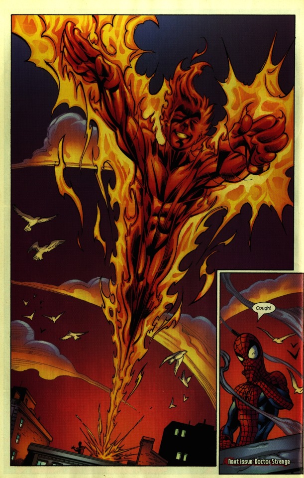
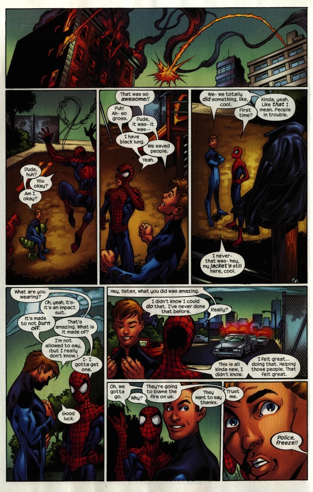
DAN: Final page.
AUD: Another money shot of him! How many are in this fucking issue!
DAN: [Sighs.] I guess if I were choosing to defend this, I would say the initial money shot on page one —
AUD: Was fine.
DAN: Yes, it sells the chaos and the fear of what’s happening. This next one on page three —
AUD: Nope.
DAN: — if I wanted to defend it, I would say that was, like, Johnny flying off into the sky like Frankenstein’s Monster, and then this last one is him flying into the sky like a hero. It’s a progression.
AUD: [Snort.]
DAN: Your milage may vary. More great sweeping motion of the clouds that create a contrast to him flying away at us —
AUD: Another example of things flying out of the page.
DAN: This is just a personal thing, but I would have broken the panel boarders here at the top and had his hands reach out into the bleed.
AUD: Yeah, if he’s gonna do the big moment where he comes out towards you, have him come out towards you!
DAN: And panel two is a funny final beat that undercuts this big heroic moment with Peter coughing — that’s solid. The birds are bit much.
AUD: The buildings are nice, though. He draws nice buildings!
DAN: He does! He’s really good at drawing this comic. Mark Bagley, shocker, is a really good guy to be drawing a Spider-Man comic. He’s good at buildings, he’s good at dynamic action — he is good at acting. I think in this issue, we just see him being a little bit on auto pilot. There’s not a lot we can say is really wrong with this issue.
AUD: Yeah, if I picked it up I would happily read it. The structural elements of it were perfectly passable.
DAN: Yeah! It’s well-written. It keeps moving. And the final action set piece is a nice way to get them to team up and learn about each other, but only be interacting with each other; they don’t have to fight anybody. Y’know, Paste Pot Pete doesn’t show up and they have to team up against him.
AUD: This is the exact kind of comic I would love to have drawn! Yeah. It’s good. Well written. Very well written.
DAN: You could be a hell of a lot worse.
***
You can buy a copy of this issue on Comixology, along with every other issue of ULTIMATE SPIDER-MAN.
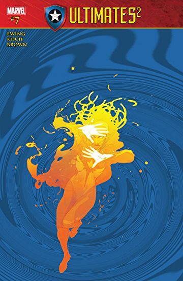
You can also pick up Aud Koch’s Marvel Comics debut, last week’s ULTIMATES 2 #7, written by Al Ewing with colors by Dan Brown -- which I highly recommend.
Check out Aud’s website, and hit her up on twitter! She’s always posting new art -- including some Spidey and Torch stuff that gives you an idea what this comic might’ve looked like if Aud had ghosted Bagley.
As always, feel free to check me on any mistakes I/we might have made, add your own commentary, or share similar examples of good comics done well. I’ll be back next week with a different comic to peruse.
Be well!
PREVIOUS PAGE x PAGE ANALYSES
THE SHADOW STRIKES! #13
PETER PARKER: SPIDER-MAN #13
BATMAN: GOTHAM ADVENTURES #17
#Ultimate Spider-Man#Aud Koch#Comics#Educational Purposes#Brian Michael Bendis#mark bagley#Marvel Comics#The Human Torch#Spider-Man
8 notes
·
View notes
Last Seen Blogs

bigllord
Official _BigllORD

rotaryturmoil
dead-end toiling

queenhoneybee-exe
𝓺𝓾𝓮𝓮𝓷 𝓫𝓮𝓮 🐝

unholyandchaotic
Unholy

katzima
Katzima's K Asian Persuasion