#HERES an idea spotify. allow for better connection and playlist sharing between users
Text
spotify is maybe the weirdest app to try out the tiktok style algorithm. who the hell wants to listen to music via swiping through 30 second clips. ill kill you
#HERES an idea spotify. allow for better connection and playlist sharing between users#if u wanna be social media soooo bad give us a tagging system for playlists. let following ppl actually mean smth#instead of the same shitty ai curated playlists every day give me a feed of user created playlists#not to say i dont use the daylist and dj. i think those r pretty alright#but like damn sometimes i want to listen to smth touched by human hands#NOT PURELY A SHUFFLE PLAYLIST LISTENER BTW……#i just find them better for when im stufying and shit
6 notes
·
View notes
Link
A playlist for when you want to binge all of The Far Meridian again but you only have two hours
Some of these connections are uhhh tenuous but I hope you enjoy this anyway. I intend to keep updating this as long as there are still episodes coming out. Track listing and notes below
1.1 The Outside – Waving Through A Window – Give them no reason to stare / No slipping up if you slip away / So I’ve got nothing to share / No I’ve got nothing to say
1.2 Overpass – Fly Me To The Moon – Fly me to the moon and let me play among the stars
1.3 The Bus Stop – Absentee – Love without anxiety / It’s like love except you’re free
1.4 Prayer – The Atheist Christmas Carol – It’s the season of bowing our heads in the wind / And knowing we are not alone in fear / Not alone in the dark
1.5 Print & Copy – Eleanor Rigby – All the lonely people, where do they all come from?
1.6 Knock – Haunt Me – And you tempt me with your empty promises / And you burn me like a hell furnace
1.7 Luthier – The Aquarium – This one is instrumental but it’s literally about an aquarium
1.8 A Fine Figure – Save Me – If you could save me / From the ranks of the freaks who suspect they could never love anyone
1.9 Mars – Life Lesson – When I’m eighty years old and alone in my chair / Will I look back at safety and be glad I didn’t care? / No!
1.10 Whitecaps – She – Am I allowed to look at her like that? / Could it be wrong when she’s just so nice to look at?
1.11 An Innocent Fly – King of the Sea – You need my help and I need yours too / We got a whole lot of work to do / So if you want a boat to sail away / You’re gonna have to tidy up today
1.12 Into The Mine – Heigh-Ho – We dig up diamonds by the score / A thousand rubies, sometimes more / But we don’t know what we dig ‘em for
1.13 In Granite – A Sign – Another instrumental track. The standout thing in this episode for me was the prophet stone, and who better to convey the idea of an ancient mysterious thing the desert than Disparition?
1.14 The Seconds Between – You Will Be Found – Even when the dark comes crashing through / When you need a friend to carry you / And when you’re broken on the ground / You will be found
Benny’s Airplanes – You Matter To Me – You matter to me / Simple and plain and not much to ask of somebody
2.1 After – Every Breath You Take – Every move you make / Every vow you break / Every smile you fake / Every claim you stake / I’ll be watching you
2.2 Take Flight – Brand New Best Friend – Now I know all about you / And you know all about me / Ooh-wee-ooh / And now before me I see / Someone with whom I agree
2.3 Market – Home Again – Instrumental. So there’s the literal connection of this being called “Home Again” and this episode being about Peri coming back to live with her parents, but also this is a track from Night In The Woods, a thematically related game about struggling with new adulthood.
2.4 Defrag – Hello World – Find my voice / Even though it sounds like bits and bytes
2.5 Playback – It’s Over – Everything’s beautiful / Every day’s a holiday the day you live without it
2.6 Too Heavy to Fly – So Long Sentiment – Why am I torturing myself? / Inhaling all these memories / Like a breath of fire sent from hell
2.7 Festival – I’m Gonna Be – And I would walk five hundred miles / And I would walk five hundred more / just to be the man who walked a thousand miles and fell down at your door
2.8 Ars Memoriae – Fear and Loathing – And now the time is here / Baby you don’t have to live your life in fear
2.9 The Abandoned Olympian – Viva La Vida – One minute I held the key / Next the walls were closed on me / And I discovered that my castles stand / Upon pillars of salt and pillars of sand
2.10 Neon is the Color of Desire – Homecoming (Walter’s Song) – It’s desert ice outside but this diner has thawed my ears / Hot coffee in a clean white mug and a smile when the waitress hears / That I was born in North Carolina not an hour from her hometown / and we used to play the same pizza parlor pinball
2.11 The Cascade – Eet – It’s like forgetting the words to your favorite song / You can’t believe it, you were always singing along
2.12 Into The Grey – Don’t Speak – I really feel that I’m losing my best friend / I can’t believe this could be the end
2.13 Coalescence, Part 1 – Run Away With Me – This is the part, you’ve got to say all that you’re feeling, feeling / Packing a bag, we’re leaving tonight when everyone’s sleeping, sleeping / Let’s run away / I’ll run away with you
2.14 Coalescence, Part 2 — Catch Me — Before I fall too fast / Kiss me quick, but make it last / so I can see how badly this will hurt me when you say goodbye
47 notes
·
View notes
Text
A Tale Of Two Ecosystems: On Bandcamp, Spotify And The Wide-Open Future
Spotify and Bandcamp could not be more opposite. Where Spotify highlights playlists, most often of its own creation, Bandcamp sticks to the album (or any other format, as determined by the artist). Where Spotify pays royalties according to little-understood formulas that can only be analyzed by reverse calculation, Bandcamp lets artists and labels choose their own prices. Where Spotify requires working through a limited number of distributors to access their services, Bandcamp is open to anyone. Where Spotify has revenue streams dependent on ads and data, Bandcamp operates on a simple revenue share with artists and collects no information on its users.
Spotify is now worth an estimated $54 billion on the stock market, despite having never shown an annual profit. Bandcamp is privately owned, has been in the black since 2012, and continues to grow... slowly. You might be tempted to say that one is a 21st-century business, and the other belongs to an earlier age. But neither could exist at any other time.
Which poses the question: does our 21st-century business world really have to be so much like Spotify, and so little like Bandcamp? I spoke with Bandcamp CEO and co-founder Ethan Diamond to try and understand better how and why his company does business the way they do.
Article continues after sponsor message
Given how differently Bandcamp has behaved from a typical startup, I asked Diamond a fundamental question: Is Bandcamp a digital business?
There was a long pause. "Yeah, I'm not sure," said Diamond. "I think of Bandcamp as a music company first, because I think of who we serve as first and foremost the artist. And the way to best serve artists happens to be through technology, a particular model of technology that our business is based on. But we're definitely – no question – we're different than a lot of digital businesses. I mean, the mission of the company is, I think, fairly unique. ... There's this great story – there was a New Yorker article about it – about how Prince was working on his autobiography just before he died. And he had picked a co-writer and in one of their initial meetings together he said, 'Music is healing. Write that down first.' He said that he wanted it to be the guiding principle they used in the book. And if you start with this idea that music is healing, that is obviously a power that should be in the hands of everybody who has the talent to wield it. ... And so that's what Bandcamp is. That's what I feel like we're here to build – that system. And the way you do that is by ensuring that artists are compensated fairly and transparently for their work. And that is through the direct support of their fans."
NATIONAL
Comments From Spotify CEO Anger Some Musicians
Try going into an investor earnings call with that! Actually, what does a proper earnings call in the digital music business sound like? Daniel Ek, CEO and co-founder of Spotify, peppered his on April 29 with the phrase, "audio-first strategy." He uses "audio" rather than "music" because podcasting has become an important element of Spotify's strategy. But strategy toward what, exactly? Here are more of Ek's own words, from his Q1 2020 earnings call:
"When I look ahead both short- and long-term, I'm always thinking about what's Spotify's role within the larger ecosystem. And while most focus is on competition between streaming services, we continue to be focused on the billions of users that are listening to linear radio. The 20-year trend is that everything linear dies and on-demand wins. This is a trend that we suspect will be accelerated by the COVID pandemic. ... So in my mind, our competition is actually those learned and long-held user behaviors. For us, it will always be about capturing the share of time listeners spend elsewhere and prove out [sic] that their time is far better spent with us."
Spotify is focused on "capturing the share of time listeners spend elsewhere." This is why Ek talks about "audio" generically, because it doesn't matter specifically what those listeners are doing elsewhere, Ek just wants them doing it at Spotify instead. Spotify is not a "music company first," as Diamond describes Bandcamp, because music plays a role only insofar as people spend some of their time listening to it, and Spotify wants all their time. What truly comes first for Spotify is competition – the company is focused on eliminating other places for time spent listening to... whatever. If it's to conspiracist shock jock Joe Rogan – now signed to Spotify for exclusivity of his podcast, reportedly for upwards of $100 million – then it's Joe Rogan. And Joe Rogan is anything but healing. Indeed, health clearly has nothing to do with this. As Ek makes clear, even the COVID pandemic can be put to use by Spotify's strategy, as can the death of an existing medium for music, "linear radio" (more commonly known as "radio").
To be fair, Ek says he does have another mission in mind for Spotify. It's one he spelled out a couple of years ago, before podcasting entered the picture but right before the company went public on the stock exchange: he said he wanted Spotify to help "one million artists to be able to live off their art." This sounds good, especially if you're one of a million artists, rather than one in a million. But what can it mean, when Spotify's royalty rates are so low that to earn a living wage of $15 an hour, a musician needs 657,895 streams per month*? (And if you aren't a solo artist, multiply that by the number of people in your band.)
*Some streaming napkin math: A $15-an-hour minimum wage is $2,500 in revenue per month (pre-tax). Calculating Spotify streaming payout as $0.0038 per stream, then $2,500 equals out to 657,895 streams. It's important to note that this is necessarily an estimate, because each artist makes a slightly different amount per stream — but many use this average figure to estimate Spotify earnings.
It's this discrepancy, between stated goals and reality, that has led many musicians to become more vocal about their dissatisfaction with Spotify. So many that Ek himself recently complained, in an interview with MusicAlly, that: "In the entire existence [of Spotify] I don't think I've ever seen a single artist saying 'I'm happy with all the money I'm getting from streaming.' " Tellingly, Ek didn't follow this with an acknowledgement of why artists are unhappy with the money they get from streaming. Instead, he drew a rather Trump-like conclusion: they are happy, they just don't say it in public. "In private they have done that many times, but in public they have no incentive to do it. But unequivocally, from the data, there are more and more artists that are able to live off streaming income in itself."
Ek continued to swallow his foot in that same interview. "Obviously, some artists that used to do well in the past may not do well in this future landscape, where you can't record music once every three to four years and think that's going to be enough," he said. The reaction from musicians on social media to this particular statement was swift and loud. Musicians do not see themselves as audio machines, able to increase output to make up for the falling unit value of their product. To anyone who knows what goes into recording an album, and how few albums one is likely to make over a career in music, this may well have been the proverbial final straw.
EDITORS' PICKS
A Borrowed World: Streaming As The New Reality
Which brings us back to the anti-Spotify. It's becoming more common, especially among younger bands, to eschew Spotify altogether and post their digital music files on Bandcamp exclusively. [Ed. note: We've been noticing, anecdotally but with increasing frequency, that many new releases we'd like to include on our playlists don't make the jump from being posted on Bandcamp to appearing on platforms like Spotify.] But does it function as a replacement? When I talk about Bandcamp to music fans, especially younger ones, they often say, "but it doesn't stream." You can stream from it, I always point out – just album by album rather than playlist. But I can see their attention has already wandered.
So I put this other very basic question to Ethan Diamond: Is Bandcamp a streaming service?
His answer surprised me. "No," he said. "I don't think of this as a streaming service. I consider us a record store and a music community. The primary difference being that we're a way to directly support the artists that you enjoy listening to. You know, half of the sales on Bandcamp at this point are for physical goods. ... Digital has also seen really strong growth. And when you buy digital on Bandcamp, what you're buying is access. So you can grab a download – you know, there are people who want to grab the high-quality file – but you can also stream through our app, unlimited once you've purchased the music. But yeah, I don't think of us as a streaming service. Definitely."
Bandcamp does stream music – I'm still going to give the same argument to those who tell me it doesn't – but it's so far from the mission of the service, it doesn't even play into Diamond's view of it. Simply put: streaming doesn't support artists. So even though Bandcamp does stream (see, I'm making that argument again!), that's not how it supports artists. Which is what it really is about as a service.
Another striking aspect to Diamond's answer is Bandcamp's connection to physical goods. It is a digital-only business: it has no warehouses or delivery service, like Amazon. But Bandcamp allows artists to take orders for physical goods that they can fulfill however they choose – from their homes, from record labels or distributors, or from third-party merch services. Bandcamp simply takes a 10% revenue share of these sales. For bands, it's a bit like setting up a merch table at a virtual venue. (Venues, especially big ones, typically collect a percentage of merch sold on their premises.)
But if half of Bandcamp's revenue is from physical product, is it a digital platform?
"It definitely started as a digital platform," says Diamond. "In 2007, when we started the company, streaming didn't exist in the United States and our competition essentially was piracy. And the idea in 2007 primarily was that nobody was going to pay for music anymore. And it just seemed very obvious to me that if you like some music from one of your favorite artists, you should be able to support them directly. And so we built the platform to do that. My reference point for this was blogging services. In 2007, you had Blogger, Typepad, Movable Type, services that were essentially like white label services for writers – you could set up a site within minutes and tap this direct relationship with your readers. And it seemed crazy to me that if your artistic output happened to be music instead of words, you were just out of luck."
LIVE UPDATES: PROTESTS FOR RACIAL JUSTICE
Bandcamp, Much-Loved Indie Music Marketplace, Launches A Juneteenth Tradition
"And the most promising thing that happened in the early days," Diamond continues, "was we immediately saw people start to actually buy music, which was very exciting. I wasn't sure that was going to happen! And then, one of the fun things that happened was we started to look at the search terms people were using that brought them to a Bandcamp artist's site that led to a purchase. And several times per hour, we were seeing search terms like the name of an album or name of a track plus the word 'torrent,' or plus the word 'Limewire' or 'Kazaa.' You know, this was somebody whose intent initially was just to get the music – I don't know if they were thinking 'I'm pirating the music' – but they were trying to get it for free. But when they saw that they could make a direct purchase to the artist, they wanted to do that. And that just warmed my heart. So that's really what we were trying to do from the beginning, was just make it clear that this was a way to show your direct support for an artist."
Whether that direct support entails a digital exchange seems immaterial to Diamond. And the platform – unlike any others that come to mind – seems equally indifferent to whether you stay on it. Diamond says this, too, was deliberate from the start.
"That's a lot of the reason why, for a long time, there were not community features on the site. The MySpace community example that I had to go on was just all these people saying 'thanks for the add,' and posting their fliers for their own shows on sites, and basically, you know, polluting somebody else's space. So I said, 'Nah, let's just have no community at all.' And then what happened slowly evolved, because a lot of people started asking us 'Hey, you know, what are the other, like, math-rock artists on Bandcamp?' And my first reaction was, 'Why do you care?' Like, we're not – just go use Google or whatever. Type 'math rock' into Google. But then I started to understand that what was really going on here was a community of like-minded people forming around this idea of direct support of artists. And so then we introduced fan accounts, and collection pages, and discovery tools. And now that drives a significant percentage of the sales on the site. And again, that's just super encouraging."
Ethan Diamond's indifference to the time and money spent by users off his platform would be anathema to Daniel Ek. I am sure any Spotify employee who suggested that their users just type "math rock" into Google would have their desks cleaned out by the end of day. The differences are so extreme, Bandcamp may not just be the anti-Spotify; it may be operating in an entirely different world. I asked Diamond what digital businesses he feels a kinship with now, the way he did with blogging services when he started the company. He didn't name a music platform.
"I would say Etsy. You know, Etsy is similar in that it's a marketplace, right. They connect buyers and sellers, but they're not trying to create competing goods. And they're not fulfilling the goods or anything like that. So it's a community, and they're creating those tools to help connect those artists or sellers and buyers directly. And I think they offer everybody on that platform a fair deal. They've grown into a big company doing that, and I think like every company they have had their fair share of criticisms. But I feel like that's probably the closest."
Music as a craft, as a cottage industry? This may well be the future for many of us in the profession. In my own career, which started in the late 1980s, the type of music I play has gone from subculture to the "alternative" wing of the mainstream and now back, it seems, to subculture. Spotify is built for an economy of scale: it needs and wants to occupy all of everyone's listening time. My music and the milieu it is part of was never intended for that environment – I would worry about anyone who listened to nothing else! Are we, as Brian Wilson sang, just not made for these times?
Bandcamp's counterexample suggests that the problem I and many musicians in my situation face isn't about the digital age per se. It is possible to build a different kind of environment for music online, one that subcultures can recognize as their own and maybe even use to thrive. Or heal, at least, while we dream up new ways to connect with one another in the 21st century.
Damon Krukowski is a musician (Damon & Naomi, Galaxie 500) and writer (Ways of Hearing, The New Analog). He contributes frequently to journals including Art in America, Artforum, Pitchfork, and the New Yorker.
https://www.npr.org/2020/08/19/903547253/a-tale-of-two-ecosystems-on-bandcamp-spotify-and-the-wide-open-future?utm_source=Jocelyn+K.+Glei%27s+newsletter&utm_campaign=a6cdd34d99-Newsletter_12_07_17_COPY_01&utm_medium=email&utm_term=0_0d0c9bd4c2-a6cdd34d99-143326949&mc_cid=a6cdd34d99&mc_eid=1dbb9b3296
0 notes
Text
Mr. Roboto: Connecting with Technology
People don’t always need another human being to experience a sense of connection. The deep emotional bonds many people have with their pets proves this. (So might the popularity of the Pet Rock in the 1970s but that’s just speculation.) Even Link in The Legend of Zelda had an inanimate companion: his trusty sword (see Figure 9.1).

Fig 9.1 Even the company of a wooden sword is better than venturing into Hyrule alone.
It’s also possible for people to feel that sense of connection in the context of behavior change without having direct relationships with others. By building your product in a way that mimics some of the characteristics of a person-to-person relationship, you can make it possible for your users to feel connected to it. It is possible to coax your users to fall at least a little bit in love with your products; if you don’t believe me, try to get an iPhone user to switch operating systems.
It’s not just about really liking a product (although you definitely want users to really like your product). With the right design elements, your users might embark on a meaningful bond with your technology, where they feel engaged in an ongoing, two-way relationship with an entity that understands something important about them, yet is recognizably non-human. This is a true emotional attachment that supplies at least some of the benefits of a human-to-human relationship. This type of connection can help your users engage more deeply and for a longer period of time with your product. And that should ultimately help them get closer to their behavior change goals.
Amp Up the Anthropomorphization
People can forge relationships with non-humans easily because of a process called anthropomorphization. To anthropomorphize something means to impose human characteristics on it. It’s what happens when you see a face in the array of shapes on the right side in Figure 9.2, or when you carry on an extended conversation with your cat.[1]
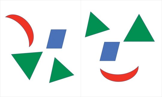
Fig 9.2 The brain is built to seek and recognize human characteristics whenever a pattern suggests they might be there. That means people interpret the array of shapes on the right as face-like, but not the one on the left.
People will find the human qualities in shapes that slightly resemble a face, but you can help speed that process along by deliberately imbuing your product with physical or personality features that resemble people. Voice assistants like Siri, Cortana, and Alexa, for example, are easily perceived as human-like by users thanks to their ability to carry on a conversation much like a (somewhat single-minded) person.
Granted, almost nobody would mistake Alexa for a real person, but her human characteristics are pretty convincing. Some research suggests that children who grow up around these voice assistants may be less polite when asking for help, because they hear adults make demands of their devices without saying please or thank you. If you’re asking Siri for the weather report and there are little ones in earshot, consider adding the other magic words to your request.
So, if you want people to anthropomorphize your product, give it some human characteristics. Think names, avatars, a voice, or even something like a catchphrase. These details will put your users’ natural anthropomorphization tendencies into hyperdrive.
Everything Is Personal
One thing humans do well is personalization. You don’t treat your parent the same way you treat your spouse the same way you treat your boss. Each interaction is different based on the identity of the person you’re interacting with and the history you have with them. Technology can offer that same kind of individualized experience as another way to mimic people, with lots of other benefits.
Personalization is the Swiss Army Knife of the behavior change design toolkit. It can help you craft appropriate goals and milestones, deliver the right feedback at the right time, and offer users meaningful choices in context. It can also help forge an emotional connection between users and technology when it’s applied in a way that helps users feel seen and understood.
Some apps have lovely interfaces that let users select colors or background images or button placements for a “personalized” experience. While these types of features are nice, they don’t scratch the itch of belonging that true personalization does. When personalization works, it’s because it reflects something essential about the user back to them. That doesn’t mean it has to be incredibly deep, but it does need to be somewhat more meaningful than whether the user has a pink or green background on their home screen.
Personalized Preferences
During onboarding or early in your users’ product experience, allow them to personalize preferences that will shape their experiences in meaningful ways (not just color schemes and dashboard configurations). For example, Fitbit asks people their preferred names, and then greets them periodically using their selection. Similarly, LoseIt asks users during setup if they enjoy using data and technology as part of their weight loss process (Figure 9.3). Users who say yes are given an opportunity to integrate trackers and other devices with the app; users who say no are funneled to a manual entry experience. The user experience changes to honor something individual about the user.

Fig 9.3 LoseIt gives users an opportunity to share their technology preferences during onboarding and then uses that choice to shape their future experience.
If you can, recall back to ancient times when Facebook introduced an algorithmic sort of posts in the newsfeed. Facebook users tend to be upset anytime there’s a dramatic change to the interface, but their frustration with this one has persisted, for one core reason: Facebook to this day reverts to its own sorting algorithm as a default, even if a user has selected to organize content by date instead. This repeated insistence on their preference over users’ makes it less likely that users will feel “seen” by Facebook.[2]
Personalized Recommendations
If you’ve ever shopped online, you’ve probably received personalized recommendations. Amazon is the quintessential example of a recommendation engine. Other commonly encountered personalized recommendations include Facebook’s “People You May Know” and Netflix’s “Top Picks for [Your Name Here].” These tools use algorithms that suggest new items based on data about what people have done in the past.
Recommendation engines can follow two basic models of personalization. The first one is based on products or items. Each item is tagged with certain attributes. For example, if you were building a workout recommendation engine, you might tag the item of “bicep curls” with “arm exercise,” “upper arm,” and “uses weights.” An algorithm might then select “triceps pulldowns” as a similar item to recommend, since it matches on those attributes. This type of recommendation algorithm says, “If you liked this item, you will like this similar item.”
The second personalization model is based on people. People who have attributes in common are identified by a similarity index. These similarity indices can include tens or hundreds of variables to precisely match people to others who are like them in key ways. Then the algorithm makes recommendations based on items that lookalike users have chosen. This recommendation algorithm says, “People like you liked these items.”
In reality, many of the more sophisticated recommendation engines (like Amazon’s) blend the two types of algorithms in a hybrid approach. And they’re effective. McKinsey estimates that 35% of what Amazon sells and 75% of what Netflix users watch are recommended by these engines.
Don’t Overwhelm
Sometimes what appear to be personalized recommendations can come from a much simpler sort of algorithm that doesn’t take an individual user’s preferences into account at all. These algorithms might just surface the suggestions that are most popular among all users, which isn’t always a terrible strategy. Some things are popular for a reason. Or recommendations could be made in a set order that doesn’t depend on user characteristics at all. This appears to be the case with the Fabulous behavior change app that offers users a series of challenges like “drink water,” “eat a healthy breakfast,” and “get morning exercise,” regardless of whether these behaviors are already part of their routine or not.
When recommendation algorithms work well, they can help people on the receiving end feel like their preferences and needs are understood. When I browse the playlists Spotify creates for me, I see several aspects of myself reflected. There’s a playlist with my favorite 90s alt-rock, one with current artists I like, and a third with some of my favorite 80s music (Figure 9.4). Amazon has a similar ability to successfully extrapolate what a person might like from their browsing and purchasing history. I was always amazed that even though I didn’t buy any of my kitchen utensils from Amazon, they somehow figured out that I have the red KitchenAid line.

Fig 9.4 Spotify picks up on the details of users’ musical selections to construct playlists that reflect multiple aspects of their tastes.
A risk to this approach is that recommendations might become redundant as the database of items grows. Retail products are an easy example; for many items, once people have bought one, they likely don’t need another, but algorithms aren’t always smart enough to stop recommending similar purchases (see Figure 9.5). The same sort of repetition can happen with behavior change programs. There are only so many different ways to set reminders, for example, so at some point it’s a good idea to stop bombarding a user with suggestions on the topic.
Fig 9.5 When a user only needs a finite number of something, or has already satisfied a need, it’s easy for recommendations to become redundant.
Don’t Be Afraid to Learn
Data-driven personalization comes with another set of risks. The more you know about users, the more they expect you to provide relevant and accurate suggestions. Even the smartest technology will get things wrong sometimes. Give your users opportunities to point out if your product is off-base, and adjust accordingly. Not only will this improve your accuracy over time, but it will also reinforce your users’ feelings of being cared for.
Alfred was a recommendation app developed by Clever Sense to help people find new restaurants based on their own preferences, as well as input from their social networks. One of Alfred’s mechanisms for gathering data was to ask users to confirm which restaurants they liked from a list of possibilities (see Figure 9.6). Explicitly including training in the experience helped Alfred make better and better recommendations while also giving users the opportunity to chalk errors up to a need for more training.[3]
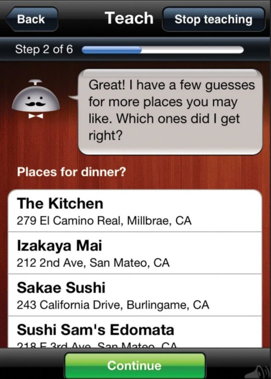
Fig 9.6 Alfred included a learning mode where users would indicate places they already enjoyed eating. That data helped improve Alfred’s subsequent recommendations.
Having a mechanism for users to exclude some of their data from an algorithm can also be helpful. Amazon allows users to indicate which items in their purchase history should be ignored when making recommendations—a feature that comes in handy if you buy gifts for loved ones whose tastes are very different from yours.
On the flip side, deliberately throwing users a curve ball is a great way to learn more about their tastes and preferences. Over time, algorithms are likely to become more consistent as they get better at pattern matching. Adding the occasional mold-breaking suggestion can prevent boredom and better account for users’ quirks. Just because someone loves meditative yoga doesn’t mean they don’t also like going mountain biking once in a while, but most recommendation engines won’t learn that because they’ll be too busy recommending yoga videos and mindfulness exercises. Every now and then add something into the mix that users won’t expect. They’ll either reject it or give it a whirl; either way, your recommendation engine gets smarter.
Personalized Coaching
At some point, recommendations in the context of behavior change may become something more robust: an actual personalized plan of action. When recommendations grow out of the “you might also like” phase into “here’s a series of steps that should work for you,” they become a little more complicated. Once a group of personalized recommendations have some sort of cohesiveness to systematically guide a person toward a goal, it becomes coaching.
More deeply personalized coaching leads to more effective behavior change. One study by Dr. Vic Strecher, whom you met in Chapter 3, showed that the more a smoking cessation coaching plan was personalized, the more likely people were to successfully quit smoking. A follow-up study by Dr. Strecher’s team used fMRI technology to discover that when people read personalized information, it activates areas of their brain associated with the self (see Figure 9.7). That is, people perceive personalized information as self-relevant on a neurological level.

Fig 9.7 This is an fMRI image showing activation in a person’s medial prefrontal cortex (mPFC), an area of the brain associated with the self. The brain activity was recorded after showing people personalized health information.
This is important because people are more likely to remember and act on relevant information. If you want people to do something, personalize the experience that shows them how.
From a practical perspective, personalized coaching also helps overcome a common barrier: People do not want to spend a lot of time reading content. If your program can provide only the most relevant items while leaving the generic stuff on the cutting room floor, you’ll offer more concise content that people may actually read.
0 notes
Text
Mr. Roboto: Connecting with Technology
People don’t always need another human being to experience a sense of connection. The deep emotional bonds many people have with their pets proves this. (So might the popularity of the Pet Rock in the 1970s but that’s just speculation.) Even Link in The Legend of Zelda had an inanimate companion: his trusty sword (see Figure 9.1).
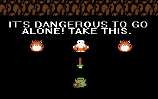
Fig 9.1 Even the company of a wooden sword is better than venturing into Hyrule alone.
It’s also possible for people to feel that sense of connection in the context of behavior change without having direct relationships with others. By building your product in a way that mimics some of the characteristics of a person-to-person relationship, you can make it possible for your users to feel connected to it. It is possible to coax your users to fall at least a little bit in love with your products; if you don’t believe me, try to get an iPhone user to switch operating systems.
It’s not just about really liking a product (although you definitely want users to really like your product). With the right design elements, your users might embark on a meaningful bond with your technology, where they feel engaged in an ongoing, two-way relationship with an entity that understands something important about them, yet is recognizably non-human. This is a true emotional attachment that supplies at least some of the benefits of a human-to-human relationship. This type of connection can help your users engage more deeply and for a longer period of time with your product. And that should ultimately help them get closer to their behavior change goals.
Amp Up the Anthropomorphization
People can forge relationships with non-humans easily because of a process called anthropomorphization. To anthropomorphize something means to impose human characteristics on it. It’s what happens when you see a face in the array of shapes on the right side in Figure 9.2, or when you carry on an extended conversation with your cat.[1]

Fig 9.2 The brain is built to seek and recognize human characteristics whenever a pattern suggests they might be there. That means people interpret the array of shapes on the right as face-like, but not the one on the left.
People will find the human qualities in shapes that slightly resemble a face, but you can help speed that process along by deliberately imbuing your product with physical or personality features that resemble people. Voice assistants like Siri, Cortana, and Alexa, for example, are easily perceived as human-like by users thanks to their ability to carry on a conversation much like a (somewhat single-minded) person.
Granted, almost nobody would mistake Alexa for a real person, but her human characteristics are pretty convincing. Some research suggests that children who grow up around these voice assistants may be less polite when asking for help, because they hear adults make demands of their devices without saying please or thank you. If you’re asking Siri for the weather report and there are little ones in earshot, consider adding the other magic words to your request.
So, if you want people to anthropomorphize your product, give it some human characteristics. Think names, avatars, a voice, or even something like a catchphrase. These details will put your users’ natural anthropomorphization tendencies into hyperdrive.
Everything Is Personal
One thing humans do well is personalization. You don’t treat your parent the same way you treat your spouse the same way you treat your boss. Each interaction is different based on the identity of the person you’re interacting with and the history you have with them. Technology can offer that same kind of individualized experience as another way to mimic people, with lots of other benefits.
Personalization is the Swiss Army Knife of the behavior change design toolkit. It can help you craft appropriate goals and milestones, deliver the right feedback at the right time, and offer users meaningful choices in context. It can also help forge an emotional connection between users and technology when it’s applied in a way that helps users feel seen and understood.
Some apps have lovely interfaces that let users select colors or background images or button placements for a “personalized” experience. While these types of features are nice, they don’t scratch the itch of belonging that true personalization does. When personalization works, it’s because it reflects something essential about the user back to them. That doesn’t mean it has to be incredibly deep, but it does need to be somewhat more meaningful than whether the user has a pink or green background on their home screen.
Personalized Preferences
During onboarding or early in your users’ product experience, allow them to personalize preferences that will shape their experiences in meaningful ways (not just color schemes and dashboard configurations). For example, Fitbit asks people their preferred names, and then greets them periodically using their selection. Similarly, LoseIt asks users during setup if they enjoy using data and technology as part of their weight loss process (Figure 9.3). Users who say yes are given an opportunity to integrate trackers and other devices with the app; users who say no are funneled to a manual entry experience. The user experience changes to honor something individual about the user.
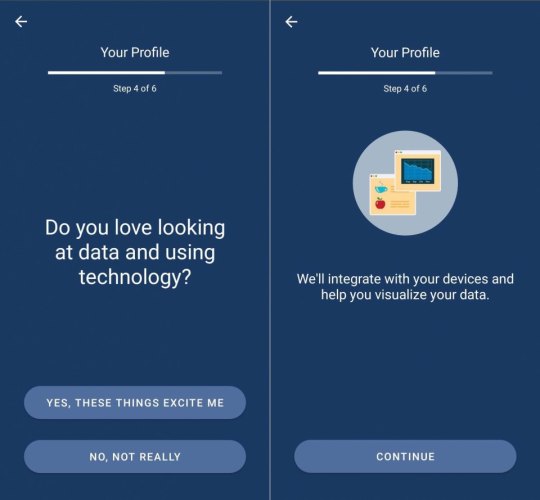
Fig 9.3 LoseIt gives users an opportunity to share their technology preferences during onboarding and then uses that choice to shape their future experience.
If you can, recall back to ancient times when Facebook introduced an algorithmic sort of posts in the newsfeed. Facebook users tend to be upset anytime there’s a dramatic change to the interface, but their frustration with this one has persisted, for one core reason: Facebook to this day reverts to its own sorting algorithm as a default, even if a user has selected to organize content by date instead. This repeated insistence on their preference over users’ makes it less likely that users will feel “seen” by Facebook.[2]
Personalized Recommendations
If you’ve ever shopped online, you’ve probably received personalized recommendations. Amazon is the quintessential example of a recommendation engine. Other commonly encountered personalized recommendations include Facebook’s “People You May Know” and Netflix’s “Top Picks for [Your Name Here].” These tools use algorithms that suggest new items based on data about what people have done in the past.
Recommendation engines can follow two basic models of personalization. The first one is based on products or items. Each item is tagged with certain attributes. For example, if you were building a workout recommendation engine, you might tag the item of “bicep curls” with “arm exercise,” “upper arm,” and “uses weights.” An algorithm might then select “triceps pulldowns” as a similar item to recommend, since it matches on those attributes. This type of recommendation algorithm says, “If you liked this item, you will like this similar item.”
The second personalization model is based on people. People who have attributes in common are identified by a similarity index. These similarity indices can include tens or hundreds of variables to precisely match people to others who are like them in key ways. Then the algorithm makes recommendations based on items that lookalike users have chosen. This recommendation algorithm says, “People like you liked these items.”
In reality, many of the more sophisticated recommendation engines (like Amazon’s) blend the two types of algorithms in a hybrid approach. And they’re effective. McKinsey estimates that 35% of what Amazon sells and 75% of what Netflix users watch are recommended by these engines.
Don’t Overwhelm
Sometimes what appear to be personalized recommendations can come from a much simpler sort of algorithm that doesn’t take an individual user’s preferences into account at all. These algorithms might just surface the suggestions that are most popular among all users, which isn’t always a terrible strategy. Some things are popular for a reason. Or recommendations could be made in a set order that doesn’t depend on user characteristics at all. This appears to be the case with the Fabulous behavior change app that offers users a series of challenges like “drink water,” “eat a healthy breakfast,” and “get morning exercise,” regardless of whether these behaviors are already part of their routine or not.
When recommendation algorithms work well, they can help people on the receiving end feel like their preferences and needs are understood. When I browse the playlists Spotify creates for me, I see several aspects of myself reflected. There’s a playlist with my favorite 90s alt-rock, one with current artists I like, and a third with some of my favorite 80s music (Figure 9.4). Amazon has a similar ability to successfully extrapolate what a person might like from their browsing and purchasing history. I was always amazed that even though I didn’t buy any of my kitchen utensils from Amazon, they somehow figured out that I have the red KitchenAid line.
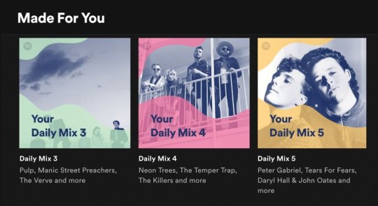
Fig 9.4 Spotify picks up on the details of users’ musical selections to construct playlists that reflect multiple aspects of their tastes.
A risk to this approach is that recommendations might become redundant as the database of items grows. Retail products are an easy example; for many items, once people have bought one, they likely don’t need another, but algorithms aren’t always smart enough to stop recommending similar purchases (see Figure 9.5). The same sort of repetition can happen with behavior change programs. There are only so many different ways to set reminders, for example, so at some point it’s a good idea to stop bombarding a user with suggestions on the topic.

Fig 9.5 When a user only needs a finite number of something, or has already satisfied a need, it’s easy for recommendations to become redundant.
Don’t Be Afraid to Learn
Data-driven personalization comes with another set of risks. The more you know about users, the more they expect you to provide relevant and accurate suggestions. Even the smartest technology will get things wrong sometimes. Give your users opportunities to point out if your product is off-base, and adjust accordingly. Not only will this improve your accuracy over time, but it will also reinforce your users’ feelings of being cared for.
Alfred was a recommendation app developed by Clever Sense to help people find new restaurants based on their own preferences, as well as input from their social networks. One of Alfred’s mechanisms for gathering data was to ask users to confirm which restaurants they liked from a list of possibilities (see Figure 9.6). Explicitly including training in the experience helped Alfred make better and better recommendations while also giving users the opportunity to chalk errors up to a need for more training.[3]

Fig 9.6 Alfred included a learning mode where users would indicate places they already enjoyed eating. That data helped improve Alfred’s subsequent recommendations.
Having a mechanism for users to exclude some of their data from an algorithm can also be helpful. Amazon allows users to indicate which items in their purchase history should be ignored when making recommendations—a feature that comes in handy if you buy gifts for loved ones whose tastes are very different from yours.
On the flip side, deliberately throwing users a curve ball is a great way to learn more about their tastes and preferences. Over time, algorithms are likely to become more consistent as they get better at pattern matching. Adding the occasional mold-breaking suggestion can prevent boredom and better account for users’ quirks. Just because someone loves meditative yoga doesn’t mean they don’t also like going mountain biking once in a while, but most recommendation engines won’t learn that because they’ll be too busy recommending yoga videos and mindfulness exercises. Every now and then add something into the mix that users won’t expect. They’ll either reject it or give it a whirl; either way, your recommendation engine gets smarter.
Personalized Coaching
At some point, recommendations in the context of behavior change may become something more robust: an actual personalized plan of action. When recommendations grow out of the “you might also like” phase into “here’s a series of steps that should work for you,” they become a little more complicated. Once a group of personalized recommendations have some sort of cohesiveness to systematically guide a person toward a goal, it becomes coaching.
More deeply personalized coaching leads to more effective behavior change. One study by Dr. Vic Strecher, whom you met in Chapter 3, showed that the more a smoking cessation coaching plan was personalized, the more likely people were to successfully quit smoking. A follow-up study by Dr. Strecher’s team used fMRI technology to discover that when people read personalized information, it activates areas of their brain associated with the self (see Figure 9.7). That is, people perceive personalized information as self-relevant on a neurological level.

Fig 9.7 This is an fMRI image showing activation in a person’s medial prefrontal cortex (mPFC), an area of the brain associated with the self. The brain activity was recorded after showing people personalized health information.
This is important because people are more likely to remember and act on relevant information. If you want people to do something, personalize the experience that shows them how.
From a practical perspective, personalized coaching also helps overcome a common barrier: People do not want to spend a lot of time reading content. If your program can provide only the most relevant items while leaving the generic stuff on the cutting room floor, you’ll offer more concise content that people may actually read.
Mr. Roboto: Connecting with Technology published first on https://deskbysnafu.tumblr.com/
0 notes
Text
Content Marketing Best Practices + Examples From Top Brands
With great content comes great responsibility! You may have really great content but what do you do with it? The answer lies in content marketing. You can use this marketing channel to build your customer base by engaging them and providing content that converts. We’re going to dive into our favorite list of content marketing best practices.
Are you applying any of them? Let’s find out.
If you already know you want to take your content marketing to the next level. Then let’s get to it. Contact us and we’ll get started turning potential customers into loyal buyers today!
What is content marketing?
Content marketing focuses on creating valuable content for your target audience. The keyword here is value. You can create all the content you want but if it doesn’t resonate with your target audience you shouldn’t expect any sales to come out of it. Producing this valuable content is a way to break through the rest of the noise in the digital world. The goal, like most marketing tactics, is to drive customer action.
Think content marketing can’t be applied to your business? Think again. Any business can benefit from creating content. Not everything has to be an obvious advertisement or a push to sell. Relevant content helps cut through the clutter and can also help build brand awareness for your company.
So now your question is probably how can I make money by just publishing content? It’s not enough to just publish content. You must be creative! Get out of your comfort zone. Go where no competitor has gone before and be able to build a strategy. With our content marketing best practices on hand it will be a piece of cake!
Content Marketing Best Practices
Content marketing is all about the content of course! So the first of our content marketing best practices might sound a little strange.
Don’t sell anything. Repeat that. Do not sell anything.
Wait what?
We know what you are probably thinking. How can I sell my products or services if I’m not actually trying to sell them?
Yup that’s right. The purpose of content marketing is to produce great content so that your customers take action. If your content is extraordinary and unlike anything customers have ever seen before, they will be compelled to take action.
So, show content that your users want to see and do not push sales on them. You can create a separate online advertising strategy dedicated to sales. But sometimes people need a break from ads. This is why you need content marketing.
Let’s take a look at a company that puts these content marketing best practices to work! Publix – the grocery store famous for “Pub Subs”- has an Instagram account filled with various food shots, recipes and cooking tips. They aren’t directly “selling” anything or telling you to buy something. But by showing followers recipes they are subtly encouraging them to go to Publix to purchase the ingredients they need to make meals or snacks like this delicious salsa.
If their account was filled with photos of their chip aisle when it’s buy one get one free, customers would be less engaged with their content.
Although this is a supermarket they have built their brand in such a way that it comes off as a source for professional recipes and cooking tips.
Deliver Value
While you are not selling your products, you should also deliver value to your customers. That’s what content marketing is all about right? What better place to have valuable content than your blog?! What’s that you say? You don’t have a blog yet? Then it’s time to start writing or outsourcing your writing to a content marketing company. This is one of the best places to deliver content that is beneficial to customers and that also represents your brand.
Blogs are great because you can use them to answer questions that your customers might have. Once you start blogging regularly you become a trusted and reliable source for content. When customers trust you, they are more likely to buy your products or services.
Patagonia, a company that sells clothing for the outdoors is on a mission to make the world better. The Patagonia blog is full of 100% great content that their customer base would find interesting and useful.
There are stories of people hiking, the changing environment, and possibly the best content from guest writers. Like this letter to Patagonia written by Laura Johnston about her pink Patagonia baggie shorts that she wore for 180 days while thru-hiking the Appalachian Trail. Her content is entertaining as she tells the story of her favorite pair of shorts. This content sells the shorts without telling customers to buy them and delivers value to the reader as they learn about how wonderful these shorts are.
Personalize your content
Personalization allows you to grab the attention of your customers and tailor their experience specifically to them. This essentially makes people feel special and like the company is working just for them. Personalizing your content can be anything from recommending content that customers might like to putting their names on your product, like Coke!
Have you found your name on a bottle of Coca-Cola yet? As part of their Share a Coke campaign, Coca-Cola has put thousands of different names on their bottles. Seeing your name on a product like this is exciting and makes you want to buy just because it’s personalized. This is a creative way to show customers that Coke cares while giving customers something fun and valuable. And it’s profitable!
Plus, have you ever seen you name on a drink before? This is key. In order to be successful think of things that your competitors aren’t doing. Or you can piggyback off of their content marketing ideas and make them better!
Spotify is another company that is personalizing their content for their users. They use an algorithm to create personalized playlists for every single person. If you are a Spotify subscriber you will have access to daily mixes, a discover weekly, release radar and more! All of these playlists contain songs that you have either heard before or new songs that are similar to your music taste based on the previous songs you have been listening to.
Even though creating content like Coke and Spotify might be out of reach for some smaller companies, it doesn’t mean you can’t compete to reach for the stars. Another way you can personalize your content is to simply include recommendations to additional content.
If you show customers content that is relevant to them it makes your company look smart! The more relevant content you can show your individual customers, the more trust you will build with them. You will quickly become a reliable source for information. When customers seek out your site because they know that they will get tailored content, you have just won the content marketing game.
Build a bond with customers through content
This is one of our content marketing best practices that any size company can and should do. It goes hand in hand with our personalization technique. But how can you as a company “bond” with your customers? Create content that resonates directly with them. Go beyond being just a “brand” and get personal.
People love when brands interact with them on platforms like Instagram and Facebook. Getting a response from your favorite brand is like winning the lottery for some people. Incorporate this tactic with the content you post! Anthropologie takes the time to share repost photos that their fans post while wearing their clothing. When customers see this, they associate the brand with being in touch with their customer base and connecting with them on a deeper level. They are subtly encouraging their customers to purchase their clothing and giving them hope that maybe the company will repost their content. Sourcing photos from customers can make them feel validated. You, as a company, essentially become a support system. Anthropologie is supporting and recognizing their customers in an innovative way.
Ask questions
Seriously, ask your customers or followers questions. This is a great way to engage with them and learn more about their pain points and how you could better service them. And you are providing valuable content at the same time! Once you do this, make sure that you engage with them afterwards. If they provide answers or ask additional follow up questions, you need to make sure you respond. Customers will quickly stop interacting with your brand and stop buying from you if you don’t continue to be attentive.
Nutrition Stripped is a health and wellness brand run by nutritionist McKel Hill. She provides content like recipes and tips for healthy eating, and she loves to ask her followers questions. Whether it’s asking them what their favorite veggie is or quizzing them in a Q&A fashion, she is always using content to engage her customers.
Many social media platforms as well as content platforms have made it easier than ever for businesses to communicate with their customers. You can do it through comments, instant messages, polls, or even a Q&A like with Instagram’s new rollout in their Instagram Stories.
Use Humor
Funny content is arguably the best content. It’s easily engaging, and who doesn’t like to laugh? Incorporating humor when you can is a great way to get people to pay attention to you so that you can get your message across. Depending on your business you may not think that you can leverage humor. You want your content to serve a purpose and you want to be taken seriously. There is a happy medium between being funny and still maintaining decorum.
Imperfect Produce is a company that sells “ugly” fruits and veggies and a lower cost. They use humor to draw attention to the fact that people waste so much produce just because it doesn’t look a certain way even though it tastes exactly the same. Using this content marketing strategy to make people aware of an issue is genius. They start by asking their followers questions (two content marketing best practices in one!) and following up with the answer as well as a funny line or two that actually humanizes onions. It isn’t over the top with humor and strikes a balance between getting their point across and entertaining followers.
Write good content, then ask for feedback
This is one of those content marketing best practices that may seem strange but it works! After you write content that answers questions or offers help to customers, ask for feedback. Not only is it helpful for you but it’s also helpful for your customers. They feel like they have a chance to tell you whether or not your content was useful to them.
You can now use this feedback to make your content even more useful and targeted. Additionally, if you actually listen to your customers and make the changes they mention, you better bet that they notice! And they love it! As I’m sure you can agree, there’s nothing more satisfying as a customer than when a company truly listens to what you have to say.
When you write articles like this that are supposed to be helpful. You are writing with the knowledge and the answers. It can be difficult to fully explain everything and from a customer perspective the answer might still be confusing. Feedback is always important so integrate it into your content marketing!
Mailchimp, an email marketing API has a long list of support articles for customers to turn to when they are confused or frustrated. At the end of each one they ask the simple question “was this article helpful?” It’s a quick yes or no question that takes all of two seconds to answer. They also give a space for customers to elaborate.
This allows customers to have an outlet to express their thoughts about the article that they have just read. And it gives Mailchimp the information they need to make their content more valuable if it didn’t answer the customer’s question. Remember, it’s all about providing valuable information and answering customer questions.
Video is content too!
You thought content was all text didn’t you? Content comes in many different forms including video. And in today’s digital world, video is so popular that 87% of online marketers use it in their strategies. Video can grab your customer’s attention and hold it throughout if you execute it properly. So how can you make your video content stand out? It needs to be clever and entertaining all while providing value to your customers so that they take action.
De Lijn is a public transportation company run by the Dutch government in Belgium. They produced this video urging people to take the bus. They do it in such a way that it entertains people while simultaneously sending a message to use the public transportation system. They are not necessarily selling anything but this clip is great, wholesome content that makes you think without even realizing it.
youtube
Content like this is pure gold. It’s compelling and doesn’t push people into buying a public transportation pass but it plants the idea in their minds that traveling in groups is better. Next time they travel they might consider taking the bus all because of a funny group of cartoon animals.
Think outside the content box
The more creative you get with your content marketing strategy, the easier it will be to stand out and beat your competition. Can music be considered content? You bet. The more “outside the box” you can get while still being valuable and relevant – the better your chances of beating your competition (just make sure it’s relevant to your company).
Many companies have decided to build Spotify playlists for their customers.
Cyclebar, an indoor cycling company, uses music in their classes to pump up their customers and create a fun athletic experience.
It’s difficult to look up a song you enjoy while you’re cycling up that imaginary hill.
Or maybe you want to save the songs you heard in class for later when you are working out at home.
That’s why they decided to make a playlist of songs that customers hear in classes. This is easily accessible content and customers can listen wherever they go!
Another company that is utilizing this content marketing strategy is Starbucks. Sometimes you like the songs you hear in the shops but you don’t know the artist or song name. If you are a loyal customer and have their app, they show you which song is playing in the store you are currently in! How cool is that? Even if you are not in the store but want a fun coffee house vibe you can tune in to their playlist at any time.
What Not To Do
It’s also important to know what does not fall into our content marketing best practices.
Let’s look at what you shouldn’t do when creating content.
Randomly posting on social media is not content marketing. You need to set goals and craft a strategy. Content marketing is still marketing so you need to research before you start posting. Produce carefully curated content that resonates with your audience. Are you a little rusty in the creative content department? Our specialists can help you out with that. Feel free to check out our social media marketing services to learn more about our creative designers.
Don’t stop blogging. Content should be consistent. If a customer religiously reads your blog, they will come to expect new content from you on a regular basis. If you stop posting you will fall off the map. In addition to keeping your posts on schedule, you should make sure you continue to product high quality content. If it’s not up to par with your previous posts, don’t post it. You’re probably saying “That’ll never happen. I don’t have time to be consistent.” Well if you have 2 minutes to fill out our contact form, then you don’t have to worry about blogging anymore. We’ll do it for you!
Good content can sell itself but it needs to be optimized in order for people to find it. Write your blogs so that they rank for a targeted keyword. Integrate your content marketing strategy with your SEO strategy so that you can show up in search.
Don’t make your content all about you or your product. Remember these content marketing best practices we just shared with you. You need to add value and created a bond with your customers. You won’t be able to do this if all of your content just tells customers why you are the best. You are here to answer questions and solve customers’ problems. If your content only focuses on you and not your customers, they will get bored and move on.
Your content doesn’t have to be long to be good. Sure you can write longer blog posts but sometimes shorter is better especially when it comes to social media. Typically people won’t take the time to read an Instagram caption that is a paragraph long. Don’t be afraid to post a photo with a short caption. Your photo is still considered content and you can let it speak for itself. Just make sure you take high quality photos!
Content marketing shouldn’t stand alone. Integrate the principles you learn in content marketing best practices into other facets of your digital marketing strategy. If you have an advertising campaign you can create quality content that is centered around it. You can also share your content via social media or through emails that you send to customers in order to get noticed.
It takes time, effort and experience to craft the perfect content marketing strategy. You need to define your target audience and come up with content that is relevant to them. Not only does this content need to be valuable, it should be innovative, creative and exciting. Take notes from bigger companies in your industry and remember that no matter what type of business you own, producing great content should be at the top of your to do list.
Are you following these content marketing best practices? If not let us know and we would be happy to assist you on your journey to producing great content! Our seasoned marketing specialists will research your target audience and craft you a content marketing strategy that will wow and engage your customers. What are you waiting for? Get started today!
Do you have more content marketing best practices up your sleeve? Share them with us in the comments below. We’d love to hear them!
The post Content Marketing Best Practices + Examples From Top Brands appeared first on Digital Marketing Blog.
from Digital Marketing Blog https://ift.tt/2p9mbdc
via IFTTT
0 notes
Text
13 Examples of Successful Co-Branding Partnerships (And Why They're So Great)
There's a good chance your favorite consumer products are the result of two separate brands working together.
One of my own beloved childhood memories was a product of co-branding: Betty Crocker partnered with Hershey's to include chocolate syrup in its signature brownie recipe.
There's something brilliant about that co-branded product: It's a fun way to marry two classic brands into one delicious experience for fans of baking and chocolate alike. In fact, these brands still create new co-branded products to this day.
Co-branding is a strategic marketing and advertising partnership between two brands wherein the success of one brand brings success to its partner brand, too. Co-branding can be an effective way to build business, boost awareness, and break into new markets, and for a partnership to truly work, it has to be a win-win for all players in the game. Both audiences need to find value -- like chocolate-loving fans of Betty Crocker and Hershey's.
There are a ton of great examples of co-branding partnerships out there. To show you what makes them so successful, we've curated a list of 10 examples of great co-branding partnerships to inspire you.
Partnership Business Examples
GoPro & Red Bull
Pottery Barn & Sherwin-Williams
Casper & West Elm
Bonne Belle & Dr. Pepper
BMW & Louis Vuitton
Uber & Spotify
Apple & MasterCard
Airbnb & Flipboard
BuzzFeed & Best Friends Animal Society
Alexander Wang & H&M
CoverGirl & Lucasfilm
UNICEF & Target
Nike & Apple
1. GoPro & Red Bull
Co-branding Campaign: Stratos
GoPro doesn't just sell portable cameras, and Red Bull doesn't just sell energy drinks. Instead, both have established themselves as lifestyle brands -- in particular, a lifestyle that's action-packed, adventurous, fearless, and usually pretty extreme. These shared values make them a perfect pairing for co-branding campaigns, especially those surrounding action sports.
To make the partnership work, GoPro equips athletes and adventurers from around the world with the tools and funding to capture things like races, stunts, and action sport events on video -- from the athlete's perspective. At the same time, Red Bull uses its experience and reputation to run and sponsor these events.
"GoPro camera technology is allowing us to complement the programming by delivering new athlete perspectives that have never been seen before," said Sean Eggert, Red Bull's director of sports marketing. The collaboration allows exclusive GoPro content to enhance both companies' growth.
While GoPro and Red Bull have collaborated on many events and projects together, perhaps the biggest collaboration stunt they've done was "Stratos," in which Felix Baumgartner jumped from a space pod more than 24 miles above Earth's surface with a GoPro strapped to his person. Not only did Baumgartner set three world records that day, but he also embodied the value of reimagining human potential that define both GoPro and Red Bull.
youtube
2. Pottery Barn & Sherwin-Williams
Co-branding Campaign: Color Your Room
One of the biggest benefits of co-branding campaigns is the opportunity to expose your product or service to a brand new audience. That's exactly what home furnishing store Pottery Barn and paint company Sherwin-Williams did when they partnered together back in 2013.
Together, the two brands created an exclusive product line of paints, and then added a new section of Pottery Barn's website that helped customers easily select paint colors to complement their furniture choices.
Source: Pottery Barn
Customers could coordinate paint colors with picture-perfect Pottery Barn furniture for a mutually beneficial partnership -- and style assistance for both brands' customers to boot. "Paint Landing," Pottery Barn's landing page for the partnership, contains helpful blog posts and how-to ideas for do-it-yourself painting and decorating.
3. Casper & West Elm
Co-branding Campaign: Test a Casper Mattress
You may have already heard of Casper -- it's an online mattress and bedding brand that sells mattresses in a box.
Casper mattress unboxing videos like this one have become a hit on YouTube, but despite the brand's 100-day return policy, some shoppers might still be hesitant to buy a mattress without getting the chance to roll around in it first.
Enter West Elm, a high-end furniture company. Casper and West Elm partnered so shoppers could try out the comfy mattress before purchasing -- and so West Elm could advertise its chic bedroom furniture.
Source: Casper
This is another example of a mutually beneficial co-branding partnership. It helps both brands appeal to a broader group of shoppers -- after all, Casper doesn't sell furniture, and West Elm doesn't sell mattresses. It also provides shoppers with options -- to try a mattress before buying, or to feel what it would be like sleeping in a bed frame.
4. Bonne Belle & Dr. Pepper
Co-branding Campaign: Flavored Lip Balm
Dr. Pepper-flavored lip balm. I mean, it's genius.
Bonne Belle first debuted Lip Smacker, the world’s first flavored lip balm, in 1973, starting with flavors like strawberry, lemon, and green apple. Just two years later in 1975, they'd forged their first flavor partnership with the timeless Dr. Pepper brand. The result? A lip balm flavor that's been famous for decades among teenage girls.
If you're thinking the connection between lip balm and Dr. Pepper is a little thin, consider the copy on one of their vintage ads: "It’s the super shiny lip gloss with lip-smacking flavor… just like the world’s most original soft drink." And later, "From Bonne Belle of course: the cosmetics company that understands your taste."
Source: Click Americana
5. BMW & Louis Vuitton
Co-branding Campaign: The Art of Travel
Car manufacturer BMW and designer Louis Vuitton may not be the most obvious of pairings. But if you think about it, they have a few important things in common. If you focus on Louis Vuitton's signature luggage lines, they're both in the business of travel. They both value luxury. And finally, they're both well-known, traditional brands that are known for high-quality craftsmanship.
These shared values are exactly why this co-branding campaign makes so much sense. In their partnership, BMW created a sports car model called the BMW i8, while Louis Vuitton designed an exclusive, four-piece set of suitcases and bags that fit perfectly into the car's rear parcel shelf.
Source: Louis Vuitton
Although the four-piece luggage set goes for a whopping $20,000, the price is right for the target customer, as the BMW i8 starts at $135,700. A price like that kind of makes that luggage set seem like a drop in the bucket.
Not only does the luggage fit perfectly size-wise, but its design and appearance fit perfectly with BMW's image: sleek, masculine, and high-quality. Turns out both the luggage and some parts of the car's interior use carbon fiber, strong-yet-light composite material.
"This collaboration with BMW i epitomises our shared values of creativity, technological innovation and style," said Patrick-Louis Vuitton, head of special orders at Louis Vuitton. "Our craftsmen have enjoyed the challenge of this very special project, using their ingenuity and attention to detail to create a truly made to measure set of luxury luggage. This is a pure expression of the art of travel."
6. Uber & Spotify
Co-branding Campaign: Soundtrack for Your Ride
Music-streaming app Spotify partnered with ride-hailing app Uber to create "a soundtrack for your ride." This is a great example of a co-branding partnership between two very different products with very similar goals -- to earn more users.
Here's how it works: When riders are waiting for an Uber ride, they're prompted to connect with Spotify and become the DJ of their trip. Users can choose from their own playlists to determine what they'll listen to.
Source: The Verge
This smart co-branding partnership helps fans of Uber and Spotify alike enjoy better experiences thanks to the app. And they might be more interested in picking Uber and Spotify over competitors knowing they can enjoy their next ride listening to their favorite tunes.
7. Apple & MasterCard
Co-branding Campaign: Apple Pay
Sometimes, co-branding partnerships aren't just cool projects between two companies -- they actually have practical value when the companies work together.
When Apple released the Apple Pay app, the brand effectively changed how people perform transactions. This app allows people to store their credit or debit card data on their phone, so they can use them without physically having the card with them. But in order for this app to succeed, it needs credit card companies to integrate with this technology. By the same token, credit card companies also face more competition themselves if they aren't compatible with the latest consumer purchasing tool.
To get out ahead of its competition, MasterCard became the first credit card company to allow its users to store their credit and debit cards on Apple Pay. MasterCard not only showed support of a major consumer tech developer in this partnership -- it evolved along with its own customers in how they choose to make purchases at the counter.
Source: MasterCard
8. Airbnb & Flipboard
Co-branding Campaign: Experiences
You've probably heard of Airbnb, the room-sharing application that allows you to find convenient lodging hosted by real people. But its newest partner, Flipboard, might not have been on your radar until now.
Flipboard is a news aggregator that collects news and topical content that users are sharing on social media, and allows you to "flip" through the material much like a social media feed. Well, Airbnb recently teamed up with Flipboard to create Experiences, which serve Airbnb users with lifestyle content tailored to their interests and shared by people with similar interests as the reader.
The ongoing campaign recently led to another co-created product called Trips, which allows Airbnb users to connect with hosts on common interests and actually book these experiences when traveling. This partnership is an impressive example of how businesses can connect their customers with information that caters to their individual interests and drive usage of the product as a result.
Source: Flipboard
9. BuzzFeed & Best Friends Animal Society
Co-branding Campaign: Emma Watson + Kittens
Some co-branding campaigns are more complicated than others. This example from BuzzFeed and Best Friends Animal Society is one of the simplest ones out there -- and it goes to show a great co-branding effort doesn't have to take months of planning or millions of dollars.
For this campaign, the folks at Best Friends Animal Society wanted to leverage BuzzFeed's readership of over 200 million people. To do this, they partnered with the folks at BuzzFeed to set up and publish an article called, "We Interviewed Emma Watson While She Played With Kittens And It Was Absolutely Adorable," which you can read here. The article is exactly what it sounds like: Harry Potter and Beauty and the Beast star Emma Watson answered fans' questions while she played with cute kittens.
Source: BuzzFeed
The article ends with a CTA advertising that the kittens featured in the video are, in fact, adoptable -- a win-win for both partners.
10. Alexander Wang & H&M
Co-branding Campaign: High-End Fashion
Anyone who's designer-conscious knows Alexander Wang and H&M aren't exactly the same caliber when it comes to quality. Shoes by Alexander Wang tend to go for around $350 a pair, whereas shoes sold by H&M tend to go for more like $35 a pair. See what I mean?
But that discrepancy in pricing is exactly why the two brands decided to partner with one another. To support their brand positioning as trendy and fashionable, H&M has traditionally paired with high-end fashion brands to offer exclusive branded items for a limited time.
In exchange, those high-end brands -- like Alexander Wang -- can expose their brand name to "a new generation of potential consumers, who will increasingly aspire to owning more pieces from his high end collection," writes Michelle Greenwald for Forbes.
Source: Snobette
11. CoverGirl & Lucasfilm
Co-branding Campaign: Light Side and Dark Side Makeup
Whenever a new installment of the beloved "Star Wars" series is released in theaters, it causes global pandemonium, and the release of "Star Wars: Episode VII The Force Awakens" in 2015 was no exception. The series' parent company, Lucasfilm, partnered with CoverGirl to capture a broader audience to get fans new and old excited about the movie's release.
You might be wondering, "What do "Star Wars" and makeup have in common?" And the cleverness of this partnership is evident in the answer.
In the past, the space-age action movies were almost exclusively advertised and targeted toward men and boys. But in this day and age, that's nonsense -- because people of all genders can be interested in space exploration and makeup contouring alike.
The line was designed by famed makeup artist Pat McGrath, and it features two styles: the Light Side and the Dark Side, which loyal "Star Wars" fans will recognize as the sides of good and evil in the movies.
instagram
This co-branding partnership was a win for both brand. Lucasfilm captured more attention and got CoverGirl shoppers (many of whom are young women) excited about the film's release. And CoverGirl hopped on the "Star Wars" advertising bandwagon that took over the internet, stores, and TV leading up to the film's release.
12. UNICEF & Target
Co-branding Campaign: Kid Power
If you have the chance to partner for a not-for-profit cause, it can pay off in multiple ways.
In 2015, Target partnered with UNICEF on a campaign called Kid Power, which committed Target to one of UNICEF's sustainable development goals (SDGs). The retailer sold kid-friendly fitness trackers encouraging the wearer to complete various fitness activities, which ultimately helped deliver food packets to underprivileged children around the world.
By selling this fun, inexpensive fitness product, Target encourages children to embrace a healthy lifestyle and uses kids' successes to supply underserved communities with the resources they need. It's an ongoing partnership that generates awareness of global malnutrition, helps UNICEF meet its demanding SDGs, and opens up Target to a demographic of giving families they might otherwise have had access to.
By the way, you can get your child a Kid Power band here.
13. Nike & Apple
Co-branding Campaign: Nike+
Athletic brand Nike and technology giant Apple have been working together since the early 2000s, when the first line of iPods was released.
The co-branding partnership started as a way to bring music from Apple to Nike customers' workouts using the power of technology: Nike+iPod created fitness trackers and sneakers and clothing that tracked activity while connecting people to their tunes.
Source: Apple
The partnership has since evolved to become Nike+ -- which uses activity tracking technology built into athletic clothing and gear to sync with Apple iPhone apps to track and record workout data. Tracking transmitters can be built into shoes, armbands, and even basketballs to measure time, distance, heart rate, and calories burned.
It's a genius co-branding move that helps both parties provide a better experience to customers -- and with the popularity of fitness tracking technology, Nike+ is ahead of the curve by making it easy for athletes to track while they play.
0 notes
Text
10 Hidden URLs to Help You Rule the Web
You’re probably used to bookmarking your favorite sites for easy access, but the web goes much deeper than the top domains you’re familiar with—from your social networks to your email box, having the right URL to hand can enable you to jump right into the page, feature, setting, or search you need. Here are 10 of the most useful ones.
1) Reading your emails marked as important in Gmail
Enter the above URL in your browser’s address bar to jump straight to the messages marked as important in your inbox (by the way if you change the “0" for another number, you can switch between all the Gmail accounts you’ve configured). Other Gmail shortcuts you might want to try saving are ones to take you straight to your drafts or starred emails.
2) Fixing your Netflix recommendations
Just how many episodes of Stranger Things have you trawled through lately? This URL will tell you, and maybe tell you why your recommendations have gone so haywire as well. If you don’t want something you’ve watched influencing what gets recommended to you in the future, click on the cross icon to the right. Click Rating to see the titles you’ve rated.
3) Disconnecting apps from Facebook
There’s been quite a kerfuffle lately over third-party apps connected to your Facebook account, and it’s a good idea to regularly review the apps hooked up to your social network profile. Keep the above URL saved or close at hand and the job is much easier—it takes you straight to the page for disconnecting apps, with no menu browsing necessary.
4) Recovering files deleted from your Dropbox
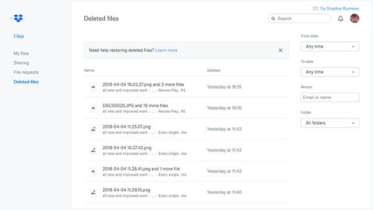
Deleted a file inside your Dropbox that you’ve since decided you did actually need after all? The web link above should see you right, listing files erased inside the last 30 days. If you want to bring a file back from digital death, click on it, then click Restore. Other useful Dropbox URLs you might want to save for easy access are shared files and file requests.
5) Seeing all of your Google voice searches
Speaking of user data, Google keeps an awful lot of it on file, which you may not be happy about depending on how much you trust Google. Click the above link to hear all the voice searches you’ve run through your Android phone, or your Google Home speaker, or whatever—you can even get them played back to you via the Play buttons on the right.
6) Restoring playlists deleted from Spotify
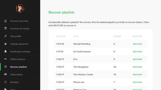
You might not visit it much, but Spotify has a website where you can log in and check your account information. One of the other features on the site is the opportunity to recover any playlists you’ve recently deleted: Just click Restore next to the relevant playlist and keep the tunes flowing. You can also see your registered offline devices and notification settings.
7) Curating Twitter
Escape the maelstrom of your main Twitter timeline by building up a shorter list of people you actually like, and then replacing your main Twitter bookmark with this new, shorter one. This trick can be used to jump straight to other people’s lists too, provided they’re public. Also, you can link straight to your Twitter notifications, moments, or liked tweets.
8) Viewing your favorite Instagram tags

Instagram’s on the web as well now, if you hadn’t realized, Stories and all. One of the ways you can use this to your advantage is by quickly linking to any Instagram tag you like using the URL above, whether that’s your local city or your favorite breed of dog. Other URLs worth bookmarking for Instagram include your saved posts and activity on your account.
9) Watching your queued up YouTube videos
The Watch Later playlist built into your YouTube account can be accessed from the URL above (to add something to this list, click the plus button then Watch Later under any video). In fact, you can link directly to any YouTube playlist, though the URLs are usually pretty garbled. Other bookmarks of use are your YouTube history and your subscriptions.
10) Checking out everywhere you’ve been on Google Maps
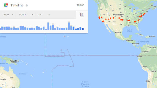
We’ve featured several Google web apps in this list, but in our defense it does this online app stuff better than anyone else at the moment. The URL above takes you straight to your Google Maps Timeline, a record of all your movements logged in Google Maps (if you’re allowing the app access to such information). See also your Google Maps contributions.
Source: https://ift.tt/2HaQBmM
0 notes
Text
2017 Gift Guide: Tech
There’s a good chance someone in your life has one or two tech gifts on their holiday wish list. The good news is there’s a dizzying array of items merging technology with smart design to choose from now, whether it’s for the home theater enthusiast, the brainiac whiz kid, the budding audiophile, or the aesthete first adopter. We’ve been check-marking tech designs all year for this end of the year gift guide – so, here’s our design-friendly picks to entertain, educate, nourish, and even decorate the home all with technology integral to the experience.
Gantri 3D Printed Table Lamp \\\ starting at $148
A few months ago we spotlighted the emergence of this San Francisco-based company for their intriguing 3D printing and on-demand manufacturing platform. Their catalog of wildly futuristic dimmable LED accent, area, and task lamps has since grown into a tempting selection of shapes and purposes, perfect to gift the person who lights up your life.
For the futurist aesthete.
DOIY Le Videpoche \\\ $41
Having a place to drop all the contents of your pockets at the end of the day could mean the difference between always knowing where your phone, wallet, and keys are or having to purchase one of these. Now if they only would make this with wireless charging built into the tray for the new iPhone X…
For the perpetually organized (or forever forgetful).
TRNTBL \\\ $499
It’s the first wireless turntable designed to play nice with two of our favorite streaming audio tools right out of the box – Spotify and Sonos. Every deck is hand assembled in either creme or black, and is equipped to identify every record played on its platter, generating a playlist to keep or share via Spotify. It’s the best of both worlds: the sound of analog with the convenience of wireless streaming.
For the vinyl lover who already owns Sonos speakers.
JLA M1 \\\ $995
The best technologies lay low, stay invisible until you need their service. That’s why we think this speaker disguised as a side table equipped with an 8″ ultra-low distortion woofer and a 1-1/8″ optimized silk dome tweeter inside a minimalist modern housing is almost a two-for-one bargain.
For the audiophile who believes speakers should be heard, not seen.
ANICORN Series 000 Watch \\\ $410
Elegant. The fashionable combination of grey and rose gold adorning the latest Series 000 Watch is a refreshing revamp of a watch formerly available in various shades of black. Beyond the new sophisticated finish, the triple-zero model still comes equipped to keep time accurately via automatic Japanese movement. Three concentric discs turn with every second, minute and hour. The Series 000 is also imprinted with the Swiss font Numeral designed by Dinamos, is water resistant with a 5 ATM rating, protected by an anti-reflective sapphire crystal glass, and operates without a battery. But we’ll admit it, we want it for its looks, not its time-keeping dependability.
For the horologist with a thing for typography.
Rylo 360-Degree Camera \\\ $499
Don’t let its small size fool you, this mighty bit of imaging equipment is capable of capturing big, seamless, and immersive 360-degree 4K video through its pair of 208-degree f2.8 lenses. An image stabilization system smooths the frosting, removing bumps and shakes for buttery smooth video playback of action. A gamut of iOS app-based controls invites further experimentation, offering a variety of different editing and focus modes, including subject locking and variable speed playback. It’s also manufactured with a confident heft that promises it can take a ding or two without even noticing.
For the adventurer who wants to see the bigger picture in life.
Xbox One X \\\ $499+ The Frame 43” \\\ $1299
We’ve already waxed poetic about The Frame, Samsung’s television designed to double up as a 4K, ultra high definition digital art platform, but we’re excited about this smaller 43″ option because it seems an ideal pairing for the new XBox One X, the most powerful gaming console available today. The +X console is more than capable of showcasing all the merits of 4K resolution HDR technology: games run faster, smoother, brighter, with vivid clarity, yet they’ve somehow reduced the physical size in comparison to its previous incarnation. The combination of power, resolution, and compact size makes the tandem a pretty compelling home entertainment system for the bedroom, den, or home office.
For the art lover who with a strong affinity for the artistry of gaming.
Optoma UHD60 4K Projector \\\ $1999
We’ve tested and owned several HD projectors (including a couple of Optoma models) throughout the years, but nothing so gloriously satisfying as this even clearer and brighter 4K UHD 2160p resolution DLP UHD projector. It’s simply badass, for the lack of better words honestly reflecting our opinion. Whether watching movies through Apple TV or XBox, streaming Netflix series, playing video games, or even playing Drawful across a 92″ screen with friends, the pictures put out from the UHD60 never disappoints. It’s the closest we’ll get to an IMAX experience in our modest sized living room.
For the cinephile who wants an execeptional picture at a reasonable price.
Nanit Baby Monitor \\\ $364
My friends just welcomed a newborn into their lives, so they seemed ideal candidates to test the Nanit. A few days after handing over the monitor, they emailed back with the following: “Nanit now and forever! The quality is light years ahead of our old video monitor. I used to have to stare at our child for a solid five minutes to detect breathing (as a new mom, you are constantly checking in on their breathing). With Nanit, you can ZOOM IN. The area that the camera covers is also really cool – an overhead shot lets you see so much more than we previously could. It even does a synopsis of the day and night via timelapse video so I can get a snapshot of it all. So not only is it informative, it’s really fun to watch.”
For the parents whose favorite channel is BabyTV (aka every parent).
Nespresso Expert \\\ $329
We’re all about the ritual of grinding our own whole beans for a cup of Aeropress or Chemex brewed coffee. But we recognize many drinkers appreciate the convenience and ease of capsule systems. If so, the neo-Art Deco industrial design of this latest Nespresso coffee brewing machine is the most pleasing expression of drop-press-and-brew coffee. A pair of simple dial controls offers satisfying clicks with every turn, allowing users to dial in temperature and intensity with an old audiophile equipment-like feel. The Bluetooth app-connected controls aren’t necessary, but offers a cool additional way to customize a cup of espresso with a swipe and a tap. Pssst, you can always switch to refillable capsules to pack with your favorite local roasts too.
For the coffee drinker looking for an elegant and compact design, and who wants to stop drinking from the gross communal carafe in the break room.
Sneakers \\\ $16 + Hex Calibre Sneaker Backpack \\\ $149
They’re calling this new 320 page tome dedicated to the business of sneaker design the “new sneaker bible”, its pages packed with photos and insight about the culture of collectible kicks. Pack a copy inside the dual compartment backpack from one of our favorite tech carry-all accessories maker, Hex and you’ve got business up top, party down below.
For the commuter and sneaker freak who wants to carry their laptop and sneakers everywhere they go.
CARY42 \\\ $3029
With just 50 of these portable retro gaming systems slated to be made, these arcade in a box are likely to become an offbeat rare collectible amongst gamers rather than a realistic gift idea. But by chance you’re a hardcore Street Fighter II devotee, this solid American walnut case with a 12″ LCD screen flanked by two 10w stereo speakers and loaded with 100 classic game titles should make it clear you’re always ready to 1-up.
For the rich gamer who just has to HADOUKEN at any given moment.
Kano Pixel Kit \\\ $79
I gave a Kano Pixel Kit to my neighbor’s daughter, and a few hours later her mom texted me back a video of her child having what appeared to be the time of her life exploring light and sound. The secret to everything Kano designs is the intuitive features that make learning a byproduct of curiosity and play. The Pixel Kit’s miniature screen is comprised of giant LED pixels capable of reproducing a spectrum of 16 million colors, and programmable using an easy block-based coding language…simple enough for Luddite parents to understand, complex enough for children to want to master.
For the kid who doesn’t want to just play games, but code the next Minecraft one day.
via http://design-milk.com/
from WordPress https://connorrenwickblog.wordpress.com/2017/11/17/2017-gift-guide-tech/
0 notes
Text
Artist Website Development
Artist Website Development
I’d like to preface this case study by stating that my intentions behind redesigning Apple Music were in no way driven by indignation or spite.
Earlier this year I applied and interviewed for a graphic design internship at Apple Music (an opportunity of a lifetime), and was turned down with a very kind letter stating that although they liked my work, they wanted to see more growth and training.
At first, I was frustrated — Northwestern University doesn’t offer any sort of undergraduate graphic design program, so whatever growth they were looking for would have to be self taught…
…but as soon as I came to this realization, I became inspired to embark on what became a a three-month long journey to the holy grail — the iOS app that Apple Music deserves.
For me, this was an opportunity to really dig my teeth into UX research and design, an excuse to spend way too much time on Sketch and Principle, a reason to bore everyone around me with my notebook of crudely drawn wireframes 😂…
What you’ll find below is a case study offering potential solutions to address some of Apple Music’s problems, as well as ideas for future development. My process was guided by qualitative user research, Apple’s official Design Principles, and my own designer intuition.
Introduction
As a designer with a background in music composition and performance, I have always been passionate about experiences that marry music and technology. Through design, I hope to one day make the experience of music more accessible and enjoyable.
However, Apple Music has always frustrated me. What was meant to be the service to convert everyone in the world to streaming is going through puberty — a phrase which here means steadily maturing yet unattractive compared to the adults in the game (aka Spotify).
To better understand Apple Music, I took a trip down memory lane and revisited its inception. Plagued with a notoriously confusing interface and a half-baked visual identity, Apple Music’s first identity was the culprit of many headaches.
Thank you, Lana Del Rey and Wayback Machine
With iOS10, Apple released a much-needed update based on the principles of Complexion Reduction.
Peep that incredible Pentatonix artwork by my dear friend and mentor Annie Stoll
While this new interface was much easier to navigate, I still felt that there was room for improvement. Despite its simplified color palette and enlarged typography, the interface felt cluttered and even claustrophobic — a far cry from Apple’s usual elegance.
I approached my redesign in three steps, while conducting research throughout:
Core Experience
Brand Identity
Visual Interface
1. Core Experience: Music Discovery
One of the first things that I found out was that users of streaming services generally fell somewhere on the following spectrum:
Tag yourself; I’m the ambiguous greige area
Hoarders:
Have a large library that they add to from time to time
Are more selective about what they listen to
Nomads:
Rely on playlists/curated content
Are probably already using Spotify
Apple Music sits at the Hoarder side of the spectrum. Open an Apple Music playlist and you’ll probably find this in the description:
If you hear something you like, add it to your library.
Treating playlists as tools to discover new music is an approach that makes sense given Apple Music’s pastlife as iTunes. However, the way that playlists are currently implemented feels very tacked on. I found that users weren’t comfortable with adding entire playlists to their personal libraries, especially if said playlists were constantly updating.
If Apple Music wants to expand to the nomadic side of the spectrum, they have to do it in a way that brings their existing user base along. This means creating a music discovery experience centered on artists and albums instead of playlists. Enter… My Sampler
My Sampler
My Sampler is a new experience made to bridge the gap between Hoarders and Nomads, replacing the current “New Music Mix.” It was born out of the understanding that users who are picky about what goes into their library would also be more reluctant to sit through an entire playlist full of new music. A better experience would be presenting snippets — or samples — of curations that gives the user just enough information to decide whether or not to add it into their library and weekly playlist.
Upon entering the Sampler, the user is presented with a series of artist headshots that correspond to a curated song. The user can tap and hold to preview 15 seconds of each song, before swiping up to reject the song or swiping down to add the song to their library.
Music for the Tinder generation
I chose to use gestural interaction so that users can use the Sampler even if they’re not looking at the screen. Once the user has finished sampling, their selections are used to create a New Music Mix that the user can listen to.
The mechanics behind this experience was inspired by the following quote captured in an interview:
“Apple is underestimating the power of gamification.”— UX designer and Apple Music user I interviewed in LA
I have come to understand that, through a gamified experience, the user is able to establish an immediate connection to the music they discover. In addition, the Sampler has the potential to provide Apple Music a constant stream of information regarding listener preferences, allowing the app to evolve and grow with the user.
2. Brand Identity
During my internship at Sony Music, I learned that a brand’s visual presence in a streaming service must be recognizable yet invisible at the same time. Spotify does this very well in their use of halftone photography and “Bursts” in their playlist album artwork.
In comparison, Apple Music’s visual branding has right now is kind of all over the place:
There’s a mix of symbols, 3D typography, and black & white photography.
In addition, there are collage-themed covers that don’t really communicate anything about the mood/feel of the playlist.
…
The main issue seems to be Apple Music throwing everything at the wall to see what sticks, instead of really developing a consistent visual language that signifies Apple’s presence in the app amongst a sea of album artwork.
My solution was built on the following principle:
Album Artwork should be treated as part of the UI, and not a stand-alone visual component.
Artist Spotlight Artwork:
Inspired by Apple Music’s Welcome Screen, I chose to showcase artist headshots within a circular motif. The circle shape was inspired by the iPod clickwheel — an iconic part of Apple’s music legacy. The “face inside a circle” motif is also seen other aspects of iOS, most notably Contacts.
In addition, I chose San Francisco so that the Artist Spotlight artwork would harmonize with the UI. Lastly, I limited the color palette to different shades/tones of blue, violet, and red to reflect the Apple Music Icon.
Artist Spotlights
Curated Playlist Artwork:
For Curated Playlists, I wanted the look to be consistent with Artist Spotlights while showcasing an aspect of the playlist’s mood/vibe through use of color. More vibrant images are displayed against a backdrop of the same image with a gaussian blur filter (inspired by iOS’s background blurs). For certain covers, I also added a subtle gradient of Apple Music’s signature red to add a sense of dimension.
Curated Playlists
Core Playlist Artwork:
Finally, I updated the centered graphics for some of the core playlists with the same typography used for the Artist Spotlights and Curations.
Core Playlists
I think this new branding scheme harmonizes well with the rest of the UI, and am curious to see if this circular motif could also be somehow animated upon user input…
3. Visual Interface
General Improvements
The chief complaint I heard about the current interface was that it felt too sterile and lacked an element of delight. To begin resolving this, I optimized white space through subtle app-wide adjustments as demonstrated below:
Above: shameless advertising for EXID
Library
I didn’t think major alterations to the Library tab were necessary, so I limited the changes to the standard white space and typesize adjustments. I removed Downloaded Music as a default menu option because I think the app should self-adjust what music the user is able to access based on the availability of LTE/WiFi.
Below are some subtle animation details (present in all tabs) I added to make the app feel less sterile.
The round corners of the app already make it look bouncy, why not make it feel bouncy as well?
For You
“For You” is the beating heart of Apple Music. It’s where Apple Music gets to flex how much it knows about the user by curating playlists and albums based on what the user has “Loved.”
I received a ton of feedback on how random the current “For You” felt, so for my redesign I aimed to reduce the amount of content thrown at the user while increasing the relevance of whatever’s left… like Facebook and Instagram’s “Top Posts.”
The redesigned “For You” begins with “My Sampler” in lieu of the current “My Favorites Mix” and “My New Music Mix”. “Recently Played” is kept intact, as users found it to be quite useful.
Scrolling down, you’ll find that I’ve changed the “Insert Day of the Week Here — Playlists” to a specific Mood that will adjust based on location, time, and recent social media activity.
Wouldn’t it be awesome if, immediately after checking into a café on Facebook, Apple Music updates this Mood section to Focus/Study playlists?If we’re sharing our entire lives on social media anyway, might as well get something out of it, you feel?
Below that is the Daily Stream, an example of how exclusive video content can be pushed to the user based on their preferences. For example, I really like Katy Perry, so if a Katy Perry episode of Carpool Karaoke is released, the Call-To-Action can be changed to place the emphasis on Katy’s appearance.
This hasn’t technically been released yet but please let this be true.
Afterwards, you’ll find the classic Artist Spotlights, which I kept in this demo to show how the new visual branding schemes works in harmony with the rest of the UI.
And last but not least, users get a preview of their most-loved/played genres so that they have quick access to more music if nothing in the For You feed was able to pique their interest.
I couldn’t think of a good instrument for Pop, hence the bubble gumBut whatever happened to Connect?
Good question. Truth is, I didn’t see any data from my research that would justify keeping the Connect feed in the app as is. Users were more interested in connecting with friends and family through music (a la Spotify) instead of with artists through a watered-down Twitter.
I think Apple should focus on integrating existing social media with Apple Music instead of trying to push yet another one on its already overburdened consumers.
Image credit to Paramount Pictures/Mean Girls
Browse
The majority of feedback I received regarding the current Browse screen was that it felt too sterile and uninviting. Some users also expressed confusion regarding the differences between “For You” and “Browse.”
My solution was to redesign the Feature Slides in the style of Apple’s Website — Jumbo slides that fill the viewport width, with a horizontal indicator of where the user is in the slideshow. I believe this change makes Featured content feel more inviting and less intrusive/random.
I also merged the Radio menu into the existing Browse menu.
This conveniently makes room for the Watch tab…
Watch
Earlier this year, Apple confirmed that Apple Music was expanding into video streaming content in an effort to turn Apple Music into a pop-culture central. I was curious how this will play out especially in the context of the mobile app, so I created a separate tab specifically for browsing exclusive video content and music videos.
An added bonus of dedicating a tab to Video is that “Browse” can be reserved exclusively for audio content.
There will eventually be enough content to justify a dedicated tab, but for now I based my design decisions on leaked information as well as Apple Music’s existing visual language.
Search
The main problem with how Apple Music handles search right now is that it is based on a mode system: where you can either search in Apple Music or your library — but not both.
Two years into using this app, I still find myself getting frustrated at being in the wrong mode, especially since the Library mode handles keywords differently:
This is especially annoying because there’s a high potential for input error, especially if the user is looking up a new song or artist not yet in their library.
My solution was to merge the two modes into one general “search” that displays results from the user’s library first, followed by anything else that is available on Apple Music.
Is it obvious that I’m a huge fan of Lady Gaga?
Support for fuzzy keywords should extend to the user’s Library content. It will also be interesting to see if results for keywords relating to moods or activities can be implemented in the future.
Now Playing
I like what Apple has done with the Now Playing screen, and didn’t think any major adjustments were necessary. I decided to keep most of the visual interface as is. However, I thought a great way to build upon the existing experience would be to incorporate some simple gesture interactions.
To many users, myself included, the necessity of “training” Apple Music through the “Love” and “Dislike” commands was unclear. This can be partially attributed to be how well said commands are hidden; the process of “loving” a song on mobile requires users to open a separate menu — a tedious process that trivializes its impact.
“If they’re hidden so well, that must mean they’re not meant to be found, right?”
My solution was to implement a gesture that most users are already familiar with — the double tap — into the Now Playing experience. I observed that many users tried to press the “floating” album art in the present release (it just looks so delightful)…why not add a response?
Music for the Instagram generation
In addition, I added sneak peeks of adjacent tracks that users can skip to through a horizontal swipe. I believe this will grant users more control over their listening experience in an intuitive way.
Swipe right to party.
What’s Next?
Looking back at the initial scribbles I made on my notebook during my initial brainstorming sessions, I’m happily surprised at the amount of progress I was able to make in three months.
Going into this process, I had no working knowledge of Principle and could barely edit blend modes in Sketch. Now…to be honest, I still consider myself a novice in said prototyping apps, but hey, I was able to make something happen — and that’s the best I could have hoped for.
I don’t expect the good folks at Apple Music to take anything from this case study. In fact, I might actually have a heart attack if anyone working on Apple Music stumbles upon this article… but if you’re out there, I hope my work was able to give you some ideas and spark some conversations!
Through this project, I have come to understand the value of my theatre background in relation to UX design — experience designers and theatre artists are alike in their shared understanding of human empathy. Take that, literally everyone who rolls their eyes at my resume!
Soon, I will be embarking on my next great adventure: BFA Graphic Design at Rhode Island School of Design. Although it feels strange to say goodbye to this process (and to Northwestern University), I sincerely hope that this is just the beginning of a career in experience design… a career of changing the world through empathy.
DRUPAL WEB DEVELOPMENT SOLUTIONS
Drupal is one of the most popular open source web design platforms that have a built-in Content Management System (CMS). It’s chosen by many businesses thanks to its powerful tools and functional platform. It’s a favorable choice out of the other open source technologies because of its user efficiency, meaning you don’t have to be equipped with technical skills in order to actually design the solution how you want. Other features include high website performance due to its built-in caching and scalability (it can be used on multiple servers). It also features easy integration with 3rd party applications, it's search engine friendly, it has supreme security functionality, it provides commercial support through training and education, and it allows management of content by the end user (i.e. you).
Primarily used as a back- end system, Drupal supports a range of website types from personal blogs to government informational sites, and it is built on a PHP language which provides the main database through MySQL. Â
As mentioned previously you don’t have to be of a technical background to be able to use Drupal effectively, although if you haven’t got the time to go through the development process, it might be worth enlisting the help of an expert who has experience in Drupal web design solutions. These experts will be able to support you from the start to the end of the project leaving you stress and hassle free.
Okay, so you’ve established your online presence, and your website is up and running, so what happens next?
DIGITAL MARKETING
Another thing to consider once your website is fully functioning is online marketing techniques, commonly known as Digital Marketing. Digital Marketing uses different techniques to build brand awareness through Search Engine Optimisation (SEO), Pay Per Click (PPC), Social Media Marketing (SMM), Content marketing and also Email and Newsletter marketing. Using these methods you can shout about your business and build a bigger customer outreach so that people know that your organization exists.
With regular website maintenance, and online marketing you can truly allow all that design and development work to truly flourish.
Nowadays, We can see a lot of website on the internet have used clean typography and nice effects. This is really a beautiful trend in web designing. It makes the design cleaner and easy to readable. It allows the site visitor to stay more time on the website. To create such hover effects, There are many different ways and techniques can be used to create nice looking effects. You can use CSS, Javascript or Jquery to developed modern effects. But, the best and easy way to create is usually CSS, and especially the additions of CSS3 make them handy. These effects can be applied on Images, buttons, logos and as well as on links.
However, there are certain things that a client needs to work on, for getting clarity of the exact requirements of web designing. This involves creation of a sitemap by the client. A sitemap is like a rough estimate of the pages and links that are to be included in the website. This can be better understood with the reference of a company's website, which includes different pages like- company's profile, products and services offered, contact us page etc. The client can create a brief of company's background including the pictures of company, its products etc. In order to have a better understanding of your preferences and for the website designer to know your taste, creating a list of sites that you like is of utmost importance.
• Professionalism- Another important factor to be considered while choosing a website designer is his professional attitude. He should be able to stand to his commitments and must deliver the project timely. Delay in work is not a good sign!
• Affordability- The cost involved in the process of website designing should be in accordance with the standard and fair prices set for this task. It's a long term investment, so spend wisely!
We hope the above information helps you in future projects.
If you're thinking about having a website built, it's important for you to have a clear idea of the process before you begin. Your website could be a profitable business venture for you, but only if you've really done your research ahead of time. Many people begin investing in their new websites before they've really thought out each step and end up wasting money on sites that never see fruition. However, with some simple planning and research, you can set yourself on the right track toward developing a successful website. Here are seven tips for web design and promotion to get you started.
1. Survey the Market and Research Your Competitors
Before you get ahead of yourself and begin hiring a web designer, take some time to survey the market and research your competitors. Look at what other types of websites are out there and see if anyone is doing something similar to your plan. Consider how many people are running similar websites, as well as how professional their websites look. This will help you to determine whether or not it's worth setting up your own site, before you've invested too much in it.
To help ensure the success of your website, you should begin finding a niche market that you can target. You may be tempted to attract any and all customers that you can but you'll actually have greater success targeting a very specific demographic. Think extensively about who your potential audience members are and what they would be most interested in. Then, you can begin to develop your website around these ideas.
2. Brainstorm Design Ideas and Figure Out What You Like
Once you've thought a little more about your site's purpose, you should now think about your ideas for the design. You'll need to consider the best way to present your message or to feature your products to audience members. Keep in mind that people tend to skim websites looking for something interesting or eye-catching, so make sure that the most important elements of your site are featured prominently.
7. Allow Time and Money for Search Engine Optimisation
Google AdWords is a great way to help you get started but it's also important to use search engine optimisation, or SEO, to build organic traffic to your site. While AdWords will automatically place you at the top of search engine rankings with an advert you will have to continue doing that for ever. SEO can help you get to the first page of rankings naturally and eventually you will receive lots of traffic for free. This is important to increasing your traffic and building your site's legitimacy and authority on your subject.
Be sure to budget the time and money for SEO. It's not cheap and it can take 6-12 months to get your page to the first page of rankings for a number of keywords but it will generate a great amount of free traffic when you get there. It may cost about £300-£600 per month but SEO is truly the best way to start bringing in consistent traffic. Over time, your SEO efforts can help you build a reliable customer base and increase your sales. You're website will now be a true competitor in your niche market and well on it's way to success.
In this digital world of the internet, mobiles, laptops, computers and tablets, online presence has become very important. If you want to grow your business, you need to promote it. Using social media platforms to get the attention is just one step towards your goal.
To be honest, we cannot deny the fact that we don't trust an organization if it doesn't have a website of its own. What is the first thing that we do when we want to know more about a specific company? We browse about it on the internet. Don't we?
A website is the mirror image of your company's status and reputation, it is a place where everything is in one place, sorted and organized.
How to create a website?
Follow these steps to create your own website.
Domain name
· The first step is creating your unique domain name.
· A domain name appears like "xyz.com" and you need to visit a registrar to pay for the name you chose.
· They are easy for people to register in their brains.
· Others like Yahoo, Firefox and Bing are also some great options.
· These search engines are absolutely free and therefore the task of promoting your website becomes very easy.
· Other ways to get your site noticed are conventional methods like word of mouth, newspapers, cold calling etc.
Doughty wondered if this "parquetting of jis", this "gypsum fretwork... all adorning and unenclosed" originated from India. However, the Najd fretwork seems very different from that seen in the Eastern Province and Oman, which are linked to Indian traditions, and rather resembles the motifs and patterns found in ancient Mesopotamia. The rosette, the star, the triangle and the stepped pinnacle pattern of dadoes are all ancient patterns, and can be found all over the Middle East of antiquity. Al-Qassim Province seems to be the home of this art, and there it is normally worked in hard white plaster (though what you see is usually begrimed by the smoke of the coffee hearth). In Riyadh, examples can be seen in unadorned clay.
Google recommends responsive design for smartphone websites over other approaches.[33] Although many publishers are starting to implement responsive designs, one ongoing challenge for RWD is that some banner advertisements and videos are not fluid.[34] However, search advertising and (banner) display advertising support specific device platform targeting and different advertisement size formats for desktop, smartphone, and basic mobile devices. Different landing page URLs can be used for different platforms,[35] or Ajax can be used to display different advertisement variants on a page.[23][27][36] CSS tables permit hybrid fixed+fluid layouts.[37] There are now many ways of validating and testing RWD designs,[38] ranging from mobile site validators and mobile emulators[39] to simultaneous testing tools like Adobe Edge Inspect.[40] The Chrome, Firefox and Safari browsers and the Chrome console offer responsive design viewport resizing tools, as do third parties.[41][42] Use cases of RWD will now expand further with increased mobile usage; according to Statista, organic search engine visits in the US coming from mobile devices has hit 51% and are increasing.[43] The first site to feature a layout that adapts to browser viewport width was Audi.com launched in late 2001,[44] created by a team at razorfish consisting of Jürgen Spangl and Jim Kalbach (information architecture), Ken Olling (design), and Jan Hoffmann (interface development). Limited browser capabilities meant that for Internet Explorer, the layout could adapt dynamically in the browser whereas for Netscape, the page had to be reloaded from the server when resized. Cameron Adams created a demonstration in 2004 that is still online.[45] By 2008, a number of related terms such as "flexible", "liquid",[46] "fluid", and "elastic" were being used to describe layouts. CSS3 media queries were almost ready for prime time in late 2008/early 2009.[47] Ethan Marcotte coined the term responsive web design[48] (RWD)—and defined it to mean fluid grid/ flexible images/ media queries—in a May 2010 article in A List Apart.[2] He described the theory and practice of responsive web design in his brief 2011 book titled Responsive Web Design. Responsive design was listed as #2 in Top Web Design Trends for 2012 by .net magazine[49] after progressive enhancement at #1. Mashable called 2013 the Year of Responsive Web Design.[50] Many other sources have recommended responsive design as a cost-effective alternative to mobile applications.
Best Website Desinging Companies in India are as follows:-
1. http://troikatech.co/
2. http://brandlocking.in/
3. http://leadscart.in/
4. http://godwinpintoandcompany.com/
5. http://webdesignmumbai.review/
6. http://webdevelopmentmumbai.trade/
7. http://wordpresswebsites.co.in
8. http://seoservicesindia.net.in/
9. http://priusmedia.in
10. http://godwinpintoandcompany.com/
11. http://clearperceptionscounselling.com/
12. http://gmatcoachingclasses.online/
13. http://troikatechbusinesses.com/
14. http://troikaconsultants.com/
15. http://webdesignmumbai.trade/
16. http://webdesignmumbai.trade/
17. http://troikatechservices.in/
18. http://brandlocking.com/wp-admin
19. http://kubber.in/
20. http://silveroakvilla.com/
21. http://igcsecoachingclasses.online/
22. http://priusmedia.in/
23. http://troikatechbusinesses.com/
Call them for Best offers India and International.
Read More
Contact Details
404, B-70, Nitin Shanti Nagar Building,
Sector-1, Near Mira Road Station,
Opp. TMT Bus Stop,
Thane – 401107
NGO Website Designing
Troika Tech Services
WordPress Development Company in Mumbai
0 notes
Text
Content Marketing Best Practices + Examples From Top Brands
With great content comes great responsibility! You may have really great content but what do you do with it? The answer lies in content marketing. You can use this marketing channel to build your customer base by engaging them and providing content that converts. We’re going to dive into our favorite list of content marketing best practices.
Are you applying any of them? Let’s find out.
If you already know you want to take your content marketing to the next level. Then let’s get to it. Contact us and we’ll get started turning potential customers into loyal buyers today!
What is content marketing?
Content marketing focuses on creating valuable content for your target audience. The keyword here is value. You can create all the content you want but if it doesn’t resonate with your target audience you shouldn’t expect any sales to come out of it. Producing this valuable content is a way to break through the rest of the noise in the digital world. The goal, like most marketing tactics, is to drive customer action.
Think content marketing can’t be applied to your business? Think again. Any business can benefit from creating content. Not everything has to be an obvious advertisement or a push to sell. Relevant content helps cut through the clutter and can also help build brand awareness for your company.
So now your question is probably how can I make money by just publishing content? It’s not enough to just publish content. You must be creative! Get out of your comfort zone. Go where no competitor has gone before and be able to build a strategy. With our content marketing best practices on hand it will be a piece of cake!
Content Marketing Best Practices
Content marketing is all about the content of course! So the first of our content marketing best practices might sound a little strange.
Don’t sell anything. Repeat that. Do not sell anything.
Wait what?
We know what you are probably thinking. How can I sell my products or services if I’m not actually trying to sell them?
Yup that’s right. The purpose of content marketing is to produce great content so that your customers take action. If your content is extraordinary and unlike anything customers have ever seen before, they will be compelled to take action.
So, show content that your users want to see and do not push sales on them. You can create a separate online advertising strategy dedicated to sales. But sometimes people need a break from ads. This is why you need content marketing.
Let’s take a look at a company that puts these content marketing best practices to work! Publix – the grocery store famous for “Pub Subs”- has an Instagram account filled with various food shots, recipes and cooking tips. They aren’t directly “selling” anything or telling you to buy something. But by showing followers recipes they are subtly encouraging them to go to Publix to purchase the ingredients they need to make meals or snacks like this delicious salsa.
If their account was filled with photos of their chip aisle when it’s buy one get one free, customers would be less engaged with their content.
Although this is a supermarket they have built their brand in such a way that it comes off as a source for professional recipes and cooking tips.
1. Deliver Value
While you are not selling your products, you should also deliver value to your customers. That’s what content marketing is all about right? What better place to have valuable content than your blog?! What’s that you say? You don’t have a blog yet? Then it’s time to start writing or outsourcing your writing to a content marketing company. This is one of the best places to deliver content that is beneficial to customers and that also represents your brand.
Blogs are great because you can use them to answer questions that your customers might have. Once you start blogging regularly you become a trusted and reliable source for content. When customers trust you, they are more likely to buy your products or services.
And don’t ever fall into the trap of choosing quantity over quality. Having plenty of short, not valuable posts is not the right way to engage your audience. Instead, take the time to create well thought articles that will be beneficial for them. After all, your blog should be about the audience and not solely on your brand. Indirectly sell them your products and services by sharing valuable, relevant and diverse content.
Patagonia, a company that sells clothing for the outdoors is on a mission to make the world better. The Patagonia blog is full of 100% great content that their customer base would find interesting and useful.
There are stories of people hiking, the changing environment, and possibly the best content from guest writers. Like this letter to Patagonia written by Laura Johnston about her pink Patagonia baggie shorts that she wore for 180 days while thru-hiking the Appalachian Trail. Her content is entertaining as she tells the story of her favorite pair of shorts. This content sells the shorts without telling customers to buy them and delivers value to the reader as they learn about how wonderful these shorts are.
2. Personalize your content
Personalization allows you to grab the attention of your customers and tailor their experience specifically to them. This essentially makes people feel special and like the company is working just for them. Personalizing your content can be anything from recommending content that customers might like to putting their names on your product, like Coke!
Have you found your name on a bottle of Coca-Cola yet? As part of their Share a Coke campaign, Coca-Cola has put thousands of different names on their bottles. Seeing your name on a product like this is exciting and makes you want to buy just because it’s personalized. This is a creative way to show customers that Coke cares while giving customers something fun and valuable. And it’s profitable!
Plus, have you ever seen you name on a drink before? This is key. In order to be successful think of things that your competitors aren’t doing. Or you can piggyback off of their content marketing ideas and make them better!
Spotify is another company that is personalizing their content for their users. They use an algorithm to create personalized playlists for every single person. If you are a Spotify subscriber you will have access to daily mixes, a discover weekly, release radar and more! All of these playlists contain songs that you have either heard before or new songs that are similar to your music taste based on the previous songs you have been listening to.
Even though creating content like Coke and Spotify might be out of reach for some smaller companies, it doesn’t mean you can’t compete to reach for the stars. Another way you can personalize your content is to simply include recommendations to additional content.
If you show customers content that is relevant to them it makes your company look smart! The more relevant content you can show your individual customers, the more trust you will build with them. You will quickly become a reliable source for information. When customers seek out your site because they know that they will get tailored content, you have just won the content marketing game.
3. Build a bond with customers through content
This is one of our content marketing best practices that any size company can and should do. It goes hand in hand with our personalization technique. But how can you as a company “bond” with your customers? Create content that resonates directly with them. Go beyond being just a “brand” and get personal.
People love when brands interact with them on platforms like Instagram and Facebook. Getting a response from your favorite brand is like winning the lottery for some people. Incorporate this tactic with the content you post! Anthropologie takes the time to share repost photos that their fans post while wearing their clothing. When customers see this, they associate the brand with being in touch with their customer base and connecting with them on a deeper level. They are subtly encouraging their customers to purchase their clothing and giving them hope that maybe the company will repost their content. Sourcing photos from customers can make them feel validated. You, as a company, essentially become a support system. Anthropologie is supporting and recognizing their customers in an innovative way.
4. Ask questions
Seriously, ask your customers or followers questions. This is a great way to engage with them and learn more about their pain points and how you could better service them. And you are providing valuable content at the same time! Once you do this, make sure that you engage with them afterwards. If they provide answers or ask additional follow up questions, you need to make sure you respond. Customers will quickly stop interacting with your brand and stop buying from you if you don’t continue to be attentive.
Nutrition Stripped is a health and wellness brand run by nutritionist McKel Hill. She provides content like recipes and tips for healthy eating, and she loves to ask her followers questions. Whether it’s asking them what their favorite veggie is or quizzing them in a Q&A fashion, she is always using content to engage her customers.
Many social media platforms as well as content platforms have made it easier than ever for businesses to communicate with their customers. You can do it through comments, instant messages, polls, or even a Q&A like with Instagram’s new rollout in their Instagram Stories.
5. Use Humor
Funny content is arguably the best content. It’s easily engaging, and who doesn’t like to laugh? Incorporating humor when you can is a great way to get people to pay attention to you so that you can get your message across. Depending on your business you may not think that you can leverage humor. You want your content to serve a purpose and you want to be taken seriously. There is a happy medium between being funny and still maintaining decorum.
Imperfect Produce is a company that sells “ugly” fruits and veggies and a lower cost. They use humor to draw attention to the fact that people waste so much produce just because it doesn’t look a certain way even though it tastes exactly the same. Using this content marketing strategy to make people aware of an issue is genius. They start by asking their followers questions (two content marketing best practices in one!) and following up with the answer as well as a funny line or two that actually humanizes onions. It isn’t over the top with humor and strikes a balance between getting their point across and entertaining followers.
6. Write good content, then ask for feedback
This is one of those content marketing best practices that may seem strange but it works! After you write content that answers questions or offers help to customers, ask for feedback. Not only is it helpful for you but it’s also helpful for your customers. They feel like they have a chance to tell you whether or not your content was useful to them.
You can now use this feedback to make your content even more useful and targeted. Additionally, if you actually listen to your customers and make the changes they mention, you better bet that they notice! And they love it! As I’m sure you can agree, there’s nothing more satisfying as a customer than when a company truly listens to what you have to say.
When you write articles like this that are supposed to be helpful. You are writing with the knowledge and the answers. It can be difficult to fully explain everything and from a customer perspective the answer might still be confusing. Feedback is always important so integrate it into your content marketing!
Mailchimp, an email marketing API has a long list of support articles for customers to turn to when they are confused or frustrated. At the end of each one they ask the simple question “was this article helpful?” It’s a quick yes or no question that takes all of two seconds to answer. They also give a space for customers to elaborate.
This allows customers to have an outlet to express their thoughts about the article that they have just read. And it gives Mailchimp the information they need to make their content more valuable if it didn’t answer the customer’s question. Remember, it’s all about providing valuable information and answering customer questions.
7. Video is content too!
You thought content was all text didn’t you? Content comes in many different forms including video. And in today’s digital world, video is so popular that 87% of online marketers use it in their strategies. Video can grab your customer’s attention and hold it throughout if you execute it properly. So how can you make your video content stand out? It needs to be clever and entertaining all while providing value to your customers so that they take action.
De Lijn is a public transportation company run by the Dutch government in Belgium. They produced this video urging people to take the bus. They do it in such a way that it entertains people while simultaneously sending a message to use the public transportation system. They are not necessarily selling anything but this clip is great, wholesome content that makes you think without even realizing it.
youtube
Content like this is pure gold. It’s compelling and doesn’t push people into buying a public transportation pass but it plants the idea in their minds that traveling in groups is better. Next time they travel they might consider taking the bus all because of a funny group of cartoon animals.
8. Think outside the content box
The more creative you get with your content marketing strategy, the easier it will be to stand out and beat your competition. Can music be considered content? You bet. The more “outside the box” you can get while still being valuable and relevant – the better your chances of beating your competition (just make sure it’s relevant to your company).
Many companies have decided to build Spotify playlists for their customers.
Cyclebar, an indoor cycling company, uses music in their classes to pump up their customers and create a fun athletic experience.
It’s difficult to look up a song you enjoy while you’re cycling up that imaginary hill.
Or maybe you want to save the songs you heard in class for later when you are working out at home.
That’s why they decided to make a playlist of songs that customers hear in classes. This is easily accessible content and customers can listen wherever they go!
Another company that is utilizing this content marketing strategy is Starbucks. Sometimes you like the songs you hear in the shops but you don’t know the artist or song name. If you are a loyal customer and have their app, they show you which song is playing in the store you are currently in! How cool is that? Even if you are not in the store but want a fun coffee house vibe you can tune in to their playlist at any time.
What Not To Do
It’s also important to know what does not fall into our content marketing best practices.
Let’s look at what you shouldn’t do when creating content.
Randomly posting on social media is not content marketing. You need to set goals and craft a strategy. Content marketing is still marketing so you need to research before you start posting. Produce carefully curated content that resonates with your audience. Are you a little rusty in the creative content department? Our specialists can help you out with that. Feel free to check out our social media marketing services to learn more about our creative designers.
Don’t stop blogging. Content should be consistent. If a customer religiously reads your blog, they will come to expect new content from you on a regular basis. If you stop posting you will fall off the map. In addition to keeping your posts on schedule, you should make sure you continue to product high quality content. If it’s not up to par with your previous posts, don’t post it. You’re probably saying “That’ll never happen. I don’t have time to be consistent.” Well if you have 2 minutes to fill out our contact form, then you don’t have to worry about blogging anymore. We’ll do it for you!
Good content can sell itself but it needs to be optimized in order for people to find it. Write your blogs so that they rank for a targeted keyword. Integrate your content marketing strategy with your SEO strategy so that you can show up in search.
Don’t make your content all about you or your product. Remember these content marketing best practices we just shared with you. You need to add value and created a bond with your customers. You won’t be able to do this if all of your content just tells customers why you are the best. You are here to answer questions and solve customers’ problems. If your content only focuses on you and not your customers, they will get bored and move on.
Your content doesn’t have to be long to be good. Sure you can write longer blog posts but sometimes shorter is better especially when it comes to social media. Typically people won’t take the time to read an Instagram caption that is a paragraph long. Don’t be afraid to post a photo with a short caption. Your photo is still considered content and you can let it speak for itself. Just make sure you take high quality photos!
Content marketing shouldn’t stand alone. Integrate the principles you learn in content marketing best practices into other facets of your digital marketing strategy. If you have an advertising campaign you can create quality content that is centered around it. You can also share your content via social media or through emails that you send to customers in order to get noticed.
It takes time, effort and experience to craft the perfect content marketing strategy. You need to define your target audience and come up with content that is relevant to them. Not only does this content need to be valuable, it should be innovative, creative and exciting. Take notes from bigger companies in your industry and remember that no matter what type of business you own, producing great content should be at the top of your to do list.
Are you following these content marketing best practices? If not let us know and we would be happy to assist you on your journey to producing great content! Our seasoned marketing specialists will research your target audience and craft you a content marketing strategy that will wow and engage your customers. What are you waiting for? Get started today!
Do you have more content marketing best practices up your sleeve? Share them with us in the comments below. We’d love to hear them!
The post Content Marketing Best Practices + Examples From Top Brands appeared first on Digital Marketing Blog.
from Digital Marketing Blog https://ift.tt/2p9mbdc
via IFTTT
0 notes
Text
Artist Website Development
Artist Website Development
I’d like to preface this case study by stating that my intentions behind redesigning Apple Music were in no way driven by indignation or spite.
Earlier this year I applied and interviewed for a graphic design internship at Apple Music (an opportunity of a lifetime), and was turned down with a very kind letter stating that although they liked my work, they wanted to see more growth and training.
At first, I was frustrated — Northwestern University doesn’t offer any sort of undergraduate graphic design program, so whatever growth they were looking for would have to be self taught…
…but as soon as I came to this realization, I became inspired to embark on what became a a three-month long journey to the holy grail — the iOS app that Apple Music deserves.
For me, this was an opportunity to really dig my teeth into UX research and design, an excuse to spend way too much time on Sketch and Principle, a reason to bore everyone around me with my notebook of crudely drawn wireframes 😂…
What you’ll find below is a case study offering potential solutions to address some of Apple Music’s problems, as well as ideas for future development. My process was guided by qualitative user research, Apple’s official Design Principles, and my own designer intuition.
Introduction
As a designer with a background in music composition and performance, I have always been passionate about experiences that marry music and technology. Through design, I hope to one day make the experience of music more accessible and enjoyable.
However, Apple Music has always frustrated me. What was meant to be the service to convert everyone in the world to streaming is going through puberty — a phrase which here means steadily maturing yet unattractive compared to the adults in the game (aka Spotify).
To better understand Apple Music, I took a trip down memory lane and revisited its inception. Plagued with a notoriously confusing interface and a half-baked visual identity, Apple Music’s first identity was the culprit of many headaches.
Thank you, Lana Del Rey and Wayback Machine
With iOS10, Apple released a much-needed update based on the principles of Complexion Reduction.
Peep that incredible Pentatonix artwork by my dear friend and mentor Annie Stoll
While this new interface was much easier to navigate, I still felt that there was room for improvement. Despite its simplified color palette and enlarged typography, the interface felt cluttered and even claustrophobic — a far cry from Apple’s usual elegance.
I approached my redesign in three steps, while conducting research throughout:
Core Experience
Brand Identity
Visual Interface
1. Core Experience: Music Discovery
One of the first things that I found out was that users of streaming services generally fell somewhere on the following spectrum:
Tag yourself; I’m the ambiguous greige area
Hoarders:
Have a large library that they add to from time to time
Are more selective about what they listen to
Nomads:
Rely on playlists/curated content
Are probably already using Spotify
Apple Music sits at the Hoarder side of the spectrum. Open an Apple Music playlist and you’ll probably find this in the description:
If you hear something you like, add it to your library.
Treating playlists as tools to discover new music is an approach that makes sense given Apple Music’s pastlife as iTunes. However, the way that playlists are currently implemented feels very tacked on. I found that users weren’t comfortable with adding entire playlists to their personal libraries, especially if said playlists were constantly updating.
If Apple Music wants to expand to the nomadic side of the spectrum, they have to do it in a way that brings their existing user base along. This means creating a music discovery experience centered on artists and albums instead of playlists. Enter… My Sampler
My Sampler
My Sampler is a new experience made to bridge the gap between Hoarders and Nomads, replacing the current “New Music Mix.” It was born out of the understanding that users who are picky about what goes into their library would also be more reluctant to sit through an entire playlist full of new music. A better experience would be presenting snippets — or samples — of curations that gives the user just enough information to decide whether or not to add it into their library and weekly playlist.
Upon entering the Sampler, the user is presented with a series of artist headshots that correspond to a curated song. The user can tap and hold to preview 15 seconds of each song, before swiping up to reject the song or swiping down to add the song to their library.
Music for the Tinder generation
I chose to use gestural interaction so that users can use the Sampler even if they’re not looking at the screen. Once the user has finished sampling, their selections are used to create a New Music Mix that the user can listen to.
The mechanics behind this experience was inspired by the following quote captured in an interview:
“Apple is underestimating the power of gamification.”— UX designer and Apple Music user I interviewed in LA
I have come to understand that, through a gamified experience, the user is able to establish an immediate connection to the music they discover. In addition, the Sampler has the potential to provide Apple Music a constant stream of information regarding listener preferences, allowing the app to evolve and grow with the user.
2. Brand Identity
During my internship at Sony Music, I learned that a brand’s visual presence in a streaming service must be recognizable yet invisible at the same time. Spotify does this very well in their use of halftone photography and “Bursts” in their playlist album artwork.
In comparison, Apple Music’s visual branding has right now is kind of all over the place:
There’s a mix of symbols, 3D typography, and black & white photography.
In addition, there are collage-themed covers that don’t really communicate anything about the mood/feel of the playlist.
…
The main issue seems to be Apple Music throwing everything at the wall to see what sticks, instead of really developing a consistent visual language that signifies Apple’s presence in the app amongst a sea of album artwork.
My solution was built on the following principle:
Album Artwork should be treated as part of the UI, and not a stand-alone visual component.
Artist Spotlight Artwork:
Inspired by Apple Music’s Welcome Screen, I chose to showcase artist headshots within a circular motif. The circle shape was inspired by the iPod clickwheel — an iconic part of Apple’s music legacy. The “face inside a circle” motif is also seen other aspects of iOS, most notably Contacts.
In addition, I chose San Francisco so that the Artist Spotlight artwork would harmonize with the UI. Lastly, I limited the color palette to different shades/tones of blue, violet, and red to reflect the Apple Music Icon.
Artist Spotlights
Curated Playlist Artwork:
For Curated Playlists, I wanted the look to be consistent with Artist Spotlights while showcasing an aspect of the playlist’s mood/vibe through use of color. More vibrant images are displayed against a backdrop of the same image with a gaussian blur filter (inspired by iOS’s background blurs). For certain covers, I also added a subtle gradient of Apple Music’s signature red to add a sense of dimension.
Curated Playlists
Core Playlist Artwork:
Finally, I updated the centered graphics for some of the core playlists with the same typography used for the Artist Spotlights and Curations.
Core Playlists
I think this new branding scheme harmonizes well with the rest of the UI, and am curious to see if this circular motif could also be somehow animated upon user input…
3. Visual Interface
General Improvements
The chief complaint I heard about the current interface was that it felt too sterile and lacked an element of delight. To begin resolving this, I optimized white space through subtle app-wide adjustments as demonstrated below:
Above: shameless advertising for EXID
Library
I didn’t think major alterations to the Library tab were necessary, so I limited the changes to the standard white space and typesize adjustments. I removed Downloaded Music as a default menu option because I think the app should self-adjust what music the user is able to access based on the availability of LTE/WiFi.
Below are some subtle animation details (present in all tabs) I added to make the app feel less sterile.
The round corners of the app already make it look bouncy, why not make it feel bouncy as well?
For You
“For You” is the beating heart of Apple Music. It’s where Apple Music gets to flex how much it knows about the user by curating playlists and albums based on what the user has “Loved.”
I received a ton of feedback on how random the current “For You” felt, so for my redesign I aimed to reduce the amount of content thrown at the user while increasing the relevance of whatever’s left… like Facebook and Instagram’s “Top Posts.”
The redesigned “For You” begins with “My Sampler” in lieu of the current “My Favorites Mix” and “My New Music Mix”. “Recently Played” is kept intact, as users found it to be quite useful.
Scrolling down, you’ll find that I’ve changed the “Insert Day of the Week Here — Playlists” to a specific Mood that will adjust based on location, time, and recent social media activity.
Wouldn’t it be awesome if, immediately after checking into a café on Facebook, Apple Music updates this Mood section to Focus/Study playlists?If we’re sharing our entire lives on social media anyway, might as well get something out of it, you feel?
Below that is the Daily Stream, an example of how exclusive video content can be pushed to the user based on their preferences. For example, I really like Katy Perry, so if a Katy Perry episode of Carpool Karaoke is released, the Call-To-Action can be changed to place the emphasis on Katy’s appearance.
This hasn’t technically been released yet but please let this be true.
Afterwards, you’ll find the classic Artist Spotlights, which I kept in this demo to show how the new visual branding schemes works in harmony with the rest of the UI.
And last but not least, users get a preview of their most-loved/played genres so that they have quick access to more music if nothing in the For You feed was able to pique their interest.
I couldn’t think of a good instrument for Pop, hence the bubble gumBut whatever happened to Connect?
Good question. Truth is, I didn’t see any data from my research that would justify keeping the Connect feed in the app as is. Users were more interested in connecting with friends and family through music (a la Spotify) instead of with artists through a watered-down Twitter.
I think Apple should focus on integrating existing social media with Apple Music instead of trying to push yet another one on its already overburdened consumers.
Image credit to Paramount Pictures/Mean Girls
Browse
The majority of feedback I received regarding the current Browse screen was that it felt too sterile and uninviting. Some users also expressed confusion regarding the differences between “For You” and “Browse.”
My solution was to redesign the Feature Slides in the style of Apple’s Website — Jumbo slides that fill the viewport width, with a horizontal indicator of where the user is in the slideshow. I believe this change makes Featured content feel more inviting and less intrusive/random.
I also merged the Radio menu into the existing Browse menu.
This conveniently makes room for the Watch tab…
Watch
Earlier this year, Apple confirmed that Apple Music was expanding into video streaming content in an effort to turn Apple Music into a pop-culture central. I was curious how this will play out especially in the context of the mobile app, so I created a separate tab specifically for browsing exclusive video content and music videos.
An added bonus of dedicating a tab to Video is that “Browse” can be reserved exclusively for audio content.
There will eventually be enough content to justify a dedicated tab, but for now I based my design decisions on leaked information as well as Apple Music’s existing visual language.
Search
The main problem with how Apple Music handles search right now is that it is based on a mode system: where you can either search in Apple Music or your library — but not both.
Two years into using this app, I still find myself getting frustrated at being in the wrong mode, especially since the Library mode handles keywords differently:
This is especially annoying because there’s a high potential for input error, especially if the user is looking up a new song or artist not yet in their library.
My solution was to merge the two modes into one general “search” that displays results from the user’s library first, followed by anything else that is available on Apple Music.
Is it obvious that I’m a huge fan of Lady Gaga?
Support for fuzzy keywords should extend to the user’s Library content. It will also be interesting to see if results for keywords relating to moods or activities can be implemented in the future.
Now Playing
I like what Apple has done with the Now Playing screen, and didn’t think any major adjustments were necessary. I decided to keep most of the visual interface as is. However, I thought a great way to build upon the existing experience would be to incorporate some simple gesture interactions.
To many users, myself included, the necessity of “training” Apple Music through the “Love” and “Dislike” commands was unclear. This can be partially attributed to be how well said commands are hidden; the process of “loving” a song on mobile requires users to open a separate menu — a tedious process that trivializes its impact.
“If they’re hidden so well, that must mean they’re not meant to be found, right?”
My solution was to implement a gesture that most users are already familiar with — the double tap — into the Now Playing experience. I observed that many users tried to press the “floating” album art in the present release (it just looks so delightful)…why not add a response?
Music for the Instagram generation
In addition, I added sneak peeks of adjacent tracks that users can skip to through a horizontal swipe. I believe this will grant users more control over their listening experience in an intuitive way.
Swipe right to party.
What’s Next?
Looking back at the initial scribbles I made on my notebook during my initial brainstorming sessions, I’m happily surprised at the amount of progress I was able to make in three months.
Going into this process, I had no working knowledge of Principle and could barely edit blend modes in Sketch. Now…to be honest, I still consider myself a novice in said prototyping apps, but hey, I was able to make something happen — and that’s the best I could have hoped for.
I don’t expect the good folks at Apple Music to take anything from this case study. In fact, I might actually have a heart attack if anyone working on Apple Music stumbles upon this article… but if you’re out there, I hope my work was able to give you some ideas and spark some conversations!
Through this project, I have come to understand the value of my theatre background in relation to UX design — experience designers and theatre artists are alike in their shared understanding of human empathy. Take that, literally everyone who rolls their eyes at my resume!
Soon, I will be embarking on my next great adventure: BFA Graphic Design at Rhode Island School of Design. Although it feels strange to say goodbye to this process (and to Northwestern University), I sincerely hope that this is just the beginning of a career in experience design… a career of changing the world through empathy.
DRUPAL WEB DEVELOPMENT SOLUTIONS
Drupal is one of the most popular open source web design platforms that have a built-in Content Management System (CMS). It’s chosen by many businesses thanks to its powerful tools and functional platform. It’s a favorable choice out of the other open source technologies because of its user efficiency, meaning you don’t have to be equipped with technical skills in order to actually design the solution how you want. Other features include high website performance due to its built-in caching and scalability (it can be used on multiple servers). It also features easy integration with 3rd party applications, it's search engine friendly, it has supreme security functionality, it provides commercial support through training and education, and it allows management of content by the end user (i.e. you).
Primarily used as a back- end system, Drupal supports a range of website types from personal blogs to government informational sites, and it is built on a PHP language which provides the main database through MySQL. Â
As mentioned previously you don’t have to be of a technical background to be able to use Drupal effectively, although if you haven’t got the time to go through the development process, it might be worth enlisting the help of an expert who has experience in Drupal web design solutions. These experts will be able to support you from the start to the end of the project leaving you stress and hassle free.
Okay, so you’ve established your online presence, and your website is up and running, so what happens next?
DIGITAL MARKETING
Another thing to consider once your website is fully functioning is online marketing techniques, commonly known as Digital Marketing. Digital Marketing uses different techniques to build brand awareness through Search Engine Optimisation (SEO), Pay Per Click (PPC), Social Media Marketing (SMM), Content marketing and also Email and Newsletter marketing. Using these methods you can shout about your business and build a bigger customer outreach so that people know that your organization exists.
With regular website maintenance, and online marketing you can truly allow all that design and development work to truly flourish.
Nowadays, We can see a lot of website on the internet have used clean typography and nice effects. This is really a beautiful trend in web designing. It makes the design cleaner and easy to readable. It allows the site visitor to stay more time on the website. To create such hover effects, There are many different ways and techniques can be used to create nice looking effects. You can use CSS, Javascript or Jquery to developed modern effects. But, the best and easy way to create is usually CSS, and especially the additions of CSS3 make them handy. These effects can be applied on Images, buttons, logos and as well as on links.
However, there are certain things that a client needs to work on, for getting clarity of the exact requirements of web designing. This involves creation of a sitemap by the client. A sitemap is like a rough estimate of the pages and links that are to be included in the website. This can be better understood with the reference of a company's website, which includes different pages like- company's profile, products and services offered, contact us page etc. The client can create a brief of company's background including the pictures of company, its products etc. In order to have a better understanding of your preferences and for the website designer to know your taste, creating a list of sites that you like is of utmost importance.
• Professionalism- Another important factor to be considered while choosing a website designer is his professional attitude. He should be able to stand to his commitments and must deliver the project timely. Delay in work is not a good sign!
• Affordability- The cost involved in the process of website designing should be in accordance with the standard and fair prices set for this task. It's a long term investment, so spend wisely!
We hope the above information helps you in future projects.
If you're thinking about having a website built, it's important for you to have a clear idea of the process before you begin. Your website could be a profitable business venture for you, but only if you've really done your research ahead of time. Many people begin investing in their new websites before they've really thought out each step and end up wasting money on sites that never see fruition. However, with some simple planning and research, you can set yourself on the right track toward developing a successful website. Here are seven tips for web design and promotion to get you started.
1. Survey the Market and Research Your Competitors
Before you get ahead of yourself and begin hiring a web designer, take some time to survey the market and research your competitors. Look at what other types of websites are out there and see if anyone is doing something similar to your plan. Consider how many people are running similar websites, as well as how professional their websites look. This will help you to determine whether or not it's worth setting up your own site, before you've invested too much in it.
To help ensure the success of your website, you should begin finding a niche market that you can target. You may be tempted to attract any and all customers that you can but you'll actually have greater success targeting a very specific demographic. Think extensively about who your potential audience members are and what they would be most interested in. Then, you can begin to develop your website around these ideas.
2. Brainstorm Design Ideas and Figure Out What You Like
Once you've thought a little more about your site's purpose, you should now think about your ideas for the design. You'll need to consider the best way to present your message or to feature your products to audience members. Keep in mind that people tend to skim websites looking for something interesting or eye-catching, so make sure that the most important elements of your site are featured prominently.
7. Allow Time and Money for Search Engine Optimisation
Google AdWords is a great way to help you get started but it's also important to use search engine optimisation, or SEO, to build organic traffic to your site. While AdWords will automatically place you at the top of search engine rankings with an advert you will have to continue doing that for ever. SEO can help you get to the first page of rankings naturally and eventually you will receive lots of traffic for free. This is important to increasing your traffic and building your site's legitimacy and authority on your subject.
Be sure to budget the time and money for SEO. It's not cheap and it can take 6-12 months to get your page to the first page of rankings for a number of keywords but it will generate a great amount of free traffic when you get there. It may cost about £300-£600 per month but SEO is truly the best way to start bringing in consistent traffic. Over time, your SEO efforts can help you build a reliable customer base and increase your sales. You're website will now be a true competitor in your niche market and well on it's way to success.
In this digital world of the internet, mobiles, laptops, computers and tablets, online presence has become very important. If you want to grow your business, you need to promote it. Using social media platforms to get the attention is just one step towards your goal.
To be honest, we cannot deny the fact that we don't trust an organization if it doesn't have a website of its own. What is the first thing that we do when we want to know more about a specific company? We browse about it on the internet. Don't we?
A website is the mirror image of your company's status and reputation, it is a place where everything is in one place, sorted and organized.
How to create a website?
Follow these steps to create your own website.
Domain name
· The first step is creating your unique domain name.
· A domain name appears like "xyz.com" and you need to visit a registrar to pay for the name you chose.
· They are easy for people to register in their brains.
· Others like Yahoo, Firefox and Bing are also some great options.
· These search engines are absolutely free and therefore the task of promoting your website becomes very easy.
· Other ways to get your site noticed are conventional methods like word of mouth, newspapers, cold calling etc.
Doughty wondered if this "parquetting of jis", this "gypsum fretwork... all adorning and unenclosed" originated from India. However, the Najd fretwork seems very different from that seen in the Eastern Province and Oman, which are linked to Indian traditions, and rather resembles the motifs and patterns found in ancient Mesopotamia. The rosette, the star, the triangle and the stepped pinnacle pattern of dadoes are all ancient patterns, and can be found all over the Middle East of antiquity. Al-Qassim Province seems to be the home of this art, and there it is normally worked in hard white plaster (though what you see is usually begrimed by the smoke of the coffee hearth). In Riyadh, examples can be seen in unadorned clay.
Google recommends responsive design for smartphone websites over other approaches.[33] Although many publishers are starting to implement responsive designs, one ongoing challenge for RWD is that some banner advertisements and videos are not fluid.[34] However, search advertising and (banner) display advertising support specific device platform targeting and different advertisement size formats for desktop, smartphone, and basic mobile devices. Different landing page URLs can be used for different platforms,[35] or Ajax can be used to display different advertisement variants on a page.[23][27][36] CSS tables permit hybrid fixed+fluid layouts.[37] There are now many ways of validating and testing RWD designs,[38] ranging from mobile site validators and mobile emulators[39] to simultaneous testing tools like Adobe Edge Inspect.[40] The Chrome, Firefox and Safari browsers and the Chrome console offer responsive design viewport resizing tools, as do third parties.[41][42] Use cases of RWD will now expand further with increased mobile usage; according to Statista, organic search engine visits in the US coming from mobile devices has hit 51% and are increasing.[43] The first site to feature a layout that adapts to browser viewport width was Audi.com launched in late 2001,[44] created by a team at razorfish consisting of Jürgen Spangl and Jim Kalbach (information architecture), Ken Olling (design), and Jan Hoffmann (interface development). Limited browser capabilities meant that for Internet Explorer, the layout could adapt dynamically in the browser whereas for Netscape, the page had to be reloaded from the server when resized. Cameron Adams created a demonstration in 2004 that is still online.[45] By 2008, a number of related terms such as "flexible", "liquid",[46] "fluid", and "elastic" were being used to describe layouts. CSS3 media queries were almost ready for prime time in late 2008/early 2009.[47] Ethan Marcotte coined the term responsive web design[48] (RWD)—and defined it to mean fluid grid/ flexible images/ media queries—in a May 2010 article in A List Apart.[2] He described the theory and practice of responsive web design in his brief 2011 book titled Responsive Web Design. Responsive design was listed as #2 in Top Web Design Trends for 2012 by .net magazine[49] after progressive enhancement at #1. Mashable called 2013 the Year of Responsive Web Design.[50] Many other sources have recommended responsive design as a cost-effective alternative to mobile applications.
Best Website Desinging Companies in India are as follows:-
1. http://troikatech.co/
2. http://brandlocking.in/
3. http://leadscart.in/
4. http://godwinpintoandcompany.com/
5. http://webdesignmumbai.review/
6. http://webdevelopmentmumbai.trade/
7. http://wordpresswebsites.co.in
8. http://seoservicesindia.net.in/
9. http://priusmedia.in
10. http://godwinpintoandcompany.com/
11. http://clearperceptionscounselling.com/
12. http://gmatcoachingclasses.online/
13. http://troikatechbusinesses.com/
14. http://troikaconsultants.com/
15. http://webdesignmumbai.trade/
16. http://webdesignmumbai.trade/
17. http://troikatechservices.in/
18. http://brandlocking.com/wp-admin
19. http://kubber.in/
20. http://silveroakvilla.com/
21. http://igcsecoachingclasses.online/
22. http://priusmedia.in/
23. http://troikatechbusinesses.com/
2. http://brandlocking.in/
3. http://leadscart.in/
4. http://godwinpintoandcompany.com/
5. http://webdesignmumbai.review/
6. http://webdevelopmentmumbai.trade/
7. http://wordpresswebsites.co.in
8. http://seoservicesindia.net.in/
9. http://priusmedia.in
10. http://godwinpintoandcompany.com/
11. http://clearperceptionscounselling.com/
12. http://gmatcoachingclasses.online/
13. http://troikatechbusinesses.com/
14. http://troikaconsultants.com/
15. http://webdesignmumbai.trade/
16. http://webdesignmumbai.trade/
17. http://troikatechservices.in/
18. http://brandlocking.com/wp-admin
19. http://kubber.in/
20. http://silveroakvilla.com/
21. http://igcsecoachingclasses.online/
22. http://priusmedia.in/
23. http://troikatechbusinesses.com/
Call them for Best offers India and International.
Read More
Contact Details
404, B-70, Nitin Shanti Nagar Building,
Sector-1, Near Mira Road Station,
Opp. TMT Bus Stop,
Thane – 401107
NGO Website Designing
Troika Tech Services
WordPress Development Company in Mumbai
0 notes
Last Seen Blogs

brwnsugaaarr
|LA|21|PrettyPisces

freddesbokhylla
Freddes bokhylla

nakkowl-blog
mizuumi

danyangliu
Danyang Liu
Fine Art &Edu@cofa