#Grad602
Text
- Boutique branding studio (Auckland) - Marx Design (Aukland) - Blake Scott (Auckland) - Studio nine (Auckland) - White rabbit (Auckland) - Husk (Auckland) - Sunny design studio (Auckland) - Design by twig (Auckland) - Stoke studio (Auckland) - Origin studio (Auckland) - Inhouse design (Auckland) - Leah Sylvia Creative (Auckland) - On fire studio (Auckland) - Seachange studio (Auckland) - South studio (Auckland) - Brave (Auckland) - Zyber (Auckland) - Fuman (Auckland) - Hannah Design Studio (Auckland and mt Maunganui) - One studio (Auckland) - Milk (Auckland) - white light studio (Wanaka) - Makebardo (Queenstown) - Salted herring design (wellington) - Obvious (wellington) - Dave Clark design (Auckland and wellington) - Psychoactive (Auckland and wellington) so there is a few more then 18 directorys here. These where put togther by our group and i have just sorted though them. I though that i would have a couple more the 18 to really help fill out the table of contents. I am also going to orignise the directory by place so I did my best to sort it out that way. there is obvoiusly more in auckland in this list then anywhere else. Might level it out later if I have time but because i alreay had these availble thought i would start here
Marx Design (Aukland) https://marxdesign.co.nz/ - Blake Scott (Auckland) https://www.blakescott.co/ - Studio nine (Auckland) https://studionine.co.nz/ - White rabbit (Auckland) https://whiterabbit.nz/design-agency-auckland/ - Husk (Auckland) https://www.husk.co.nz/ - Sunny design studio (Auckland) https://www.sunnydesignstudio.com/ - Stoke studio (Auckland) https://www.stokestudio.co/design - Origin studio (Auckland) http://www.origincreative.co.nz/ - Inhouse design (Auckland) https://inhousedesign.co.nz/ - Leah Sylvia Creative (Auckland) https://www.leahsylviacreative.com/ - On fire studio (Auckland) https://www.weareonfire.co.nz/onfire-design-team/ - Seachange studio (Auckland) https://www.seachange.studio/ - South studio (Auckland) http://www.studiosouth.co.nz/ - Brave (Auckland) https://bravedigital.nz/about - Zyber (Auckland) https://www.zyber.co.nz/ - Fuman (Auckland) https://fuman.co.nz/ - Hannah Design Studio (Auckland and mt Maunganui) https://www.hannahdesign.co.nz/work - One studio (Auckland) http://www.studioone.org.nz/whatson/ - Milk (Auckland) https://milk.co.nz/ - white light studio (Wanaka) https://whitelightstudio.co.nz/?utm_term=studio%20design&utm_campaign=&utm_source=adwords&utm_medium=ppc&hsa_acc=2592808717&hsa_cam=17848044947&hsa_grp=140253432478&hsa_ad=612434846798&hsa_src=g&hsa_tgt=kwd-18379356&hsa_kw=studio%20design&hsa_mt=b&hsa_net=adwords&hsa_ver=3&gclid=CjwKCAjwi8iXBhBeEiwAKbUofRfaUWSrHkiSB--mGnRXosfPp_nJF5Z06q5ha1ulEwKkIiAycHxvPRoCyOEQAvD_BwE - Makebardo (Queenstown) https://www.makebardo.com/ - Feast Creative (Queenstown) https://www.feast.co.nz/ - Shotover (Queenstown and Auckland) https://shotovercreative.co.nz/?gclid=CjwKCAjwi8iXBhBeEiwAKbUofV8pr17vPvYg5TDPC9K-o_-EuIuOmf5DEGgE45jTe_naoG4JDs0cNBoCLC4QAvD_BwE - Salted herring design (wellington) https://www.saltedherring.design/how - Gusto Design (wellington) https://gustodesign.co.nz/ - Obvious (wellington) https://obvious.agency/ - Dave Clark design (Auckland and wellington) https://www.daveclarkdesign.com/en-nz - Psychoactive (Auckland and wellington) https://www.psychoactive.co.nz/ - Creature (wellington) http://www.creature.co.nz/ - Marque (wellington) https://www.marque.co.nz/ux-design?gclid=CjwKCAjwi8iXBhBeEiwAKbUofYS9I38MUFY5lIx8Q4lUw4dmb3fkS0I-6Onf-FDbllLDw0U48y1qtBoCDaQQAvD_BwE - 45 design studio (wellington) https://fortyfive.co.nz/ - Fay and Walter (wellington) https://fayandwalter.co.nz/ - Creativa (wellington) https://creativa.co.nz/about-design-studio/ Now these are all the studios that I thought that I would put in my directory I really started to work on this and it’s got all the links everything and I might come out on location as I knew that’s the way I wanted to separate them out
1 note
·
View note
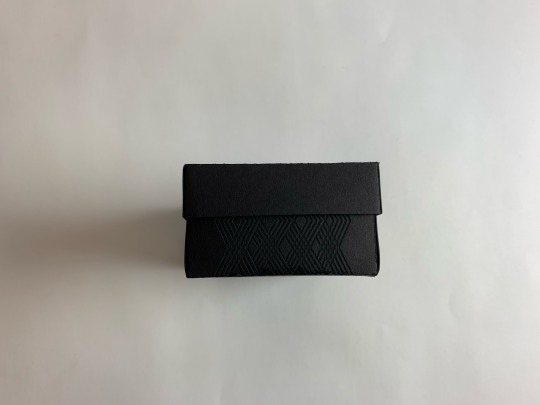
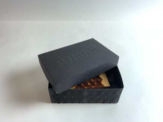
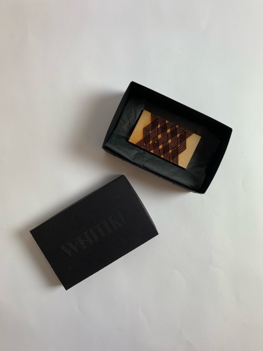
Text
Testing out die-lines + different packaging styles
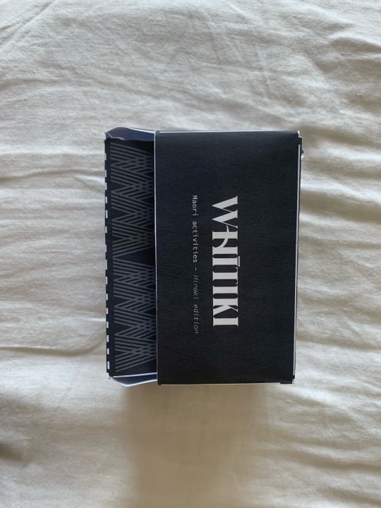

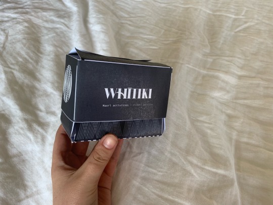
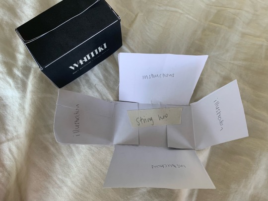
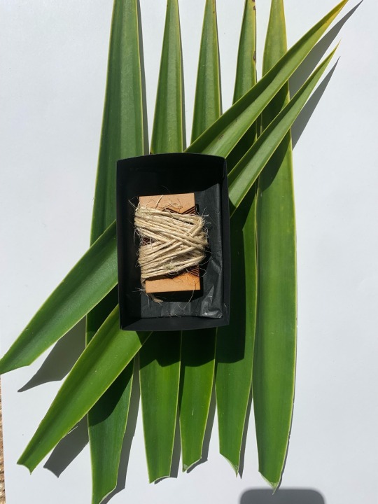
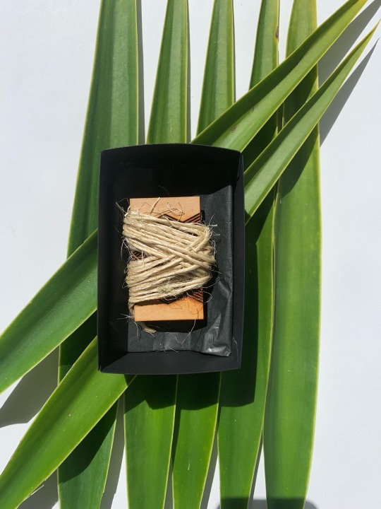
This is my first attempt at re-developing the packaging from the original. I wanted to have the 4 sides drop down once you lifted the lid and have the instructions on the sides. I also wanted to show the patterns on the side + have the “Māori activities game - hīnaki edition” under the whītiki logo.
But I felt it was still too big and tall so I want to adjust the height
0 notes
Photo
PDF Portfolio Progress
Here is the front page of my PDF portfolio. I decided to use a photograph of me to capture my love for photography but also real life visual of my identity instead of illustration.
0 notes
Text
3 Design Agencies Research
Re:brand
Dow Goodfolk
Publica
0 notes
Photo
GRAD602
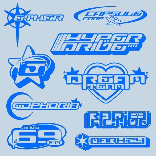
Looking at Y2K inspired logos and text for our publication company logo (called Lucid publications).
An article I read on i-D magazine website called the a-z of y2k mentioned “E is for Emigre: The influential digital foundry was responsible for designing fonts popular in the Y2K-era like Dogma, Platelet, and Dead History. The availability of digital fonts and modelling software in the 1990s led to widespread experimentation in graphic design and typography, with 3D text, various effects, and 'techno' fonts like Cyberotica, Aura, Flexure, and Dr.No-b.”
A lot of the imagery I found when I did a quick google search was stuff like the image above - a lot of outlining, bubble style - no hard lines and edges, 3D text and icons etc
5 notes
·
View notes
Text
Final Critical Review
Crafting Design Identity: Exploring Personal Insights and My Creative Journey
I’m outlining and analysing the influences and insights that have directed my design choices and have given me guidance into the designer I currently am. This document involves exploring my journey of self-discovery which has been heavily influenced by my surroundings throughout my childhood, and how they have made me see the creative world through my lenses.
I want to understand what drives my design journey by taking a closer look at the three key aspects of my creative process: the factors that have shaped me personally, such as social challenges, specific creatives that are passionate about projects that are based on concepts that I'm inspired by, as well as communities that can strengthen my practice and allow me to grow. It's important to recognise that these various influences hold universal significance. My unique creativity offers a distinct viewpoint that may inspire others or have underlying connections.
Before this paper, I was uncertain about my path as a designer and whether I had chosen the right degree. This journey of self-discovery has shed light on my identity as a creative. I've realised that my designs consistently revolve around themes of social change and helping others, reflecting my early life experiences dealing with challenges and hardships. I found comfort and a means of coping with these challenges through creative expression. Painting and sketching, which I initially used as coping mechanisms, have now transformed into a genuine passion of mine.
At this stage of self-discovery as a creative, I have a passion for illustrative design, often incorporating elements of photography or vectorising images, and then deconstructing them. Typography was something that I thought would never be my strong point until recently. The GRAD602 studio paper I'm currently doing has made me find a new love for typography and working with publication design. I'm determined to explore this aspect further to potentially find a deeper passion within it.
My design inspiration stems from my desire to escape and redirect my focus from the underlying issues I faced during my upbringing. The experiences I endured led me to discover and embrace hobbies like horse riding and painting, which now inspire my current projects with a deeper sense of purpose and a personal connection to my audience.
In my design journey, I aspire to empathies with and connect with children and young adults, conveying that it's right to feel isolated at times. By finding one's creative outlet and passion, it's possible to come to terms with challenging situations. The past can't be changed, but it can be reimagined and applied to shape a more meaningful future.
Building on my journey and creative influences, I've delved into the current landscape of design and its impactful practitioners. By doing this I’ve seen a larger range of skilled designers that have unlocked creative inspiration and views I didn't know I had. In my exploration, I've uncovered noteworthy creatives who have significantly contributed to the field. These individuals have not only produced outstanding work but have also left a lasting impact on communities and influenced my thinking and practice.
Leta Sobierajski - Vogue Fashion Night Out Tokyo
Leta Sobierajski's creativity and freestyle draw me into her design lifestyle. She has worked for huge brands like Gucci and BMW and her approach to design represents her as an individual and is now a creative director working with her husband Wade at their studio: Wade and Leta. Working with her and her team would be a happy environment while being super interesting and informative. I found it super fascinating when looking into Leta's background and how she often struggled to find rhythm in her style until she produced a core principle. The other principle is “purposeful eclecticism,” a simple method of reinventing a brief, seeking a twist, and flipping the perspective to discover an otherwise unobtainable solution. It’s all about interpretation (Miltimore, 2021). Leta always strives to create something that doesn't follow a typical standard which is super inspiring.
1
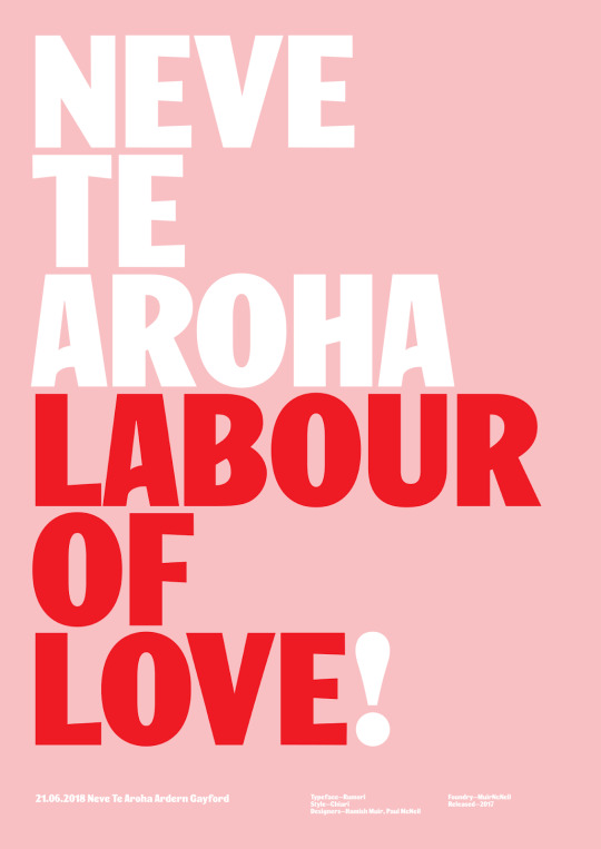
Catherine Griffiths- Labour of Love
This poster created by Catherine Griffiths is a style that catches my attention. The way she has crafted the typography to have a broad appearance yet have a soft and calming approach is a great complement to the meaning behind it. Catherine was out to create a wordplay poster but struggled to make it flow. Jacinda was campaigning for a Labour of Love. But, for some reason, I couldn’t make the words work (Studio Catherine Griffiths | 03 Other in(Ter)Ventions, n.d.). She then continued to explain that it took her 5 months to create the right play on the world for the poster to work as one cohesive unit. The inspiration ended up coming from the announcement of Jacinda Ardern's daughter's name. This poster's simplicity is a style that caught my eye and it's comforting to hear that not all phrases look right but you just have to step back sometimes and look at it from a different viewpoint to get that more profound meaning to make one whole unit. Catherine's typography has always stood out to me, and her style made me view typography differently as I originally really struggled with it and now, I’m starting to enjoy it.
2
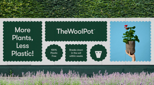
Seachange Studio - The Wool Pot
This was a project that initially I didn't look much into until I stared at the designs more. The longer you look at it the more aspects unfold and make you ask yourself more questions. This project stuck out to me as it's got that modern and minimal aspect to it while having such a huge social impact. I love how it has this playful and friendly approach while it's got the underlying theme of the global warming issue. The use of creating the sheep around the product of a pot that is being promoted is creative yet minimal. This is the type of style I want to push myself further to try as it says so much in such little design. This is important because it can have a large target audience. I’ve noticed most of Seachange’s projects reflect this minimal visual aspect with a larger underlying issue or theme they are trying to portray.
3
Emma Kaniuk- Semi Permanent
Co-founder of Akin Studio, Emma’s design approach is “great ideas, crafted well” (» About, n.d.). The minimal style she uses across many of her projects as well as her colour pairing choices are skills that inspire me to start deeper thinking when I’m in the process of making those choices. This showed me the importance of breaking down the design process and the making process. This project in particular was interesting to me as I generally wouldn't see these colours working well but she has done a great job at blending them all with the right amount of contrast. You can see how her design system has been put into place and the more playful style that's showing through. This was designed for designers; she wanted it created with more noise and less visually minimalistic style, as that is what designers are used to. I found this thought process interesting and backed up amazing with her statement of great ideas crafted well. This phrase is something that I want to keep reminding myself of in the initial stages of projects as it can be applied to anything to push myself further.
Throughout this research journey, I've learnt a lot about the industry itself and how all these talented designers were once in a similar position to me. I've learnt that many talented artists and designers have their phases where they are trying to figure themselves out as a designer or just sometimes are struggling with concepts and starting points. These creatives I've researched have given me so much insight into how they started with some projects feeling lost and unsure then broke the theme down to end up with these amazing meaningful designs. This has also taken a lot of unnecessary stress I’ve been putting on myself thinking that I'll never get a job or be good enough to work in the industry. I've realised I'm just starting out and still trialing what my natural strengths are and what I can put some more work into improving. As for my future, I originally thought I wanted to purely go into branding design but now I've taken more of an interest in typography and am still interested in web design. Web design has always been a practice I've been intruding into, and I picked up a web-building paper this semester and I found it fascinating. Doing the design part as well as making the prototypes feels super rewarding as you get to see the entire process from building it to a finished user-friendly site. It would be great to incorporate both type and web design together into a campaign to integrate both practices. I would like to work towards getting into a role in a design agency as it will be more fast-paced and will allow me to get a lot of exposure to many industries, clients and projects without having to move around different companies, according to Lorenzo Bellucci (Bellucci, 2022). I also currently do a bit of freelance work however it ended up in construction branding design so I would like to keep spreading my name out there to see if I can grow a solid and reliable client base in different workforces.
When starting my poster, I wanted to collect elements that I use in my design process and elements that have a lot of significance to me. I wanted to experiment with my new interest in typography in this poster so I decided to test out creating my typeface for a numbering system. A lot of my design process in the past has been used as an outlet as I didn't want to express verbally how I felt. This inspired me to go with the theme of my vault as it represents things, I keep close to my heart and items that hold importance to me. I decided to scan the elements as flat 2D vector images to bring light into the setting.
The element of my book not only started my love for reading but also challenged me to realise that I want to create work that connects with my audience emotionally and deeply enough to make them feel like they can relate and then form discussions about it. The book sparked interest in my practice of creating for social change and the greater good by influencing my approach to combining concepts. Before I would tend to use a lot of great ideas and struggle to combine them as now, I gather all my ideas and see which ones have that deeper connection to form a clearer story for the audience.
I also had a similar realisation when thinking deeper into my heart bowl assets. This journey made me think more about designing for the greater good and helping others. The man who made the bowl didn't have much and was the most happy and lovely person I had talked to in a while. He showed me how effortless it is to be a great person; this is something I'd like to put more into my design work to share with the future world.
Throughout this process, I’ve learned a lot more about myself than I initially thought I would get from this paper. I've come to realise that although I'm still on my journey of finding my true strengths and passions, I’ve realised that I want to design for social change and to connect with the community on a personal level. I found it so interesting seeing how the creatives I looked into interpreted their briefs to reflect an interesting topic. I also never thought deeply enough about the root of all my design inspiration and how those elements had a significant impact on it so it was fascinating to connect them, build a greater bond with memories, and apply them to the project.
One challenge I faced was understanding the initial brief of this paper, which led to me struggling to research in the early weeks. Going into GRAD704 next year I now have a clearer understanding of myself as a designer and what my practice may become as well as the areas of design that I thought I enjoyed. This research into the communities has given me great insight and guidance in unpacking a brief to fit and visualise it in your aspect so that when I look for an internship what agencies I would like to work for and the style of designs that would align with my best. If I were to look back at myself 12 weeks ago when I was asked who I am as a designer, I genuinely had no clue how to answer. Now I can confidently say I'm a curious designer who's passionate about benefiting society.
0 notes
Photo
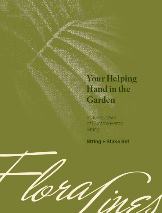
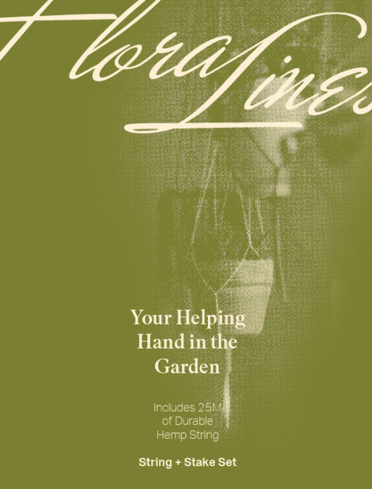
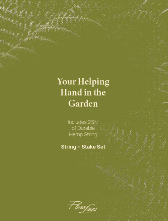
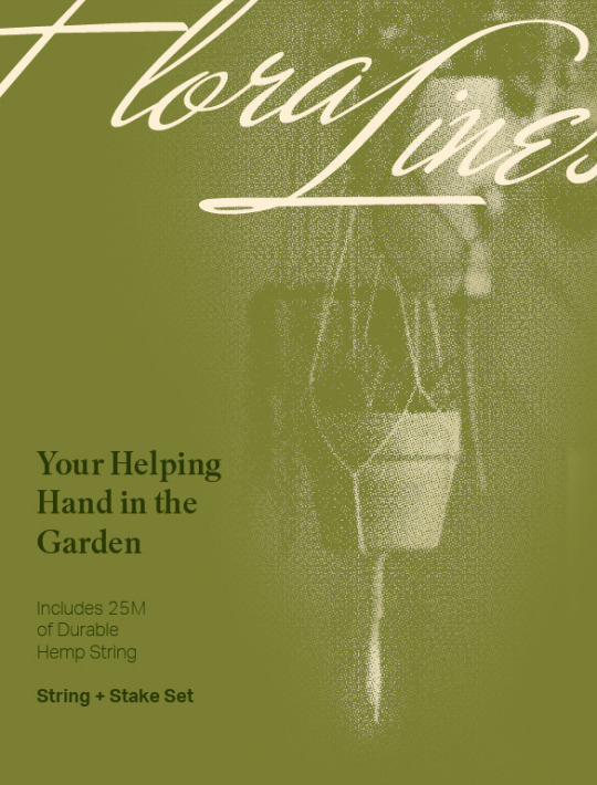
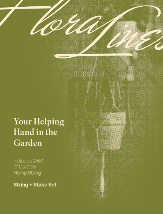


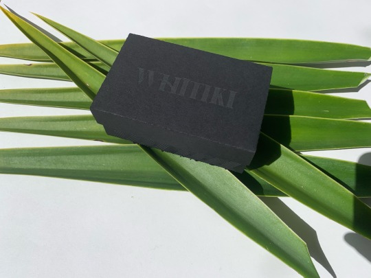
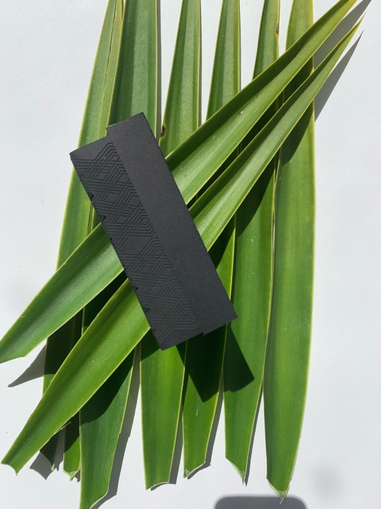
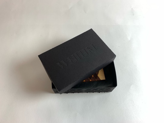
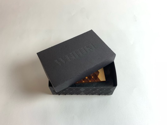
Studio Grad602 - Inside Cover Developments + Final
I decided to get rid of the mock up photography and use similar photography for what I designed the packaging with. This led me to find this image of a couple of plant pots that use string to hold them up which I feel represents the possibilities with the string. I also experimented with the large logo thats cropped out from the page. I really liked it in the concepts and I think its worked so well in my final. After that it was a matter of playing around with the typography to find an order of hierarchy and proximity that I liked.
The larger design at the bottom is the final.
0 notes
Text
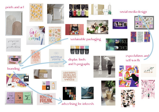
CONNECTIONS ON MY VISUAL MAP
I noticed that a lot of my interests all came back to branding and packaging which is interesting as that has become one of my interests since doing the branding task in GRAD602.
0 notes
Text
Anna Kernahan
GRAD602/50 Communication Studio IV
Group: Arapu Studios
********************
Week 1 Covid isolation
week 2 Bereavement leave
week 3.2 (Thursday Morning) Funeral
0 notes
Text
Week 1 - Self-reflection
Looking back at my projects from previous semesters, I consider myself a more minimal and typographical designer. I have done a couple of projects on health and wellbeing, so I'm quite keen to continue focusing on this topic for my capstone project. I'm pretty confident in publication design and InDesign after creating a few booklets in the previous semesters, therefore publication design is an area that I will consider doing this semester. I'm also quite interested in branding design, I enjoyed making the collaborative project in the GRAD602 paper last year and also creating a self-branding for Design Research 4. I have not decided which area I will go into in this semester so I will have a think about it after chatting with lecturers and classmates.
0 notes
Photo
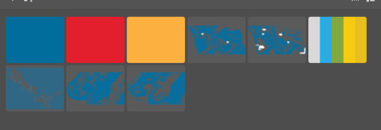
Lastly these are the assets are what I had saved to my library see you so it has the maps and just a colour pallets
0 notes
Photo
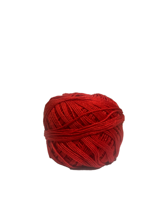
Advert Designs
Here are some designs concepts of my adverts where I have used my own photo of red string for the first design. I wanted to keep these adverts simple and straight to the point.
0 notes
Text
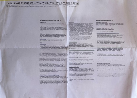
Studio - Understanding the Brief
GRAD602 Communication Design Studio III
Design Project 1: 50%
Week 1-3
Formative - Group Work (Due 8.30am Thurs 4 Aug)
As a mini design studio group, we will be working together to create a brand identity/design system that starts up our publisher’s directory and BLAD for the launch publication. This is presented in studio on screen.
Single Page Format (or can presented be presented in different slides)
140mm(w) x 200mm(h) + 3mm Bleed, Spine width 4mm
Week 3-5
Summative Part 1 - Individual Work (Due 2.30pm Thurs 18 Aug)
Using feedback from the group work, we will individually interpret, refine and progress any changes you make to the original brand identity of the directory as a printed copy of a BLAD. We also need to submit an updated PDF to show any changes or updates we make.
Printed BLAD - 20 pages, from 5 leaves printed double sided:
- outer cover - 4 page section (one leaf)
- inner pages - 9x DPs (4 leaves + inside front and back pages)
Design Project 2: 50%
Week 6-12
Summative Part 2 - Individual Work (Due 12pm Thurs 27 Oct)
PDF Portfolio
A4 Landscape
Minimum 10 pages, including a CV.
Assessment is focused on your design system and presentation of your work. This portfolio is in support of applying for any future jobs during summer or start of GRAD704 for external engagement.
0 notes
Text
new body copy
GRAD602
I’ve rewritten the introduction/back cover blurb and the conclusion for the back, inside cover:
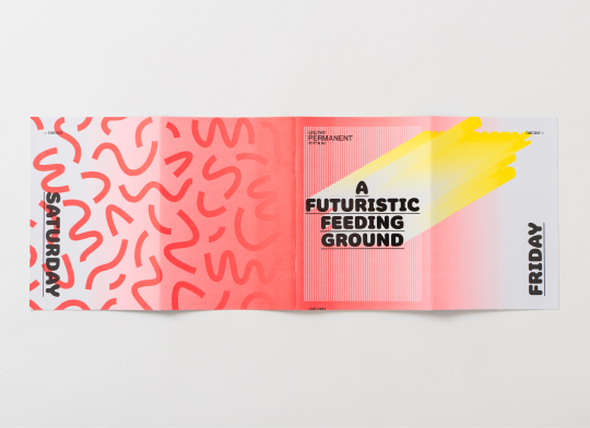
conclusion: Lucid publishing was happy to join you on your discovery of 18 of Aotearoa’s finest design studios. We introduced you to their humble beginnings, successes, opportunities and some must see projects from their talented team’s, ultimately outlining the blueprints that make up the character, culture, and style of each individual studio. We hope you feel more informed and use these blueprints on your journey as a designer in the industry. All the best! Lucid Publishing
back cover blurb: To instill a sense of clarity in industry ready creatives by providing the blueprints that inform a variety of design studios in New Zealand, that is the goal of this publication. In addition, we aim to bring these 18 studios’ character to life in a young, fun & cutting edge, style ensuring that their brand is highlighted in the most authentic light, as well as being clearly expressed and easy to understand, similtaneously aligning with the defenition of our publication house ‘Lucid’.
0 notes
Last Seen Blogs

talhatrends
Untitled
ripley0187
ripleydraws

visualmeta4
Nicolas Jandrain

papagym008-blog
Sin título
sootrootdoot
soots stuff