#Esterbrook Radio 913
Photo
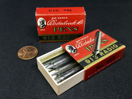
Matchbox Nibs
If there's anything better than finding just the right dip nib, it's when you can get a dozen at once in a cute li'l matchbox-size package. [penny for scale]
0 notes
Photo
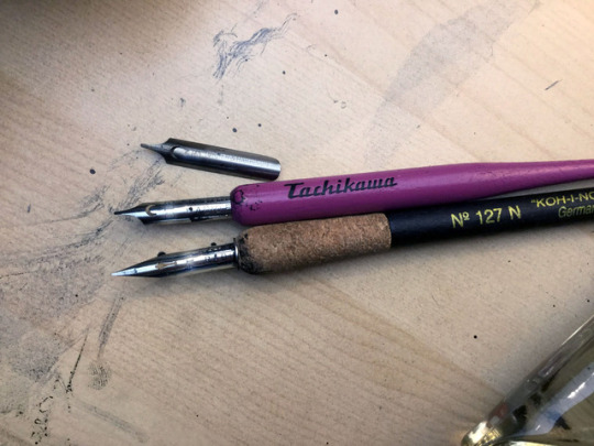


Nib it on the board
I was planning to use the same type of pen to do my lettering as the one I tried for my panel borders (just in a smaller size) and, of course, ran into the same rapid failure issue as that process ( see: Long Way Rounded ).
Plus, even if the pen not lasting longer than a few weeks of strips wasn't a problem, the pressure I needed to apply to produce nice letters was starting to take a noticeable toll on my hand. If my hand wasn't numb after 6~9 strips, it was at least cramped up, which meant lost drawing time while I recovered.
And since there's typically much more lettering in a comic than there are panel borders, this was an even bigger problem that needed solving. If all else failed, I could have just not done panel borders at all and grudgingly redeveloped my rounded border plans. But for lettering, not being able to quickly and neatly write in the words would mean . . . sigh . . . going back to digital lettering.
Go back to digital for the lettering? At that rate, why not go all digital again?
No.
I lost my cartooning soul to that once already. It's taken until now to get it back. This whole redevelopment time over the last 7 years (oh . . . oh, wow, has it been that long?) has been about getting back to cartooning the way I originally learned it, but doing it better and faster so I can be near or on par with how fast I worked digitally.
Plus, logistically, pre-planning for space for the lettering would mean the art would suffer (that works in comic books, for strips not so much). In the long-run, I wouldn't really save any time.
So I began an experimentation phase where I finally tried using a dip nib to do my lettering. I've been a long-time fan of dip nibs for drawing, but lettering always seemed too precise of a skill to trust to them. And when I did try, I wasn't comfortable with the results, so I never took the time to try out very many nibs.
(Insert "Why didn't I do this years ago?" trying out dip nibs montage here.)
The Turner & Harrison 310 . . . is not the nib I settled on for my lettering (though, it could substitute in a pinch easily enough), but it set me on the right track to focus in on other italic-flex style nibs with the little crescent breather hole.
In researching italic-flex style nibs, I stumbled on a most curious model: the Esterbrook Radio 913
This is curious because my primary nib for inking the art in the new Oy is the Esterbrook Radio 914 (made famous in usage by Charles Schulz for Peanuts and hard to come by for a reasonable price . . . and not JUST because I bought up 2 dozen of them myself years ago).
What were the odds that the model number just before my primary drawing nib could become my primary lettering nib? Very good as it turned out.
I ordered a handful of 913 nibs online. Thankfully, this nib is MUCH easier to find than the 914, and cost-effective as well (I've paid more for modern-manufactured nibs).
The results were fantastic! It had a similar line to the T&H 310 and a couple other nibs I tried, but with a superior spring-back for better control and overall nicer quality. Plus, since I didn't need to press as hard as my old pen, I was able to letter for awhile with zero hand cramps or numbness by the end.
This also meant that every ounce of ink on the page would be the same for the borders, lettering, and artwork. I'm a huge fan of consistency!
Oh, but I didn't stop there . . .
Since I was recalibrating my methods anyway, I decided to try and see if I could speed things along even more using two methods:
1) Instead of creating both the guide AND spacing lines with the Ames lettering tool (fellow hand letterers, if you're not using one already, you should), I tried only creating the guidelines and I would just eyeball the spacing. This had the happy side effect that I could also just use certain holes along the left side--making more lines in one step while doing about half the number of passes--than bother with that center circle thingy anymore.
2) On top of the mild craziness of step #1, I decided to go full crazy and try: Inking the words DIRECTLY. Literally from pen to paper with no lettering completed via pencil first.
I figured, I'm already eliminating that "let's do the same work twice for no good reason" step from my panel borders, why not try it with the lettering?
It was a bit nerve-wrecking at first (there's a lot of mental math to kerning and word spacing on-the-fly) but once I got the hang of it, I couldn't believe the time savings! For any minor mistakes, I can use white-out, for major ones I don't mind doing small tweaks on the computer; I could even rewrite the whole thing if needed since it's not an hour's worth of lost work.
It varies by how much dialogue there is and how many different characters are talking in one panel . . . oh! oh! And if there are sound effects . . . math, math, and more math . . .
But on average, I'm going from blank page to inked panels and letters in 10~15 minutes (EXAMPLE: the comic pictured above is actually a "Sunday" spread across two pages. I completed panels and letters for both pages in 22 minutes total). Add on time for drawing (I work in batches so I'm not waiting idly during ink drying time) and I'm averaging about one hour per strip.
After taking anywhere from two hours to even three or more each before, I was hoping to trim my average to ~90 minutes per (very close to being on par with my average digital speed), so getting to one hour (pretty much on par vs. my digital average) . . . I'm just a little bit excited about that.
Basically, in the time it took to write and edit this blog post, I can now get an entire strip completed. Which means, that's one less strip that's done now . . . whoops.
OK! OK! Back to the drawing board.
0 notes
Last Seen Blogs

amg-mirae-blog
Beautiful Liar

dranasse
Dr. Anasse Benslimane
saloquintero-blog1
Sin título

f043v3r
Real_life

kokuszkockahas
kokuszkockahas