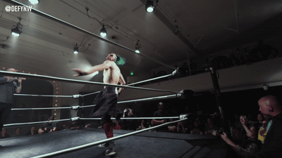
#DR KLIEVER
Text


HAPPY PRIDE REMEMBER RANDY MYERS IS THE BEST
#PANSEXUAL#NONBINARY#RAVENOUS RANDY MYERS#WRESTLING#MJF#maxwell jacob friedman#JUICE ROBINSON#DREXL#DR KLIEVER#CODY CHHUN#ANOTHER GUY I CANT REMEMBER
1 note
·
View note
Text
#Preview: DEFYANCE FOREVER
DEFYANCE FOREVER
August 23, 2019
Tacoma Washington
The Temple Theater
It’s finally happening! What is easily considered one of the most anticipated events of the year, DEFYANCE FOREVER. We will see some of the best on the NJPW roster face the best of the DEFY roster! It really doesn’t get much better than this.
Friday evening we’ll see some old friends return, and some talent making their first…
View On WordPress
#8 XGP Championship#Alex Coughlin#Artemis Spencer#Brian Pillman Jr.#Clark Connors#CMLL#Cody Chhun#DEFY Championship#DEFY Tag Team Championships#Douglas James#Dr Kliever#dragon lee#Ethan HD#Guilllermo Rosas#IWGP United States Championship#jacob fatu#Joesph Samael#Judas Icarus#juice robinson#Jushin Thunder Liger#Karl Fredericks#Matt Cross#Mike Santiago#No One Lives#NXT#PCW Ultra Tag Team Championships#Randy Myers#Rocky Romero#RoH#Schaff
0 notes
Text
8.4.4: Week 4 Mastery Journal Process and Reflection -
During my four weeks of Design Integration, I was tasked with exploring new directions in my designs so I can proceed with a solid foundation to prepare for the ever-changing landscape of the media design profession. I further expanded my capabilities and refined my work through the integration of new ideas and methods and further implementation of research. I delved deeper into defining and articulating design solutions, further honed an understanding of brand voice & vision, and worked to further convey my brand’s characteristics through sound and motion. I also begin to determine the media assets that will best communicate my brand to the target audience.
Material & Concepts Overview:
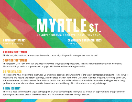
This month was all about learning to establish and define design solutions, articulating brand voice & tone characteristics through various media, developing a media plan, and finalizing my design brief. In week one I explored and implemented Kliever’s (n.d.) 5 Principles of Design Thinking to define the best solution for the design problem Myrtle St. faces. Through research and peer review I was able to narrow down the scope of potential solutions to one working solution.
In week two I was tasked with developing Myrtle St.’s brand voice and tone and dove further into research to develop a brand voice chart according to Ericka Heald’s article 5 Steps to Find Your Brand Voice. With the brand voice & tone developed it was then time to dive into establishing the visual elements of the brand through a static vision board, where pertinent design elements such as a typography sampling and primary color palette could be showcased.
In week three it was time to bring those static design elements to life through a dynamic vision board that serves to illustrate not only the brand’s voice and tone, but also how brand imagery, colors, textures, and typography can be used in dynamic media. Firstly, it was important to explore and examine the tonal elements of various other tourism videos to see how professional brands present their voice and tone through video with sound and shot choices.
In week four I developed a media plan to prepare assets that will further communicate and bolster Myrtle St.’s brand identity and to finalize Myrtle St.’s design brief into a client-ready format.
Degree Learning Outcomes:
Connecting/Synthesizing/Transforming - In conducting research on design thinking, articulating design solutions, and establishing voice and tone I explored not only how to engage in design thinking, but also examined the means to develop and synthesize a consistent brand experience for the target audience through transformed media. The developed final dynamic vision board and finalized design brief will work to persuade my client that my brand is the right solution for Myrtle St.
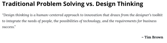
Problem Solving - I admittedly struggled quite a bit this course in delving deeper into the how and why of my rationale for my proposed design solution and my voice & tone rationale. Moving forward I need to elaborate on how my research helped me arrive at the proposed conclusions. Kliever (n.d.) states, “Instead of starting with a problem, design thinking starts with observation. It’s informed by an understanding of the culture and the context of a problem (what people need), rather than the problem” (Empathize Section ¶ 1). While the rationale provided for these specific assignments implements elements of research I need to work to further redefine and connect the applied research to my proposed rationale to further bolster and strengthen my reasoning and the credibility of what I am saying.
Innovative Thinking - The Myrtle St. brand is unique and innovative in that it focuses on promoting outdoor activities and sports as an opportunity for wellness and allows the target demographic to explore those opportunities for themselves. The challenge is presented to the reader to join the inclusive community of the Myrtle St. area in all of the fun. The Myrtle St. brand offers opportunities to interconnect the community. Davis 2009 observes, “A brand may offer a key service or product for that audience and then extend the range” (Davis 2009, p. 78). While she is referring specifically to corporate branding, the idea still stands that if the perception of the area is changed and something is offered to the target audience, such as wellness, the opportunity exists to build upon that perception and further instill a purpose into the community.
Acquiring Competencies - I learned to articulate design solutions and further develop and establish the voice & tone of a brand through various media. I also learned to develop a media plan and explored the pros and cons of various media assets whether they are online, on-air, print, or environmental. I re-examined my previously conducted demographic research to refresh my understanding of the thoughts, feelings, and behaviors of my target demographic in order to plan for media assets that will most effectively reach and resonate them. Stone (2013) observes, “Great design is all about getting the right message to the right people in the right way, and that means choosing the appropriate delivery medium” (Define the Delivery ¶ 1).
Reflection:
Week 1: Articulating Potential Solutions:
In week one it was time to define the solution to Myrtle St.’s problem statement. I began by reading Design Thinking: Learn How to Solve Problems Like a Designer, by Janie Kliever, Why Design is About Solutions, Not Visuals, by Creative Bloq, and Designing a Brand Identity, by Gerren Lam.
In Design Thinking, Kliever (n.d.) delves into the design thinking process and outlines the 5 Principles of Design Thinking: Empathize, Ideate, Prototype, and test.
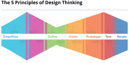
Begin by empathizing to understand your audience. By working to understand what makes your audience tick you can work to define the design challenge and begin to work toward solutions.
From there it’s time to ideate, or rather brain storm potential solutions, then prototype to test out multiple solutions, and then allow for user testing and feedback. By outlining design thinking as a multi-step process it allows us as designers to start thinking with an observation rather than a problem and then work to develop working solutions based on what people need.
In the Not Visuals article, Creative Bloq explores why design is not merely art or decoration. This article resonates with me as a budding designer because I have often found lately that when I explain design to others, rather than seeing it as a problem solving approach, some people (specifically elderly individuals) presume I am referring to interior design and claim they “Don’t think much of it.” As I begin to expound further on what design is and why it matters, these same individuals look at me as if I have antenna growing out of my head. Creative Bloq (2014) offers, “Design is not art. Design looks a problem in the face and asks 'why?' Good design concerns itself with the 'what' and 'how', but great design asks 'why' first” (Design is Not Art ¶ 3).
The feedback I received for my solutions from both my peer review and my Professor informed me that I needed to dig deeper. Part of Dr. Baldowski’s feedback in particular resonates with me he advises, “There are the seeds of great ideas here, but each solution feels a little incomplete. What's missing is the why and how” (Baldowski (2019), [personal communication]).
Week 2: Voice & Vision
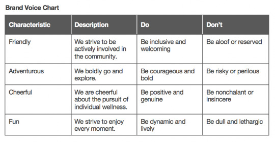
In week two it was time to produce the voice & tone for Myrtle St.’s brand and develop a vision board. In 5 Steps to Find Your Brand Voice by Ericka Heald, Heald outlines a five step process for developing a consistent brand voice or rather a consistent brand experience for audiences. From gathering samples of brand voice to describing your brand as if it were a person, Heald (n.d.) suggests, “With your brand’s voice defined, illustrate how it turns up more concretely in your content with a brand voice chart” (Brand Voice chart ¶ 1).
Brand Voice Chart
Voice & Tone Rationale:
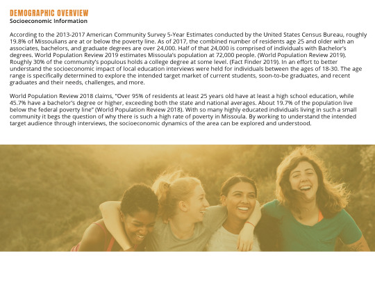
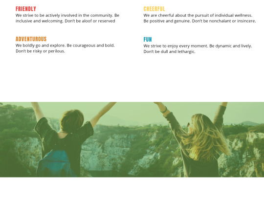
The community of the Myrtle St. area is comprised of university students. The intended target demographic is students ages 20-30. The target demographic is friendly and strives for a welcoming and inclusive community. They are adventurous, cheerful, and fun. They enjoy hiking, cycling, and the great outdoors. Kenny 2017 inquires, “If your brand was a person, how would you describe its personality to someone?” (Kenny 2017). The characteristics of the brand’s voice are chosen with the demographic in mind.
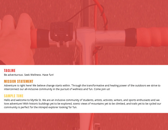
The tagline seeks to concisely convey the core values of the brand and draw in the intended target audience. The mission statement is written in a welcoming, positive, and lively tone. According to Big Commerce Essentials (n.d.), the four key elements of a mission statement are: value, inspiration, plausibility, and specificity. (Big Commerce Essentials (n.d.)). To break down this brand’s mission statement and plug pieces into these four key elements, the question of what value does this brand offer the target demographic of students ages 20-30? An inclusive and welcoming community. Why should the target demographic care? Access to an interconnected community in the pursuit of adventure, wellness, and fun. As for plausibility? If the target demographic can meet friends for a beer at a local brewery or tea at a local coffee shop than why not in the Myrtle St. area for the transformative and healing power of the outdoors? As for specificity, the challenge is presented to the reader to join the inclusive community of the Myrtle St. area in all of the fun which ties it back to the brand and is also a call to action for the reader. The introductory paragraph aims to invite and welcome the reader to the Myrtle St. area and all that it has to offer. Kenny 2017 asserts, “You adjust your tone according to who you are talking to and what you are talking about, but your voice remains the same” (Kenny 2017). The introductory paragraph maintains welcoming, positive, and genuine tone while outlining who the community is comprised of, what’s offered to the reader, and what the community is after, fun and adventure.
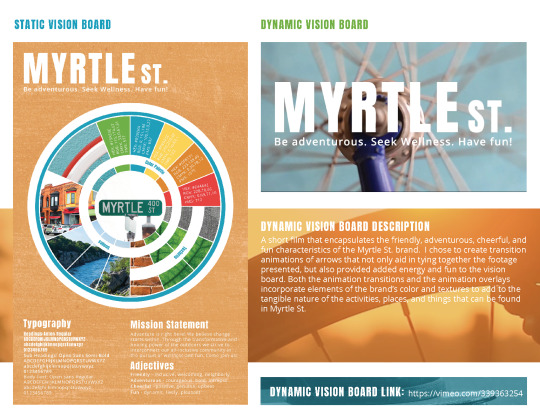
Static Vision Board:
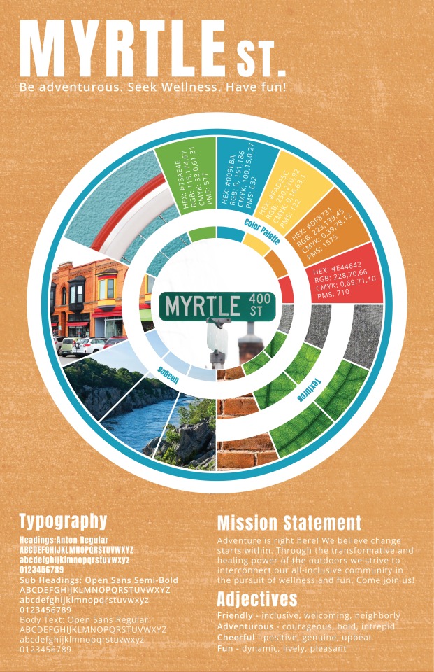
Static Vision Board Rationale:
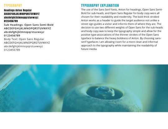
How does the Typography communicate the voice and tone of the brand? What considerations were accounted for when determining (or avoiding) type pairings?
The use of the Sans Serif fonts, Anton for headings, Open Sans Semi-Bold for sub-heads, and Open Sans Regular for body copy were all chosen for their readability and modernity. Cousins 2015 asserts, “Serifs are considers to be a little more professional and serious while sans serif typefaces are associated with more modern, clean and informal designs” (Cousins 2015). The bold thick stroked Anton works as a header to guide the target audience not unlike a street sign guides a visitor and informs them of where they are. The decision to use two different weights of Open Sans for the sub-heads and body copy was to keep the typography simple and allow for the positive type-associations of the thinner strokes of the Open Sans typeface to balance the heavy boldness of Anton. Andra 2013 argues, “Your purpose is to make sure that the text is in such good shape that the reader will keep his interest long enough to read through the whole thing” (Andra 2013). By choosing sans-serif typefaces I am allowing room for a more clean and informal approach to the typography while maintain the readability of future media such as websites, brochures and more.
Explain the Textures presented in your Vision Board and the ways in which they communicate the brand voice. How do you envision these being applied to media assets?
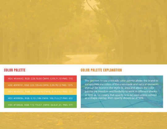
The provided textures are of concrete, bricks, and a macro view of leaves. I chose these textures to hearken to the textures that are readily found in the Myrtle St. area. The concrete for the sidewalks and the Clark Fork river trail. The bricks for the old historic buildings of the area, of which are vibrant orange. The leaves tie-in the natural elements to be found in the area such as trees, bushes, grass, etc. Theodor (n.d.) believes, “Visual textures, be it photography or isolated images, can evoke emotion and bring life to any design” (Theodor (n.d.)). By choosing to incorporate the man-made textures of bricks and concrete as well as the natural texture of leaves I am marrying the man-made and the natural and emphasizing all that the Myrtle St. area offers and all that can be explored there.
Explain the color theory principles that were applied to your Color Palette selection.
Admittedly, the choice to explore tetradic or rather double-complimentary colors goes outside of my comfort zone. Kliever (n.d.) claims, “If you use this type of scheme, you’ll want to choose one of the four to be the dominant color and adjust the saturation/value/etc. of some or all the colors so they work well in different parts of your design like the text and background” (Kliever (n.d.)). The decision to use a tetradic color palette allows the brand to encapsulate the colors of the man-made and natural elements that can be found in the Mytle St. area and allows the color palette the freedom and flexibility to work in different shades or tints as necessary.
Provide additional context for your Photograph selections. What do you intend to communicate through these photos?
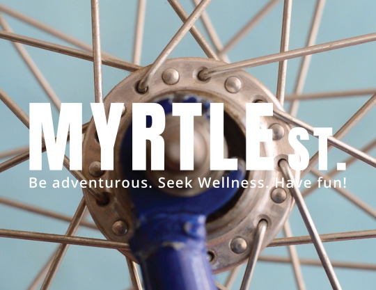
The close-up image of an orange and white bike wheel against a vibrant blue wall. An image I took of the historic Knowles building with its orange brick and wild window paints of yellow, red, light green, and black. As well as an image of a bright blue river against dark rocks with vibrant green foliage. All of these things can be found in the Myrtle St. area. Cyclists ride on crazy colored bikes, trikes, and unicycles. The river adjacent to the river trail is always moving in sharp contrast to the natural rocks and foliage around it. The Knowles building, for all its long-standing history is a testament to how modern Missoula both maintains and modernizes its historic landmarks. Wyatt 2019 advises, “Real world inspiration such as this can be a very powerful 'convincer' when putting together a board for a client” (Wyatt 2019). Since the design problem of the Myrtle St. area is “What’s here for me?” the images needed to both capture different things that can be found there but be very tangible and seem very obtainable and accessible. During the interview phase, the intended target demographic stated that they enjoyed biking, hiking, and being outside. In showcasing the tangible elements of what can be found in Myrtle St. I am communicating not only what’s here, but also that it can be easily viewed, explored, and accessed by the target audience.
Week 3: Dynamic Vision Board:
In week three I was tasked with dissecting the tonal elements of tourism videos for the meanings the videos implied and the emotions they conveyed through different shots, and both diegetic and non-diegetic sound. From there it was time to develop a Dynamic Vision Board to communicate my brand’s characteristics through sound and motion.
Original Dynamic Vision Board:
vimeo
Dynamic Vision Board Rationale:
In what ways was Motion used to communicate the voice and tone of the brand? What considerations were accounted for when determining appropriate image animation effects and/or video selections?
The voice characteristics of the brand is adventurous, fun, friendly, and cheerful. The chosen video selections needed to hearken to these characteristics while bolstering the activities, places, and things that can be found in Myrtle St. In choosing to create transition animations of arrows, the transitions not only aid in tying together the varying quality of footage presented, but also provided added energy and fun to the vision board. Both the animation transitions and the animation overlays incorporate elements of the brand’s color and textures to add to the tangible nature of the activities, places, and things that can be found in Myrtle St. Krassner 2013 states, “Properties such as value, color, opacity, and effects can be interpolated through key frames. Standard operations such as Levels and Curves can animate an image's tonal effects by remapping its distribution of shadows, mid-tones, and highlights” (Krassner Properties such as value, color, opacity, and effects can be interpolated through key frames. Standard operations such as Levels and Curves can animate an image's tonal effects by remapping its distribution of shadows, mid-tones, and highlights 2013, p. 420). By experimenting with opacity, color, textures, and luma mattes the provided clips become more dynamic and engaging.
In what ways was Sound used to communicate the voice and tone of the brand? How did you select the most appropriate audio elements for this project?
The chosen sound contains both non-diegetic mood music and diegetic ambient sounds. From a bicycle wheel turning to birds chirping, and wind blowing the provided sounds work to bolster and connect the target audience to the visual footage provided. The provided diegetic sound needed to add to the accessibility of Myrtle St. Blazer 2015 argues, “If a beat is too long, shorten it. If a beat seems expendable and you need the time, get rid of it. You might even find that you have too much time and be forced to create a new visual beat” (Blazer 2015, p. 50). By critically listening and editing down only the sounds that were necessary, the chosen sounds and music serve to further the visual beats of the vision board.
Explain how you communicated the brand’s Primary Colors and Texture in a way that wasn’t a simple display of the color palette and texture swatches.
The brand’s color palette and textures needed to work to push the visuals forward. As such they were incorporated as both transition animation between footage clips and were overlaid as luma or luminescence mattes on top of footage. Krassner 2013 asserts, “Luminance mattes should not be confused with alpha mattes, which are internal mattes derived from alpha channels. (Krassner 2013, p. 431). By layering the pre-nested animated shape layer over the footage, placing a luma matte onto the footage layer and adding a solid shape layer underneath the footage layer with a brand color and low-opacity brand texture overlay I was able to create added movement and dynamism through animation to tie together the varying quality and subject matter of each of the different clips of footage. The decision to apply the brand colors and textures in such a way allows these pertinent design elements to carry the visual message forward in a fun and adventurous way.
Revised Dynamic Vision Board:
vimeo
The original Dynamic Vision Board that I submitted to class featured music that was too folksy which did not communicate the fun, friendly, adventurous, or cheerful voice of the Myrtle St. brand. I revised the video for fun. I took out some of the more abstract animations that made the video too experimental and psychedelic and changed the music to be more fun and adventurous. I also changed clips that did not add sufficient context or meaning to the brand for clips that work to bolster what Myrtle St. is about. I had a lot of fun with this assignment and found myself going back to my experimental found-footage film roots of my previous Digital Film-Making undergraduate days. However with that being said, the first iteration of the Dynamic Vision Board ended up being a friendly reminder that I am not in experimental film-making and that I needed to refocus the efforts and intentions of the video to align with the brand characteristics I developed for Myrtle St.
Week 4: Media Plan & Final Design Brief
In week four it was time to finalize my Design Brief and determine the media assets that will best communicate Myrtle St.’s brand to the target audience.
Media Plan:
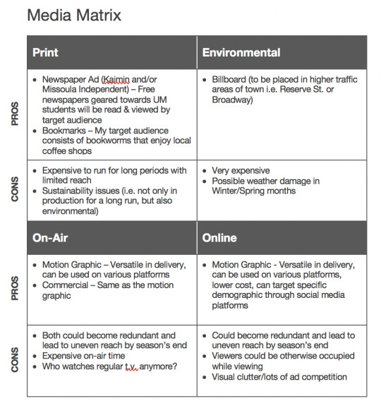
Media Plan Rationale:
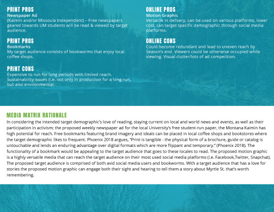
In considering the intended target demographic’s love of reading, staying current on local and world news and events, as well as their participation in activism; the proposed weekly newspaper ad for the local University’s free student-run paper, the Montana Kaimin has high potential for reach. Free bookmarks featuring brand imagery and ideals can be placed in local coffee shops and bookstores where the target demographic likes to frequent. Phoenix 2018 argues, “Print is tangible - the physical form of a brochure, guide or catalog is untouchable and lends an enduring advantage over digital formats which are more flippant and temporary.” (Phoenix 2018). The functionality of a bookmark would be appealing to the target audience that goes to these locales to read. The proposed motion graphic is a highly versatile media that can reach the target audience on their most used social media platforms (i.e. Facebook, Twitter, Snapchat). Murphy (n.d.) offers, “Humans are storytelling creatures and our brains soak up a good story like a sponge. With motion graphics, you can not only introduce a product, but turn it into a memorable story” (Murphy (n.d.)). The proposed target audience is comprised of both avid social media users and bookworms. With a target audience that has a love for stories the proposed motion graphic can engage both their sight and hearing to tell them a story about Myrtle St. that’s worth remembering.
Media Plan Reflection:
What were the common denominators for your media delivery plan?
Common denominators for the proposed delivery plan were considerations not only of the intended target audience in what social media platforms they use and places they frequent, but considerations of a student’s typically limited budget. Integration of media needs to be both physical and virtual. A proposed newspaper ad in the local university’s free student-oriented weekly paper, The Montana Kaimin would be seen by the target demographic, of whom is comprised of activists and avid readers that strive to be up-to-date on current events. Free bookmarks could be distributed at local coffee shops where the target demographic frequents. A motion graphic showcasing the various activities, places, and things that can be found in Myrtle St.
Wood (2017) claims, “According to the ASI study, 85% of consumers remembered advertisers who gave them a shirt or hat” (Impact and popularity of promotional products section ¶ 3). By considering the user’s behaviors of social media use and reading the proposed media will directly reach them. The bookmarks for example will comprise brand imagery on one side and fun facts about Myrtle St. and all of the area’s offerings on the other.
Explain your research process for the media delivery plan.
The research process began by re-reviewing previously conducted demographic research. By refreshing my understanding on the thoughts, feelings, habits, and behaviors of the target demographic, I could focus the developing proposed media to be audience-driven. After assessing the outlets most likely to reach the target demographic it was time to weigh the pros and cons of each potential media asset. Some initial considerations that will not be pursued are a t.v. commercial, since the target demographic typically does not watch standard t.v. or cable, but instead uses streaming services like Netflix. Billboards while not only costly to produce and are susceptible to weather damage and vandalism, but also are not a sustainable or eco-friendly option for the environment which is something the target demographic cares deeply about, and thereby could be produce more negative than positive responses. Inman (2019) claims, “To put this into context, approximately 300,000 billboards produce hundreds and thousands of pounds of vinyl waste every single year in the U.S. alone, while it’s thought that the cost of sending billboard skins to landfill in Australia costs up to $200,000 (£107,000) every single year” (Overcoming Barriers section ¶ 3).
The three strongest take-a-ways gained from the research and development of the proposed media delivery plan are that as Stone (2013) advises, “Sometimes, in order to better reach the target audience, the best approach is a mix of several different mediums” (Media Matrix section). Strictly digital or strictly physical media assets will not be enough on their own. By keeping the target demographic’s behaviors in mind, the proposed media will be audience driven and thereby more effective. Also, tangible materials can be more memorable and enduring in that you can’t just scroll past a brochure on social media or push a button to skip the ad. Print materials lend an obtainable air to the information presented. Phoenix (2018) believes, “Print is tangible - the physical form of a brochure, guide or catalog is untouchable and lends an enduring advantage over digital formats which are more flippant and temporary” (Why section). Lastly, it is important to consider the lifecycle and adaptability of media assets as a brand continues to grow and technology continues to change and improve over time. Robison (2017) advises, “The kind of flexibility that comes with creating digitally offers considerable perks when it comes to meeting deadlines; though of course, you will ideally launch a perfect product, you do have the opportunity to make changes after it goes live” (Changeability and Life Cycle section).
How will you apply this knowledge going forward?
Moving forward it is important to continue designing content and media with the audience in mind. To continue conducting research in order to create effective media assets that will reach the target audience. Also, to continue weighing the pros and cons of the different forms of media assets in regard to cost, effectiveness and reach.
Final Design Brief:
vimeo
I had a lot of fun with this project. Once I developed the final .pdf pages for the brief I went a couple steps further and explored using FlipHTML5 as a digital booklet maker because I want my client to be able to explore the booklet in it’s intended format. However, I could not export it as a video without paying for a subscription to the program so I took a screen capture of the flip through.
References:
Andra [Web Username]. (2013, October 13) Design Theory: 5 Basic Principles of Typography. Available at: https://pixel77.com/principles-of-typography/
http://bbcsfx.acropolis.org.uk/?cat=atmospheres&page=2
Big Commerce Essentials. (n.d.) How to write a powerful mission statement that resonates. Available at: https://www.bigcommerce.com/ecommerce-answers/how-to-write-a-powerful-effective-mission-statement/
Blazer, L. (2015). Animated Storytelling: Simple Steps For Creating Animation and Motion Graphics. Retrieved from: https://ce.safaribooksonline.com/book/animation-and-3d/9780134133812
Carroll, J.J. (2013). Bleed - Indie Folk Instrumental. On Soundcloud [Website]. Available at: https://soundcloud.com/justinjude/bleed-indie-folk-instrumental
Centers for Disease Control and Prevention. (2018, June 7) Suicide rising across the US: More than a mental health concern. Retrieved from Vital Signs available at: https://www.cdc.gov/vitalsigns/suicide/infographic.html#graphic1
Clarsen. (2015, August 3). Skateboarding Close-Up 1. Retrieved May 23, 2019, from: https://www.videvo.net/video/skateboarding-close-up-1/3823/
Creative Bloq. (2014, March 31) Why design is about solutions, not visuals. Available at: https://www.creativebloq.com/design/solutions-not-visuals-6126268
Creative Market. (2017, March 3) Designing a Brand Identity. Available at: https://creativemarket.com/blog/designing-a-brand-identity
Coolers.Co. (n.d.) Color Generator. Available at: https://coolors.co/73ae43-009eba-fad25c-df8731-e44642
Cousins, C. (2015, February 12) How Color, Type and Space Can Impact Mood. Available at: https://designshack.net/articles/graphics/how-color-type-and-space-can-impact-mood/
Davis, M. (2009). The Fundamentals of Branding. Retrieved from: http://web.b.ebscohost.com.oclc.fullsail.edu:81/ehost/ebookviewer/ebook/bmxlYmtfXzI5NTczNV9fQU41?sid=57090c95-4bd2-4737-ba81-01e8bffeb7fe@pdc-v-sessmgr06&vid=4&format=EB&rid=5
Frenson, M. (2016, July 5) How to write effective design briefs: a quick guide. Available at: http://unmatchedstyle.com/news/how-to-write-effective-design-briefs-a-quick-guide.php
Google Fonts. (n.d.) Sans Serif and Monospace Font. Available at: https://fonts.google.com/?selection.family=Anton&category=Sans+Serif,Monospace
Heald, E. (2018, April 17) 5 Steps to Find Your Brand Voice. Available at: https://contentmarketinginstitute.com/2018/04/find-brand-voice/
Kenny, J. (2017, November 1) Know the Difference between Tone and Voice to Set Your Brand Apart. Available at: https://gimmemojo.com/2017/11/01/tone-voice-set-your-brand-apart/
Kliever, J. (n.d.) Color Theory. Available at: https://www.canva.com/learn/color-theory/
Kliever, J. (n.d.) Design thinking: Learn how to solve problems like a designer. Retrieved from Canva available at: https://www.canva.com/learn/design-thinking/
Kliever, J. (n.d.) How to Create a Moodboard and Get Your Creative Juices Flowing. Available at: https://www.canva.com/learn/make-a-mood-board/
Krassner, J. (2013). Motion Graphic Design: Applied History and Aesthetics, Third edition. Retrieved from: https://www.vitalsource.com/products/motion-graphic-design-jon-krasner-v9781136146619
Miksanskiy, R. (n.d.). River Between Trees. Retrieved May 23, 2019, from: https://www.pexels.com/video/river-between-trees-2126081/
Murphy, L. (n.d.) 7 Reasons Motion Graphics Will Enhance Your Digital Marketing. Available at: https://www.harpinteractive.com/blog/2018/01/7-reasons-motion-graphics-enhance-digital-marketing/
National Register of Historic Places. (n.d.) Knowles Building Retrieved from
National Park Service U.S. Department of the Interior available at: https://npgallery.nps.gov/AssetDetail/NRIS/87000608
Padriñán, M.A. (n.d.). Close Up View of Bicycle Spokes. Retrieved May 23, 2019, from: https://www.pexels.com/video/close-up-view-of-a-bicycle-s-spokes-and-hub-1793482/
Phoenix, J. (2018, August 20) 5 Print Marketing Materials To Increase Your Sales. Available at: https://www.digitaldoughnut.com/articles/2018/august/5-print-marketing-materials-to-increase-your-sales
Robison, J. (2017, September 14) 5 Key Differences in Designing for Print vs Digital Media. Available at: https://medium.com/inkbot-design/5-key-differences-in-designing-for-print-vs-digital-media-6e69edcfc414
Soofa. (2016, May 14) 5 Ways to Attract People to Your City. Retrieved from Soofa available at: http://www.soofa.co/blog/2016/5/13/5-ways-to-attract-people-to-your-city
Stock Footage. (2015, September 3). Silhouette Bike Sunset. Retrieved May 23, 2019, from: https://www.videvo.net/video/silhouette-bike-sunset/4351/
Stone, T.L. (2013, January 7) Define the Delivery Medium. Available at: https://www.howdesign.com/parse/define-the-delivery-medium/
Theodor, V. (n.d.) The role of textures in contemporary graphic design. Available at: https://www.canva.com/learn/texture/
Veryday. (2017, January 14) How to Write a Good Design Brief. Retrieved from Issuu available at: https://issuu.com/veryday/docs/design_brief_v2
0 notes
Text
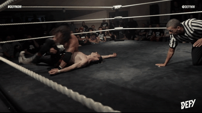
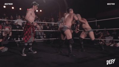
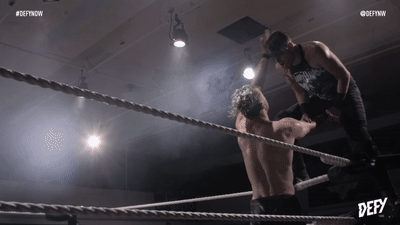
A GIF from every match
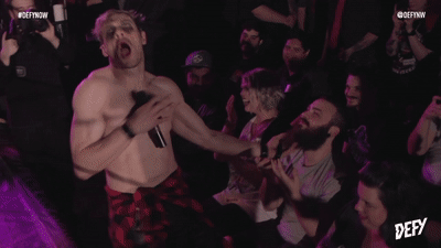
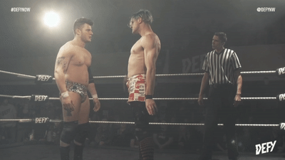
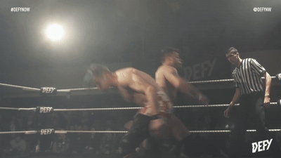
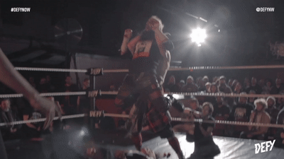
2017: THE "WEIRDO HERO" RAVENOUS RANDY MYERS DEBUTS IN DEFY AGAINST DOUGLAS JAMES
..... And then he's absent for the rest of the year.
2018: RANDY RETURNS AND QUICKLY BECOMES A FAN FAVORITE
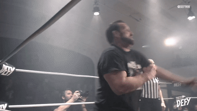
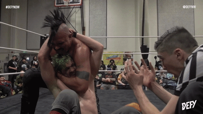

(he's a big fan of beards, as you can see.)
#TO BE CONTINUED#my gifs#randy myers#ravenous randy myers#sami callihan#tommy dreamer#dr. kliever#x-pac#johnny defyance#john morrison#joey ryan#ethan hd#mike santiago#jimmy havoc#wrestling gifs#pro wrestling#professional wrestling#indie wrestling#DEFY#defynw#defy wrestling#queer wrestlers
13 notes
·
View notes
Text
whatever happened to Dr Kliever? he and Drexl used to tagteam.
0 notes
Last Seen Blogs

rueshea-blog
unknown

nuitthegoddess
Sorcery And Serenity
🥀🐉

clausvonbohlen
Claus Von Bohlen
newdougg
Another Day, Another Doug

evlampiysblog
Без названия