#1k+ words of nis rambling on about art
Text
NARRATIVE STORYTELLING + COMPOSITION
First thing I always think of before doing ANY drawing is: what’s the story I want to tell? What’s the mood/emotion it should give off?
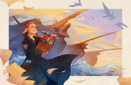
For The Visionary, I wanted to capture that feeling of seeing your hard work and creations finally come to life. It’s that satisfaction as artists, engineers, and creators we feel after seeing our hard work finally bear the fruits of our labor. It’s an exhilarating feeling and we feel a sense of pride.
I can pick out some key words from those descriptions: pride, excitement, satisfaction. Now, how do I depict that in the illustration + what compositional tools can reinforce that feeling and therefore story?
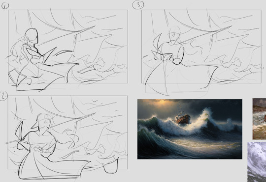
I also knew I wanted to draw my character, Kala. To reinforce the feeling, I wanted to think of his action and, in general, what he would be thinking in the illustration. I did a few thumbnails like below and figured to have him writing in his book and depicting boats in the background, almost like he’s drawing them at the moment and they’re appearing in the background.
Action: writing in his journal, almost as if making the background come to life -> gives a sense of pride and excitement.
This forms the basis of my composition. Everything from here on out (every decision in the illustration) relates back to this.
When thinking of your own illustrations and what you want your characters to do, try this simple template (do this for each of your characters in the scene):
<character> <action> -> gives <mood/emotion>
e.g. The rogue flees from the castle guards -> gives a sense of urgency. A witch backs away from her cauldron -> gives a sense of fear.
Kala’s placement is important as well. I purposely made him stand on one of the fourths of the canvas at the far left to make him feel almost like one of the boats (one of his creations). You know those scenes in pirate movies (or even just Navia Genshin Impact) where the character stands next to all their soldiers or a series of cannons? Yeah, I wanted to do something similar here.
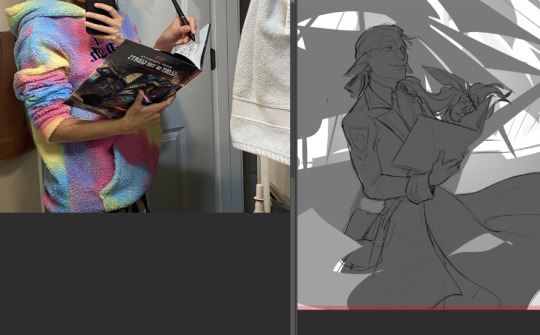
After thumbnailing, I’ll start refining the drawing and getting the structure right before doing anything else. Often, I’ll take reference photos like this and put them together in Photoshop. This helps not only get more accurate drawings but you can even put yourself in the shoes of your character. Imagine how they’re feeling in your illustration and act it out. Your pose—and therefore, your character’s pose—might change depending on how you do it which can help with your drawing.
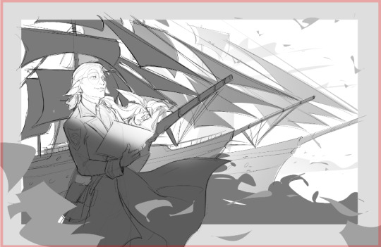
The boats get lighter in value as they recede to the background. I fix this later on in the composition, but since Kala is the focus, I had to make sure that he had the greatest amount of contrast. So I put a hint of light near his face so that his silhouette would pop well against the darker boat behind him. I later enforce this contrast through differences in color saturation which I will show soon.
I felt the boats weren’t grand enough + the mast shapes were too busy, and therefore didn’t support the story as strongly as I wanted to. And to further add contrast + give Kala more focus, I made the boats a bit larger, drawing them more from a low angle to further emphasize their grandiosity and the pride Kala feels in his work. It’s great when something works both compositionally well and enforces the story:

General lines of action of objects for flow. The boats specifically are all angled differently, converging towards Kala, to draw the eye towards him more + not feel static. It creates a sweeping motion to draw the eye towards him, along with the placement of papers and the shape of his coat further adding to the flow.
In general, you can strategically place objects in your drawing to follow certain lines of flow that go back to your focus. This helps guide your viewer around your piece while also giving a sense of motion and energy.

Every artistic decision you make should reinforce the story in some way. Even the tiniest things like the line art style. This idea came after looking through the Across the Spiderverse concept art book, specifically reading about the art style choices of Nueva York. Constructional lines and architectural diagrams are seen throughout the city and I wanted to bring a bit of that into this piece.
It further enforces the idea that Kala is creating the background behind him while also making the boats recede into the background due to atmospheric perspective. Depth of field is determined by how refined the boat’s sketch is, so the boat furthest away is still in pure constructional lines while the one closest to him is fully rendered. I thought that was a big brain idea and I’m glad I went with it >:)
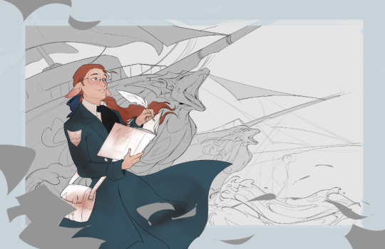

To add a bit of texture, I added a grid pattern off in the distance to help with the feeling of the background being drawn in. I also added sketches of engineering diagrams into Kala’s blue coat for a bit of visual interest. These further add to the fact my character is an engineer and is almost drawing the background himself. Plus, it just looks cool.
Quick breakdown of some visual choices + how they show the story:
large value range: the values go from very dark to very light -> deeper contrast gives sense of drama and overall intensity to the image -> reinforces feelings of epicness
strong warm vs. cool color contrast: shows the sunrise lighting, gives the character more focus (red is a very intense color) -> gives of sense of pride
sketch-y depth of field: objects further away have a more sketch-y, drawn look -> helps with atmospheric perspective and shows that the character is an engineer. contrast with more refined foreground and character.
character pose: Kala is standing tall while also writing in his journal with a very satisfied look ->
flowing papers in the foreground: intentionally placed to aid in the overall flow of the piece -> also enforces the idea that the character in question is very experienced + shows his hard work to get to where he is now
These are all my personal choices for the illustration based on my own experiences and intentions. But every choice, from the character pose, the value range, or whatnot was intentionally done to support the story I wanted to tell in the piece. You or another artist may have different choices given the same prompt, and that’s cool! It’s these kinds of intentional choices based on one’s own experience and emotions that make art awesome and inherently human.
Let me know if you like posts like this and I’ll do more, breaking down the process and my thinking in some of my other pieces!
#nis talks art#tutorial#art tutorial#art walkthrough#my art#1k+ words of nis rambling on about art#idk if i even made sense but I did my best to describe some of my decision processes in regards to composition#composition#steamworks family#art
58 notes
·
View notes
Last Seen Blogs

anotreadyforprimetimeplayer
hillzzz~
flunky-robots
Flunky Fanart!

bestedpills
Untitled

fangsmyth
i just cut the line

roguenlome
Leaves in the Wind