#(make sure to turn the animation off with the Slider Animation button / A key first)
Text
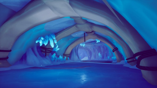
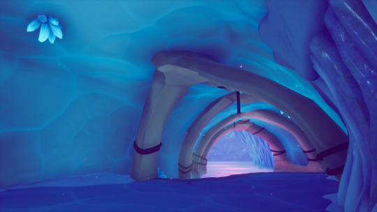

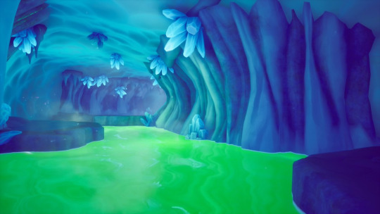
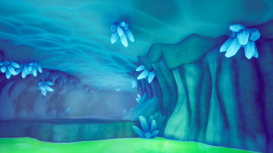
🧊 Crystal Glacier Expedition - Neon Cave Tour ❄️
This extensive cave system circling underneath the center of the glacier is home to several large pools of subzero waters, brightly illuminated from below. Try not to lose sight of the guide, but if you do, just watch your step and follow the sound of crunching snow from the group's steady march.
photos by CatbatQuartet
#Spyro The Dragon#Spyro Soundscapes#Ripto's Rage Soundscapes#Soundscapes#<- Insane person who actually enjoyed the Dracklet Cave challenge#Thankful for it tho b/c i cannot imagine having an instinctual Negative reaction to this cave loop#i love it SO much it's so beautiful#Spyro#i know I always post these to just be kept on their animation modes#but if you want to hear the cave noises w/o all the walking sounds:#(make sure to turn the animation off with the Slider Animation button / A key first)#pull the orange; blue; and indigo sliders down (3rd; 7th; and 8th from left-to-right)#and if you're willing to Finagle a bit:#turn the animation off; click the 'Low' under Animation Parameters (the hover text should say 'Load/preview lowest bound');#once the sliders have moved pull the 3 Walking Sounds sliders down to 0 and click on the 'Set' that points to 'Low'#and repeat the process with the 'High' parameter#then just hit Animate / hit the A key again and you've got a Walking-Free dracklet cave simulator!#that's what a trip through the cave system would sound like to a solitary Ice Wizard i guess
18 notes
·
View notes
Photo
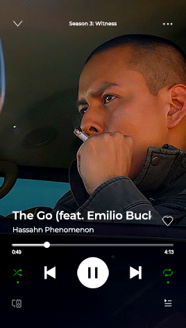

For the anon curious about these Spotify gifs, this is not so much a tutorial but a (hopefully beginner-friendly) guide on how to tinker with the Spotify PSD file.
Also anyone who wants to use the PSD for their own projects is free to do so! No credit needed.
Guide and download links under the cut!
Things you need:
PSD file and video (download here)
Photoshop
Shortcuts to PS tools:
Move (press V)
Brush (B)
Text (T)
CTRL + and CTRL - to zoom in and out
I. LAYERS
Open BASE.psd. You'll notice a bunch of folders. LAYOUT contains all the Spotify buttons and text. Underneath all that is BG VIDEO. That’s where we put the background video.

Quick note: I usually resize the BASE file down to 268px (my preferred default width for this kind of gifset) before I change anything. I do this to cut down on file size and avoid crashing PS. Video layers eat space! To avoid problems with animation later on, I highly suggest resizing it now.
To do that, look at the menus on the top of the window. Select Image > Image Size or hit Alt+Ctrl+I for a shortcut.
II. CHANGING THE TEXT
All of the text layers are directly editable with the Text Tool (hit T). Just hover over the text you want to change and click to edit. Hit ESC or click on any random layer to exit the text editor.

III. CHANGING THE TIME
Same with the song titles. Hit T, hover your cursor over the numbers and click to edit.
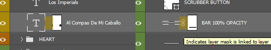
IV. MOVING THE SCRUBBER BUTTON
Go to the SCRUBBER BUTTON layer. Hit V to select the Move Tool. Press SHIFT (not SHIFT+V, only SHIFT) while moving it horizontally with your mouse so the button stays flush on the bar.

V. CHANGING THE SLIDER SCRUB POSITION
Now we gotta match the bar/timeline to the Scrubber Button. Select the BAR 100% OPACITY layer. Click exactly on highlighted area.
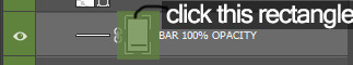
This is a Layer Mask. On this mask, anything painted black will become transparent and anything painted white will show up. Currently, most of the bar is hidden by that mask. We want the BAR 100% OPACITY layer to match the where the SCRUBBER BUTTON ends so we have to paint part of it back in.
To do that, hit B to use the Brush Tool. To quickly change the brush size, hit ‘[’ or ‘]’ on your keyboard. Take a look at this portion of the toolbar on your left:

The color on top is the one you’re painting with. If you hit X in Brush Tool mode, you can quickly switch between the top and bottom colors. We want to paint with white on this Layer Mask to expose more of the BAR 100% OPACITY layer. You can use the SHIFT trick (same thing with the Move Tool) to keep your brush stroke straight.

Now the Scrubber and bar/timeline match!
VI. ANIMATING LONG SONG TITLES (optional)
You'll notice that the song title has a Layer Mask too. It's there to mimic the scroll-fade effect Spotify puts on long titles. But compared to the BAR 100% OPACITY mask, this one is missing that little chain link in the middle.
If we turn the chain link on for the text layer (click on middle portion), this is how it will animate:
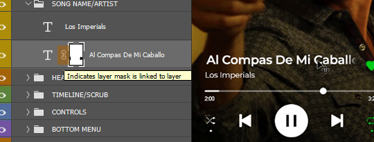
The mask is moving with the text. Not what we want.
But if we turn the link off, the Layer Mask stays put and only the text moves. We get that Spotify scroll-fade effect.
Now we animate! Look up the menus and select Window. Find and click on 'Timeline'. This window should appear on your workspace:

In your Layers window make sure the big T is selected, not the mask. Then find the song title layer in the Timeline.

Scrub to the start of animation timeline. Click on the tiny stopwatch next to Transform. You've created your first keyframe.
Scrub forward to where you want to end the animation. To move the text, hit V to select the Move Tool and then press the left/right arrow keys OR do the same trick with SHIFT + mouse same as before.
Move the text to the left until the last few letters are no longer obscured by the mask. This should automatically create another keyframe on your animation timeline, like so:

To preview your animation, hit SPACE. Adjust the keyframes until you find the right speed. And that's animation done!
VII. SAVING YOUR GIF
Click on File > Export > Save for Web (Legacy) or hit ALT+SHIFT+CTRL+S at the same time to bring up this box:


Leave the settings as they are. Hit save and you’re done!

#photoshop tips#spotify#might put together another of one of these for making UI/layout from scratch#but that shit ain't beginner-friendly#this will have to do for now#😅#bcs spotify#my tutorials#gif tutorial#photoshop tutorial
253 notes
·
View notes
Note
So 👀 you have inspired me to think about making gifs and/or edits 👀 and I don’t know shit about either. Care to throw some tips at ya girl? 👀 I ain’t even know what the first gah damn step is
I’m really flattered that I’ve inspired you 🥺 I’d be happy to help you get started!
HOW I MAKE A GIF 101:

1. The first step is acquiring the software needed to create gifs—which means you need Photoshop. I use Photoshop CC and it costs $10 a month with the plan I have. There’s also cracked versions available, but from what I hear they might not be as reliable at times and can be buggier. It’s up to you if you want the cracked or legitimate version. Either way I’m not judging you 😂
2. Gifs are made from video footage, so to begin the process you’ll need footage on your computer. The higher the quality the better. Since I make gaming edits, I record from my PS4 using the share button. I privately upload onto youtube and download them onto my computer. I can also plug a flashdrive into my PS4, but I don’t have a decent one. If the footage is captured on my computer then I don’t have to go through the hassle. You might a screen recording software. I have a PC and with windows 10 I can record by pressing the windows key, alt, and R.
When you have those two things, you’re ready to make a gif! Here are the actual steps to my process. (please note, this is just a tutorial on how to make a basic gif. I’m not going in-depth on my coloring processes and what filters I use and such.)
(I apologize for my screenshots being the best 😖)
The first thing you do once you open PS is to go to File, and then from the drop-down menu click Import, and from there Video Frames to Layers. So what we’re doing here is opening up the footage in PS and loading it into frames. Next, a file explorer window will pop up.
(Yes laugh. I have a folder for heart memes and Arthur. Mind your own business 😂)
So since I download my uploads off of youtube, they are stored in my downloads folder, so I go there to find them and select the clip I want. For today’s example I’ll do a clip from Ghost of Tsushima. Click open.
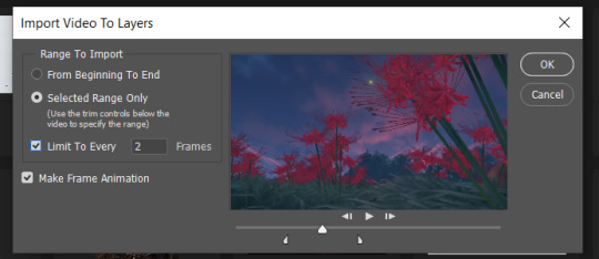
This will be your next screen. Here it’s asking to select a range from which to make layers. You’ll notice two beginning and ending slider bars you can use to crop between what part of the video you want to gif. Also note the setting I have of limiting to every 2 frames. Click OK.

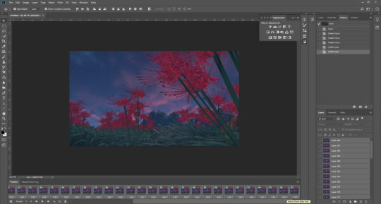
Once that loads, your screen should look like this. If it doesn’t, go to the Window tab in the header bar above and make sure Adjustments, History, Layers, and Timeline are checked off. You can customize your workspace layout however you wish.
So now you have a timeline bar that let’s you play through the frames. Make sure on the bottom left you change Once to Forever. This controls how much the timeline will loop. During my process I play through it and look for where I actually want my gif to start and end, so I do delete frames as needed. When I’m satisfied with the range, I select all of my frames (there’s a short cut in the hamburger menu ≡ up to the right of the timeline bar, click it and find select all frames) and I select all of my layers in the layers window on the right (click first frame and hold the shift key until you select the last frame).
With everything selected, I now change the frame delay. If you notice on the bottom on each individual frame there’s a decimal number and a downwards arrow. This is the time that elapses before the next frame plays and so on and so forth. I click that arrow and a menu will pop up. Typically, most gifs have a frame delay of 0.05, but I personally find that too fast for game gifs so I set mine to 0.07. Again, everyone is different, you use what works for you. Anyways if you want to set the delay to 0.05 click Other... from that menu.
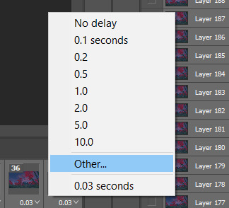

Then just type in the amount you want and click OK.
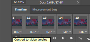
Now it’s time for the real work to begin. On the bottom left of your timeline panel, click square with the icon of a stack of bars with a slider. This will convert the gif into a video timeline.

Shit’s gonna look like this now ^
Next, go to the Filter menu from the header bar and select Covert to Smart Filters
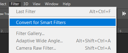
Once it’s converted, go back to the Filter menu and go to Sharpen.

Select Smart Sharpen.
A new window will pop up.

Everyone uses different settings, but I typically go with Amount at 500% and Radius at 0.3. This is something you can experiment with, each gif may require different levels of sharpening. I know 150% is another popular option for the amount. Choose whatever you think looks best and makes the image clearer. Sharpening is a very important step.
Now, you’re free to experiment with coloring using the adjustments panel. I’ll typically tinker around with Brightness/Contrast, Levels, Curves, Vibrance, Color Balance, Photo Filter, and Selective Color. I do all of my colorings from scratch and just go by what I think looks good, trusting my eye. Once you’re satisfied with how everything turned out, here’s the next step:
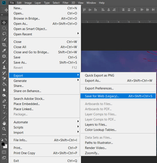
Go to the File menu, choose Export, and then Save for Web (Legacy).
Now comes the waiting. You can resize the gif before this step by going to the Image menu on top, and then Image size, and type in the dimensions you want. I personally don’t do this because it creates a transparent border around the gif? and it fucks with the specific filters I frequently use and makes it turn out ugly? So that’s why this step takes time for it load.
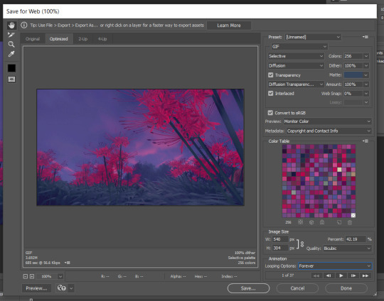
In the Image Size box here I type in the dimensions I want. Usually I always do a width of 540, your typical rectangular gif. Hit enter and it will start to resize again. Please note that the Animation box I have the Looping Option set to Forever. That’s very important. Again, everyone is gonna use different settings here based on what they think looks best. I use Quality: Bicubic, Selective coloring and Diffusion dithering. Some people using Pattern dithering and Adaptive coloring.
Once your gif is all ready you can click save. This window will also tell you the size of the gif in that left corner. And that’s it. That’s how you make a gif.
It’s a trial and error process and it takes so much practice. You’re gonna get frustrated, it’s gonna take awhile to learn your way around photoshop, and you’re gonna have to look things up sometimes. There’s many great resource blogs on tumblr for this as well, but for the most part I learned by doing and experimenting.
I know this was long but I hope I explained the process well? Feel free to shoot me more questions if not, I’m always down to help out with this.
Good luck! ♥
24 notes
·
View notes
Text
Kerbal Space Program 1.8: “Moar Boosters!!!” is now available!

Hello everyone!
New gadgets are coming from the Research and Development facility, the kind that will get Kerbals screaming: MOAR BOOSTERS!!! A brand new update is here and with it comes better performance, fresh new features, improved visuals, and new parts being added to our players’ creative repertoire!
Kerbal Space Program 1.8: Moar Boosters!!! is an update focused on making the game perform and look better, all while introducing more quality of life features that will improve the overall player experience. We’re also bringing some new solid rocket boosters to the VAB, as well as introducing some exclusive treats for owners of the Breaking Ground Expansion.
Let’s go through some of the update’s highlights below:
Unity Upgrade
Moar Boosters!!! brings an upgrade to the underlying engine of the game to Unity 2019.2, which helped us implement performance and graphics improvements, as well as better rendering performance and a reduction of frame rate stutters. With the new tools that this upgrade provides, we’ll be able to continue refining the game in upcoming updates.
Celestial Body Visual Improvements
Mun, Minmus, Duna, Ike, Eve and Gilly have new high-quality texture maps & graphic shaders, and now look sharper and more realistic! You will also be able to select the celestial bodies’ shader quality in the settings and set them to low (legacy), medium or high, with improvements being visible across the board. These are just part of the first batch of celestial bodies being overhauled, slowly but surely we will continue this endeavor.
Map Mode improvements
Map mode received some adjustments too! Now you can use docking mode and stage your craft whilst in map mode. The stage display button (formerly stage mode) now serves as a toggle to show and hide the stage stack, whether you’re in flight or map view, and selected map labels will now persist when going back and forth between map and flight mode.
New SRBs!
A range of new solid rocket boosters have been added to the game. From the tiny .625m stack size Mite to the titanic 2.5m wide, 144ton Clydesdale, these new boosters will offer a range of versatile solid-fuel options. Making History owners get an extra bonus here too with the “Pollux” and a 1.875m nose cone to fit on top of it.

Breaking Ground Exclusives
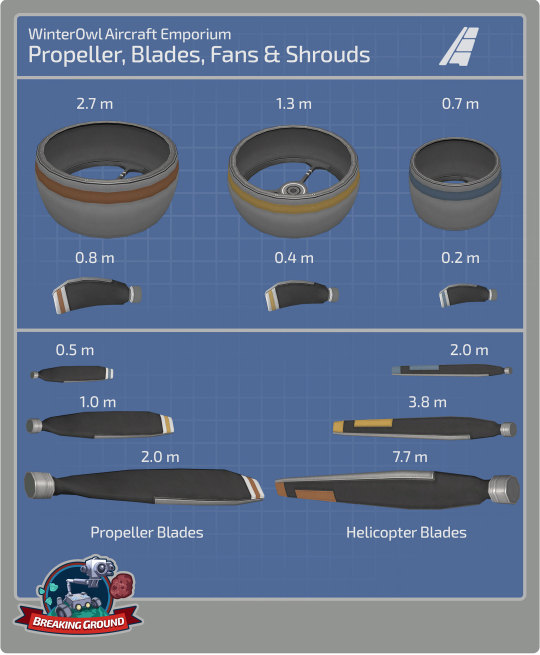
Kerbal Space Program 1.8: Moar Boosters!!! also includes some exclusive content for owners of the Breaking Ground Expansion. A new set of fan blades and shrouds will continue to push the creativity of KSP players even further. Use them to create drones, ducted fan jets, or anything you can imagine.
Improvements to the helicopter blades and the robotic part resource consumption have also been included. The latter will now have better info on consumption and improved options for power-out situations.
And more!
To learn more you can read the full Changelog here:
=============================v1.8.0===========================
1.8.0 Changelog - BaseGame ONLY (see below for MH and BG changelog)
+++ Improvements
* Upgrade KSP to Unity 2019.2.2f1 version.
* Standalone Windows build now uses DX11 Graphics API. Many visual improvements to shaders and FX.
* Implement Unity Incremental Garbage Collection.
* Implement new celestial body shaders and textures for Mun, Minmus, Duna, Ike, Eve, Gilly.
* Update Main Menu Mun terrain shader.
* Add Terrain Shader Quality graphics setting.
* Improve the TrackingStation load time.
* Implement ability to edit Action Groups in flight.
* Performance improvements to the VAB/SPH scenes.
* Performance improvements in the flight scene.
* Performance improvements in the Tracking Station scene.
* Add ability to edit resource values in PAWs using the key input.
* Add Warp to node button on dV readout in NavBall display.
* Add enable/disable wheel motor Actions to all wheels.
* Add ability to limit the maximum size of PAWs via settings.cfg.
* Improve the Action Groups/Sets UI.
* Add PAW_PREFERRED_HEIGHT to settings.cfg for players to set a prefered max height.
* Made staging and docking UI available in map view
* Pinned labels in map view now persist pinned even when leaving and re-entering map view
* "Delete All" functionality for messages app has been implemented.
* Improve the KSC grass and asphalt texture and shader to reduce tilling.
* Improve textures for the VAB building on level one.
* Model revamp for the level one and level two Research and Development nissen huts.
* Increased precision for eccentricity in advanced orbit info display.
* Upgrade VPP and improve wheel and landing leg function.
* Expose global kerbal EVA Physics material via setting.
* Add do not show again option to re-runnable science experiments.
* Add actions for same vessel interactions functionality.
* Implement per-frame damage threshold on destructible buildings.
* Add vessel name title to flag PAWs.
* Add a confirm dialog with the option of “Don’t display again” when a kerbal removes a science experiment data.
* Disable Pixelperfect on UI Canvases to improve performance - available to configure via settings.cfg.
* Increase precision for numerical editing of maneuver nodes.
* Kerbal position on ladders and command pods improved.
* Add ability for users to add their own loading screen pictures to the game. Folder is KSP/UserLoadingScreens
+++ Localization
* Fix incorrect naming of The Sun.
* Fix Action Sets text in VAB/SPH for some languages.
* Fix Text in dV KSPedia pages in Japanese.
* Fix Chinese Localizations.
* Fix dV readout for Chinese language.
+++ Parts
New Parts:
* S2-33 “Clydesdale” Solid Fuel Booster.
* S2-17 “Thoroughbred” Solid Fuel Booster.
* F3S0 “Shrimp” Solid Fuel Booster.
* FM1 “Mite” Solid Fuel Booster.
* Protective Rocket Nosecone Mk5A (“Black and White” and “Gray and Orange”).
* Add rock/dirt debris FX to the Drill-O-Matic and Drill-O-Matic Junior.
Updated Parts (reskinned):
* Service Bay (1.25m).
* Service Bay (2.5m).
Color Variants:
* Protective Rocket Nose Cone Mk7 (New “Orange” color variant)
* Protective Rocket Nose Cone Mk12 (New “Orange” color variant)
+++ Bugfixes
* #bringbackthesandcastle - Fix the Mun sandcastle easter egg from not appearing.
* Fix Maneuver editor so that the mouse wheel adjusts the node now in the contrary direction (same behavior as dragging down/up).
* Fix a null reference error when player threw away a vessel with fuel flow overlay turned on in the editor.
* Fix an input lock when switching between Editing the vessel and the Action groups menu.
* Fix user created vessels disappearing from the vessel spawn dialog.
* Fix the random selection of Mun vs Orbit scene when returning to Main Menu.
* Fix input field rounding on Maneuver Node editor fields.
* Fix a Null reference in the Editor when selecting a part and opening the Action Part Menu.
* Fix pressing Enter key confirms the game quick save dialog.
* Fix PAWs will now scale downwards from the header keeping more consistency on the fields.
* Fix an input lock issue where some PAW buttons disappeared when editing a numeric slider field.
* Fix Menu Navigation was missing in the quicksave dialog.
* Fix Mini Settings had some items that would be skipped when navigating with the arrow keys.
* Fix for remove from symmetry causing NRE in flight scene.
* Fix the FL-A10 collider no longer mismatching its geometry.
* Fix Control Surface and Aero Toggle Deploy Action not working in all situations.
* Joysticks and gamepads on Linux are again recognized and usable.
* Fix Action Groups UI and Color issues.
* Fix the LV-T30 Reliant Liquid Fuel Engine ́s bottom attach node.
* Fix a texture seam on the Probodobodyne Stayputnik.
* Fix a z-fighting issue on the destroyed VAB at level 3.
* Fix the Z-4K Rechargeable Battery Bank ́s bottom attach node.
* Fix the concrete tiling texture of the SPH at level 3.
* Fix a grass texture seam in front of the VAB at level 3.
* Fix missing texture and animation on the level one Administration Building flag.
* Smoothened Kerbal IVA expression transitions to avoid strange twitching.
* Make the LV-TX87 Bobcat exhaust FX more appropriate.
* Fix kerbal portraits when launching vessel with multiple kerbals in external command chairs.
* Fix drills operating when not in contact with the ground.
* Fix thrust center on the Mainsale engine.
* Add bulkhead profile to LV-T91 Cheetah, LV-TX87 Bobcat, RK-7 Kodiak and RE-I12 Skiff.
* Fix re-rooting of surface attach nodes.
* Fix kerbal IVA expression animations transitions.
* Fix shadows at KSC and in flight.
* Fix “sinker” warning during game load.
* Fix lengthy Map Transition when lots of vessels in the save.
* Fix overlap in vessel type information window.
* Fix a Null Reference when copying parts with alternative colours.
* Fix an error where the custom crafts were not loaded in the Load Craft dialog after navigating the tabs.
* Fix a null reference when clicking the Remove Symmetry button on some parts.
* Motorized wheels no longer keep generating torque even when the motor is set to ‘Disabled’
* Re-centered an off center scrollbar in the mini settings dialog.
* Rebalance decoupler, MK1-3, MK1 lander can, MK2 lander can, separators costs, crash tolerances, weight.
+++ Mods
* Target framework now .NET 4.x.
* DXT3 DDS formatted textures are not supported by Unity or KSP any more. You must convert to DXT5.
* Added UIPartActionWindow.UpdateWindowHeight to allow mods to dynamically set the PAW max height
* MapviewCanvasUtil.GetNodeCanvasContainer created as more performant method than MapViewCanvasUtil.ResetNodeCanvasContainer. Use the rest one only when you need to force a scale reset
* ModuleResourceAutoShiftState added that can be used for startup/restart of parts based on resource availability.
* VesselValues are now cached per frame. Can use ResetValueCache() to reset the cache.
1.8.0 Changelog - Making History DLC ONLY
+++ Improvements
* User can now click and drag and release to connect two nodes in the mission builder.
+++ Parts
New Parts:
* THK “Pollux” Solid Fuel Booster
Updated Parts (reskinned):
* Kerbodyne S3-14400 Tank
* Kerbodyne S3-7200 Tank
* Kerbodyne S3-3600 Tank
+++ Bugfixes
* Craft Thumbnails are not shown/generated for stock missions.
* Fix Kerbals spawning on EVA in missions spawning on their sides (very briefly).
* Fix Intermediate and Advanced Tutorial becoming stuck.
* Fix Typos in some part descriptions.
* Fix vessel width and height restrictions on Woomerang and Dessert in career games.
* Fix camera becoming stuck if in IVA mode when a vessel spawns in a mission set to change focus to that vessel.
* Fix hatch entry colliders on the M.E.M. lander can.
+++ Missions
+++Miscellaneous
+++ Mods
1.8.0 Changelog - Breaking Ground DLC ONLY
+++ Improvements
* Add renaming of Deployed Science Stations.
* Add alternators (producing electric charge) on LiquidFuel Robotic Rotors.
* Add propeller blade AoA, lift and airspeed readouts to their PAWs.
* Add Reset to built position button in PAWs of Robotic parts which causes them to reset their Angle, RPM or Extension.
* Add shutdown/restart function to robotics parts based on resource availability.
* Add preset curves functionality to the KAL controller.
* Add part highlighting on mouseover in KAL.
* Improve Robotic Part Resource usage info in editor.
* Add interact button to open PAW for Deployable Science parts.
* Added new KSPedia slides for Grip Pads, Propellers and Track Editor.
* Improve Robotics Parts Resource usage to use less resources when moving slower.
* The PAW button “Reset to Launch Position” for robotic parts now reads as, “Reset to build:” + Angle, RPM or Extension depending on the robotic part to avoid confusion.
+++ Localization
* Fix description text on R7000 Turboshaft Engine in English.
* Fix localization of resource name in robotic part PAWs.
* Fix KAL help texts.
+++ Parts
New Parts with Variants:
* S-062 Fan Shroud
* S-12 Fan Shroud
* S-25 Fan Shroud
* R-062 Ducted Fan Blade
* R-12 Ducted Fan Blade
* R-25 Ducted Fan Blade
* Readjusted the liftCurve, liftMachCurve and dragCurve values on the propellers and helicopter blades.
Rebalanced Robotic Resource Consumption values:
* G-00 Hinge
* G-L01 Alligator Hinge
* G-11 Hinge
* G-L12 Alligator Hinge
* G-W32 Hinge
* Rotation Servo M-06
* Rotation Servo M-12
* Rotation Servo M-25
* Rotation Servo F-12
* EM-16 Light Duty Rotor
* EM-32 Standard Rotor
* EM-64 Heavy Rotor
* EM-16S Light Duty
* Rotor, EM-32S Standard Rotor
* EM-64S Heavy Rotor
* 1P4 Telescoping Hydraulic Cylinder
* 3P6 Hydraulic Cylinder
* 3PT Telescoping Hydraulic Cylinder
* R121 Turboshaft Engine
* R7000 Turboshaft Engine
+++ Bugfixes
* Fix Deployed Science Log and Message system spam.
* Fix Deployed Science parts sometimes exploding when coming off rails if in contact with another part (kerbal, etc).
* Fix Deployed science parts being visible during the astronaut complex when opening that scene from the Editor.
* Fix Robotic Parts using EC when moving to initially set position on launch.
* Fix slider numeric values in some PAW fields could go out of range.
* Fix autostrut processing for some use cases regarding root part being robotic part.
* Fix autostrut delay when vessel comes off rails for vessel with robotic parts.
* Fix Actions at the end of KAL track not firing in Play Once mode.
* Fix separation of the blades when attached to an active rotor.
* Fix rotation of cargo parts in extended tooltips.
* Fix cargo part icons appearing in Astronaut Complex when pinned.
* Fix drag on pistons.
* Fix cargo parts now rotate at the same speed as in the Editor on the inventory grid during Flight.
* Fix mirroring of hinges and rotation servos.
* Fix KAL Window not closing when vessel goes outta range.
* Fix incorrect naming of the Sun in science experiments.
* Fix mirrored attaching to rotor side nodes.
+++ Miscellaneous
+++ Modding
Kerbal Space Program 1.8: Moar Boosters!!! is now available on Steam and will soon be available on GOG and other third-party resellers. You will also be able to download it from the KSP Store if you already own the game.
Click here to enter the Grand Discussion Thread for this release.
Happy launchings!
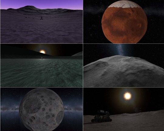
By the way, you can download the new wallpapers of the Moar Boosters!!! art here:
1080x1920p (Most Phones)
1080x2048p (Galaxy S9)
1440x2560p (iPhone X)
Desktop 1920x1080p
Desktop 2048x1080p
Desktop 2560x1440p
#Kerbal Space Program#Update 1.8#Moar Boosters#Breaking Gorund Expansion#making history expansion#annoucement#changelog#Release Notes
44 notes
·
View notes
Photo
How To Create a Company Timeline With a WordPress Plugin
When running a business creating an emotional connection with your audience is key. This emotional connection will allow you to communicate with your audience on a deeper level and makes them more likely to make a purchase on your website.
While there are many ways that you can create this emotional connection, one method that stands out is to add a timeline to your About Us page on your WordPress website. This timeline allows you to take your audience inside the business and make them feel like they were and will continue to be apart of the journey. This type of connection with your audience will not only create this emotional connection, but it will help them understand your business better and they will have a clearer picture of whether or not your products or services are right for them.
12 Best WordPress Slider & Carousel Plugins of 2020
Whether you want to show off customer testimonials, your latest blog posts, your best images, or just celebrate the members of your team, there is a...
Nona Blackman
19 Nov 2019
WordPress
20 Best WPBakery Page Builder (Visual Composer) Addons & Plugins of 2019
Want to know the coolest and most useful new addons and extensions available for the WPBakery Page Builder? Here’re a list of the 20 best of 2019.
Nona Blackman
16 Apr 2019
WordPress
There are many WordPress timeline plugins on the market today, but one stands out above them all. With over six thousand sales on CodeCanyon, the Cool Timeline WordPress plugin is the most advanced WordPress timeline plugin and can showcase your life history timeline or your company’s story timeline in a responsive horizontal or vertical chronological order.
In this article, we are going to use the Cool Timeline WordPress plugin to present our company’s life history in an About Us page.
What We Will Be Building
In our example, we are the owner of Mugs Coffee. We would like to create an emotional connection with our website viewers by detailing our company’s history in a timeline. This emotional connection will help us get more people into our coffee shop and buy coffee on the website. Our timeline will be placed on our website’s about page and contain six different dates, a header, descriptions of what happened in each year, and images to go along with the text. Here is what part of our timeline will look like.
Creating the Timeline
To begin creating our Mugs Coffee company timeline, we will install the Cool Timeline WordPress plugin. Once the plugin is installed we will head on over to Timeline Stories > Add New from the WordPress admin section. The new story builder will now pop up. From here we can begin adding our specific timeline dates and begin adding all our information and media to them.
We will begin with our very first entry into the timeline. This very first entry will be labeled Inspiration so we will type that into the Add title field. This title will be present on the top of the timeline entry.
Next, we will add in the text that will be displayed on the timeline entry in the WordPress visual editor below the title field. This entry is meant to let our audience know what inspired us to start Mugs Coffee.
When you are adding in your text descriptions for a specific timeline date for your company, try and keep them short. You don’t want to overwhelm your audience with too much information. You just want to provide a short little emotional jolt here.
Filling out title and description of the timeline entry
Next, we will scroll down to the Timeline Story Settings. We'll now add in the date for this entry in the Story Date / Year field. Click the field and a calendar will pop up. Our "inspiration” entry will be for January 1st, 2000, so we will insert this into the calendar. We aren't worried about the exact time for our example, but if you do require a specific time in the day, you can always set that at the bottom of the popup calendar.
Next, we are going to change the Story Color. Our website’s theme makes use of the colors blue and red. We will make this first entry blue. This will color the banner header, month, and day blue for the particular entry.
Finally, we are going to add this timeline entry to the categories in the plugin. By default, a Timeline Stories category is created upon installation of the plugin. If we scroll to the top of the timeline entry editor and look on the right-hand side of the screen, you can see the Categories section with one category labeled Timeline Stories in it. Click the checkbox next to Timeline Stories.
Each timeline story that you add needs to be under a specific category in order for the entire timeline to show up on your webpage. Each category is essentially a new timeline. If you would like to create a new category or timeline, head on over to WP Dashboard > Timeline Stories > Categories > Add New Item and label it accordingly.
We have now created our first entry into Mugs Coffee timeline and added it to a specific category. We are going to repeat this process for the other five timeline entries so we will have six total timeline entries ready to be displayed on our about page. Below you can take a look at what our first timeline entry looks like.
Adding the Timeline to the About Page
Now that we have finished adding all six of our stories to our company timeline, we can insert the actual timeline into our about page. To do this, go to Pages > Add New from the WordPress admin dashboard. We will title the page About Us.
From the visual page editor, we will add the timeline. Click on the Cool Timeline icon on the far right of the header of the visual editor. Here is an image of the icon you should click.
Once you click on the icon, a pop up will appear with four different options for the type of timeline to add. We would like to have our website visitors view our timeline vertically so they have to scroll down to see the entire timeline, we'll choose the Vertical Timeline option. From here, we will be brought to another menu that will give us a range of options on how we would like our timeline to be displayed.
The first option we are going to change is the Story Order. We are going to change this to DESC, so the timeline will be displayed in descending order starting at year 2000 in our case.
Next, we will change the Timeline Design. We will choose the Elegant option from the dropdown menu as this design fits best with our website's theme. Make sure to experiment with the different designs to find one that works best for your website's theme.
Finally, we will change the Animation Effects. We want our timeline to fade in to give the timeline a more polished look, so we will choose the fade option. Click the okay button and the timeline shortcode will now be created and ready to go. You can now view your webpage with our Mugs Coffee company timeline for everyone to see on our about page. For a detailed tutorial on how we created this timeline, you can view the video below.
Getting the Most Out of the Cool Timeline Plugin
In this article, we just went over one way that you could use the Cool Timeline plugin. There are many more uses for this timeline than just creating a company story timeline though. Here are a few ways that you could use this plugin.
Team Page
If you are running a business, you might want to let your audience know who the team members are. The Cool Timeline plugin allows you to replace the dates with custom text. Under the Timeline Story Settings, you can click the button Custom Order Based and you will be given the option to add in a custom label and a custom secondary label to be displayed under the main label. If you are creating a team page, you can use the main label to write the name of the person on the team and the secondary label to write the position they have in the business. From there, you can add a short bio in the description and an image of the team member.
Converting Your Blog Into a Timeline
The Cool Timeline plugin also allows you to turn existing blog posts into a timeline. To accomplish this all you need to do is choose the blog post timelines from the drop-down menu when you click the cool timeline icon in the page visual editor header. Choose either the Vertical Content Timeline (Blog) option or the Horizontal Content Timeline (Blog). The timeline menu will pop up and you can then choose the specific posts that you would like displayed in the timeline.
Guide or Step-by-Step Instructions
The layout of the timeline allows you to display text, images, and links in a clutter-free way. This allows you to systematically display a detailed set of steps on instructions that you want to show your audience. Again, by selecting the Custom Order Based option in the timeline story editor, you can replace the dates with text and links and create a step-by-step visual guide.
Conclusion
When communicating with your customers, you should strive to create an emotional connection with them. This will help your customers relate to your brand and want to make a purchase on your website. By using the Cool Timeline WordPress plugin, you can easily create an eye-catching timeline that will help you create this emotional connection with your audience. In addition to creating a traditional timeline with this plugin, you can also create other visually appealing timelines that include step by step instructions, your website's blog posts, or display your team members.
To give this plugin a try, head over to CodeCanyon and check out the Cool Timeline WordPress plugin. And while you're here, check out some of the other great WordPress plugins available from CodeCanyon.
12 Best WordPress Slider & Carousel Plugins of 2020
Whether you want to show off customer testimonials, your latest blog posts, your best images, or just celebrate the members of your team, there is a...
Nona Blackman
19 Nov 2019
WordPress
20 Best WPBakery Page Builder (Visual Composer) Addons & Plugins of 2019
Want to know the coolest and most useful new addons and extensions available for the WPBakery Page Builder? Here’re a list of the 20 best of 2019.
Nona Blackman
16 Apr 2019
WordPress
6 Best Weather WordPress Widgets & Plugins
Websites for restaurants, retreat centers, country clubs, and many other businesses and organizations can benefit from a weather WordPress widget. Take a...
Kyle Sloka-Frey
28 Feb 2019
WordPress
20+ Best Popup & Opt-In WordPress Plugins
If you're looking for fresh and interesting ways to encourage visitors to opt in to your email subscribers list, this awesome list of over 20 WordPress popup...
Nona Blackman
24 Apr 2019
WordPress Plugins
by Daniel Strongin via Envato Tuts+ Code https://ift.tt/2OS2pfH
0 notes
Text
Best WordPress Page Builder Themes
New Post has been published on https://www.templified.com/best-wordpress-page-builder-themes/
Best WordPress Page Builder Themes
There are a good deal of exciting and new options out there in case you would like to make a WordPress theme with the capability to customize layouts without needing to really code the theme yourself. A great deal of webmasters need a WordPress theme and they wish to do-it-themselves, to a certain extent at least. But how do you tell a contractor and front from a back end builder? Bear in mind, these are page-builders rather than theme-builders. If you pick the appropriate drag-and-drop WordPress theme, you can ensure that your website has all of the functions, options and layout style you desire. Whatever suits your brand. Drag blocks or components where you want them, add your content and do it.
All this enables a webmaster to create a theme that has the options, flexibility and functionality they want without needing to make the theme from scratch. The best drag and drop theme builders provide excellent flexibility with loads of widgets, tools and features to create precisely the site you envision. Visual builders permit you to drag a block or element of material to where you need it without breaking into the code itself. These page-builder WordPress themes allow you to create a theme that will look perfect on almost any device with responsive in every way design, produce limitless designs, swap components out on the fly, use multiple header and footer designs and much more. We’ve found a good deal of what we think are the most effective drag-n-drop WordPress themes available on the market. Tell us if we have missed any more amazing themes. Thanks!
Divi
Divi is a fantastic, full featured WordPress theme with a built in, custom page builder feature that allows you to drag and drop any element anywhere you want it. Divi is all about flexibility. Elegant Themes has created a truly multipurpose theme and the many, many layouts options and the over forty different content modules available will let you include just about any feature you can imagine. Use Divi for a photography or creative portfolio, for a business venture selling products, even as a personal blog. The functionality and ease of use is very high and since this theme is from Elegant Themes, you know that you’ll be supported all the way.
Elegant Themes offers a bunch of pre-made layouts if you don’t want to have to create your own too. But down the road, the flexibility this template offers is really going to pay for itself if you find that you want to redesign your site, you don’t have to learn a completely new Admin panel and figure out how to rebuild your site from scratch.
Demo More Information Get Hosting
Shoppe
Shoppe is fantastic theme, built around Themify.me’s proprietary drag and drop page builder plugin. Shoppe offers beautiful, modern looks with powerful features that make it a great all-purpose eCommerce solution, ideal for almost any sort of website and the drag and drop aspect is a massive bonus. This Shoppe theme is very simple to implement, with demo data importing with just one click, letting you set your site up fast and letting you quickly start to customize your shop. Shoppe uses Themify’s custom drag and drop page builder to offer the ability to drag content blocks where you want them, visually building your page from the ground up. With Shoppe, you can use WooCommerce (or any other WordPress shopping cart plugin for that matter) to create a gorgeous shop selling any products. Themify has added some special tools to make the WooCommerce experience even better for your customers, AJAX powered cart, wishlists, AJAX powered quick search, product image zoom and tons more. There’s no limit to what you can do with Shoppe.
Demo More Information Get Hosting
Benson
Benson is a lovely but simple looking portfolio theme that’s built with a drag and drop page builder to give it maximum levels of flexibility at every turn. Photographers and artists who want the added level of custom design that a drag and drop page builder can provide, will love Benson. The Benson theme offers more than just a drag and drop interface to help you build a homepage that looks and acts just like you want it to, it also has tons of widgetized areas, supports Jetpack and several gallery plugins like Envira Galley, NextGEN gallery and Sunsjine. There’s video and slideshow support, multiple different image layouts and total control over colors and fonts. This theme really works well out of the box but if you need a powerful portfolio you can also change up via the ‘drag-and-drop’ interface, then this one may be right for you.
Demo More Information Get Hosting
Neto
Neto is a WooCommerce ready theme that could be a good choice for selling clothing, shoes or other products where a stylish presentation is key. WooCommerce is the industry standard for eCommerce and with it, you can add tons of extensions and addons to create a shopping cart as powerful as any cart around. Since WordPress and WooCommerce is free, you can save a ton of money setting up your shop and there’s also no monthly fee for the basic setup. Flexible layouts are key these days, so Neto has decided to offer support for Visual Composer, Elementor, Divi and Site Origin. That’s a sure sign that you can craft a layout with the features you need. There are tons of powerful options which you get complete control over, giving you the flexibility to make any sort of site you’d like.
Demo More Information Get Hosting
Float
Float is from Themeify.me, and it comes bundled with a high quality page builder, so we’ve decided to add it to this collection. I really like Themify’s offerings, they’re user friendly for beginners, but flexible enough to please even a longtime WordPress user. WooCommerce is fully supported, so you can set up a great looking, responsive online store for any type of products. With several premade demo sites included, you can get started building your page quickly. Then again, you can spend a little time customizing with the page builder and get something that’s precisely like you want it. Portfolios, blogs, shops, they are all simple to create. Also, promoting your posts and products is a breeze, thanks to full social media integration. Float is a parallax theme that really goes the extra mile to make your products, your posts and your pages look incredible.
Demo More Information Get Hosting
Doberman
What do you get with Doberman? Well, plenty, that’s what. This theme has so much to offer to go along with the Visual Composer plugin, included for free, allowing you to drag and drop your way to a dynamic, attractive WordPress based website. What else? Well, to start off, there’s the modern and classic style. This theme is unique, yet somehow familiar. That’s a pretty great place to start. You need a great looking site to build the best viral content site you possibly can build, which is what this Doberman theme is all about and Doberman knows that a viral site that has the flexibility of drag and drop layouts is even more powerful. You also need a well coded theme that’s simple to use, which Doberman is as well. SEO friendly, simple to use and customize, an intuitive admin panel with all sorts of theme options at your fingertips, Doberman makes it easy to craft a winning website. Then there’s the support, which is very solid. The net result is a stunning, powerful and user-friendly template perfect for any viral magazine website.
Demo More Information Get Hosting
Potenza
The Potenza WordPress Theme displays its content in a single page for smooth navigation and fast page loading. It features a top bar navigation menu, and a header slider to help guests have an overview of what the website offers. It best suits service-oriented businesses and similar websites.
Potenza boasts of being one of the most flexible themes. It allows the use of a simple drag and drop page builder that does not require coding knowledge and skills. It also has nine custom content widgets that allows designers to choose from various layouts.
Designers are also given a wide latitude of discretion to add custom logos, backgrounds, animations, and even parallax modules. The Potenza theme includes over 30 color controls for every page element like headings, links, buttons, and paragraphs.
The Potenza WordPress Theme is constantly being updated to keep up with the demands of modern technology. Its responsive design adapts to the different screens it is viewed on, without any drastic change in its style and performance speeds. It is retina ready for optimum user experience on retina devices.
Other notable features of the Potenza theme include being translation ready and search engine optimization ready. It is also engineered to ensure speedy page loads for optimal performance.
Demo More Information Get Hosting
Salon
For crafting a beautiful, easy to use and high quality salon, spa, wellness center or beauty salon, this theme is a great choice. Salon was built from the ground up to create a user experience that is a perfect fit for any sort of beauty site. Makeup artists, aromatherapy, hair stylists and more will find Salon to be a great fit for their businesses.
Salon’s drag-n-drop page builder is a wonderful way to create an impressive site that gives readers a wonderful first impression. There are several content types for showcasing services, personnel, galleries and videos. That’s a wide range of content types that can help turn a reader into a customer. If you’re selling products, you’ll need a great shopping cart setup. Fortunately, Salon includes support for WooCommerce, which will make it simple to sell any kind of product as well as manage inventory and shipping. I also love the flexible, widget heavy layout, that gives you the ability to make your site work just the way you want it to work.
Demo More Information Get Hosting
Zero
Zero is a fantastic multipurpose theme for WordPress with a lot of potential to be a really big hit. It’s creative, it’s bold, Zero is a business theme, a blog and a magazine theme all in one, each design style and concept is demonstrated at the link below, but this eCommerce ready template comes complete with Visual Composer, Slider Revolution and it was built on the Opal framework to load fast and for easy admin management of posts, pages, navigation and everything else that it takes to run a successful site in a very competitive market. Bootstrap 3, Mega Menu, Font Awesome 4, HTML5, CSS3 and SASS are more of the incredible technology behind this fast selling responsive business WordPress theme. WooCommerce is perfect for monetizing your magazine business theme, so don’t forget that option.
Demo More Information Get Hosting
Aesthetic
Visual Composer powered Aesthetic is a multipurpose theme with a really elegant style, loads of handy features and a simple to manage admin panel that allows for the highest level of custom design possible. Aesthetic uses the power of Visual Composer to let you make a site with nearly any type of layout, any feature possible and it does all of this at a relatively reasonable price. Want to sell products? Aesthetic handles all the major eCommerce plugins and handles them well, whether it’s Sell Media, WooCommerce or Easy Digital Downloads, this theme has a sales channel that looks great and is simple to set up and manage. For those who aren’t coding experts, the documentation and support are delightful, easy to use and also quite helpful.
Demo More Information Get Hosting
Magazine Vibe
Magazine Vibe is a full-featured WordPress magazine theme with the kind of design that is reminiscent of modernist print periodicals and it manages to look great despite being somewhat minimal in appearance. There’s a lot of flexibility in this template, due to the fact that it offers up feature posts in a split screen slider up top, a feature that many new WordPress magazine templates are taking advantage of. There’s also custom mega-menus, smooth scrolling, and hover effects as well as WooCommerce compatibility. We also love the expanding Video shortcode, which makes this a great choice fora video magazine. Add in tons of sidebar options and layouts, quick demo import, quality code and SEO optimization, Drag-and-Drop page creation through Visual Composer and more, Magazine Vibe is a theme you can really grow into.
Demo More Information Get Hosting
Technico Responsive WordPress Themes
Technico is a drag and drop WordPress business theme that’s responsive and attractive, packing a lot of features into a reasonably priced package. Technico is a template that offers the very newest in drag and drop code and it’s built to last. Your website will be flexible and if any new desires pop into your head, you can easily make them a reality by just adding in new sections of content with a few mouse clicks. That’s high functioning. Liven up the site with some widgets, if you feel like doing that. The ease with which you’ll be able to change your layout is impressive, whether you want two, three or four columns to show off your projects, images and services, you’ll have that done in a jiffy. If you like the demo version, which is pretty vanilla, that’s fine too. Technico is savvy enough to handle any sort of website and style from blog and magazine to eCommerce portal.
Demo More Information Get Hosting
0 notes
Link
Noupe http://j.mp/2oZCK8M
You think the big picture is what counts? You’re right, but only as long as it differentiates itself sufficiently. Today, the small UI elements and features are far more important. Thus, microinteractions are what you should pay special attention to when designing your projects.
What Are Microinteractions?
Microinteractions define the actual human-machine interface. If you turn off your alarm or lock and unlock your car, flush the toilet, or turn the light off and on – all of these are microinteractions.
With these examples, you can already see that all of them are short actions with major significance regarding the respective user experience (in one of the example cases even affecting the user experience of following users). Calling microinteractions the most important elements in product design is not an exaggeration.
The main advantages of successful microinteractions are obvious. Microinteractions, especially when combined with small animations, can convey the impression that the digital product behaves very similarly to an analog product. This can be accomplished via immediate feedback, like the effect of clicking a button, pulling a slider, or showing a rotating spinner during a download, or a shopping cart filling after clicking on buy.
Targeted use of immediate feedback avoids user mistakes since you have access to much better controls of the click paths via visual support. Psychologically speaking, the product reacting to the user has a positive effect. Who doesn’t like recognition for his actions?
Microinteractions 1.0: Skeuomorphism as a Design Principle
In the past, designers liked relying on skeuomorphism, which are very detailed recreations taken from the real life, when designing interactions. Some designers went ahead and even imitated a real example to make sure that the user won’t struggle with using it.
The problem with skeuomorphism is their high taste and culture dependency. Additionally, too exact copies get boring very fast.
Switch Animation | Eugene Cheporov
Thus, for a few years now, interface elements with minimalistic design and integrated interactions have established themselves. Logically, skeuomorphism is limited by the limitations of the real role models, if they want to keep up the image.
More modern approaches don’t underlie these conventions. Especially Google’s material design leads the way. People also like to call this microexperiences, as a synonym for microinteractions.
Microinteractions 2.0: Use the Modern Options
Nowadays, after ten+ smartphone years, designing elements that let the user relate to the analog world is not as relevant anymore. The digital aspect has been established in our everyday lives and does not need an explanation via wood hammer methods. Nonetheless, the significance of microinteractions is rising constantly. The reason is simple.
Due to a consistent design language, digital products are getting more and more similar. Some products can only be told apart from each other if you specifically look for the name. Here’s an excerpt from the search result when searching for the category “todo” in the Google Play Store:
I told you. You have to look for the names to tell apart the products. (Screenshot: Noupe)
This is not what we call innovation. From a superficial point of view, you’ll be tempted to ask how I think the different providers should have made their todo apps recognizable. Sure, the answer isn’t simple. But, it is no reason not to seek for it.
Differentiation can no longer happen on the level of the design basics, it seems. The microinteractions are what lets you as a designer set your product apart from others. Basically, the only way the user interacts with your product is via microinteractions.
The more convincing they are, the more fluid the usage feels, which increases the chance of the user enjoying using your product. A single well-done interaction is capable of deciding the battle between product A and product B, which is key to surviving amongst millions of rival apps, and a lot more competing websites.
Download Button | Alex Pronsky
The perishing of old design patterns frees you, and lets you make use of the options of modern technologies. With microinteractions, it is always important to not just provide the user with a clear trigger, such as an obvious button or slider.
Instead, you have to make sure that the user receives a clear feedback. This has to reliably inform the user regarding success, failure, or the duration of the action.
Progress Circle | Leo Zakour
Here, usage of motion in the element, meaning the integration of small animations, has been proven to be successful. In the guidelines for Material Design, you’ll find detailed tips on the topic. But, especially when using animations, it is important to be careful. Something that may be perceived as a nice surprise the first time can seem boring or even annoying when the users encounter it the tenth time.
Fluid Switch | Leo Zakour
When creating animations, it is important to make them as short as possible. Google recommends not exceeding 400 milliseconds. The animation mustn’t cause a delay when using your interface. Delays in the seconds would be too long and make the product seem slow.
Form Flow | Leo Zakour
Once you’ve made sure that the user gets a clear feedback after using a microinteraction, it is time for the next step. You have to judge whether the microinteraction will be one that the user will use repeatedly.
If yes, you need to consider whether the first usage makes it necessary to make changes for repeated usage. For instance, you could turn the button “buy” next to the purchased product into the button “buy again” after the purchase, handing out important information to the user on the go.
When developing the microinteraction, it is also important to only display what’s really necessary to complete the task up next. Surely, you can add a bit of humor to your animations, if you use it very conservatively. However, I only recommend this for animations that the user doesn’t see all the time. Don’t put a funny play button into your music app.
Even if it’s a good one, every joke is only funny once. With microinteractions, however, users are exposed to the same element hundreds or thousands of times. It’s better not to annoy the users. The best microinteraction is so subtle that it is not even recognized as one, and just treated as a natural component.
Of course, you mustn’t forget about the general principles, even when designing microinteractions. Which designer hasn’t heard of Don’t Make Me Think? All UI elements have to exist in context to each other, and, at least in this context, need to be self-explanatory.
The color scheme has to be homogenous, as well as the typography. Texts need to be worded in a comprehensible, simple language. But you know all of this already.
If you want to learn more about microinteractions, you should visit Dan Saffer’s website Microinteractions – Designing with Details.
(The article was initially written in the German language by our author Dieter Petereit for our sister magazine Dr. Web.)
http://j.mp/2HkOz04 via Noupe URL : http://j.mp/2mWVRO5
0 notes
Last Seen Blogs

twomexicanfurries
Two mexican furries

stimmedtavi
stimmedtavi!

dond3rd
Untitled

gioiafinejewellery
BESPOKE DESIGN

lhsrainbowhelmet
fyeah pride bitchez