
Last Seen Blogs

momsnflight-blog
Untitled

cricschedule2019-blog
Cric World Cup Updates

fazzd
FazzD

gimgilu-blog
슴가

crossmebitch
Spider-Meh
Text

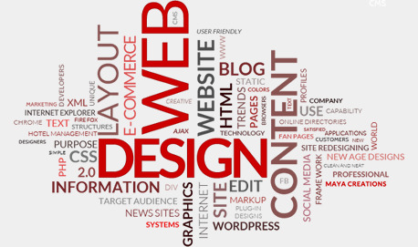
Graphic design in Commerce
With millions of wensites on the web, making an impression is key. You have limited time to engage a customer when they land on your page, otherwise they are going to leave. How you grab their attention is to differentiate yourself from the competition with a beautifully designed site that represents your brand.
You need to convey who you are and what you sell immediately. Your site’s colors and imagery need to show the customer that you are different and better than all of the other companies selling products like yours. Lifestyle imagery should make the customer feel the same way they feel by using your product. The overall design should compliment your product’s packaging and style, use similar fonts and colors, and be consistent throughout the site. Quite simply, the customer needs to ‘feel’ your brand when they visit your site.
Color is one of the most important aspects of the design. The color needs to not only represent your brand, but your industry as well. Using the appropriate color for your demographic is key, or you risk alienating your potential clients. For example, using a pink theme for a product targeted at men would obviously not be a wise choice, nor would using red for a site selling stress-relief products. Each color elicits an emotional response, and a graphic designer will know exactly which palate to use for the site’s demographic and product line.
How colors act together is also important, and you need to pick a compatible color family to use throughout the site. If you have site full of earth-tones, don’t suddenly throw in a neon orange banner even if you do think it will get the user’s attention.
Getting the customer to go where you want can easily be accomplished by establishing a clear visual hierarchy. The use of colors, bolder fonts and graphics help certain portions of the site ‘pop’ more than others, and that will naturally draw the eye of the customer. On the home page the main hero image is what should get hte user’s attention first, as that is what you use to provide your site’s identity and draw the user in. The main navigation bar with your categories should be the next thing they see, as you want to pull them into the site to shop. Secondary navigation, search, the cart icon and other site functionality should be clearly visible, but not draw away from the products themselves.
Once you get the customer into the site, you need to give them clear calls to action on what to do next. Usually these are in the form of buttons – add to cart, checkout, submit order, etc. It is extremely important to make these really stand out from the rest of the site, and that is done with color. Again, we go back to the color families and choosing a contrasting color that still fits with the family. Don’t just use red because it stands out, use a color that pops but still gels with the other colors on the site.
What the buttons say are just as important as their color. You’d be surprised at what a difference between ‘submit order’ and ‘pay now’ has on your conversion rates (hint: submit order is almost always better because you don’t want to remind them how much they are spending). It is always best to A/B test your calls to action to make sure you are optimizing them for your particular audience.
Another trend these days is to use large ‘lifestyle’ photos on the home page to show the potential customer real-world uses for the product. The images usually incorporate short blurbs of bold text that entice the customer to click on the image, giving them the feeling that they too could be enjoying that product. How those images are designed, what font and colors are used for the text, and what the call to action is are all things that need to be done by a professional. A poorly designed home page graphic will not only look bad, but could give the customer the wrong impression of your products all together.
Graphics also need to be high-quality, but as low a file size as possible. You may think that 20mb image you uploaded to your home page looks great, but Google won’t think so, nor will any mobile users stick around to wait for it to load. The size and quality of your graphics is also something a professional designer should be able to do for you without asking.
Web design trends change as fast as fashion trends do, and it is difficult for someone who isn’t involved in the industry on a daily basis to keep up. What looks good to the $15/hr high school kid you hired to build your site may instead be a dated design technique that makes your site look amateur and behind the times, neither of which you want to convey to your customers. A good designer will have a good handle on the current design trends and techniques, allowing your site to appear modern and relevant.
4 notes
·
View notes
Text
Graphic Design on the internet
Gone are the days when graphic design was solely focused on the obvious graphic elements of a product like its packaging and marketing materials. Technology has enabled brands to have more exposure online, allowing businesses to interact with their clients and consumers, which has also allowed us the ability to review and analyze real-time data to measure and see what sources are driving more traffic. We can actually analyze digitally the type of content and graphics that are getting more media impressions, more likes, more saves and, ultimately, are more appealing and converting to an audience.
With the internet as the major source of marketing and exposure, companies have invested so much ion content creation for customer communication, analytics and real-time feedback from consumers. Companies like Ikea and Johnson & Johnson employ the world’s most sophisticated marketing teams to spread their message and gain analytics across digital media globally. For example, according to the Digital Agency Network, Ikea launched a virtual-reality kitchen experience that brings you a life-size virtual IKEA kitchen. The pilot program is aimed at gathering feedback and suggestions from users. This is a great example of how companies are using analytics and customer feedback to improve their content marketing strategies and product offerings.
The visual power of graphic design is even inspiring companies to combine useful tools for the office. For example, Peerhatch employs graphic designs to create customizable wall surfaces. With its collection of images that companies and workspaces can customize to fit their own spaces, they are able to create stunning visuals for any work area that lends itself to brainstorming, allowing employees a collaborative environment where all ideas feel welcomed. We have helped Peerhatch develop an effective communications strategy that incorporates modern content marketing campaigns to expand their exposure to its target market.
0 notes
Text

Graphic Design in space and place
When designing within a public space, you have to take into consideration that people have various attention spans. Some may want to spend time engaging with your environment, while others may just be passing through. Despite their motives, you should be designing all experiences for different levels of engagement. That means having short, impactful experiences that reward longer interactions but don’t require them. It is, again, all about visual representation of a space or place.
When graphics is used correctly the audience should forget that they are an audience. While designers should aim to capture attention, you don’t necessarily need people to be fully immersed. For a brand, you should be aiming to put a smile on someone’s face, which could change a brand perception within just a few seconds. For a museum, you should instill a sense of discovery and wonder in order to improve information retention and insight.
1 note
·
View note
Text
Graphic Design in Film
When most people think of graphic design as it relates to film and motion pictures, most people likely think of movie posters or billboards that advertise the film on street corners or along the sides of buses. While the movie poster and marketing aspect of graphic design is probably the most visible aspect of the trade, as it sells the entire creative vision of what a director desires the film to be viewed as within a glance, most people don’t realize is that graphic design influences film in a much more intimate way.
In fact, much of the graphics that you see called out on screen are created by graphic designers who work closely with the film’s production designers. These graphics could include a sign, a logo, or an illustration that is an important part of the story through props (such as newspapers, cereal boxes, books) and set design (such as signage to be used in different contexts; varying through storylines that include shop fronts, saloon doors, and writing in bright lights.) Graphic design helps to set the films scene, it can show time, place and so much more just through the style in which is was used.
0 notes
Text
Graphic Designs influence with music
A long time ago records were packaged in a plain white paper sleeve, simply to protect the vinyl being sold. These paper sleeves featured little or no printing on them, usually just the music title or producers name. However, In 1938, Columbia Records hired Alex Steinweiss as its first art director. Steinweiss has been credited with inventing the concept of album covers and cover art. He replaced the plain covers used before to this new approach of packaging and gave columbia's artists a competitive advantage in the marketplace. This forced other record companies to follow in his footsteps. By the late 40s, all the major labels featured their own colorful paper covers in both 10- and 12-inch sizes using either reproductions of classic art or original designs. Album covers became renowned for being not only a marketing tool but an expression of artistic intent.
Another way to describe what a designer creates for the musician is a brand for their music. Not a brand in a corporate sense, but in terms of defining a visual identity, the principal is the same. That "brand" defines that album and marks it in time and can be adapted for any related collateral from merchandise to crucial social media marketing tied directly to that album and its associated tour. The marketing must correlate with the artists’ sound and arsthetic of music. People buy into a brand as to buy into their own identity. The tone and nature of the music must be synonymous with it’s marketing or else people would become confused and may not wish to listen or promote artists they dont feel they can understand their creative vision. Some of the albums out today don't even feature the artist name on the front cover, proving the power of the identity that's created by the album packaging.
On reflection, the designer creates something that transcends mere packaging. They create a visual representation your music - not all of your music, just a snapshot in time, but a snap shot that last forever.
0 notes
Photo
branding out of focus
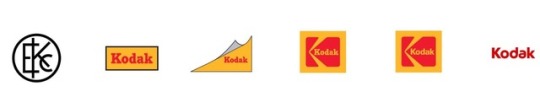
A key common feature of most global businesses is that when they change their brand identity, they redesign their logos also. Kodak is one such global enterprize which made vital changes periodically in its logo.The Evolution of the Kodak logo began in the nineteenth century and continues even today.
The Kodak logo is one of the iconic symbols that everyone recognizes across the world in the photography business and industry. But this simple design went through a lot of changes over the decades.
The Kodak Logo Colors
The Kodak logo is recognized for its strategic color scheme. The color scheme involves the use of only two colors red and yellow. Red dominates due to its overwhelming use in the design. Yellow is sparingly used but it catches the eye.
Kodak Logo Colors
These colors surround the letter ‘K’ in the design. The use of red in evokes a set of emotions like passion, love, happiness, and optimism. Similarly, yellow is the color of sunshine and hope.So,the company connects people’s passion and joy when they take photographs of family, occasions, nature, or anything else.
The Fonts
The Kodak logo had the company name in serif fonts in the initial phase. Serif fonts express a formal environment of a company or profession. The company wanted to project an image of a professionally run business. Hence, it created the company name in serif font. Later, it realized that the photography business should directly connect with the people. Photography is something that people use to express their joy on an occasion. So, the serif font was removed and a simple and friendly sans serif font was brought in. The Kodak logo, in fact, went through some design changes in its history of more than a century
0 notes