
Last Seen Blogs

spider-beep
now at fourdaysofrain!

lickitflat
Mostly About Hairy

unlikelyprincesscrusade
제목 없음


98769876me
Untitled
Text
Semiotic Analysis
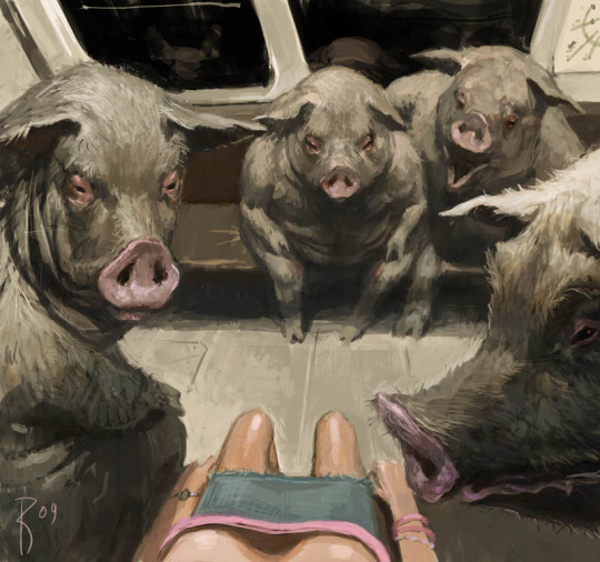
Art can be used for many things, no matter what it may be, we the viewers can have different interpretations. Depending on what may be the subject or the signs being depicted in the art, it can have many different meanings. In this case, I would like to look into the artist Waldemar-Kazak on DeviantArt, this specific piece was posted on April 6, 2009. They used a digital medium to create their work.
What can be understood at first glance from this piece, is presumably a woman who is being surrounded and stared at by pigs on the metro. By making the woman the center of the art, this places emphasis on her and also by using most of the colour in this piece on her clothing. In other words, her cute pink top with matching accessories and her denim skirt. This makes the viewer feel as if they were in her place while viewing Waldemar’s art. What adds to this is, when the viewer follows the eyes of each pig, they could see it leading towards the woman which also adds to the feeling of being preyed upon. Each of the pigs are drawn with a rough and hairy body that contrasts the smooth and almost delicate skin of the woman. Realistically, we wouldn't see pigs casually sitting on the metro with people, which is why we should interpret their presence metaphorically.
By looking at the context, it is basically saying men are pigs, to understand this we must understand the different signs shown. Such as the animals who are seated on the metro however, they show human behaviour by the way they sit and mannerisms. These animals are in fact imitations of the true object the artist is trying to portray. The way we can make this connection is, as I have mentioned before, is the way they all stare at the woman in the center of the image. Them being pigs indicates the animalistic nature of hunting down a prey. Just as how men shamelessly stare at women for their own self-pleasure like it was an instinct, such as a beast hunting to fill its belly. The pigs themselves look more like boars who are known to be more aggressive and have even killed people before. The ones in the image do not have tusks, or you can go as far as saying they might be hidden.
As a woman, it reminds me how no matter how docile a man may seem, they all pose harm to me. In everyday life, women are subject to verbal and physical harassment which are acted out majorly by men. We can effectively deduce the message being sent to the viewers, “you are not safe.” And how the artist puts into creation the quote “men are pigs.” I believe this was communicated perfectly in his art, from the unease I felt being stared at by these beasts to the melancholic atmosphere created by the lack of saturation in the palette.
Citations:
Kazak, Waldemar. Moscow Subway. 2009, DeviantArt, Russia.
https://www.deviantart.com/waldemar-kazak/art/moscow-subway-118374090
2 notes
·
View notes
Text
WORLD PRESS PHOTO EXHIBITION ANALYSIS - KAMLOOPS RESIDENTIAL SCHOOL - AMBER BRACKEN

Many have used their voices to spread awareness on how European colonization has deeply affected Canada’s Indigenous people. Henceforth, Amber Bracken, a Canadian photojournalist whose images expose the issues surrounding Indigenous people in North America. The image demonstrated was taken on June 19, 2021. Notably, the first thing you see when observing the image is a very vibrant orange dress hung up on a wooden cross followed by even more dresses hung down a path of crosses. Immediately, these can be recognized as tombstones or a kind of memorial for the deceased that are placed along a path. There is also a rainbow seen in the back, whose presence usually uplifting, might deceive the viewer of the true meaning behind the image. Amber’s photojournalist style helps divulge the event portrayed in the image to its viewers. I was even shocked to discover the horrible and unjust history behind the image. Hence the title “Kamloops Residential School”, this image commemorates the children who died at the Residential School by representing them with the oranges dresses. Amber’s photograph emphasizes the orange dress which could be chosen as reference to Orange Shirt Day. Which in fact is an important colour to remember Indigenous history and the legacies of the many victims. Sadly, the bodies were only discovered last year in May, 2021, even though the school was still operating from 1890 to 1969 and was later turned into a day school residence. With further observation, the golden light which the sun reflects on the dress creates a melancholic feeling by contrasting the murky and dark sky in the background. Reminding the viewer that the 215 innocent and bright children were taken away from their families and brought to a place of abuse and were stripped of their culture. In addition, the continuous line of dresses hung over the crosses creates a rhythm which drags the viewer's eye along the path and creates a sense of longevity. Notably this path leads to the school in question and yet the picture is taken with only nature in its surroundings. Therefore we understand that there are many more crosses we must pass before reaching the former residential school. The attractiveness of the bright orange colour and beautifully captured scene will attract anyone to this amazingly taken photo. The audience could be anyone, by having our children learn history through this image or adults appreciating the effort and thought put behind Amber’s photojournalism to tell the stories of those who might’ve been long forgotten. Coupled with those in-between these 2 demographics, who will lead the next generation and are old enough to create change and help support Canada’s Native people and protect their culture. As I am someone who is part of this age group, seeing this image invoked nostalgia from the warm light and greenery surrounding the pretty dresses, reminding me of my childhood. And yet I felt a hidden hope deep in my heart, when reading the description I then understood why. I must learn from their history and keep their legacies alive to remind myself and others that we must use our power to protect those who face injustice.
1 note
·
View note
Text

The success of many companies depend on advertisements to sell their product to as many customers as possible. Since we live in a world of consumerism, millions of dollars are put into the industry, like marketing, media services and advertising agencies. However once in a while we see an advert that isn’t selling a product but is selling an idea, is raising awareness or spreading a message to its consumers and giving meaning to its creation. An example of this comes from a company called Wall’s, a British Ice Cream seller and Frozen dessert brand located in the United Kingdom, it is one of many other food brands owned by Unilever. In this image, to make it attract as many eyes as possible, it leaves a feeling of depth with the space around the cone. It has a lighter value of colour behind it to contrast the darkness of the cone and emphasise its presence. In addition there’s a defined contrast between the hard and texturized cone in comparison to the smooth background. The missing ice cream on top was also strategically removed, seeing a cone without the refreshing dessert layed on top is kind of sad. Looking closely at what’s written underneath: “We’re Sorry” and “there will be a global shortage of ice cream due to global warming”. This represents the global shortage of ice cream which is mentioned on the advert, our global temperatures have reached a height where eating ice cream is practically impossible. The heat-waves and bipolar weather are affecting our daily lives and simple privileges are being taken away because of this. As a result, there’s this sort of irony where an ice cream brand is apologising because they can no longer provide the one product their entire brand is focused on. On another note, this advert draws attention to an environmental crisis and political movement to the crowd with no interest in the marketplace. It is viewer friendly and can attract anyone from teens and over, however its lack of vibrant colours might fail to catch a child’s attention. Conversely, its demographic is not children but to those a bit older who can understand its message and can make change. Many might see the advert and negotiate its meaning. What I mean by this is, there are many who believe global warming is a hoax and to some degree, proganga. Its negotiated reading might spark some controversy within its viewers but in the end, it is portraying effectively a growing problem for our world. Nevertheless, I believe the content and simple design make the message easy to digest as a consumer of mass produced and repetitive commercials. It doesn't try to bait viewers with flashy or scandalous imagery. It sparked my interest since it was presented in such a simple manner and communicated a clear message. I wasn't looking at a man riding a horse on a beach, only to realise it's a perfume ad. Personally, this ad is a great example of how to spread awareness on a serious matter without scaring the audience. It uses contrast to attract the eye then gives meaning to its message by explaining it in a playful manner. The missing ice cream and apologetic tone of Wall’s advert doesn't stress the viewer but makes them try to understand where this ad is coming from.
0 notes
Text
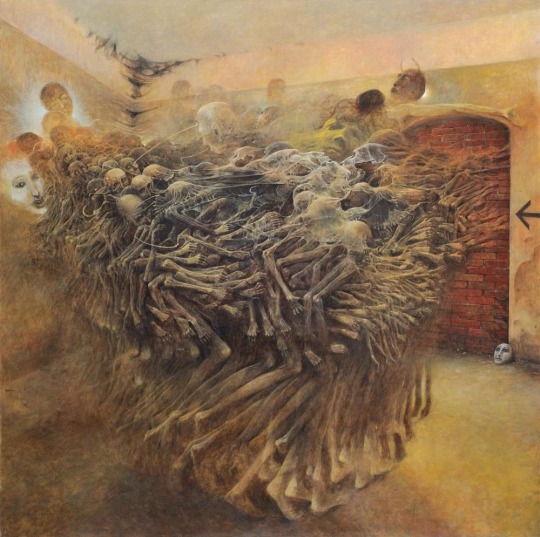
In the capital of Sanok County, in southern Poland, was born Zdzisław Beksiński, on the 24th February 1929. During his early life, his country was occupied by Germany and was subjugated to oppression and genocide, as Poland in this time, was hugely composed of Jewish people. There were camps set up on the outskirts of his birth land for 3 years. He experienced death, watched his people crumble before him and grew up during a very terrifying time for the world, the second World War. I believe this shaped him from a very young age and affected his art even if unintentional. His work “Untitled” made in 1980 is one of many which do not have a name. However many know it as The Cursed Painting. Zdzisław Beksiński created his paintings inspired by the Baroque style. These Arts were very popular in the early 1700’s and were meant to capture the viewer's attention. In addition, he studied Architecture which gives his paintings a Gothic style. That is to say, what can be derived from this painting at first glance is the skeleton-like bodies.
To begin with, a harmony is created by the movement created by the continuous pattern of arms, legs and heads all moving to one direction. This creates unity within the chaos of the oil painting which attracts the eye. They seem as if they were to be as one all together, but the longer you look, the more bodies seem to pop out of the bunch of despair ridden figures.
On top of this crowd of death, there’s a sheer white layer that takes the shape of a face. Its smooth texture and flowing state remind me of something ghostly, it’s almost as if the souls of these corpses are being sucked out of them.
As I look closely at the subjects of this painting, their bony structure and pale skin complex reminds me of starved people. In this case, they already seem to be on the brink of death. Observing the painting further, there is much to interpret from the space around it. Looking at its surroundings, it seems as if they were trapped. The murky walls and dark webs hang at the corner, almost as if ashes or dirt were stuck to it. The only escape being blocked off by bricks, many of these poor souls claw at the exit desperately and yet it seems as if their fate had already been decided. There is no escape. Having that said, the historical background of the painter makes me believe this is a refenrence to the holocaust, as I have mentionned before, there were camps set around his homeland. The victims of the War, trapped in a room, their fates tied to death with no way out.
Seeing this painting for the first time I was overcome with unease and horror. Seeing such deformed bodies all cramped and pushing against each other made me uncomfortable. I’ve never seen anything like it. However I couldn’t pull my eyes away from it, it made me question what a person must go through to create such a painting. All I understood from it was the despair I felt from seeing the poor disfigured humans struggle. The painter had always said that he had no need for meaning, that it was meaningless to him. He wanted the viewer to interpret the painting as it was, and to enjoy it for what it was. It piqued my curiosity as I had known nothing of its history nor creator. Even if symbolism has no meaning for him, I’ve learned that his art will always be connected to each other and have been influenced by his life experiences. After my formal analysis, I was able to better understand what was portrayed in the painting and to better appreciate it. To look beyond the paint smeared over the canvas.
In the end, Zdzisław Beksiński used oil paints to create his art as they are the best way for him to bring his visions to life. As he has said once before; “I wish to paint in such a manner as if I were photographing dreams.” He paints dreams he says, as for me, they remind me of the nightmares that haunt my mind.
0 notes


Text
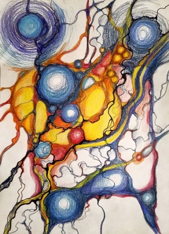
Neurographic art (NOT MINE)
This image really inspires me to be more loose and just have fun with my art. The process of drawing is very important to me and i enjoy creating what makes me feel good. The main point of neurographic art is “working with the subconscious mind”. Seeing this kind of drawing shows me that expressing myself is not the only reason to why i should make art but to heal myself and sort out my thoughts. Seeing art other than what is on the mainstream helps me be more creative and be confident that my art shouldn’t look a certain way. This image is one of many that i inspire myself from, to the variety of lines and shapes, colours used, I want to try all of them.
1 note
·
View note