sophierattueba2a
Sophie Rattue BA2a
151 posts
Last active 3 hours ago
Don't wanna be here? Send us removal request.
Last Seen Blogs

kharmenmanzano45
Sin título

anjuramam
Untitled

octoberautumnbox
October's Autumn Box

cybertechal
CyberIT-Me

Video
Household Robot Updated Version
To finish this animation, I masked out the remaining bubble and added more ease to the bottle as it falls into the second chamber. Now, it actually looks as though its floating through a liquid.
I also added some sound effects. To begin, I realised that the bubbles are constantly moving, so they would constantly be making a noise. I found a cauldron sound effect online and I think it works really well to convey the idea of bubbling liquid. I also changed the volume to rise as the bottle dissolves, just to emphasise what stage of the process it is in.
For the bottle’s sounds, I found a plastic bottle and hit it on a table to create the noise of it bouncing into the robot’s interior. Then I crushed it to create the crinkling noises.
The Iron Giant’s mechanical sfx came in really useful for the mouth shutting, crushing pistons and printing nozzle. When I thought about what kind of noise the pistons would make, their movement reminded me of pneumatic animatronics. Over the summer I got really interested in researching entertainment animatronics and how they work, and found that although today’s versions are usually some kind of robot, older ones were controlled with compressed air. Which is surprisingly loud when there is no music to drown out the sound.
The valves in this animatronic are so small they sound like popping:
youtube
With this much larger pneumatic cylinder, you can easily hear the pressurized air being released
youtube
So, I chose an air release sound for the pistons and I think this works quite effectively.
0 notes
Text
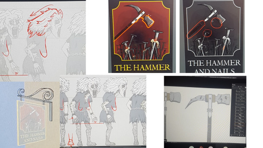
Most influential images of my character design project, cited
(Click keep reading)

(2018). https://folkhorrorrevival.files.wordpress.com/2018/08/164-banshees.jpg. [image] [Accessed 11/02/21].

Found on Google images, original listing for this hammer no longer exists, but the origin of this image is https://www.medievalcollectibles.com/product-category/weaponry/medieval-pole-weapons/war-hammers/

Sola, B (2016) Available at: https://www.artstation.com/artwork/YGAEK [Acessed 11/02/21]
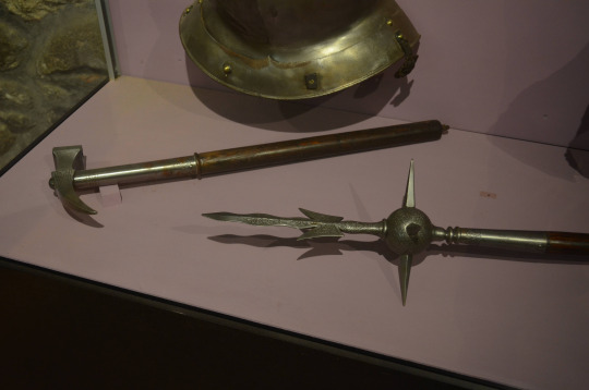
Warhammer posted on Reddit in (2017) https://www.reddit.com/r/history/comments/5wscaz/were_war_hammers_actually_used_in_medieval_battles/ [Acessed 11/01/21]
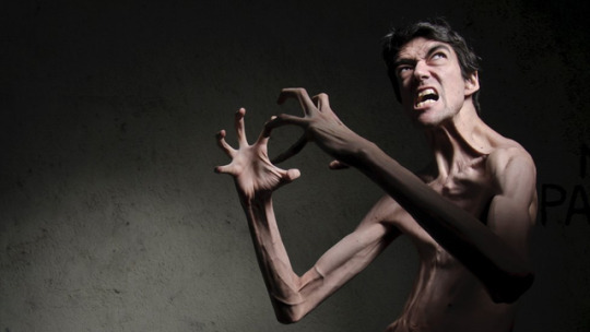
(2019). Javier Botet: Meet the actor behind Hollywood's monsters. [image] Available at: <http://_107095507_a06e0829-0c15-4a95-8b99-7079fa7f6789.jpg> [Accessed 11 February 2021].

Kim, J (2017). Mother Gothel. [image] Available at: <http://_107095507_a06e0829-0c15-4a95-8b99-7079fa7f6789.jpg> [Accessed 11 February 2021].
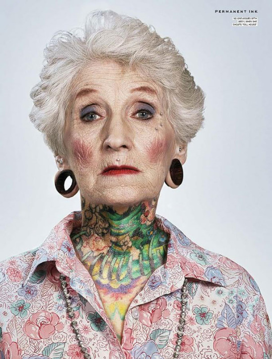
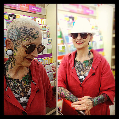
Original image seems to be from Permanent Ink, but I could only trace it back to (2016). 41 Tattooed Seniors Answer The Eternal Question: How Will Your Ink Look When You’re 60 Available at: https://www.boredpanda.com/tattooed-elderly-people/?utm_source=google&utm_medium=organic&utm_campaign=organic [Acessed 11/02/21]
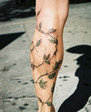
McNamee, C (2013) Available at https://www.pinterest.ch/pin/705728204086327728/ [Acessed 11/02/21]
Original image apparently from polyvore.com but is n longer there.
(2016) Available at https://www.pinterest.at/pin/45106433752285023/ [Acessed 11/02/21]

Milos, B (2018) Available at: http://www.brendanmilosart.com/blog [Acessed 11/02/21]
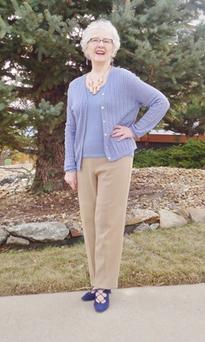
Available at: http://www.gmcshahdol.org/nail.aspx?cid=748&shop=fashions+for+70+year+old+woman&xi=1&xc=23&pr=48.99&you=0

Professor Hubert J. Farnsworth. Available at: https://www.syfy.com/futurama/cast/professor-hubert-j-farnsworth [Acessed 11/02/21].
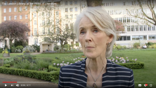
Screenshot from: The London Library (2016) The London Library: at the Heart of Literature. Available at: https://www.youtube.com/watch?v=8dd2tPNtz80 [Acessed 11/02/21].
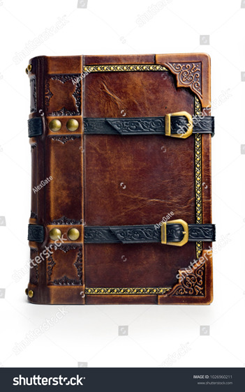
alexlibris, Old leather bound book with the gilded frame, leather straps and brass buckles.The book is captured isolated. Available at: https://www.shutterstock.com/image-photo/old-leather-bound-book-gilded-frame-1026960211 [Acessed 11/02/21].
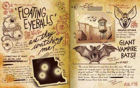
(2016) Gravity Falls: Journal 3, Available at: https://www.barnesandnoble.com/w/gravity-falls-alex-hirsch/1123577136 [Acessed 11/02/21].
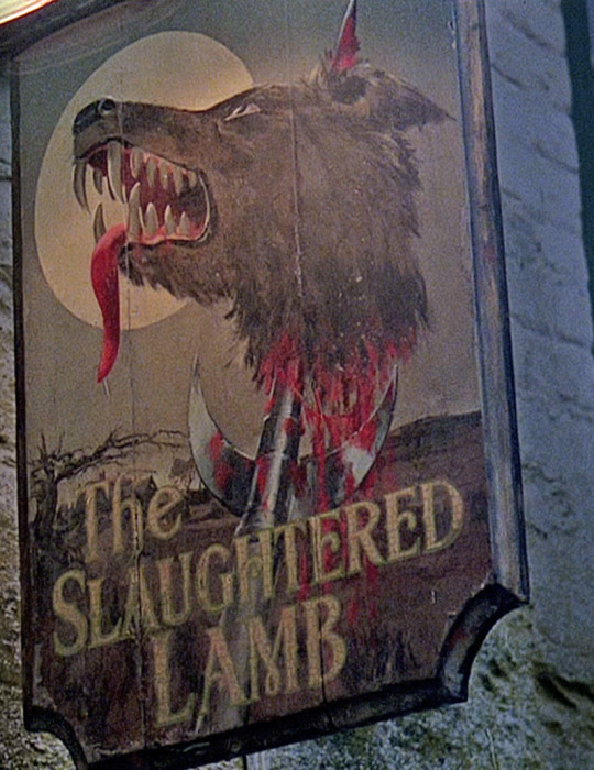
Screenshot from: Landis, J (1981) An American Werewolf in London. Polygram pictures, USA.

Panel from L Stevenson, R (1943) Classics Illustrated -013- Dr Jekyll And Mr Hyde.
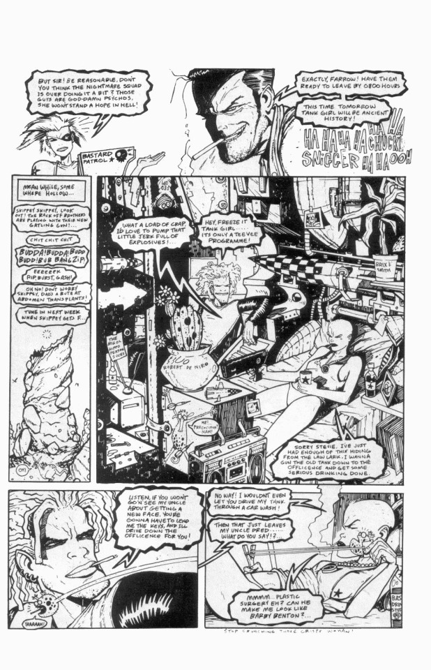
Hewlett, Martins (1990) Tank Girl: Get Knotted!. Clays Ltd England P.35
Screenshot from: Talalay, R (1995) Tank Girl. MGM United States [film]
1 note
·
View note
Text
Evaluation of Character Design Project
I feel like I have challenged myself in this project. I found scriptwriting really inspiring and fun and I wanted to carry this through into my designs. By creating such a complex character (especially when compared to my last character design project) I have pushed myself to improve my eye for detail- making sure every limb, eye, tear, mouth and dress looks consistent.
I believe I have been successful in designing an interesting character with a unique look that seems menacing, but also has appeal. This is especially prevalent in my pose and expression sheets, where alongside her more evil looks, she also has comedic, relatable ones that depict her boredom and sarcasm.
And I feel successful in fleshing out her world in-depth with multiple props and the backstories behind them. I also think my turnaround animations look smooth and keep a consistent volume.
I do have room to improve in how I research however. Although I did look at a variety of sources, I’ve learnt that I need to spend longer studying each one, especially when it comes to anatomy and posing. Whilst I like what I’ve created for the pose sheet, I probably could have pushed it even further with more dynamic positions.
So, when designing my next character, I think it would be beneficial to produce multiple pages of loose gesture sketches before finalising any poses. This way, I will get a better feel for how the character moves and a better performance with dynamic lines of action.
0 notes
Photo
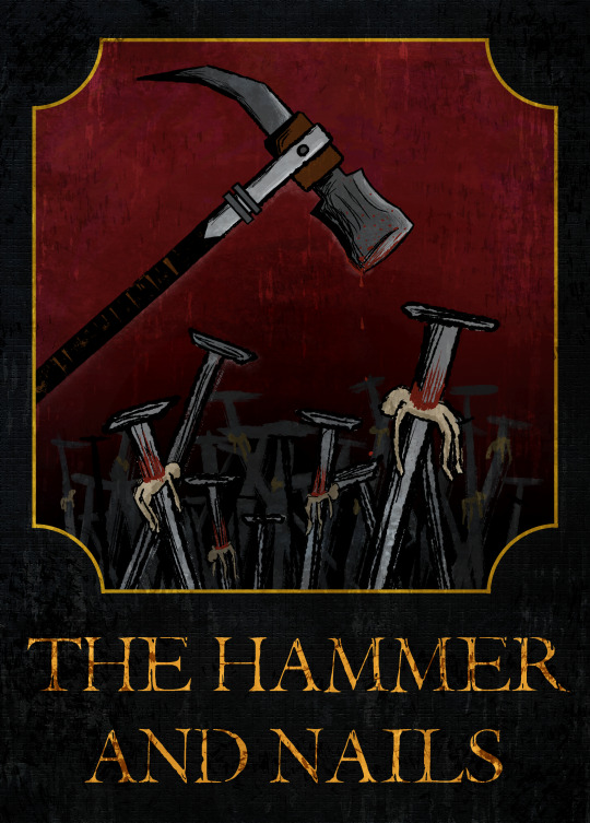
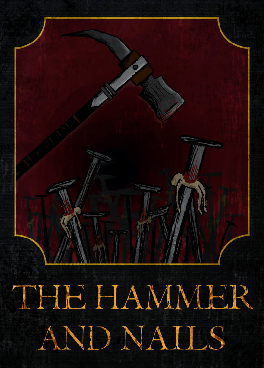
Sign update
In this final iteration, I added a gradient to the red background and moved the black vanishing point behind the nails. Now, the hammer is clearly defined and by making the space behind the nails darker, they seem like they have more depth.
Although this was originally going to be a side project just to have fun fleshing out the world of my character, I’m glad I’ve spent time to improve it. I’ve learnt a lot about values, and how the most important parts of an image should have the most contrasting value compared to the rest of the composition. I’ve also learnt about adding texture really quickly by changing the layer mode in Photoshop.
0 notes
Text
29/01/21 Tutorial
-For the pub sign: look at Children of the Corn poster- try a gradient to change where the black gradates into red- leaves more space for hammer.

(from google images)
-If time push poses on pose sheet
Since we are now coming up to deadline there are things for other projects that I want to prioritise over changing my pose sheet. However, as I said in my hands workshop post, I’ve now seen how important it is to find the line of action in photo reference and I hope to take what I have learned into the next creative project.
0 notes
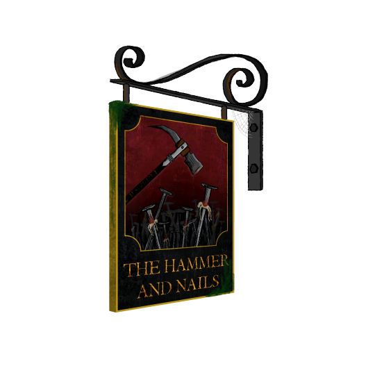
Photo

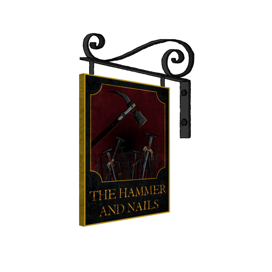
Pub sign update
In this iteration, I adjusted the levels in Photoshop to make the red background even lighter. Now I think it is much more readable- I can easily make out the shapes of the most prominent parts of the image and more clearly see the texture.
I also added some rust, moss and a cobweb to the hanging sign (hard to see on white, you may have to click the image) which I think added more character and now I can actually imagine it as part of a scene in an animated film.
0 notes
Photo

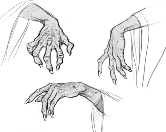
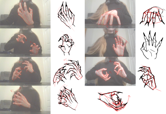

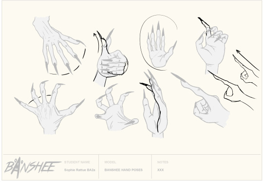
Dan Kelby hands workshop and hand sheet update
A couple of days ago, we had a workshop with Dan, where we traced over pictures of hands at different angles- finding the shapes that make up a hand and the direction of the fingers. Then, using what we learnt, we traced over animated hands and tried to redraw them without tracing using the basic shapes.
I found this workshop really interesting. I’ve never really enjoyed drawing hands or thought I was very good at them. But after learning about what shapes make up a hand and how to use reference to create a base that you can then bend and exaggerate, I found myself enjoying it and producing better work than I have before.
Because of this, I wanted to go back to my hand sheet and add a few more poses using what I’ve learnt. I took some photos of my own hands, which I then traced over to find the shapes and lines of action, and redrew them as the Banshee’s; exaggerating the length & knuckles, as well as the bones on the outer part of the hand. I used concept art of Mother Gothel’s hands as further reference.
By doing this, I was able to make some iterations that I am really proud of- that have dynamic poses and realistic proportions. This has also shown me the importance of studying reference. I think if I had the time to start this project again, I would have spent more time studying anatomy and the photos I took- tracing over them and finding the shapes that make up a body. I’m still really proud of what I have been able to achieve but from this point onwards, I am going to put more effort into making observations and studying reference before moving into sketching ideas.
Gothel Hands concept art: Jin Kim (2017) available at https://theartofjinkim.wordpress.com/2017/05/26/mother-gothel/ [Acessed 01/01/21]
9 notes
·
View notes
Photo
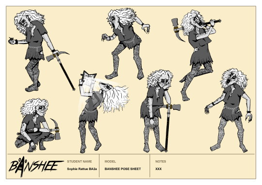
Pose sheet update
For the lower right pose, I used the transform tool to bring both arms down & turn the arm on the right so the shoulder lines up with the body at a better angle.
I also rotated the entire torso to the right and turned the head to face upwards. Then, I straightened out the left leg and brought it closer towards the body.
With all of these alterations, I think the pose has a much better flow of action and the proportions seem more realistic.
1 note
·
View note
Photo


Mouth Chart update
I looked through The Animator’s Survival Kit to see if there was anything about lip-syncs and mouth shapes and confirmed that the jawline is generally animated to move with the mouth. So, I went back into my mouth chart file and brought the jaws up on the positions where the mouth is more closed. I also brought the cheeks up to partly cover the eyes on positions where the corners of the mouth are stretched outwards (like on the ‘ee’ and ‘d’ sounds).
With these alterations, I think the mouth shapes look more believable now and if I were using this chart as reference to animate something, not only would I be able to see how the mouth moves, but how the face moves with it too.
Lower image: Williams, R., 2009. The animator's survival kit. London: Faber and Faber, p.309.
1 note
·
View note
Text
22/01/21 Tutorial
-Play with the eyes in the mouth chart, usually there is some kind of movement on sounds like ‘ee’ and ‘ch’
-Lighten the pub sign a but more and maybe add some moss & rusting
-On the shocked pose (bottom right, pose sheet) the arm is jutting out at an old angle and line of action could be clearer.
-lines of action on all poses could be pushed a little more
-For the hand sheet:
straighten out & stretch the pointing hand, bring knuckle down
Arc on the thumb in the thumbs up and move knuckles to make more of an arc shape than straight across
extend a couple of fingers to add more variety and movement to positions
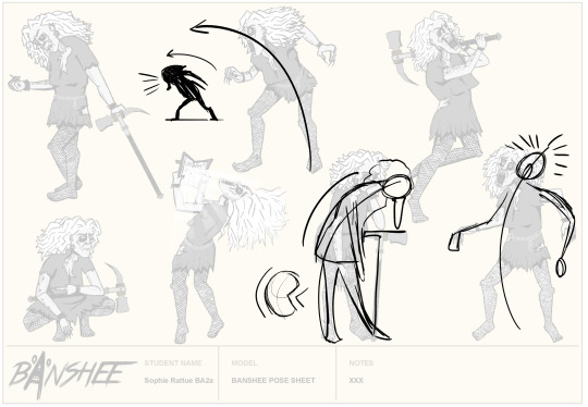
(Dan’s notes)
I thought earlier that I could improve the mouth chart, so I’ll get to work on changing the eyes and jaws to fit some mouth shapes more accurately.
Personally I really like the look of my poses, but I do agree that the lower right’s arm is placed a little awkwardly. I will improve this, and possibly if I have time I might redraw or edit some other poses to exaggerate their line of action.
I will also make all necessary changes to the hands.
1 note
·
View note
Photo
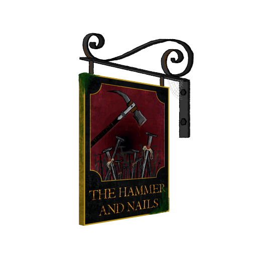
Sign update
I adjusted the levels of the sign to try and make the hammer more visible, which I think has improved this a little. However, looking at it now on a white background instead of the grey in Photoshop, I may need to lighten it a bit more.
I also added some wood texture using some images I found in Adobe Stock, Which I placed over all of my layers, turned the opacity down and switched the layer style to soft light.


I love how this extra layer of detail instantly made the sign feel like real, aged wood, giving it an even more ominous (and realistic) look.
I then used the perspective tool to turn the sign into a 3/4 angle, and the line tool to add a golden frame to match the sign’s border. Then I used a flat brush to draw out the shape of the metal hanger, and used this as reference to draw the outline.
This looks much more polished than my last attempt and I don’t think I will include a wall in this iteration as it’s not really necessary for understanding what this is.
Next, I’ll see what feedback I get but I will probably have to lighten the sign a bit more.
0 notes
Text
Adding texture to book & hammer
I used the same brushes that I used to add texture to the pages to rough up the surface of the cover a bit. Even adding the same speckles of green to the outer edges to look like it has been damaged & frayed over the years. I also added texture to the straps and spine to keep everything looking consistent. This is a vast improvement, it has given the book a real tactile feel & more closely resembles cracked, old leather. Again I don’t think there is anything else I want to improve upon in this design, so unless I get further notes I am pleased with this as the final product.


For the hammer, I used the runny inker brush to add some scratches, and a splatter brush to add faint, black specks of dirt and dried, red blood droplets. As well as a pastel textured brush to add dried bloodstains on the face of the hammer. To make the markings consistent, I drew them all on one layer starting on the side view, then duplicated the layer, brought it over to the 3/4 angle and used the transform tool to fit it to the shape of the spike.

Comparing this to my previous version, I much prefer having all of the details, they add a sense of history to the prop and raise questions about how it might be used- whose blood is it? how old are the stains? What happened to cause someone to do this?
Just like the book, I don’t think there is much else I can add to this design without overdoing it and spoiling what I have so far. So, unless I get further notes, this will probably be my last iteration.
0 notes
Photo


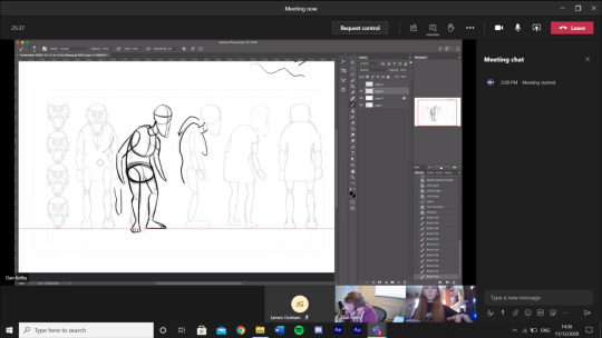
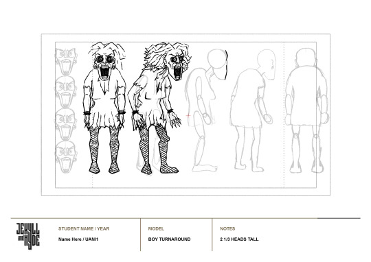
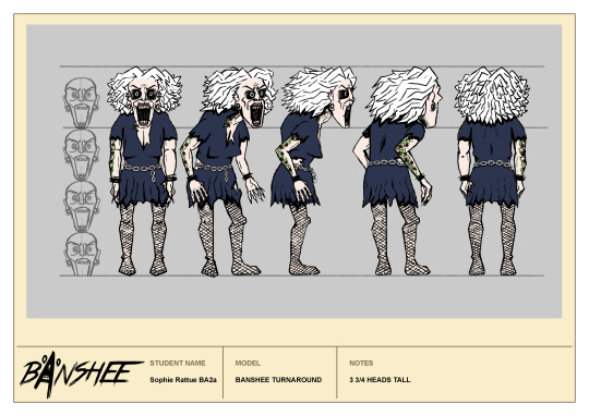
Turnaround and Line-up update
As suggested, I brought up the back hand on the 3/4 view and redrew the Banshee’s front-facing feet so that they are now in line with the floor and I can see now why this is an improvement- the perspective feels more consistent and I think this will make the movement of the feet & arms look smoother in the turnaround animation.
I also brought the leg down in the character line-up and this now feels like a much more solid pose.
I tried changing the shape of the hair but this didn’t feel right, it doesn’t have the same impact as the previous version & doesn’t feel as big and crazy. So, I’ll stick with what I had before.

As I expected, the feet now look a little smoother, and the hands no longer look like they are coming inward on the front/back views- their position feels more consistent and the movement a lot smoother.
0 notes
Text
21/01/21 Feedback & advice
Before the tutorial tomorrow, we had a session with Dan where we shared our work and discussed what could be improved upon. He suggested:
-In the hand poses- bend some fingers to make the pose more interesting, instead of having them all in the same position
-Add some scratches and texture to the hammer- dried bits of blood, make it look more used & old- like it has history.
-Add some texture to the book cover as well- the blended brown of the cover looks a little too smooth, texture might make it feel more like leather
-Lighten the gradient on the pub sign, or alternatively lighten the hammer- the values are too similar so it’s hard to define the shapes in the sign. I could also add some wood texture by finding some stock images and overlaying it with the soft light layer style.
-In the line-up and turnaround, the banshee’s feet still doesn’t touch the floor in some places- make them flat to the ground level.
-Bringing the hands out on the front & back views of the turnaround might fix the ‘pop’ in the animation.
-Bring the back arm up a bit on the front 3/4 view
Maybe position the Banshee’s hair downward so it has more flow
I think I can get most of these changes done by tomorrow, most are just small alterations or adding texture. I’ll try changing the shape of the Banshee’s hair but I really like its current odd shape- it looks almost like a mane.
0 notes
Text
Turnaround update
Taking Dan’s notes into consideration, I began to line the poses for the Banshee’s turnaround. During this, I exaggerated certain features like the hunch & brought the arms further out to create a more well-defined silhouette.
In my sketches, I mostly used circles and rounded shapes to create the volume of the body. So, for the clean-up I also added more straight & curved lines, to define her shape and look more coherent with my chosen art direction. I think this is a great improvement, her pose is easier to read and looks less stiff. I was also able to duplicate it and use it as a base for the back 3/4 view, which now looks much more accurate.
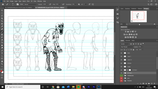
I also made sure to line up the feet so that they all rest on the same level- which immediately made the poses feel more believable. And, I added a kink to the neck, which I think emphasises her age and fits really well since the rest of her body is also quite angular.
I saved some time by re-using the leg from the 3/4 view for the side view (something I learnt in the Santa turnaround workshop) and duplicating & flipping the front and 3/4 views to use as a base for the back views. Then, I just followed along with the guidelines to draw in the rest of the details
For the hair, I outlined the basic shape first, then added random angular lines directed towards the back of the head. I think this will look ok in the turnaround because we don’t see the same angle of hair twice, so its detail doesn’t have to be completely consistent.
To finish, I added some block shading around the legs, chest and dress folds and coloured it by eye dropping my cast line-up page.
Since this design is asymmetrical, with a tattoo on one side and two tears in the dress, I hade to make sure these details were positioned consistently. The front & back views I could leave as is, but for the side & 3/4s I had to duplicate them, flip them, then erase what shouldn’t be visible. I then duplicated and flipped the tattoo to add to the other side, and drew in the tears in their correct position.
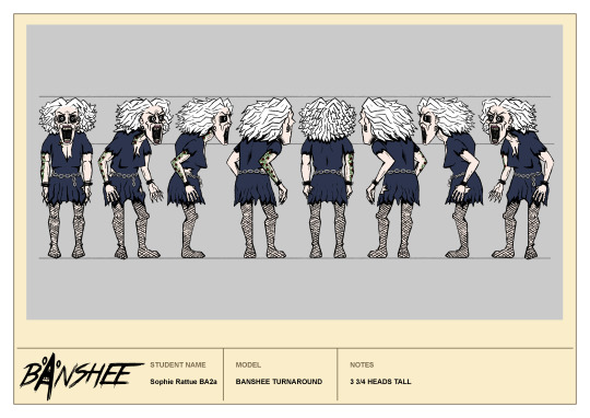
The, to animate I used the same method as my prop and used the timeline tool to play each angle in sequence.
Overall I am so pleased with this turnaround. This character is more detailed than anything I’ve tried to animate before and I think I was successful in keeping her volume and the shape of her body consistent. I was worried about the hair and fishnets looking too jittery but they actually seem ok, like we are seeing them at different angles instead of just changing their pattern randomly.
I may try to improve the hands however, I think I drew them too close to the body so they look like they move in as we see the front & back views.
1 note
·
View note
Text
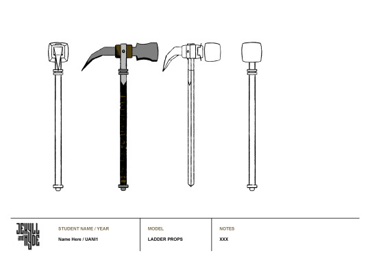
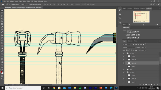
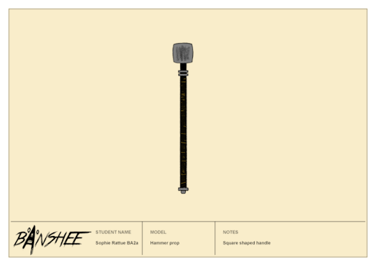
Hammer turnaround
To make the turnaround for my hammer, I firstly placed the side view I’ve already drawn on the canvas and added guidelines to each main section (then smaller sections as I added more detail). I began with the front view, copying & pasting the outline of the handle from the side view, then re-shading it so its texture would look slightly different. Then, since the face of the hammer is so large and reaches the highest point of the whole prop, I only had to draw the shape of its surface to match up with the guidelines (the back spike is obscured by the handle).
Then, I decided that because this is an antique hammer that has likely been used, I should scuff up the surface, so I used a textured brush to add a sense of roughness.

After that, because I had the back view, I could just duplicate it and add in the back detail.
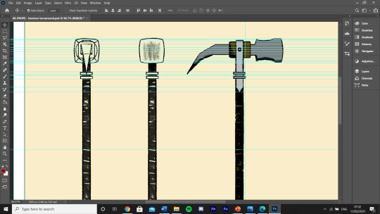
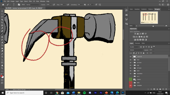
I was having a lot of trouble with the 3/4 view trying to figure out how to draw the perspective of the 3 metal rings that wrap around the handle. I thought I would need to show the top of them since you can now see 2 sides of the square handle. However, I experimented by wrapping a piece of blu-tack around my pen and realised that if you are looking at it straight on- the rings will always look the same. A bit of a silly mistake but without checking I probably would have rings that wobble around in the animation.
I also used blu-tack to create a quick model of the shape of the spike. it doesn’t translate well on camera but this was really useful for figuring out what this part of the hammer looks like at different angles.

Once I had drawn the from 3/4 view using the guidelines and blu-tack as reference. I was then able to duplicate it, flip it horizontally and re-draw the hammer head to fit the perspective. The outline of the spike didn’t need any adjustment, I just had to add some lines to show its top & side faces.
To finish, I added some block shading and colour to each angle...

Made sure to soften some shaded areas with parallel lines...
and changed the middle outline on the handles of the 3/4 views to white. This is because the handle is meant to be square, so hopefully this will give an indication of an edge.
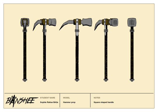
Overall I am really pleased with all of the angles. It took a while matching up each detail so I had to use a lot of guidelines, but the result feels very accurate & technical.
To animate, I took each angle into another photoshop doc, made duplicates of the side and 3/4 views, flipped them horizontally and placed each drawing on top of each other. Then, I used the timeline to show each angle in sequence.
This looks so smooth and I can’t really see any jittering, I love how consistent in shape and volume the back spike is, and how you can get a real sense of what this object looks in a 3D space. I don’t know if there is much I would improve, maybe some more detail on the upper half but I kept it flat to look more coherent with the Banshee’s colouring. I’ll have to see what notes I get about this in the next tutorial though, but for now, I’m eager to take what I’ve learnt here into the character turnaround.
0 notes