scrambledlikeeggs
I guess i'm really doing this now...
Welcome! Call me Scrambled,
sometimes I write, sometimes i draw, but most of the time i'm thinking about doing it
408 posts
Last active 60 minutes ago
Don't wanna be here? Send us removal request.
Last Seen Blogs
zacharia1-blog1
Zacharia 🤘
carolineskingdom
::brave princess::

no-sir-i-do-not-vibe
Ugh, me.

bisnismantapyoel
yoel-bisnismantap
aguantame
Question, Create, KickAss.
Note
ask game for scrambled scrambledlikeeggs
🖍️ When did you start drawing? Do you remember?
🙃 Which is easier: faces facing left, right, or front view?
📚 How many layers do you typically use?
🖍️- I actually know this one, there no real age where I started, I’ve always liked art and been good at patterns and shapes but when I was (11?) I started collecting my drawings inside a plastic wallet which could be located now if I wanted to- but it’s mostly full of stock ‘ anime’ style stuff and reminiscent of early art YouTube
🙃- front view I think just out of habit and expression work
📚- too many. Previously when I worked on Krita it was 5-12 now on csp 32-50 because a) I’ve been doing more complex pieces and b) I I get bored to easily I just add another layer like that will solve my problem
1 note
·
View note
Text
Joel’s latest video has made me question things and I need to know
When you see Mumbo’s skin do you interpret it as having eyebrows? Please feel free to elaborate in the tags and reblog for larger sample size!
#Like eyeshadow? Deep set eyes? Eyelids in general#like his eyes are like this: ¬ ¬#(scrambled reblog)
261 notes
·
View notes
Text
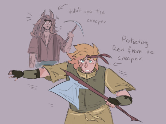
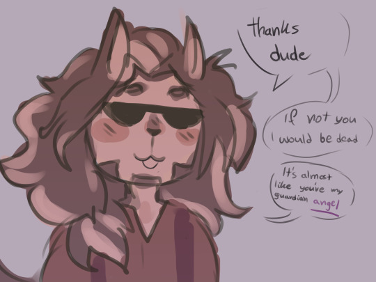
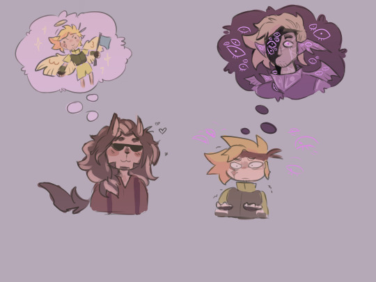
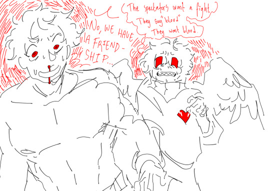
@treebarkweek : Day 4 infernal / divine
something something Ren meant the stereotypical angel with you know one pair of wings and a halo and stuff, meanwhile Martyn imagined a biblically accurate one and became terrified of the thought that he reminds Ren of a watcher
that moment when your liege compares you to your worst enemy-
#I FOUND YOUR ART :DD#——> treebark fic writer you commented on#it made me very happy#i freaking love this
911 notes
·
View notes
Text
Written primarily for @/apollothetransboy’s @treebarktitleswap event which I have finished. Just very late. Which happens to coincide with @treebarkweek’s day 7 prompt: blood
5 notes
·
View notes
Text
i really like ahasbands although sometimes their situation just reminds me of the one ongoing bit in Arrested development where Gob gets married due to a series of escalating dares and refuses to admit they didn't consummate the marriage and then his wife divorces him because she's in love with his brother in law (you're in love with your own brother?- no your sisters husband, Micheal, Micheal >:( -No thats your sisters brother, no i'm my sisters brother your in love with me, ME :D -i'm in love with tobias, -My brother in law?)
#trafficshipping#ahasbands#redwood#what even is this#scrambled rambles#this is more like a scrambled shit post
7 notes
·
View notes
Text
🌼Artist Ask meme!🌼
There’s probably a lotta these out there but I wanted to make one of my own! Hopefully these are fun<3
Send an emoji for each question!
🖍️ When did you start drawing? Do you remember?
✏️ Do you prefer traditional art or digital to relax?
📏 What’s your go-to canvas size?
☕ Do you do warmup sketches before drawing? (Bonus: do you have any to share?)
🙃 Which is easier: faces facing left, right, or front view?
📚 How many layers do you typically use?
🐻 Your go-to things to draw when you need comfort?
🎁 Do you prefer drawing fandom stuff or your own characters?
🌈 Do you use more warm or cold colors?
🎼 Your favorite music to draw to right now?
🙌 Draw a doodle with your non-dominant hand
📐 Whats your favorite kinds of lines to draw?
💐 Do your drawing suit your aesthetics?
🦋 Do your drawings resemble you?
✨ How often do you draw?
🌗 Is night or day better for drawing?
🍭 What’s your main art blog / what do you tag your art with?
🍀 You wish your art was more..(fill in the blank)
🌊 What’s the hardest thing for you to draw?
🙊 Share your latest silly doodle with no context
31K notes
·
View notes
Text
I am going on a run. I will go on a run I am on a run
0 notes
Text
My Favorite Cheap Art Trick: Gradient Maps and Blending Modes
i get questions on occasion regarding my coloring process, so i thought i would do a bit of a write up on my "secret technique." i don't think it really is that much of a secret, but i hope it can be helpful to someone. to that end:

this is one of my favorite tags ive ever gotten on my art. i think of it often. the pieces in question are all monochrome - sort of.

the left version is the final version, the right version is technically the original. in the final version, to me, the blues are pretty stark, while the greens and magentas are less so. there is some color theory thing going on here that i dont have a good cerebral understanding of and i wont pretend otherwise. i think i watched a youtube video on it once but it went in one ear and out the other. i just pick whatever colors look nicest based on whatever vibe im going for.

this one is more subtle, i think. can you tell the difference? there's nothing wrong with 100% greyscale art, but i like the depth that adding just a hint of color can bring.
i'll note that the examples i'll be using in this post all began as purely greyscale, but this is a process i use for just about every piece of art i make, including the full color ones. i'll use the recent mithrun art i made to demonstrate. additionally, i use clip studio paint, but the general concept should be transferable to other art programs.


for fun let's just start with Making The Picture. i've been thinking of making this writeup for a while and had it in mind while drawing this piece. beyond that, i didn't really have much of a plan for this outside of "mithrun looks down and hair goes woosh." i also really like all of the vertical lines in the canary uniform so i wanted to include those too but like. gone a little hog wild. that is the extent of my "concept." i do not remember why i had the thought of integrating a shattered mirror type of theme. i think i wanted to distract a bit from the awkward pose and cover it up some LOL but anyway. this lack of planning or thought will come into play later.
note 1: the textured marker brush i specifically use is the "bordered light marker" from daub. it is one of my favorite brushes in the history of forever and the daub mega brush pack is one of the best purchases ive ever made. highly recommend!!!
note 2: "what do you mean by exclusion and difference?" they are layer blending modes and not important to the overall lesson of this post but for transparency i wanted to say how i got these "effects." anyway!
with the background figured out, this is the point at which i generally merge all of my layers, duplicate said merged layer, and Then i begin experimenting with gradient maps. what are gradient maps?
the basic gist is that gradient maps replace the colors of an image based on their value.

so, with this particular gradient map, black will be replaced with that orangey red tone, white will be replaced with the seafoamy green tone, etc. this particular gradient map i'm using as an example is very bright and saturated, but the colors can be literally anything.

these two sets are the ones i use most. they can be downloaded for free here and here if you have csp. there are many gradient map sets out there. and you can make your own!
you can apply a gradient map directly onto a specific layer in csp by going to edit>tonal correction>gradient map. to apply one indirectly, you can use a correction layer through layer>new correction layer>gradient map. honestly, correction layers are probably the better way to go, because you can adjust your gradient map whenever you want after creating the layer, whereas if you directly apply a gradient map to a layer thats like. it. it's done. if you want to make changes to the applied gradient map, you have to undo it and then reapply it. i don't use correction layers because i am old and stuck in my ways, but it's good to know what your options are.

this is what a correction layer looks like. it sits on top and applies the gradient map to the layers underneath it, so you can also change the layers beneath however and whenever you want. you can adjust the gradient map by double clicking the layer. there are also correction layers for tone curves, brightness/contrast, etc. many such useful things in this program.
let's see how mithrun looks when we apply that first gradient map we looked at.

gadzooks. apologies for eyestrain. we have turned mithrun into a neon hellscape, which might work for some pieces, but not this one. we can fix that by changing the layer blending mode, aka this laundry list of words:

some of them are self explanatory, like darken and lighten, while some of them i genuinely don't understand how they are meant to work and couldn't explain them to you, even if i do use them. i'm sure someone out there has written out an explanation for each and every one of them, but i've learned primarily by clicking on them to see what they do.
for the topic of this post, the blending mode of interest is soft light. so let's take hotline miamithrun and change the layer blending mode to soft light.

here it is at 100% opacity. this is the point at which i'd like to explain why i like using textured brushes so much - it makes it very easy to get subtle color variation when i use this Secret Technique. look at the striation in the upper right background! so tasty. however, to me, these colors are still a bit "much." so let's lower the opacity.

i think thats a lot nicer to look at, personally, but i dont really like these colors together. how about we try some other ones?

i like both of these a lot more. the palettes give the piece different vibes, at which point i have to ask myself: What Are The Vibes, Actually? well, to be honest i didn't really have a great answer because again, i didn't plan this out very much at all. however. i knew in my heart that there was too much color contrast going on and it was detracting from the two other contrasts in here: the light and dark values and the sharp and soft shapes. i wanted mithrun's head to be the main focal point. for a different illustration, colors like this might work great, but this is not that hypothetical illustration, so let's bring the opacity down again.

yippee!! that's getting closer to what my heart wants. for fun, let's see what this looks like if we change the blending mode to color.

i do like how these look but in the end they do not align with my heart. oh well. fun to experiment with though! good to keep in mind for a different piece, maybe! i often change blending modes just to see what happens, and sometimes it works, sometimes it doesn't. i very much cannot stress enough that much of my artistic process is clicking buttons i only sort of understand. for fun.
i ended up choosing the gradient map on the right because i liked that it was close to the actual canary uniform colors (sorta). it's at an even lower opacity though because there was Still too much color for my dear heart.

the actual process for this looks like me setting my merged layer to soft light at around 20% opacity and then clicking every single gradient map in my collection and seeing which one Works. sometimes i will do this multiple times and have multiple soft light and/or color layers combined.
typically at this point i merge everything again and do minor contrast adjustments using tone curves, which is another tool i find very fun to play around with. then for this piece in particular i did some finishing touches and decided that the white border was distracting so i cropped it. and then it's done!!! yay!!!!!
this process is a very simple and "fast" way to add more depth and visual interest to a piece without being overbearing. well, it's fast if you aren't indecisive like me, or if you are better at planning.

let's do another comparison. personally i feel that the hint of color on the left version makes mithrun look just a bit more unwell (this is a positive thing) and it makes the contrast on his arm a lot more pleasing to look at. someone who understands color theory better than i do might have more to say on the specifics, but that's honestly all i got.

just dont look at my layers too hard. ok?
2K notes
·
View notes
Text
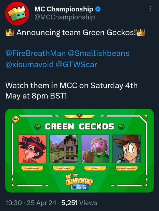
HES IN MCC YIPEEE!
Can’t wait to see my predictions
okay so I always wanted to see xisuma in mcc, just for the funnies and the dynamic that would come out of it and after seeing that blood of the clock tower game It is no longer a want but a *need*
Cub, Ren and false the whole twitch rivals crew participated at some point, etho, jevin pearl gem and grian have played (also after watching twitch rivals vods plus hearing Ren describe them in the video make me nostalgic (?) for more)
He was so clearly out of his depth in a social deduction game it was iconic, now tone that down a bit because i think that level of anxiousness to watch live and for a 2 1/2 to 3 hour period would make anyone feel sick and i think it would be a new but interesting experience especially if teamed with some other hermits and someone like illumina or fruit
(i also need Joe hills in mcc as the wider mcyt community needs to know the Joe hills difference)
Honestly I've been wanting this for a while just more hermits in general plus others honorable mentions that don't get their own ramble include: docm77 and woolfie
even if it was a one time thing, even if the event itself wasn't the best as long as the creators had fun I'd take it as a win!
38 notes
·
View notes
Text
Xisuma is in MCC depression is cured
144 notes
·
View notes
Text


Moments before
#You’ve gained +1 scrog#(Scrambled reblog)#This grian is so feral- not even that sort of monstrous his desperation bleeds into his everything (which is how I like my characters)
1K notes
·
View notes
Text
I fucking love the birds out side my window right now /gen
I mean it they are making my evening and are so just. Spring. I like living rural, cities scare me plus I’d miss stuff like this.
#scrambled rambles#delete later#i know I sound agressive but that’s how much I like these bird sounds
4 notes
·
View notes
Text
Extra info (who wants this lol)
Ants_Of_The_Universe was my first ao3 name I’m pretty sure had it for like… a month? I didn’t know how to change it, it was way too long, I hated the underscores and just a *little* pretentious I think I cut the underscores before changing it completely
2.CommonMoth second/and current ao3 name and short lasting Tik Tok and twitter respectively I actually really like this except one of my siblings tracked me down and that was embarrassing so I had to scrap it out of fear (I’m pretty sure they won’t ever use tumblr or ao3) I still love moths a lot idk why it’s common though.
3. Scrambledd is my pseudo on ao3 where I write my misc shit that isn’t bsd (which happens to be fairly common nowadays) again I hate long names on ao3 and just ‘scrambled’ was taken
4. ScrambledLikeEggs the icon. I was walking home and yes. It was a twitter before tumblr and ao3 (sort of) before that and I hated scrambled eggs at the names creation now they are simply okay in my book
5. (!?) fungifreak if I ever change my shed this is way I’d change it too jetswarm can confirm this is fitting but I would have no name- actually I would have people call be ‘guy’ cause fungi and that’s something I’ve wanted to try on the internet (I probably won’t change my name here maybe other places though)
3 notes
·
View notes
Text
If I ask nicely will people reblog this and tell me what their most common breakfast is? Not your favorite necessarily, just what you have for breakfast most frequently? 🙏🏽
#since lockdown i have religiously eaten peanut butter on toast with a banana. every. single. day.#i very rarely miss a day unless i am out of one or the other#toast can be replaced with any breakfast starch including: bagles (english) muffins or if i'm particularly desperate crackers#(scrambled reblog)
25K notes
·
View notes
Text
Extra info (who wants this lol)
Ants_Of_The_Universe was my first ao3 name I’m pretty sure had it for like… a month? I didn’t know how to change it, it was way too long, I hated the underscores and just a *little* pretentious I think I cut the underscores before changing it completely
2.CommonMoth second/and current ao3 name and short lasting Tik Tok and twitter respectively I actually really like this except one of my siblings tracked me down and that was embarrassing so I had to scrap it out of fear (I’m pretty sure they won’t ever use tumblr or ao3) I still love moths a lot idk why it’s common though.
3. Scrambledd is my pseudo on ao3 where I write my misc shit that isn’t bsd (which happens to be fairly common nowadays) again I hate long names on ao3 and just ‘scrambled’ was taken
4. ScrambledLikeEggs the icon. I was walking home and yes. It was a twitter before tumblr and ao3 (sort of) before that and I hated scrambled eggs at the names creation now they are simply okay in my book
5. (!?) fungifreak if I ever change my shed this is way I’d change it too jetswarm can confirm this is fitting but I would have no name- actually I would have people call be ‘guy’ cause fungi and that’s something I’ve wanted to try on the internet (I probably won’t change my name here maybe other places though)
#scrambled rambles#Idk sometimes I just want to hear other peoples on my stuff because I’m a sucker for validation like that#it’s sad. I’m aware#/lh /j
3 notes
·
View notes
Text

you can literally say anything to men, it doesn’t matter
#Reblog if you also are a pain in the ass and high strung as fuck#(very highstrung irl lol)#(scrambled reblog)
81K notes
·
View notes
Text
3 years and I still haven’t made that animatic. Not even in the fandom anymore but it haunts me.
#scrambled rambles#in reference to ‘guide to success’ using the bsd cast to show the cycle of abuse in the mafia#Bungo posting#<- for the chance I speak about it again
1 note
·
View note