
sanitationandfemaleempowerm-blog
Coursera Wesleyan University Course
4 posts
Don't wanna be here? Send us removal request.
Last Seen Blogs

chrisstjohnthird
Untitled

darkexceptwhereexposedtolight
jump overboard, the sea will save you

beanskcid
Dan

dude-storm
Dude Storm

iro9
Irons den
Text
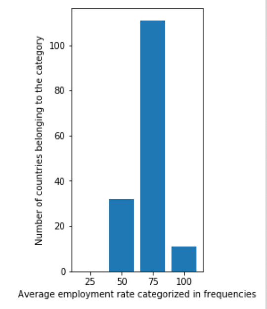
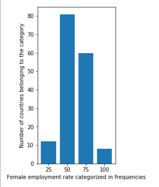
Assignment week 4
For this week’s assignment I created three univariate graphs of three different variables from the gap minder dataset. The three variables I used are: the female employment rate, regular employment rate and average life expectancy.
The univariate graphs were created in Python by first creating frequency categories and then plotting these categories in a graph. The code I used for this is:
import csv
import matplotlib.pyplot as plt
from matplotlib.ticker import NullFormatter # useful for `logit` scale
with open('gapminder.csv') as csvfile:
readCSV = csv.reader(csvfile, delimiter=',')
testlist = list(readCSV)
for row in testlist: #Removing white spaces between rows of information
if(len(row) == 0):
testlist.remove(row)
female_employement_rate_25 = 0
female_employement_rate_50 = 0
female_employement_rate_75 = 0
female_employement_rate_100 = 0
for row in testlist[1:]: #Selecting all rows but first row
if(len(row[6]) > 2): #Skipping all empty rows of information about female employement rate
if(float(row[6]) <= float(25)):
female_employement_rate_25 += 1
elif(float(row[6]) <= float(50)):
female_employement_rate_50 += 1
elif(float(row[6]) <= float(75)):
female_employement_rate_75 += 1
else:
female_employement_rate_100 += 1
barnames_female_employementrate = ["25", "50" , "75", "100"]
barvalues_female_employementrate = [female_employement_rate_25,female_employement_rate_50,female_employement_rate_75,female_employement_rate_100]
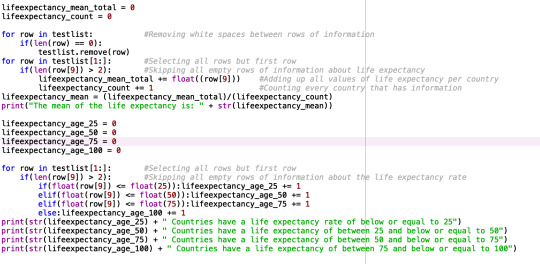
lifeexpectancy_age_25 = 0
lifeexpectancy_age_50 = 0
lifeexpectancy_age_75 = 0
lifeexpectancy_age_100 = 0
for row in testlist[1:]: # Selecting all rows but first row
if (len(row[9]) > 2): # Skipping all empty rows of information about the life expectancy rate
if (float(row[9]) <= float(25)):
lifeexpectancy_age_25 += 1
elif (float(row[9]) <= float(50)):
lifeexpectancy_age_50 += 1
elif (float(row[9]) <= float(75)):
lifeexpectancy_age_75 += 1
else:
lifeexpectancy_age_100 += 1
barnames_lifeexpectancy = ["25", "50" , "75", "100"]
barvalues_lifeexpectancy = [lifeexpectancy_age_25, lifeexpectancy_age_50, lifeexpectancy_age_75, lifeexpectancy_age_100]
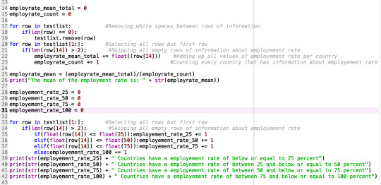
employement_rate_25 = 0
employement_rate_50 = 0
employement_rate_75 = 0
employement_rate_100 = 0
for row in testlist[1:]:
if(len(row[14]) >2):
if (float(row[14]) <= float(25)):
employement_rate_25 += 1
elif (float(row[14]) <= float(50)):
employement_rate_50 += 1
elif (float(row[14]) <= float(75)):
employement_rate_75 += 1
else:
employement_rate_100 += 1
barnames_employement_rate = ["25", "50" , "75", "100"]
barvalues_employement_rate = [employement_rate_25, employement_rate_50, employement_rate_75, employement_rate_100]
plt.figure(figsize=(12,5)) #Defining the size of the window that will display the graphs
plt.subplot(131)
plt.bar(barnames_female_employementrate, barvalues_female_employementrate)
plt.ylabel('Number of countries belonging to the category')
plt.xlabel('Female employment rate categorized in frequencies')
plt.subplot(132)
plt.bar(barnames_lifeexpectancy, barvalues_lifeexpectancy)
plt.ylabel('Number of countries belonging to the category')
plt.xlabel('Average life expectancy categorized in frequencies')
plt.subplot(133)
plt.bar(barnames_employement_rate, barvalues_employement_rate)
plt.ylabel('Number of countries belonging to the category')
plt.xlabel('Average employment rate categorized in frequencies')
plt.suptitle('Bar graphs')
plt.gca().yaxis.set_minor_formatter(NullFormatter())
plt.subplots_adjust(top=0.92, bottom=0.1, left=0.10, right=0.95, hspace=0.5, wspace=1) #Added padding so that the graphs and their text display correctly
plt.show()
The result of this code is:

Next, I also created a scatterplot that plots the relation between he female employment rate and average life expectancy. I was surprised by the results of this graph. There is no (linear) relation between the two variables. From the literature review done in the first week, I would have assumed that there would be a positive relation between the variables. Namely, a higher female employment rate would lead to a higher life expectancy. When more people work in a country they earn more money, thus have a higher disposable income as a family and can spend more on better food, education and healthcare. These factors would then again have a positive impact on life expectancy. The scatterplot shows that this assumption is false. It would be interesting to research this further.
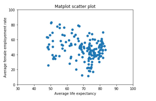
The scatterplot was already created by Python with the following code:
import matplotlib.pyplot as plt
import csv
with open('gapminder.csv') as csvfile:
readCSV = csv.reader(csvfile, delimiter=',')
testlist = list(readCSV)
for row in testlist: # Removing white spaces between rows of information
if (len(row) == 0):
testlist.remove(row)
scattervalues_female_employement_rate = []
for row in testlist[1:]: # Selecting all rows but first row
if (len(row[6]) > 2 and len(row[9]) > 2): # Skipping all empty rows of information about the life expectancy rate and female employement rate
scattervalues_female_employement_rate.append(float(row[6]))
scattervalues_lifeexpectancy = []
for row in testlist[1:]: # Selecting all rows but first row
if (len(row[9]) > 2 and len(row[6]) > 2): # Skipping all empty rows of information about the life expectancy rate and female employement rate
scattervalues_lifeexpectancy.append(float(row[9]))
x = scattervalues_lifeexpectancy
y = scattervalues_female_employement_rate
fig = plt.figure()
ax = fig.add_subplot(1,1,1)
ax.scatter(x,y)
ax.set(xlim=(30, 100), ylim=(0, 100)) #Setting the scale for the plot, xlim = life expectancy scale, ylim = female employement rate scale
plt.ylabel("Average female employement rate")
plt.xlabel("Average life expectancy")
plt.title('Matplot scatter plot')
plt.show()
0 notes
Text
Assignment week 3
Unfortunately the assignment for week 3 was difficult to compute with my dataset. As I mentioned in my previous assignment, the gap minder dataset only consists of unique data (data entries are unique or only occur a maximum of two times in the dataset) and the data only consist of numerical data. Therefore, some of the instructions in the video lectures were not applicable to my dataset. In stead I opted to calculate the mean for my variables and to include frequency tables.


0 notes
Text
Assignment week 2
As specified in the previous assignment, I am using the Gapminder dataset to perform me research.
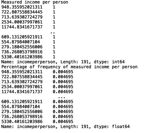
When I imported my CSV file in Python and ran my program I noticed an issue. Namely, the Gapminder dataset consists of unique data. This means that frequency tables are difficult, if not, impossible to compute. Every recorded valuable in the columns is unique and only occurs one or sometimes two times.
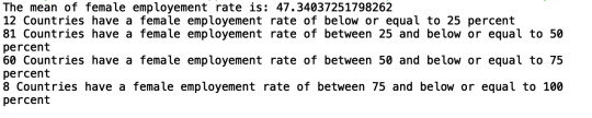
Below you can find my program in Python for the first variable: female employment rate.

The results of this analysis were as follows:

This image shows that the CSV file contains 213 rows, and also shows that the data in the dataset is unique. Only the percentage 34.2 occurs twice in the dataset.
I tried to perform the analysis again, this time with two different variables: Life expectancy and income per person. However, the results were the same as above.


After this analysis I will consider whether or not to change my research question. I am currently working in Python to try to include frequency tables. This way I can map the results together in frequencies, for example: female employment rate between 0-10%, 10-20%, 20-30% etcetera. This will allow me to use the same dataset while still being able to interpret the results. However, I am not fluent in Python so this will take some time.
0 notes
Text
After looking through the codebooks I have decided to study the data in the Gap Minder Dataset. I am particularly interested in the development of the female employment rate in development countries due to my personal and professional experiences in this field. My choice to study the female employment rate is based on several reasons, both social and economic.
First of all, studies have shown that women have a great responsibility in their community and own household. They also seem to be increasingly aware of this role. For example, several studies on microfinance have shown that women have the highest repayment rates of loans and also contribute larger portions of their income to their household (International Labour Office Geneva).
Second, an increase in the female employment rate leads to an increase in productivity and diversification of the economy. A study by the UN has also shown that an increased percentage of women in organizations leads to an increase in organizational effectiveness and growth (UN Women, 2018).
However, key to increasing female labor force participation is education. Without an educational background, women are less likely to enter the labor force. There are several factors that influence the drop-out rate among young girls. One of the most substantial reasons is a lack of access to sanitation facilities. Once girls reach puberty their attendance drops. They will not be able to attend classes during their monthly periods due to a lack of basic sanitation and wash facilities. This often results in lower grades or even dropping out of school. In the long term this means less opportunities to enter the labor force and have paid work later in life (World Toilet Day Advocacy Report, 2013).
Therefore, I would like to explore the association between the female employment rate and access of the population to improved sanitation. My hypothesis is: What is the association between the female employment rate and increased access to sanitation in development countries?
I use the definitions for the variables as given in the Gap Minder Dataset. I define the female employment rate as: females aged 15+ employment rate (% of the population) that had been employed during the given year. And improved sanitation, overall access (% of the population using improved sanitation facilities) (Gapminder).
When looking at existing literature and research on the role of sanitation, one can find many different sources. On the one hand there are reports written by international organizations and NGOs about the role of sanitation when it comes to women empowerment, gender equality and the eradication of poverty. Most of these reports employ a broader view of the problem and describe all the ways in which access to clean water and improved sanitation can have an impact on the daily lives of communities. These reports also emphasis Sustainability Development Goals 6: Ensure access to water and sanitation for all (UN Women, 2018).
On the other hand, we have academic literature. The majority of these articles and books consist of case studies on the impact of improving sanitation in development countries. An example is the article titled “Informing Women and Improving Sanitation: Evidence from Rural India”. The author, Lee, concludes that a lack of access to sanitations does not only have negative effects on the health of women, it also affects their physical security and impacts the livelihood of their children (Lee, 2017). Another example is the article by Kaberi Koner, “Sanitation and Hygiene of Darjeeling City: A Crisis for Women and Adolescent Girls”. Koner concludes that a lack of water and sanitation have greater effects on women and girls in poor households. She finds that this group has lower literacy rates and is more vulnerable to violence and sexual abuse (Koner, 2018).
Even though the articles and reports employ different methods and use different data, they all come to the same conclusion. A lack of access to sanitation leads to a loss of dignity, a higher chance of sexual abuse and harassment, less girls attending school and higher child mortality (Nurual et al., 2019). Therefore, I hypothesize that there is a positive association between the female employment rate and the access of the population to improved sanitation.
Improved sanitation will most likely allow more girls to finish their education and to get paid jobs after. It will also allow women to continue to work during their monthly periods. This will both have a positive effect on the female employment rate and will allow women to make a living wage and to provide for their families. I will aim to test this hypothesis during the remainder of this course.
Bibliography:
(2013). World Toilet Day Advocacy Report. Retrieved from: https://worldtoilet.org/documents/WecantWait.pdf.
(2019). Gapminder Data. Retrieved from: https://www.gapminder.org/data/.
International Labour Office Geneva. Small change, Big changes: Women and Microfinance. Retrieved from https://www.ilo.org/wcmsp5/groups/public/---dgreports/---gender/documents/meetingdocument/wcms_091581.pdf.
Koner, K. (2018). Sanitation and Hygiene of Darjeeling: A Crisis for Women and Adolescent Girls. Space and Culture 5, 89-105.
Lee, Y. (2017). Informing Women and Improving Sanitation: Evidence from Rural India. Journal of Rural Studies 55, 203-215.
Nurual Indart, Rokhima Rostiani, Tamara Megaw, Juliet Willets (2019). Women’s Involvement in Economic Opportunities in Water, Sanitation and Hygiene (WASH) in Indonesia: Examining Personal Experiences and Potential for Empowerment. Development Studies Research 6, 76-91.
UN Women (July, 2018). Facts and Figures: Economic Empowerment. Retrieved from https://www.unwomen.org/en/what-we-do/economic-empowerment/facts-and-figures.
0 notes