
rylee-wagteveld
DS502001 Communication Fundamentals 1 (Communication)
14 posts
Don't wanna be here? Send us removal request.
Last Seen Blogs

instalasifirehydrantsystem99
Untitled
baezart
baezart

muhabbetkosesi
Hakikat Yolu


isalikelove
Isabella Castillo
Text
Final Evaluation
What was challenging?
Personally, I had the most trouble with the Photoshop component. Although this was just pretty simple stuff, I had some previous knowledge with photoshop. I enjoyed getting to experiment with the application's newer, more technical features, although I did found some of them challenging. However, I had definitely improved in all areas of the programmes which is really good!
What did you discover?
I gained so much knowledge from this course, all of which I have recorded on one Tumblr post. When reviewing certain features of these applications, I will without a doubt make reference to this piece. The pen tool, filter layers in Photoshop, the fundamentals of Indesign, patterns in Illustrator, and how to construct mock-ups are some of the most memorable things I've learned. I will definitely retain all I've learned from this course in mind and utilise it further throughout my career.
What else would you like to practise or learn?
As my particular favourites in this course, InDesign and illustrator, I'm quite eager in learning more about them. All of the Photoshop skills I learned in this course, in particular, will be put to greater use. Additionally, I'll be making an effort to maintain a respectable level of all the skills learnt. I had a lot of fun making the mock-ups. I would love to learn more about editing photos in Photoshop with photos we take personally
Another thing?
I learned a heaps from this course, and it was very beneficial. I'm proud of what I accomplished and what I learned, and my abilities have improved across the board. I look forwards to developing these talents further and building upon them. Aseptically more in photoshop!
0 notes
Text
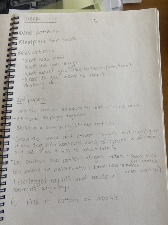
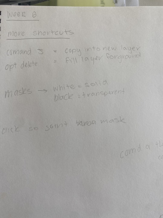
Week 11
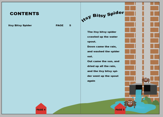
Easy method for creating patterns in Illustrator. This was really simple yet effective, and I'll be using it to design my final page for the 12-page booklet assignment for graphic design . Shown in the images below
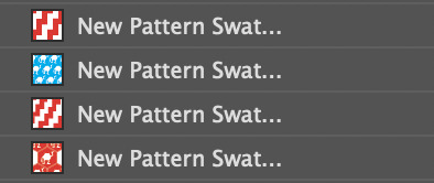
If you look closely the zig zag pattern is the background which was quick easy and effective.
https://href.li/?http://ZippyPixels.com
notes
0 notes
Text
Week 10
These are all my notes below about this project
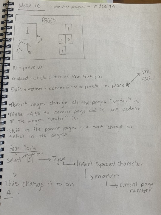
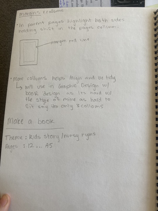

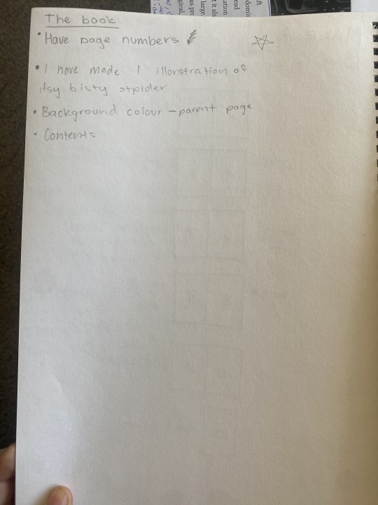
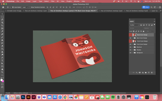
Make my own Book
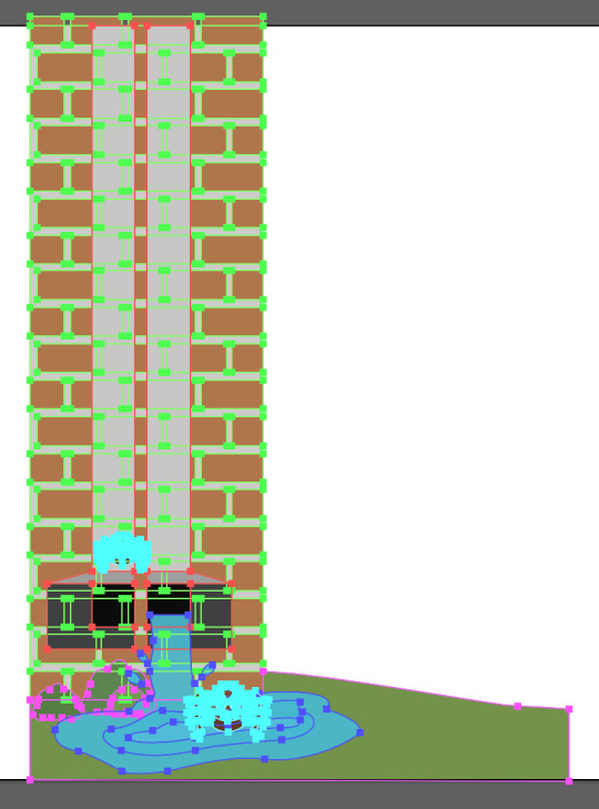
After learning about parent pages I put in The background colour and pages numbers, learning about this was very helpful as I now have parent pages in my Graphic design book. I created the illorstration to the left onf the image below and the image below that is the illorstaion file. I was not able to complete this project due to outside issues I however used all the techniques I learnt in this to my graphic design booklet.

https://href.li/?http://ZippyPixels.com
0 notes
Text
Week 9
Below is all my notes from this class and thoughts throughout


This was my final results I learnt so much during this class and have used it in my book design for graphics... the border around the image to move text all around the image evenly and paragraph styles/character styles and so much more. This activity was really help full and I will always remember every part of it.

These are my saved files during this project which knowing how to save things properly is very knowledgeable. I can also refer to this as notes as the title syas what has just been completed.
0 notes
Text
Week 8
Illustrator Last project
Our assignment was to construct an object silhouette using every Adobe Illustrator technique we had learned. I decide to a cactus. This cactus is slightly difficult so I believe they cover a wide range of approaches that will allow me to hone my talents. I'll be making a more challenging piece after this one to put my abilities to the test.

I photographed the sketches from my last drawing, imported them into Photoshop, and then used the pen tool to trace over them. A screenshot of the finished drawing is below. I drew the shape over my sketch. I was able to create a silhouette effect by the shapes i made with the pen tool.
Overall, I didn't find this work to be too challenging, although at times it was really difficult to fine-tune the points. Although I'm generally pleased with the result.

We must produce a more detailed, coloured illustration for our final Adobe Illustrator assignment. Since I adore avocados, I'm going to sketch one. I'll be using the image I sketched of one.
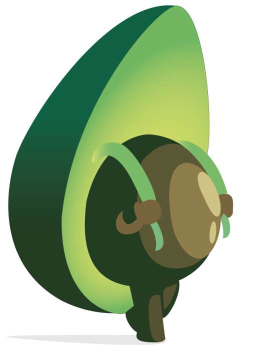
Overall, I'm satisfied with how my design turned out. It didn't seem too challenging to me. I will need to practise the gradients more, though, as I did have some difficulties with them. In terms of smoothing things out, some of my lines also need a little work. I am really pleased with my colour selection since I believe they go nicely together. After completing this job, I feel more certain in my colouring skills and pen skills and I love my avocado!
0 notes
Text
Week 6
Man jumping Activity
An image of a man jumping was provided to us for this challenge. We had to use a connected illustrator file to cut out the image and draw a squiggle surrounding him.
(Below) We were first shown this picture of the man leaping. The first step was to remove the man, which we did by use masks and several selecting tools. I mostly just utilised the fast selection option, which was quite effective. I made a mask to cut him out once I had chosen him.

I was able to fine-tune the mask to make sure all the edges were precise after cutting out the person and eliminating the backdrop. I adjusted the entire part, especially the area surrounding the hair, which was pretty difficult to do well. I applied blur to certain borders to better integrate them.

I was able to restore the backdrop after making the election by adding a replica of the picture that was behind him. Then, using the pen tool in Adobe Illustrator, I made a straightforward squiggle. The file was then imported into Photoshop using the fine > put linked command. I made two copies of this squiggle, one of which I positioned above the person and the other behind him. I then used a mask to remove the portions of the top layer that I wanted to be behind the person. This gives his form the appearance of a squiggle looping in and out. behind his elbow but in front of his leg, behind his knee, and then in front of his upper arm.

With the exception of the tough bits, like cutting out the hair, this project was a lot of fun. This was a terrific activity that gave me the chance to put my knowledge of Illustrator and Photoshop to the test. In comparison to when I started this course, I definitely felt more comfortable using both of these programmes. I am really happy with the conclusion and believe I gained a lot of valuable knowledge that will help me in my future academic endeavours.
notes
0 notes
Text
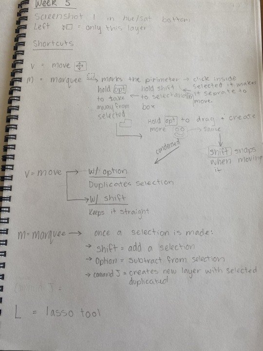
Week 5
Layer Mask
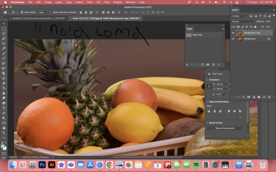
You can hide certain elements of an image in Photoshop by applying a mask to an element. There is a little icon for creating a mask at the base of the layers panel (see previous post); clicking it adds a mask to the layer you have chosen. In the example below, we first chose a lemon and then created a mask, allowing us to make modifications to only the lemon and not the entire image. Which is something I did not know, as I am not familiar with photoshop as much as In design and Illustrator. So learning about this in an easy context... cutting the lemon out was really a good way to learn about layer masks
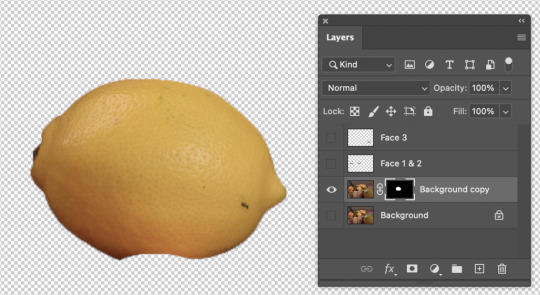
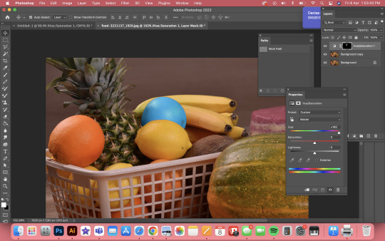
Then, by creating a mask that is attached to the layer behind it, we can make changes that only affect the lemon. You can see in the image below how I modified the lemon's saturation and colour by adding an adjustment layer to the mask.
This assignment was quite helpful to me and taught me numerous basic but crucial Photoshop functions. I'll definitely want to keep in mind and use the mask option often.
Path Selection
Using the pen tool to pick anything is really simple and effective. With the pen tool, you can create an outline around an item that you can later transform into a segment in the path window. Another benefit of this is that it is not a one-time option; rather, you may generate this option from the path whenever you need to. Below is a screenshot of a grape fruit that I have used the pen tool to outline and prepared for selection.

This is a really simple approach to add adjustment layers to an object, as we discovered in earlier lecture. As you can see in the picture below, I was able to use the option to give the grape fruit an adjustment layer so that it would seem like a blue grapefruit.
This little activity served as a decent warm-up to remind me how to use the pen tool to make selections.
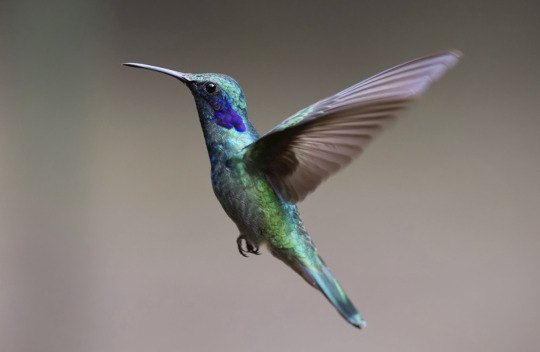
Humming Bird Activity
Another exercise required us to take an image of a hummingbird, cut it out, and position it on a different backdrop in order to put our understanding of layer masks to work. This exercise addressed a wide range of topics; it began with a simple description of the hummingbird. However, certain areas of the selection were a little rough because the bird wasn't in a clear background, so we had to make minor modifications utilising the methods we learned in the prior masking exercise. The wings' edges then needed to be blurred to represent movement and to better match the fresh backdrop. The entire bird was then thrown into the new background. Here are a few images of this process...
Orignal
Cut from the background
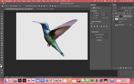
Final
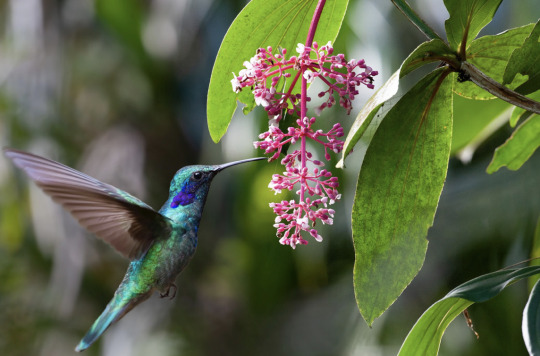
It was quite beneficial for me to practise my selection and masking methods with this work. It also highlighted the value of making several minor tweaks along the way and blurring moving elements. Using what I've learned from this and the other tutorials, I'd love to practise my ability to choose stuff even more.
I also like learning about when you cut something out of an image, most of the time there is the the colour of the background left slightly around the edges and by getting rid of this you use the stamp tool around the edges to the new colour of the background that you are using.
After learning this very useful thing I noticed this very thing when making my book for graphic design. This was when I cut my artist out of a photo to put into a different background... which was a totally different colour. I used the stamp tool!!! This created a much more natural image rather than having the white crusty edges that it had before. Results of this below...
Original Cut out
Fixed Cut out !

notes

0 notes
Text
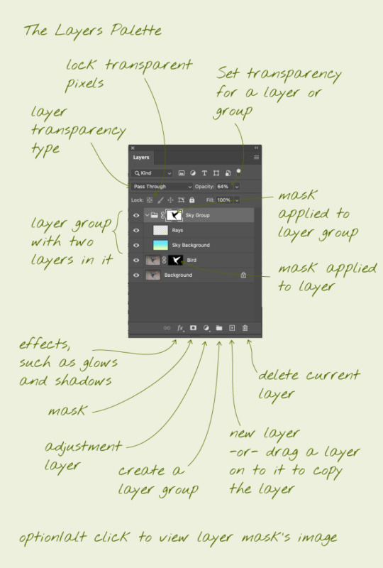
Layers Palette
This is a very useful diagram that I can/ always look back at to remind myself on most of the techniques within photoshop1
0 notes
Text
Week 4
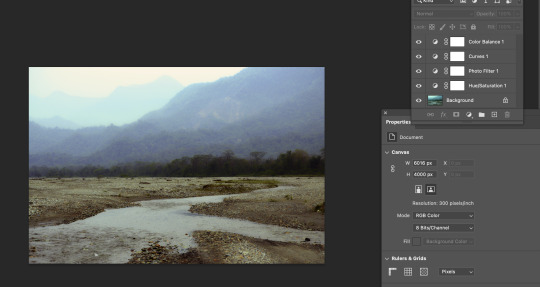
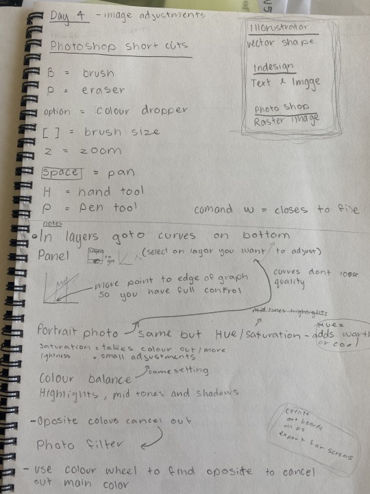
Image Adjustments - Curves
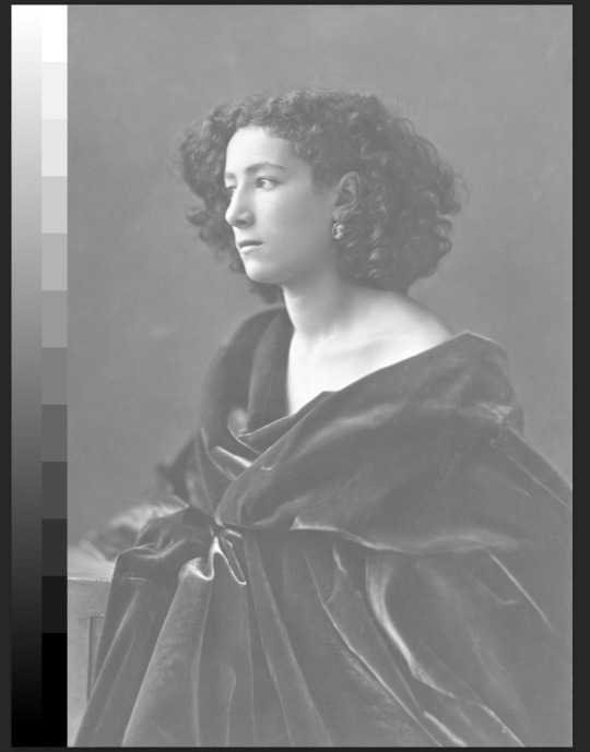
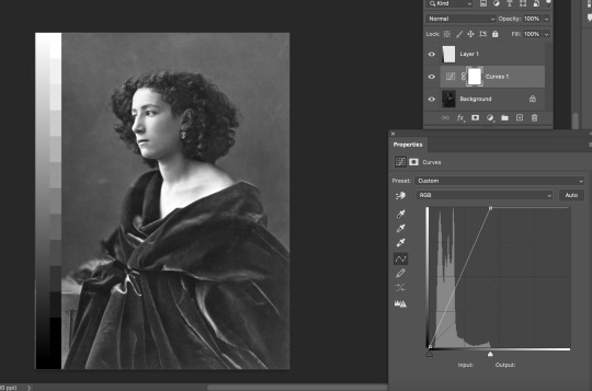
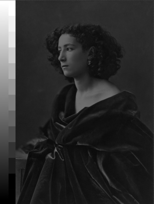
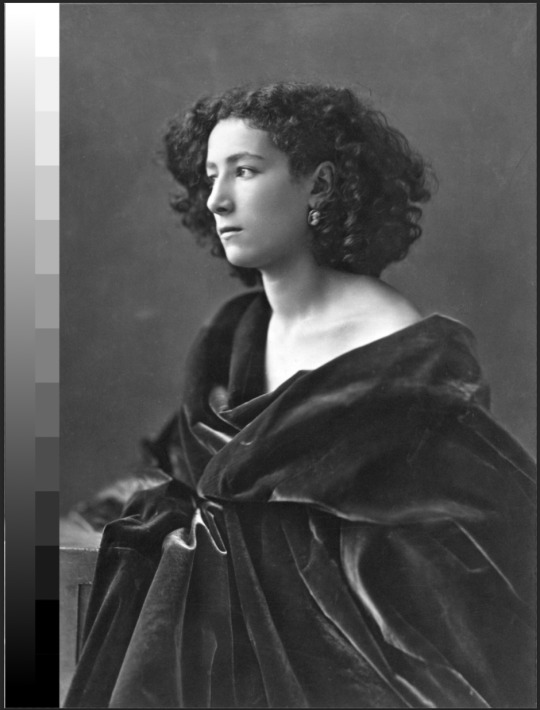
Adding an adjustment layer to an image allows you to edit the curves of the image, allowing you to change things like the darkness and brightness. This is incredibly handy for adjusting the colour of an image. The image below shows a before and after comparison; as you can see, the original image was quite white washed( looked sort of faded) and made largely of mid colours. I was able to boost the blacks by using the curves adjustment, balancing the levels and generating a much sharper image.
We then had another image to alter but basically the opposite way...
The image below is an example of the same image, except the original was quite dark. I was able to alter the tonal values and add additional whites using the same curve modification, resulting in a much sharper image.
New image similar adjustments... It was really good to try different images with the similar problem and it is wired in my brain how to fix the curves.. ( if the graph for curves is not to the edge on either side it means pull the line in up to where the graph begins as shown in the photo below, you can then add a curve to the line as-well. So basically moving the handles at the bottom of the graph inwards from the ends compresses the picture tonally, while moving either of the end points up or down adjusts the brightness of the image within the range.
New image similar adjustments...
Again same as the the image above ... quite dark. So again I was able to alter the tonal values and add additional whites using the same curve modification, resulting in a much sharper image.
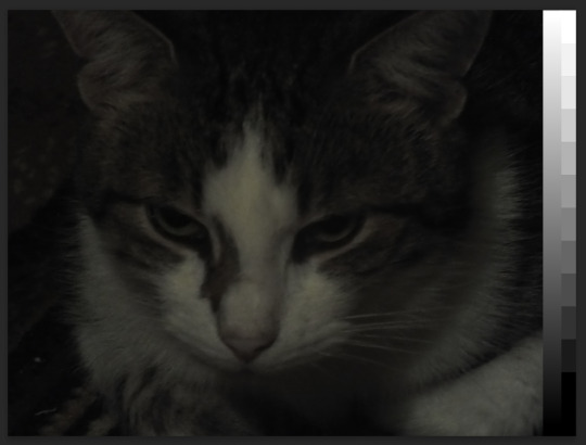
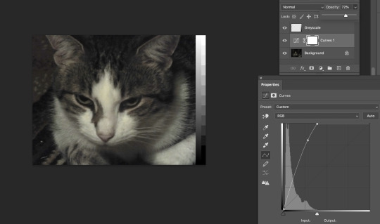
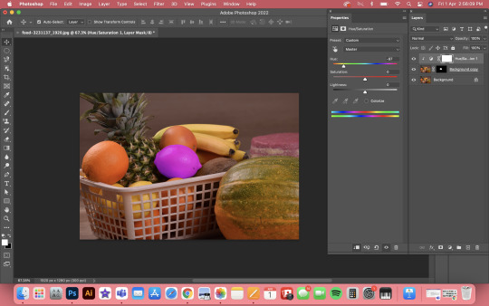
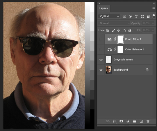
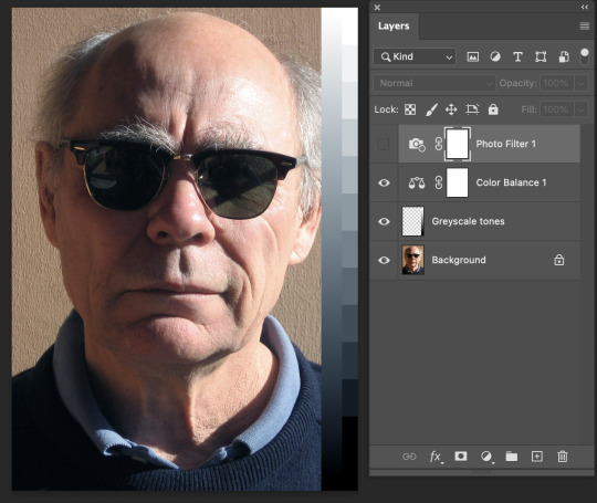
Image Adjustments - Colour balance & Photo filter
An image's colour can also be adjusted using layers for photo filters and colour balance. You may independently alter the colour values of midtones, darktones, and lighttones using colour balancing.
I've modified the midtones in the sample below to more cyan, magenta and blue, this created a less warm image... more realistic and sharp image.
Original
W/ Colour Balance
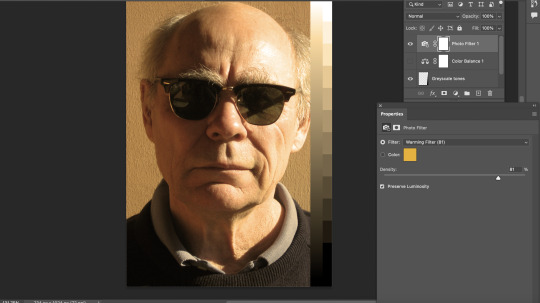
You may apply custom or pre-made preset filters to photos, which are handy for adjusting the overall colour of an image or making it appear warmer or cooler with the photo filter layer. I added an orange to bring some more warmth to the image for when both Colour balance and Photo Filter are added together to create the colour that I want in this photo. Photo Filter is really good to know about as when designing say an article the images in the article are apart of the design and want to be cohesive e with the article, and the image you want to use isn’t the right colour you can change it straight away with the photo filter and adjust other layers with it like I’ve done down below to create the perfect corrected photo you want.
W/ Photo Filter
This is two layers combined to create a more precise image that you want.
W/ both colour balance and photo filter
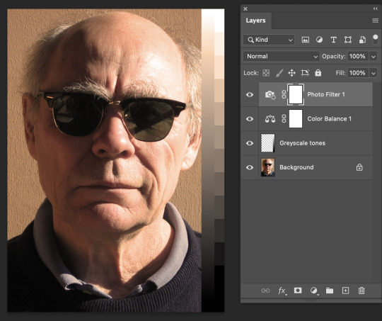
Now putting everything together...
Combining adjustment filters gives you a lot more control over the image. You may modify the colour and the blacks and whites, add filters, and change colours all at once to get a much sharper image. An example of how combining these adjustment layers might result in a sharper image as provided below:
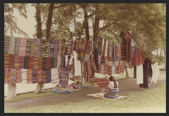
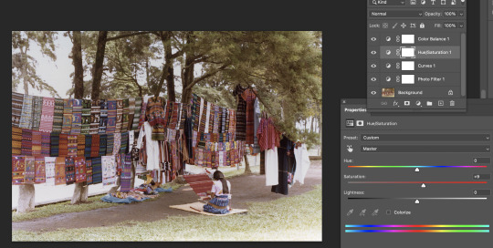
Original Image... Quite washed out and very strong in blue, cant see many details
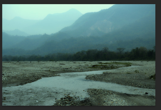
Altered... I used colour balance, Curves, Photo Filter and Hue and saturation. All of these combined has created a much more realistic, readable and warmer image.
Another example of using all the adjustments learnt to create sharper images/ to what you want them to look like.
Orignal
Altered
Learning all about editing these photos has really helped me understand photoshop much better and has come at a really good time as I had taken photos for someone but didn’t know how to make them the best that the photo can be. And being able to try what we have learnt multiple times has drilled this into my brain.. which is a really good thing and will be using all of what Ive learnt to edit future photos!
notes
0 notes
Text
Week 3
Making a Penguin
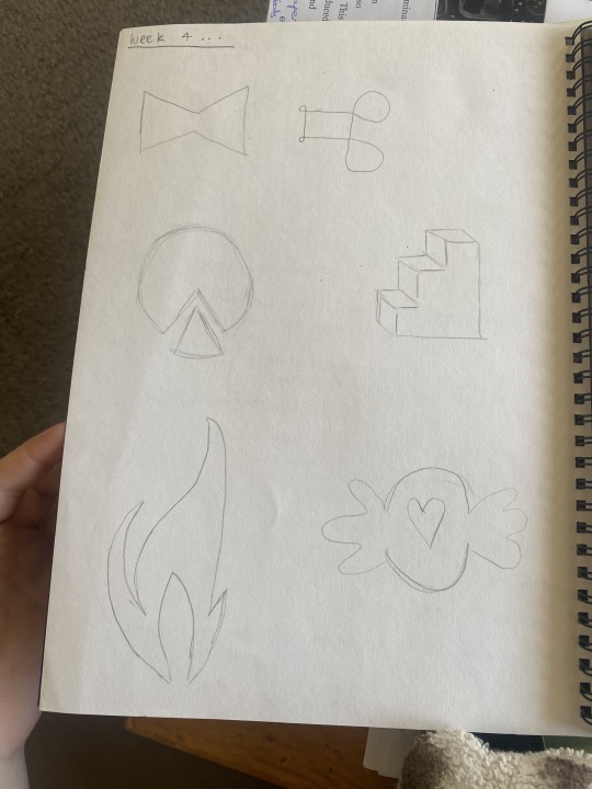
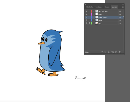
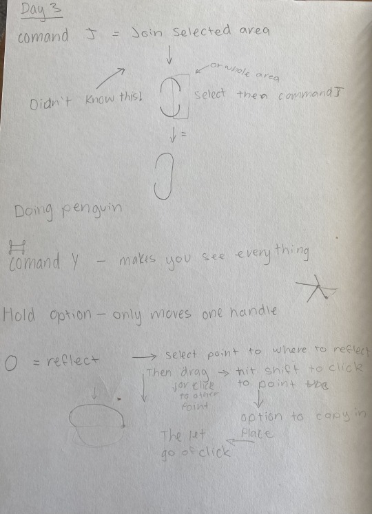
There was new Keyboard shortcuts today in the attached photo which the first one was joining an lines together, this was a new thing that I didn't know so instead of stretching an object you can separate it then join it and lines will form between the gaps. Then learning the reflect tool was HUGE as I used to never be able to make a cured object the same on the other side. My notes in the photo above about the Reflect and join I have put them both into context with the penguin so I can go back and remember what I did. It was harder to follow with making the 3D foot which would of been cool how to make it and also with the end part of making the penguin was hard as we were running out of time so being online and writing notes was hard, But I’m pretty sure we used the path finder to create the stomach colour. Also I learnt that you don’t have to create layers while making an illustration you can highlight the part you want to be in a different layer and move a wee box the appears to the right of the layers and drag it to a new layer that you want it to be in. I found the penguin i more difficult to make compared to the straight and cured lined shapes but I think a factor was being online. But I will be in class next time so should b fine. It was good to see how toby made the penguin with all the different parts to it and techniques so learnt some different thing which was great!
0 notes
Text
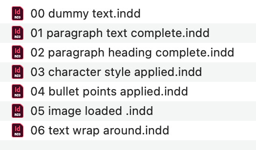
File Management
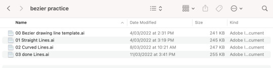
I have been also learning about file management as I used to randomly name stages through projects so having the 00, 01, 02 onwards with what was achieved within the file is huge and really helpful!
1 note
·
View note
Text
Week 2


Finishing of beizer Practice
Was no new Keyboard shortcuts today in the attached photo, however i learned about the different type of anchor points. When making the shapes on 5 & 7 I found the less points you have the cleaner the object and it helped me learn more about making things properly on illustrator. also to have as many handles as you can parallel to the shape. I used to always have them on weird angles with many points to make an object, but today I have learnt less points and straight handles makes an object much cleaner.
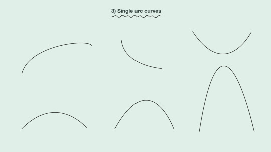
Reflection on how confident I’m feeling so far with the techniques i have covered... I feel more confident now with making curved objects and I feel that I have made a step towards making things the right way not a random way. Learning little things like this really stays in my head and helps shed light on making things properly on illustrator. This task was still easy for me but I learned how to properly use the handles and having less points on an object the better.
0 notes
Photo


Week 1
Benzeir Practice
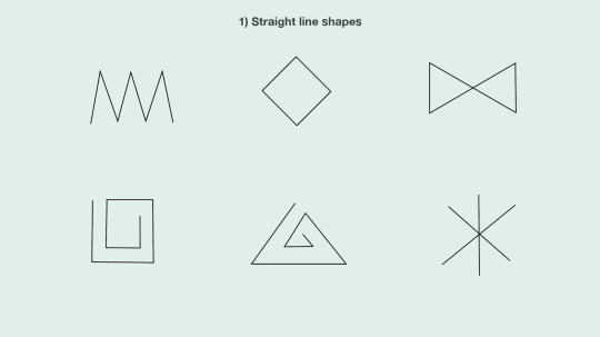
Easy
Keyboard shortcuts learned today in the attached photo, I knew most of them but however I didn't know the shortcut to Selection tool and Directs Selection tool, which will be really handy to make something on illustrator in an short amount of time.
My intentions about what I would like to learn from this course is how to make things right on adobe, not doing bad shortcuts on making things. In high school I self taught most of the stuff I know, as I have mad Posters, Magazine articles, animations, House flythroughs and many more things on adobe. However i want this course to teach me to make these things the right way as after this course I will hopefully be doing these things professionally.
A rating of my software skills at this current time across different software I believe is very high, just learning the way to make things “professionally” is my only flaw. So I think about an 8/10 for my skills at my age is reasonable.
Examples of Illustrator work that I like, and I could probably make would be the adobe work that shows when you open illustrator. I have attached a photo above.
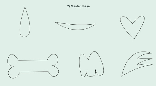
Reflection on how confident I’m feeling so far with the techniques i have covered... pretty much feel the same as with the curves and straight lined objects I feel the same as when I started as i pretty much knew all these techniques so therefore found it very easy and quick to finish
1 note
·
View note