
remymarchantdesign
remymarchantdesign
DESN1021 (Thursday 8-10 am)
10 posts
Don't wanna be here? Send us removal request.
Last Seen Blogs

Text
(Final post) Assignment 2- Flat Mag
Here’s the last big assignment for this course, the Flat mag. It was a group task, so I was dreading it, but in the end, I don’t feel like I really did much work. The things I did for this task were the “Jojo” heading and the illustration next to it (cause I’m a weeb). I also did the body copy for that area (starting at P in the top right corner) and the “Lion King” heading for one of our classmates.


This’ll be my last post, I had fun this semester, the mini-projects were enjoyable little things to work on between big assignments.
0 notes
Text
Week 11- mini project 8: Personal Logo
Welp, here it is, the final project. This week we had to design our own visual identities, something that represents the kind of designers we want to work as. Personally, I don’t like corporate or brand stuff, but I do have an interest in music and I like listening to various genres of metal. I think it’d be cool if I could do some band album covers or logos in the future, though it’s not the only area of design I’m interested in, I figured it would be a good place to start from for this task. I took note of some examples of black metal, heavy metal, and death metal logos, and decided that my identity would derive some aspects from black metal, with the typical symmetrical design and jagged, brutal look, though I didn’t want to take it too far (if you look on google, you’ll find some logos become absolutely illegible by how much they push it).
Heres an example of what I sort of went for (it says “Mayhem” btw).

Sketching
I decided to go with a blackletter inspired look with my letters, to give my letters are dark/medieval feel. I flipped the “R” to make the design symmetrical looking. I also decided to include a circle with 8 arrows sticking out of it. It’s a variant of the symbol of chaos found in fantasy fiction (and the occult... Maybe, I’m not sure).

Here’s the final image, I decided to add some decorative spikes to give it a more brutal look, while also give the symbol of chaos a more organic look (a circle with some arrows sticking out it looked to geometric).

In the end, I’m sort of OK with it. There’s something that isn’t quite clicking with me though, and I can’t put my finger on it.

0 notes
Text
Week 9- mini project 7: Create a design brief + B/W logo
Getting close to the end now! This week we had to design a logo for one of our classmates based on their specifications. Before we did so we had to write a brief. A design brief is a document that provides a designer with all of the information needed to effectively design for their client, afterward we interviewed our classmate. Below are the questions I asked, plus the answers I got.
Name of your business?:
Fortis Industries/entertainment
What do you do? Illustration, graphic design, UX design, logo design etc.?
Game design
Who is your target audience?
Teens-adults
Do you have a specific idea in mind for your logo (initials? pictorial? Abstract?)
Abstract
What message or emotion do you want your logo to portray?
Formal, intelligent
Do you have a particular style of font you would like to use?
Cursive, Small caps
Fortunately for me, he already had a logo design in mind, which he sketched and handed over to me. From there, my job was to elaborate/redesign the logo until he was happy, which then I could vectorise.
Here is the initial design, the top one I think was the one he drew (1). From there, since he was busy, I refined the logo in order to get a better idea of what he wanted (2). To me, the abstract shapes had a sort of plant-like quality to them, so I accentuated these qualities (3). He wasn’t a fan of that, as he felt like the message of the identity was being lost.

From there, we bounced back and forth on how to improve the design, both of us drawing on this page below. I recall he said he liked the one top left of this picture. Since we still had time left, I decided to get funky with the design and experimented a bit, to see if he preferred whatever else I could up with.

In the end, I think he said he liked the one at the bottom of this picture below (circled). This experimentation process took until of class (I thought he was a bit fussy about it tbh).

Below are the final images I vectorised. I admit that the final logo I ended up with lost the sophistication demanded by the brief, now it has sort of an “edge” to it, which led to me changing the decorative serif font to a sans serif font to reflect that. Being unsure of my efforts now, I decided to vectorise three of the logos I did. The top one isn’t much changed from the original sketch, the middle is the more plant-like logo (that I liked), and the bottom is the one we agreed on at the end. If I showed these to him, I’m not sure which one he’d choose, but in my opinion, they all look pretty nifty.

0 notes
Text
Week 8- mini project 6: Reduction (Four Icon Challenge)
This week was a fun task for me, as it involved illustration. We had to break down the narrative of a story and design a set of four icons that best summarise it. I chose Star Wars: A New Hope, as it’s the easiest film story for me to remember. I went over in my head the key plot points of the film: Empire captures Leia, R2D2 gets sent to Tatooine with Death Star plans, Luke discovers it and finds out he has to find Obi-wan, he recruits Han Solo who owns the Millenium Falcon, they go to the Death Star and save Leia, after fleeing with Leia and Obi-wan dying, they come back to the Death Star at the end to blow it up. That was as far as I could summarise it, but that’s still too many plot points for 4 icons. So I jotted down some potential icons on a piece of paper and chose the ones I thought best encapsulated the plot.

In the end, these four are what I ended up with (5 if you count the lightsaber which I included to separate the text from the images, and also because an underline was included in the example images we were shown of this challenge, I just wanted to take it a step further). Overall, I was happy with what I finished with.

0 notes
Text
Week 7- mini project 5: Appropriation T-Shirt
Warning: Politics ahead

Howdy y’all. This week we had to make a t-shirt design using appropriation. I had quite a hard time with this assignment. As I’ve found out, making something that’s “funny” and “topical” is hard, for me at least. I just didn’t get any kind of spark of inspiration when I was working on this, so I just kind of threw something together.
Working from a youtube tutorial on making a “Hope” style poster in photoshop(cliche right?), I made a poster of far-right Brazillian president Jair Bolsonaro with the title “burn”, referring to the recent burning of the Amazon rainforest. I’m not claiming I know much about this topic, but from what I can see the Brazilian government under his leadership is encouraging the burning of the Amazon for financial gain in spite of the growing issue of climate change, hence I made this sort of “protest poster”.
Original

Edit

Mock-up (courtesy of GraphicBurger)

To be honest, my final work doesn’t quite look like a real “Hope” poster, as the colour on the face isn’t quite right, and the flat blue colour looks a bit too close to purple.
Also, here's an extra thing I did. You don’t even need to open up Photoshop to make a “Keep Calm and Carry On” design, there’s a website that you can use to insert your own text into to make a design, with mockups included (plus some extra graphic element presets included too).


.
0 notes
Text
Week 6- mini project 4 Advertisement design
For this week's task, we had to make an advertising poster for a fictitious magazine called “The Wandering Eye”. With no real direction for what this magazine is about, I’m guessing we had to make up our own meaning, so I decided to give the poster a surreal, cosmic-horror sort of look to it (i.e. H.P. Lovecraft) as if this magazine was about short horror stories or something (idk I don’t read magazines). I interpreted the “The wandering eye” almost literally as if it was a giant eye drifting through space like something out of a Lovecraft story. I think the weird, surreal image I’ve created would serve as a way of instilling a sense of curiosity in potential readers as to what “The Wandering Eye” would be about, as well as appeal to people in the horror genre through the Lovecraftian imagery.
Below are two images I used in my poster, I obtained them from unsplash.com (credit to Paul Gilmore and Joel Filipe respectively).


Because I thought the above poster was a bit too self-serious, I decided to make a logo for “The Wandering Eye”. This time I interpreted the eye as a character, something that travels or sees the world, so I drew up some ideas before landing on the one on the right. I then vectorised him and added him to the poster, also adding a little blurb at the bottom because I thought potential readers might need some idea as to what “The Wandering Eye” could be.


0 notes
Text
Week 3- mini project 3 Type design (number plates)
‘Ello ‘ello. Type design was the task for this week. We had to design our letters as if they were for custom number plates (which some people apparently pay hundreds of dollars a year for. I don’t get it). We needed to do two number plates with the letters “UON018″ and “DES745″. I tried for a “futuristic” sort of look, something you’d maybe see on the back of a high-end sports car with these two. In the first one, I went for a geometric look to the letters, reinforcing the feel of cachet I want to go for by making the letters purple, a colour associated with lavishness (and tackiness).

For the second, I decided I wanted to push the futuristic look further, so I did some sketching and came up with this.

I took some inspiration from the Sauerkrauto pro font in creating the divisions in the strokes of the characters, which I pushed to give the letters almost a digital clock aesthetic to them, which I thought was unique for a number plate (though I’m not sure if something like this could be made physically on aluminium plates). After I was done with the letterforms, I made the colours gold on black, to link back into my idea of appealing high-end sports car owners.

0 notes
Text
Week 2- mini project 2 Grid design
Hi, it's me again. This week our task brief asked us to experiment with grid layouts in InDesign. Below you’ll find my layouts in A4 portrait and landscape, plus a square format. I decided to extend the brief a bit by adding dummy text and images to each of the layouts. To be honest, I wasn’t exactly sure what I was doing. I thought this task was a bit odd since we had to design our layouts first using coloured shapes then add the images and text, where I would think in practice it might be the other way around, with content and images determining the layout (you’ll notice below in the square grid I used two images instead of 1 long image because I couldn't find an image that suited that size).


0 notes
Text
Assignment 1 Lead-up work + Final Submission
I was having a bit of a slow start to the semester, so I didn’t really start getting to work on the assignment until week 3. I had ideas swimming in my head about doing a fantasy-themed calendar that was either going to be landscape or creature design, but as the deadline crept up it became obvious to me that I wasn’t going to be able to do that concept in time for pin-up. So I did some brainstorming (as you can see below) and landed on a few ideas before settling on the fishing guide calendar. I thought this idea was achievable in my short time since all I would need to do was produce images on certain fish and information about them like where they are, how many you can keep and how big they have to be. To make location simple, and keeping with the brief detailing the calendar had to be an Australian calendar, I limited my options to just fish that can be caught off the NSW coast. All the other relevant information was obtained from the Department of Primary Industries website.

Below are two very basic thumbnail sketches, and the only ones I did for this assignment. I didn’t stray very far from them, but in the sketches, I had the idea to have faded images of typical fishing paraphernalia, as well as grit and sea grime in the background of the main illustration but decided against it after deciding I wanted to go for a clean, professional look with the final calendar.

Moodboard
I took inspiration from the seafood industry in terms of visual design, and I included the blue and white colours as seen below, as well as the realistic illustration style which I did by hand in blue pen.

Final Submission:
Front cover:

All-pages

0 notes
Text
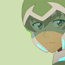
Belated 1st post Week 1- mini project 1 Geometric portraits

Yeah, I’ve started this a bit late, so I’ve got some catching up to do.
Geometric portraits

The top one in pencil is the first one I did, which is a self portrait. It’s sloppy because I was coming down with the flu the day of the tutorial, and I was also late to class because the train broke down and I had to catch a bus into town. I think the facial expression on the drawing portrays pretty well how I felt at that moment. The second drawing (the one in pen) is one I didn't do until after I felt better. I wasn’t sure of who to draw, so I opted for current internet darling- Keanu Reeves. I did a sketch of his face from a photograph, then drew triangle and square shapes to pronounce the contours of his face, as well as straightened out the curves of his face and hair in order to give the image a blocky “low-poly” look. Overall, I think I could have done better, but time is of the essence unfortunately.
0 notes