
pendragondraws
eighteen squirrels in a trench coat
nadine/dean | 18 | any pronouns | I will post art and writing stuffs here... maybe!!
6 posts
Don't wanna be here? Send us removal request.
Last Seen Blogs

dreamon777
Niki/Alex

lovelywhite8
LovelyWhite

canilveron
Canil Veron

albertfrazierdetroit
AlbertFrazierDetroit
fangirl-insanity
it's me, hi, i'm the problem, it's me
Text
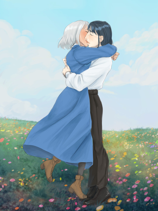
So uh. Have y'all seen the tiktok videos of people standing on their partner's feet and you can only see the legs but it's heavily implied they are making out
Yeah
#I originally just did the legs but I physically needed to draw the rest of them.#I used approximately zero references for the kissing so don't look too hard at it LMFAO#digital art#howl pendragon#howls moving castle#sophie hatter#studio ghibli fanart#fanart#ibispaint art#howl x sophie#the struggles of being aromantic and a hopeless romantic simultaneously#one day irl soulmate au will happen to me#< says guy who is delusional
4 notes
·
View notes
Text
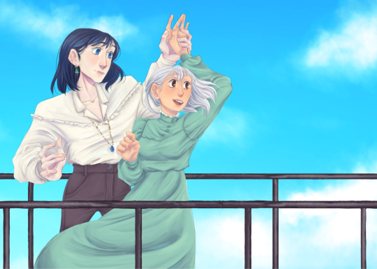
MORE Howl and Sophie fanart because I am Normal™
#rb for more people to see this bc i am really proud of it and I'm an attention whore#ibispaint art#digital art#howls moving castle#i crave validation
9 notes
·
View notes
Text
MORE Howl and Sophie fanart because I am Normal™
#this started as a random sketch i did in art class#i didn't use any references for this so. if the poses are incorrect idc#i lowkey really like the hands in this#digital art#howl pendragon#howls moving castle#sophie hatter#studio ghibli fanart#fanart#ibispaint art#i drew this with my finger#art
9 notes
·
View notes
Text
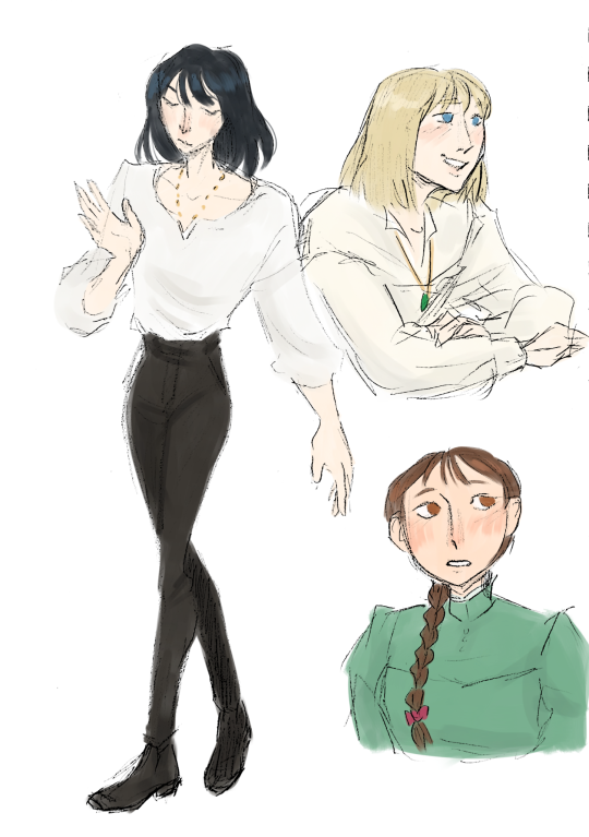
Some style experimentation feat. Howl and Sophie
#i am very normal#i like howls moving castle a normal amount#howls moving castle#howl pendragon#sophie hatter#crying sobbing etc etc#i want what they have#PLEASEEEEEEE#studio ghibli fanart#fanart#art style#digital art#art
26 notes
·
View notes
Note
hi, correct me if i'm wrong but i seem to remember you saying that you're majoring in illustration! i'm currently in the process of applying to colleges and i plan on majoring in illustration as well, so i was wondering if you had any advice for portfolios. I could really use some tips on the presentation aspect specifically, bc I'm a little lost when it comes to stuff like the arrangement/organization of pieces, how I should crop my pictures, etc. any advice you can give me is greatly appreciated!!
hi yes i can totally help you out with this! i like to think my college portfolio was pretty good bc i got accepted to every school i sent it to lol :) the main pieces of advice that i was given when building it were this:
studies and pieces that show off your technical skill are great, but limit them to around a third of your portfolio at most. art schools DO want to see that you're technically skilled and can like, draw a charcoal still life or a self-portrait, because those ARE important skills to have, but ESPECIALLY if you're applying to a school that's more known for contemporary fields like animation or illustration, it's much more likely that they want to see your creative mind at work. the single best thing you can put in your portfolio is a BODY OF WORK, and specifically a body of work that shows off your own ideas and your own take on whatever you're producing. this means 3+ pieces that are interconnected or related to the same central theme. my portfoilo, for example, consisted of 2 or 3ish traditional, technical pieces which showed that I had a certain level of technical skill, and the ENTIRE rest of it was devoted to a series of original interconnected narrative comics I'd written and drawn. Every reviewer I met with told me that this was what made my portfolio stand out to them--it showed that I was not only technically skilled, but that i had something i wanted to DO with that skill, that I had direction and drive with my art and was able to produce work that reflected that. If you're maybe (definitely) not quite as ambitious as me, something like a series of 3-5 interconnected illustrations or a short comic if you're into that might do the same thing.
as a side note, if you DO have a body of work as the central focus of your portfolio, a lot of colleges will be interested in your process as well! for example with my comic portfolio, i used one slot to demonstrate my process, because I penciled every page traditionally before digitalizing it and i had extensive character and worldbuilding sketches. I wouldn't devote more than one slot to it, but if you have a body of work where the process is important to you it could be worth throwing in!
arrangement is tricky, but the advice I generally heard was "put your best stuff first." whatever you're most excited about, whatever is going to grab someone's attention the fastest, that's what you want to have in your first slot. (I actually don't think I followed this advice on my applications LOL but it's what i was TOLD to do and i think it's solid advice.)
in terms of editing, assuming we're talking about traditional pieces being photographed, you want to make sure your pieces are 1. well-lit, (DO NOT TAKE YOUR PHOTOS WITH OVERHEAD LIGHTING. wait for an overcast day and take them outside trust me) 2. legible, (no weird shadows obscuring parts of the piece, high-quality enough that no details are lost due to digital pixelation, etc) and 3. as color-accurate to real life as you can make them. most of this is just about getting a decent-quality camera (a newer iphone should be fine) and a good location. (outside and overcast, as previously mentioned) you may want to throw your pics into photoshop and play with the balance slightly, but I wouldn't do anything too drastic, try to get the most accurate photo possible without any editing. (if your pieces are small and flat, scanning them in may work better. most public and school libraries have scanners you can use for free.)
finally, cropping. the general rule that I was taught is to crop the piece, not the photograph. if you've got a piece on paper and you're not sure you like how the actual drawing is oriented on the paper, crop the PAPER down to size, and THEN photograph it. your photos should aim to show the ENTIRE piece from edge to edge (unless it's a detail shot obv) and I even like to include a little bit of extra "breathing room" around the piece so that it's clear exactly where the dimensions of it end. here's a piece I used for my college portfolios for reference:

i lowkey do not like this piece now but that's not the point. this is what i mean by breathing room--a few extra inches of space around the actual canvas so it's clear that this isn't a closeup and you can see where the canvas actually ends. the same is true for digital pieces. if it's a full bleed illustration (something with full color all the way to the edges of the canvas) just make sure you like the composition cropped the way it is and submit the full piece as-is. if it's a floating spot or something similar without hard edges, leave a bit of white or transparent breathing room around the edge of your image.
hope this helps! if you have any more specific questions lmk :)
88 notes
·
View notes
Text


hi hello if this looks terrible I'm sorry I'm on mobile
#Kaeya is mitski coded#im not taking criticism bc I'm right. objectively#ignore how this is like. bad#i pulled it out of my ass#in case you're nornal and mentally well the text is lyrics from your best american girl by mitski#kaeya#comic#genshin comic#ragbros#diluc#any sun and moon metaphors with kaeya and diluc makes me go feral#bark bark awoooo etc.#i am mentally ill#genshin fanart#art
162 notes
·
View notes