Text
youtube
We found this great video showing the workflow of a very good walk cycle! It really goes into the thought process of the animation and I think could provide a good resource for animators regardless of style.
27 notes
·
View notes
Text
We still have three slots for feedback submissions!~
It's a bit late so if anyone submits tonight we'll probably get to them tomorrow, but please feel free!
4 notes
·
View notes
Text
Made the submission box a little easier to find!
You can find it here, but it's now in our description too!
1 note
·
View note
Text
"Am I smart?" - 🍓
"Yes." - 🖋🐲
"✨Terrifying.✨" - 🍓
0 notes
Text
have i mentioned Ozzy's head is not at all attached
yes the swamp hand is a part of him
#berry baby babbles#this is a fun example of smear#no thots head empty#i wanna put a meaty WUMP over the impact and then a cute little rubbery kweeky kweeky noise with the hand at the end#kwuhhhh i love thissssss
84 notes
·
View notes
Text
"When thinking about poses, especially in animation, you kind of want to think about everything like you're putting on a big Broadway play. Your art is the characters on stage, and you want each action they're doing to be visible and read-able from the farthest seats in the theater. That's the kind of exaggeration you should aim for." - Alyx
0 notes
Text
Art Feedback Session - meepdrawartgood
This is an animation I did mostly for fun/practice, I'm aware I have room for improvement and I'd like some advice on how to do so. I'm a mostly self taught animator, I've never taken any animation classes and this is my first longer animation I've taken past just the sketch level, I've really only gone off of the usual guides I see online. I'd like to get better at animating as a hobby/possibly a career in the future, so I'm open to any critiques!
Also should mention this is not my character, this is a character from a webcomic called Ruby Quest and the voice acting is from its Let's Read series on YouTube.
- meepdrawartgood
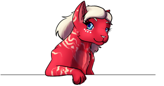
Wow! I haven't ever read Ruby Quest before, but this makes me curious to look into it. There are a lot of very good points about the animation I would like to address before we get into the critique!
First thing that I notice that you've done well is how smooth the character moves and the lack of 'wobble' in your line art. Well done! This is something that can be quite difficult and you've hit the nail on the head here. You've also got some wonderfully intense expressions here, especially through the body language. The way he's hunched over expresses how the changes are probably quite painful, and you got the 'insane' look to him pretty solid. You've even included animal behavior here with the squirrel's tail thrashing to show aggression and the ears pinning. The way the mouths burst out of the cloth is well done too! And that lip syncing!
As for improvements, there's two pieces of animation technique that I feel you can work on that all kind of tie together. Squash and Stretch is the principal of deforming a form to emphasize a movement or action, and anticipation is preparing the viewer for the movement before it happens. For example, you do a bit of anticipation with the twitches of the tail before it thrashes and the bubbling of the cloth before the mouths burst out. However, a little more drama adds a lot of flavor and intensity.
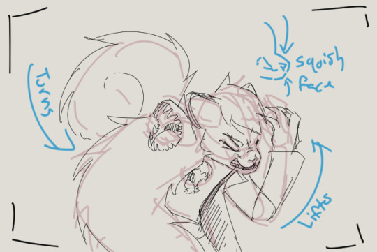
For example, when he's about to roar you should really emphasize the wince beforehand, maybe make his whole body turn towards the camera and his normal hand come towards his head, and the wince would cause his whole face to squish in a little. For the roar itself, he then whips his whole body towards the character he was facing with that roar leans forwards with a follow through gesture- ending more hunched and closer to the ground, arms thrown back, and teeth bared to the point his gums are showing. These are all ways to emphasize the rational human mind being replaced with the mind of the monster.
Alyx did a quick sketch to show what I mean for those poses.
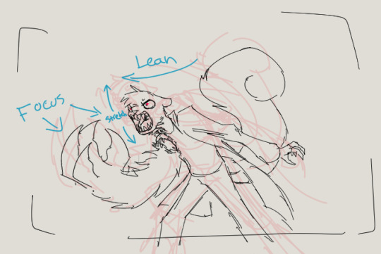
Here are a few more details that would add some sparkle to the animation! Something about the main mouth doesn’t quite seem right during the roar, even from a stylistic point of view. The way the mouth opens is a bit too warped and the teeth aren’t quite set right in the mouth even for a distorted monster mouth.
Adding some more out of place fur and some more jerky, erratic movements in the beginning would help display the pain, both mental and physical.
Starting the character out with slightly bigger irises would help emphasize how the pupils shrink through the animation.
A darker environment, or making the environment just before the roar, would help one notice the glow of his eyes better at the end.
I feel like there should be a more visible wince when the first mouth comes out... we have the eye twitch and he turns his head away, but it doesn't quite read as pain here.
I'm going to point you to a few classic YouTube videos I would recommend to any animator. The first is an old Alan Becker tutorial that you may have seen before, but it goes over the twelve principals of animation. Squash/Squish and Anticipation are the first two lessons, but all of these are important to learn.
The next two are by Toniko Pantoja. The first talks about smears- an important skill to learn for drawing fast movements. The second is a general exercise you can learn to help practice your animation skills!
Here’s a link to a tutorial on mouths- while this is a human mouth study, similar concepts apply to animal mouths as well when it comes to the way the mouth stretches and the teeth curve. This tutorial here is a good way to feel out more beast-like or monstrous mouths!

Thanks again to meepdrawartgood for letting us provide feedback! Keep up the great work and keep practicing and your animation will go far!
11 notes
·
View notes
Text
Art Feedback Session - Spookydoesstuff


"Our task was to make a mock intro to a show using our own original stories, either ones we had in the past or ones we made in class. I used Adobe Animate, which isn't very traditional for art to begin with.
I wanted something dramatic and more anime-esqe (inspirations being Persona 5's 2D animation, as well as the Cowboy Beebop intro.
The render itself didn't turn out as high quality as I had hoped, but that's on me for not figuring out how to render in a higher quality. With my time crunch (I had put off working on this until I had 1 1/2 days left, on top of a project for another class.)
I feel this could have been better? But I'm satisfied with it. I just wished someone had said something, even just asking about my characters (I dont generally ask here, at least about these specific ocs, just because I've had them so long and I want to give out more of their story through context and art. But in that class no one had seen them before and I would have loved explaining their story better than just 'alien cats')"
-- Spookydoesstuff

So! Let's start with the good. The color contrast is lovely, the bright red against the monochrome is a classic high tension color combo that really sells the adversarial stress of the scene. The characters themselves each have their own unique silhouettes, which means if you just filled each of the characters in with pure black and then showed me their reference sheets I could easily identify which character is which. The line work here is very crisp and clear, which for animation lends very well to streamlining and simplifying things. Your style itself applies very nicely to an animation style, again, thanks to its general simplicity will make the whole animation process much easier than a more detailed or complex style or design.
When thinking of areas of improvement, the first thing that is brought to my attention is expression. With the four-eyed cat in the second image, at a glance it's hard to see he's furrowing his brow a bit and his current expression comes across more as a neutral expression than a concerned, worried, or frustrated expression. I would recommend here adding a bit of emphasis on the expression with the eyelids or eyebrows so that it goes into the general shape of the eye instead of just above it or add a stylized eyebrow so it is more visible against the dark fur. Due to the thin line art, the line that marks where he's furrowing his brow is hard to spot.
Your art would also benefit from expression through body language! Cats, in particular, are incredibly expressive through body language. The ears in particular here are showing no emotion- Cats when anxious, scared, or angry will pin their ears back. Perhaps a bit more emphasis on bristling fur too- in the nape of the neck and the tail. Fluffing of tails is not just fear, but also aggression when raised high or thrashing. When curved it's fear. The nervous cat in the second picture might want to be keeping her head a little lower, as nervous cats will duck down, especially if submissive. Of course, since these are not standard cats, you are welcome to take these cat behaviors and alter them to your alien culture's standards! Go wild!
Also, look into playing with the line of action a little more. Even with characters that are standing still, exaggerating some curves in their body will add a hearty dose of personality. Plus, look into the 'law' of stretch and squish- I use the term law here loosely, it's more of a guideline.
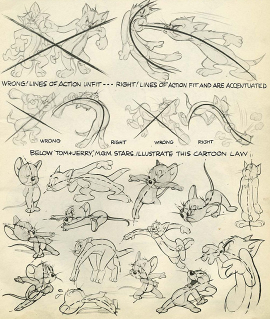
(Here are some image scans from a book called Cartoon Animation by Preston Blair, and there's a lovely tutorial on expressions from the comic Lackadaisy here!)
Next I'd like to mention the shading. There is a bit of an inconsistency between the way you shaded each character. Although lighting direction was ignored for style here, the particular techniques used for each piece should remain the same throughout each frame of an animation, each panel of a comic, or between related images in general. In the second photo, the highlights on the four-eyed cat almost looked like fur patterning, so maybe refining that highlight by making it a little darker would make it more obvious it was a highlight and not a change in fur color?
I think if you were given a little more time you would have managed with the shading, but still something of note to keep in mind for the future~
Finally I would like to address the environment... or the lack of it. The bright red background is lovely, especially in this grey scale-pop style of colors. My only issue is that it feels like they're floating in some red void- you have the darker red to denote the ground, but it doesn't feel very consistent with where the characters are placed and there's no shapes in the background to denote any kind of environment- no tree silhouettes, no building silhouettes, or any other objects that could denote where the characters are.

Above is an example from Persona 5 which kind of shows what I'm talking about. Looking at some perspective tutorials will actually show you a way you can manipulate the floor or gradients to help add some solidity to the ground. With this style I wouldn't even say you would need to add nearly as much detail to them as Persona 5's art- just some dark shapes and perhaps a gradient of sorts to give a sense of location to the scene would help.
Overall, wonderful job! My first impression was 'Oh hey this looks like something from Persona 5!' so you really got that feel you were looking for. You also immediately get a sense of relationship here- from an outsider's perspective with zero previous information on who these characters are or how they are related. You can clearly tell the four eyed cat is protecting the female cat in the back, and there's a sense of either accusation from the one-eyed cat or threat, and that the other two almost seem to be distressed as if they were once close to this character.
Keep up the good work, don't feel discouraged with the lack of feedback from your class. I really feel with a bit of practice in terms of expression and body language you can really make some great waves with your art! You have a great foundation.
In terms of art program recommendations, my wife and I both use Clip Studio Paint. You need the EX version for feature length animations unfortunately, but the PRO version is much cheaper and lets you do some very short animations however it is a very powerful illustration and comic tool as well. Krita is a totally free program that will let you animate as well and has a pretty robust illustration feature itself, but I'm not sure if it has anything specific for comic making.

A big thank you to Spookydoesstuff for being our first review and for being so pleasant to speak to! Please check out more of their art and their blog by clicking here to go to their tumblr!
7 notes
·
View notes
Text

does my cat look like her
326 notes
·
View notes
Text
when i was a teenager it felt very revolutionary to be cruel to myself. like some kind of slow passive protest against how much everything hurt. i starved myself of sleep and food and tenderness because it felt right. it felt sharp and angry and radical and i wanted to be those things. adulthood is the realisation that the world is already working to cut into you well before you learn how to do it yourself. caring for yourself and others is the real protest
377K notes
·
View notes
Text
We're Open!

Do you need redlines or just aren't sure what you want to do to execute a piece? Submit your dilemma, and we'll help!
By "dilemma" I mean submit your progress, sketch, or completed piece with any questions you may have!
For our about page, click the 🍓!
Currently redlines and other critique are available through 4 submission slots. One slot out of our original five are filled, and will be given feedback based on the artist's goal for the piece.
If you have a general question, feel free to ask!
🍓Berry🍓
0 notes
Text
A friend of mine did a redline over my Rex drawing for me to help me figure out where I wanna take it and boy did it help me a LOT.
Getting some feedback in the sketch stage is always a good idea, especially if you got friends who are willing to redline your work! A very valuable tool for learning! ✌️😊
Particularly if you want to use forced perspective. Always wanna push a pose/perspective to its limits for the best effect!
9 notes
·
View notes
Text
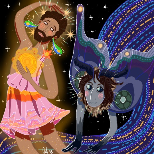
the poets say some moths would do anything out of love for a flame
- moshin hamid
#an example of how to marry colors super well#the whimsy in this one steals my heart#to use as a good example#the poses and expression of feeling through movement is so goooood
90 notes
·
View notes
Text
To all you aspiring artists out there:
You will get better. You may be like “gosh, I really can’t draw people, dogs, whatever” right now, but someday you WILL be able to.
Less than a year ago, our dog drawings looked like this. They were fun, whimsical, but GOSH the anatomy and expressions of the dogs weren’t good at all!

Now look at us. This is less than a year later and honestly, this was all just from continuing to draw dogs.
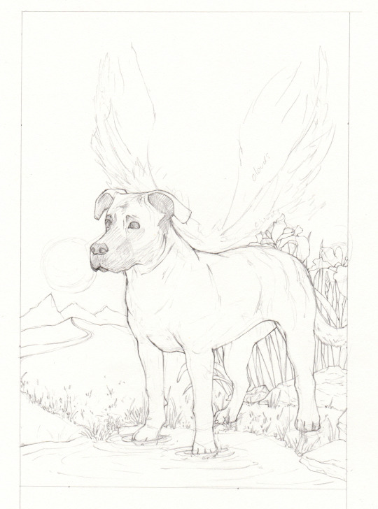
Here’s the key:
🌟 Use references: The things that often deters artists from doing this is that, at first, your drawings look NOTHING like the reference. This is okay! Even if you absolutely hate the finished drawing–you’ve learned valuable skills. Draw five more times from reference and you’ll start to notice that you’re picking up on skills you never had before.
🌟 Celebrate your accomplishments: The hardest part of art is staying motivated even when your art isn’t up to your preferences. So, celebrate what does look good! Noticed a bit of improvement in one area? Literally write on the back of the drawing “I just improved with (whatever it was)!” As silly as it sounds, this makes a difference.
Keep going. You’re doing great and you are improving.
If you’d like, feel free to post two pictures below–one from a few years ago and one recently. Mention how you feel you’ve improved!
(This is totally okay–even encouraged–to reblog, too. There are a lot of artists out there and we could all use some motivation.)
5K notes
·
View notes
Text
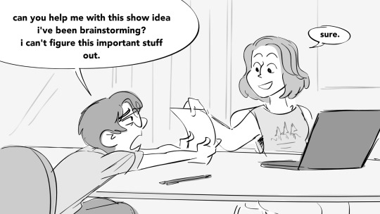
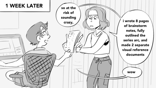
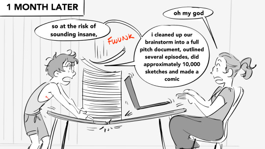
i love working with my wife on our gay comedy passion projects because we enter a loop of feeding each other’s unhinged lunacy
48K notes
·
View notes
