
paige-sparks-ist-blog
Illustrative Studio Techniques
31 posts
Don't wanna be here? Send us removal request.
Last Seen Blogs

tohru-honda
本田 透

themkdsnetwork
The Red Hive

sacredmoonrising
Enter this sideshow
melflippendo
Melvin Estrella
tohru-honda
本田 透
Text
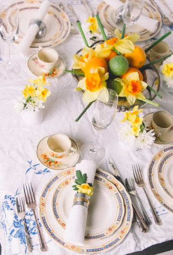
2807QCA - Task 05 - Critique
I wanted to create a beautifully constructed images that when someone looks it at, they can put themselves into that situation at the wedding and imagine their very own wedding.
I believe strongly that the perspective and point go view of this image really captures the surroundings of the party, rather than just shooting it from above as one plate, because that does not tell a story. Here, you get the bigger picture.
The consistency of using all the same flowers throughout my works really bring them all together to become a cohesive body of work.
I could definitely take this work further by creating a whole series of ‘wedding’ table sets as well as other scenes of the wedding. This would be a great spread for a magazine like ‘Better Homes and Gardens’ etc.
The weakness in this image is that the table cloth is not ironed and really takes away the perfection of the able setting. I also think I could have paid attention to more of the finer details adding in things here and there and also taking them away. But I really do think that this word works well with all my other images. The character portrait could even be seen as the flower girl for this wedding. The choice of colour palette really ties everything together.
0 notes
Text
2807QCA - Task 05 - Test Images
When setting out to to this Set Design I loved the idea of the Wedding Table Setting, but as I was shooting I realised that it might not be classified as a ‘set’, although I was creating a set and it was a 'place’. In my panic I came up with a little set using my sister little horses and the flowers I had left over. I really didn’t enjoy the image, although with more props and more time it would have been an effective image.
0 notes
Text
2807QCA - Task 05 - Lighting
The lighting for this image was very simple. I wanted a clean and soft light coming through the image. I lit it with just one horizontal soft box, firing from the same angle that the I was shooting at. This have a nice and gentle gradient of light, making the image come to life and be more inviting to the viewer. This also kept the reflections to a minimum on the plates and glasses. I feel as though I have achieved what I was set out to do in terms of lighting.
0 notes
Text
2807QCA - Task 05 - Research
Adam Voorhes and Robin Finlay
I took inspiration from these two because of the simplicity that they use and capture in all of there works, I wanted to bring this element into the my Set Design.
David Hockney:
I always love how David Hockney does his Set Designs, they are always very elaborate and very well thought up. They seems quite busy, but they are really just simple and elegant.
0 notes
Text
2807QCA Task 05 - Test Images
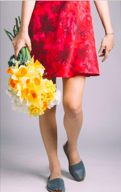
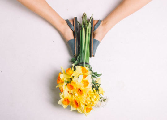
For the Fashion I wanted to create an image that could be used in a variety of magazine and advertising campaigns but also wanted something that would fit my Spring Floral Campaign, I wanted to step away from the tradition fashion poses and go for a pose very unique and different. I chose to have a model that I knew was fun and vibrant and that would also help come up with some different poses helping me convey my message. I really loved these two images as well but felt that they didn’t fit the criteria of ‘fashion’ enough. I do think though that they have a lot of potential in also being shown in a magazine and also part of the campaign. The shoes are super funky and very different to the ‘typical’ fashion pose and that image could be used for a company similar to Birkenstocks.
0 notes
Text
2807QCA Task 05 - Lighting
In terms of lighting for my final image, I wanted something that was soft like the flowers and the dress to compliment them, and also give a bit of shape and depth to the model and flowers. I chose to light it with a vertical soft box, lighting from the left of the model, right of the camera, and then a reflector on the other side of her to catch the light and fill in the areas where there was too much shadow and contrast. This lighting brought to life the flowers and the dress, making them both pop and showing them in such detail. This lighting also compliments her legs by being shape into them and not making them look flat, because it is important in fashion that everything looks the best it can, because it become more derivable that way.
0 notes
Text
2807QCA Task 05 - Research
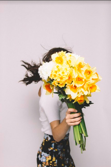
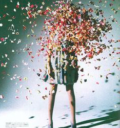
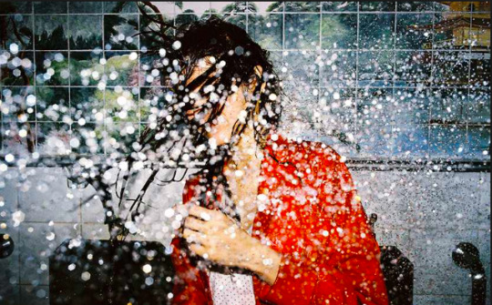
As inspiration I looked at a photographer by the name of Yoshiyuki Okuyama, She creates a lot of interesting and unique fashion photographs, and I wanted to bring an element of that into my work. She tends to not shoot the models face and either leaves it out of the picture of covers it with something, similar to the flower confetti as seen below. Her work is very Japanese inspired and always fun and vibrant, and immediately grabs your attention.
0 notes
Text
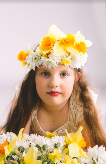
2807QCA Task 05 - Critique
For the Character Portrait, I wanted to create an image that would fit and heighten my sisters personality. She is a really soft, quiet, delicate and sensitive girl that has so much purity and love in her body. I wanted nothing to distract away from that, and when I captured just her gaze, I felt that what I was trying to convey was right and that the message was being received. The soft nature of the flowers and how delicate they are really contribute to me message behind the image. The colour palette is perfect and help bring the softness and beauty to the image.
I would take this image further by continuing to do a whole series of similar images with different young girls with all different type of flowers, this could help the advertising for a florist as an example of what a flower girl could be dressed up as. I feel as a whole series it would really bring the works to life.
As mentioned before this image would either be a feature in a magazine advertising a certain florist or look book or the cover of the magazine.
I believe my weakness in this image is that her hair is imperfect and lots of look hairs everywhere. I am not completely happy with the background either, it is a different colour to the rest of them, letting the series down as a whole. I believe my strength is that it is a very beautiful and emotive image that truly captures who she is as a person. I love the tone of the image and how it is presented as a whole.
0 notes
Text
2807QCA Task 05 - Test Images
I did end up doing a whole lot of different frames and different poses with the model, I got her to stand up, look around, sit down, and had the flowers in a lot of different positions. But I think my final image was the most effective in conveying the message I wanted and really brought to life the model. It was the most subtle beautiful one, where their were no distractions taking away from her and the flowers.
0 notes
Text
2807QCA Task 05 - Lighting
The lighting for my Character Portrait is very simple, there was only one light used and one reflector. This gave my image depth. The light was positioned on the left of the model at her head light, beaming across her face. The reflector was on the other side of the model and catching the light and then reflecting and filling in the darker side of her face. This gave a lovely gradient to form on her face, bringing depth and a subtle contrast.
0 notes
Text
2807QCA Task 05 - Research
I took inspiration from Annie Leibovitz and how she captures people’s personality and also capture that person in their rawest form, simply just gazing at you. Her photos immediately impact you, conveying an emotion not just through the gaze but in the lighting of the model. It is such a simple image but it says a thousand words, her colour palette is truly beautiful and I wanted to replicate that in my own way, by not coping her colours, but to create my own.
0 notes
Text
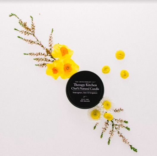
2807QCA Task 05 - Critique
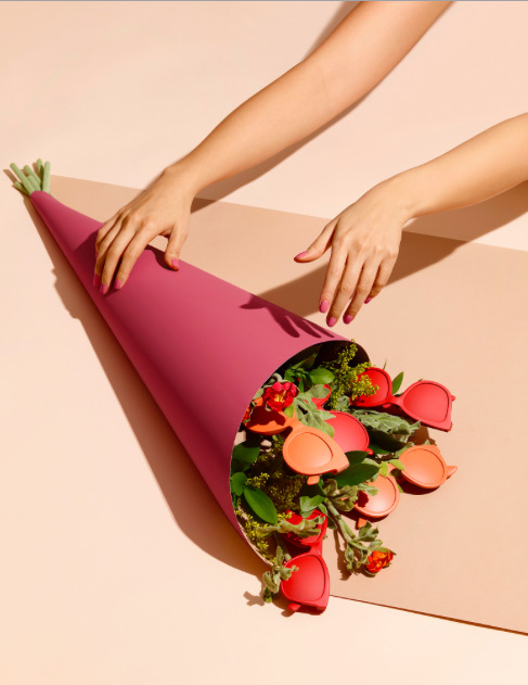
I have chosen to link my four images with a Spring Floral Campaign that could be used as advertising for a florist in a magazine similar to Frankie or Yen.
I wanted to create an image that would fit my Spring Campaign but also bring an advertising element to it, so the incorporation of the flowers and the candle brings desire and want to the viewer. The flowers draw the viewer in to the image and then lead their eye to the candle, which is the main part of the photograph.
I would like to take this image further by doing a whole line of candles from the same company and accompanying them with the ingredients that are put into the candle itself. This would give a whole new element to the image and could be used in a variety of advertisements.
I believe my weaknesses in this image is that the background colour does not match the ones of the other photographs, bring the series down as a whole. I think my strength is that the image is very simplistic and will draw the viewer in easily making it a great advertising/ still life image.
0 notes
Text
2807QCA Task 05 - Test images
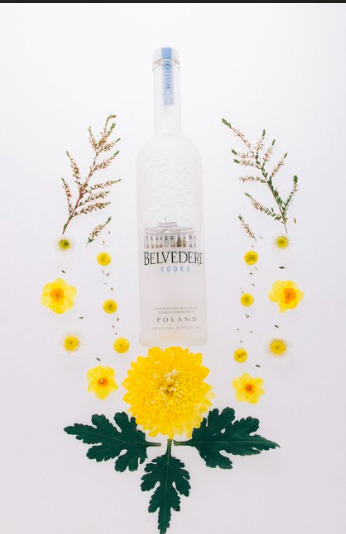
I was originally going to use the Vodka Bottle as the centre piece of advertising, but once I had finished shooting I realised that the bottle wasn’t straight and it didn’t look the way I wanted it to. So I chose to use the candle which I shot at the same time as the vodka bottle.
0 notes
Text
2807QCA Task 05 - Lighting
My set was lit with 2 lights, one was an elinchrome light lighting it from below so it shone through the white plastic to give detail to the items. My second light was just a standard broncolour light which was shining on a reflector behind the S table which my objects were sitting on. I then created a white box around it by putting a reflector on each side and then one above, this gave it a really clean look.
0 notes
Text
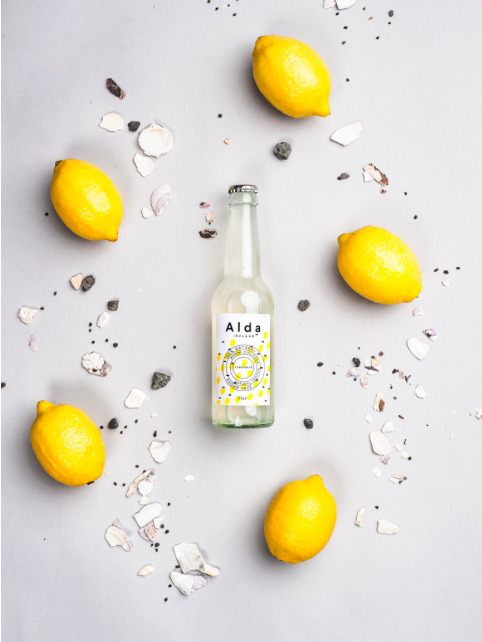
2807QCA Task 05 - Research
Milja Emilia - Alda Iceland Series
This series of works from Milja Emilia was part of the campaign for the packaging and social network images for Alda Iceland Lemonade. I really like how clean and simple these photographs are in conveying the message as well as being aesthetically pleasing. I want to draw the elements of simplicity and colours from her work into my own.
0 notes
Text
2807QCA Task 04 - CRITIQUE
FINAL IMAGE

This was my final image and I am very pleased with how it turned out.
I see this image being used as a cover of a children's story book, or as one of the pages in it. The story would be something similar to ‘Where the Wild Things are’, in the dark but also inviting nature. I would take this further by producing some more pages of what the book could possibly be.
Technically I had some issues with lighting and getting all the exposures of different elements in the image correct. But I think in the end I achieved what I was looking for. I think I could improved with more effective lighting and more interest in the photo, and I will strive for that next time.
I wanted to create a set design based on what I like doing, which is camping and I wanted an element of creativity in it and for it to have an abstract look to it. I wanted to have an element in of mystery though the narrative and wanted the viewer to fill in the pieces of the story. It could be before or after something happened in the narrative.
I looked at Gregory crewdson work because he is amazing at lighting sets and also his images are always snapshots of a story that is being told and I wanted to take that element through my work.
0 notes