Text
500 words (or less) of review Ep5- Thunderball
My, oh my, what a busy college schedule i had. At first, I thought, “Huh, How could I be so unprofessional and never finished watching this movie”, which seemed alright at first, but after 3 minutes, I remembered why now. The action sequences in this movie moved from fun, popcorn-y action, to seemingly pulled-out-from-one’s-arse contrived. Spy gadgets just came up from no where, it makes the action really hard to keep up. I guess this is the point where I just do not care anymore, because the action had pushed the movie right into Sillytown. I get that weary sense when I watch these movies, the same as when I watch Marvel movies in recent times. It is good, it passes the test, but it also makes me give less of a shit than a rectal stopcock. Oh well, here we go.
James Bond, a sex machine with no stop button, is on a quest to stop a dastardly scheme concocted by non other than Spectre, the crime organization that seems to be run by a group of accountants, believing themselves to be massive villains, but in modern time would be considered to be nothing but common thieves. While we’re on the subject of sex, James Bond really seems to get out of his way just to get his rocks off this time around. In previous Bond movies, he at least tries to seduce the ladies, and know when to back off when appropriate. But now, he just puts his dick wherever he wants to. I think James Bond will be convicted not as a murderer, but as a serial rapist and sex offender. I guess it’s supposed to make James Bond look like a male power fantasy, but I don’t know about other men, but I like to have my woman consent for any sexual touching.
And speaking of horrible crimes, there is a lot of killing that just came across as wanton and unnecessary. It just doesn’t make sense to kill off the guy who you just gave money to do your job, and then killing them. It makes the group look silly rather than threatening, because there is no actual sensible motive behind their action. It’s just kill, kill and kill, for no better reason other than they are the bad guy and someone has to kill. Even James Bond has done some wanton murder in this movie, and none of them are being killed in a clever subterfuge or whatever, it’s just plain brutal murder.
So that’s my final word really, you need to possess 1/10th of your current brain capacity in order to properly enjoy Thunderball. There is willing suspension of disbelief, and then there’s this. It’s just silly.
0 notes
Text
500 words (or less) of review Ep4- Darkman
I feel like I have to get away from James Bond movie for a while, because I’ve found myself dreading to watch another James Bond movie, regardless of its actual quality now. I fear that it just can’t satisfy me unless it features 20% more action, guns and tits. So this episode I will be reviewing the 1990 movie, Darkman starring the then not badass Liam Neeson.
What intrigued me is that it’s essentially a superhero movie, but it is so far apart compared to modern comicbook superhero movies of Marvel and DC. In this movie, no one actually win. By the end of the movie, Peyton was too twisted by his own vindictiveness that he could no longer see himself be with his girlfriend again. It is a tragic story that sets up a decent man, and throughout the movie, we see how our protagonist deal with the difficult circumstances, such as having his lab, and his face burned down.
The comparison of Peyton’s deformed face and the circus freak at the fairgrounds really epitomizes the experience of one’s crippling self-awareness of their own abnormality or even deformity. It does have the “The Fly” effect where we are emotionally attached to the characters through their actions, but as time goes on, the protagonist steers further away from their own conscience, and becomes ever more deformed and deranged. We as the audience feel for the character and couldn’t help but pity for them, but it is ultimately to no avail. And that’s what I like about this movie. I could give or take the special effects, since it’s the 90s, but it does the job well enough, and the character arc, the plot and the tone of the movie are more than enough to compensate that.
So yeah, if you’re sick of the recent Marvel’s neverending hype train to Moneyville, go watch Darkman.
0 notes
Text
500 words (or less) of review Ep3 - Goldfinger
I've maybe put this review thing down for too long, so without further ado, here's what I think about the their installment in the adventures of the gun-wielding, hottie-snogging, stealthy espionage agent, James Bond. It's a solid movie with a clear plot line and no muddled motivations, with action and witty dialogue weaved seamlessly into the movie.
The villain, while very articulate and well-spoken, and claims to have calculated every possibilities and therefore his plan will never fail, couldn't even conceive the possibility that strapping James Bond next to your bomb gives James Bond all the opportunities to foil your stupid overly-complicated plan. So, he isn't exactly the most threatening James Bond villain, but he gets the job done.
Alright, I probably should address the big turd on this otherwise perfectly satisfactory film, which is the way female characters and the bad guys are portrayed. For one, the Bond girl is called Pussy Galore. That is all you need to know about the 1964 film Goldfinger. Second, almost all the henchmen of Mr.Goldfinger is Asian, even the stewardess on his private jet is a sexily-dressed Asian girl. The iffy gender politics and the casual racism makes it absolutely cringy and at the same time a joy to watch with a fresh new modern perspective.
Overall, I'd say it's pretty solid, with a weird obsession with women and Asians, not unlike myself coincidentally.
0 notes
Text
500 words (or less) of review Ep2 - From Russia with Love
This is the second installment of Sean Connery's James Bond movie, where the main antagonist is Russia, same as every movie made in the 2000s. I would like to start off by saying that this could very well be the template that a lot of good spy movies modelled from. It features three elements for a good spy movie, cutting edge spy gadgets, action-packed scenes, and of course hot titties showing on screen. The movie starts off strongly as we witness a stealth sequence with our hero, James Bond being followed by a Russian agent in a garden in the middle of the night. The Russian agent assassinated him, but it was then revealed it's actually a stealth training by the Russians. Shortly after that, we were introduced to the principal villain, No. 1. The main baddie never reveals his face throughout the movie, which gives a sense of mystery behind their evil schemes. I mentioned spy gadgets earlier, and here we're introduced to a concealed sniper rifle during the first act. We, as well as James Bond were shown the ins and outs of the gadgets during this sequence. This is paid off with a later scene where the concealed rifle was put into good use to eliminate the enemy. Now this is good screenwriting. Another strong point that this movie has is the relationship between James Bond and the Bond girl. The romance in this movie is quite believable, as we witness their development throughout the whole movie, focusing on only one Bond girl. This gives a tighter focus to the story and it also gives actual emotional weight to the movie during the action scenes. One other thing worth mentioning is the interesting set pieces throughout the movie. The intriguing settings are used creatively to not only draw the pace of the movie, but also creates a stage for witty dialogues. An example is the gypsy camp that James Bond and his colleague went to for an investigation. During their visit, we're shown the ways of living and the rituals that the gypsies perform. One of them is a fight between two ladies, of which the victor will be awarded the right to marry the chief's son. Just when the fight is really kicking off, the Russian soldiers storm the place and started to shoot everyone. The scenes in this movie makes it so that it's always exciting. But it must be said, the Russian accents in this movie are not great. And besides that, the principal villain never really struck me as motivated to kill James Bond. It just seemed that he's just a inconvenience. So it never feel like James Bond was ever in a tight situation. But really though these points are quite nitpicky. Overall, this movie is quite solid, especially considering that it's over 50 years old now. It's a testament of how a well-made movie can stand the test of time. Now onto the third movie...
0 notes
Text
500 words (or less) of review Ep1 - Dr.No
It's a James Bond movie, it's regarded as one of the classics, so I thought I might as well go through the James Bond movie franchise, starting with its first movie, Dr.No.
Initially, I was watching the movie with the attitude that I will have a great experience, but as the movie progressed, some crow's feet starts to surface, starting with the what might be cutting edge special effects at the time, with its rear screen projection and so on, now seemed a bit absurd, but heck, I've seen worse in modern movies.
The thing that really kicked me in the balls though is the blatant lack of musical score in the movie. Most of the scenes have no soundtrack going on and the few that do have used two or three of the same soundtracks repeatedly, one of which is the now famous James Bond movie soundtrack. Silence is more suited for an atmospheric horror feel that gives a sense of dread, not so much in an action-packed movie.
While we're on the subject, the action in this movie is serviceable at best, and laughable at worst. The male power fantasy image that James Bond now has must have been acquired in later films, because in this he fights like someone in their first karate class.
But worst of all is the screenplay. The movie consists mostly of wide shots, and the editing is done in a bland way. Even the action shots goes on for ages, whereas the angle change like Billy-O in a modern movie fight scene. Later James Bond movies did well in this regard, (at least that's what I thought since the last time I've watched the Pierce Brosnan ones and Daniel Craig ones, my thoughts could very well change after my James Bond movie run) by having fight scenes that have interesting set pieces that can be used creatively to create a sense of threat for our protagonist. Meanwhile there's barely fighting in this one, at one point some enemy soldiers came and James Bond flat out surrendered, not as a clever subterfuge, it's just a surrender.
The plot is quite muddled as well. It's pretty hard to follow anyone's motivation for why anyone is doing anything, and the villain is as bland as new year's crackers. The female protagonist is pretty confusing as well, from what I've gathered she's supposed to be a marine biologist of some sort, but that's about it. It's quite unclear why she needs to be there when she doesn't seem to contribute to the proceedings.
You might say that I am an overstimulated 20-something who can't understand older movies and therefore won't enjoy this movie for that reason, and your probably right. But I can't help but get bored watching this movie, and I can't honestly recommend this movie to anyone. It definitely did not stand the test of time is what I'm saying. I'd recommend the first Mission Impossible over this.
0 notes
Text
Project log #11(Reflections after doing a proper interview)
29 April 2017

These are the responses gathered from Form 1 Mathematics teachers in SMJK Kwang Hua.
All interviews were conducted on 26th April 2017.
Pn.Junainah
1) How long have you been in the teaching career?
I have been in the teaching career for 12 years.
2) What subjects do you teach?
I taught Mathematics, Pendidikan Moral and Pendidikan Sivik.
3) When teaching mathematics to lower secondary students, what are the problems that you faced?
The new syllabus introduced by the Ministry of Education early this year is very confusing. This has led to many frustration teaching students, while still needing to use the teaching guidelines provided by the Ministry. In general, the mathematics syllabus taught to Form 1 students are quite hard compared to primary school level mathematics.
4) What are the difficulties of students in learning mathematics?
Students generally have a lazy attitude towards learning, and they lack concentration during classes. This has made it very hard to properly teach mathematics to Form 1 students.
5) How would you explain the concept of calculating positive and negative integers?
I would explain it by using a metaphor of temperature and weather, just like in geography. For example, a winter day will have a -5 degrees Celsius temperature. When it goes down by 5 degrees, it will be -10 degrees Celsius.
6) What are the problems that you faced when teaching the calculation of positive and negative integers?
When teaching positive and negative integers, the students will always be confused with the formula given, which goes like this: minus minus plus, plus minus minus and so on. But some students will go and do something like – 4 – 5 = +9, which is not the right thing to do.
7) What are your opinions on implementing a teaching tool in teaching mathematics?
I think a mathematics teaching tool should be implemented in a case by case basis, using makeshift materials, which will fit the individual need. This is because I think there is no cure-all when it comes to teaching mathematics.
8) What are the elements you think that are the crucial to an effective teaching tool?
I think that the way that the teacher introduces the teaching tool is a lot more important than the teaching tool itself. A competent teacher will know how to make use of what is available and be able to use it effectively. The teaching tool only needs to grab enough attention from the students to not be boring.
9) Do you think the design will help students understand the concept better?
I think that a teaching tool like this will be of more interest towards good-grades students. The bad-grades students will not give that much attention to classes in general, so it is will not be that effective.
10) Which design do you prefer?
I prefer the U-shape design.
11) What are the unique characteristics of the design?
It has a unique design to it. To me, it will attract more attention from the students, as opposed to the rather bland straight tube design. It functions alright and it serves its purpose.
12) What are the flaws of the design?
None
13) How can it be further improved?
None

Describing positive and negative integers like it is the temperature in a thermometer.
Miss Lim
1) How long have you been in the teaching career?
I have been working as a teacher for almost 30 years now.
2) What subjects do you teach?
I have only taught Mathematics as it is the teaching subject that I have been focusing on all these years.
3) When teaching mathematics to lower secondary students, what are the problems that you faced?
There is a language barrier when trying to teach Mathematics in English, because most of the students are from primary schools that taught Mathematics in Chinese. Furthermore, the syllabus introduced by the Ministry of Education makes it even more confusing to teach. The guideline is very vague, and the textbook does not do a good job explaining the subject. So we are forced to use our own methods to teach Mathematics to Form 1 students.
4) What are the difficulties of students in learning mathematics?
For the bad-grade students, they do not put enough attention during classes, and have less interest in education as a whole.
5) How would you explain the concept of calculating positive and negative integers?
I would use a table, positive on one column and negative on the other column. Using this way, the calculation can be done in a mechanical way, without needing much explanation at all. I would just tell the students to do more exercises. That way, the formula will become more innate to them.
6) What are the problems that you faced when teaching the calculation of positive and negative integers?
A lot of times, students will be okay with the formula and the table method. But often times they will forget it at the very next day.
7) What are your opinions on implementing a teaching tool in teaching mathematics?
I think that implementing teaching tools in teaching Mathematics can make students better understand the concept, but it is still crucial that students do their exercises.
8) What are the elements you think that are the crucial to an effective teaching tool?
The teaching tool has to look interesting, because students nowadays are coming from an era of smartphones, so it is very important to catch their attention.
9) Do you think the design will help students understand the concept better?
I think it will give them a visual cue for the concept. At least the students will have something to link the concept with other than just a blank.
10) Which design do you prefer?
I prefer the U-shape design.
11) What are the unique characteristics of the design?
It has a unique shape.
12) What are the flaws of the design?
It is still not that easy to understand with it.
13) How can it be further improved?
I think that interactivity is important for the design. It has to be able for students to interact with it, let them experiment with it, so that they themselves can get an idea out of the tool.
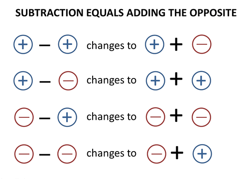
Stick to your guns, use the formula.
Pn.Sou
1) How long have you been in the teaching career?
I have been teaching for 20 years.
2) What subjects do you teach?
I taught Mathematics, Pendidikan Seni, Bahasa Cina and Pendidikan Moral.
3) When teaching mathematics to lower secondary students, what are the problems that you faced?
Students are generally having less interest to actually put in some effort to finish their homeworks.
4) What are the difficulties of students in learning mathematics?
Students cannot seem to concentrate on what is being taught in class. This is not helped by the fact that the new syllabus introduced by the Ministry of Education, which incorporates syllabus from Form 3 and Form4 Mathematics, which makes it even harder for Form 1 students, who could not even grasp the basics of Form 1 Mathematics
5) How would you explain the concept of calculating positive and negative integers?
I would use the example of owing people money, so it will be like: owing Ali RM 3 will be like -3, and receiving RM2 means that I only owe Ali RM1, which is -1.
6) What are the problems that you faced when teaching the calculation of positive and negative integers?
This is not an issue for the good-grade students, as they can cope quite well with the syllabus. But, the bad-grade students will have a much harder time, because they are more careless in their calculations, which mean that they will make more mistakes.
7) What are your opinions on implementing a teaching tool in teaching mathematics?
It will certainly make them more interested towards the subject.
8) What are the elements you think that are the crucial to an effective teaching tool?
A unique and interesting looking design which will grab the eye. It also has to be easy to understand; otherwise it will be useless for the occasion.
9) Do you think the design will help students understand the concept better?
If the students are more interested, they will put in more effort into solving the equations. So I think it will help them understand the concept in the way that it makes them work harder to solve the problem.
10) Which design do you prefer?
I prefer the U-shape design.
11) What are the unique characteristics of the design?
Its aesthetic is more interesting. It also has a unique shape, which will attract more attention compared to the straight tube design.
12) What are the flaws of the design?
It is not that user-friendly, because the design is somewhat unwieldy, making it hard to use it during a demonstration or an interactive learning session.
13) How can it be further improved?
The stability of the design has to be improved. This will make it much easier to use. The students’ interest is the most important thing for the teaching tool. So make sure that it will be interesting for the students to look and to use.

Making the students more engaged in classroom environment will make them work harder in their studies.
Pn. Jeanny
1) How long have you been in the teaching career?
I worked in the teaching career for 7 years.
2) What subjects do you teach?
I taught Mathematics, Kemahiran Hidup, Pendidikan Moral, Pendidikan Sivik and Pendidikan Jasmani.
3) When teaching mathematics to lower secondary students, what are the problems that you faced?
Students not paying attention to classes, and just generally being lazy and not wanting to do homeworks.
4) What are the difficulties of students in learning mathematics?
Students lack the foundation needed to learn lower secondary Mathematics. So, it makes it quite a bit harder for students to keep up.
5) How would you explain the concept of calculating positive and negative integers?
I would explain it like owing somebody money.
6) What are the problems that you faced when teaching the calculation of positive and negative integers?
Students will get the formula confused, because sometimes they will use the formula in the wrong way. For example, some students will write -5-8 = +13. The negative negative positive could only work like this if it had been multiplication or division, like (-5)X(-8) = +40.
7) What are your opinions on implementing a teaching tool in teaching mathematics?
It will certainly improve the teaching experience, because the teaching tool will be a good visual cue for the students, giving them a mental image for the subject. If the teaching tool can provide interactivity, it will be even better. It is like how the psychologists say 50% visual, 30% touch. If the tool can engage more senses, it will be even more effective.
8) What are the elements you think that are the crucial to an effective teaching tool?
The teaching tool needs to have a unique design. It needs to have the wow factor, because the teaching tool needs to attract attention, and make them ignore the mathematics temporarily for the interactive teaching session.
9) Do you think the design will help students understand the concept better?
The teaching tool will give an interesting visual cue for the students, something to remind them of the concept and the formula during exercises.
10) Which design do you prefer?
I prefer the U-shape design.
11) What are the unique characteristics of the design?
It has a unique shape and look. I think it is quite usable as a teaching tool, because the students can interactive with the design.
12) What are the flaws of the design?
The design is not very stable.
13) How can it be further improved?
Adding on more support to the design will make it an even better teaching tool, because students will definitely monkey with the teaching tool. So, the structural integrity is very important.

Having interactivity to your teaching tool will make it even more effective in teaching, as students can experiment with it, and come up with a logic that will suit them to an individual level.
Pn. Yeo
1) How long have you been in the teaching career?
I worked as a teacher for 25 years.
2) What subjects do you teach?
I mostly taught Mathematics, but sometimes I fill in for other teachers, most of them are Pendidikan Moral and Pendidikan Sivik.
3) When teaching mathematics to lower secondary students, what are the problems that you faced?
The language barrier is a major issue, because Form 1 students are coming from primary school that teaches Mathematics in Chinese. This makes it hard for students to understand the questions. This year, the Ministry of Education introduced a new syllabus for Mathematics, starting from Form 1. The syllabus is too advanced for Form 1 students, because they simply lack the foundation in Mathematics to learn such advanced Mathematics that would normally be taught to Form 3 or Form 4 students.
4) What are the difficulties of students in learning mathematics?
Students lack the foundation to learn the mathematics. But really though, most of them are just lazy to put in the effort, even the good-grades students too. I think this is mostly due to modern-day parents not paying attention to their children’s education.
5) How would you explain the concept of calculating positive and negative integers?
I would just use the formula to teach them, because I believe that if the students do their exercises, they can understand the concept.
6) What are the problems that you faced when teaching the calculation of positive and negative integers?
The formula is not very intuitive to some of the students. For example, a student wrote down -5-3 = +8, simply because he was thinking of the formula negative negative positive, albeit somewhat misguided.
7) What are your opinions on implementing a teaching tool in teaching mathematics?
Using a teaching tool will make the students to give more attention to the subject. It also gives a visual cue for them to link the concept to. I strongly encouraged my students to draw during tests, because students often times get stuck when looking at pages of numbers and words. The teaching tool will at least give the students something to think to when they are stuck in a question.
8) What are the elements you think that are the crucial to an effective teaching tool?
It has to immediately catch the attention of the students. Because ultimately, the teaching tool is used to make the students more interested. I also think that it has to be colourful. In my experience, Form 1 and even Form 2 students will get very excited by colourful tools and cute shapes, even the boys. My students will get very excited about the things that are related to the latest trends and fashions.
9) Do you think the design will help students understand the concept better?
I think it will at least give the students a visual cue, a mental image for them to link with the formula.
10) Which design do you prefer?
I prefer the U-shape design.
11) What are the unique characteristics of the design?
It gives a stronger impression than the straight tube design, which to me feels like a better design.
12) What are the flaws of the design?
The hydraulic fluid inside the tubing is colourless. The design in general is not very visible if used in a classroom situation.
13) How can it be further improved?
The water should be coloured, preferably bright blue. I think the teaching tool should be brightly coloured, to attract as much attention as possible, because the teaching environment is generally boring, so this will be something for them to look at.
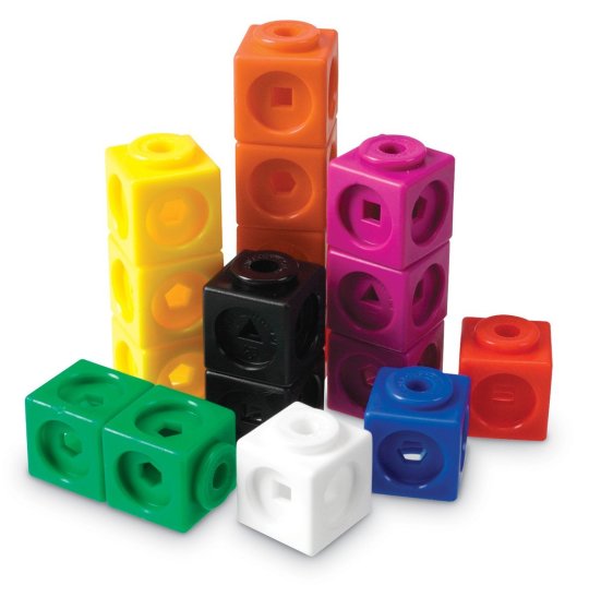
Teaching tools should be brightly coloured, to attract the attention of the students.
Reflections after the interviews
Initially, it was thought that the mechanics of the teaching tool will be somewhat equally important as the aesthetics. Because as a designer, it was taught to design “form follows function”. Turns out, this specific teaching tool and teaching tools in general are more like a conversational piece. The tool’s function only needs to serve its purpose. Teaching tools are like party pieces, they are there to start a conversation and make people, or in this case students more interested to the subject matter.
Through this interview, it was found out that most teachers think that the formula is confusing, and does not give an intuitive way to solve a problem. But, it was also found out that most teachers still prefer to continue using the formula, but with teaching tools to aid the teaching process, rather than using them as a definite way to solve the equation.
Whilst on this topic, the preconception that lower secondary students do not want to use items that are brightly coloured, or items that will be seen as childish was debunked. The teachers interviewed agreed that lower secondary students are still in the primary school mindset, and still likes to see cute and fun things, and would prefer to let the maturity slip by, so that it does not ruin any sense of fun.
A teaching tool for integers will be even more important, now that the new syllabus has the first chapter being integers, which need not be reminded; it is a topic that confused students who are halfway through Form 1. A teaching tool that is colourful and has a sense of fun will no doubt help students to go through the traumatic experience of going to secondary school and finding out what mathematics is like in post-primary environment.
As for the design elements of the teaching tool, there are a few insights acquired in this session of interviews. A teaching tool must be striking, or at least more attractive than the typical classroom environment, and it also must be visible for the whole class. Interactivity and functionality, while very exciting and no doubt will increase the effectiveness of a teaching tool, they are optional.
A teaching tool must be striking not just in colour, but also in form. It should be designed with a sense of uniqueness, so the usual polygonal shapes should be avoided, unless they are implemented properly. An organic shape can bring the students’ focus to the item, to increase the effectiveness of the teaching tool.
But most importantly, a teaching tool must be able to be seen from the back of the classroom. This was not considered when designing the teaching tool, so the mistake of leaving the water colourless was made. If the liquid do not have colour, the movement of the liquid will not be very visible. This will defeat the purpose of the hydraulic pump mechanism of this design. With brightly-coloured liquid in the hydraulic system, the movement will be clearly visible, which then adds a sort of mesmerizing quality to the teaching tool, as the water level goes down on one end and goes up on the other.

A teaching tool’s purpose is to teach, and it has to be designed with the classroom environment in mind. In summary, the improved design for the teaching tool will need to be:
1) More aesthetically striking
2) More stable
0 notes
Text
Project log#10 (Experience of working with foreign dealer in Taobao)
26 April 2017
To preface, the experience was generally better than expected.
The materials needed to make the teaching tool were somewhat unaccessible in nearby area which is the Petaling Jaya area. Moreover, the prices offered by Taobao acrylic dealers are cheaper, with wide selection of length and sizes.
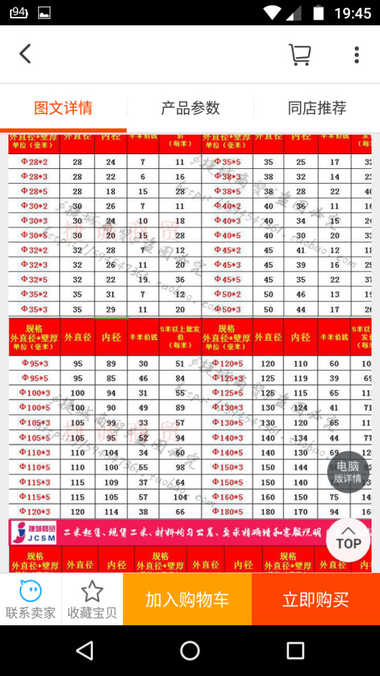
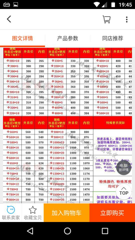
All of the texts were in Chinese, but it did not pose a problem, as the author had Chinese background, which aided a lot in shopping on Taobao.
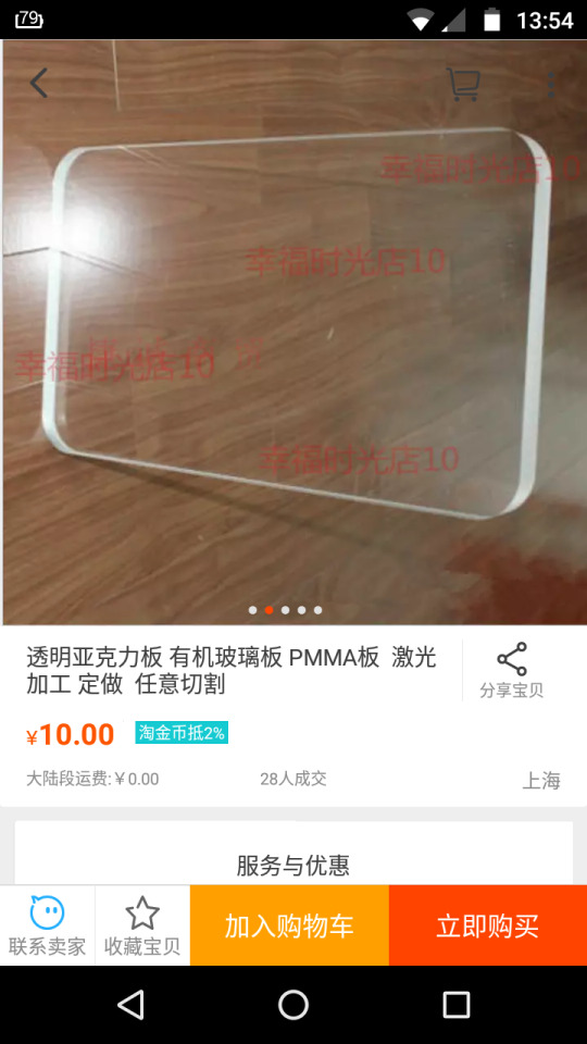

Acrylic tubes and acrylic sheets with vast selections. Not only that, the shipping cost was very reasonable. All these items shipped to Malaysia only costs 44RMB, or around RM29.
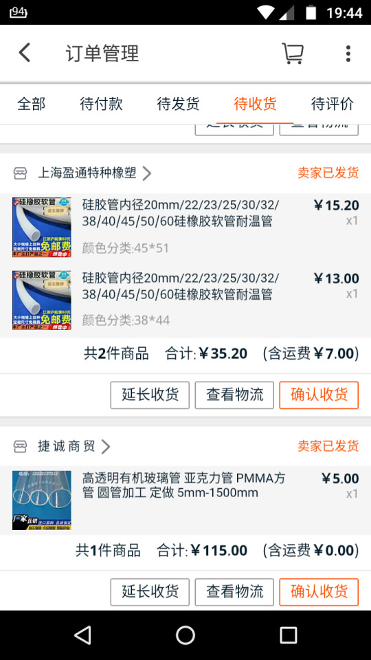
115RMB bought the author around 3m of 50mm diameter acrylic tube, and a 200X200X10mm acrylic sheet.
Needless to say, the reaction to all of these were generally very positive.
0 notes
Text
Project log#9 (A rough demonstration of mechanics)
23 April 2017
The design was focused around the concept of hydraulics, with pumps on both ends and liquid in between.
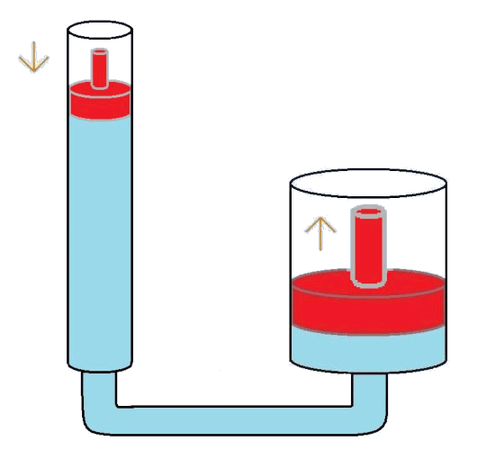
But, since it needed some marking, some syringes were purchased and brought to good use.
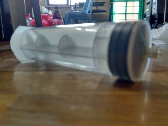
syringe
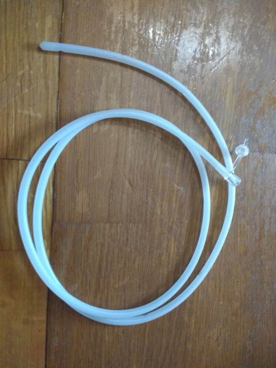
silicone tubing
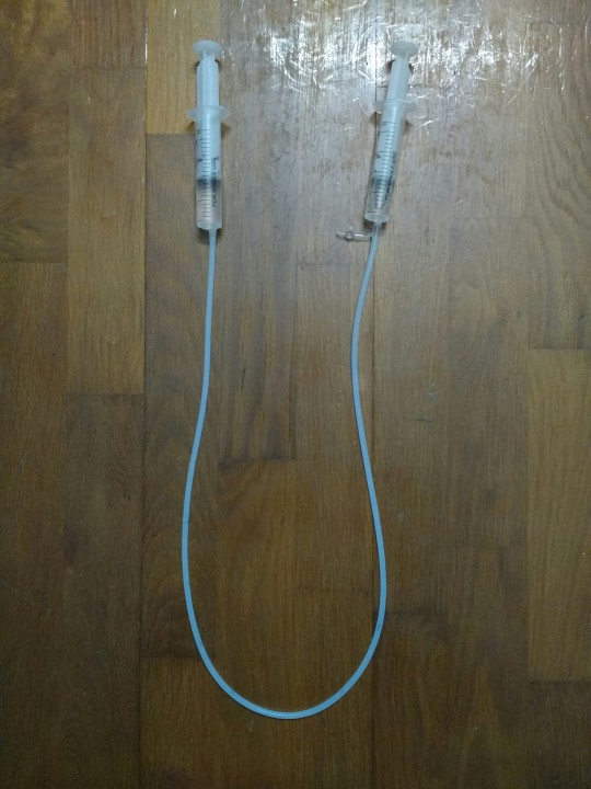
Rough working system.
The mechanics were as follow:
1) Water inserted into the tubing and the syringe acted as hydraulic fluid.
2) Two syringes acted as hydraulic pumps.
3) Markings on syringes were stand-ins for the positive and negative number marks of the design.
4) When a pump is pushed down on one side, the other side will be pulled up.


The model that will be created models around this mechanism.
The prototype will use the rubber seal in a conventional syringe as it has good quality seal, and it usually has standard dimensions, to ease the model-making process.
Acrylic tubes will be used to make this model. This is because acrylic tubing simulates glass pretty well, and it gives a feeling of clear-cut accuracy, a clean look to the overall design.
0 notes
Text
Project log#8 (Failed attempt on surveying)
21 April 2017
An attempt to do a survey amongst personal peers was made, and the questionnaires are as follows:
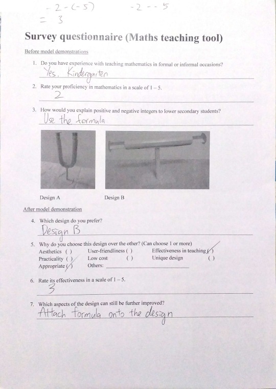
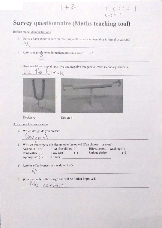
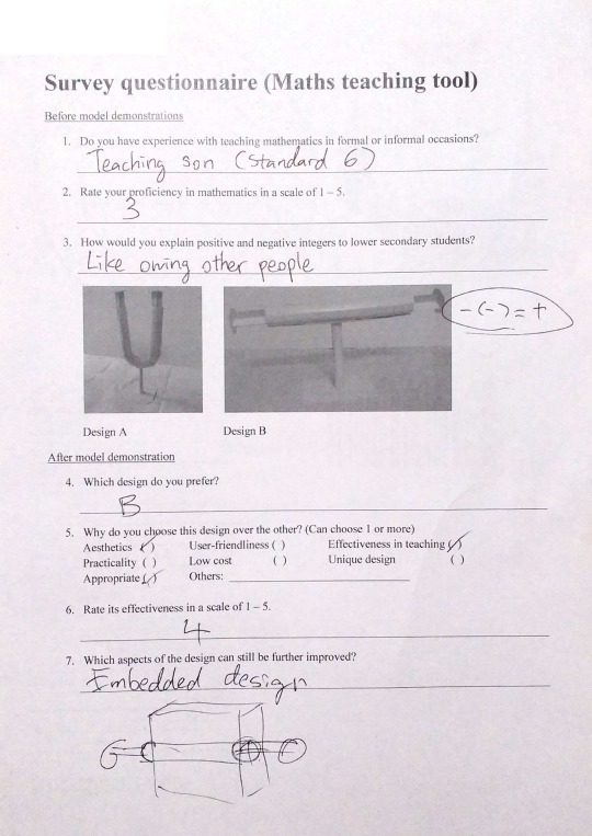
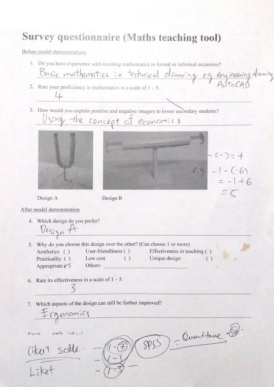
As seen above, these are failed questionnaires, for a few reasons:
1) Survey questionnaires should be mostly multiple choice, or at least in a Likert scale, that is from mostly disagree to mostly agree.
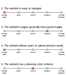
Something like this will greatly improve the quality of the questionnaire.
2) Before and after demonstration in a single piece of paper. This means that the surveyee will see a mention of a model demonstration beforehand, which will spoil the experiment somewhat.
3) Structured interviews should be left with a few experienced surveyee in the subject. This can improve the quality of the answer that could be obtained from the interviews.
More work needs to be done on this department.
What was learnt from this venture though are:
1) Generally people still use the formula.
2) To designers, it is not just the way it looks, it is also how it works and how it interacts with the user.
0 notes
Text
Project log #7 (Deciding on colour scheme and overall structure)
19 April 2017
Since the overall theme for this teaching tool was dealing with positive and negative numbers, the colour scheme was decided to be focusing on the colours red and green, to represent negative and positive.
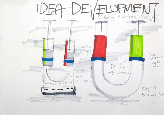
There were some uncertainty of the design on whether to use soft tubing or rigid tubing. It was later decided that rigid tubing was to be used because:
1) Rigid tubing has better structural integrity
2) More aesthetically pleasing
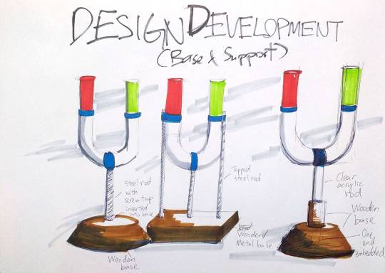
A base was added to provide firm grounding so that the apparatus will not fall over during demonstration. In addition to that, the base will make using the apparatus easier, due to less shakiness when using.
A piece of larger diameter tube (shown as blue coloured) will be used to connect between the straight tubes and the curved tube. This was designed to ensure that there are no leakage, minimizing maintenance cost of the apparatus.
The overall design was designed to be made with mostly acrylic, for a clean and reflective look, to highlight its mathematical looks.
0 notes
Text
Project log#6 (Attempt on dyeing acrylic using printer ink)
17 April 2017
This is a technical drawing which was sent to custom shops that said that they are capable of making custom-shaped acrylic objects.
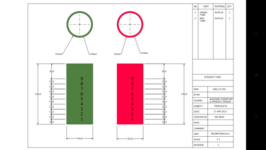
After knowing that manufacturers from Taobao do not take custom orders that requires heat bending, custom painting, and engraving, an attempt was made to use cheap material to dye acrylic, as an experiment.
The important characteristics that the colouring material must possess is that it needs to be:
1) easy to use
2) low cost
3) stains the acrylic, rather than painting over it
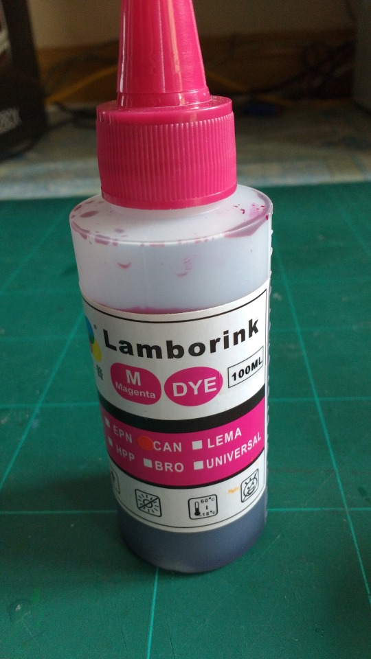
The material chosen was printer ink. Research on the Internet had led me to conclude that printer ink was a viable option as it contains dye rather than pigment.
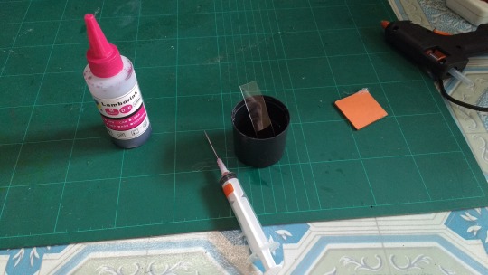
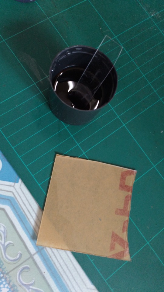
But it was a failure, the ink came right off after wiping it with a piece of tissue paper, leaving absolutely no mark on the acrylic.
As a consequence, the possible course of action now is to order pre-coloured acrylic tubes, and silkscreen the markings on the coloured acrylic tubes as dictated by the design.
0 notes
Text
Project log #5 (Trouble of manufacturing)
16 April 2017
The u-shape tube was considered as it had the better wow factor and functionality. But, because of the complexity in the shaping of the design, even custom shops refused to take orders for it.
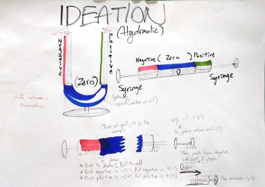
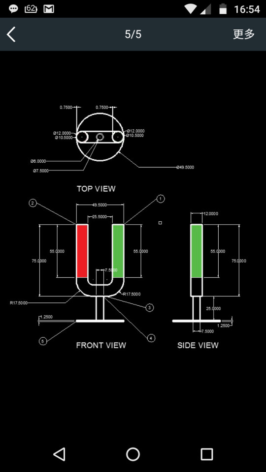

For those who do not read chinese, it says”Sorry we can’t do that, we don’t do heat bending” which rendered the whole notion of a custom shop useless.
So the choice left is to think of another way to create the bend, or to out right ditch it, and implement an easier method.
0 notes
Text
Project log #4 (Ideations for the teaching tool)
15 April 2017
Several teaching tools and methods were sketched out. These methods all relied on being intuitive and interactive, to make the experience more straightforward.
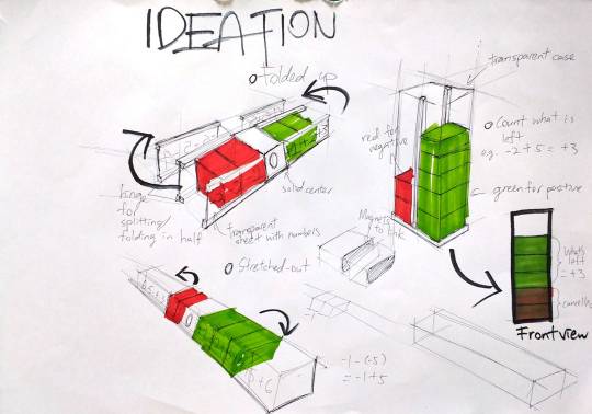
This ideation relied on giving the students something to hold and to manipulate, like coloured blocks. There are two ways to go about with this, one way is to lie it flat, like a conventional number line, with negatives on the left and positives on the right.
The other one is to make it stand up like a tower, with a transparent casing and sectioned columns. This method relied on the fact that the blocks will be transparent or at least translucent. The students can count out the remaining blocks that are not cancelled or neutralized.
But, there are a couple of reasons why these would not work:
1. It does not give a straight answer to the solution once the calculation is done. It still requires the user to count out the number of blocks.
2. It does not explain why -(-) = +. The inability to explain this phenomenon is the biggest downfall for this design, because the whole point of the teaching tool is to make calculating -(-) intuitive by giving a clear visual cue.

This ideation used a hydraulic system, with glass tubing connecting two syringes on both ends. So that the pushing on one syringe will affect the other. For this system, two shapes can be created, one is a u-shape, like a lab apparatus, or a straight tube.
There are two reasons why these design works:
1. It creates an interactive tool to illustrate that minus the negative side is equal to adding the positive side. This is crucial as this is the whole point of the exercise: To create a straightforward and intuitive visual cue to the calculation.
2. The tool has readouts so that the answer is immediately observable.
Both shapes have their advantages and disadvantages,
The U-shape tube
Advantage: More visually interesting, giving more sense of fun
Disadvange: Significantly harder to manufacture, handles of the syringes are slightly less accessible
Solution: Build it from a custom shop specialized in bending tubes
The Straight tube
Advantage: Easier to manufacture
Disadvantage: Looks dull compared to the u-shape
Solution: Aesthetic improvements?
The author’s choice is the u-shape as it is very important for a design to have the wow factor, meaning that it has to be appealing on first sight, whether mechanically, or aesthetically.
0 notes
Text
Project log #3 (The trouble of explaining positive and negative numbers)
14 April 2017
Positive and negative integers are one of the hardest topics for lower secondary students to comprehend. One of the reasons is that the formula taught to students doesn’t really make any sense.
The usual teaching method for positive and negative integers is to tell students to draw a number line, with negatives on the left and positives on the right, and use that for calculation.
Link to the photo:
http://www.helpingwithmath.com/by_subject/integers/int_positive_negative.htm
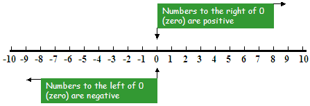
In addition to that, this formula is taught:
POSITIVE AND NEGATIVE NUMBER RULES
1. Adding Rules:
Positive + Positive = Positive: 5 + 4 = 9Negative + Negative = Negative: (- 7) + (- 2) = - 9
Sum of a negative and a positive number: Use the sign of the larger number and subtract
(- 7) + 4 = -3
6 + (-9) = - 3
(- 3) + 7 = 4
5 + ( -3) = 2The sign will be that of the larger number. Remember adding a negative number is the same as subtracting a positive one!
2. Subtracting Rules:
Negative - Positive = Negative: (- 5) - 3 = -5 + (-3) = -8
Positive - Negative = Positive + Positive = Positive: 5 - (-3) = 5 + 3 = 8
Negative - Negative = Negative + Positive = Use the sign of the larger number and subtract (Change double negatives to a positive)
(-5) - (-3) = ( -5) + 3 = -2
(-3) - ( -5) = (-3) + 5 = 2If you get confused, it often helps to write a positive number in an equation first and then the negative number. This can make it easier to see whether or not a sign change occurs.
Needless to say, this formula confused a lot of lower secondary students. To make the number line method effective, they still need to convert +(-) and -(-) into - and + to proceed, which is counterintuitive to say the least, because surely minus a minus means doubly minus right? But in reality minus a minus is a plus.
This is why this project’s objective is set out to design a teaching tool rather than a calculation tool, because if the process of calculating negative numbers became instinctual and intuitive, the calculations are actually very simple. It is just to give a logical connection to the calculation.
0 notes
Text
Project log #2 (further research on dyscalculia)
13 April 2017
Video about dyscalculia https://www.youtube.com/watch?v=p_Hqdqe84Uc
Research was done on dyscalculia and its various symptoms and anomalies. Two main observations were made by Professor Brian Butterworth, the researcher on dyscalculia. One is that dyscalculics differ from normal person that is bad at mathematics in that dyscalculics have a serious problem in counting numbers, or dots on a screen, and not just arithmetics and calculations. Another one is that dyscalculics are bad at remembering numbers. This is why dyscalculics often have one pin number for every account they have.
As a consequence, dyscalculics have to individually count items, even as low as three, unlike normal individuals who can discern numbers in sets, like seeing 6 dots as 2 sets of 3 and so on. There are ways to teach dyscalculics mathermatics though. One is to give visual cue in the form of colour or imagery to give them an idea of what a number is, or how much a number is. So the number ‘5′ can be written alongside 5 apples, to link the two imageries together.
For example,


Like so.
0 notes
Text
Project log #1 (brainstorming&design goal)
(A log for a Personal Design Project, which is technically a project work for college, but what the hay)
11 April 2017
The brainstorm map was first created before any progress can be proceeded, as this is the part where the various aspects and nuances can be fleshed out to good use. As seen below, dyscalculia was chosen as the main subject for this ongoing project.

But quite a few things were in mind beforehand, which is that this hands-on project will be focused on designing a tool for teaching people suffering from dyscalculia (a disorder that impairs mathematical abilities, a subset of dyslexia), which will also benefit all kinds of people, students and teachers alike.
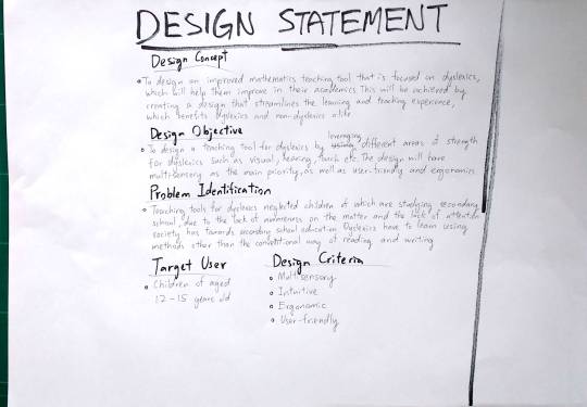
The design goals, concepts and objectives were all clearly laid out in a3 paper. As previously mentioned, the teaching tool will help teaching and learning mathematical concept easy. This teaching tool was designed focusing on a target audience of lower secondary students, aged 12 - 15 years old.The reason was that teaching tools for dyslexics, or dyscalculics in this case are generally isolated to catering children under the age of 12. As such, the tool designed has to straddle the line of being entertaining and educational while not looking childish.
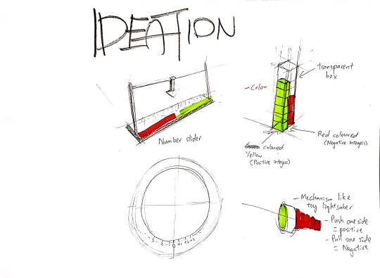
The following ideations are rough sketches of tools that will help students understand the concept of calculating positive and negative integers. Generally, green and red were chosen as the colour scheme for this project as it neatly characterizes positive and negative numbers.
One is a number slider, that is a variation of the number line used to learn positive and negative integers in school.
Second one is a transparent case with red blocks and green blocks. This demonstrates the calculation in a more physical manner as the blocks can be clearly counted.
Third one works like an umbrella cover, but is able to extend on both sides. The unfortunate implication was having to build one as it is nearly impossible to create a two-way retractable cone without over-complicating the design.
0 notes
Text
Dyslexia
2 April 2017
I haven’t got the presence of mind to catalogue my progress, so this will be a summary of my findings. (You can learn more from Google Search)
This research report researches on dyslexia. Dyslexia is a brain disorder that affects language skills, and it is most obvious in children. Students suffering from dyslexia have trouble keeping up in school and are usually mistaken as lazy or lack of wit.
Research findings in this report reveal that the symptoms of dyslexia are: the disability to understand language and imparity in reading, writing and spelling skills. Besides that, it is learnt that Malaysians are not aware of dyslexia and have wrongly blamed their children as being lazy for their low grades. In addition to that, this report also covers how current Malaysian education plan do not take special education into account, which resulted in low rankings in international education rankings list like Program for International Student Assessments (PISA). Apart from that, it is also found out that dyslexic children require tutoring sessions with reading experts and specialists to improve their learning skills. Not only that, there are also teaching tools that will help dyslexic students to understand learning subjects better.
The author hoped to design a teaching tool for dyslexics that will integrate the findings from this research report, so that it is easy to use, even for a person with no special education training, and also easy to make it yourself if the teaching tool is unavailable for purchase.
(An exact quote from the abstract of my research report. I know, I know, it’s lazy move. but hey, it’s all about efficiency)
By the way, there is a teaching method for dyslexics called the Orton-Gillingham Approach. You can learn more here:
https://www.youtube.com/watch?v=kE3DqJP-nkI

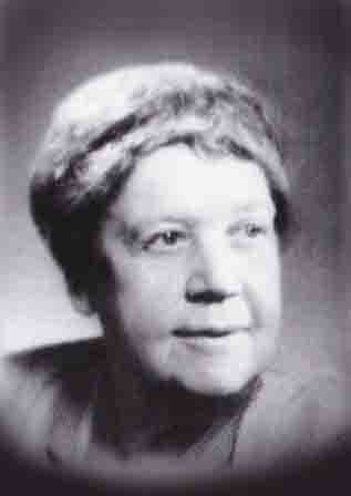
Samuel Orton and Anna Gillingham, two of the founders of the Oton-Gillingham Approach.
0 notes