oliverccwfoundation
Oliver Newman
Foundation Student at the Camberwell College of Arts, 2017 - 2018.
10 posts
Don't wanna be here? Send us removal request.
Last Seen Blogs

lady-samantha-blog
Women 's Weight loss

jennyreed1-blog
Fibreglass roofing Dublin
mehdi2409
designer

slytarien
Kirin's
coconut-dreamz
coconut
Text
2nd Week of Easter: All Complete(-ish)
Sunday (or rather Monday when I’m typing this) marked the completion of my movie, which I named “LIMINAL”. Made with both After Effects and iMovie (because After Effects has buggy sound integration), the final product is below:
vimeo
The making of the movie was quite frustrating as there were a lot of bugs with the video clips audio tracks but generally I regard it as successful, as I learned many things with After Effects; it was also heavily experimental, as the pixel sorting plugin is not consistent with every result, as it has a lot of variables that can be played with (angle, threshold, shadows or highlights, etc). It was enjoyable, but much like video editing itself, was quite repetitive.
When I showed the final product to my peers, many liked the visual effects that the film employed but were initially confused to what the concept of the movie was, as the word liminal is vague; but when I told them the definition of liminal and how the movie is based on my personal experiences in both my home country (South Korea) and living in London, it made much more sense. The distortions (Pixel sorts and the VHS glitch at the end) played to great effect; I used these effects because they are quite unique and unpredictable (on its own, at least), as well as they are quite jarring and discomforting to the eye, presenting both an emotional and physical response to people that view the film.
Feedback mostly included tweaking the audio during the freeze frames (some of it was too quiet for some people to notice that it was foreign), as well as perhaps timing distortions better. Despite that, they say that it was great in it’s current state. I may perform tweaks before the final hand in on Thursday.
I personally wanted the film to be longer, but due to the limited amount of video clips I had (some may have been filmed awkwardly, etc) I stuck to a shorter length of 2 minutes and a half; but I feel that this is enough to achieve the aim of my sentence; “The discomfort of existing between two spaces”.
0 notes
Text
Week 5, 1st Week of Easter Reflection and Updates
It felt like it was going great in Week 5, and I had taken a break in the weekend to prepare myself for an intensive two weeks of work. Unfortunately, at the beginning of the two week break, personal circumstances happened yet again, which rendered me unable to do some work for a few days. However, I did some work after trying to sort out my head.
I spent most of this week getting the storyboard together with my video clips to see how the film was going to flow. The storyboard is below:
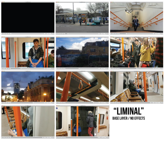
The basis of the film is that there is this discomfort that I experience, existing between two spaces. So I chose some very ordinary task that I do both in South Korea and here: riding, and waiting for the train, and watching life go by as I sit and wait to get to my station for work, leisure or home. I chose the name “LIMINAL”; Liminal means to exist in a transitional state of a process, which is relevant to the premise of the movie. For some reason, riding the overground network here reminds me of a Seoul subway line that I used to take often in Korea, the Gyoungui-Jungang Line (경의중앙선). I still get odd moments of deja-vu while riding the overground here to the mundane moments I experience, so I decided to incorporate that as the final theme for my final major project: Liminality, Deja-Vu, and Discomfort.
With the base layer of the film complete (IE, with no effects) I decided to start doing the tricky stuff- the glitch effects, where I use pixel sort plugins for After Effects, and VHS-Style “glitch” effects (which is not as natural as pixel sorting). I’ve experimented on some footage that I shot, and these are some of the results:
vimeo
vimeo
vimeo
vimeo
The experimentations, in my opinion, are very good as they give me some perspective of what may work, and what may not work. The 4 above to me give me a lot of discomfort, and confusion; right now they do not portray the “existing in between two spaces” aspect, however, I will work that in eventually by splicing in clips in between the effects and original video clips. Once that is done, I feel like this video will illustrate well the concept of liminality, and address my one sentence description of the project: the discomfort of existing between two spaces.
A couple things that I can improve from this week is quite obviously my time management, which has always been a weakness of mine. Since I have the next week off, I will be dedicating more time to the project, trading off courier work in the process. In addition, I should have more resolve when experimenting: After Effects can be very tricky (and rage-inducingly annoying at worst) especially when working with multiple layers of videos. While I did achieve successful experiments, it came at a cost of me being frustrated. I should, instead of being frustrated, be a bit more patient with experimentation next time.
What now lies ahead is to get some quick feedback from friends and classmates (the ones who I can contact, at least) and to compile it all together, which shouldn’t take too much time.
0 notes
Video
Man on Fire [2004] - Creasy suicide failed scene
The above scene from the 2004 film Man on Fire, directed by Tony Scott, employs very jarring, yet appropriate transitional effects between clips. While there are many clips with similar effects, the clip above has arguably the most effective. The main character, Creasy, who is a alcoholic bodyguard, goes through a suicidal crisis while drinking heavily. The rapid cuts, and fading transitions between clips illustrates a deteriorating state of mind where one is gradually fading in and out of any semblance of control in their life.
While my film doesn’t deal with having alcohol and depression-induced suicidal crises, the kind of visual transitions are a good reference; one being in stuck in between two spaces after living in one space for so long that he/she cannot fully integrate into another space without having some form of deja-vu or feeling like they are still in the space where they existed for a long time.
0 notes
Text
It Finally Has Direction: Week 4 Reflection
Compared to Week 3, Week 4 has been successful. While nothing is 100% concrete yet, there is a plan that was followed, a storyboard was created and most of the main filming had finished.
The beginning of Week 4 was marked by “Messy Monday”, a workshop that was intended to help people to expand or change their project outcomes. We had to come up with one sentence that captured the aim of our project; mine, initially, was “to illustrate the split identity of home”. This sentence had caused me a bit of trouble as it was quite vague; there is lots of ways to illustrate splits, and just that mass had gotten me lost.
Despite this, I tried a few illustrations:


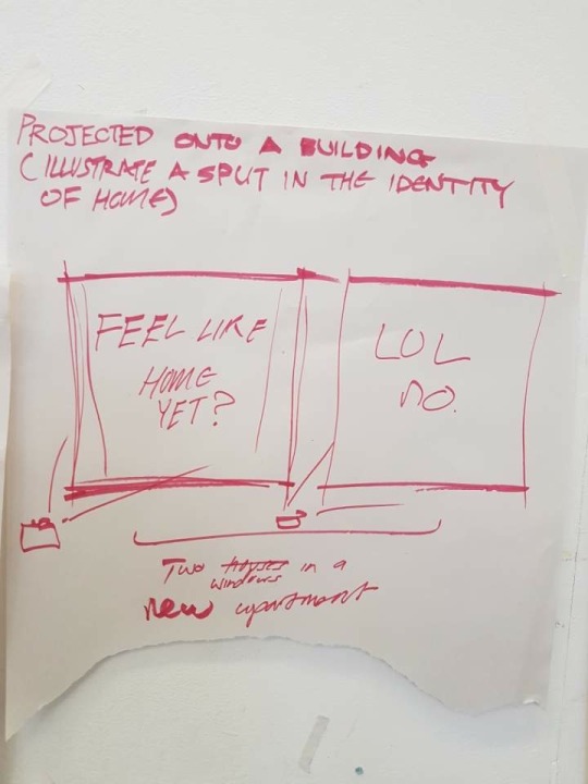
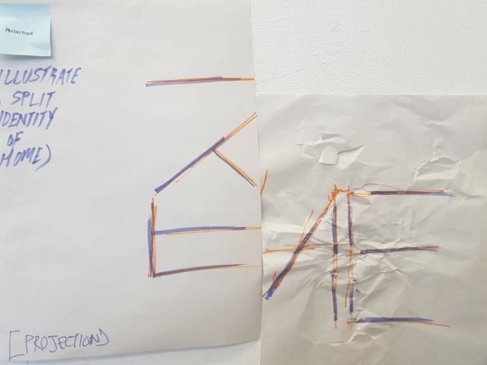
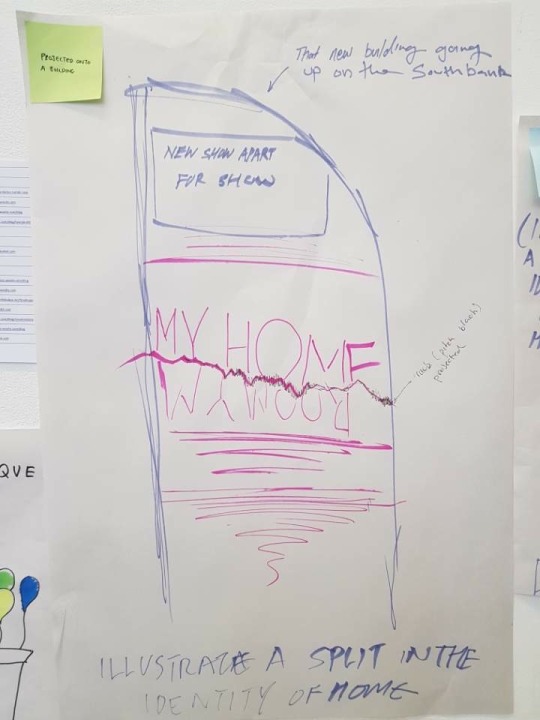
Most of the sketches deal with projecting text upon buildings; one was to broadcast a mishmash of TfL announcements on the Northern Line and Seoul Metro announcements, and one was (quite literally) a garbage bag that was overfilled. It helped me begin to sort out what could I possibly do with the sentence, as it filtered out irrelevant ideas and left ambitious, yet possible outcomes.
I then thought that instead of projecting text onto a side of a new apartment block, I could do a film where I mosh clips and sounds together to create discomfort; this would still fulfil the “split” in identity of home, as existing in two spaces (IE South Korea and London) can be quite difficult. I then changed the “essence” of the project to reflect this; the discomfort of existing between two spaces. This can be explained through me existing in some kind of limbo, where I am separated from home and living in another country, yet I am still attached to home and not fully settled in the new environment, which is a common enigma that many who live their whole lives in one country and then move to another may experience. This is a much clearer essence than, “illustrating the split identity of home” as it states a feeling toward something, and it also shows the state of being somewhere at sometime; this, for me made the project have a direction.
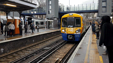
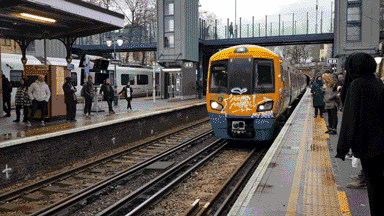
I was then going to show this discomfort through film. I looked at one of my routines that I have here, and in Korea; riding a train from one place to another. Here, if I don’t cycle, I often take the overground, as is in Korea, where I either take the Gyoungui-Jungang line. It’s almost identical in a way, yet so different.
The storyboard is below:
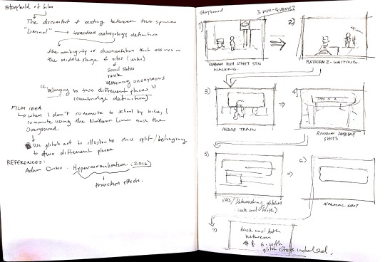
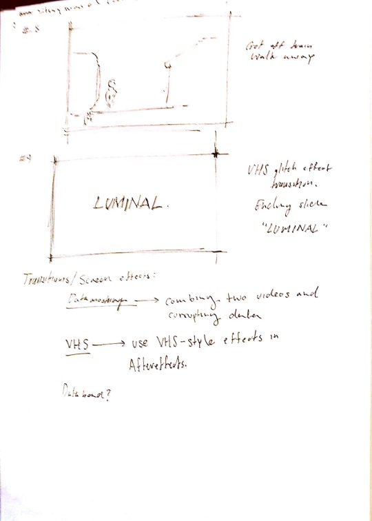
So far, I have finished most, if not all, of the filming on the London Overground, and now all that remains is to apply glitch-y effects, add text where applicable, and to compile it all together. Due to the nature of the glitch effects, this will take longer than expected, though I am confident that it will produce and fulfil my one sentence description of the project.
Two such examples of experimentation are below:
These two experiments were done with GIFKR2, a program that makes glitching GIF sequences, videos and images easier. While still remaining a largely trial-and-error process, it is much less stressful to produce. While more experimentation could be done (especially with the array of pixel sorting effects and image alteration effects there are, or with manual glitch effects in After Effects), I am now confident that this project can actually become something.
Over the next few weeks, the video will be put together, with an odd bit of experimentation here and there.
0 notes
Text
Frustrations: Week 3
Weeks 3 has mostly been defined as frustration and a project that wasn’t really moving.
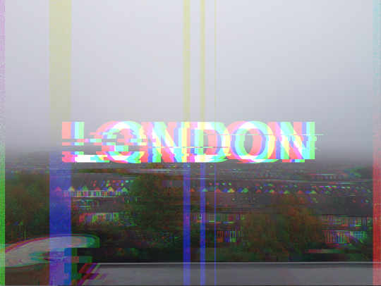
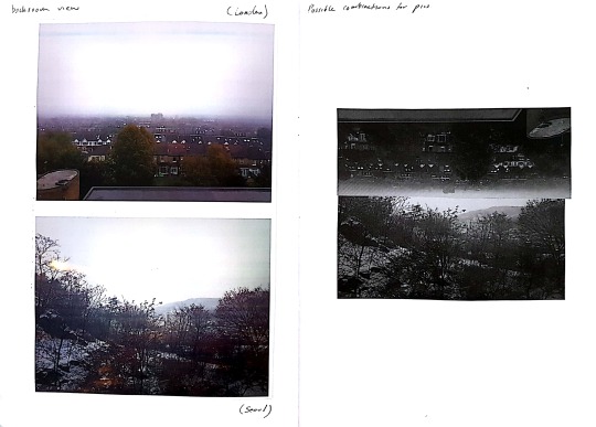
In Week 3, I did research glitch art, and some processes related to it. I took a picture of the view of my room view in London and decided to experiment with data bending (intentionally corrupting data in a non-image/video editing program) and came out with these results:
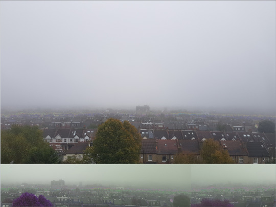
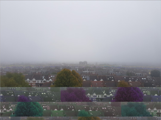
The above pictures were done with a sound editing program, Audacity; I simply converted the JPEG to a .TIFF file and then imported them as raw data, and applied a repeat filter onto it. I like the results and the process, as it’s extremely destructive and can give interesting outputs. However, it’s extremely unpredictable and half of the time it gives an unreadable file, or just doesn’t work at all. Out of 30 tries, only 5 images were readable; looking at that, it just didn’t seem very worth it, especially if I was going to do a video, as it also takes ages to do. Below is a data bended video file that was readable:
Although the result is interesting, it took at least an hour and countless attempts to produce it, and that’s not including the amount of time I had with my head in my hands, asking what had I done to myself. So it wasn’t worth it to continually go down the path of databending with Audacity.
I also looked doing fake corruptions through photoshop, wielding this result:
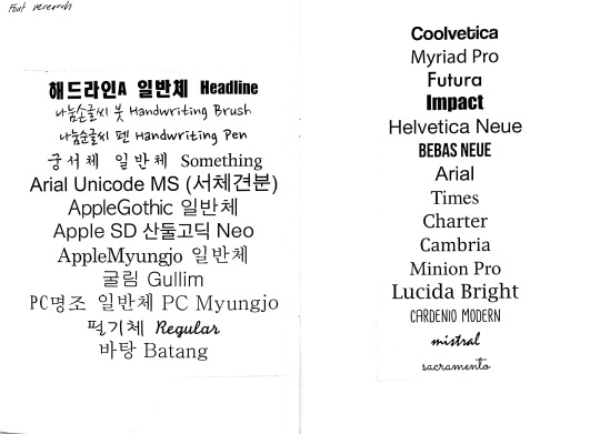
It was a simpler process with equally appealing results. But, at the same time it just looks a bit bland; to me, it just doesn’t really do much for me. Perhaps if it was animated, or if the font was more interesting (not Helvetica), it could have been something. Yet, something about photoshop just screamed artificial at me. I wanted a process that didn’t take 40 minutes to do one thing, and had a 100% success rate in actually producing a file that was readable.
So I moved to GIFKR 2, a glitch application that allows one to easily “pixel sort” (sort pixels in images by hue, contrast, etc) images. I put in a few images, and came out with a RGB pixel sort like this:

It was something in the right direction, but still somewhat meaningless. It was becoming clear to me that the typographic approach was not doing much justice for the project, and I have to look at other approaches or applications. Glitch art, however, was staying as a viable process to experiment with.
There was much that could be improved, but with time constraints and extenuating circumstances weighing me down, I was starting to be worried at this point; I had a project that was effectively, going nowhere.
0 notes
Video
youtube
*trigger warning: visible violence and humans in distress
“HyperNormalisation 2016″ - Adam Curtis
“HyperNormalisation” is a heavily political film that touches upon how people do not set up an alternative option despite knowing that what is going on around them is wrong, and their politicians are corrupt. It looks at several periods of recent history and trends that effect people’s minds, such as the 2003 invasion of Iraq, the 2016 US Presidential Election, and the increase of UFO conspiracy theories in the 1990s.
Politics and trends aside, this film is a good piece of contextual research, as it contains several cut ins as well as glitchy effects, similar to those I want to try and emulate with my film. My movie will also utilize glitch art in a way, and is about the discomfort of existing in two spaces; thus, studying the way the video cuts between two scenes with VHS style glitches (especially in the introduction), or the really jarring cuts between some scenes, is very valuable, though the content is not exactly related to my topic.
0 notes
Text
Weeks 1, 2 and 3 Reflection
I was going to update this blog weekly, but due to my own incompetence in time keeping as well as unexpected circumstances toward the end of Week 2 where my girlfriend was hospitalized for functional neurological disorder, I’ve just been able to do this now.
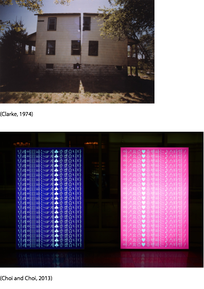
Regardless, I found weeks 1-2 somewhat productive as I began my research and investigations into very basic destructive methods, such as tearing up prints as well as cutting off portions of text in Illustrator. The initial idea of destructive typography or methods came from my revamped proposal where I looked at the works of Gordon Matta-Clark as well as Sulki & Min who specialize in destructive art (Splitting houses with Clark and typography with Sulki and Min. Most of the initial work that I was able to do was centred around looking at references as well as trying some early experimentations with photo stitching and compiling fonts, as shown below:
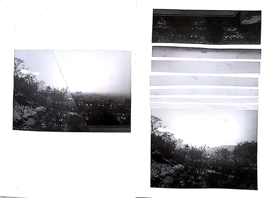
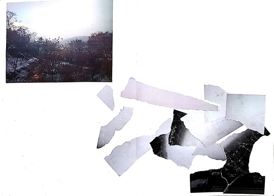
The work is obviously in it’s really early stages and not really refined, but it started to give me headway into looking at possibilities, as well as illustrating a divide between the two places that I reside in (Seoul and London). Seoul is untouched relatively compared to the London side which has deformities and damage, to represent my somewhat incomplete feeling that I have here sometimes. It’s a call back to the Blind Date black and white experimentation, with all the photo stitches and modifications. In the end, I wasn’t very fond with this and decided to experiment with type, as shown below:
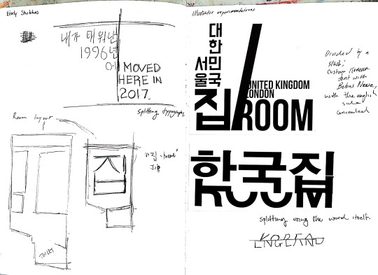
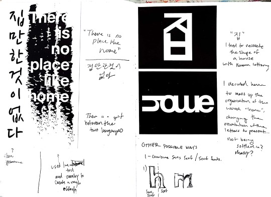
I thought that the typographic experimentations were more successful as I thought more results which can be further developed came out. For example, the black and white texts on the lower right has limitless possibilities, where it could be developed into stickers, posters or even stitches/sewing and screen printing. They may not be refined typographically (such as the Korean word 집, which means home, where the ㅂ does not match the ㅈ and ㅣ characters) but if I was to create a massive floor sticker, it could possibly work. Therefore the initial work I thought are good bases for further experimentation.
My next steps would be to further research other forms of destructive art, such as Glitch Art where one corrupts digital data for aesthetic effect, and perhaps combine text and photography and see what comes up. Furthermore, I will keep doing research as I go along as more inspiration and possibilities will come along.
0 notes