Last Seen Blogs

yourtwistedlies
⋆ ˚。⋆ ୨୧ ⋆ ˚。⋆

sienaa-mariee-blog
Siena Marie

voices-in-the-fog
Welcome to the Fog

69vnfund
69VN

cocktailmagnum
Basement Door
Photo
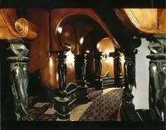
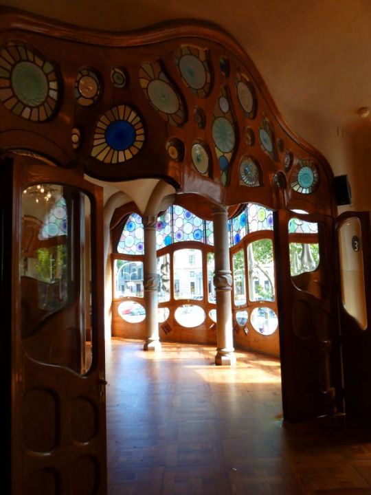
There was always something that appealed to me about the style of the Whipstaff Manor from Casper the movie way back from the 90s. The architecture is from the Art Nouveau style which has rounded edges and natural inspiration. A couple of these pictures also have what look like sunburst, which makes me think maybe there’s some Art Deco inspiration as well.
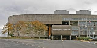
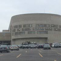
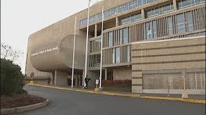
This next set of photos is from CCRI in Warwick, RI. It was built in 1964 and there was something that has always been “weird” about the design. It is very industrial on the inside. I think it has Bauhaus inspiration... it is stark, contemporary - concrete and glass wall combination as well as rounded edges.

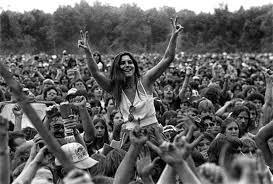
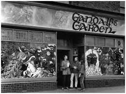


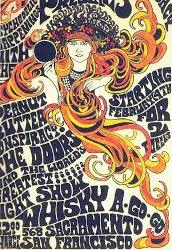
The several pictures above represent the counter culture era of the 1950s and 1960s. The illustrations and pictures of very controversial events, books and music encompass my thought of the counter culture of that era. I think any style that was not within the conformity of white picket fences and suit and tie outfits as well as the racial segregation that went on was shunned as counterculture. That time period made some amazing cultural breakthroughs which were represented through their art and design.
2 notes
·
View notes
Photo
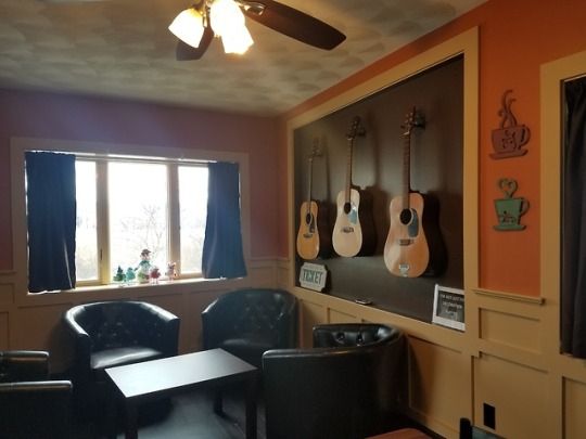
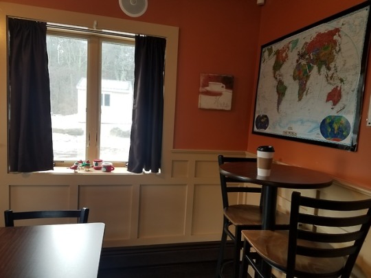
This is a picture of a local coffee shop and in looking at this space, especially the moldings and displayed guitars, there are a few design influences. The Renaissance plays an undercurrent role in that items are displayed and the room is layered with the moldings. The club/bucket chairs originate in early 1900s, and those leather chairs look like from 1970s. The tables are simple – high tables and the coffee table. The furniture was probably mass produced, the result of our industrialize nation. Maybe a neo-classic, modernist design for the furniture. I think you could go into any number of coffee shops in 2019 and find similar style, not sure if that would be similar to globalized design though. There’s definitely a melding of different designs and eras.
In terms of elements and principles, there are clear lines with the moldings and comfortable, complementary colors in this coffee shop. The guitars are a focal point in the room, and they are able to be used to give the costumer a certain experience. Even with the blending of eras, the coffee shop is an experience and a place you’d want to stay and drink your coffee which makes the design effective.
1 note
·
View note
Photo
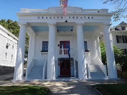
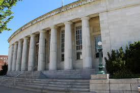
Above: Granite Theater, Westerly, RI, 1849
Below: Westerly Post Office, 1913
Renaissance - Classicism
Both images of these buildings are from the Renaissance Period and have the Classicism style that is the model of power. Similar to our White House in construction and design. I remember the first time I saw this post office, I thought, Seriously? Is this City hall or something?! So grand, over grand.
The Granite Theater in Westerly used to be a church, but was renovated and the pillars were added later.
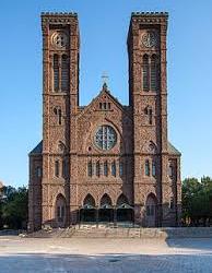
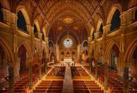
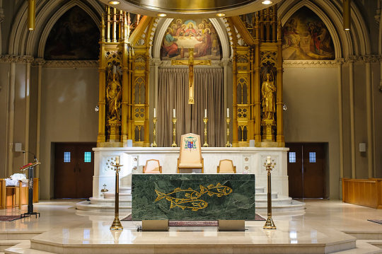
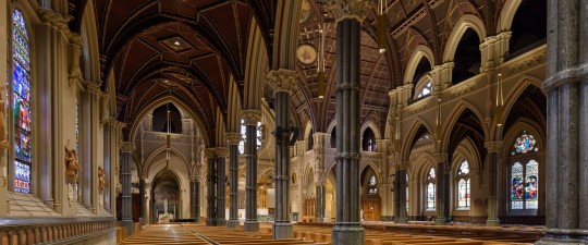
The four above pictures are from the Cathedral in Providence, RI. I once went to a funeral service here. It is very large and opulent with its huge cathedral ceilings. I’m going with the Baroque period on this because it is not so layered with finery that it is overwhelming or obscene. The alter has a little more of the layered gold and may seem a little more Rococo, but the tallness of the building and the symmetry outside indicates Baroque.
1 note
·
View note
Photo
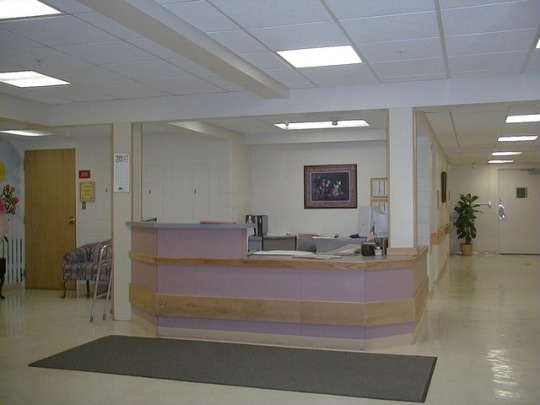
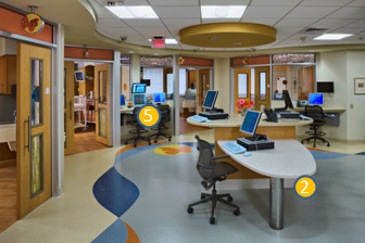
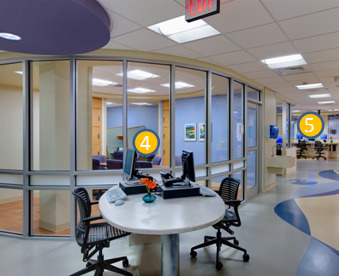
Centralized vs. Decentralized nurses’ stations
The above picture is a nurses’ station that is similar to the one on the hospital unit where I work. Kind of 1980s style. The nurses station is more in the middle of my unit flanked by hallways and patient rooms. It can get very loud during the day around the nurses station. The nurses station also becomes the pharmacist, doctor, physical, speech, hospice station…. I left a few out. During the day it can be very difficult to concentrate with all the busyness of the area. There’s also very little natural light at the nurses station. The Naccarella (2016) article states a study found that facility maintenance reflects the standard of care patients will receive within the walls.
Scampering
Decentralizing nursing stations can reduce the congestion and noise found at a centrally located station. Changing some of the materials used in the design of a unit to bring in more natural light can make it a better work environment. Utilizing more glass doors and larger windows can make the space appear more open. By changing the elements of the wall and door material, more natural light will create a more therapeutic, healing atmosphere for patients. Nurses want what is best for their patients, including a safe environment. According to Naccarella (2016), including nurses in the design planning process and conversation, facilities can address issues that cause stress, disrupt work flow, and are barriers to retention. The anticipated nursing shortage will increase competition for facilities to keep nurses and provide efficient working conditions.
0 notes
Text
RN portfolio 3: elements
Color/Line
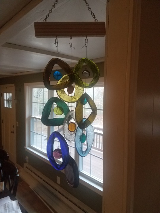
I’ve been stalking this wind chime design for almost two years. The gift shop located in the hospital where I work had other versions of this chime: clear glass circles with light green circles inside and a medal designed tree hanger. Another color version had bolder colors, like purple, red and blue. They were nice, but not enough for me to spend the $50 price tag. Recently they came out with these muted earthy colors which I find lovely, and when I researched the company, I found out the glass is recycled. The chime makes a tinkling sound which I also really enjoy.

Time/Experience
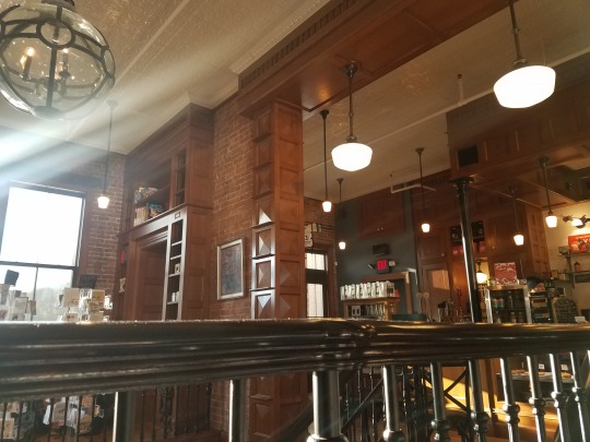
This is a picture of Savoy Bookshop in downtown Westerly, RI. It is a local bookshop that opened in 2016 and the atmosphere in this bookshop is wonderful, kind of a classic/vintage design. The store has multiple design elements from the tiled ceiling, brick walls, wood beams and hanging lights which add to the ambiance. There is a staircase that leads to the downstairs that has metal railings. Sounds and smells....the store plays alternative rock music and smells of coffee (there’s a coffee shop too!). There are café style table and chairs as well as some leather chairs for reading. The shop invites you to stay and browse and read.
Sticking with the bookshop…..
The light fixture in the upper left of the picture is an interesting design with glass and metal that hangs over the staircase at the bookshop. It adds to the nostalgic feeling this bookshop puts off. The design of the light and elements in the store remind me of a city apartment. My personal experience of living in a rural area makes going to the bookshop even more special because it is a different feeling from home. The light fixture is an interesting design, makes me think of smart inventions and innovations of years past. All the books in the bookshop also add to the “smartness” and inspires to obtain knowledge and do grand things.
1 note
·
View note
Photo

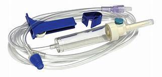
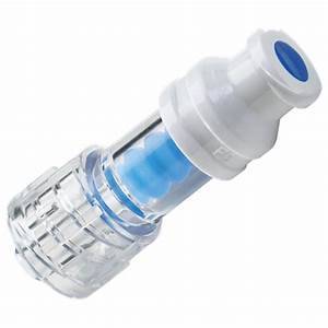


Describe how would you communicate what is especially important about the design to this audience? Luer lock prevents the tubing from being dislodged from iv catheter and possibly putting patient at risk for bleeding.
2. Tell us how would you describe its design in 50 words or less to someone who has never seen it before? Intravenous tubing is used in the healthcare setting to administer fluids, medications, nutrition and blood products into the patient via intravenous catheter. It is needed for patients who are acutely ill and unable to get adequate replenishment orally. There isn’t any medical technology that surpasses IV drug/fluid administration via catheter and the need for subsequent tubing. The tubing is usually marked with a date, and depending on type – continuous or intermittent use. The IV tubing is crucial to the life-saving fluids/medications infused into patients.
What would be three to five physical objects or samples that would be especially effective at the presentation for the audience to touch and hold? Explain why in each case.
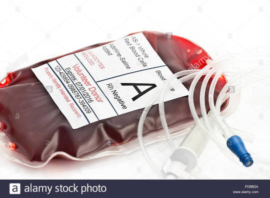
IV tubing with luer lock system – audience can visualize and touch the iv tubing.
IV fluid bag – audience could see how tubing connects
IV push 10mL syringe – heavily utilized in acute care, cleanses catheters and tubing, if needed.
IV catheter – the avenue into the body by which the tubing is connected.
How would you use these in the kind of situations described in either DiNardo 2015 or Eagle 2016? Nurses are utilized in the design process and have a unique perspective on patient care as stated in the Eagle (2016) article. Initially thinking about design and what works, IV tubing works and the system of how we get fluids and blood into patients is effective. Really what other options would patients have but to get intravenous medications and fluids through a catheter and into their blood stream? Eagle (2016) also spoke of hospitals which used the Lean principle to better manage resources and bringing critical personnel to the “front-lines” to help with solutions to problems. Nurses in acute and critical care use iv tubing and bags constantly, and could attest to its necessity as well as the waste and patient dissatisfaction involved in using such systems.
0 notes
Photo
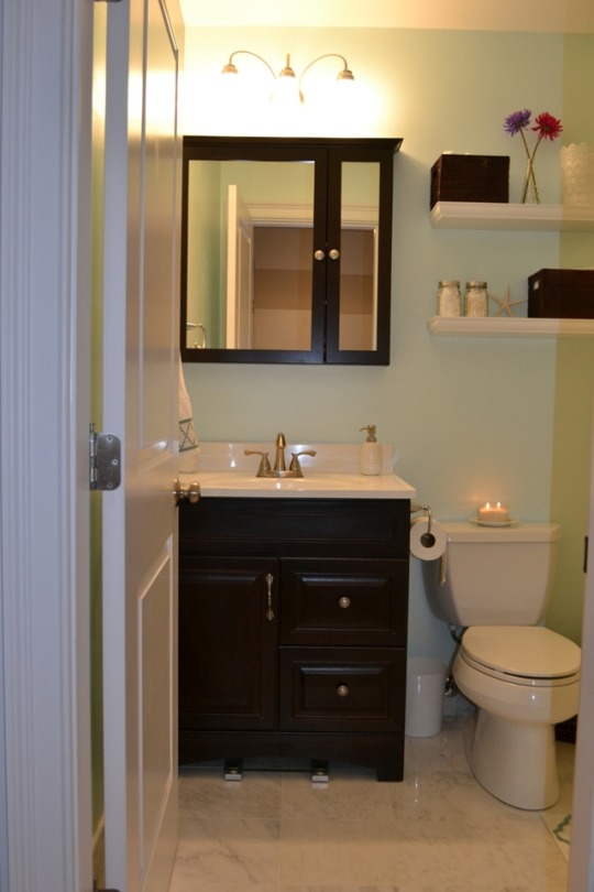
Designing to prevent adverse events – half bathrooms. A majority of falls happen in patient bathrooms or are somehow related to going to the bathroom. The half bathrooms are designed to give patients access to a toilet and sink with minimal space taken from patient rooms. The size of the pictured bathroom is the most appropriate that I’ve been able to find that depicts the bathroom size my patients have to access to at the hospital. Picture trying to transfer a patient from a wheelchair onto that toilet. Or a patient who has a walker turning the walker to sit on the toilet. Before I became a nurse, I worked as a CNA at a nursing home, and I remember being wedged in the corner, the patient’s wheelchair blocking the doorway to the half bath and thinking, if this 250lb. patient goes down, I will land on top of her. So unsafe, so high risk.
Consider the seven stages of the Design Process. How far back in the process do you think you would you have to begin, in order to solve this problem and why?
Conceptualization: “here is a problem with the day to day”. A bathroom designed for patients either in a nursing home or hospital setting need to accommodate persons who require mobility assistance. Space, the bathrooms need to be bigger than just a sink and toilet. Some of the solution in the hospital is to have the patient use a bedside commode if they can’t use the bathroom. Not very dignified. In the hospital, we don’t use wheelchairs to transport patients in their rooms, nursing homes do however.
2. Pick one of the SCAMPER actions (see pages 14 & 15 in the textbook) that you would use toward a solution of the given problem. How does that work and why?
Adapting: Most rooms in a hospital and nursing home are designed for two patients and one half bath to maximize the number of patients/residents a facility can accommodate. This leads to cramped and congested space for patients, increased risk for infection, lower patient satisfaction. Designing for a single patient room would give more space for the bathroom, taking away from the patient’s room space.
Where on the hierarchy of design is the object currently? Where would it be after your SCAMPER-ing? Explain your assessment, briefly.
The facility half bathrooms do function; the usability of the bathrooms would be the issue on the hierarchy of design. We need to either use a commode if the patient can’t access the bathroom or risk safety if they can access it with a walker or wheelchair. Ideally, the new patient room designs would take from the existing two bed space to make the bathroom larger and more accessible to those with mobility concerns. These modifications would require renovation, and most facilities don’t have that kind of budget to take on a full project. Decreasing size of rooms would add to the constraints of how many patients the facility would be able to accommodate which would also decrease money coming in. Less money doesn’t help renovation, but does help patient safety and satisfaction.
0 notes
Photo
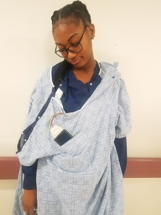
Heavy Tele.... Cardiac monitoring is necessary for patient care and safety, however the telemetry boxes are not conducive to the patient experience. The telemetry boxes are heavy and burdensome to many patients. While they do fit into the pocket of the johnny, their weight and wires are very cumbersome to patients. My “patient” modeled the telemetry we have on my unit, and we did embellish the telemetry burden with the photograph, but most patients have no under clothes and sometimes the johnnies droop. The idea is very undignified, and a shame that in this age of technology with Ipods and cell phones in everyone’s back pocket that we can’t do better for our patients.
Recently an elderly woman on my unit who came out to the nurses station dressed similar to this, but holding her telemetry. She was taking her stand, she was not going to wear “this thing” any longer! We explain the necessity of the monitoring, but ultimately the patient has the right to refuse. I feel that we fail our patient when this happens.
Design modifications:
Weight: a lightweight box the size of a small cell phone with wires connecting to electrodes would be a better design. If we could somehow go wireless - maybe electrodes only? Different colors could differentiate the position of the electrodes, but the small size might cause them to be easily misplaced.
Not battery operated: the current telemetry boxes use 3 AA batteries every 24 hours of monitoring. A new system with a docking station for recharging would be better for the environment and solve some of the weight issue.
The article, “Design Thinking as a Way to Improve Patient Experience” by Wykes(2016) addresses the need for healthcare workers and design specialists to put themselves in the patient’s shoes to fully understand the patient experience. If the hospital personnel were to take the walk of shame down the hall in only a johnny weighed down by telemetry, they may understand the need for a better telemetry design.
7 notes
·
View notes