
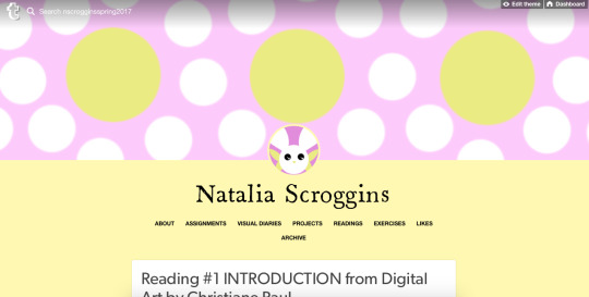
nscrogginsspring2017
Natalia Scroggins
Introduction to Digital Art Spring 2017
21 posts
Don't wanna be here? Send us removal request.
Last Seen Blogs


Text
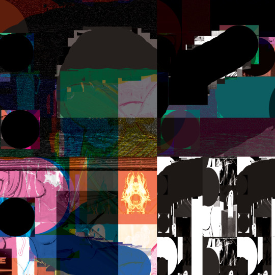
Project #4: Identity Zine-Putting it All Together


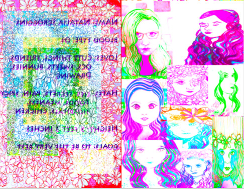

CONCEPT
I decided to represent my identity by using my personas as the figures/subjects of the zine because I often use my personas to represent myself.
SYMBOLISM
Text: is intentionally hard to read to symbolize how that persona does not want to fully reveal that part of themselves
Different Colored Paper: were selected in a random order to represent the possibility of there being an infinite amount of universes; which is a large part of my personas’ strange and long story
Blood Color: all my personas have a different blood color from one another that all have different meanings relating to that specific persona
Gender: my personas identify as different genders because I identify as gender fluid
Red Buttons: symbolize pain
Id versus Superego: the id and superego play a large role in my personas’ stories
Selfie: the photo of myself is from a project I did with 3D design where I have about 500 buttons in my hair to represent mental pain
Personas: my personas’ names are Nata, Nico, Bunny, Naa, Alex, and Bunni
Ribbon: I used ribbon to symbolize how childish I am and I like whimsical things
Second Image: the second image in my booklet are a collage of self portrait drawings
Bandages: to represent how bandages do not fully heal one’s wounds; the bandages I used have a weaker type of adhesive to show how the bandage cannot even ‘stick’ around long enough to really heal a person’s wounds
Backwards Order: I chose to reverse the book and have the cover on the opposite end because that is usually what way I draw or write in my journals (I do that because I am left handed)
THE PROCESS
-I knew instantly what my zine was going to be about as soon as I figured out what a zine was
-It took over twelve hours to print everything; all the ink is gone now
-I have pulled multiple all-nighters making this zine
-Every image took a lot of hours to make
-The whole process was really hard to get through because I really wanted everything to look aesthetically pleasing
-I am a really indecisive person so figuring out what the end result of each image would be was hard for me
-I used only my drawings/artwork for every image
QUESTIONS AND ANSWERS
1. What were your favorite and least favorite projects and why?
My favorite would be the photo montage project because I felt I learned the most about the art programs from that project. I would choose the zine project, but it has caused me to be quite sleep deprived.
2. Which project(s) were most successful & why?
I feel the project with the photo montage was the most successful because I kind of liked my end result of the gif I created for that project.
3. What did you learn about digital art this semester?
I learned or rather was reminded of how time consuming it can be to create a digital art piece. Also, how to better use the art programs because I did not know much before this class, but now I know more.
4. What more would you like to learn about digital art?
I would like to know how to animate, how to use a green screen, and how to make the background of a gif remain transparent when you put it in a video.
5. How has working with a computer as your medium enhanced your creative practice?
I realized that I could take old artworks and remix them drastically to make new art pieces. I feel like now I can make better backgrounds for art pieces than before.
6. How does your final book relate to digital art and what does your overall design say about you?
My final book relates to digital art by how I used art programs on the computer to remix older art works of mine. Also, my design says about me is that I take risks with art and love to use vibrant colors in my art pieces.
7. How does the overall book design relate to the design of your online tumblr portfolio?
I you look through my portfolio you will see I consistently use my drawings of my personas to be the main focus of art pieces. Also, that the colors fit with the color scheme of the portfolio.
8.How do the accentuate each other?
By how the colors of the art pieces go along with other art pieces I have posted in the portfolio and deal with similar topics. Also, the colors accent each other well.
9. What grade do you expect on your final project and why?
I am not exactly sure what to expect, but I strongly hope for a 100% on this project because I went past my limits in order to create these art pieces in a variety of ways that I probably should not have done.
10. What grade do you expect in this course and why?
I am not sure. I think it is between the range of a C+ and B- because I did the grade calculator on canvas and that is what it told me. I hope for higher though somehow because I really tried my best in the course despite all my crazy reoccurring health issues.
0 notes
Text
Reading #5: MY CHOICE
“What Do I Do With Those Damn Anime Kids?” by Sean Michael
KEY POINTS
-The writer believes that if a person wants to draw in an anime/manga style should be able to do so if they please because it is that said person’s interest
-The writer responds to another teacher with an elaborate thought on how these “damn anime kids” are in school trying to learn skills that will help their artistic career in the future and should not be discouraged
-The writer emphasizes that these type of students who enjoy a certain style is not a new concept and have been around since the beginning; for instance, instead of an anime/manga art style it is a superhero comic art style.
MY PERSPECTIVE
The author puts the constant complaint of other art teacher with students who are interested in an anime/manga art style into the spotlight while discussing how these type of students should not be discouraged. I concur with the author’s view on students who have these interests and how they should not be put down because of these interests.
After all, these students are in school to improve their craft and are typically genuinely trying their best to learn. Having a passion about a certain art style should be encourage for various reasons.
1. Yes, students should indeed learn the fundamentals to creating an art piece, but that does not mean their passions should be fully disregarded.
2. Students going into art school with an already found passion has those students ahead of the game because they have a concentration and are goal oriented.
3. Art is subjective not objective. Art can be anything and everything, so who is to say that an art piece with a certain art style is not considered to be ‘real’ art
4. Art should be trying to go outside of the traditional concept on what art is instead of keeping people boxed in because art is all about progressing
QUESTIONS AND ANSWERS
1. Why did you select this reading?
I chose this reading because it discusses the topic of students and their interests in certain art styles not being accepted by art teachers; which is an issue i have faced during my art education.
2. Why did you feel its important to share it?
I felt it was important to share it because it is a current issue amongst teachers and students in art education. Also, because I strongly believe that students should be able to freely pursue their passions in art regardless of what the art teacher may think. To add, the student should not feel ashamed or embarrassed of their interests and should be able to learn the fundamental skills in art while improving their art style of interest.
3. How has it affected you?
The issue in the article has affected me by me having personally experienced having a professor who has told me that the anime/manga art style is not considered be ‘real’ art. Also, when I was reading the article I felt encouraged to continue with my interests despite popular opinion.
4. Has it changed your perspective in any way? if so why?
It has changed my perspective by allowing me to feel more confident in my passions in art because of the writer’s compelling argument against teachers who discourage students interested in an anime/manga art style.
Also, it has convinced me that the art professors should try to fuse the students’ interests/passions with projects in class. To demonstrate, instead of having a project sole focused on traditional way of thinking on what art is to have the project be created in whichever art style the student prefers while fulfilling the requirements in the project such as having a human figure drawn with correct proportions.
0 notes
Text
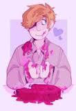
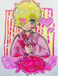
Assignment #5: Show Me What You Know
CONCEPT
-My favorite types of people are usually fictional characters that I create
-The person displayed is my character King Boppy
-My favorite place is my imagination because I can imagine whatever place I want
-On of my favorite things are eyeballs because they can have a variety of meanings in art
FORMAL ELEMENTS
Elements of Art
-Line: with how there are lines around the figure in the center of the image
-Color: with how bold the colors are in the image
-Texture: with how the background of the image appears to have a rougher texture
Principles of Design
-Movement: in the active mark making in the image
-Unity: with how the whole image seem to go together in its continuous use of movement in the mark making
HOW MY WORK EXEMPLIFIES WHAT I LEARNED IN CLASS
-I learned how to convert layers into smart objects; which I utilize often in creating a digital art piece
-I learned how to add filters to images, so I used a variety of filters in this artwork
-I learned how to create new artworks from already existing art pieces; which is how I created this piece
-I learned how to erase backgrounds to existing images; which I did to make this art piece
0 notes
Text
Reading #4: Beyond Pong: why digital art matters by James Bridle
KEY POINTS
-Emphasizes how computers have become an important tool for society to function
-People are highly considering integrating academic classes that focus on the digital world in order to allow for people to broaden their knowledge on computers and the digital language
MY PERSPECTIVE
The writer discusses the rise in the use of computers while asserting how people should become more educated in how to utilize a computer and understanding the digital world. I concur with the writer greatly with how society needs to become educated in comprehending the digital world. The digital world and learning about it is crucial for the future of society.
1. Understanding the digital world is important because it will allow for more advances in technology as more people become more informed on the topic
2. The digital world has become a vital part of society’s everyday life, so learning about it should have people understand in what ways the digital world has become a part of our world
3. The digital world has been a constant tool in society already throughout history and will continue to increase in its use everyday
HOW THE DIGITAL WORLD IS USED TODAY
Digital Art- In fact, I see digital art all the time on all sorts of social media platforms such as Deviantart, Facebook, and Tumblr.

Birdie by FairyBunni on Deviantart

Arbor by GardenGroves on Deviantart
Politics- with how politicians such as the President of the United States are now communicating with the public through the use of social media such as Twitter

Schools- with textbooks being available online and having online classes available as an option for students
Medicine- with how people in medical field are gradually increasing their use of computers in order to store information on patients and their medical history

Television- with how commercials use digital software to create their advertisements and to make animated programs

Those are just a few ways the digital world is used in daily in society. The digital world is continuously becoming more and more integrated into society, so learning how it is relevant, how it is used, how it functions, the language of it, and much more is necessary for the development of civilization.
0 notes
Text
Digital Art Runway

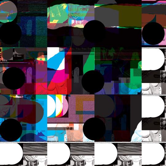

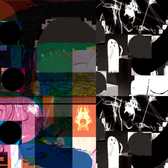
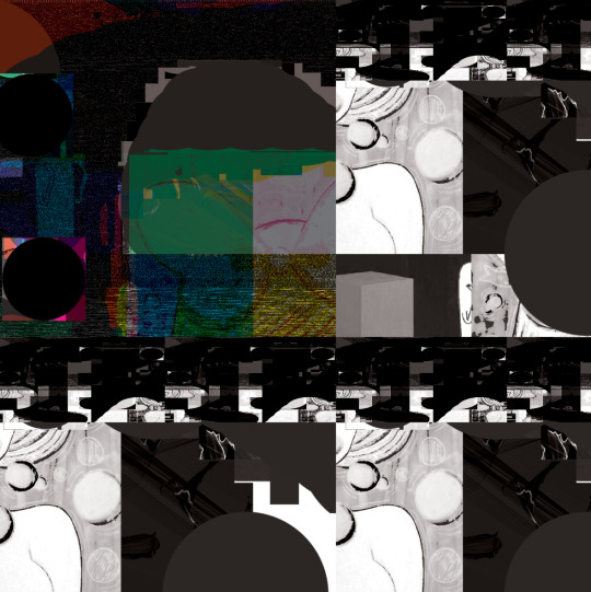
WHAT I HAVE CREATED
-Something abstract using the 3 images and one of my drawings
-I am confused as to how I created this
ELEMENTS OF ART
Color-with how it has a variety of bold colors in the image
Line-with how each section is in squares
PRINCIPLES OF DESIGN
Balance-with how even the squares are
Pattern- with the squares
0 notes
Photo


DIGITAL EXERCISE #5: WATCH & COMPLETE ADOBE INDESIGN TUTORIALS
First Brochure was created using the website that showed how to create this brochure.
Second Brochure is my creative version I found the photos on Google of Macchu Picchu


First Postcard was created using a Tutorial on this website
Second Post card is my creative version using a painting I did a year ago
WHAT ADOBDE INDESIGN IS USED FOR
-To edit and make certain images look more professionally done
-To have the images be better quality
-Can be used to make brochures, postcards, advertisements, ect.
0 notes
Text
Extra Credit
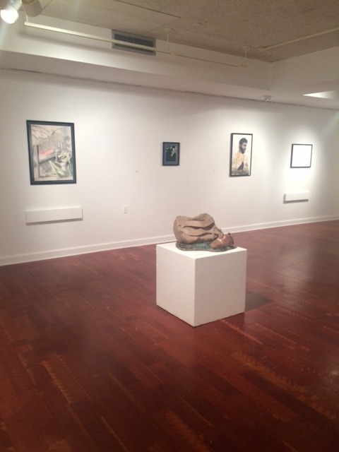
REVIEW OF THE RITTER ART GALLERY
The Organization of Art Works
Pros
-The art works were all organized in away where each and every individual art piece could stand out
-The walls of the art gallery were white; which allowed for the art works to be the viewer’s main focus
-If a multiple artworks were created by the same artist then their artworks were grouped together in the same area
-I thought it was interesting how sculptures that were smaller were placed near each other; which made viewing the artworks simpler in that it allowed the viewer to easily transition from observing one art piece to the other
Cons
-Some of the art works’ titles that were next to the art piece seemed to be out of order in correlation to the art piece (I do not know if it was intentional)
-For instance, the art work title “Human Nature,” “Medusa,” and “Cloud Nine” by Ashley Goldstein seemed to place out of order compared to the order of the artworks displayed
-I feel as though the original order was supposed to be “Medusa,” “Cloud Nine,” and “Human Nature”


Art Pieces
Pros
-The art pieces were all visually interesting such as “The Takeover” by Natasha Da Silva and “Product Placement” by Thomas Brady
-There were most certainly art pieces in the art gallery that were thought provoking as well as art pieces that confused me greatly as I appreciated the formal qualities of the art piece; yet was unable to understand the concept
-There was a quite a variety in the type of art pieces in the art gallery; which ranged from sculptural pieces to ink and marker art pieces
Title: The Takeover
Artist: Natasha Da Silva
Date: 2016
Materials: Woodcut print
Title: Product Placement
Artist: Thomas Brady
Date: 2016
Materials: Ink and marker
Cons
-I feel as though some of the art pieces had concepts that have been over done such as the “Self-Portrait” by Ramsey Clevenger. The art piece was well executed, but I have seen this type of art work a countless number of times, but then again it is just my opinion
-There were multiple art pieces that I believe was made of paper mache that looked as though there was a person underneath a white blanket in the art gallery that peaked my interest, but I could not find the name of the artist who created the piece nor the title of the art piece, so I was disappointed about not knowing who created such an art piece

Title: N/A
Artist: N/A
Date: N/A
Materials: N/A
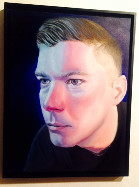
Title: Self-Portrait
Artist: Ramsey Clevenger
Date: 2017
Materials: Oil on canvas
COMPARE AND CONTRAST OF ART WORKS
“Cactus Desert” VS “Convenient Deaths”
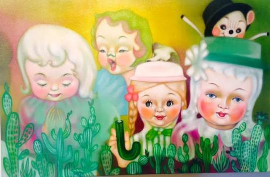
Title: Cactus Desert
Artist: Cangshu Gran
Date: 2017
Materials: Oil on canvas
Title: Convenient Deaths
Artist: Caitlein Nobile
Date: 2017
Materials: Oil on panel
SIMILARITIES
-Both artworks seemingly have happy and bright colors utilized within the art pieces; meanwhile, having a deeper concept behind the art pieces
-In my perspective both artworks appear “cute” in a way because of the bright and pastel like colors utilized as well as the art style
-Both artworks depict an unrealistic scene and are both highly stylized
-Both artworks illustrate child-like objects and have kind of a whimsical or a child-like tone to them
-Both employ the Element of Art of Line with how the baby-like faces in the first art piece have a slight outline and the second art piece employs a slight amount of Line in the background
-Both art pieces use the Principle of Design of Balance with how there are an even amount of figures or objects on both sides of the art work creating an even distribution of weight on either side of the art pieces
-Both art works apply the Principle of Design of Emphasis on the stylization of the objects/figures in the art pieces
-Both art works administer the Principle of Design of Unity with how the colors and the art style of both art piece remain consistent
DIFFERENCES
Cactus Desert
-The art piece’s medium is oil on canvas
-The art piece is quite large in size being about the height of at least 2 feet
-The art piece depicts people with baby-like visages
-Majority of the figures are facing the viewer
-The cacti at the bottom of the art piece are a bit transparent looking and have a cartoon appearance
-The background does not imply a 3D space and is instead a few colors that blend a bit into each other
-The hair on the figures are not as well defined as their faces and appear more blurred
-The Element of Art of Shape is used in how the figures and cacti appear to be 2D
-The Principle of Design of Pattern is utilized with how the faces are continuously go across the canvas along with the cacti
-The Principle of Design of Contrast is applied with how the two face on the right appear to be bolder looking than the more saturated face on the left of the art piece
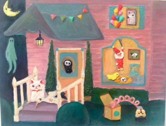
Convenient Deaths
-The art piece’s medium is oil on panel
-The art piece is a bit small and is most likely no taller than an average sheet of notebook paper
-The art piece illustrates objects that appear to be outside while also having a view into a building through a window
-The objects in the art piece are portrayed with bolder colors
-The title of the art piece has an ominous tone to it and imply a darker meaning to the art piece
-A variety of the objects demonstrated in the art piece suggest to be the objects of a child
-The art piece appropriates the Element of Art of Texture with how the art piece up close has areas that have such a thick layer of paint on it that it sticks out of the flat panel surface
-The art piece displays the Element of Art of Space with how the art piece implies a 3D space with the view inside the building and the space to the side of the building
-The art piece executes the Principle of Design of Contrast with how the soft dark color to the left of the art piece differ from the bright/pastel colors on the right of the art work
COMPARE AND CONTRAST OF ARTWORKS PART 2
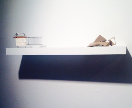
“Abstract Representation of Delray Beach” VS “Angle Study (Conceptual Model)”

Title: Abstract Representation of Delray Beach
Artist: Tyler Thompson
Date: 2016
Materials: Chipboard and foamboard

Title: Angle Study (Conceptual Model)
Artist: Victoria Nicolay
Date: 2017
Materials: Chipboard
SIMILARITIES
-Both artworks both utilize the material of chipboard into the art piece
-Both artworks are a solid brown and cardboard-like color
-Both artworks employ angular shapes in the art piece
-Both of the art pieces are sculptural
-Both art pieces apply dynamic compositions in the shape of the art piece
-Both art pieces have an interesting shadow coming from underneath the art piece
-Both art pieces are abstract
-Both art piece utilize geometric shapes such as triangles that are created through their angles and bends
-Both art works exercise the Element of Art of Form with how both art pieces are 3D and occupy space
-Both art pieces administer the Principle of Design of Balance with how the art pieces both have a consistent amount of angles throughout the sculpture
-Both art works implement the Principle of Design of Movement with how the dynamic compositions cause the viewer to move across the art piece while following their interesting angles and corners
-Both art works have the Principle of Design of Rhythm with how the art piece remains consistent in the regular repetition in the use of sharp angles
-Both art works appear as though they could have been presented as a set or a series of art work because of their large amount of similarities
DIFFERENCES
Abstract Representation of Delray Beach
-The art piece is displayed on the wall and is stuck onto a piece of foamboard in order hold the art piece in place
-The art piece has noticeable cuts in the chipboard in order to give the art piece more depth and more of a sharp angle
-The art piece has a title that implies that the concept of the art piece is to represent the area of Delray Beach in an abstract manner
-The art piece has a clear concept because of the title; otherwise, without the title the art piece’s concept would have been shrouded in mystery
-The art piece exhibits the Element of Art of Line in how the thin cuts in the chipboard look like drawn outlines of the sharp angles in the art piece
-The Element of Art of Value is employed in the artwork with how the shadows of the art piece are quite dark and almost appear to be the color black
-The Principle of Design of Emphasis is displayed with how the angles and the corners of the art piece are exaggerated through the cutes of the chipboard and the dark shadows the angles have in the art piece
-The art piece seems to be about a foot tall in height
Angle Study (Conceptual Model)
-The art piece is presented horizontally on a shelf in the gallery
-The art piece does not contain as many sharp angles and as much depth as the first art piece
-The art piece is not as dynamic as the first art piece, but is still dynamic in its composition
-The art piece does not have a clear concept and possibly was created for aesthetic purposes as implied by the title that the art piece was only an art study
-The art piece address the Principle of Design of Movement with the angular shapes causing the viewer to look all over the art piece, but demonstrates Movement to a lesser degree compared to the first art piece
-The art piece uses the Element of Art of Space with how the art piece occupies a space and if the art piece was presented on a pedestal then the viewer could have walked around the art piece
-The art pieces attributes the Principle of Design with Rhythm with not only in repetition of sharp angles, but also in its continuous use of the shape of triangles and creating triangular shapes with the chipboard
QUESTIONS AND ANSWERS
1. Why did you select the particular event/exhibition?
I went to the Annual Juried Exhibition at the Ritter Art Gallery because it was more easily accessible for me to go to than the other events/exhibitions because the event was on school campus and I am often on school campus.
2. Why did you pick these works?
I picked these works because the first two I compared and contrasted appealed greatly to my artistic aesthetics and the last two seemed, so similar that I wanted to observe the chipboard art works further to see if I could understand and differentiate between them better.
3. Do they relate to your work in any way? How?
Yes, the first two artworks I compared and contrasted relate to my artworks in the sense that they both use happy-like colors in the art piece while having a darker hidden message in the art work; which is similar to how a multitude of my art works tend to be like.
4. What have you learned from attending this event/exhibition that you had not known before?
I learned that even students can have the opportunity to be in an art gallery. Also, that the art piece does not necessarily need a strong and clear concept behind them.
5. How might this experience help you as an artist?
This experience could help me as an artist by giving me more confidence in my art work and possibly trying to submit my artworks to more places in the future, so that way my artwork could be in an art gallery too. Also, the experience has helped me look into what is on the minds of other student artists and what they would like to bring attention to from the viewer.
0 notes
Text
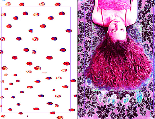
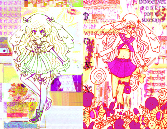
Create 3 Identity/Obsessions/Interests GIFs

Obsessions
-I am and have been obsessed with my original characters and I continuously develop their stories and personalities often.
-This gif displays some of many original characters I have created such as my personas or characters from my unwritten story “Starlight.”
-I am also obsessed with the anime/manga art style
Identity
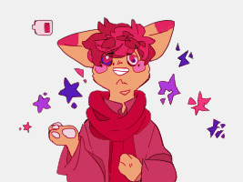
-This gif displays one of my six personas, Bunny, I identify with my personas greatly
-I often draw my personas to represent certain aspects of myself and my experiences
-This drawing was meant to demonstrate Bunny’s battle with mental illness by trying to defeat the “monster” inside her with “poison” (medicine).
-Bunny has consumed so much medicine that her blood has turned into the color pink
-She is the only persona who can feel the emotion of anger
-She represents the aspect of myself with me being stuck in the past (hence, why she has the haircut I used to have when I was younger) when I was being bullied by classmates and my growing resentment towards my father
-The gif is distorted because Bunny’s reality and perspective is distorted
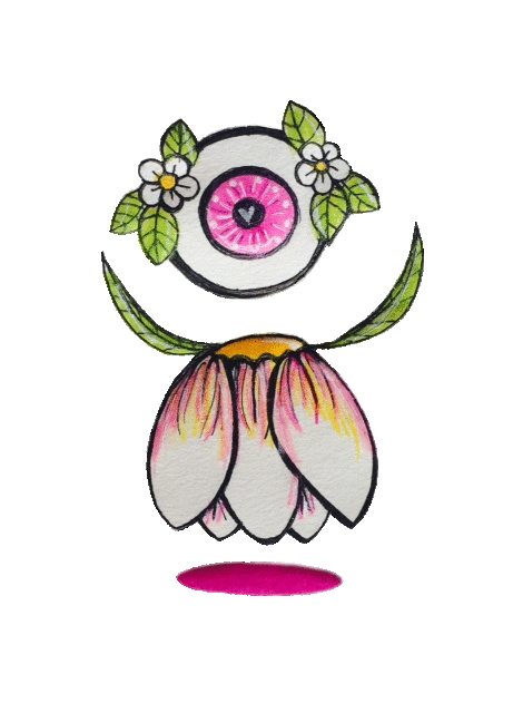
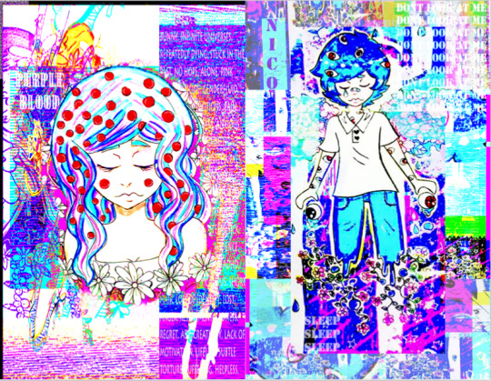
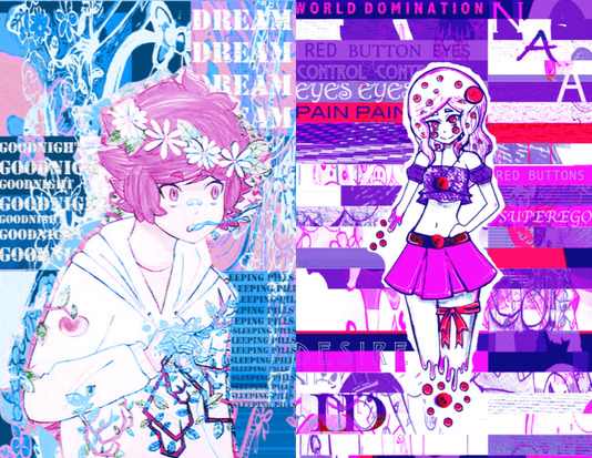
Interests
-I am very much in love with cartoon-like art styles and love creating weird and strange creatures/characters
-I constantly draw using traditional media. I typically use an ink pen, colored pencils, white out, and markers
-This is a creature I created called the Floweri
-They consume raindrops by having the drops go onto their eye like eye drops
-They are the size of a tiny fairy such as Tinker Bell
-Their body is made of some sort of flower-like plant
0 notes
Text
Project #3: MUSIC VIDEO = Story + Image + Sound
CONCEPT
The concept for the video is to show how painfully boring and lonely it is to suffer from major depressive disorder. The song repeats "don't be, what you want to" and that represents what it feels like the world is telling me to do along with taking a large variety medications that do not work.
SYMBOLISM
-Bandaids: represent self harming habits and internal wounds
-Umbrella: represents the shield I try to put over myself to protect me from the "rain"
-Daisies: symbolize my birth flower and the flower has the meaning of innocence
-Pill Bottles: symbolize the various medications I have tried to get better
-Gifs: inner turmoil
-Googly Eyes on Socks: anxiety
-Blunt Affect: My face is poker faced throughout the video to display my unchanging negative feelings 24/7
-Drawings in Room: They are drawings of either myself or one of my personas to show how I am constantly only around myself
DIGITAL FORMAT
The digital format chosen functions best for the video because it shows how I am in the consistent state of not feeling happy. Whether it is day or night I still feel sad.
Also, I am the only person in the video because I am usually by myself and I hardly socialize with any other person.
INSPIRATIONS
-My own experience with Major Depressive Disorder
-My current situation of being extremely isolated and hardly ever feeling happy
-My love for 2D animations
-A sculpture I created years ago with a similar theme
-Pastel colors
-Vocaloid songs such as The Lost One's Weeping, Drowning in A Wave of Sadness, Abstract Nonsense, Irony, Crier, Magenta, Clean Freak, Rolling Girl, ect.
-The songs Hurting For A Very Hurtful Pain, Restraint, Black Clouds, Hot Milk, and Next Time It Rains were almost used instead of the song chosen
-Pastel gore art
FORMAL ELEMENTS
-Contrast: between the animated gifs and the 3-dimensional me
-Movement: with the animated gifs and spilled pill bottles
-Unity: with how the entire video is in a consistent setting
-Color: with the pastel and pink colors
-Space: with how my bedroom looks
youtube
3 notes
·
View notes
Text
Digital Exercise #4: Watch & Complete Adobe Premiere Tutorials
youtube
Tutorial
youtube
My Version
The Purpose of Adobe Premiere Pro
-To enhance a viewer’s experience when watching a video
-To edit videos in a specific way
-To personalize videos
-The program allows for a person to not only edit the moving images, but also the audio that goes along with it
-The program allows for the user to export it to differing types of files
0 notes
Text
Reading #3: Allergy to Originality by Drew Christie
KEY POINTS
-Draws attention to the realization of how no one’s ideas or concepts are truly original
-People using ideas from others before them has been occurring even from long ago.
MY PERSPECTIVE
Although the writer seems to become increasingly disappointed by the realization of how unoriginal people actually are, I actually have an opposite perspective to the realization. Yes, nothing in life is 100% original, but that is because being truly original is like trying to imagine a color you have never seen before. I strongly believe being “unoriginal” is a positive thing!
1. When past ideas are utilized they are typically combined with another different idea; which forms a new concept.
2. Ideas that are reused are not usually reused in the SAME EXACT manner instead it is a variation of the idea.
3. Ideas being employed again are often improved; which causes for the idea to continuously progress.
Ideas are reused a lot, but for good reasons. For instance, the popular art style, anime/manga is utilized across the earth from Japan (its origin) to the United States of America. Although, a vast amount of people draw in this art style everyone draws in this style in their own unique way. It is like if a group of people were to all draw the same still life with the same materials. The outcome of the artwork would all be quite different. Originality is demonstrated through unoriginality; which in my opinion is not a bad thing at all.
Art piece from one of my best pals, gardengroves on deviantart
My art piece of gardengroves’ character where I chose one of his drawings and tried to draw what he drew, but in my art style.
1 note
·
View note
Text
Assignment #3: Individual Research on Digital Artists
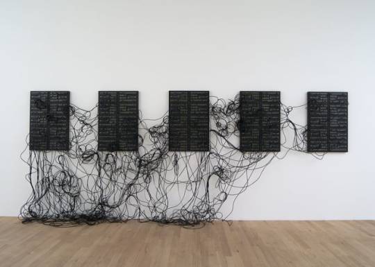
Artist: Addie Wagen Knecht
Title: Data and Dragons
Date: 2013
Medium: Sculpture, mixed media
WHY I SELECTED THIS ARTIST
I selected this artist because of the interesting materials the artist uses in their art work and because of the way the artist creates compositions that stand out from other art pieces.
FORMAL ELEMNTS
-Balance: with how the black structures are evenly distributed throughout the art piece
-Movement: with how the black wires are arranged in a very expressive way
-Line: with the black wires on the left side of the art piece
-Texture: with how the black wires appear to have the texture of hair
CONCEPTUAL ELEMENTS
-Emphasizes the digital environment
-Works with the concept of the peoples’ awareness to their digital surroundings
HOW IT RELATES TO DIGITAL ART
-The artist tends to focus on the influence and increase of the use of digital technology
-Employs parts and pieces of digital equipment in the art pieces

Artist: Rosa Menkman
Title: Venacular File Formats
Date: 2010-2011
Medium: Print
WHY I SELECTED THIS ARTIST
I selected this artist because of their unique way of portraying and communicating the increasing use of digital technology.
FORMAL ELEMENTS
-Value: with how the face is formed through subtle value shifts
-Form: the face in the art piece appears to 3D
-Balance: in the amount of light and dark colors throughout the art piece
-Movement: with how the face appears to be moving side to side
-Unity: with how the art piece stays with a single type of monochromatic color scheme
CONCEPTUAL ELEMENTS
-Visualizes the way file formats appear
-Draws attention to how file formats are constantly utilized in the media
-The art piece is meant to be a corrupted self portrait
HOW IT RELATES TO DIGITAL ART
-The artist attempts to visualize and depict certain digital technology and their abilities in art work
-Artist illuminates the constant use of digital technology
ANSWERS TO QUESTIONS
A) The role of digital art is to break the traditional boundaries of art. Also, to progress ways to express one self.
B) The kinds of personal connections I can make to the selected artists are with how they are able to communicate their concepts through the use of digital material or equipment in their art pieces and how I can easily make the connection between the art piece and the concepts behind them.
C) The common theme that both artists express in their art works is the theme of digital technology and its constant use by people on a daily basis.
0 notes
Text
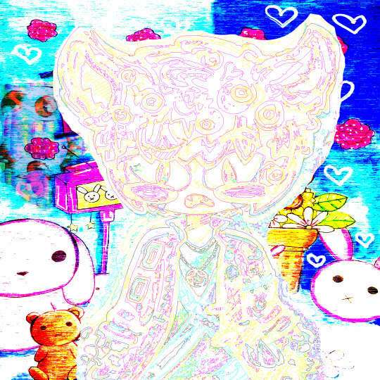
Project #2: Digital Collage/Montage--Exploration in Multiple Media
http://fairybunni.deviantart.com/art/Project-2-666148946?ga_submit_new=10%3A1488236043
CONCEPT
The art piece I have created represents myself by displaying how my internal desires conflict with the reality of my life.
I only utilized my own personal artworks in the art piece to make the gif. I created a gif to show how I am constantly in this trapped state of mind and life; which is similar to the format of a gif because it is on a consistent loop.
SYMBOLISM
Umbrella Sculpture: A sculpture I created in the summer of 2016. It symbolizes the endless cycle of me taking different medications to treat my seemingly incurable depression.
Human Figure: Represents one of my six personas. Her name is Bunny and is constantly struggling with mental illness. She lacks hands because while she is more severely depressed than usual she experiences art block.
Red Buttons: Symbolize pain.
Animated Background: Symbolize how my mind is constantly thinking and creating.
Cartoon Objects: Represent my inner creative mind and wants in life.
Real Objects: Represent the harsh reality of my life and dealing with mental illness.
INSPIRATION
I am constantly coming up with ideas with stories and characters. Even though I have not drawn in almost a year, I am still often developing concepts and ideas. Also, I have been experiencing severe depression for about ten years, so struggling with depression has become a large part of my life.
The depression, I am and have been experiencing has caused a vast amount of issues in my life with not being able to concentrate on school, constantly feeling negative emotions, crying a lot, having learned helplessness, somatic pain, chronic fatigue, not eating, sleeping too little or too much, constantly being stressed, being isolated, hardly ever having any fun, persistent suicidal thoughts, and a lot more.
FORMAL ELEMENTS
Elements of Art
-Line: with how some parts of the artwork have black line art surrounding the image.
-Color: Intense and bright colors are employed throughout the art piece such as the background or the red buttons.
-Form: The umbrella sculpture is an actual sculpture and appears to be 3D.
Principles of Design
-Balance: with how the human figure and umbrella sculpture are in the center of the art piece and there are varying objects on both sides of the art piece.
-Contrast: is demonstrated between the real 3D objects with the cartoon drawings.
-Movement: with the background colors consistently changing.
-Rhythm: with the colors of the background changing at a constant pace.
ARTWORKS USED
Room Filled with Cute Things
Incurable Melancholy
You WiIll Obey
You’re So Distant
Bubbles
Consumed
1 note
·
View note
Text
Reading #2: The Work of Art in the Age of Mechanical Reproduction by Walter Benjamin
Art used to be something that was not able to be reproduced. Art eventually became reproducible through print. The ability to print something is quite the important ability when it comes to reproducing art. Without being able to print out art there would be a vast amount of artworks that would not exist today.

The art piece being created or reproduced through print could cause an issue though. The issue of the art piece losing its impact factor because the printed piece defies the traditional view of how an art piece is made. When a person sees a large painting and a printed version of the painting next to it the person is more than likely is going to be more impressed with the original painted version over the printed version of the art piece.

Although the ability to print and reproduce an artwork is indeed important the original are piece seems to feel as though it has more value over the printed artwork. I hope that the traditional way of making artwork does not become lost and forgotten with the new inventions and ways to create or reproduce artwork.
0 notes
Text
Assignment 2: Individual Research on Contemporary Art & Artists
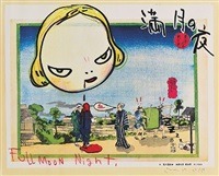
Artist: Yoshimoto Nara
Title: In The Floating World (Full Moon Night)
Date: 1999
Medium: Prints and Multiples. Offset lithograph
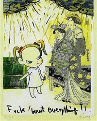
Artist: Yoshimoto Nara
Title: Fuck ‘bout Everything
Date: 1999
Medium: Prints and multiples, offset lithograph
Why I Chose This Artist
-Intersting Compositions
-Very Colorful
-The contrast between the detailed background and simplicity of the cartoon character work well together
-Thought provoking
-Has viewer look across both artworks
How It Relates To Digital Art
It relates to digital art with how the artworks are not the typical types of artworks that would be seen in a textbook. Also, with how this artwork could be replicated through digital art. Digital art and these artworks both go outside the idea of a typical artwork and what represents art.

Artist: Zhou Chunya
Title: Peach Tree & Woman
Date: Unknown
Medium: Prints and multiples, Lithography

Artist: Zhou Chunya
Title: Flower Story
Date: 2008
Medium: Prints and multiples, Siebdruck
Why I Chose This Artist
-The flowers in both artworks are aesthetically appealing
-A working composition
-Bright color usage
-Feels as though the artworks tell a narrative
How It Relates To Digital Art
These artworks relate to digital art with how the artworks appear as though they could have been created through digital art. These artworks and digital art both push the typical idea and concepts artwork usually has with how the artwork was created through prints and multiples and siebdruck.
Answers to Questions
A) The role of contemporary art in my opinion is to try to break the boundaries of a typical art piece. Also, the role of contemporary art is to try to relate better to the younger generations and make a statement.
B) The kinds of personal connections I can make to the selected artists’ works are with how the artworks appeal to my personal aesthetics. To add, the artworks appear to be bold and very much stand out. Also, while I was growing up my art was heavily influenced by art in Asia so, viewing these artworks give me a nostalgic feeling.
C) The themes and concepts the artist has displayed in his artwork are the beauty in his surroundings and with the love he has in the beautiful things he sees in life.
The themes and concepts in Yoshimoto Nara’s artwork are isolation, rebellion, and spirituality. His artworks are often influenced by popular culture in both the West and East. he is a part of Japan’s Neo-Pop Movement.
0 notes
Text
Project #1: Create your own Logo/Avatar & Header=The Art of Visual Identity

1) Header Image

2) Logo/Avatar Image
3) A screenshot of online tumblr portfolio
About Me and the Designs
I decided to draw simplistic logo and header because it follows an aesthetic of mine. Also, the logo depicts a white bunny with yellow fairy wings because I have represented myself with that symbol for years. Years ago I figured out that if I were an animal I would be a rabbit and if I were a mythological creature I would be a fairy. Eventually, I combined both concepts and got a fairy bunny.
The header has two different colored circles because they are meant to represent my birth flower, the daisy. The colors I used for the header correspond with the colors in my logo. I use these colors the most in my art work.
Elements of Art
Shape: with how the shapes are simplistic
Color: with how most of the colors are soft
Principles of Design
Balance: with how the logo and header are both almost symmetrical
Contrast: with how in the logo the soft colors contrast with the bold black eyes
Unity: with how the header and logo both follow a simplistic design
The Future
These designs will compliment my future art work completed in Digital Art. Also, these designs will influence how people will view my future art work and designs. These designs work as a representation of an aspect myself.
1 note
·
View note
Text
Reading #1 INTRODUCTION from Digital Art by Christiane Paul
In “Introduction from Digital Art,” Christaine Paul uninterestingly explores through the history and development of digital art. Although the text is quite informative the information on the history of digital art is presented in a “textbook” manner and fails to grab the reader’s attention because of how Paul continually writes fact after fact nonstop.
On the other hand, the development of digital art is an interesting topic by itself with how people have varying opinions on whether it should be accepted as a form of art or not and with how digital art has been referred to with different names. People have begun attempting to figure out a way to preserve digital art despite the form of art being considered “unstable” (Paul, 25). Hopefully, a proper wqay to store digital art will be discovered because of how important digital art is to society and how digital art represents present day’s and the future’s society.

The use of digital art is growing in today’s society. Digital Art is in use in everyday life and can seen everywhere. Digital art is used in music videos, advertisements, social media, ect. It is important to improve utilizing digital art in order to communicate with people across the globe and with younger generations. One could employ digital art by diffusing important messages to others. For instance, my close friend who goes by the username GardenGroves employs digital art to communicate his neurodivergent characters. His characters and digital art brings awareness to people about mental illness, differing gender identities, and varying sexual/romantic orientations.

Since digital technology has been created along with social media, the people have been more connected and informed on global issues. To demonstrate, the Women’s March that happened recently in response to Donald Trump’s inauguration has been discussed all across the Internet and the television. A vast amount of people are highly aware of this march.

Thus, the digital media has allowed for more people to be aware of the Women’s March and was most likely utilized in order to organize the Women’s March. A potential issue with digital art could be trying to reach those without access to devices that allow them to view the digital art pieces. Overall, digital art is necessary in order to continue progressing in this society.
0 notes