
nomanwalksalone
No Man Walks Alone
www.nomanwalksalone.com
A store for men of contrast and character
1278 posts
Don't wanna be here? Send us removal request.
Last Seen Blogs

fashionable-boy
My Lovely Ambiance

ninaazarova
the world is quiet here

familyicons
Family Icons

nikz1807
NikZ

gbolla
GBOLLA: dEcl@$$ified dE:colon*Zation gUide
Photo
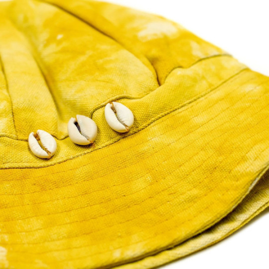
BRIGHT GREEN, BRIGHT YELLOW
by Réginald-Jérôme de Mans
A romantic restaurant six years ago. Thin and nervous, recovering from the worst illness of my life. On one side of us, a fireplace roars and crackles, making up for the bunch of lawbros talking structured finance to our other side. And then suddenly, I hear it, faux-naively touching my heartstrings like its own accordion keys, slow wistful notes common to 1960s and early 1970s French films, the kind that I would stumble on in late-night zapping through cable… So common as to be almost anonymous and thus exotic. The sort of channel-surfing that felt like waking dreams and alcohol-fuelled glimpses of other realities, where other mores applied.
I knew this would stay with me in my ears and in my head, so was glad the staff were able to tell me what I was hearing, the theme to Bernardo Bertolucci’s Last Tango in Paris lightly reworked by Gotan Project.
Last Tango in Paris, infamous now not for its eroticism but for the exploitation of its star Maria Schneider at the hands, and other body parts and a stick of butter, of director Bernardo Bertolucci and costar Marlon Brando.
Is it ever acceptable to separate what charms us from the otherwise problematic? I’ve been thinking about that again reading that Banana Republic is now marketing vintage items from its very different 1980s incarnation, back before its longtime owners, Gap, decided to rein it in. Back when its name, Banana Republic, had any relevance to its image and its merchandise.
Launched in Mill Valley, California in the late 1970s,Banana Republic once called itself a “travel and safari clothing company,” using a wonderfully constructed catalog narrative of exploration and exoticism to sell Brady fishing bags, so-called expatriate jackets and trousers, and arrays of travel books. It was closer to Seinfeld’s J. Peterman than J. Peterman itself, which started around the same time. Like Peterman, that old Banana Republic circulated thousands of catalogs with hand-drawn illustrations, rather than photographs, of its merchandise, accompanied by the seductive imagery of persuasive, whimsical prose recounting the founders’ exploits in Burma, Australia and elsewhere. The early Banana Republic shops featured life-size plastic megafauna like giraffes and staff whose jackets called them “guides”, with the shop logo of double bananas flanking a decidedly developing-nation-style star: the national seal, as it were, of Banana Republic.
To judge by small ads in old New Yorkers, many odd little ventures tried to sell clothes with atmosphere and wordy descriptions. But none did it more successfully than Banana Republic, which even launched (and quickly folded) its own high-powered travel magazine with serious contributions from international journalists famous not for fluff but insightful writing and photography.
In recent years, a devoted Instagram account, Abandoned Republic, has tracked down merchandise, memorabilia and personal memories from that era. And now, at least momentarily, so does Banana Republic corporate, in search of a more interesting brand identity than its last 30 years of “Gap, but a bit more upscale.”
Banana Republic corporate reconnecting with its past means current passing through a name, an attitude and a choice of merchandise that are necessarily differently freighted in today’s context. For the last three decades the name Banana Republic has been divorced from any signifier, a handful of syllables that might as well be an ideogram for “somewhat nicer khakis.” But what was a banana republic? In 1979, it must have sounded like a quirky choice of name, connoting quaint, backward, exotic autocracy – an elsewhere demarcated from the reader’s presumed safe, rule-of-law-governed, developed Northern Hemisphere, Western homeland. But this consciously chosen corporate name ignores the horrific, nearly incomprehensible political and ecological domination American corporations exerted on and in various South American countries to create and exploit enormous fruit plantations. O. Henry coining the term was one effect of such circumstances. This was by no means a forgivably distant phenomenon: barely two decades before Banana Republic’s own founding, one American fruit company lobbied the U.S. government into overturning a democratically elected government in Guatemala in favor of an unstable, bloodthirsty tyrant who safeguarded the company’s gigantic profits.
A similar lack of awareness stains those cute catalogs, which uncritically quote (for example) Henry Stanley, inarguably one of history’s greatest monsters, for the commercialization of safari fashions influenced by colonial nostalgia. Which was quite fashionable in the 1980s: Out of Africa, White Mischief, even claptrap like King Solomon’s Mines all came out in Banana Republic’s heyday, popular at least as much for their elegant, dashing depictions of ruling-classes as for their narratives. It’s rather surprising that the early Banana Republic didn’t sell the deeply freighted pith helmet, although it did sell – and the new BR vintage shop has briskly resold –many, many surplus Israeli Defense Force shoulder bags.
Safari fashions, particularly against the narrative and cultural context of early Banana Republic media and marketing, risk not just whitewashing but bleaching and sanitizing centuries of exploitation in all its forms. That conjunction of imagery localizes readers in the shoes of the privileged and the heavily armed, gives those forerunners all the benefits of a reputation laundered and lightened of venality, predation, bloodthirstiness without connection to any agency, risking turning the wearers into walking unironic homages to them. Context refracts resonance.
And with the resale shop an homage to that homage, what are we to make of this? It seeks a rebrand, to stand for something more interesting, now that it’s been reminded that retail, like the daydreamed safari landscape of BR’s old marketing, too is red in tooth and claw.
Like my consternation thinking about Last Tango in Paris, perhaps we can reproportion concern. The Banana Republic resale shop, although much heralded in fashion media, can only be a limited phenomenon (dedicated to the exploitation of the #basic consumer, rather than the Global South), limited by the relative rarity of existing 1980s BR clothing and by the marketing needs of maintaining exclusivity. And marketed identity lasts until the next thing. We, consumers, must exit comforting and entertaining dreamworlds and be aware, of what we are wearing, of its significance, whether we are shopping at Banana Republic or elsewhere, whether the song playing in the background will haunt us romantically or psychically.
15 notes
·
View notes
Photo
KNOTTY AND NICE
by David Isle
The New York Post recently reported on a study concerning blood flow within the male body. The competition in this area of journalism being rather stiff, this study distinguishes itself by addressing blood flow to a man’s thinking head, rather than to his unthinking one.
The study, reports the Post, finds that men wearing ties “had 7.5 percent less blood flow” to their brain. From this, the Post concludes that “comfortably dressed men may be smarter and higher-functioning than guys who wear ties.” This finding may arouse worry within the presumably blood-deprived brains of tie-wearing men. But in fact the Post has erected a false dichotomy. It is, in fact, possible to be both a comfortably dressed man and a man who wears a tie.
The study itself excluded this possibility. The tie-wearing group of men were directed to administer their neckwear using a Windsor knot (itself a grave mistake, but for stylistic reasons rather than functional) “tightened to the point of slight discomfort.”
Discomfort in the service of fashion has a long history, as does documentation of the resulting health problems. In Oscar Wilde’s essay “On Dress”, he describes Catherine de Medici’s invention of the corset as “the climax of a career of crime.” But in the case of the tie, there is no need for discomfort and disability. The answer is simply a looser knot, and, perhaps more elusive, a shirt collar that fits.
There are three ways to get a shirt collar that isn’t uncomfortably tight. I will describe them from most difficult, expensive, and elegant to least.
The first way is to get bespoke or made-to-measure shirts. Most good shirtmakers, including G. Inglese through No Man Walks Alone (just email us), offer this service. This option has the advantage of giving you a shirt that fits well along every dimension, in whatever fabric and style you desire. The downside is that it costs more than a ready-to-wear shirt, and you have to wait a few weeks between ordering it and being able to wear it.
The second way is to alter a ready-to-wear shirt. The key is to size the shirt by the collar, since it cannot be altered except by moving the top button, which allows only limited adjustment. Find a shirt that fits you comfortably about the neck; if it’s too big in the body or long in the sleeves, have it taken in. If it’s too small in the body or the sleeves, you’ll have to resort to the first option described above. Since after alteration ready-to-wear shirts end up being nearly as expensive as made-to-measure anyway, usually this isn’t the best option. The best candidates for ready-to-wear shirts are those who fit them well enough without alteration.
There is a third way, usually taken by someone whose shirts used to fit but now finds the collars strangely tight. Not that this has ever happened to me, but I have heard stories. This way involves leaving the top button of the shirt undone, and simply using the tie knot to close the collar. There may be some necessary compromise between the comfort of the tie knot and the closing of the collar, but this can be managed.
In any case, the important point is that you need not strangle yourself when wearing a tie. Besides being uncomfortable, it’s bad for your brain, and our intelligence is precarious enough as it is without being choked by an overaggressive Windsor knot.
Quality content, like quality clothing, ages well. This article first appeared on the No Man blog in 2018.
10 notes
·
View notes
Photo

ON DECONSTRUCTION
by Alexander Freeling
Ferran Adrià could never be accused of being too straightforward. The celebrated Spanish chef made his name with dishes that were part science experiment, part conceptual art. Familiar dishes made utterly strange by a cocktail of tricksy humor and laboratory technique.
As Silviya Svejenova and colleagues put it, “Adrià’s artistry is in the contrasts (hot–cold, soft–crunchy, solid–liquid, sweet–savory), the concepts (e.g., foams), the techniques (e.g., spherification), and the creative methods (e.g., deconstruction).”
Deconstruction, in this case, means taking a dish and altering its physical properties (texture, appearance, temperature) until it becomes something utterly different. The aim is often to make food that looks alien until the moment you taste it, but then triggers a memory of something entirely familiar. Or you are presented with a total man-bites-dog inversion of the expected that somehow works. A vegetable course comes as a series of glossy gelatin blocks which reveal themselves to the tongue (but not to the eye) as distinct and familiar vegetables. “Kellogg’s paella,” a famous high-concept composition, involves saffron-fried puffed rice, served with a seafood broth to turn the Spanish dish into an imitation of American breakfast.*
The use of humor and disguise in cooking is far from new. Liber Cure Cocorum, a medieval English cookbook, gives instructions for lacquered pork meatballs disguised as apples. Epulario, or The Italian Banquet describes a pie containing live birds that fly out when the crust is broken. Adrià’s signature is the marriage of this playful attitude with serious interest in science and new ideas. He once called his work “stovetop philosophy”; the legendary restaurant el Bulli that he operated until 2011 “was a sort of gastronomic-philosophical media lab.” Inside, everything from memories to raspberries were broken down—deconstructed almost to the molecular level—and then reformed and remixed with cunning, wit, and a helpful chemist.
The heyday of deconstruction in philosophy wasn’t so different, despite the grandiose claims of its cultured despisers and self-appointed champions. It was about taking ideas out of their normal contexts, pulling and pushing them until they no longer fit in their original place and could be used in new ways. And like the cooking, it was accompanied by a love of humor, surprise, and scientific jargon.
When it comes to menswear, the term deconstruction can suggest a few different things. Sometimes it’s a synonym for unstructured: soft jackets, unfused shirt collars, and free-flowing dresses come to mind. But these strategies for casual ease have been around for generations. For the humor, irony, and inversion of culinary deconstruction you have to go from tailoring to streetwear and high fashion. Think ugly sneakers for beautiful people, ultra-rare but mass-produced box logo sweaters, and shockingly expensive clothes imitating commonplace uniforms (perhaps imagine a cobrand between a Parisian fashion house and a German logistics firm). To find comparable scientific prowess, on the other hand, nothing comes close to the specialist world of techwear.
The avant garde needs its workaday partners. Simple, nutritious food. Smart industrial design. Practical clothes. But these things in turn need people who push at their limits. What the ultimate limits are depends on your art. An architect must resist gravity. A chef is constrained by their imagination but also the health codes. (The true peak of avant garde cookery might be something delicious but fatal, a taste that must only be imagined, or else enjoyed but once.) For fashion, the immutable object is the human body, be it corseted or cosseted, built into a bold silhouette or lovingly draped. In that context, deconstruction is really just another word for dress up: playing with contexts, appearances and expectations in an effort to shock and delight.
* NB. not to be confused with this truly challenging recipe for chicken, rice and All-Bran® cereal.
30 notes
·
View notes
Photo

SETTING A HIGH STANDARD
by David Isle
The pocket square is the canary in the menswear coal mine, announcing a man’s decision to view his clothes as an opportunity rather a necessity. Many writers have heralded the pocket square as the mark of a truly natty dresser - Bruce Boyer wrote that “a gentleman should wear a pocket square”; retired menswear doyen Will Boehlke used to say that most men should have half as many ties and twice as many pocket squares.
Budding dandies generally take eagerly to this sort of advice - I know I did. Pocket squares are fun to play with, offer a frisson of satisfaction at having the sophistication to wear this rare sine qua non of elegance, and what’s more, aren’t terribly expensive. Then there are the little thrills that come from women tugging at a pocket square thinking that it’s fake, only to unfold some medieval hunting scene or whimsical sketch of an Italian piazza. (This has happened to me exactly once. I have offered a pocket square to absorb champagne or tears - the two most commonly cited services a pocket square might do a gentlemen - exactly never.)
In this flurry of folded silk, it’s easy to forget the first rule of pocket squares: a white linen or cotton square always works.
Often the white square is presented as a disappointing last resort - if all your other squares clash hideously or match garishly with the rest of your outfit, give up and wear a white square. (And start shopping for a different square you can wear with this outfit next time.) Sometimes it’s even suggested that a white square is really only a good choice with conservative business suits.
As my initial pocket square fever has started to break (it took a few years), I’ve started to view a white square not as a last resort, but as a default. A white pocket square always looks pretty damn good. And it surely obeys Alan Flusser’s exhortation that the pocket square should “appear unstudied.”
The white pocket square sets a high bar that any alternative must clear to merit consideration. With a business suit, I wear little else. Even with sport coats, I wear a white square frequently - with the points up rather than in a TV fold, or with the fringes out in the nattily casual Post-Imperial version. I’m not the only one - it’s easy to find pictures of style icons like Cary Grant, the Duke of Windsor, and Gary Cooper wearing white pocket squares with sport coats and casual suits.
Of course, I still stuff a piazza or a fox hunt in my pocket now and again. But I no longer feel uncreative or unambitious when choosing a white square. Wearing a white square is not settling for mediocrity. It’s setting a high standard and holding to it.
Quality content, like quality clothing, ages well. This article first appeared on the No Man blog in 2017.
9 notes
·
View notes
Photo

JEAN DUJARDIN, ICON OF IMPERMANENCE
by Réginald-Jérôme de Mans
There’s a fantastic new podcast Kill James Bond! providing a critical eye on the tired old cliché and media it inspired, from the Ennio Morricone-scored, Neil Connery-starring Operation Kid Brother to apparent #wifeguy Michel Hazanavicius’ revisionist French takes on the Bond also-ran OSS 117. Something clicked hearing the hosts discuss the joy the hero of the latter, Jean Dujardin’s entitled, thoughtless Hubert Bonisseur de la Bath, takes in simple moments and simple experiences. Joys typically filled with double entendres, like having his biscuit buttered or getting oiled up, as well as those that provided novel thrills for a 1950s character, such as taking an airplane… or, for a dandy, getting a chance to wear his new alpaca tuxedo.
Anyone reading this has probably secretly had similar moments, moments that you can’t share with a partner, of finding the perfect occasion, the perfect excuse for being able to display a fanciful indulgence. And, along with other fanciful details of old 1950s and 1960s spy movies like rear-projected driving scenes and blue-filtered day-for-nights, the makers of OSS 117: Cairo, Nest of Spies brought back the old tradition of having the hero’s suits made by a reputable tailor. Sean Connery and Patrick McGoohan had Savile Row tailor Anthony Sinclair, Cary Grant had a slew of Internet bores attempting to decipher a maker’s label in North by Northwest, and Dujardin’s spy had Jo Kergoat, renowned Paris tailor and protégé of none other than André Bardot, a founding member of the Groupe des Cinq of French custom tailors, the circle of prestigious 1950s tailors who shaped what French tailoring is today.
What is today? As tailored by Kergoat (who made 47 suits for the movie), Dujardin is a perfect French parody of Sean Connery, immaculately dressed in elegant detail – far better, for instance, than Daniel Craig ever has been as James Bond. Dujardin has reprised the role twice, once in 2009’s OSS 117: Lost in Rio, and now in OSS 117: Red Alert in Black Africa, which is slated to come out around the same time as the oft-delayed Bond film No Time to Die. In the meantime, during the long uncertainty of the pandemic, Jo Kergoat, who has previously raved that “everything’s going to hell and soon there won’t be a single real tailor in Paris," has helped fulfill his own prophecy and hung up his shears, at 91.
Hazanavicius and Dujardin have worked on other projects together, including the prominently Oscar-ed The Artist. Another period piece, it also featured the unusual attention to detail of French bespoke crafted clothing for Dujardin, this time from the custom tailor and shirtmaker at Lanvin, the oldest continuously existing French fashion house. Such a step was coherent with Dujardin’s role, a silent film star confronted with the new age of Hollywood talkies, in an age where studio systems practically required stars to maintain the same care in their off-camera appearance as in their highly orchestrated films. Not only was Lanvin one of Paris’ oldest couture houses, but with its men’s custom business founded in 1926 (in magnificent Art Deco premises decorated by Armand-Albert Rateau), it was one of the old guard of established French tailors, mostly forgotten names like Cristiani, Larsen, Knize and Creed (yes, the overhyped perfumers of today were once custom tailors to none other than the Shah of Iran, among others). An old guard against whom Bardot’s Groupe des Cinq had rebelled around the time that the action in the first OSS 117 movie takes place, because those five tailors (Socrate, Waltener, Camps, Bardot and di Nota) had wanted to show more progressive designs, back when prestigious custom tailors could set fashion because they dressed men of fashion, rather than being the isolated, crumbling redoubts they are today. And Lanvin itself lost its own such redoubt, after just under a century as one of the best, tailor and shirtmaker in the world, in the last year after the actual people responsible for such craft fled to the relative safety of Francesco Smalto… a tailoring house founded, ironically, by one of the alumni of the Groupe des Cinq.
It cannot be too coincidental that those two absurdly well-dressed, well-tailored roles make Dujardin confront periods of uncertain transition: his silent matinee idol facing the advent of films with sound and a whole new style of acting, and OSS 117, he who acts out all of the things 007 elides, like the need to carefully remove his custom suit jacket, shoes and cufflinks before jumping into bed with the femme fatale du jour, faced with the disintegration of colonial empires, of the illusion of France as a great power. In a way, Hubert Bonisseur de la Bath is Eurocentrism himself, forced to encounter other cultures as they shrug off imperialism (in the case of his first film, through the Suez crisis that destroyed British and French pretenses of power), as all of the absolutes that composed his worldview break down. So indeed the tailors and shirtmakers that made him. One can no longer take the joys of an alpaca tuxedo for granted, no matter how elegant one momentarily looked in it.
8 notes
·
View notes
Photo
THE INDOORSY BASEBALL CAP
by Steve Gottschling
The baseball cap is an indoor hat. I know that sounds weird. You probably wear yours only when outdoors and remove it when you go inside. Maybe you voiced mild befuddlement when Morgan Freeman attended the SAG awards wearing a black one. But there he was, the brim low on his brow, until Rita Ora implored him to raise it a bit so the audience could see his face, which by then had shaped into something between amusement and annoyance.
None of the news outlets covering the show could pin down a reason for Freeman’s cap. But the reason is clear: the baseball cap is an indoor hat. And for further proof, we need only shift our gaze to the current lifetime achievement award holder for ceremonial cap-wearing, composer Steve Reich. He wore a cap while shaking Prince Charles’ hand to accept an honorary doctorate from the Royal College of Music. He wore one while accepting his Pulitzer prize in 2009. Wearing caps in large indoor spaces is Steve Reich’s thing.
But unlike Freeman, Reich discusses his cap frequently. In a 2016, he told the Globe and Mail:
“This is my kipa – this is my way of squaring the circle, of being able to be comfortable in the various worlds in which I find myself. In synagogue I have a regular yarmulke on, but outside, I wear the hat. I wear it on stage and I feel good that I can do that – that I’ve found a solution, a way of maintaining a couple of 1,000-year-old traditions while still not trying to force myself on people.”
Reich’s cap isn’t just celebrity insouciance. It shows how decades of social changes can collide into a single garment. In the 70s, after the counterculture and all the squares it influenced began embracing identities that had been overlooked or suppressed in the West, Reich jumped aboard a wave of renewed interest in Judaism. He enrolled in a religious education class at a Manhattan synagogue. He picked up Hebrew. And then came the cap.
Reich’s display of faith was coy compared to what happened in the decade prior. In 1962, according to a paper by Aminadav Grossman, the American Jewish Congress convinced the governor of New Jersey to let men wear yarmulkes to court after a judge forced an Orthodox Jew to remove his yarmulke at a traffic hearing. In 1970, after the New York Stock Exchange’s policy of prohibiting the yarmulke prompted a Jewish employee to complain to the City Council of Human Rights, the Exchange reversed course and let workers wear the hat after all. Meanwhile, a meeting among Jewish advocacy groups shows the degree to which students were bringing their yarmulkes to the classroom:
“…over the years the practice of deeply observant Jews in covering their heads during the waking hours, has become firmly imbedded [sic]. In fact, it is apparent that increasing numbers of Orthodox Jewish youth are beginning to assert themselves by wearing yarmulka [sic] in public schools and colleges. This is in sharp contrast to a previous era when Orthodox Jews, sensitive to the hostile attitudes of the Christian world, compromised themselves by removing their skull caps in public spaces.”
But even after so many American Jews fought for the right to wear their yarmulke in public, Reich chose the cap. And that is less a fault against Reich than it is a testament to the cap’s meaning-shifting, comforting ways.
Unlike the fedora, which carries its history like a wet sock, the baseball cap picks up and sheds meanings at will. The same blank cap that helps a barely undercover celebrity thwart the paparazzi could drift onto the head of a fast food worker without disturbing anyone’s idea of peace.
And while baseball caps have always been malleable– declaring allegiance to both sports teams and military branches– the design itself is like a telephone booth for the head. The crown is just the right size for the scalp, the brim just long enough for the brow. Nothing protrudes further than it has to, no extra fabric to curl jauntily toward an unconsenting audience unless the wearer swivels the hat himself. It simultaneously reveals part of the wearer to the world, while giving him enough of a ceiling to feel like he can keep something to himself.
None of this, of course, tells us what Freeman is hiding. But whatever it is, we know it is safe.
Quality content, like quality clothing, ages well. This article first appeared on the No Man blog in 2018.
6 notes
·
View notes
Photo

WEAK TIES AND STRONG TIES
by Alexander Freeling
It was a theory of social networking before social networks. In 1973, Mark Granovetter published an essay on “The Strength of Weak Ties.” Rejected four years earlier by one of the major sociology journals while Granovetter was still a grad student, it ultimately made his name.
Strong ties are connections to people close to you. Weak ties—no surprise—link to the opposite: friends of friends, people you see at the pub or the gym, perhaps some distant family. Granovetter’s idea was simple enough: weak ties matter more than we think.
At the heart of Granovetter’s work was good old-fashioned survey work. He asked a sample of people in Boston who had just found a new job who helped them the most. It wasn’t those closest to them, he found, but those on the periphery: the weak ties. Thinking emotionally, we might assume that strong ties are most important for finding a job, since those people care the most about your success. But from a structural viewpoint, weak ties have a clear advantage: precisely because they aren’t the people you typically spend time with, they’re likely to be less similar to you. And that means they move in other circles—and hear about opportunities you don’t.
The finding is sometimes summarised as one more iteration of “It’s not what you know but who you know.” This obnoxious saying misses the point. For one thing, nobody ever traded facts for friends. They’re correlated. But anyway, Granovetter’s point was that it’s not who you know, but who they know.
Aside from the practicalities of getting hired, “Weak Ties” tells a quietly optimistic story: people don’t need an especially strong reason to help each other out. And our communities of support may be far larger than we realise.
The seduction of “strong ties” runs deep, especially with men (who often spend rather more energy on people they are hoping to work or sleep with than on friendships). It’s comforting to think that social life boils down to a few people whose names you definitely remember, but the truth is more complicated and diffuse.
In the UK, people still talk about the old boy network, meaning the connections between alumni of elite fee-paying schools, and other powerful institutions, who look out for one another out of group loyalty. This brings us to the other kind of “strong ties”: neckwear. You’d have to be graceless to wear the tie of your old school, university or regiment to a job interview as a selling point these days, but the metaphor still holds.
Alumni garments aside, what about literal weak ties? That is, the ones you hardly ever wear, but which make up 90% of any collection. These, too, shouldn’t be ignored. The fantasy of “five essential ties” is not so different: get the key pieces and you can ignore the rest. (Let’s say a navy grenadine, a repp stripe, two neats and a knit. You’re welcome.) There’s nothing wrong with minimalism, but I don’t think these listicles generate so many clicks because everyone wants fewer possessions. I suspect it’s the desire to have all eventualities covered. To complete your collection.
As everyone who as painstakingly assembled their “essentials” knows too well, that’s never how it works. Situations and tastes change, as they should. Getting dressed or building a wardrobe isn’t a challenge to be completed, any more than reading books or having ideas is something you should hope to finish by thirty. Ditto social relations. What’s the message here? Keep the hot pink tie you wear once a year at most. And have a beer with that guy you’re on nodding terms with (and try to remember his name this time).
14 notes
·
View notes
Photo
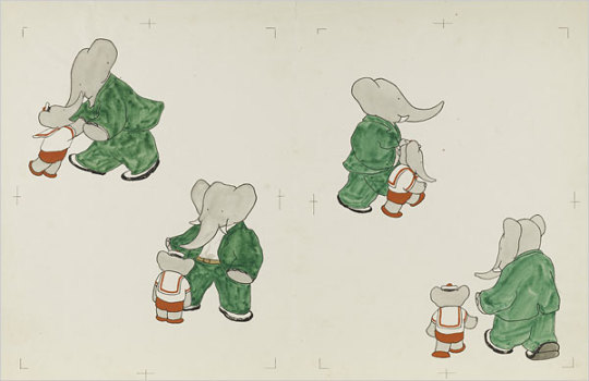
ALTERNATIVE STYLE ICON: BABAR THE ELEPHANT
by Réginald-Jérôme de Mans
It wasn’t until I read The Story of Babar as an adult, to a young child who loves elephants, that I realized how jarring Jean de Brunhoff’s charming childhood story is. The Babar stories lay in my mind as a vague genial tale of a mellow, rather formal, pachyderm civilization. I had forgotten that the young Babar’s childhood idyll, as soon as described, ends with the peremptory shooting of his mother by a big-game hunter (the so-called page 2 dilemma for bedtime-reading parents). And I had forgotten that the distraught Babar’s discovery of #menswear (early 1900s edition) takes his mind off of her murder.
Babar flees for several days and nights until he comes to a town, where what interests him the most, more than the architecture, the wide avenues, the cars and buses, are the suits two gentlemen are wearing. He immediately wants one for himself. Providentially, an old lady who loves elephants crosses his path, gives him money to go shopping, buys him a car. For two years he lives with her in the city, depicted behind the wheel of some 1920s open-top bolide, or amiably recounting anecdotes about life in the jungle to human dinner guests while wearing what look like tails and spongebag trousers (the humans are downright underdressed in dark suit and tan tweeds). The chance visit of his cousins causes Babar to return to the jungle, just at the moment the old king of the elephants dies. Babar’s life among the humans leads the elephant elders to crown him king; his coronation ceremony is also his wedding, for which he sends back to the city for wedding clothes. His story ends after the celebration, gazing out into a desert night with his new queen, both crowned and dressed to the nines.
Surprisingly, it’s only a coincidence that the brother of Babar’s creator was the editor of French Vogue; de Brunhoff himself was a classically trained artist. The Babar stories originated as bedtime stories his wife had told their sick children, but I do wonder if she, or de Brunhoff himself, was the one who first described in loving detail the litany of Babar’s clothing purchases when he rushes to spend his first francs at the department store: “a shirt with collar and tie” (a pink popover with detachable wing collar and carefully drawn folding buttonhole to attach to the inside waistband of trousers to stay tucked); “a suit in a nice shade of green, then a bowler hat, and finally dress shoes (the old-fashioned, highly formal term souliers rather than chaussures) with gaiters” (I had a hard time explaining to my son what gaiters are, but there they are, perfectly depicted as light-colored accessories sitting atop Babar’s shoes to give the impression that he was wearing boots, or whatever gaiters were supposed to do).
Reading the Babar stories as an adult, It is very, very difficult to avoid seeing the Babar stories as an easy colonialist parable, despite all of the charm of Babar’s unexpected sartorial fussiness. Researching this piece, I found I was far from the first to notice this. The New Yorker’s resident Francophile, Adam Gopnik, wrote a wonderful recent essay reevaluating the criticisms of colonialism and neoimperialism levelled at Babar, suggesting instead they were gentle caricatures of France’s attitudes towards its roles as colonial power and as civilization itself. Gopnik proposes that the Babar stories are instead “a fable of the difficulties of a bourgeois life.” Understandable, given their genesis as bedtime stories in a bourgeois household, a parent striving to create relatable adventures starring charismatic megafauna. Nonetheless, the colonial optic is hard to close our eyes to. The charismatic young elephant, noblest of savage beasts, strays into the city and is immediately arrested by the sight of fine suits. Generously adopted, dressed and educated by a wealthy, worldly benefactor, he returns to his birthplace with the gifts of knowledge and culture, clothed among the naked, to rule and spread the lessons he learned.
Perhaps what we can take from the Babar stories is that the refined delights of the metropole are just a few days’ walk (as the elephant flees) from nature at its most wild. Yet both had a kind of order; the jungle’s order disrupted by the so-called civilized, in the form of the big-game hunter and in the form of the tutelary patron. Along with the question what do we long to be, we must ask ourselves why do we long to be it? Let us adopt Gopnik’s gentle view of the Babar stories, and adopt the things we love – nice or natty clothes, if we must – for themselves, and not for the darker political overtones that may shade them. Let clothes only make the elephant, not the man.
Quality content, like quality clothing, ages well. This article first appeared on the No Man blog in 2018.
17 notes
·
View notes
Photo
NOTES FROM THE GROUND FLOOR
by Réginald-Jérôme de Mans
As I get older, it’s amusing to recognize that so many of the pithy quips and sayings I have derive from a small set of catchy past readings, however shallow my culture. Case in point: I thought of beginning this piece with “I’m a profane man,” a self-hating declaration inspired by my high school assignments in Dostoyevsky’s Notes from Underground (“I am a sick man... I am a spiteful man.”). One of the many ways in which I am profane occurs when I find something, some article of clothing or tool that suits me so perfectly and improves my quality of my life that I’m tempted to use Jude Law’s slightly unnerving ejaculation as Dickie Greenleaf in The Talented Mr Ripley, “I could f**k this I love it so much.”
Dickie was getting passionate about his refrigerator, a new purchase that allowed him to have cold beer in southern Italy. While I’m lucky enough to live in an age and place where refrigeration is taken for granted, I find myself echoing that sentiment in my head when, say, I find a pair of jeans with the right cut, denim and fit, or, more recently, the ideal pair of slippers – durable, beautiful, tactile, reasonable, perfectly fitting and insanely comfortable.
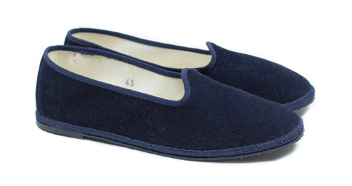
I’m not one of those people who insists everyone take off his or her shoes at the house. I take mine off, though, since it’s generally more comfortable to walk around without shoes on, and in summer far cooler to do so. As a teenager, I used to wear Chinese slippers, which had the advantage of being dirt cheap and available in precise sizes. Of course, they wore out quickly, and because I kept shoving my foot in, the backs got trodden down. After all, I’m not fanatical enough to use a shoe horn to put slippers on. I found a delightful pair of pointy suede babouches at the Entreprises Artisanales in Marrakech, the government-sponsored crafts market outside the souk, which were both handsome and reasonably well made. After those wore out I tried to replace them remotely by ordering a similar-looking pair from a merchant online, but they came apart almost immediately. As those gave up the ghost I tried suede slippers from one of my Paris haberdashers, which were light but rather old-mannish, and expensive for what they were. I finally dug through my #steez stash and found glorious relief in velvet furlane, otherwise known as gondolier’s slippers.
The story goes that furlane originally were made by convicts on one of the islands of the Venetian lagoons using what otherwise would have been refuse: discarded bicycle tires were made into the soles, while the uppers were made out of offcuts of the velvets and brocades Venice had become famous for producing. The front ends in a little curved point up the instep like a Persian slipper, and the upper is bordered in grosgrain, while the edge of the sole is trimmed with a handsome roped braid. I do query at what point these became the footwear for gondoliers, since they’ve been plying their trade in the lagoon for centuries, while the bicycle’s been with us for less than two. Historicity aside, they fit wonderfully and come in precise sizes, while the cloth forgivingly grips any width of foot. While they’re also made with backs, I prefer mine backless, resembling a far sleeker version of the custom cloth slippers that John Lobb of St James will make up custom for around a thousand pounds, which come with the ineluctable odor of burning money. Even though not custom, my backless furlane still fit well (none of the heel-slapping that comes with slippers that are too long in back, and cost a few percent of Lobb’s delusional price, meaning they’re relatively affordable, even if I am now scouting replacements to set aside.
I’ve been surprised to find almost no sources for them online. At best, one or two sites ask potential customers to email to see what’s available. Even Etsy, the world’s handicrafts gar(b)age sale, turned up empty. How can it sell handmade Spider-Man panties (don’t ask) and not have furlane? I’ve thus started asking my Svengalis to consider selling them. Watch this space… til I profane it again.
9 notes
·
View notes
Photo

BASIC CABLE STYLE: DEMOLITION MAN
by Steve Gottschling
This month, Cinemax has been screening Demolition Man, which is about as remarkable as saying, “this morning on Facebook someone wrote something unreasonable.” Cable channels are always screening Demolition Man. It’s the television equivalent of a numbers station, Sylvester Stallone’s face forever broadcasted into the aether as generations of viewers tune in with varying levels of puzzlement.
But 2016 is particularly apt for giving the 1993 film a closer look, if only because the menswear that roams today’s sidewalks is vastly more diverse than the film’s vision of sartorial sameness. Baggy pants have lumbered back into stores, and yet men who cling to their clingy dungarees need not fear any sort of shunning, as slim silhouettes haven’t budged a bit. Relaxing dress codes mean Dockers can cram right next to polished sweatpants on office elevators without either wearer feeling out of place.
No wonder Simon Doonan spent the end of May giving Slate readers an overview of New York’s “menswear tribes.” The average public space in any fashionable city resembles a sort of Hadron Collider of contrasting looks.
The civilians of Demolition Man’s San Angeles, on the other hand, prefer precisely one shape: their ample, flowing robes. It’s an outfit that costume designer Bob Ringwood intended to protect them from the sun after the ozone layer has collapsed (remember when we talked about the ozone layer?). But while San Angeles stays remarkably melanoma-free, all that healthy skin comes at a price – no one can move very quickly. They drift in deliberate strides, usually in groups, their layers of fabric flapping around as they enact a futuristic version of every city dweller’s tourist-season nightmare.
But put aside your slow-walker Haterade for one moment, and you’ll notice how peaceful this sort of fabric-induced dawdling can be. For their fifth issue, titled On Slowness, Vestoj magazine interviewed a clergyman who explained the ways his cloak restricts his movement, encouraging a slow contemplative pace:
“The design of the cowl is a large cloak, with long sleeves and a hooded neck hole. It’s a contemplative garment and meant to be impractical – you can’t run in it for instance. It slows you down and you can’t do much in the way of work as a result of the long sleeves. Because you can’t move quickly, it calls forth a sort of gravitas by imposing a sense of gravity on the wearer.”
A city full of people with acres of fabric weighing down their bodies. It’s hard to tell whether walking in stunted strides give them a sense of gravitas, whether it encourages them to think, perhaps, of what their forebearers must have done to create a world where far less impeded UV rays hurtle toward the Earth. Either way, an action movie would never let a moment of thought last longer than necessary, and Demolition Man unleashes two forces that send the berobed civilians scurrying in slow motion– Wesley Snipes’ shoot-em-up reign of terror and, soon after, the marauding scavengers headed by Denis Leary.
What do these men have in common? Clothing that fits much more closely to their bodies. Snipes’ overalls are hardly form fitting by 2016 standards but still permit enough mobility to make him the most agile man in whatever room he lands in. Leary hides beneath an enormous trench coat but, unlike most of the citizens who line their robes with additional layers of voluminous fabric, opts for slim-fitting underlayers that let him move as quickly as his coatless followers.
Thus, we in 2016 face a crucial choice every time we shop for clothes. We can buy something with dramatic volume, maybe with a dropped crotch, knowing our decision might leave us with slightly shorter strides. Or we can hug our bodies with a fitted garment, lessening our comfort but allowing us, perhaps, to steal the wallet from the nearest slow-walker we come across. Can’t decide which path to take? Try watching Demolition Man a few more times. It will be on TV for sure.
Quality content, like quality clothing, ages well. This article first appeared on the No Man blog in 2016.
8 notes
·
View notes
Photo

RABBIT HOLES
by Alexander Freeling
The curse of the algorithm is also its genius: the goal is to make you watch one more video, but whether you click or not, it uses that fact to become even more persuasive next time. The forces of repetition win either way. It’s the inverse of channel hopping: rather than randomly skipping until something grabs you, it serves you a seemingly random but utterly calculated platter of options.
The whole beauty and terror of machine learning is that we don’t know what conclusions the machine will reach, and we certainly don’t know how it will get there. It’s smarter than us in some respects; in others profoundly worse. Where people are irresistibly drawn towards misery and outrage, it will serve them more than they could ever have imagined looking for. And if all you want is videos of animals interrupting each other’s naps, it’s got you covered.
One genre to rise out of the new media soup is the mesmerizing process video. These videos depict precise, repetitious activities of all kinds. They can be industrial, artisanal, or leisurely: making pencils, toothbrushes, or marbles on the assembly line; an old and unbelievably patient man sharpening knives; archery or darts. And if you display even a passing interest in one of them, the machine will serve you a million more. Down the rabbit hole you go.
These videos have the smooth predictability of the lullaby. Life may be chaotic, but every brush gets the same bristles. Every knife is sharpened with the same motion across the whetstone. If, like most modern professionals, you spend your days and minutes processing abstract information (accounts, regulations, timetables, and the rest), an outside observer watching you work would have no idea what you were trying to achieve. A straightforward, practical task is a welcome contrast. Whether they are making watches or hot sauce, the best examples demonstrate a casual mastery that might be as close as humans get to perfection.
You’re probably wondering what this has to do with style. The answer is that my particular choice of rabbit hole is shoe repair. The format is always the same: some terribly afflicted shoe (worn into the ground, stained, dried out, and cracked) is stripped down, taken apart, and slowly rebuilt. The heel comes off, and then the sole (pulling out the nails, and in some cases, dissolving an awful lot of glue). Excess polish is stripped off, suede is shampooed, leather redyed and moisturized. New soles are sewn on (sometimes with a new welt), trimmed, sanded, colored and buffed. New laces and polish seal the deal.
These videos are bad TV in some respects. They have endless amounts of dead air because the explanations are short and the work is long. In fact, there’s little drama at all. Few complaints about the negligent wearers (who are, after all, the customers) or poor craftsmanship. Occasionally an expensive but flimsy Italian loafer will be subtly improved as it’s rebuilt.
No problem is too grave. The welt is chewed up and there’s nothing left to sew. The shoes got wet and the shank corroded like an old gate. The boots are so gnarled that you can’t tell if they’re calf leather or suede. However bad things get, tragedy turns to comedy by the end. Every job is different but by the end they’re all the same.
In our algorithmic paradise, something is provided for all so that none may escape. But as genres go, shoe restoration isn’t bad. It has the structure of a TV serial: disaster strikes, triggering a series of different but related challenges through which the damage is repaired and the world returns, for a moment, to the condition of perfection. And if this all sounds too wholesome for you, there’s always the “alternative” version: ASMR – GUCCI LOAFER RESOLE.
8 notes
·
View notes
Photo

INTERVIEW WITH PETER PLOTNICKI OF MERZ B. SCHWANEN
by David Isle
Peter Plotnicki is one of those lucky souls who has taken a passion and turned it into a career. Always an avid collector of vintage items, Peter has taken over a vintage company, Merz b. Schwanen, and turned it into a thriving enterprise.
David Isle: What are the differences between the vintage pieces and today's Merz shirts?
Peter Plotnicki: The first difference is the patterns. We started at the beginning much closer to the vintage pieces. The patterns were not very well shaped. The second difference is we have brand labels inside our shirts, whereas vintage shirts had only labels to indicate the materials.
DI: What might make you decide on a cotton/polyester or cotton/viscose mix for a shirt as opposed to pure cotton?
PP: One of the original vintage shirts was made out of a fabric of amazing quality. It had a great soft feel.
We found out the composition and it was 67% cotton and 33% Viscose. The shirt was from between 1910 and 1920.
They called it Maco Imit which means that they imitated the Maco or Egyptian long staple cotton, which has the same softness but is more expensive.
We reproduced this yarn because of the history and our appreciation of this fabric.
DI: What function does the triangle insert on the sleeves of the shirts serve?
PP: The patterns in the past were much different than today.
The aim was to use as little fabric as possible. The sleeve pattern was a rectangle and the triangle insert gave the extra width at the upper arm.
The fitting wasn't good but in that time it wasn't so important.
Our sleeve pattern is modern but we like the triangle idea very much and we want to honor our archetypes.
DI: What has been your main interaction with vintage clothing? Have you spent a lot of time in thrift stores and vintage shops? What's your favorite item that you've ever found?
PP: I love to go to vintage shops and flea markets. My favorite items are of course a nearly hundred years old Merz b. Schwanen button facing shirt, a German coachman leather jacket from the thirties and a Lewis from the middle of the fifties.
DI: Does circular knitting allow less, just as much, or more, shaping in the body compared to a shirt that's sewn together?
PP: You can shape as much as you like using either technique. I feel more comfortable in a seamless shirt and it's the authentic way of production.
But the production is much more complicated. I think that's the biggest reason that nowadays nearly every shirt has a side seam.
DI: Are there many differences between German clothing style and clothing manufacturing compared to say, Italian or British? How would you say that Merz b. Schwanen fits into that?
PP: Regarding the style I think the Germans are more conservative. The Italian and British are much more into fashion; for them personal style more important compared to the German.
Our customers are really diverse. We have the authentic and more denim people, and we have also the street fashion styled customers. Both are wearing Merz more as a shirt and less as underwear.
But we also have some more classic orientated customers which are wearing Merz as underwear.
Quality content, like quality clothing, ages well. This article first appeared on the No Man blog in 2014.
4 notes
·
View notes
Photo

ALTERNATIVE STYLE ICON: JIMMY WANG YU IN THE MAN FROM HONG KONG
by Réginald-Jérôme de Mans
There are things we always want to reclaim from our past, even from its most confused, bittersweet moments. In my case, the thoughtful moments driving home late at night down Santa Monica Boulevard decades ago from an essay-writing extension class at UCLA. With the top down on my coincidentally Australian-built convertible (a deathtrap, a future girlfriend would call it, and refuse to get in), those summer evenings seemed flower-scented, ripe with potential that would go wasted, still and quiet and beautiful in a city that was not mine.
I was taking this after-work class after feeling like I was losing my marbles, wanting to find a way to collect myself after college. College had beaten any confidence in my ability to write for personal expression out of me. I would not rediscover that in that class, in fact not for decades until blogs like No Man Walks Alone reached out to me and I could process and piece back together parts of myself, those disjointed, uncalm, uncollected pieces of myself. At the time, I was young and unmoored, and the station at the lower end of the dial I’d listen to on those drives back reflected that feeling of unreality and detachment. It played everything, ironically or not, everything from the Laverne and Shirley theme to what would have at the time been cutting-edge electronica. And one-hit wonder Jigsaw’s strange “Sky High”, whose refrain “You’ve blown it all sky high” was sung altogether too casually for someone to be expressing the upheaval of their entire life.
I was pleased to rediscover the song playing as the main theme to 1975’s The Man From Hong Kong, whose star Jimmy Wang Yu is today’s Alternative Style Icon. The song’s strangely flip attitude towards destruction works perfectly in this bizarre, bizarrely interesting movie, which ends on the climax of Wang Yu blowing former James Bond George Lazenby and an entire floor of Lazenby’s apartment building to kingdom come. After setting Lazenby (yes, Lazenby himself, in a practical effect that actually did leave him with burns) on fire by kicking him into his open-plan 1970s fireplace…
Lazenby had blown his own career sky high by walking away from a multi-picture Bond film deal to instead star in 1971’s Universal Soldier, a confounding mashup of Easy Rider and The Dogs of War whose chief point of interest is that feminist writer Germaine Greer plays a minor role. Lazenby claims that his friend Bruce Lee was set to star with him in The Man From Hong Kong until Bruce met his mysterious end at the hands of either a Dim Mak death touch or a medication allergy. Jimmy Wang Yu stepped into the role and Lee’s vacant shoes and acquits himself well in all respects except the unfair and unwinnable one of being in the shadow of a deceased legend, deceased so very much larger than life.
The Man From Hong Kong showed how exploitation films could be strangely liberating, indeed subversive. It was a so-called Ozploitation film by dint of its Australian production, going so far as to have its first scene a fight atop sacred landmark Ayers Rock, where a future Mad Max actor actually beats legendary martial artist and fight choreographer Sammo Hung. It also exploited many other period trends: the Kung Fu, international thriller, and loose cannon cop fads, with Wang Yu a polished Hong Kong police inspector able to charm very white Australian beauties out of their hang-gliding pants and bikinis. Nearly a half century later, moviemaking still is rightfully criticized for emasculating Asian men, yet in this 1970s exploitation film an Asian man got to carry out the old seduction tropes of the regressive, lily-white British spy movie, even if (as Alice Caldwell-Kelly has observed) the characters do engage in racist banter about it.
This is very much a Jimmy Wang Yu showcase. It’s certainly not Lazenby’s fits that stand out in this movie. As my friend Matt Spaiser of The Suits of James Bond has pointed out, Lazenby has to dress the part of a playboy bigwig villain, and wears old playboy clichés like gold-buttoned blazers with draggy 1970s long collars and fat ties, all in combination with the long sideburns and Zapata ‘stache that make him look like a more butch Peter Wyngarde. Wang Yu, instead, makes a deep blue his theme color, first in a rollneck with light salt-and-pepper tweed jacket in his suave arrival scenes in Australia, then as the color of the jumpsuit he wears in a viciously violent car chase and final fight where, as agent of the most chaotic good, he smashes through the windows of Laz’s penthouse apartment. That jumpsuit could have been iconic, were it not eclipsed by the yellow jumpsuit that would turn up in Bruce’s boss fights in Game of Death, released infamously long after Lee had died. In the shadow of the legend, shadows of legend. In contrast, Wang Yu’s dark green corduroy suit that he wears for his first confrontation with Lazenby is iconic and uneclipsed. Despite its 1970s exaggerations of style and details, its material, color and dash are very much contemporary, corduroy being one of the casual materials in which suit designers are trying to lure us out, even if might wear a bit warm for hot girl summer or whatever the current name of this current uncertain, tentative summer is. Perhaps hang gliding should make a comeback, although not in Sydney airspace.
Uncertain and tentative, you do what you can to collect yourself, invest at the time in what you can of yourself, and decades later maybe, maybe, you get somewhere, even if you can never stop looking back.
13 notes
·
View notes
Photo
SUMMERTIME AND THE LINEN’S EASY
by William Phips
To appreciate linen you need to see it worn in its natural environment. For years I knew it as something a senior manager would wear to work on a Friday in the summer to announce that he’d be leaving at three to spend the weekend in the Hamptons. The fabric always seemed out of place in an office tower in New York City – too rumpled for a buttoned-up office and impractically light for a dirty metropolis. But once you’ve reached your weekend destination and sit down to enjoy a cold drink, linen is just the thing.
Linen is meaningfully different from the wool and cotton that make up the majority of a man’s wardrobe. Unlike cotton, which comes from a seed pod, linen comes from the stem of the flax plant and its unique qualities mostly follow from that.
Linen has a long staple (staple being the length of an individual fiber) while cotton has a relatively short staple, since the stalk of a plant is longer than the fluff that helps disperse the seeds. This means that fewer linen fibers need to be spun together for a given length of yarn, which leads to cloth that is naturally smoother, except for the nodes placed at odd intervals where the stem of the plant is interrupted by emerging branches. These nodes can’t be fully broken down during processing so linen is left with characteristic nubs throughout.
Linen is a bast fiber, which means that it comes from the inner bark of the plant. Bast fibers contain a natural wax that helps protect the inner parts of the stem and gives linen a slight sheen. The wax also allows linen to quickly wick water away without feeling damp. The same happens, to some extent, with dye. Linen will therefore fade faster than cotton.
Bast fibers also give structure to plant. They’re meant to flex a bit but not bend. This makes linen a bit brittle and likely to eventually break in areas that are frequently creased. It also gives the cloth the characteristic wrinkles which aficionados will tell you is part of its charm.
Linen, then, is a cloth with visual interest that wears cool. It’s noticeably refined but still relaxed. It isn’t very well suited to the rigors of everyday life and isn’t ideal for conservative offices, but it’s perfect for somewhere with a sea breeze and nothing much to do but enjoy life and look good doing it.
Quality content, like quality clothing, ages well. This article first appeared on the No Man blog in July 2014.
22 notes
·
View notes
Photo

OTHER PEOPLE’S GEAR
by Alexander Freeling
Borrowed branding has a strange appeal. The most egregious example might be Franklin & Marshall: not the small liberal arts college in Lancaster, Pennsylvania, but the Italian clothing brand of the same name, which for years produced athletic clothing with unlicensed Franklin & Marshall logos, before finally going straight and cutting a deal with the college. Their hoodies, sweatpants and tees sold well outside of the United States, and low-end fashion retailers in the UK are still trying to shift boxes of them. For the rest of the world, it was a believable heritage logo with a dash of New England money and collegiate athleticism. In the US—where business was decidedly less successful—it was just someone else’s gear.
This illustrates a more general point. If uniform is sufficiently obscure, borrowing becomes playful rather than posturing. My favorite piece of sportswear as a kid was a rugby shirt I found in a small (and now tragically closed) factory shop in a small English village. It was stuffed with seconds and new old stock for minor sports teams and school clubs, and for some reason, old replica kits for minor international competitors. This is how I ended up with a Romanian national team shirt in canary yellow. Not the kind of rugbies that fashion brands sell to preppy Anglophile poseurs, with hard plastic buttons (unlawful in the professional game), but a real, rip-stop, rubber-button, cotton jersey. Well, a real replica, let’s say.
My brother, meanwhile, developed a taste for the kind of fake soccer shirts that you might find in any southern European resort town during the summer. Not mere knockoffs, you understand, but the kind of fakes that are scarcely believable, because of either how obscure the team is or how ludicrous the printer’s errors are. It’s not far from the things that excite philatelists.
The best of these borrowings resemble a broken hyperlink: it points to something that no longer exists or was never there. Old political campaigns, long-gone bookstores, bankrupt and fraudulent financial firms and commemorations of victories that never came to pass.
OPG offers a kind of inverse nostalgia: it’s charming because it represents the lives you haven’t lived and those you have no intention of sampling. This is why I can find no joy in Zara’s “BRITISH COUNTRYSIDE” slogan sweater (thanks to the caprice of fast fashion, that link may already be dead). It’s also why there’s something missing from fake graphic tees advertising imaginary diners, sports clubs, and holiday destinations. I’d rather wear a cap repping an unknown but real agribusiness than an invented horticultural club.
Crucially, OPG should never be used to enhance status. For one thing, it never works. Using branding that you are entitled to is bad enough (because who wants to look entitled?) College cufflinks for Gen X and “clever” tote bags for millennials are common offenders here. The honorable exception might be school t-shirts at the gym, where educational paraphernalia impresses no one. The episode of The Office where Dwight proudly wears his Cornell sweater (as a prospective applicant, not alum) in order to enrage Andy, who’s convinced that his status as a Cornell man proves his superiority, is a study in the petulance of both the entitled gear wearer and illegitimate OPG. The most objectionable form might be militaria: if you’re patriotic, wearing a uniform you’ve not earned is an insult to the ideal of service; if you’re not, it’s the worst kind of hollow nationalism.
It’s true, there are many ways for the whole game to turn sour (caps with sportscar branding are like fragrances from fashion designers: they exist to sell a cheap taste of the real thing at ten times the margin). But at its best, OPG is a seductive cocktail of referential fun and obscure collecting. And in the unlikely event that you meet another fan of that Albanian spa or second-division Colombian soccer team, you’ll have an instant friend.
6 notes
·
View notes
Photo

ON INSPIRATION
by Réginald-Jérôme de Mans
It took me seven years staring at it on my bookshelf to finally open Paul Smith’s you can find inspiration in everything* (*and if you can’t, look again). It was, I now recognize, too close to my own thinking about inspiration, inspiration that was coming to a head at the time I bought the book years ago.
Of course, Paul Smith is a knight of the British Empire, a globally acclaimed design force who has accumulated decades of accolades. I simply scribble on the Internet. But what hit so close to home in this gaily eclectic volume, originally published in 2001, is its appreciation of the vast sensory possibilities out there in anything from Japanese toy robots to old cameras to trophy animal heads, to say nothing of clothes. I wonder if Smith has anything like Stendhal syndrome, that feeling of taking in so much, being so moved, by contemplation, that you pass out. There is inspiration everywhere, and simply trying to capture a fraction, to capture one tiny smallest increment of an instant, feels like my life’s work, if not my work’s work, before it overwhelms me. At the time I was finally realizing that, more than thirty years into my life, I discovered this book, a happy coincidence, and its random and motley assemblage of past and present, kitsch and elegant, intellectual and low, resonated with me.
More than 20 years ago, I learned about Smith and the simple design philosophy he repeats throughout his book: classic with a twist. Today, that may sound like the most worn-out cliché. A throng of tailor-designers played variations on that theme in the 1990s, a leitmotiv of dusting off old classics and making them relevant again. (They’ve been followed by the recent trend for the allegedly classic itself and the misconception of timeless style, now, rather sadly to me, on the ebb.) I suspect those 1990s Young Turks, Welshmen and Ghanaians would have been nowhere without Smith. Classic had become a matter of either perceived exhaustion, or appropriation in Ralph Lauren pastiche, a rich, inexhaustible mine. Smith embraced the innate kitsch of clothes and styles made for a disappearing world, that phantom British Empire. Rather than sell the actual old relics of Empire, as the 1960s’ Granny Takes a Trip (co-founded by Savile Row-trained tailor John Pearse) did, Smith could design new clothes repurposing the ethos of those remnants, rather than those old clothes themselves. Less chance of catching a disease, as was legendarily the case for a Swinging Londoner who purchased a Crimean War greatcoat still infected with impetigo. Not for nothing was Smith’s old London flagship in Covent Garden on Floral Street, a street that was “dead” at the time he moved in as the old market shops of an earlier London had all closed up. London the plutocrat’s Disneyland was not even a gleam in a New Labour eye.
A self-consciousness and awareness, a knowing and witty transgression, marked Paul Smith’s earlier clothes. That irreverence was engagingly levelling, democratic, fitting for a man universally recognized as down to earth, blokey, unprepossessing. He made totems for modern Britain acutely aware of what had gone before, designing a rainbow-striped Mini, or shoes (that used to be made in Northampton) on whose soles were carefully printed maps of London. He stood for knowing rules, construction, design and intentionally flouting them in minor ways. Innovation is essential for a designer to keep putting out seasonal collections, of course, but primed by all I had read and seen, I had to visit his well-worn, homey London shop on my first visit to England. A student, I was shocked by prices, too late realizing the premium some pay for concept…or name. I finally settled on a thick indigo selvedge denim buttondown shirt, my first piece of selvedge denim (the first time I had seen the word “selvedge,” in fact). I had to admit to myself I had bought it to have part of the totem, and gradually wore it less and less often, until it dwelt on the back of a closet shelf.
Reading this book, I was inspired to wear the shirt again. We, the customers and wearers, repurpose too. The shirt is dark enough to avoid Canadian tuxedo (Canadian dress shirt?) connotations, and now that there is a subtrend for denim shirts with bespoke tailoring, I should probably try wearing it with a suit one of these days like my more attractive #menswearblogger friends (you know who you are).
I kept the shirt for sentiment; I put off reading Paul Smith’s book out of fear of confronting the reality of inspiration. There really is in every moment, every possible tiniest impression, incalculable volumes of not data, but being, incapable of completely capturing, reflecting or recording, at least for human beings. Smith comes across in his book as an obsessive collector (about which, come to think of it, I better plead the Fifth), accumulating so many different tiny items that one person’s individual, slightly askew perspective, can build of them a world. Or his own True Brit Empire.
Almost all his profiles dub Smith “True Brit,” a man whose designs reflect a vision of a broad, modern, diverse Britain – not for nothing did postcolonial novelist Hanif Kureishi model for him at one point. Today, of course, you’re as likely to encounter cheaply made $100 Smith-branded graphic T-shirts at luxury retailers, but brand expansion forces concessions.
Seven years after coming to terms with my fears about writing again – my struggle between the need to expiate my inspiration and a fear of derision, if not failure, I overcame my fears about reading a book too close to my way of thinking. It’s a vivid, entertaining read, containing various interviews, monographs, flights of fancy, even a fold-out board game. I owed it to him to recognize this.
Quality content, like quality clothing, ages well. This article first appeared on the No Man blog in 2017.
10 notes
·
View notes
Photo

BOOK REVIEW: RICHARD JAMES SAVILE ROW
by Réginald-Jérôme de Mans
As Troy McClure said about playing the human in a musical adaptation of Planet of the Apes, reviewing this book is “the role I was born to play!”
Simply entitled Richard James: Savile Row, this book commemorates the 25th anniversary in Savile Row of the fashion house and tailors of the same name. A read is somewhat disappointing, full of short essays by what amounts to a rather incestuous school of longtime Richard James fans in British media and entertainment, among them British GQ’s Dylan Jones and Richard’s most notorious client, Elton John.
Elton’s known as a voracious devotee – to not say addict – of his favorite outfitters over the decades, buying out entire shopfloors at times. His twenty-year devotion to Richard James is a key to understanding Richard James’ enormous if unrecognized positive influence on contemporary men’s clothing and British tailoring. Forty years ago Elton dressed head-to-toe in psychedelic Tommy Nutter, switching in the 1980s to over-the-top Gianni Versace glitz. Since the end of the 1990s, he’s evangelized Richard James.
Tommy Nutter, the last tailor-designer in Savile Row, dominated British men’s tailoring in the 1970s. Custom tailoring took a back seat to the cult of the ready-to-wear designer, mostly the Continentals: Pierre Cardin, then Armani and Versace. Nutter had a few isolated 1980s hits, like dressing the Joker in 1989’s Batman, before dying in 1992.
What had become of the British? 1980s attitudes towards luxury and clothing meant regression, selling an image of Britain as Raj, pith helmets, and gin among palm trees, not progress. Ralph Lauren did a much better job selling that ethos in his more expensive lines than any of the British could. Some tried; those of us of a certain age (me) remember seeing cashmere sweaters made in China sold in Bloomingdales under the label of Savile Row tailor Gieves & Hawkes, or blocky ready-to-wear suits at Barneys sold with the name of Savile Row tailor Kilgour, French & Stanbury, although made in Canada by Samuelson. An ersatz Britishness for export markets, an ersatz image and look created by ready-to-wear licensees with little input from the British tailors desperately trying to sell their names abroad.
Into this breach came Richard James. Like Nutter, James is categorically not a trained tailor. What he is, though, is an inspired designer who, since opening on Savile Row, has offered true custom tailoring as well as ready-to-wear in visionary designs. I remember the first Richard James items I noticed, beautiful belts and wallets of gorgeous quality hand stitched in England with contrasting linings in deeply saturated color. I still have one of those belts, in all its magnificence. What did they have to do with British custom tailoring? Nothing – and everything. For the first time a Savile Row name appeared to be doing something relevant, interesting and elegant – and doing it to the fullest extent and the last detail. Savile Row survives by its export markets and by the reputation its tailors have forged for beautiful items of a certain Britishness. No more uninspired licensed items that has as much to do with British elegance as a Sterling car (derided by Consumer Reports for “Industrial Revolution-era” English technology, remember those?). What Richard James has done is modernize British elegance from the creepy colonial-obsessed ethos that today only blinkered Brexiteer bluestockings and Internet edgelords cling to. Even the past James references uses other, more inspired touchstones of British greatness, including his bespoke offer (initially serviced by the Savile Row tailors Anthony J. Hewitt and James Levett before being brought in-house), but also ready-to-wear shirts in stripes that recalled the best of Swinging London; handmade ties whose lush, delicate patterns rivalled the best of midcentury Sulka or today’s Charvet; magnificently, decadently warm alpaca pile ‘teddy bear” coats originally created for 1920s motorists; astonishingly soft leather or suede jackets in the café racer style 1960s London Mods would have died for; and even the made-to-order cashmere socks with custom monograms Corgi used to make for defunct shops of yesteryear like the custom shirtmaker Beale & Inman. It was a vision of Britishness far, far from Lauren’s fantasies, a Britishness that admitted the turmoil of Ted Heath’s premiership, that added much-needed glamor after John Major’s greyness. And James reminded us what was wonderful about the British suit by invoking all that was dashing in its cut. Ready-to-wear suits were made in beautiful cloths from British mills like the impeccable Taylor & Lodge, in unexpectedly evocative colors and patterns: sharp mohair sharkskin, gorgeously patterned real Scottish or Irish tweeds or a French navy that was lighter than the normal shade; even rainbow chalkstripes on a sober dark ground. The cut was always tapered at the waist, double-vented, slant pocketed in the “hacking” style, a look espoused by Patrick Macnee’s subversively too-British John Steed in the 1960s. Richard’s linings were often boldly colorful, to remind us what could be playful about the suit, everything that 1980s pretention (clinging to all the trimmings of colonial oppression) had repressed.
Richard James the book shines in cataloguing those designs in beautiful detail. James really has been the best colorist in the business, as Jones termed him. Even more importantly, this book also shows how James has aced the tricky game of tennis without a net of innovating within the classic: in addition to recreating ruffle-fronted tuxedo shirts like those of George Lazenby’s louche Bond in 1969’s On Her Majesty’s Secret Service, James also invented tuxedo shirts whose fronts (instead of pleats or stiff waffle-weave Marcella) were hand-beaded by Hand & Lock, beaders and embroiderers to Her Majesty the Queen; Corgi (knitters and hosiers to the Prince of Wales) knitted thick, thick cashmere sweaters with hand-inlaid abstract intarsia designs; elegant cufflinks (always double-sided) recalled childhood marbles in the forms of hand-blown translucent glass or semiprecious banded agate (a real “Aggie”) or amber set in sterling silver; and even a travel bag that recalled the bags given away by Pan Am or Concorde in the early days of jet travel was rendered in ballistic nylon with reflective silver piping and brilliantly contrasting linings.
I’ve never owned a Richard James bespoke suit. I know that his ready-to-wear suits were disappointingly half-canvassed or fused, despite their wonderful materials. But they helped remind me that Savile Row could still be relevant, and that those tailors, despite past reputation, could be approachable and contemporary – and that has been my experience with the other tailors of Savile Row, including the impeccable, evocatively named Steed, whom I loved for their name before ever using them.
Every item with the Richard James name carried and carries the same visionary, whimsical design philosophy, a Britishness less fanciful and more romantic than Paul Smith’s, and far less caricatural and cynical than those of Ralph Lauren or Hackett. Socks, always made to a high-standard by Pantherella, are accented in amusing contrast colors or mad patterns. I have a number that are doing fine almost 20 years later. My Richard James Concorde bag has been a beloved, perfect gym bag for years, while his larger, tougher Japanese denim bag (trimmed in the best British bridle hide) is my go-to travel holdall no matter where on Earth I go. My beaded Richard James tux shirt is a prized piece of design genius, as is a magnificently waterproof raincoat made for him by Mackintosh in a beige twill that cunningly iridesces turquoise or orange from certain angles. For years I’ve searched for the same shade of gorgeous Thomas Mason turquoise twill cotton that an old Richard James shirt is in, but most of his materials are specially made for his designs; even the fine-gauge cotton knits that John Smedley or Peter Geeson created for him seemed to be in special colors and to his own patterns.
That wealth, that treasury of a vision and genius, tumbles out of Richard James’ new book, pictures that really are worth thousands of words and that speak for themselves about the importance of this designer’s contribution, reminding us that Savile Row, indeed British menswear itself, still had things of wonder to offer us.
11 notes
·
View notes