
Last Seen Blogs

areswyler
Quack.
itsagablething
ItsaGableThing
randompicsblackclover
Black Clover Pics🍀

skybluelatte
skybluelatte
theroyalwhite-blog
The Royal White
Photo


Planning for poster and to do list.
Although I’m out of time, I still want to try make another map and some additional graphics. But I will focus on finishing the poster first.
0 notes
Photo
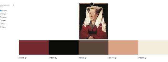
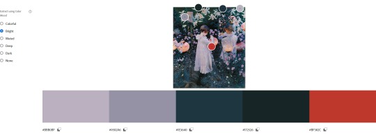

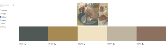

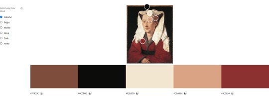
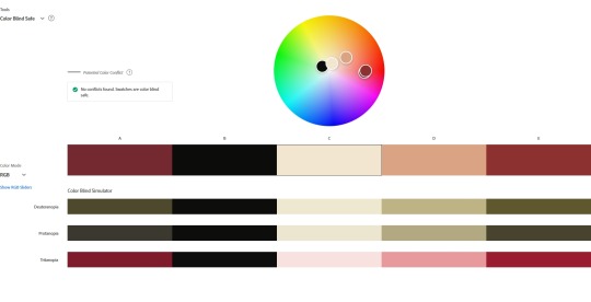
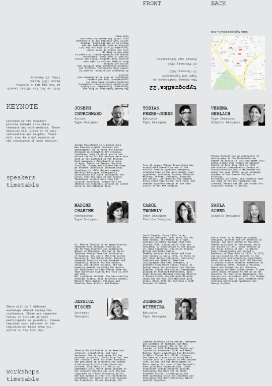
colour and typography options
for colour I picked a few paintings that was made around when notable events took place in the European printing history. I selected the palette from “Portrait of Margareta van Eyck “, because it was dated 1439 (related to Gutenberg’s printing press), it felt more medieval and historic, and these colours passed the test for legibility and colour blindness.
I wanted to be inspired by the historic printing process and early newspaper aesthetics, but not too restricted to the concept? Just a “keep it at the back of my mind” kinda thing.
A history of graphic design by Meggs, Philip B [https://archive.org/details/historyofgraphic00megg/page/76/mode/2up?view=theater]
I also really liked the palette from the Sargent painting (mid-left), but I didn’t think the greyish purple would be suitable.
For typography I considered/tested from:
Courier Prime; Courier New; Source Code Pro; Playfair Display; Didot
Open Sans; Futura; Archivo; IBM Plex Sans; Tahoma
These were the ones that gave me a newspaper/printing feel.
Currently I‘ve selected courier prime and open sans, with consideration to my concept, balance, and how it looks as paragraph and heading.
1 note
·
View note
Photo


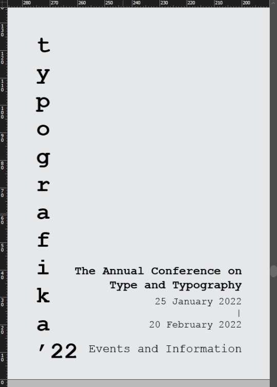
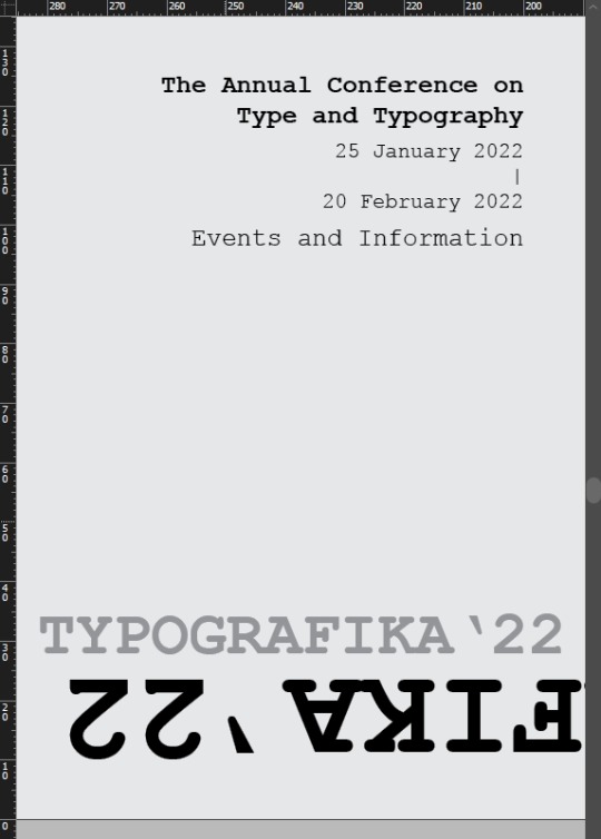
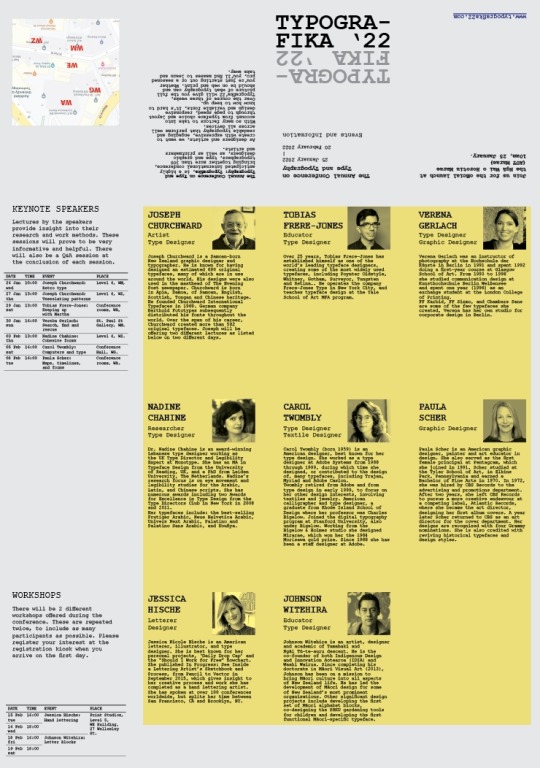
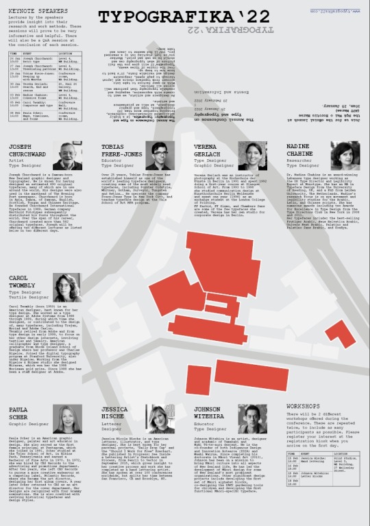
refining colour, typography and layout
(changed courier new to courier prime, because it looked more balanced. Also changed some secondary content to a sans serif (open sans) for adding some variety and definition to the text copy.)
Right now it feels a bit crowded with content, which I hope can be resolved by changing the red blocks into overprint fine-line or chunky illustrations.
0 notes
Link
0 notes

Photo

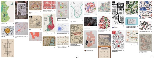
REFERENCE + INSPIRATION
For creating graphics, further refining layout and settling on colours, my general direction is referencing to traditional printing methods, history of typography and elements from the speakers’ descriptions. I would love to try make illustrations as graphics, and maybe do that for the map too. I really love Japanese designers’ information design works, as well as a hybrid(?) traditional look (e.g. hatching illustrations that looks like traditional etching)
SOURCES
img.1
0 notes

Photo

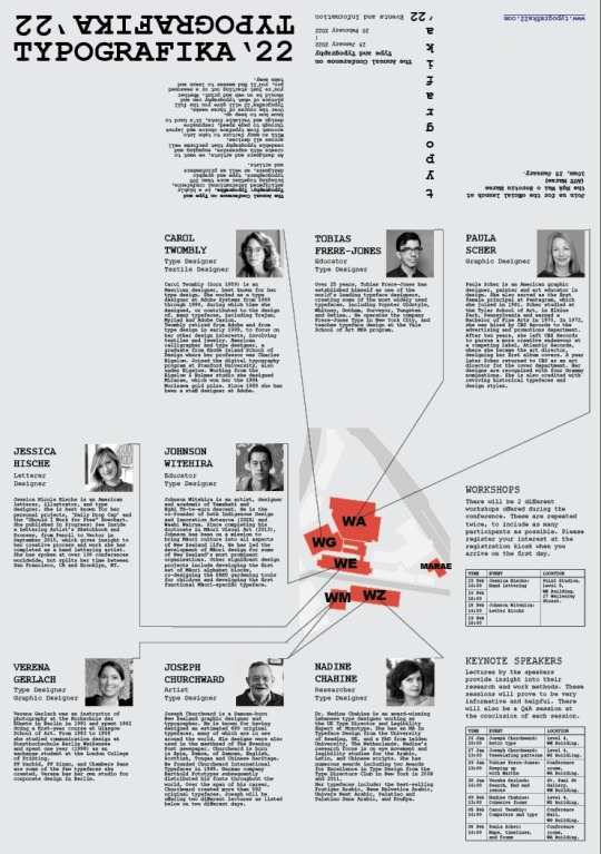


some fiddling with layout, mainly focusing on the timetable, front cover/title, colour palette, and map design.
0 notes
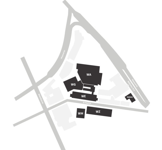
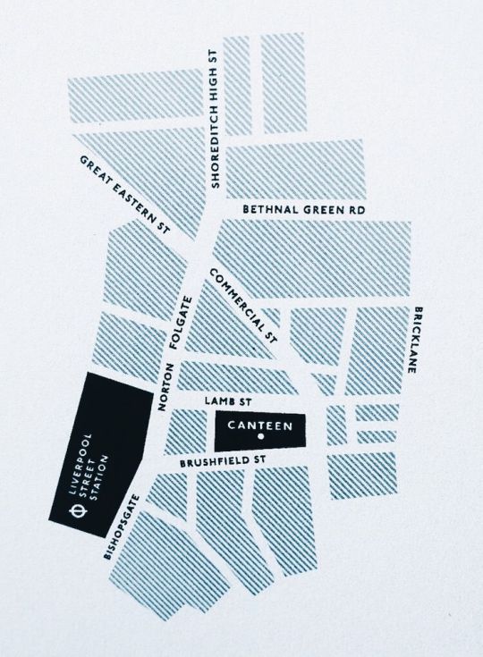
Photo


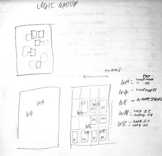

experimenting with optimizing the map layout
I had an idea of making a large map that spreads across the panels, with each speaker panel positioned next to the specific building, according to the location of their event. But I think it will be more confusion than clarity so it’s a soft discard.
0 notes


Text
220315~ to do list
-import, crop and edit all images for consistency
-proof read body copy
-create timetable for keynote speakers and workshops -refine
-test colour palette and typography
-check if any text placement can be changed for better reading experience
-find reference of other designed pamphlets
-create graphic for map etc
-poster layout concepts
0 notes
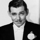
Photo
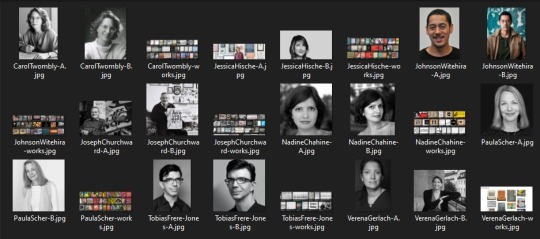
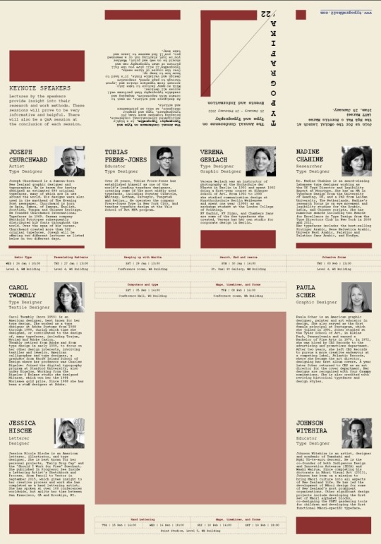
SPEAKER IMAGES and sources
01-Joseph Churchward: A B
02-Tobias Frere-Jones: A B
Also this is a nice website design about his work and others.
03-Verena Gerlach: A B
04-Nadine Chahine: A B
05-Carol Twombly: A B
06-Paula Scher: A B
07-Jessica Hische: A B
08-Johnson Witehira: A B
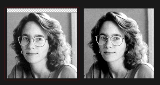
I tried to find images that are already in black and white, with the speaker’s eyes looking at the camera, to make the images more consistent. Also just having an alternative image in case the first one looks out of place when placed into the layout.
I’m also taking screenshots of each speaker’s works to see if any elements can be put into the pamphlet design. But it might make the design inconsistent.
0 notes
Photo

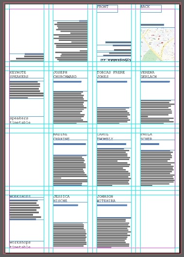
Assimilation and Text import, initial text layout.
Just starting out with all type in Courier New, which I like for it’s monospace and a typewriter feel.

I wanted to do a 12-panel layout because I like the square canvas, but considering that I prefer to have one speaker per panel, I’m starting with putting the text into a 16-panel layout.
0 notes
Text
220308
ILLUSTRATOR REFERENCE
REI
https://twitter.com/rei_17
https://www.pixiv.net/en/users/74184


5 notes
·
View notes