niamhandersonart2
Niamh Anderson
House of Cards
31 posts
Don't wanna be here? Send us removal request.
Last Seen Blogs

resintools01
Resin Tools
artdroidme
DIGITAL ART by ARTDROID
alyawts
aly
satine86
Ruffles Writes

perfumesncosmetics
Untitled
Text
Evaluation.
For the brief “House of cards” which is to create a playing card for each suit, back cover and box.
I have really enjoying this project. I feel like after doing remediation work and picking a new concept really worked out better for me. I know that before I didn’t have a full body of work and my ideas weren’t developing the way I wanted to or the way I needed to. I think that this new concept for me, has expressed myself in a new way that I didn’t know before. I’ve found this concept really interesting with the use of colours and textures. During this project I found it very difficult to become motivated due to the lack of space in my house and no studio time due to COVID-19. Having a second chance has made me realise how much better my work has been with the use of different materials and experimenting different ideas. This has made me develop work with different materials that I wouldn’t usually grab first. I didn’t do many prints during this project which was a struggle for me as this is how I would usually produce my work nowadays, I think that learning new ways to produce work from workshops I have done and finding new ways myself was a learning curve for me. I know that my ideas were strong enough to create the requirements for this project and that I’ve really developed my work and ideas. I have found my motivation to create the art I enjoy again because of this concept. I think that doing this project has made me realise that I can incorporate different media and edit them further to establish another meaning for myself. I am really happy with how my new concept came out.
I know that this project has made me think about how I produce my work and how I can do more and not limit myself to basic sketches or digital work when just in the house.
Overall I enjoyed this project a lot and I’m so glad I got to redo this project even though it stressed me out completely. I think that making my own brief helped me when it came to understand what I had to do to succeed. I am happy with the way I interpreted this project and the work I produced for it.
0 notes
Text

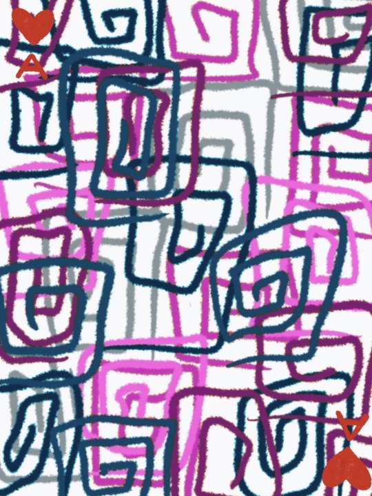
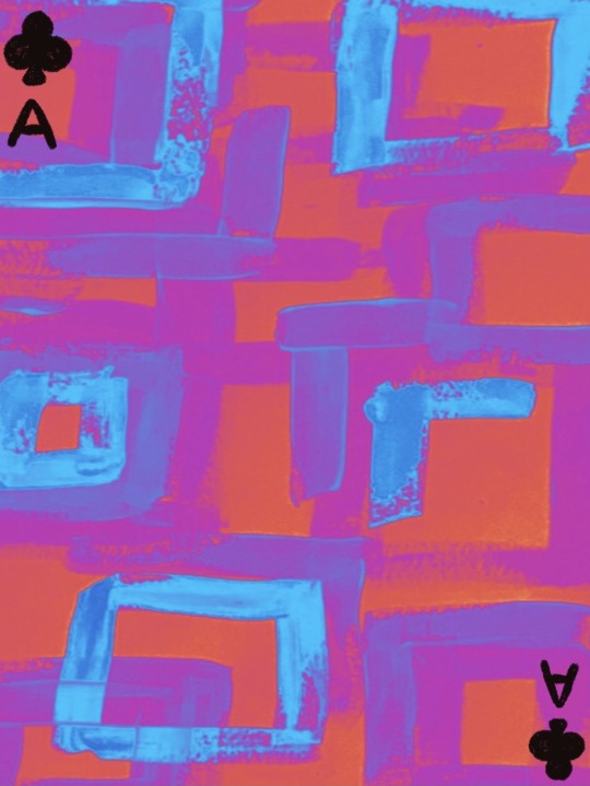
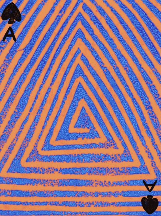
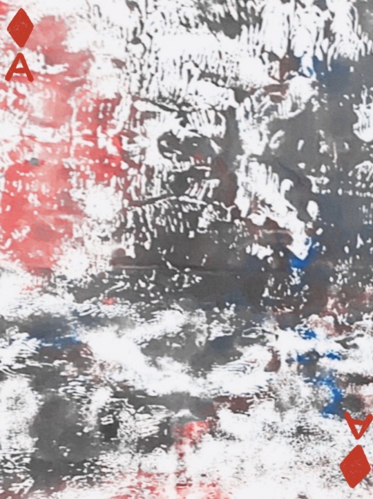
Abstract art final.
Using procreate I was able to present my cards professionally. I wanted a simple pale pink background so my work would stand out and still able to see all the detail of everything. I like how my designs are bold and colourful and would probably stand out in any background but I think the pale pink really works for the layout of my finals. I’m really happy with the way my final looks and is presented. I really enjoyed this concept as it made me come out of my comfort zone.
0 notes
Text

Box Design.
Cards.

Back cover.
Abstract art.
These are the strongest pieces of work I’ve done throughout this project. I’ve picked these designs as I think that they are the most vivid and different pieces I’ve done. I like how all of the designs are very different from each other but fit well together and make the pack of cards come together. I think that the development stages f this concept have worked well for me and I’ve progressed so much making these pieces of work. I love how there is a big difference from when I’ve started making work to now and how much better each card looks.
0 notes
Text


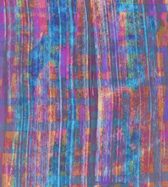


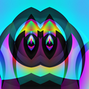
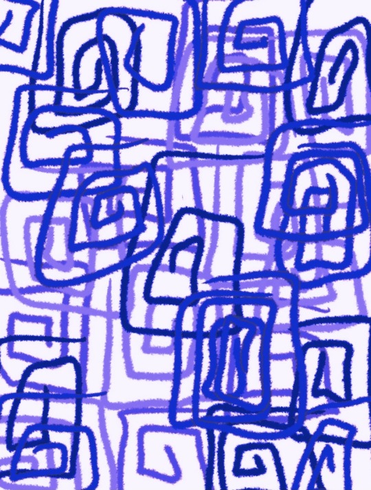
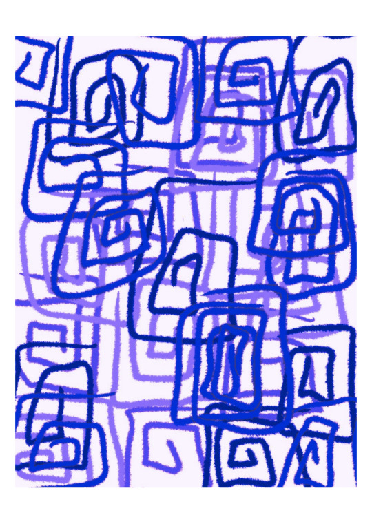
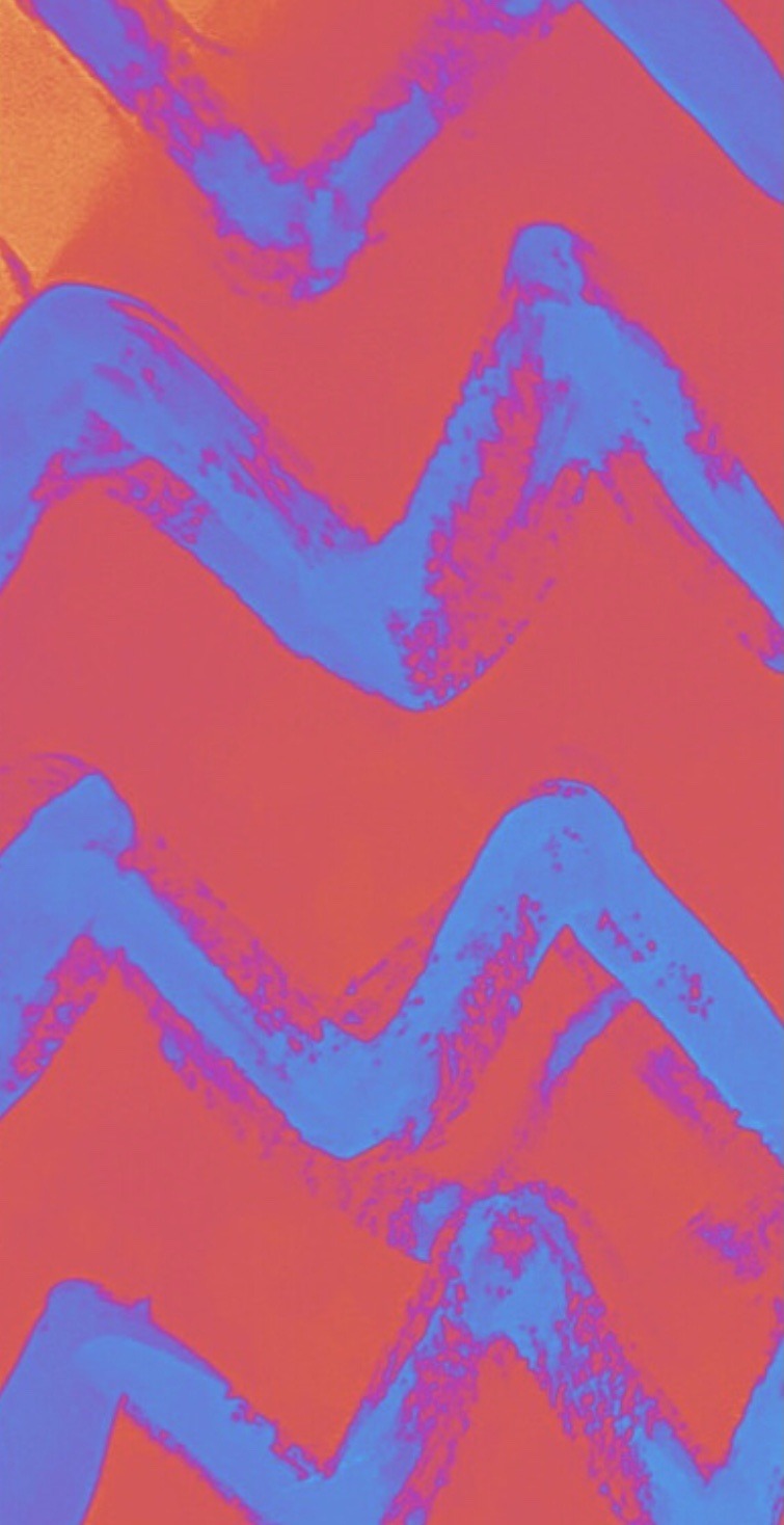
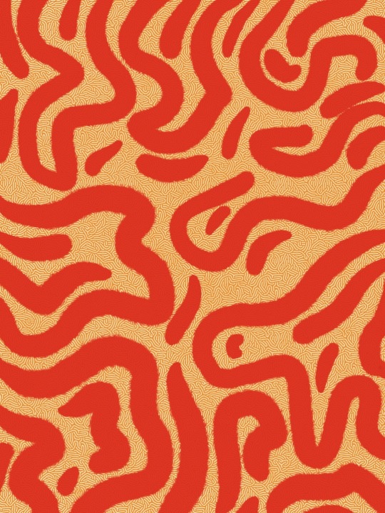
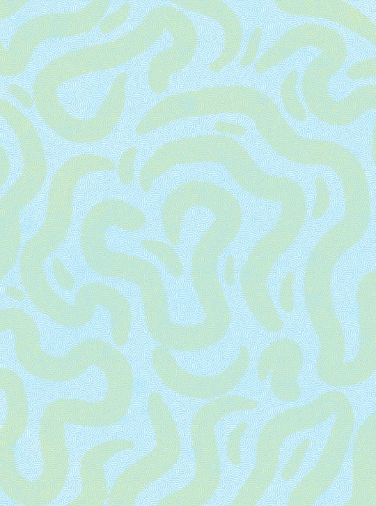
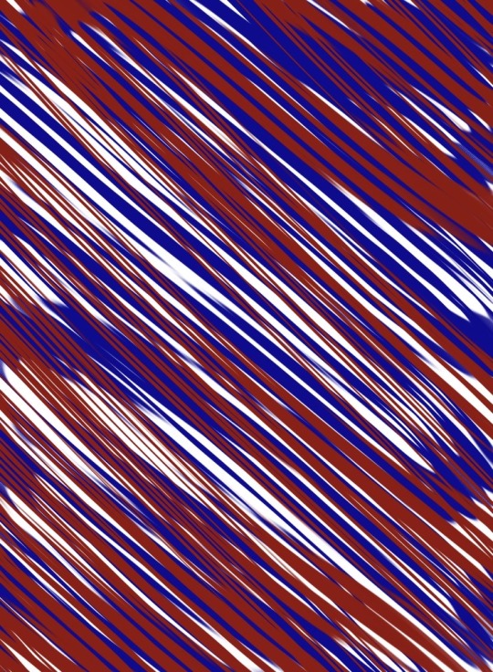
Abstract art.
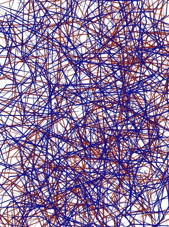
Using the work I’ve done previously, I decided to layer different ones together that I thought would look good. I think that the different patterns coming through is really powerful. I think that layering was a significant development for this concept. Each piece of work has more depth to it showing the different lines and texture. The colours work well together as well and are very loud. Will definitely use at least one of these pieces in my final.
0 notes
Text

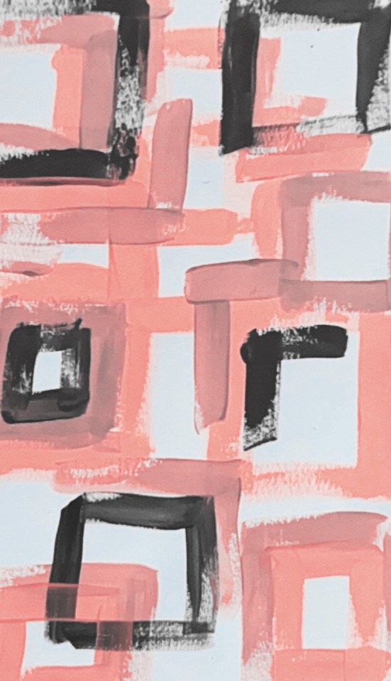
Abstract art.
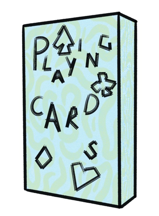
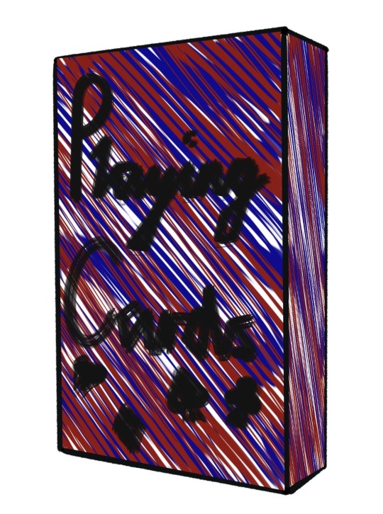
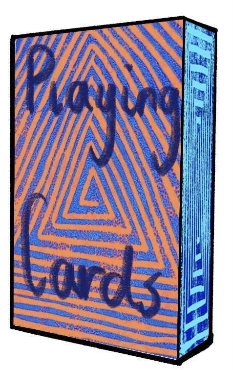
Box design. I used procreate to develop these box designs. I was trying to make the box design look playful with the squint letters and different colours. I wanted the writing to be readable and not fall into the design of the box. I don’t think any of these boxes are finals. They need to be developed further with a different design on the box as I don’t feel like any of these are strong enough.
0 notes
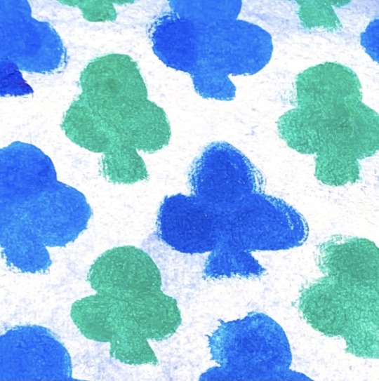
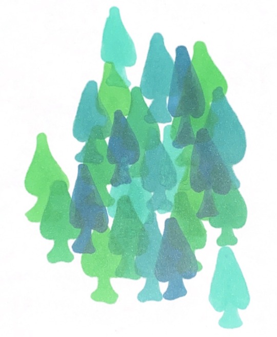
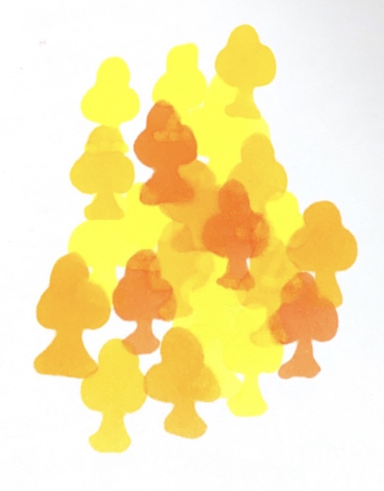
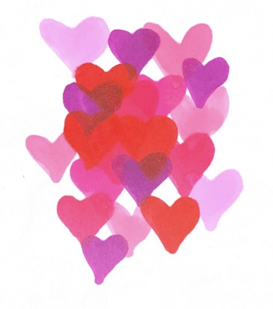
Text

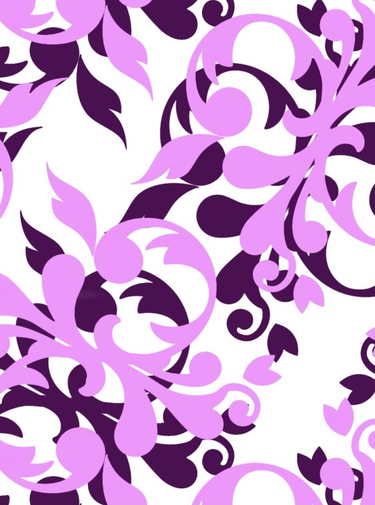
Abstract art.
Card design. I used pro create to create these pieces, I believe these have great use of loud colours such as green, yellow and purple. Although I don’t like how the suits and numbers are seen in the middle of the card. I don’t think I will add anything to the middle of the cards and just show the full piece of work I pick.
0 notes
Text


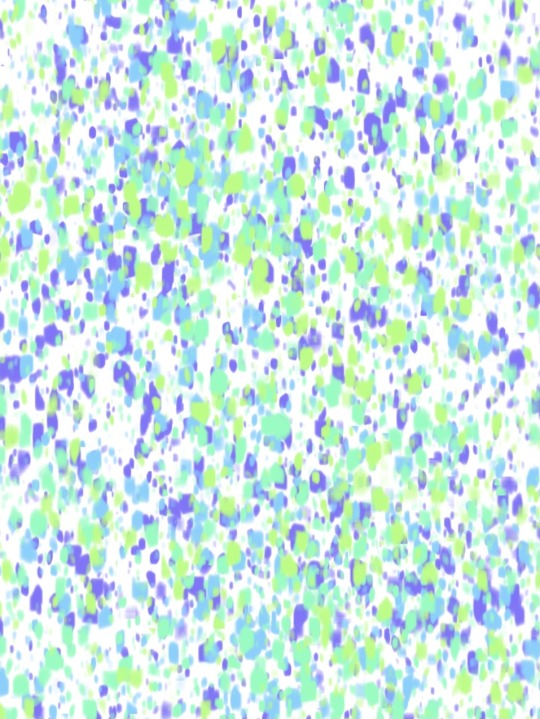
Abstract art.
Again taking pieces of work from before from on paper and the digital art, I took them onto Canva and put a colour pop effect onto them. I love the way these came put again, it just makes each one stand out so much more.
0 notes
Text


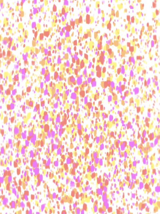
Abstract art.
Taking work from my developing stages that I did on paper, I decided to edit them by taking them into Canva. I put different colour pop effects on each piece, i really think this makes each piece unique in there own way. I love how vibrant each colour looks and how you can still see the textures of the paint brushes even with an effect. I’m glad I’ve developed these further as it has surprised me with how different they look from before.
0 notes
Text


Abstract art.
Just the same as before although I don’t like some of these pieces as some don’t really fit in to what I want for my final pieces. Definitely will improve some of these so they are more fitted to my ideas.
0 notes
Text

Abstract art.
I decided to make some quick, colourful designs on procreate using the different brushes on there. I really like these pieces as it was very easy to create fun and eye catching pieces of work on procreate. I think I could edited some of these slightly by changing the colours to make them more vivid. I like how there is so many different options to pick from on procreate that makes different textures. I am glad I tried this way of working as its really therapeutic just to create different shapes on a digital aspect.
0 notes
Text
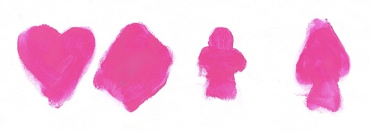
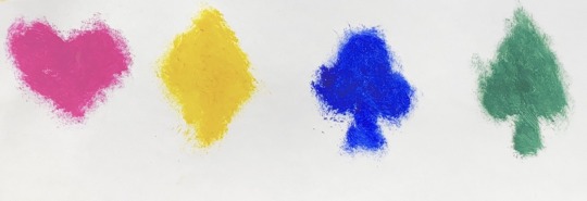

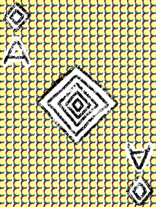
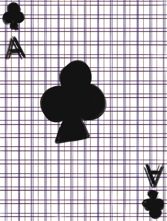
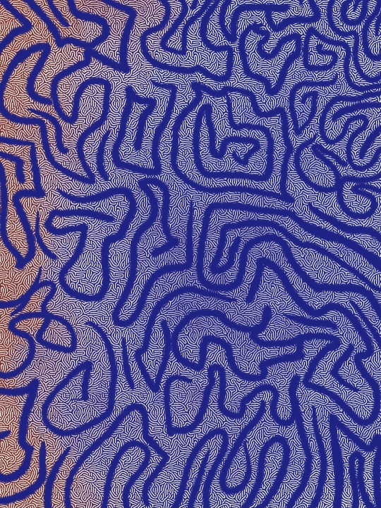
Abstract art.
I decided to try different ways to show each suit. I like the way these turned out but I don’t like them for final ideas, I think they would attract too much attention and look out of place on top of the card design I pick. I think I’m going to stick with the original design of each suit.
0 notes
Text
I have decided that I am going to take forward concept 1, abstract art. I have really enjoyed this concept, making marks and patterns has interested me and made me feel more motivated than the other concept. I feel like this is my strongest work so far but also needs developing. This concept has shown a more colourful, playful style that is unique and eye catching. I will continue to develop my work through digital work and incorporate my other development work of paint, pens and Lino. I know that these cards will be vivid, unique and will appeal to all viewers as well which is what I stated in my brief.
0 notes
Text
Concept 2 Development.
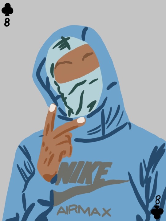
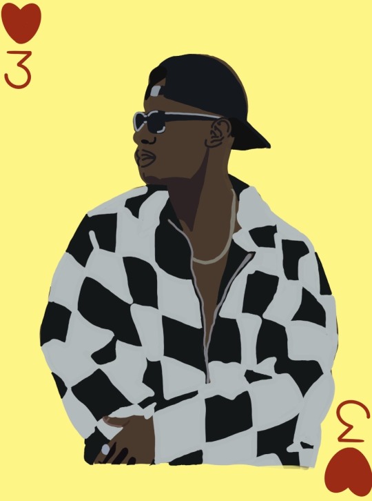
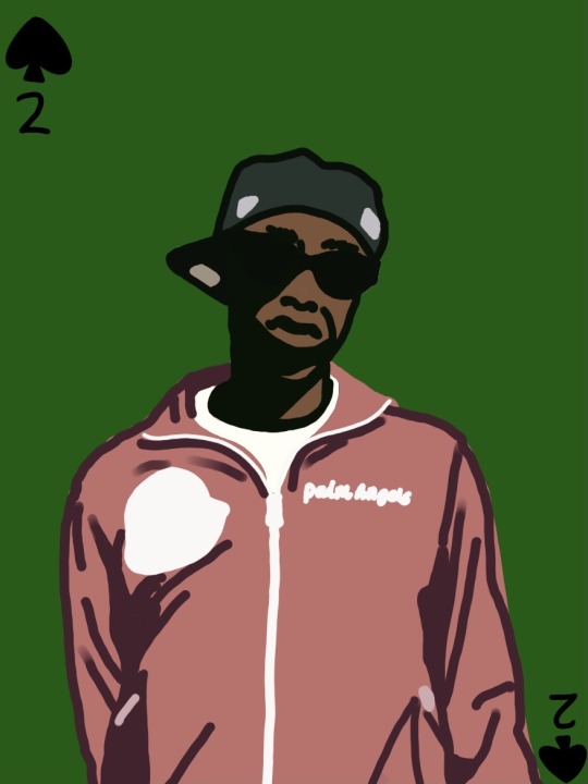
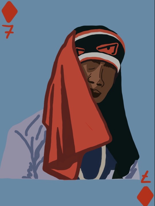
Card design. Using procreate really helped me with inspiration for this concept. I really like the way these came out and they are not too detailed but the artists are recognisable even without their main features. I think that this as an experiment worked out well and would be a contrast to any other design that I’ve made for this concept.
0 notes
Text
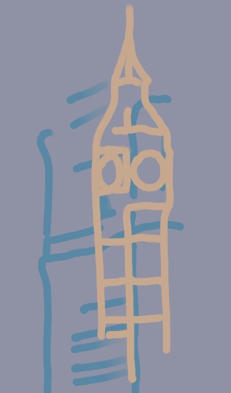

Concept 2 Development.
Box design. I wanted to incorporate London somewhere in this concept as all the artists are from London. I decided to look at London landmarks. I wanted them to overlap as they would have to fit on a small box, using different colours to outline them. I really like the way that these came out because you can still recognise the landmarks even though they are overlapped.
0 notes
Text


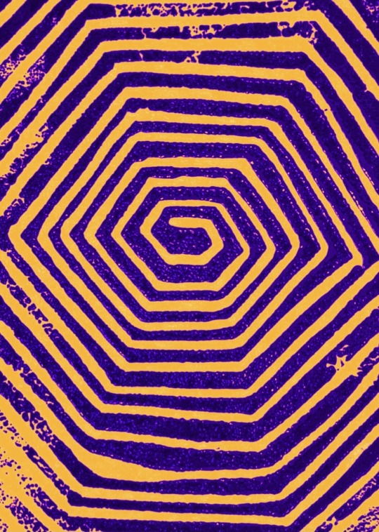
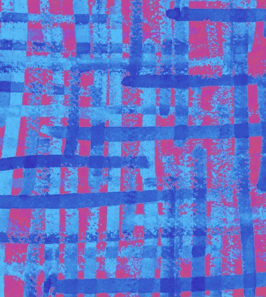
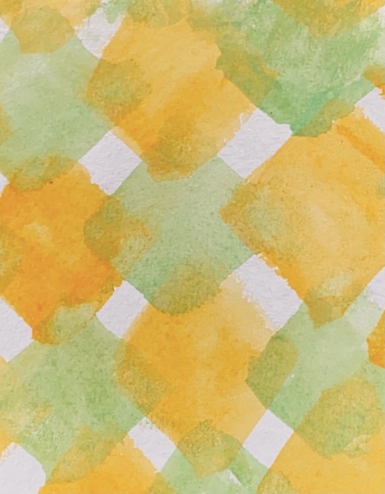
Concept 1 Development.
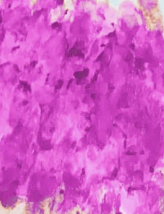
Developing my Lino prints. I decided to print them with colour. I used watercolour to print with, it resisted going onto the Lino and when printed you can see where it resisted, I really like that effect its giving. I think that these Lino prints could be developed further and will be used for my final idea.
0 notes
Text
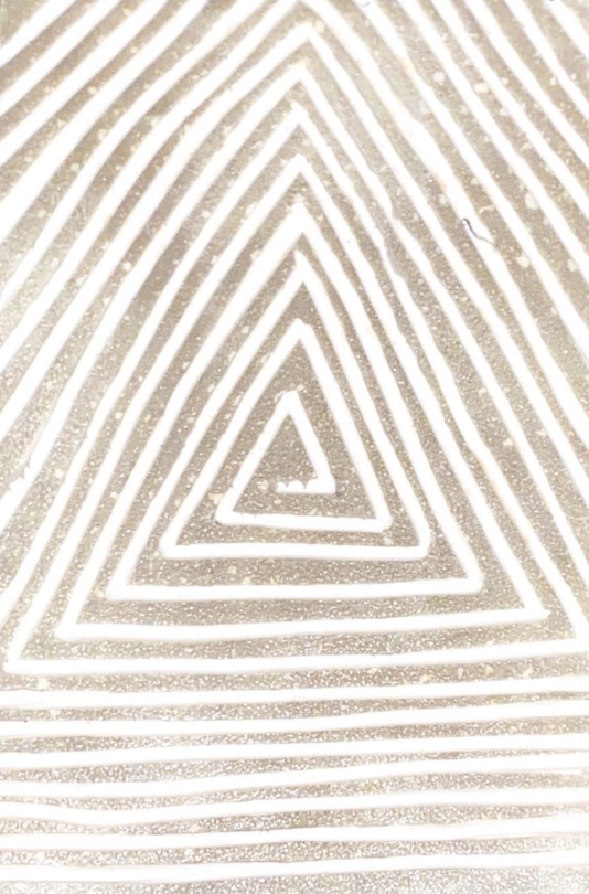
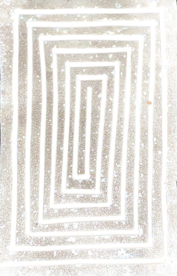

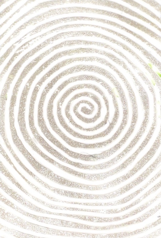
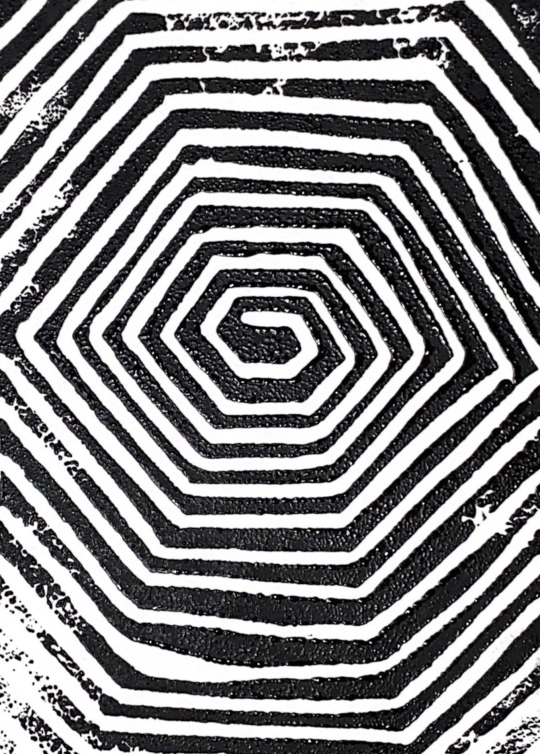
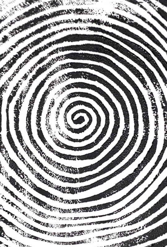

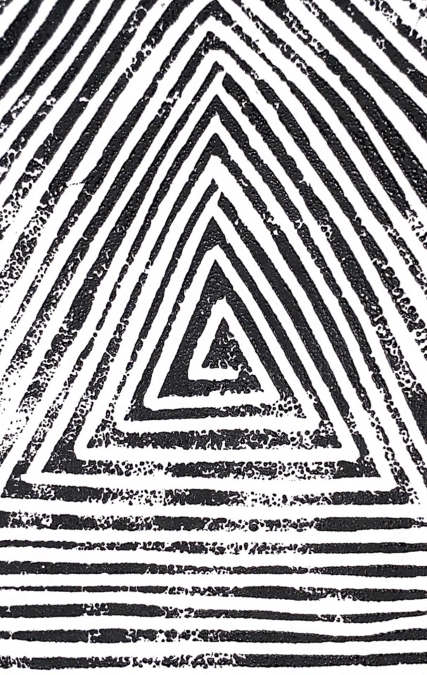
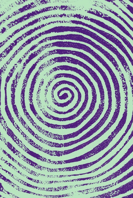
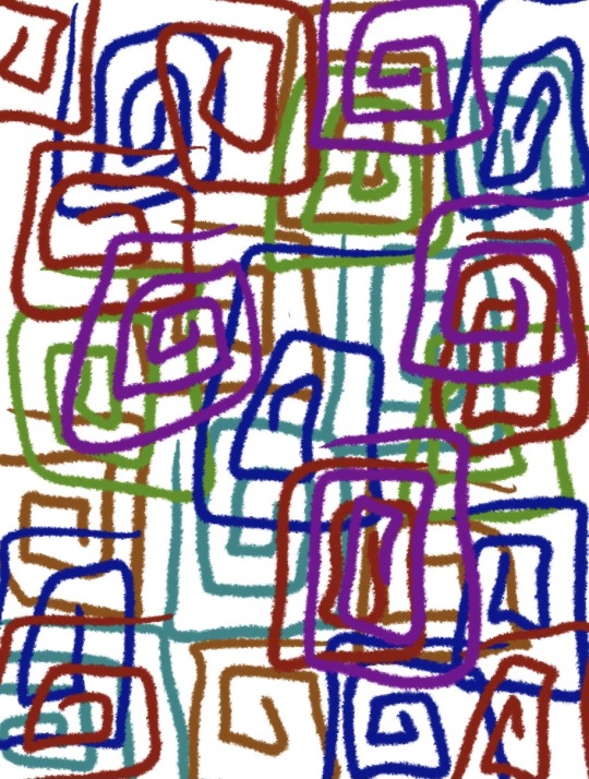
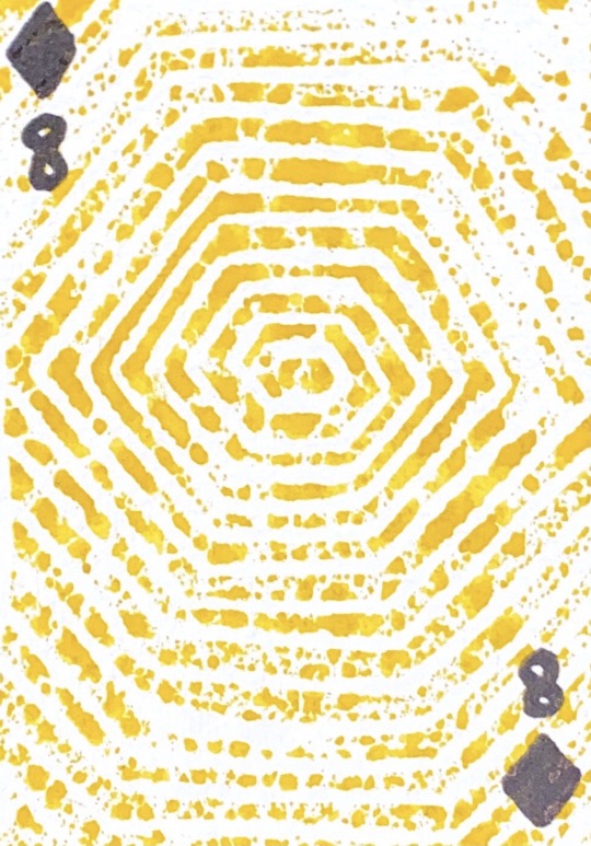
Concept 1 Development.
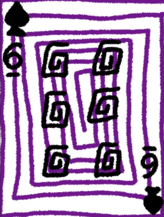
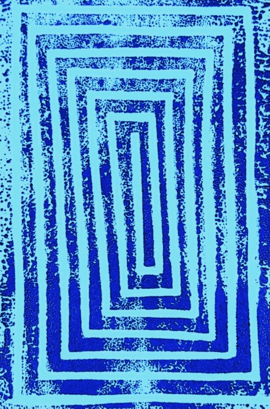
Experimenting with Lino I created 4 different spiralling shapes. I really like these prints as it gives an optical illusion, and also that its not just a full sold black line. I think that these prints would look better if they where in colour or even printed onto coloured paper.
0 notes
Text
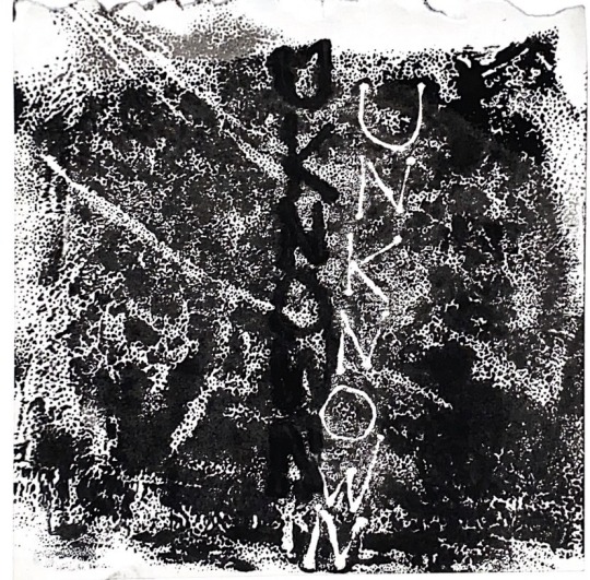
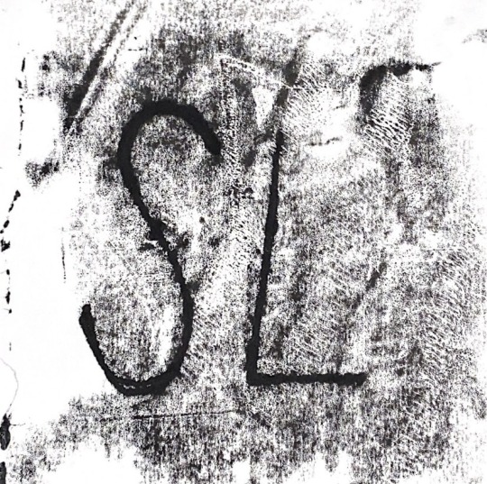


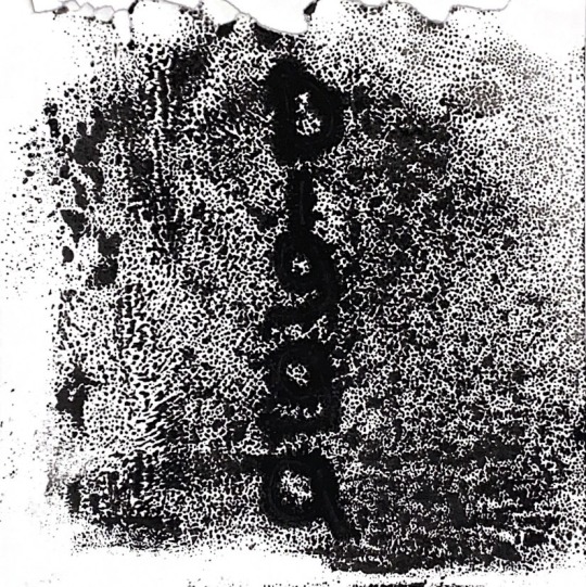
Concept 2 Development.
Following my idea I made monoprints of all the other artists logos but landscape so they would fit on the playing cards. I like these mono print and will use this way of printing for my finals. I like the texture of the ink and how it almost fuzzy around the letters.
0 notes