
newworldjackstretton-mason
newworldjackstretton-mason
124 posts
Don't wanna be here? Send us removal request.
Last Seen Blogs


Text
High poly artists
For this post about high poly creations, I am going to be talking more about different artists creating high poly creations rather than what high poly means. The three artists I am going to be looking at are: Phil Nquyen, Cornelius Dämmrich and Christian Behrendt. These three artists are incredibly talented at creating amazing and life like creations using modelling software.
The first artist I want to properly look at is Phil Nguyen. Phil Nguyen is a 3D modeller who creates figures from popular games or movies rather than creating sets or scenes from popular games or movies. His works are incredibly detailed and realistic even though he doesn’t think so himself with him saying that he ‘deliberately exaggerates shapes and details’. This exaggeration works in his favour as he likes to create characters from games which will have over exaggerated features to set them apart from other characters.
Out of the three artists I am looking at, Phil Nguyen is the most abstract as the other two artists tend to create sets and scenes rather than characters. Despite saying that, you could definitely combine Nguyen’s characters with one of the other artist’s scenes and make it look life-like.
The next artist I am going to look at is Cornelius Dämmrich. Unlike Nguyenb, Dämmrich tends to create scenes rather than characters. His scenes aren’t standard scenes that you might see if you walk down a street, his scenes are a lot more abstract than that with incredibly realistic depictions of syringes, pencils, space stations and abandoned towns. His work is incredibly well made and even though a lot of the scenes he creates aren’t physically real he still makes them look incredibly like they were from another planet from another solar system.
Dämmrich’s work would fit best with Nguyen’s characters because of how unique and diverse his scenes are. I think that Nguyen’s work would fit best with Dämmrich’s work over Behrendt's work because Behrendt tends to deal with the more realistic side of things as I will talk about later.
This brings me on nicely to my final artist, Chrstian Behrendt. Behrendt is another scene/set creator like Dämmrich who tends to create more realistic scenes rather than very abstract or other-worldly scenes which is what makes him different to Dämmrich. As I said earlier, Behrendt tends to create more realistic scenes that are still incredibly detailed and realistic which is still impressive because it's both easier and harder to make a scene you can physically see with your eyes look realistic to other people. It's easier because you can see what you want to create but it is also harder because you now have a standard to create rather than having a lot more freedom when creating something that wouldn’t naturally originate from this world.
Behrendt’s work can only be linked with Dämmrich’s work because of the few realistic creations that Dämmrich has produced. Behrendt's work can’t really be connected with Nguyen's work because of what I said earlier with Behrendt creating more realistic scenes which wouldn’t work with Nguyen’s mostly other-worldly characters.
image link - https://www.artstation.com/artwork/Y3JR6

image link - https://corneliusdammrich.com/nasa

image link - http://www.christian-behrendt.com/favorites/maison-mentana/lightbox/
Quote link to the site where I got it from - https://us.rebusfarm.net/en/blog/2712-3d-artist-of-the-month-august-2018-phil-duc-nguyen
0 notes
Text
Cinema 4D project modelling process.
For my final cinema 4D project I was tasked with creating a 3D object that would fit inside of a bottle that related to my island. I chose a space fighter with a colour scheme that would fit with the invading fleet against my island. With a design in mind I started the modelling process by creating a quick segmented sketch on the middle portion of my fighter ship.
It's important to plan stages of a model out because otherwise you model just won't look right because there is nothing apart from a very specific reference picture that you can go back to. It's also useful to physically draw a plan out because it means you can experiment with different angles and shapes very easily instead of staring at a reference image and then trying to guess how a certain piece of your model is supposed to look like.
Now that all the initial planning and design is out of the way I could start on actually putting something into the editable space of cinema 4D. I started off by switching to the plane viewports so that I could create the main body of the fighter plane with relative ease. I used the top down plane because it meant that I could extrude and resize various segments of the mid-section of the ship evenly and with relative ease. This first section was quite easy to complete because it was just a long cuboid that had some variation when I wanted to widen a portion of it.
The next part that was a little tricky to create was the cockpit area at the front of the fighter. This was a little tricky because I had to use a different function that I wasn't very familiar with at that time. This function was the extrude inner function. This allowed you to extrude a certain area within a face so that you have a piece of a model jutting out of a face. This was used alongside the move function to create a drooping cockpit area. I quite like how it turned out this time, but if I were to create this model again I would spend a lot more time on the cockpit area to try and make it look more realistic.
The next stage I had to create were the two intakes/vents on the sides of the main body I had already created. These were initially simple enough to do with me just extruding the inner of two of the main bodies faces so that the intakes/vents looked like they were set in a little bit and then angle the fronts of the intakes/vents so that they looked like intakes or vents. Once this was done I had to curve the edges of them so that they wouldn’t look incredibly boxey once I was done creating them. This was easier said than done because the bevel function kept making large spikes in the curve of the edge that I was currently curving. I solved this issue by deleting the extra spike every time I rounded an edge using the bevel tool.
With this done I was on to the most complex part of the model which was the wings and engines. These proved to be a nightmare to create because the wings themselves had to be more triangular in thickness rather than being square in thickness. This combined with removing a giant panel of the wing out of each wing proved to be a technical nightmare. Creating these wings took a lot longer than any other part of the model. I ended up doing the wings in two different sections. I did it like this so that it would be easier to remove the section of wing that needed to be removed. The first section of the wing was just lots of extrusions to create a triangular shape with a rectangle cut out of it around halfway. I repeated this process on the opposite side before working on the engines that came out of the back of the fighter. I worked on the engines before completing the wings because the last section of the wing connects to the engines so the engines actually need to be there so that the wing has something to connect to. To create these engines I simply just extruded a piece of each intake and stretched it back until it reached the back of the model. Once it was there I brought the end down to a flat point to make the fighter look more streamlined. Once this was done I started work on the final piece of modelling which was the last section of the wing. This was actually very easy to do as I only had to create a triangle that led from the tip of the first section of wing to the engines. This was done by extruding the edge of the first section of wing and then filling the space behind it with another extrusion.
With the model complete it was time to colour and texture the fighter plane. I settled for only two colours as I felt it would fit with the theme of my island better. These two colours were black and a dark red. I painted the majority of the model black apart from a lot of the front and the intakes/vents the dark red colour. For the cockpit glass I added a reflection the the initial dark red colour to make the cockpit look more like glass.
I quite enjoyed making this model because it proved to be a good show of what I had learned in previous sessions. If I were to make this model again I can think of a couple of small things that I would change to hopefully make the model look better.

unfortunately I cannot get any other screenshots of this Project at this moment because of how the cinema 4D files opened on my computer. once I get more screenshots I will post them in a separate post so that you can still view them.
0 notes
Text
Latex sampling
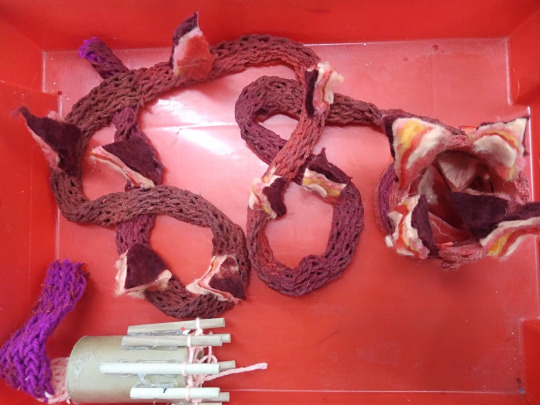
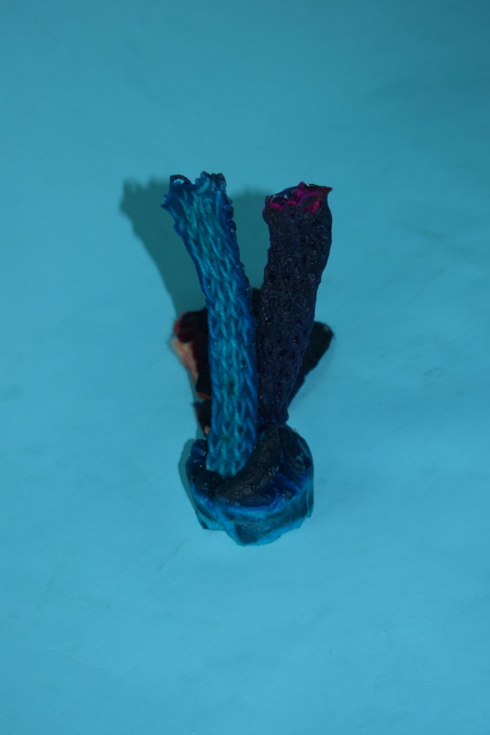
For one of my final projects within my plant project theme I had to experiment with latex and how it combines with my other projects. My first immediate thought was what would happen if I combined latex with my French knitting. I initially thought about doing this because I couldn’t find a way to make my French knitting look like a plant by itself. I first tried to create an orangey-red latex colour which turned out really well so I dunked just over two thirds of my length of French knitting in this and then left it to dry.
As latex takes ages to dry I decided to mix up a new batch of latex and create a small plant monster using latex, some of my homemade felt and the rest of my French knitting. For this plant monster I chose the latex to be a blue colour because I hadn’t experimented with blue latex before. Once the latex was properly dyed and mixed I poured around a third of the latex over my homemade pieces of felt and then dunked the rest of my French knitting in the cup two thirds full of latex.
When I came back the next week both latex experiments had dried so I started the cleaning process for both of them. Cleaning these latex infused pieces of French knitting or felt is quite easy as you can just use a pair of scissors to cut away the extra latex. Now that all of the latex infused pieces have been cleaned up I cans start to assemble them into two very different plants. The first plant I created was a dragon plant using the red latex infused French knitting and some triangles cut out of my homemade felt ( not the latex infused felt though). The other plant I created was a plant monster that bore some resemblance to a rabbit. To get to this rabbit-like appearance I simply hot glued the two pieces of latex infused felt to the top of the blue latex infused French knitting so that they were sticking up. I also added a ‘tail’ to the back of this design using the spare latex infused felt that I had spare.

0 notes
Text
Slot sculpture
With my plant project where I made my plant plushie, I was also tasked with creating a cardboard or card slot sculpture of an abstract plant. For this task I decided to make a lotus flower that had tentacles coming out of the leaves. To start this process I designed a few templates out of some thick card that I then would use to make my cardboard leaves all the same size so that they would fit together well. Once these templates were finished I started work on these leaves. The first layers of leaves were going to be the biggest set of leaves so I cut out 8 large round tipped leaf shapes that I then arranged in a circle and then taped them together as I didn’t want to permanently attach them together until the rest of the leaves had been cut.
The next set of leaves were around half the size of the first set of leaves which made them easier to cut as they were smaller. I also cut 8 of these leaves and arranged them in a circle on top of the larger leaves making sure that the tip of the smaller leaves were in the middle of two of the bigger leaves creating a staggered look.
When this was done I tried to create some more leaves out of cardboard that were even smaller than the previous leaves but, I realised that making these leaves out of cardboard meant that they would be too thick and then they wouldn’t sit in the flower properly. To combat this, I created some smaller leaves out of the same card that I made the templates out of as I knew that kind of card was quite resilient and quite tough to wrinkle or bend. I ended up glueing these to the smaller cardboard leaves with hot glue as I wanted to make sure that the card leaves were attached to the cardboard leaves. I also hot glued a small square of cardboard to the bottom of the larger circle of leaves so that I would have something to glue onto when I glued the two sets of cardboard leaves together.
As I was leaving this piece to dry and cool down I started on the little tentacles that would come out of the smaller cardboard leaves. These tentacles were just little squares of cardboard threaded through a piece of florist wire. This method of creating cardboard tentacles actually worked really well because cutting the tentacle into different sections meant that I could bend these tentacles into any shape without the cardboard bending and looking quite bad. I left these tentacles as the bare cardboard colour as I quite liked the brown colour that the cardboard was already.
For the actual main body of the plant I decided to spray paint it dark green and then add some light green highlights around the edges of the cardboard leaves to add some detail so that the plant wasn’t just one block colour. Once this was painted and dried I painted the smaller card leaves on the inside a light green and then I hot glued the 4 tentacles I had made just under the smaller set of cardboard leaves.

0 notes
Text
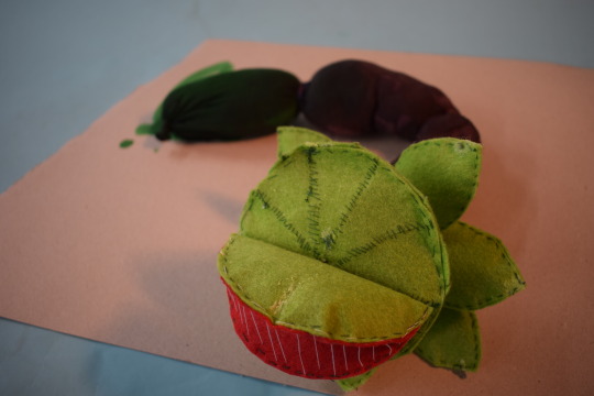
Tight plant plushie
For a part of my plant plushie project I had to create an abstract plant using a set of tights and various rubber bands, paints and inks. The first design that I created was a horrible agglomeration of tights, rubber bands and an incredibly bad camo paint job on the top. I initially created this to see what I could create off the top of my head. Evidently it didn’t work very well so I went back to the drawing board to try and come up with a different design.
I tried to come up with a plant design that just involved the tights but, I couldn’t think of anything that would look good or plant like. Instead I settled on combining this task and another of my tasks together to create a hybrid-plant. I ended up attaching this length of stuffed tights to the end of my felt plushie in an effort to create a large tail/trunk or a singular large root. This actually worked a lot better than I expected so I stuck with it and proceeded to paint the tights because they were originally a peachy skin colour, and that wouldn’t match with the green and red felt plant I had already created.
I tried to create a brown colour so that I could make the tights look like a root but, I ended up creating a purply-blue colour. I initially thought I had created a brown colour because it looked very brown in the cup that I was using for mixing; however, when I started to paint the tights, that's when I noticed that it was a very purply-blue colour. I actually stuck with that colour because I thought that it made the plant look more alien which I really liked. Out of the three sections of tight that made up this ‘root’, I only painted two of them with this colour (the sections were made by tying rubber bands around the tights at different lengths) because I wanted to try and dye the end piece green to make the ned of the plant look a bit poisonous. This did work as in the dye coloured the tights and stuffing but, the rest of the dye kept seeping through so that plant took an incredibly long time to dry. Because of this I had to photograph this plant hybrid on a grey piece of cardboard so that I didn't stain the backdrop that I was taking pictures on.

(my first attempt at a stand alone tight plushie) - picture above
0 notes
Text
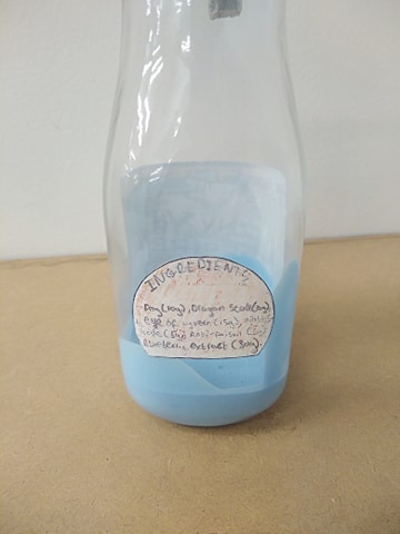
Final Label for my physical bottle process
To Finish of my sculpture project I needed to design and create a label for the front and back of my bottle. My initial design was incredibly simple as it was just a very clean cut box with my choses ‘potion’ name in the centre of it. I originally was thinking about making the label very uniform with its design (as I had done) to replicate the process of making the robots on the planet's surface as they would have all been made the same.
When I had finished that design I thought that it was far too simplistic so I tried adding some various body parts and general gooey flesh growing around the original label to incorporate the actual ‘potions’ effect into the design of the label. I initially really liked this design, but when I came back to it the next session I thought it was a bit too cartoony for the backstory of where this potion came from.
I then decided to try a completely different approach to how I was creating my labels since I was hand drawing them. I moved over to photoshop where a completely new and improved design came to life. Whilst I was experimenting with some of the functions of photoshop I realised that i could import images from the internet to help with my design. This was incredibly useful as my digital and physical drawing skills are incredibly lacking when it comes to drawing pictures.
With this knowledge and a basic idea in my mind I set off to create what would become the label that I stuck with. I started out by creating a box for my label so that I wouldn’t make the label too big or too small. Once this was done I experimented with various designs for a steampunk system and theme for the label by drawing various steampunk contraptions around the edge of where the text would sit. Once this was finished to a standard that I liked, I added some cogs on the corners of the box to ‘flesh’ out the steampunk system I had created around the box. Since I had mainly been adding various bits to the outside of the box, I decided to create a larger box with bold edges around the smaller box as a border and a guideline for where to cut the label.
With this new box I had a load of space to fill, so I decided to create a small landscape at the bottom of the larger box to represent the actual world that this ‘potion’ would have come from. With the bottom of the larger box filled, I decided to add a sky at the top of the larger box because just having a landscape by itself was going to look a bit weird. With this completed I finally decided to add some armour plating at the top to imitate the armour of the actual robot/sentinel I had created. With this the decoration for the label was completed. All that was left to do for this label was to create the actual text that would go in the middle.
For this text, I decided to create a bold and noticeable logo which would stand out against the colourful background of the rest of the label. To achieve that effect I decided on a big black bold title split over a line that had half cogs to make the title look more interesting. With this in the middle of my label design, I feel like the front label has come together a lot better compared to the previous other two designs which I didn’t like.
With this label done, it was time to start on the back label design which would hold the ingredients list. I ended up hand drawing this because it was a simple shape and I could achieve a weathered look for the paper better. For this back label I decided to make it a circle with the bottom cut off. I wanted to make this back label simple so that it didn’t take the attention away from the main front label. I have achieved this effect with the back label and I feel that this effect makes the front label pop out more against the bottle.

0 notes
Text
Pinterest account
For some of my research I have used a website called Pinterest to collect some ideas for the various projects I have been tasked with. I am going to provide a link to my Pinterest account so that you can look at these ideas and inspiration.
https://www.pinterest.co.uk/jackstrettonmason/_saved/
Within this Pinterest account is my research for sea stacks, I will also post a few images of them here in this post as well.


0 notes
Text
Final evaluation
The most enjoyable part of making my island themed bottle stopper sculpture was the initial details in the clay and then the final painted details. I enjoyed this part the most because of how much expression and freedom I could have with creating a sculpture entirely from scratch. I feel like I got on well and have produced a successful level of sculpting that I am personally incredibly happy with. I feel that this project does fit with the brief well because it very clearly fits with the theme and story of my Island.
I initially generated ideas for this project from listening to a podcast called High Roller’s DnD (Dungeons and Dragons) which is created by a group of influencers called The Yogscast*. Their Dungeons and Dragons’ character that really inspired me was from a ‘Homebrew Race’ called the Guardians. One of the main characters called Sentry was a robotic character from the guardian race. My initial robotic design was influenced by her back story and fit well with my island’s backstory and theme, so I decided to try and incorporate this for my own work. The other program that I took heavy inspiration from was an old anime called Neon Genesis Evangelion which inspired the genderless nature of my character. Within this anime there are giant mechanoid creatures called EVAs which are primarily used as tools and are not treated as a human. This contrasted with Sentry’s very human nature, so I decided to combine these two elements to create a genderless robot who looks like a human to appeal to the inhabitants of the planet, but its only function is to fight and protect.
My sculpture does and doesn’t conform to a typical gender stereotype we see in anime because of its unique human and non-human qualities. However, it does lean towards being very stereotypically male because as a protector it has a muscular torso. I have tried to offset this by having a thinner midsection which would more resemble a woman. This is the part that doesn’t conform to a typical gender stereotype because women as robotic sentinels aren’t quite common in films or TV shows. This pairing of male and female characteristics enables me to confidently call my design human but genderless. This is breaking the typical stereotypes found in the anime films but reflects what is going on in society now. You can choose the gender you want it to be and relate to its human features too.
When it came to researching and generating ideas, I struggled to organise my thoughts before making. I created the physical sculpture first because I am more confident in my creative modelling skills rather than my sketching skills. For the next project I am going to develop my drawing skills and focus on sketching some ideas first. I feel I have missed the opportunity to see what my peers are doing which would have helped me organise my thoughts and ideas. Overall, I am happy with how my sculpture came out and enjoyed making it.
*A group of influencers on YouTube and a streaming service called Twitch
Highroller’s DnD is on Spotify and Twitch
‘Homebrew; refers to a class or race that isn’t originally from a pre-set list of classes or races
0 notes
Text
Materials used for my sculpture
Whilst creating this sculpture I mainly used a polymer clay called Super Sculpey. This clay is primarily used for sculpting and modelling because it doesn’t dry out if you leave it out, instead you have to bake it if you want to harden the clay. I found working with this material was very useful because it meant that I wasn’t on a short time restraint so I could add more details and change bits later on if I decide that something needs changing. You can’t do this with typical air dry clay because it either dries out before you're finished working with it or, when you do add water to the surface of the clay to make it workable, all the details you have been working on are lost.
There are a few different types of Super Sculpey that are designed to be used for different things. I used the normal base standard variant of the Super Sculpey as it was easy to work with and stayed in place fairly well and didn’t lose a lot of detail. Some other people in my class used the tougher variant of Super Sculpey which is a dark grey coloured clay which excels in keeping intricate shapes and making thin surfaces a lot for items of clothing or a metal mask where the normal version of the Super Sculpey wouldn’t work as well.
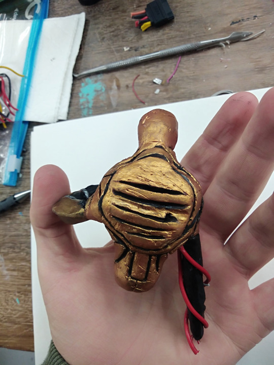
Super Sculpey was mainly used for the actual body shape and detail for the sculpture but I did use other materials for the armature underneath the clay to give the general shape of the sculpture and to strengthen it so that it would break as easily. These other materials are fairly common to find around houses and shops which is really useful because it means that I can replicate what I am doing for my course at home with relative ease. These basic materials are florists wire, tin foil and masking tape. Florists wire is incredibly cheap and easy to buy either online or in a flower shop and is incredibly useful for creating the basic armature for a sculpture because of how the wire is easily shaped and how the wire retains its shape once bent in a certain way. I used a few of these wires to create the basic shape of my sculpture so that I had a surface to work with when I was bulking the form out with tin foil and masking tape. These two very accessible materials are essential to creating a strong sculpture because they provide a bulky frame for the Super Sculpey to stick to so that you can mould and shape the super sculpey easier.
For one of my sculpture arms I wanted to add some wires or pipes to it to add some detail to the arm so I looked in a box full of old computer parts to find the wires that I needed. Old computer parts are incredibly useful for scratch building and sculpting because of how many different components you can find on a single circuit board which world well with the robotic theme of the sculpture. The only downside to using these old computer parts is that you have to be incredibly careful whilst handling them because there are sharp objects and potentially dangerous chemicals (battery acid) on them.
For my sword that my sculpture holds, I wanted a material that could be thin and strong and be able to accept detail without permanent damage to the actual material. I tried to use a piece of hardboard, but I didn’t like the look of the edges once I had filed them down once I had filed down the edges so instead, I used a flat bar of aluminium stock. This isn’t a very common thing to have in a house or a shop but it can be quite easily bought online for a reasonable price. I used aluminium because it was really easy to file and add details and that it is also pretty strong for something so thin. The other positive to using some thin aluminium is that when you file the edges down to create an actual blade's edge it doesn’t lose its edge like a piece of thin wood or hardboard would do.
The final material I used for completing my project was some balsa wood for the cross guard to my sword. I chose to use balsa wood because I needed to stack two layers of the wood together to form the correct thickness and balsa wood was the easiest material to cut small pieces that wouldn’t look badly cut. Balsa wood can be found at pretty much any modelling store because of how useful it is to creating buildings or scenes for dioramas. The one downside to balsa wood is that on its own it is very soft and easy to break accidentally.
0 notes
Text
Final sculpture stages
For the final stages of creating my sculpture all I had left to do was bake and paint what I had currently moulded using super-sculpey. Baking the still soft and delicate sculpture came first so I finished off any major details and then baked it in a low oven for around 15 minutes (fan setting at 120 degrees centigrade). For baking I purposefully left that hand out of the design for fear of burning it in the oven as the fingers were going to be quite thin. I realised after the main body of the sculpture was baked that I should have moulded and before baking the sculpture because adding a hand to this sculpture was going to be a lot more difficult and not look as realistic. Instead, I created a few variants of a hand before I settled and baked one design to be added at the final assembly stage for the sculpture.
After baking all of these individual pieces I added some black paint into all the crevices and joins where I had simulated armour joins to add some shadow and depth to the design. I did this first because I knew that I could be less careful with where I am getting the paint because the paint I was going to paint the rest of the sculpture would have covered up the excess black paint. Once this was done and dry I moved onto the first main coat of paint across the rest of the body of the sculpture. I decided to use a metallic copper colour because it made the sculpture look less human in a way which i liked because the whole design of this robot in the lore of my world is to be functional rather than to look good. I had to do a couple of coats of this metallic copper colour because the first coat was far too thin when I applied it so it just looked far too light and showed some of the initial flesh colour of the super-sculpey through the paint.
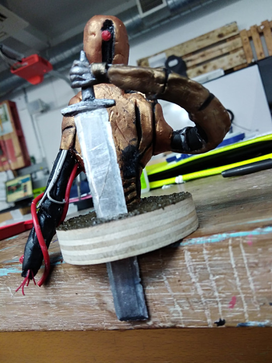
Once the second coat had dried and I had finished touching up the little areas I missed I started to work on the ‘face’ of the sculpture. This was a fairly quick process as all i had to do was to colour the rectangular inset where the optical lens sat a dark metallic colour and then to paint the optical lens red. I chose red because red in a robot usually means something has gone wrong and I want to show that in this sculpture because of how it has been partially destroyed and how its original home world has been destroyed. Now that these steps have been completed, the sculpture looks a lot more robotic rather than a robot shaped lump of flesh.
The final stages came with detailing both the arms and creating the giant sword that would be planted firmly in the base which the robot would be holding. I first started off by painting the armour plates on the sword arm a bronze colour to imply a stronger metal and to add some variation with the rest of the sculpture's design. This arm is the arm that I superglued the arm to so I tried to make the end of the arm fit with the hand by adding some wires and supports to look like the armour around the hand had been destroyed and then fallen off of the actual hand. This took the longest time to complete because I had to keep shaving the hand down so it would fit properly and then I had to add other details to actually make the hand look like it is a part of the actual arm. This is why I should have added a hand to the initial sculpture before baking it so I wouldn’t come across this problem in the first place.
The final stage of the actual sculpture came when it was time to paint and add details to the angular bare arm that was pointed straight down. I initially wanted this arm to have a full cannon on it but, instead I decided to have an arm that would lead to a wire stump mess to imply that this was another part of the robot that got destroyed as well. To start this process I painted the arm completely black before adding various thicknesses of wire to simulate various wires and pipes that would lead to the main arm cannon attached to the bottom of the arm. The end of the arm actually has a few very thin red wires poking out the end of it to make it seem like the cannon that should have been attached there has been ripped off or blown off revealing the circuitry that would have been on the inside of the cannon.
Now that I had fully completed the actual main sculpture I could get to work on the sword that the robot would be holding. For this sword I took inspiration from an executioner's great sword because of how it fits in with my medieval fantastical theme to my island and my sculpture. The whole process to create this sword took quite a few hours as I physically filed a sword out of a length of aluminium bar. I used actual metal because I couldn’t find anything thin enough and strong enough to create a sword that wouldn’t break under pressure.
To start this process I created and cut out a paper design that i could use as a template for when I was cutting the sword blade out of the aluminium. Once that was done I roughly cleaned up the edges of where I had cut the aluminium with a file before properly creating a sword edge to my cut bar of aluminium. I settled for a double edged sword because It fits with the research I had done about these swords. This process took around 3 to 4 hours mainly because of how long the clean up of the metal and the fine sanding of the sword took. After I was done I started to damage the edges of the blade by using a smaller file and some stones bashed into the edge of the blade. I purposefully damaged this blade so that it wouldn’t look out of place with the rest of the damaged and broken sculpture I had made. The final steps to this blade was the actual handle that the robot would be holding. This started out by cutting a cross guard out of balsa wood in a curved rectangular shape to add some detail to the cross guard. Once this was done I superglued it to the blade and left it to dry whilst I created the handle that would attach to the bottom of the cross guard by simply wrapping a bit of super-sculpey around a wire in the shape of a round tipped cone. I baked this for around 15 minutes at 120 degrees (centigrade) and then super glued it to the cross guard. Once that was done I painted the cross guard and the handle a dark metallic colour and then made sure it fit in the actual grip of the hand that I had made.
Overall I really like how this whole project has turned out and I am definitely likely to develop my skills further at home to create more of these sculptures.


0 notes
Text
final plushie and plant project photos
these photos are the final photos I have taken for my plushie and plant project that I have made. I experimented with a few different colours of backdrops to see what would work best with each different plushies or plants.


0 notes
Text
Major design influence for the sculpture project
During my design process I had a couple of major influences that completely changed how my design was going to be made and how it could be viewed. A lot of this influence came from japanese culture in the form of a fairly old but brilliant anime called Neon Genesis Evangelion. Originally created by japanese artist Hideaki Anno who was working under the production company Gainax at the time that the original series was released. The original series released in october of 1995 and ran for 1 season composed of 26 episodes.
The main storyline is your average mecha anime with a very philosophical and depressong feel to it. You have your EVA’s (the mechanoid creatures) against the main big enemies called ‘angels’ (like a kaiju from pacific rim) but, underneath the surface of these incredibly fights you have the philosophical questions about fighting in a war you don’t want to be in, or if there is an actual god letting this happen and so forth.
The main aspect that influenced my design heavily was the design of the EVA’s and how they looked either male or female or genderless at the same time. I say this because if you look at the four different EVA’s you could attach a gender to them if you had to but, you wouldn’t initially think of it having a gender based on its looks. I wanted to replicate this idea so I developed a humanoid looking robot that contained both female and male characteristics so that it initially looked genderless but someone could attach a gender to it if they wanted to.
Before I continue I am going to mention that the EVA’s are in fact an ‘angel’ held in a suit of armour that the pilot would then control rather than just a robot that only contains metal and wires. This is important to mention because this is the first time I have seen a mechanoid creature that resembles a human without a gender. The only other example I can think of that replicates a humanoid shape for a mechanoid design is the incredibly popular Gundam series, but all of their mech’s have very clear genders attached to them which is the complete opposite for the Evangelion series which I quite liked so I implemented it in my own design.

image link - https://www.google.com/url?sa=i&url=https%3A%2F%2Fwww.vox.com%2F2019%2F6%2F21%2F18683621%2Fneon-genesis-evangelion-netflix-release-explained&psig=AOvVaw1AbjcS1xqtiiL9KVSjBSAT&ust=1607975408670000&source=images&cd=vfe&ved=0CAIQjRxqFwoTCMCD877dy-0CFQAAAAAdAAAAABAD
0 notes
Text
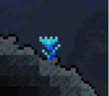
Plant idea drawings
To generate some ideas for my actual plant plushie I decided to draw some sketches of mythical or abstract plants with resemblance to real word plants or plants that don’t look like anything that could possibly grow on this earth.
With the first page of sketches I took inspiration from various plants around my house just to get started with the feel of creating mythical and abstract plants. The first design that I ended up drawing was the design that I used for my cardboard plant design. Drawing the design out in an artistic form helped a lot with the actual detailing that I put into the leaves of the cardboard plant. This drawing was the only drawing that I felt could have some merit in my work as the rest of the drawings were random sketches of random weird plants when they came to my mind.
This completely changed when I got onto my second page of drawings. After I drew some very earthen plants, a brilliant thought occurred and I started to design what I like to call the ‘elemental flowers’. These were 6 different flower designs that were themed around different naturally occurring elements or substances found in this world. Those six elements being: fire, ice/snow,rock,poison,lightning and air/wind. For a lot of these designs I used my own imagination, but for the flower of frost I took a lot of inspiration from a game called Terraria. In this game there is a naturally occuring flower called ‘shiverthorn’. This sprite takes on a very rugged and square form compared to other flowers from this game which I quite liked so I decided to recreate my own version of this flower.
My favourite plant from all the drawings I drew has to be the flame flower because it looks very impish in nature which I quite like because it is very misleading. A passer-by could look at it and think it looks fairly beautiful, but when they touch the flower it gives the passerby a nasty burn. I really like these kinds of misleading plants for those kinds of features.
(shiverthorn plant) image link: https://www.google.com/url?sa=i&url=https%3A%2F%2Fforums.terraria.org%2Findex.php%3Fmembers%2Fshiverthorn.102926%2F&psig=AOvVaw1Rns1OkevUWiP-iu4lTt8v&ust=1607896201922000&source=images&cd=vfe&ved=0CAIQjRxqFwoTCMj8-Nm2ye0CFQAAAAAdAAAAABAD

(My first set of drawings)

(My second set of drawings)
0 notes
Text
Cinema 4D uses in films/games (5/5)
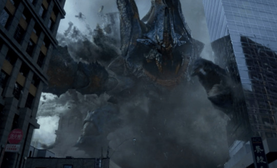
The final film that I am going to look at that involves heavy usage of cinema 4D within it is the 2013 film Pacific rim. This film is actually quite a good film that relies heavily on cinema 4D for its building destruction and for the actual mechanoid Jaegers.
The interesting thing when it comes to modelling the Jaegers is that the initial designs are created in physical form in what the modelling business calls a maquette. I have done a previous post explaining what a maquette is and how its used so i will provide a link to that post in this post: https://newworldjackstretton-mason.tumblr.com/post/634032900406476800/pacific-rim-maquettes-research
The next thing that must have been fairly lengthy to model would have been the actual settings and all the destruction that the massive Kaijus cause. With the setting modelling most of the models are fairly square it's just that it would take awhile to destroy a building convincingly and not to over destroy it so that it looks unrealistic. The modellers have done an excellent job with treading this fine line between being realistic and unrealistic.
One Of my favourite scenes that must have taken a fair bit of model and design is the scene when the lead Jaeger smacks the kailu with a full on tanker. This is just the best scene because i thought that when i first saw it that some guy had to sit down for a couple of hours or days to model and animate a scene where a giant lizard gets smacked with a boat.

https://www.google.com/url?sa=i&url=https%3A%2F%2Fwww.imdb.com%2Ftitle%2Ftt1663662%2F&psig=AOvVaw3Cyv5rx12Z89e_OvThZ_M3&ust=1607599826465000&source=images&cd=vfe&ved=0CAIQjRxqFwoTCKie6NDmwO0CFQAAAAAdAAAAABAD - image link
https://www.google.com/url?sa=i&url=https%3A%2F%2Fwww.thatmomentin.com%2Fmoment-pacific-rim-2013-a-red-shoe%2F&psig=AOvVaw3ynsUSCvCkC-vY18mqALx1&ust=1607599998809000&source=images&cd=vfe&ved=0CAIQjRxqFwoTCKD17ermwO0CFQAAAAAdAAAAABAD - image link

https://www.google.com/url?sa=i&url=https%3A%2F%2Fm.youtube.com%2Fwatch%3Fv%3D9x4GlPyITGA&psig=AOvVaw2YI8RfvSW0xyb7q2vKQlo7&ust=1607600063022000&source=images&cd=vfe&ved=0CAIQjRxqFwoTCKifh4znwO0CFQAAAAAdAAAAABAD - image link

https://www.google.com/url?sa=i&url=https%3A%2F%2Fscreenanarchy.com%2F2013%2F04%2Fnew-pacific-rim-trailer-shows-robots-beating-monsters-with-boats.html&psig=AOvVaw2YI8RfvSW0xyb7q2vKQlo7&ust=1607600063022000&source=images&cd=vfe&ved=0CAIQjRxqFwoTCKifh4znwO0CFQAAAAAdAAAAABAP - image link
0 notes
Text
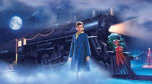
Cinema 4D uses in films/games (4/5)
Another film that was created using cinema 4d is the all time christmas classic, the polar express. This film came out in 2004 and is still one of the best christmas films (apart from the nightmare before christmas). For a film that is 16 years old it is still animated fairly well using cinema 4D for modelling and rendering. It's hard to pick out certain aspects of this film that have been modelled because all of it is animated so all of it must have been modelled at some point.
Despite that I can still focus on how the modellers developed and created the scenery to look realistic but also fit in with this overly animated style of art. A lot of the scenes outside of the initial train tend to be very snowy mountains off inthe distance. This choice of setting is really nice because mountain scenes tend to be incredibly scenic which would fit with the whole train idea that would take the children on the scenic route towards the north pole.
Another model that is created quite well is the actual train that is the whole set of the movie. This train is modelled quite well which is pivotal to the movie's success because no one would like the movie if the main setting where the majority of the film takes place. Overall this film is modelled incredibly well to the point that it is still incredibly popular 16 years from being released.

https://www.google.com/url?sa=i&url=https%3A%2F%2Fwww.cordcuttersnews.com%2Fvudu-is-giving-away-the-polar-express-for-christmas%2F&psig=AOvVaw06Wd92IZuCm8bPy-DjN39-&ust=1607598732361000&source=images&cd=vfe&ved=0CAIQjRxqFwoTCIDO0Z_iwO0CFQAAAAAdAAAAABAD - image link
https://www.google.com/url?sa=i&url=https%3A%2F%2Fwww.raileventsinc.com%2Fpolar-express-train-ride%2F&psig=AOvVaw06Wd92IZuCm8bPy-DjN39-&ust=1607598732361000&source=images&cd=vfe&ved=0CAIQjRxqFwoTCIDO0Z_iwO0CFQAAAAAdAAAAABAJ - image link

https://www.google.com/url?sa=i&url=https%3A%2F%2Fwww.mentalfloss.com%2Farticle%2F567459%2Fthe-polar-express-tom-hanks-movie-facts&psig=AOvVaw06Wd92IZuCm8bPy-DjN39-&ust=1607598732361000&source=images&cd=vfe&ved=0CAIQjRxqFwoTCIDO0Z_iwO0CFQAAAAAdAAAAABAP - image link
0 notes
Text
Cinema 4D uses in films/games (3/5)
The golden compass is a fairly old film nowadays that came out in 2007 and is based off the novel called the golden compass written by philip pullman. This film is chock full of special effects because it is set in a world where everyone has their own demon (familiar) that follows them around. The decision to create virtual animals instead of real ones (except a few dogs) proved many different modelling challenges because the daemons in the book tend to shapeshift into completely different animals that would also need to be created.
As well as these small demons, the modelling team also had to model a whole sleuth of armoured polar bears that can speak. It is very important that they model these bears instead of training live ones because training live ones to act like the bears in the actual book is going to be physically impossible but not virtually impossible.
The final big thing that was modelled is a lot of the scenery of the film because of how abstract it is to real life. This film actually won a BAFTA for its modelling work which is pretty amazing since the film came out 13 years ago.

https://www.google.com/url?sa=i&url=https%3A%2F%2Fen.wikipedia.org%2Fwiki%2FThe_Golden_Compass_(film)&psig=AOvVaw3xnTT9CaiDe_wBhjZkT6HJ&ust=1607597095353000&source=images&cd=vfe&ved=0CAIQjRxqFwoTCLjS0pfcwO0CFQAAAAAdAAAAABAV - image link

https://www.google.com/url?sa=i&url=https%3A%2F%2Fwww.denofgeek.com%2Fmovies%2Fthe-golden-compass-movie-what-went-wrong%2F&psig=AOvVaw3xnTT9CaiDe_wBhjZkT6HJ&ust=1607597095353000&source=images&cd=vfe&ved=0CAIQjRxqFwoTCLjS0pfcwO0CFQAAAAAdAAAAABAb - image link

https://www.google.com/url?sa=i&url=https%3A%2F%2Fhellogiggles.com%2Freviews-coverage%2Fmovies%2Fgolden-compass-kids-now%2F&psig=AOvVaw3xnTT9CaiDe_wBhjZkT6HJ&ust=1607597095353000&source=images&cd=vfe&ved=0CAIQjRxqFwoTCLjS0pfcwO0CFQAAAAAdAAAAABAP - image link
0 notes
Text
The private life plants
The private life of plants is a BBC produced documentary series narrated by David Attenborough which goes into detail about many different species of plants life cycles from being born to flowering and so forth. For me, this sort of series is quite useful for when i am planning what environment my plants will be in because I can watch this series and then see what a plant from a mountain would look like compared to a wild flower in a rolling field.
As well as being able to accurately gage what my plant would look like within its environment, I can also gather lots of ideas from the various speciesofexotic or normal plants that are talked about in the series so I can design a plant that is incredibly out of this world.
The series consists of six 50 minute episodes which means that it is really quick and easy to watch within a week which is nice because it means that I don’t have to sit and watch a really long series of shorter episodes that might not be as detailed as these episodes are.this series is actually quite detailed which is nice because I don’t have to do extra research since all the main points are covered with this series.


All images sourced off of google.
0 notes