neragamesdevlog
NERA GAMES ⚔ DEVLOG
Hobbyist game dev learning one day at a time. It's a kind of hero's journey.
9 posts
Don't wanna be here? Send us removal request.
Last Seen Blogs


Photo

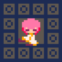
Alright, it’s been a bit since my last post here, but the holiday season kind of pulled me in another direction. Feeling a bit stuck on dealing with collision and where to go in the game design process, I decided to do something different. I will be going through my thought process as a newcomer to animating below. Maybe it will help someone!
I originally decided to translate my character sprite into something that fits in an 8x8 square since that is Pico-8′s base sprite size. It was a fun exercise as simplification can be tricky. From there, I decided to animate it. I have nearly zero experience with animation so I knew this was not going to be easy.

I found some run cycle references online with a quick google search. References are important! Especially for someone who is still learning the basics, they are critical. From the image above, I made a mental note of a few things:
On the side that the foot is grounded, the shoulder swings backwards and the person is facing towards the direction of the landed foot.
The highest point of the head is mid leap, and the lowest point is full-foot contact/right before push-off.
The three big movements I saw: twisting body rotation, parabolic movement of the arms, and circular movement of the legs.
When working with such a small sprite, every pixel matters. It is important that the actions the sprite is performing is readable and clear to the viewer. The way I thought I could help achieve this was through exaggeration of movement. Without too much thought, I attempted a first pass of the running animation (shown by the yellow-haired sprite).
Because of the cloak, you cannot see the arms (for better or worse) and I knew in order to convey a believable run cycle, I would have to still show that twisting body rotation somehow. The only thing I had available to convey this then was the head. Even though it’s a bit unrealistic, turning the head to completely obscure and reveal the face was the kind of exaggeration of movement that was very readable to the viewer, so I went with it.
During the high point of the cycle, i have the sprite moved up one pixel to make it look like they’re jumping in the air. The top of the head gets cut off but it didn’t look strange to my surprise (probably something to do with squashing in animation). However, I did not have the sprite dip lower during the contact point. I could not figure out a way to make it read properly and just forwent it.
The blue-haired sprite is my second pass. I noticed from the first pass is that the key-frames didn’t feel right. My solution was to add a couple more in-between frames for the movement. This made the run cycle feel floaty compared to the original but I decided that was fine.
The other major change I made was to add hair movement. To tl;dr this, I thought about animating it in this way:
Light-weight/floaty objects attached to a heavier object (such as hair or loose clothing on a character) will follow the same relative path as the object it is attached to but will both start and complete the movement later in time than the heavier object.
I do not know if this is the correct way to go about this but it was my personal solution to animating the hair.
The final sprite, with pink hair, refined these movements further. The back of the hair has a frame with the end point hanging lower than the midpoint and the back of the cloak falls a frame after the leg drops.
Although I am not an animator, something I do know about is the concept of inertia. Inertia is basically resistance of change in motion. In personal observation in animation, it takes more time to start and stop an arc than performing the middle of the arc. Using this concept, I made the head hang longer on the fully revealed and fully obscured moments.
The final change I made was I made a circular arc with the entire character in the 8x8 sprite-window. During the push-off, I actually made the sprite move forward horizontally by one pixel and during the full contact point have it drop back one pixel. The push-off moving the character actually forward in the animation gives the pushing movement more emphasis/impact.
My goal was to create a clear and readable running animation that had a great deal of action despite it’s size and I found some success through perseverance and observation. Overall, I’m happy with how it turned out and looks in motion (as seen at the bottom of the image running across the screen).
Current Game Info | Twitter
10 notes
·
View notes
Photo


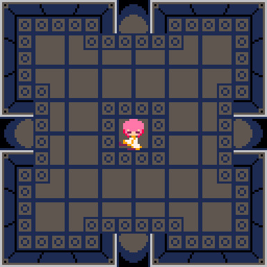
Oh boy, collision. This is very new territory for me so this has been a few days.
Long story short, the code I used as reference was using one sprite in size for the hitbox (8x8px) and that caused me a lot of problems. The orange rectangle is the character’s hitbox and is not a square and bigger than 8x8.
My current solution is to have a midpoint check as well, not just the corners. It took me way longer to figure it out than it should, and thankfully I got a little bit of help with it. You can see I made a mess of the map trying to diagnose what was wrong.
It’s all in a single function so I’m going to be separating them out next into separate x and y checks.
Last image is where I’m at currently and it’s got some work to do still but it’s nice to start to see it coming together. Need to deal with drawing the sprite completely against the wall when colliding still.
Current Game Info | Twitter
2 notes
·
View notes
Photo


More sprite work! I could use the entire Pico-8 sprite sheet for just main character animations at this rate. I’m probably going to have to pull back somewhere by the time I’m done (and definitely reorganize the sprite sheet) but having more options to choose from never hurts.
The leaning Zzz sprite is fun but will definitely be scrapped, though.
Current Game Info | Twitter
11 notes
·
View notes
Photo

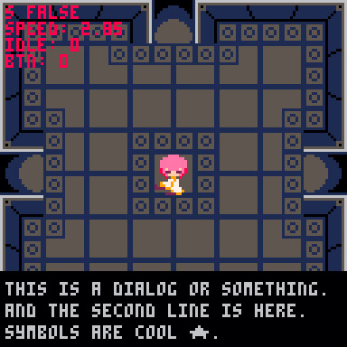
I’m at a point where I need to do a few things:
Figure out how collisions work with the map editor. I THINK I need to use sprite flags? I have a lot of research to do.
Finish all the basic character sprites and properly implement them + their animations
Start thinking about how to flesh out the game.
I mostly just played around today. I made some “more fun” placeholder sprites for the walls and floor as well as added real doorways. The doors are being individually placed instead of being part of the map, but I’m still figuring out how I’m actually going to create ‘a room’. I definitely don’t want to just map every room out individually in the map editor; there must be a more efficient way that uses less visual real estate.
I drew a sleepy/idle sprite (and a couple variants I’m not showing here) for fun. It will probably also be part of the death animation down the line (if I have the room for that).Scaling back animations and other things to fit the Pico-8 requirements has been a challenge and will continue to be as I add more to the game.
Finally, I created a basic dialog box that’s printing some random text. I just wanted to see what it may look like. I don’t plan on having a lot of text but it may come in handy later?
Current Game Info | Twitter
17 notes
·
View notes
Photo


I can already tell the map editor is entirely bare bones. I created some basic tiles sprites to get a better visual for the dungeon dimensions. Next, I think I’m going to deal with wall collisions and having the bg there will be nice.
Now, let’s talk about the gif, which shows everything moving correctly:
In the top left, I printed cardinal direction, boolean to flip the sprite, and change in velocity for reference. I realized that when moving diagonal, it felt faster than up/down/left/right. I decided to slow diagonal movement (I used sine since circles are cool).
Unfortunately, there was major jittering with the diagonal movement (due to using decimal numbers but having to align to the pixel grid?). My solution was to speed up the up/down/left/right and make the diagonal a whole number.
I feel like this won’t be the last time I use this image.
6 notes
·
View notes
Text
Why PICO-8?
I’ve had a few friends wonder why I’ve chosen PICO-8 to make games in. It’s simple really: it feels like an attainable goal.
I’ve made previous attempts with both Unity and Game Maker in recent years but I never stuck with them long. Maybe it’s because of the open-endedness of the environments or maybe it was just my lack of resolve, but I kept dropping the ball.
So I’m using PICO-8 to really learn to make games. The limitations allows me to focus on the game development itself and not all the fluff that can bog down design.
If I can make something fun in PICO-8, I’m on the right track.
0 notes
Photo
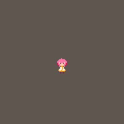

Spent my evening after work yesterday with some basic movement/animation testing. I’ve simplified the sprite with a second pass (no more twin tails D:) and settled on a color palette. Unfortunately, I did not get the sword animation to work right so this is what I ended up with before rolling straight into bed.
2 notes
·
View notes
Photo

These animation exercises aren’t necessarily useful for what I will be doing in PICO-8 due to a lack of sprite real estate. However, I want to practice these anyway as creative exercises since I am still grinding through tutorials. Keeps things interesting!
Earlier, I tried to do a rotation animation like this with the sprite I worked on in the previous post. I quickly realized that I should break the sprite down more as as the twin tails in particular were giving me trouble.
Both animation and pixel art is new territory for me so I’m learning as I go.
8 notes
·
View notes
Photo

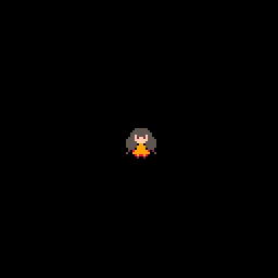
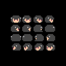
I have been doing some personal exploration when not pouring over tutorials for Pico-8. I created a couple sprites and printed the animation in the middle of the screen. The first four sprites are what are used in the animation. The last two were previous frames that were scrapped and set aside.
It’s not a very useful animation but it was fun to make and I learned a lot from it.
6 notes
·
View notes