
Last Seen Blogs

chris92834
people i like
amirrusso
Amoras

webmagnate
WebMagnate

dmtnspain
Dalmatian Spain
patronumses
patronumses


Photo


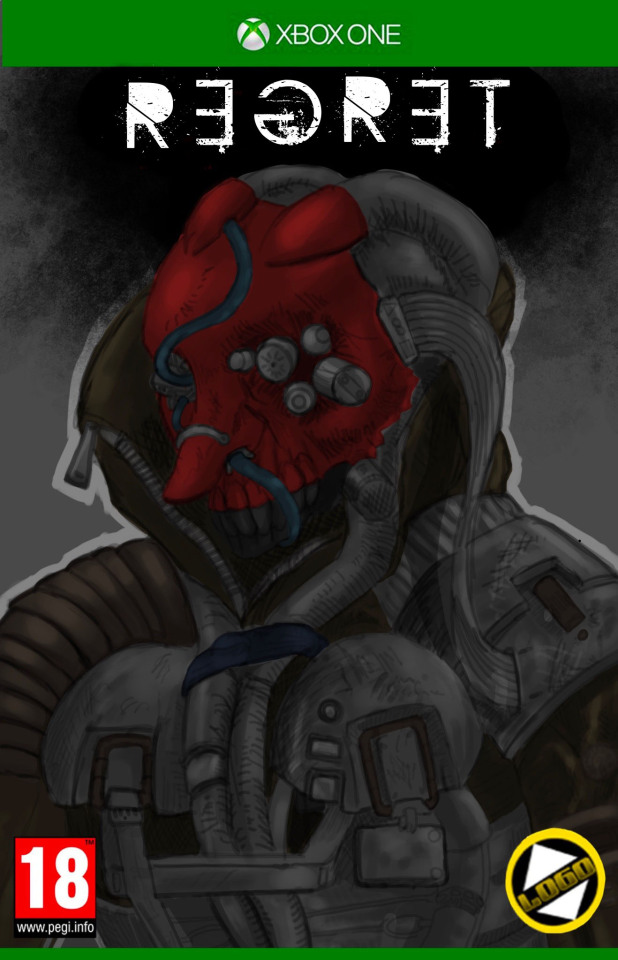
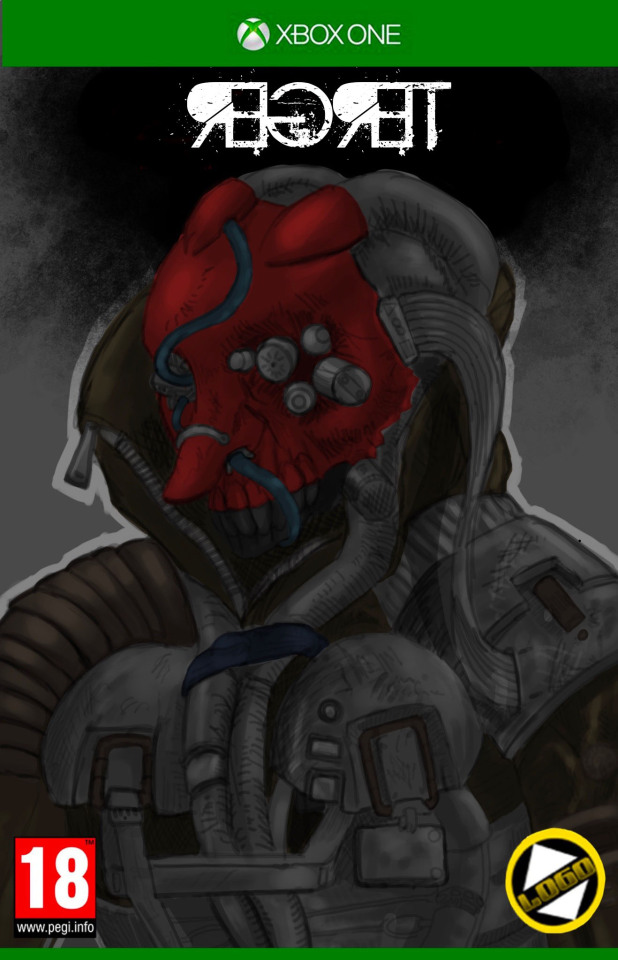
Molly suggested an English versioning with the greater variety of English fonts I thought it was a good idea.
left - right top- bottom: top secret, war eagle, Spanish apocalypse, hatchet man, Aristotle punk (edited by me so that it was more readeble), Aristotle punk.
0 notes


Text
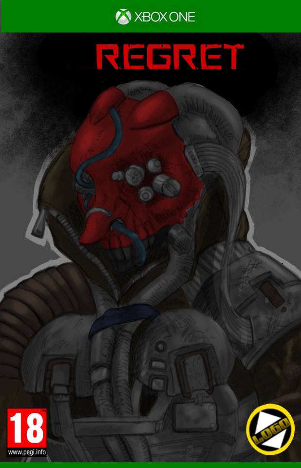
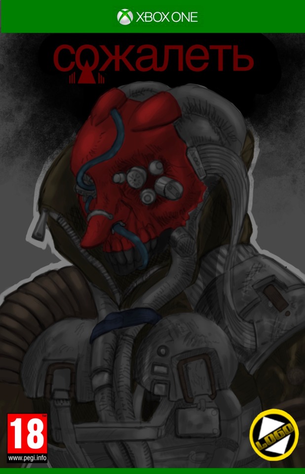
сожалеть (sozhalet) - regret, pity, remorse, sorrow, repentance, rue
putting in Cyrillic at the request of the tutor mentioned previously, interestingly Cyrillic is compatible with most fonts, (this font is ‘DIN Alternate’) unlike hiragana.
0 notes

Text

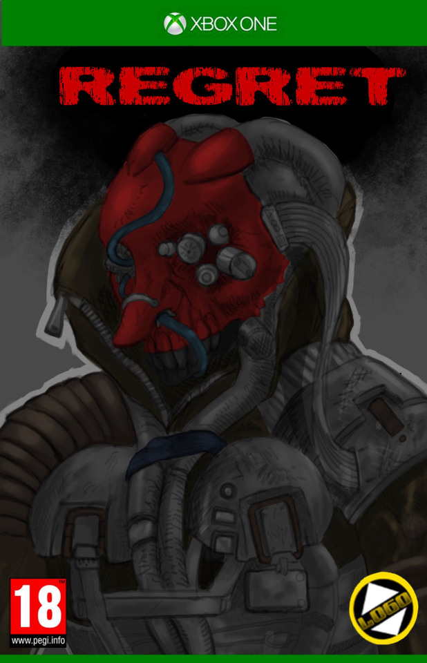
ざいばつ (zaibatsu) - financial clique
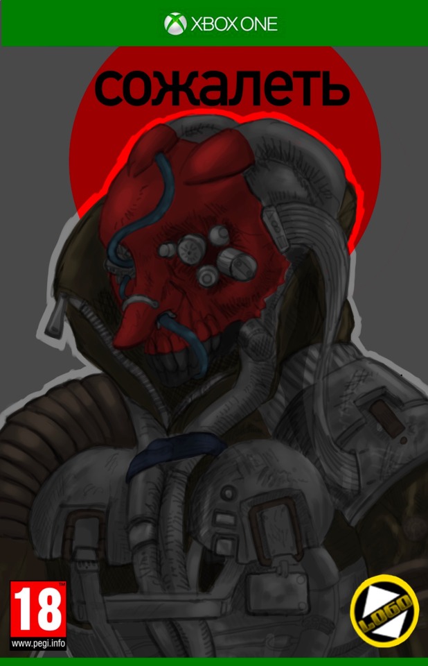
personally, i think the yellow box i put in to make the text stand out looks awful
0 notes
Text
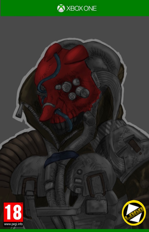
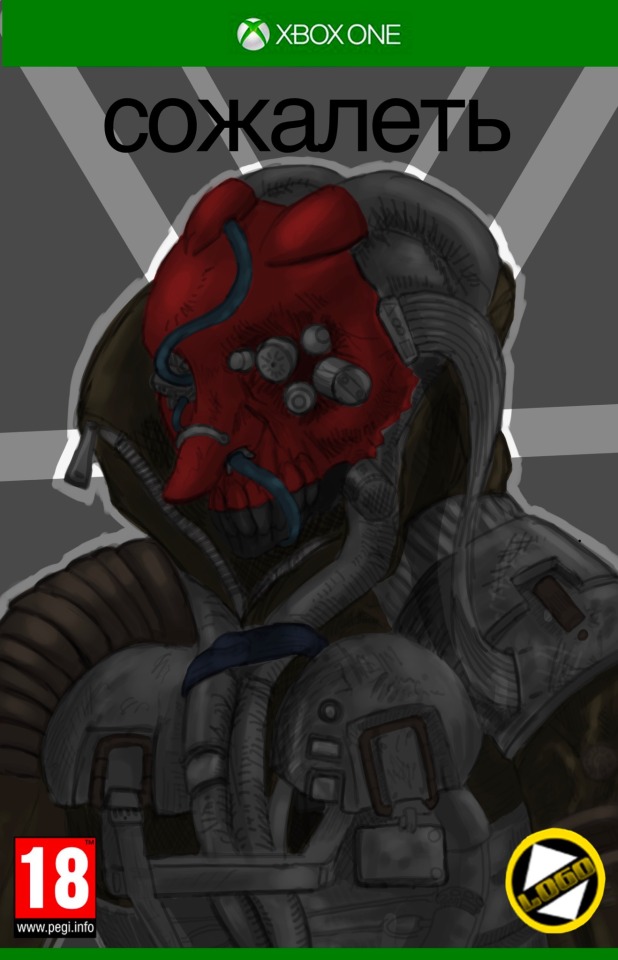
Updated the cyberpunk concept art to make it into a cover at the suggestion of a tutor I was talking to, they seemed to like this artwork more than my other cover. This version has no text so I can add text in photoshop, it was suggested that I put in Cyrillic (Russian) text, i think I’ll do that and add in Japanese and English text.
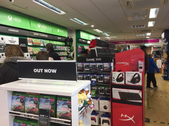

Described to add cover into the environment were the audience would view it.
0 notes

Text
stopped making art

its become clear that there are so many issues with this piece and the other that I'm going to stop making art or working on it to start too focus on writing out things and working on the portfolio.
0 notes
Text
Final version of this artwork, still don't like it very much. still dont consider it complete, its clear i should spend more time on landscape art, or art with lots of people in it.
added lighting, more detailing on people.
0 notes
Text
added shading and highlights,

added clothing details. and shading and highlights.

cleaned up skin coloured areas. and greyed in other objects.
0 notes
Text
Both versiosn side by side

using the blue to use a clipping mask over, it should me less mess when I colour in the clothes.
I still don't like this one, somethings wrong with the perspective fundamentally I think? all the colours might be too bright and the linework again, is just off in some way, maybe its too thick and bold?
added roof tiles as well as some shininess to the tower
0 notes