
mynewchallenge-webauthoring
MY NEW CHALLENGE: WEB AUTHORING
12 posts
Don't wanna be here? Send us removal request.
Last Seen Blogs

technopartners-blog
Techno Partners Pty Ltd

superxboyposts
Untitled

magic-office
Pour les office manager

gildedstarbaker
~destiny awaits~

martin-eden-teljesfilm
Martin Eden 2020 Teljes Film Magyarul [Video-Online]
Text
Responsive Web Design
We already have all the necessary elements to create our website, but we must have something very important in mind that many designers are still ignoring.
Create websites that are responsive to the viewer’s device by adjusting their layout and functionality to display content in an aesthetic and legible way no matter the size and proportion of the screen they are being viewed on.
This topic caught my attention so I took on the task of investigating a little more about the key points to use for a responsive web design and among all the sources these were the most important.
Fluid grids: Set to auto-snap or can be manually set to snap across breakpoints.
Flexible images: Responsive images that can be displayed to the browser in different sizes depending on the size of the image in the layout and the resolution of the viewer's screen. This will avoid having pixelated images that are too small or images that are unnecessarily large and slow down the loading of the site.
Breakpoints: the points in screen size or orientation (reported by media queries) where a website is triggered to adjust its layout.
Media queries – The specific CSS function that receives information about the size of the viewer's device to trigger breakpoints in the layout.
Viewport: The viewable area on the user's device where content can be viewed.
Overflow: elements in your layout that exist outside the viewport or are too large for their container.
Fixed sizing: size that is always the same regardless of other factors that affect your site or layout (pixels). Fixed size not responding.
Relative sizing: size that changes in response to another element in your layout or the user's device (%, em or rem, character height, viewport height, or viewport width). Relative size is sensible.
Mobile-first: A design strategy of designing the most constrained mobile layout first before designing for larger devices, in reverse of the previously assumed process of designing for desktop and scaling down from there.
Hamburger menu: a menu button that enables a drop-down feature for navbar links that helps save space on constrained layouts.
0 notes
Text
How do we put our page on the internet?
In this class we have seen different servers that will help us to do it. The chosen one to use is WordPress.
Investigating what you would do in reality to carry this out would be to follow the following steps.
First would be to buy your domain
To create a website you must choose a domain, that is, your internet address. When you think of the name you should keep in mind that should be easy to remember, unique and reliable. Think that it is better for the user to see extensions like .com or .ie than some unknown one and the price will not be so expensive per year.
Then pay attention to the server
The server where your website will be stored and the place where it will be seen on the Internet. Choose a fast one when loading, safe, especially to avoid hacking, and with good technical support.
WordPress is the most used platform and does not usually give problems. It is very easy to configure and has many possibilities. Once installed, all you need is a template to get started. You should be careful when choosing it as it will be the appearance.
In Themes you will find a wide variety of options to choose from, the best thing is that you can customize it.
0 notes
Text
What is CSS Grid and what is it used for?
The use of CSS Grid is a topic that was a bit difficult for me to understand how to use it.
But the use of this is important, if we think of web pages created for different screen sizes. Therefore, using a grid, the elements will be distributed independently and clearly, taking into account the space conditions given for each screen.

In order to understand how to move these elements around the page, we must know the different parts of this layout.
Grid Container: It is our “Parent” element, where a {display:grid;} is assigned and it will allow us to place other properties to manipulate our design.
Grid Item: They are the direct children of our container, we will handle these at our rows and columns that we will move.
Grid Line: These are the horizontal and vertical dividing lines.
Grid Track: It is the Space between two adjacent lines. Rows and columns.
Grid Cell: Our cells will be the space between two adjacent rows and 2 adjacent columns.
Grid Area: Space surrounded by 4 grid lines.
Creating these layouts we will have the general idea of how we want to organize our website. After we have identified the elements to use in the CSS Grid we will use different codes to assign which properties they should take.
With codes like the following:
To declare an element grid container, display:grid;
grid-template-columns to add column tracks, here we can add the size of this tracks too.
grid-auto-columns to set a maximum/minimum range for auto added columns or rows.
grid-row-start and grid-row-end to position items between lines.
grid-area to define grid areas, assign names
Grid also has two axes so to align block axis we can also use align-self and align-items.
0 notes
Text
Flexbox
We need to understand how flexbox works first. Flexbox is divided into two-axis: main axis and cross axis.
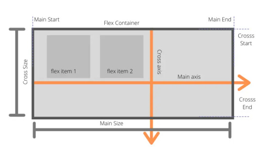
Flexbox Container Properties
display: giving value as flex then we are turning on flexbox context
flex-direction: decides that how items will be laid out on main-axis horizontally or vertically (row, row-reverse, column, column-reverse).
flex-wrap: controls the behavior that items will move into the next line if the container width is less than the total item width (nowrap, wrap, wrap-reverse).
justify-contents: aligns items on the main-axis. Its container property so it will align all child items to the particular position like to the center, start or end or giving space between them (flex-start, flex-end, center, space-between, space-round, initial).
align-items: aligns items in respective of cross-axis like justify-content for main-axis (stretch, center, flex-start, flex-end, baseline, initial, inherit).
align-contents: aligns rows not items in respective of cross-axis.
Flexbox Item Properties
order: to re-arrange the order of container items.
flex-grow: allows the item to grow as container size greater than the total items size.
flex-shrink: allows item to shrink as container size decreases.
flex-basis: Default value: Auto
flex: is shorthand for flex-grow, flex-shrink and flex-basis.
align-self: is for aligning individual item in respective of cross-axis and it will override the value set by align-items.
https://www.techboxweb.com/detail-beginner-guide-for-css-flexbox-with-examples/
0 notes
Text
Colors, links and box model
Last semester while using p5js we became familiar with the use of colors in programming. In this software the RGB system is used, which is the base of the hexadecimal system since it has the same order.
Hexadecimal numbers are the most common in CSS, they are numbers which use a base of 16 rather than 10. The letters A through F represent the “digits” 10 through 15. For a 2-digit number, the value is 16 time the first digit, plus the second digit. The hexadecimal number 3F means 3 * 16 + 15, or 63 in decimal.
The first two digits of a hexadecimal color are the red value, the next two are the green, and the last two represent the blue. Like p5js. Smaller values yield darker colors, so #000000 is black while #FFFFFF is white.
A shorter version uses three digits. It’s equivalent to the six-digit format, where each digit is duplicated to give the six-digit version. The value #46A is the same as #4466AA.
The eight-digit version adds a transparency value. In the three and six-digit notations, all colors are fully opaque.
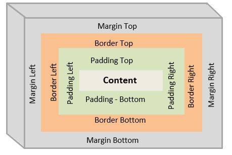
These are the elements in the website. Each element is considered as a box. Each box has four areas.
First area is a content area, it can be text, image, etc.,
Around content area is padding area
Around padding area is border area
Around border area is margin area
Each element’s content, padding, border and margin properties can be adjusted (width, style and color).
https://www.csssolid.com/css-box-model.html
Link states
a:link {color:green} /*for unvisited link*/
a:visited {color:yellow} /*for visited link*/
a:hover (color:blue} /*on hovering over the link*/
a:active (color:red} /*when hyperlink clicked*/
a:focus (color:black} /*when focus on link*/
0 notes
Text
Let's get started with CSS
CSS is a mechanism that will help us design a website. We already have the elements to add information, now we can decorate it.
How to start? We have to know how to write to be able to instruct CSS what to change and what specific information.

As shown in the image, there are 3 elements that are the CSS rules: selector, property and value.
h1 {
color: green;
font-family: Arial;
font size: 4rem;
}
This means that all our h1 will change with the given values: green text, with that typography and size.
The different ways to select in CSS are:
Element
h1 {
color: green;
}
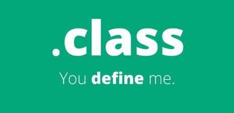
Class
.blog{
background:#5dc1b9;
}
Selection
#article{
border:4px
}
Position
#article a{
color:white;
}
It will only change in white the link that is inside that class.
Typography is one of the most important elements on our page, since a website is "90% text".
The following elements will help change different aspects of the text.
font-family to select a typeface (font stack is need it, this means we have to select more than one typeface in case the user hasn't that typeface and always finish with a general font family)
font-style (italic, oblique and normal)
font-weight (normal and bold)
font-size (can be in px, pt, %, em or rem)
line-height is the distance between lines. (leading)
letter-spacing
word-spacing
text align (to align the text: center, justify, left or right)
text transform (capitalize, uppercase, lowercase and normal)
text-decoration (line-through, none, overline or underline only for links)
0 notes
Text
Attributes to group information
We are about to start with CSS.
We have learned how to write our codes and so far we have a basic website in which we can display all the information we need.
It is time to group our codes and organize them.
The following elements will help us to divide our website and have a better understanding of what content will be in each of them.
<header> within this element can be our navigation menu, branding, social media links, login form and search form. This element can be the main of our website or part of one of our articles
<nav>
<main> initial content, which will be the first thing the user sees.
<content>
<article>
<section>
<sidebar> or <aside>
<footer>
If we keep our codes organized in HTML, when commanding in CSS what to do with each piece of information will be a faster task.

These two elements will help us group information.
ID is used only once and is used when none of the parent elements can already be used.
CLASS is an identifier, it can be used multiple times and will help identify elements.
We have a last special attribute: charset. This specifies the character encoding for the HTML document.
<meta charset="utf-8">
This one, covers almost all of the characters and symbols in the world.
0 notes
Text
After learning the written content that involves how to organize our texts with the different elements, how to add the different types of links, now we move on to how to add images.
Images can be added in CSS or HTML with the following code.
<img src="dog.jpg">
As well as when adding our internal links, we must also mention the location of our images, if they are in subfolders. Using the same element (/)
<img src="images/dog.jpg">
We have another element that describes the image in case it cannot be shown or if the user has a visual disability. (alt)
<img src="images/dog.jpg"alt="A picture of a Dog waving">
Another attribute that works as a "tool-tip" will show information about the image when the mouse hovers over it. (title)
<img src="images/dog.jpg"alt="A picture of a Dog waving"title="This dog was famous in the 80s">
Dimensions are an essential element. Using (width + height) for this action is important to know the dimensions of the image to get the correct scaling.
<img src="images/dog.jpg"width="400" height="350"alt="A picture of a Dog waving"title="This dog was famous in the 80s">
0 notes
Text
Continuing with the study of the basic elements
In the last session, we saw what were the main elements on the website and we learned how to organize our texts, that is, how to show that information is relevant.
This step was easy to understand and apply. Now we continue with more elements for the development of the website.
Lists
The use of lists is important since it will be the basis of the navigation systems and in the use of CSS.
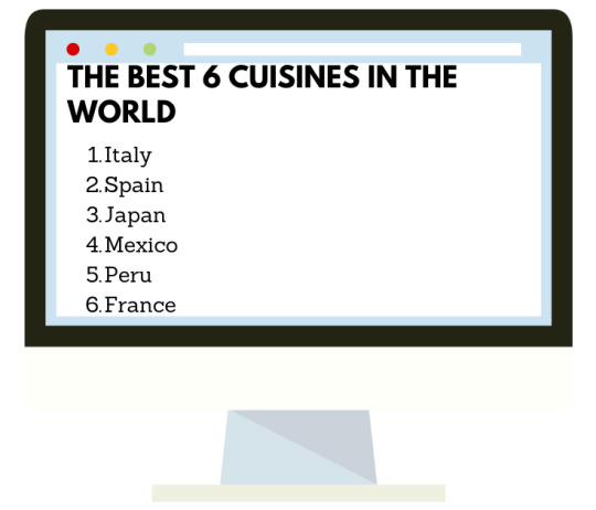
Ordered List
<h1>THE BEST COUNTRIES TO LIVE</h1>
<ol>
<li>Denmark</li>
<li>Finland</li>
<li>Switetzerland</li>
<li>Australia</li>
<li>Germany</li>
</ol>
Unoredered List
<h1>THE BEST COUNTRIES TO LIVE</h1>
<ul>
<li>Denmark</li>
<li>Finland</li>
<li>Switetzerland</li>
<li>Australia</li>
<li>Germany</li>
</ul>

Another essential element is adding links that will help us to direct the user to different parts of either your own website or external links.
Linking to external sites
<a href="https://wordreference.com">WordReference</a>
We start with the beginning of our tag, followed by the absolute URL, the Text that the user will click on and we close our Tag.
Absolute URLs are usually
protocol://domain/path
protocol: https://,ftp://, gopher://, or file://
domain: name of the website
path: includes directory and file information
Linking to pages on the same site
<a href="contact.html">Contact us</a>
In this case, you need a relative link, this one can be as simple as the name of the file.
If the link is is a subdirectory you can use (/) when the file is in the same directory, if you want to look for another file that is in a higher directory you use (...) which means to go up a directory.
Linking to a specific part of the same page
id is the attribute to use
So in our text, we will be identifying the part that will be the link, it can be applied to any element.
<h2 id="sales">Sales Points</h2>
<p> Select your nearest market where you will find your order ready to collect</p>
While at the time of adding our link we will identify our id with this symbol #
<a href=#sales>Sales Points</a>
0 notes
Text
Text & Semantic Elements
What can we see on a web page?
We find titles, paragraphs, images and links.
Now that we have identified which software will be used for the creation of the web page, the next step is to learn the basics and how to add them in HTML.
To add paragraphs is used the next code.
<p> PARAGRAPH (here goes the text we want to be seen on the website) </p>
When adding headings, HTML has 6 levels that are written and viewed this way

<h1>Main Heading</h1>
<h2>Sub heading</h2>
<h3>Sub heading</h3>
<h4>Sub heading</h4>
<h5>Sub heading</h5>
<h6>Sub heading</h6>
We have different codes that will help us organize our texts.
<br> For line breaks
<p> Fresh vegetables and fruits.<br>Available every week.</p>
It will be shown:

<p><strong> To have something in bold</strong></p>
To have something in bold
<p>Em is used for emphasis, that will show the selected part in<em> italics.</em></p>
It is used for emphasis, that will show the selected part in italics.
<p>Blockquote is used for longer quotes</p>
<blockquote><p>That will be shown like this example</p></blockquote>

0 notes
Text
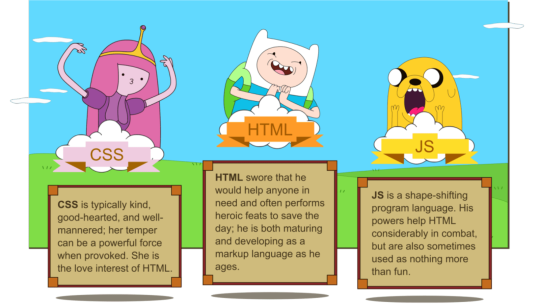
Let´s meet HTML, CSS and JavaScript
Last semester we were challenged to enter the world of coding where we met a tenacious character with certain moments of obstinate: 5Pjs, being able to do incredible things but also giving us headaches when this character decided not to help.
How are the characters of this semester?
0 notes
Text
First step to create a Website
When I was in college studying marketing I had a class that was for the basic learning to create a website. I remember finding it too complicated and uninteresting.
Today it is an issue that cannot be set aside, since websites are the store of the present for any business.
HTML is the base to build any website, the language that will give the base to our page, then with the help of two other technologies: CSS or JavaScript, we can give the desired design.

LIST OF BASIC HTML TAGS
<a> for link
<b> to make bold text
<body> main HTML part
<br> for break
<div> it is a division or part of an HTML document
<h1>... for titles
<i> to make an italic text
<img> for images in document
<ol> is an ordered list, <ul> for an unordered list
<p> for paragraph
<span> to style part of text
<strong> for bold text with emphasys
<li> is a list item in bulleted (ordered list)
0 notes