
mmoralesartwork
M.MORALES ARTWORK
Every day I share my watercolor studies and do a little self-criticism about the result • No filter, no edits and no cute background • Just the reality
9 posts
Don't wanna be here? Send us removal request.
Last Seen Blogs


granonine
Untitled

oldmenandbigasslover
Untitled
callmepelos
Hey :D

russos-one
A Circular Ice Cube From The Sky
Text


Botanical watercolor - rose paiting
This is definitely not my best painting. Building dark shades of red was more difficult than I thought, either the tones were too similar and didn't stand out in the layers, or they went too far from the color palette. I tried to use two ways to darken tones: using the opposite color (green) and using chromatic black. Both created tones that I didn't really like. Result: the painting had a "hard" appearance.
Final score: 5,7/10 (whatever, beautiful paintings don't always come out in my hands and that's okay)
#art#illustration#traditional art#watercolorart#watercolor painting#watercolor#aquarela#my art#daily art#daily painting#artoftheday
3 notes
·
View notes
Text
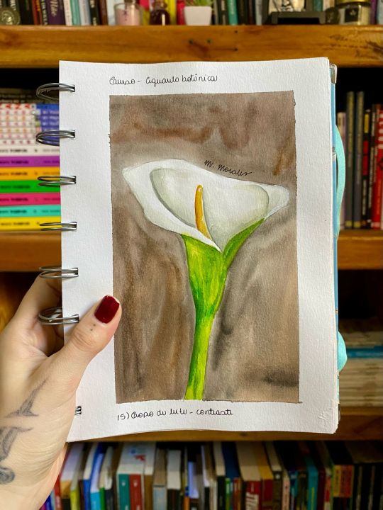

Botanical watercolor - calla lily
I went back! This time I bring a study with white in watercolor. For those who don't know, normally the white color in watercolor is not used much, because it doesn't work in layers and the appearance is usually very opaque. To solve this problem, we reserve the areas we want to leave blank and/or work with shades of gray to create shadows. Obviously I also made a dark background to give contrast, so the flower stands out even more. I liked the result, but calla lily isn't really my vibe.
Final score: 7,5/10
#art#illustration#traditional art#watercolorart#watercolor painting#watercolor#aquarela#my art#daily art#daily painting#artoftheday
1 note
·
View note
Text


Botanical watercolor - bunch of grapes painting
It took me a while to post the next painting, I know. Sometimes the discouragement of life leaves me a little uncreative (here in Brazil we use the word "borocoxô" to describe this feeling). When this happens, I try to accept that working with art isn't always about living with high peaks of creativity, sometimes it's just about understanding that consistency also generates a lot of results. It could even be that consistency is one of the keys to getting out of these boring moments. Well, here is one of the paintings where I was borocoxô and, sincerely, I didn't think the result was bad. I risked a mottled background and tried to vary the tones of the grapes to make the transition between younger grapes and those ready to eat. It was satisfactory and that's what matters.
Final score: 7,5/10
#art#illustration#traditional art#watercolorart#watercolor painting#watercolor#aquarela#my art#daily art#daily painting#artoftheday
3 notes
·
View notes
Text


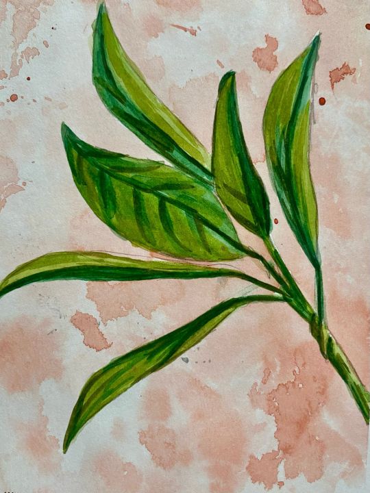
Botanical watercolor - pitanga painting
Pitanga is a very common fruit in Brazil. My intention in this painting was to make a branch with young and more mature fruits, that's why I varied their color. Even so, the colors were a little wrong, I think they were too dirty and the effect was a little damaged. This probably happened because I wanted to use the mixtures that were already in my pan, I'm terrified of waste. Anyway, the painting turned out cool, I reserved a good amount of space for white and worked well with light and shadow. This probably saved the painting.
Final score: 8/10
#art#illustration#traditional art#watercolorart#watercolor painting#watercolor#aquarela#my art#daily art#daily painting#artoftheday
4 notes
·
View notes
Text
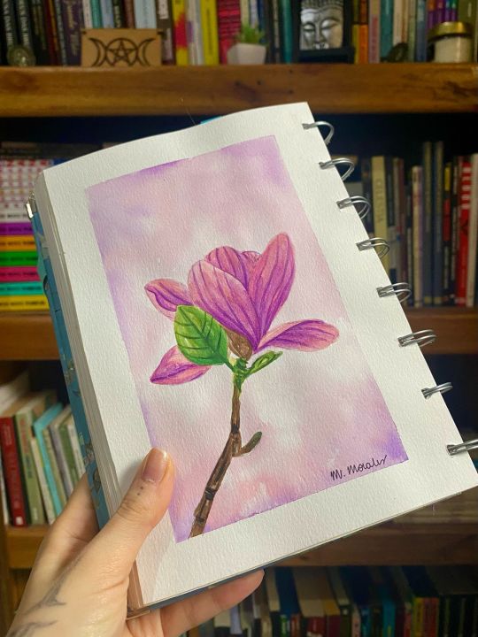
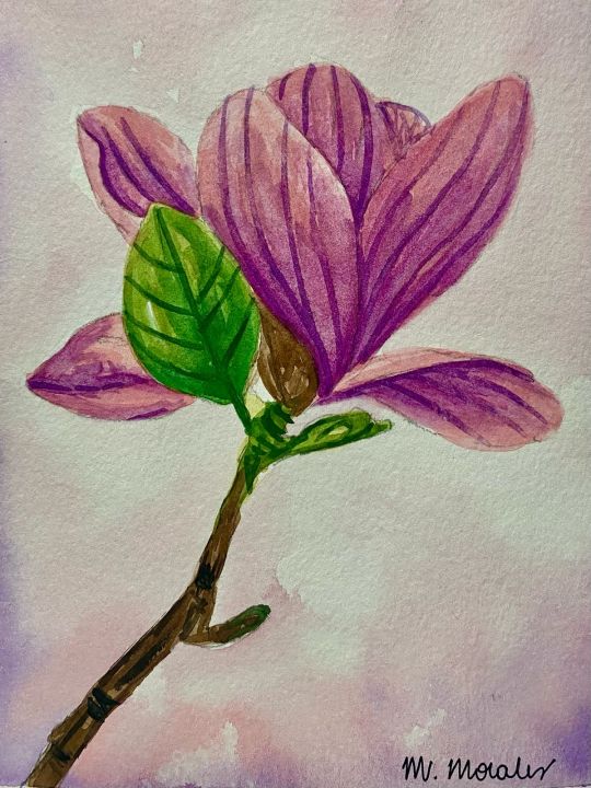
Botanical watercolor - magnolia painting
Ok, the idea here was to work in layers, using the transparency characteristic of watercolor to give volume and texture. I think you can see that the effect wasn't that transparent, which is a shame. BUT, I really liked the result. What I've been noticing is that maybe my visual language doesn't use as many diluted layers. And I think that's okay, maybe I should work more on what I see as the strong points of my productions. Anyway, I think the only detail I didn't like about this painting was the details, which looked too "hard".
Final score: 9/10
#art#illustration#traditional art#watercolorart#watercolor painting#watercolor#aquarela#my art#daily art#daily painting#artoftheday
11 notes
·
View notes
Text

Botanical watercolor - chromatic black study
I got tired of studying human anatomy and portraits, so I decided to relax with botanical watercolors. I'm a tattoo artist and I already work with this theme, so the result was very pleasing to me. The difference here is that I used black to darken some shades of green to give volume and texture. This technique is called "chromatic black" and is great for creating dark tones, you can basically add black to any tone you want to darken. Approved!
Final score: 10/10
#art#illustration#traditional art#watercolorart#watercolor painting#watercolor#aquarela#my art#daily art#daily painting#artoftheday
4 notes
·
View notes
Text


Watercolor portrait - middle-aged man
It took me a while to post another study, but it’s here! I don't have skills in painting male portraits, this difficulty probably comes from the fact that I'm not a man, so I'm not familiar with more masculine features. I took advantage of the fact that my experience with mature skin was very good and decided to take a chance on a male portrait. For the first time I'm happy with the result. Probably the marked features and beard helped a lot with the effect I wanted. I worry if one day I'll be able to paint a male portrait without a beard or marked features, but I'll find out later.
Final score: 9/10
#art#illustration#traditional art#watercolorart#watercolor painting#watercolor#aquarela#my art#daily art#daily painting#artoftheday
2 notes
·
View notes
Text


Watercolor portrait - mature skin
Okay, here I think I nailed it. Painting mature skin helped me to accept more the natural stains that watercolor creates. I still think that the expression lines in the portrait are "too hard", perhaps I could mark them less in the next painting, diluting and layering them to create more fluid textures.
Final score: 7,5/10
#art#illustration#traditional art#watercolorart#watercolor painting#watercolor#aquarela#my art#daily art#daily painting#artoftheday
1 note
·
View note
Text


Detailed anatomy - monochrome
Monochromatic exercises are great for training light and shadow. The eye painting was really cool, maybe the eyelashes could be more "organic" and making fewer wires would solve the problem. I liked the result of the mouth and ears, I wouldn't change many things about them. The nose looks weird, I know. And honestly, I always miss this part of the face and I never know what I'm doing wrong.
Final score: 7/10 (the nose really looked weird)
#art#illustration#traditional art#watercolorart#watercolor painting#watercolor#aquarela#my art#daily art#daily painting#artoftheday
1 note
·
View note