
milfnecromancer
blog about Heroes of Might and Magic VI
19 posts
Don't wanna be here? Send us removal request.
Last Seen Blogs

jiyongisbae
Bury them with a...

one-of-the-birds
Welcome to My World

remonifisoxo
Untitled

mi5019anamariarizea
Experimental Motion Graphics

sfish07
Untitled
Note
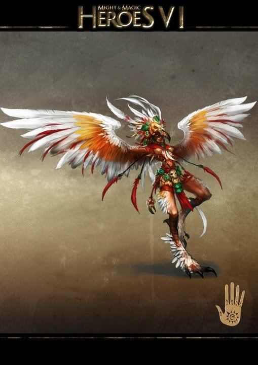
Thoughts on VI Dungeon? It’s my second favorite behind Inferno and the invisibility racial is very interesting to me. Making Raelag actually likable after Heroes V was also a great accomplishment for the campaign. I’m not super enthused with the hero designs, though. The boob armor is pretty bad and I find the Tears designs to be pretty visually uninteresting even compared to the Neutral designs.
I also really wish the Faceless were explored more, as they’re undoubtedly the coolest part of VI.
I probably have the least strong opinion on dungeon, simply because I haven't played with them very much, but I will say that overall aesthetic wise they are in my opinion almost as cool as necropolis, and their cities are maybe the most beautiful in VI. I do agree with you on the hero designs though, especially the might heroes, and yes, the tears designs are very boring.
Also you're completely right about the faceless, they're so interesting, especially the way they play a role in the core campaigns through characters like Jorgen. I absolutely love their wings as well, the butterfly like design with all the eyes is perfect!
2 notes
·
View notes
Note
2 questions this time:
1. Favorite hero class designs? I’m personally a big fan of the Vindicator, the Tide Master, the Pyromancer and the Chieftain, to pick one from each category.
2. Thoughts on the Sanctuary faction? I like the aesthetic a lot but they only really have one campaign + Crag Hack’s second map in terms of worldbuildint around them.
My favourites are the necromancer, pyromancer and the monk!
I love Sanctuary! It is definitely one of the most beautiful factions in the game, the aesthetic is so calming. I especially love the design of the cities with all of the terraces and waterfalls. But yes, lore and worldbuilding wise it is much less developed than the others, since I'm pretty sure they only appear in this game, although Irinas campaign does a pretty good job of introducing and exploring them.
Also I'm not sure if this really happened or if I'm making this up, but I think there was a poll of some sorts, wether it should be in VII or not and it lost, which is a shame, there was a lot of potential to explore it further and weave them deeper into the lore, by connecting it to the other factions a bit more.
3 notes
·
View notes
Note
Also I am curious on your thoughts on the designs for Stronghold in VI and VII. Obviously different designs because one is the Pao Islands Orcs and one are the Ranaar orcs, but you can still compare the two.
VI is probably the first Heroes game that made me actually enjoy Stronghold. They felt far too dry in the other games, especially due to them leaning into the “no magic” thing. VI having them have Prime magic as a barred school is much more interesting, letting their casters sacrifice power for diversity.
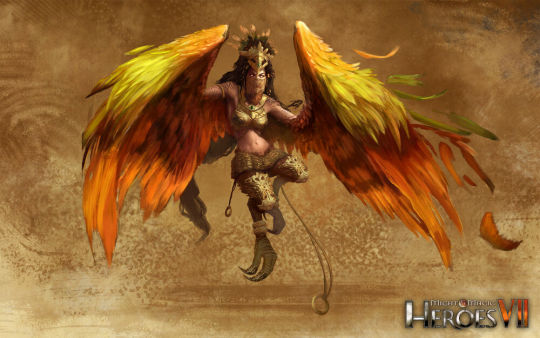
I actually really like the concept of VI being tropical island orcs and VII being desert ones, and them having adapted differently to these environments! It makes it possible to keep iconic creatures like the harpy and the centaur but still making them distinct.
My personal favourite is the harpy/fury, both versions look nice and make sense for their environment, but this applies to the centaurs and the brute/mauler as well, although the VII units are in general a bit plainer, but that is an overall theme in VII. (also a harpy based on a tropical bird is such a cool thing to me so the VI harpy will always be very special to me)
The goblins are also an iconic feature of stronghold and I'm glad they kept them in the form of the basilisk riders.
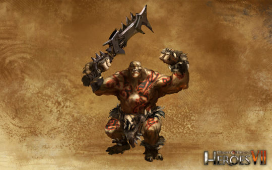
As for new creatures, the gnoll is a pretty good replacement for the jaguar warriors, which were never my favourite, they are a bit boring and not distinguished enough from the maulers imo, I like the concept of the hyena beastman a lot more, although the actual design could be a bit more interesting (like making the clothes a more vibrant colour or something).
On the other side the sand wyvern and the behemoth made no impact for me whatsoever, they look way too generic, I wish they at least had some cool armour. also there is already a big desert lizard in the form of the basilisk, making the wyvern even less distinct.
They really didn't change much with the cyclops and the dreamwalker, so I don't really have anything to say lmao.
(on an unrelated note am I insane or does this concept art look weird somehow, as if his chest was too smooth)
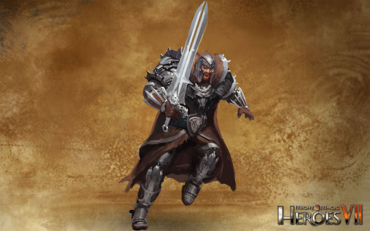
On the heroes, I am still salty that there are no longer 9 unique designs I really like the different masks (and the warmonger's mask looking somewhat demonic) as well as the difference in colour palettes between tears/blood/balanced (as opposed to for example inferno, where tears and balance look very similar, tears is just a bit more orange)
Despite that I like the design for the VII shaman very much, especially the female version's top, something feels off about the barbarian though, it would have looked better with less mail armour.
This is also a good point to talk about something that I will probably expand on in another post, namely that I don't like how VII made the female forms notably different from the male ones, mostly by giving them smaller/less bulkier armour and accessories as well as excessive cleavage (very obvious with the barbarian). Now this is not a new or unexpected in video games and VI definitely had instances of weird boob armour, but i feel it did an overall better job at equality.
Overall I like Stronghold in VI very much as well, yeah it would have been a shame if they didn't have magic at all :)
2 notes
·
View notes
Note
also sandro did nothing wrong
I respect the Sandro stanning, though personally I prefer my fucked up necromancers to be of the hot woman variety
#Miranda my beloved#also hypocritically Zenda and Charna#I may dislike HoMM VII in a lot of aspects#but their characters are very good#heroes vi#homm
1 note
·
View note
Note
holy shit i didn’t know there were other people who liked heroes vi
I have over 800 hours on this godforsaken game send help
I’m doing every campaign on Hard with every Might/Magic and Blood/Tears combination
you should rank the hero designs for the classes
Yesss, I am so glad to have found someone else!!! (also, very impressive, I have to admit, I'm an easy mode player)
I am actually going to do that, it just always takes me so long! I really like most of the hero designs!
1 note
·
View note
Text
It is probably very weird that the reason why I am unhealthily obsessed with the computer game heroes of might and magic VI is that when I was a child it was the only game my father would ever play and I would always watch him, which lead me to develop strange feelings towards the character of Svetlana and I eventually started learning Russian just to be able to read fanfiction about her
3 notes
·
View notes
Text
If I had even a minuscule amount of knowledge about making videos, I would make an eight hour long video essay about heroes of might and magic VI, but alas :(
3 notes
·
View notes
Text
HoMM VI Necropolis (part 1)
After mostly rambling about the Haven designs I finally decided it is time that I talked about my actual favorite faction in HoMM VI. :)
Necropolis creature designs
As a preface I want to explain, what my personal criteria for "good" creature design are (these are for the most part completely personal and barely supported by the actual games)
Overall coherence, while still being distinctive: I talked about this in my post about haven, but I like it when there is a certain narrative throughline in all the designs (for example the blue and white/ gold and white colors for the haven creatures), however with all the individual creatures still being unique ( all the creutures kinda looking the same is a problem that inferno has imo)
the creatures themselves making sense: This is mostly my own opinion (even more than the rest of this post), but I think the base creatures should be the "no brainer" ones, by which I mean basically the first thing that comes to your mind when thinking about the faction (like the skeleton, the ghoul and the ghost for necropolis). And by this I don't mean that the designs themselves need to be boring or generic (in fact they shouldn't be), but only that the concepts should make sense as the core units. Similarly the champion creatures work best for me when they are something that is both visually impressive and big, as well as thematically important for the faction (like an angel for haven). The elite units are where there is the most space for unusual or off the wall concepts or designs, that should still fit within the theme but that the player wouldn't expect from the get-go.
Again these aren't some universal principles, just what I personally like to see. (also if I get some of the english names wrong in this post it's because I mostly consume content about HoMM either in russian or in hungarian and I'm sorry)
And with all of that out of the way I will finally get to the actual topic of this post:
Core creatures
The skeleton
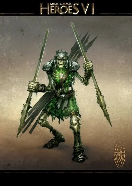
Obviously the skeleton was a clear choice for one of the core units! And it is because of this that I am so happy that they managed to make them interesting and unique. First I love that they throw spears! I fell like that is kind of unusual for shooters with most of them using either arrows or magic beams and it really works for me. Additionally the cool helmet and the green glow coming from their chests are nice touches. (Also, in the russian version at least, they make a strange, pirate-like sound of "hey-haha" whenever they shoot, which I find adorable)
the skeletal spearman
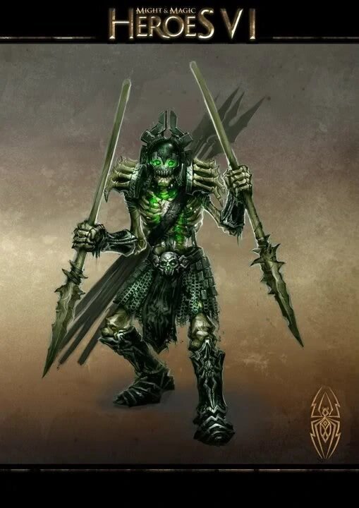
The skeletal spearman is a great upgrade! The boots, gauntlets and belt very much resemble the armour of the might necropolis heroes, which serves nicely to show their higher status, as well as elevating them from just a reanimated corpse into clearly a soldier. The upgraded version having better and stronger armour makes complete sense. I also like the finger bone shoulderpads and the strange, almost halo-like design of the helmet, that also fits the geometrical pattern thing that the necromancers have going on in general. Also, although I can't fully pinpoint, what kind of real world soldiers they were inspired by, but their armour (for example because they aren't wearing breastplates) looks kind of ancient, which fits in with the other necropolis designs, which were often based on ancient egypt.
final score: 9/10 they are like funny little guys to me :)
the Ghoul

I'm gonna be very honest, I don't like the ghouls at all, despite them fulfilling all my above mentioned criteria, but I find most kinds of zombies (especially the ones that growl and act animalistically) very scary and disgusting, which may raise the question, why necropolis is my favourite faction, but what I like about it is the very fact, that all the other creatures aren't like that at all. The big metal claws are pretty cool, but neither the weird nose ring, nor the fact that the artwork makes it look like they are wearing a chastity cage serve to endear them to me. (and again, they also growl weirdly) Sorry ghouls, but you are my least favourite part :( However I do want to reiterate that they were a good choice for one of the core creatures and their design fits the theme very well, while still being creative.
the Ravenous Ghoul

The upgrade sadly didn't make them look any less disgusting, but ignoring that, it is still very good. The longer claws and strange spikes/hooks do make them look more intimidating and powerful and the hooks are a motif that also returns in the design of the magic heroes. The colour scheme of the upgraded creatures having more white in it is also a thing that returns with other units as well (the ghosts and liches for example), which adds to the visual coherence.
final score: 3/10 but only because I find them gross
the Ghost
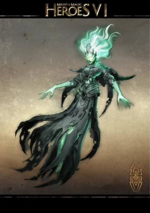
I love the ghosts and not only because I enjoy seeing pretty women in video games (although that is also a part of it)! But I also enjoy the creativity of their appearance, despite the simple concept, which I was referring to in the beginning. Their flowing/tattered robes make them resemble mummies a bit and thus makes them fit into the ancient Egypt theme, while the necklace/belt thing (?) and especially the headdress give the ghost a regal appearance and elevates them from the very simple base of "dead woman" (also you can't see it in the artwork, but in the actual game the gems on their chest and waist glow green, which really cool and pretty)
The Specter

Here we see the theme of the upgraded versions having more white in them again and it works beautifully with the specter, since it makes her shine more brightly and that with the more elaborate headdress and chains makes her appear even more regal and radiant than the ghost and really showcases her power. The tattoos are also a very ice touch and again show the typical geometric patterns of the necromancers, however I don't think they really show up on the 3d renders.
final score: 10/10 beautiful design, no notes
next up: elite and champion creatures
8 notes
·
View notes
Text
Anyway, despite the fact that they are not my favourite faction, I sand behind the fact that Haven has if not the best, then still the most coherent design in all of HoMM 6, especially when it comes to the creatures. Most notably they manage to avoid the problem that many "human" factions have in video games, which is that they are a lot more boring than the others, since they are essentially just medieval people.
They do this by 1. adding some roman influences (esp. with the praetorian) and 2. doubling down on the light magic aspect and adding more "magical", unusual creatures.
The best thing though, is how much sense the creature line-up makes. The base creatures are fairly "normal", a foot soldier, a crossbowman and a priestess, but their blue and white colour palette (and especially the white and gold of their upgraded versions) makes them fit in with the theme of the faction very well and their designs make perfect sense as the basic units of the human faction without being boring or unimaginative.
And then with the elite creatures they introduce the more magical elements with the glories the griffins (who also fit the campaigns) and the sun riders (who I especially like since they are a cavalry soldier and thus the more elite version of a foot soldier, the sentinel). This establishes that more powerful = more magical/fantastical, since even the sun riders get magical horses to ride on, which then culminates in the champion creature, the seraph. Not only is the design of the seraph very pretty (especially their swords), but they make perfect sense, both because of the large role that angels play in the campaigns, and as the strongest creature for a faction that is very heavily inspired by christianity.
From the other factions I think only the necromancers come close in terms of narrative cohesion in their creature line-up, with all of the others having some units that seem a bit arbitrary .
12 notes
·
View notes
Text
I played a little Heroes VI this evening.
My mind was blown. This game is the most beautiful thing I’ve ever seen. Seriously, the hero’s horse’s every little detail is perfect. Like I can see it’s eyes.
God.
Tomorrow I’ll have a big exam so I can’t play till tomorrow afternoon. This is pure torture.
4 notes
·
View notes
Photo
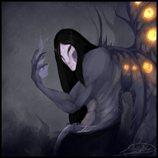
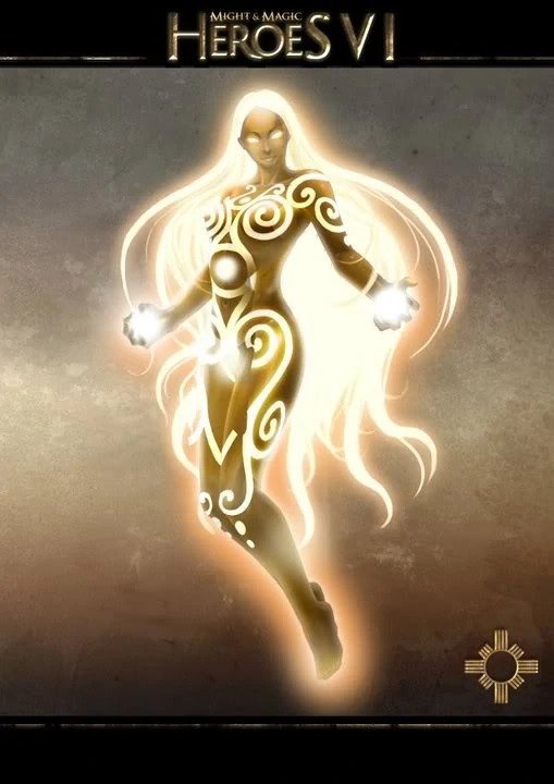
Dermuth - My faceless baby
The “painting” what SAI can’t handle.
Without lineart and “base”. PURE PAINTING.
That’s why it has tons of mistakes xD but I like it anyway!.
30 notes
·
View notes
Text
Comparison between haven units in Heroes of Might and Magic 6 and 7 part 6 (the final part)
the Radiant Glory
I really like the Glories because they are one of the most original creatures in the faction (although they look like light elementals) and I find their design very beautiful as well especially since they glow. :)
the Chaplain

This is just a priest in ugly brown robes, even the gold accents are desaturated and boring. :( His staff is quite cool however.
the Landsknecht
In HoMM 7 there are two champion creatures instead of one but the Landsknecht is boring even next to the dissapointing angels. He is just another warrior, of which there are 5 out of 8 creatures, and there is nothing that really differentiates him from the others. (I also don't know why he has a German name)
the Blazing Glory
The upgraded Glory suffers from the same thing as the Vestal, namely that the only thing really changed is the color. They still look beautiful but maybe they could have gotten some armor as an upgrade.
the Abbot
This is literally just a priest in a weird helmet.
the Swordmaster
I find this upgrade quite nice actually, the end result still isn't revolutionary, but I like the red and white as well as the design of the skirt(?) and especially the glowing sword.
This concludes my comparison, I did it because I was very dissapointed when I saw the designs in HoMM 7, especially since those of the other factions are mostly really good and the Haven units just look incredibly boring and way too "human" to me, which the 6th game managed to avoid very well. However these are just my personal opinions, I'm sure some people really liked them. :)
3 notes
·
View notes
Text
Comparison between haven units in Heroes of Might and Magic 6 and 7 part 5
The title is a bit misleading as my comparisons have completely fallen apart at this point, so I will just ramble about my opinions on the remaining units.
the griffin
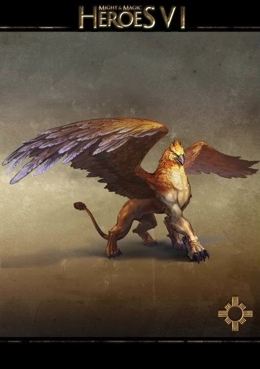
The Griffin is one of the more visually boring units, the simple fact that it is a mythological creature isn't enough to make it interesting and it doesn't really fit into the color scheme that well, they are important though, since the main characters of HoMM 6 are from the Griffin house.
the Dire Wolf

The dire wolves are even less interesting, they are literally just normal wolves with a collar on them.
Dire wolves actually also exist in HoMM 6 but they are neutral creatures there.
the Imperial Griffin

I like this upgrade a lot more, the white and gold armor really makes it fit in, but the blue tassels hanging off the helmet are a bit weird, adding some blue gems on the armor would have maybe looked a bit better.
the Silverback
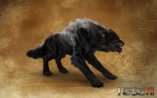
They somehow managed to make the upgraded form even more boring, this is just a black wolf. :/ It also maybe looks a bit too aggressive for the Haven faction but since they toned down the light motive it isn't too bad.
3 notes
·
View notes
Text
Comparison between haven units in Heroes of Might and Magic 6 and 7 part 4
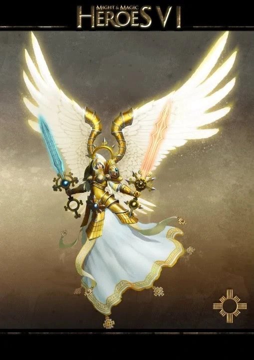
the Seraph

The Seraphs are the strongest Haven creatures in HoMM 6 and they look majestic enough to reflect that. My only problem is with the boob plate which is frankly unnecessary ( and sadly featured heavily in HoMm 6) but the giant glowing wings and two differently colored glowing swords are very cool.

Of all the downgrades in HoMM 7 this is definitley one of the worst. First of all since they changed the design to male and got rid if the Glories (more on them in a later part) there is now only one female unit in the faction. Second, the fact that they kept the two swords really make the downgrade obvious, if they had come up with a completely different design I would maybe have been more lenient, but like this it is very easy to see how the shorter swords, the smaller and not glowing wings and the boring colors really take away from the effect.
the celestial
There is not much I can say about the upgraded version except that it is very pretty and the white and gold look very powerful. (I find the wing armor a bit weird though, it doesn't look cool or practical)
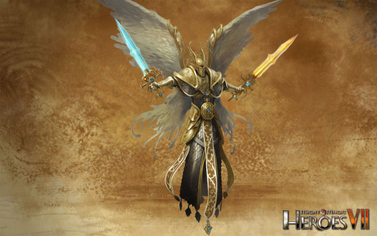
This upgrade sadly fails to imrove things , the gold isn't as shiny and the gray hasn't been changed to white. The swords are still embarassingly short.
This applies to the unupgraded version as well, but the split in the skirt makes the models lack of legs more obvious and the wings are strangely split which gives them a butterfly-wing like look. I also like the hood in HoMM 6 more than the helmet in 7, it is imo a bit more original than just a helmet.
Also I do know that there is an in universe reason why the heroes vii angels are less powerful, but that shouldn't mean a more boring design
1 note
·
View note
Text
Comparison between haven units in Heroes of Might and Magic 6 and 7 part 3
The saga of HoMM 7 toning down the magical aspect of the haven faction and making them very boring sadly continues :(
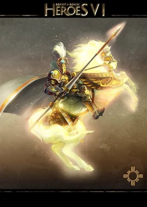
the sun rider/ crusader

I like the look of the sun riders very much, especially since in the game the horse is very bright and shiny. The rider himself isn't that interesting but the giant lance is nice and the focus really is on the horse.
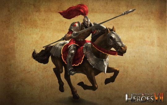
In contrast to that the brown horse of the cavalier could not be more boring and there isn't really anything else I can say about it. :/
the sun crusader/ cuirassier
The sun crusader is a very nice upgrade, the blue gems on the helmet and the shield (sadly not in this image) are a nice highlight to the gold and white armor. The helmet is thematically fitting but a bit ridiculous. I would have maybe liked it if the horse had been changed a bit as well, but there isn't really a way to make it even brighter.

First of all I have no idea what a cuirassier is or how to pronounce it but since that is mostly due to me being uneducated I will let it fly. They are a nice upgrade to the cavalier but since he was incredibly boring that only elevates it to "average" status
2 notes
·
View notes