michellescm1998publication
603 Publication (Y2 Materials Media)
24 posts
Don't wanna be here? Send us removal request.
Last Seen Blogs

svartvitkatt-blog
And even dragons have their endings.
pushkar63929
शीर्षकहीन
whoselineordie
just another whose line side blog

mrsbrokeinside
vertrauenslos

dustystars
March into the Ocean
Video
WIP: Poster at back
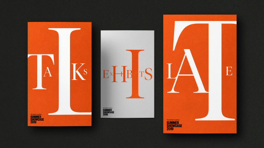
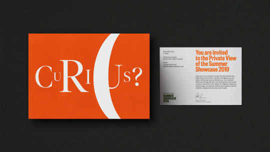
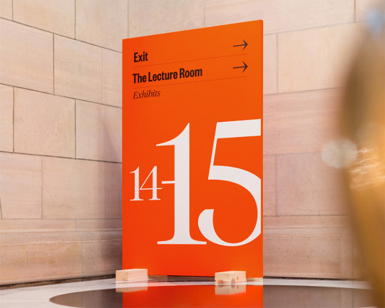
For the posters, I’ve been modelling it after British Academy’s Summer Showcase 2019 designs (from prior research on different scaled letters)
0 notes
Text
WIP : Color Comparisons
I originally had some speakers in red and others in blue for greater differentiation, especially with the keynote speakers VS workshop designers. But feedback from others said this was too jumpy, so I stuck with using the red.
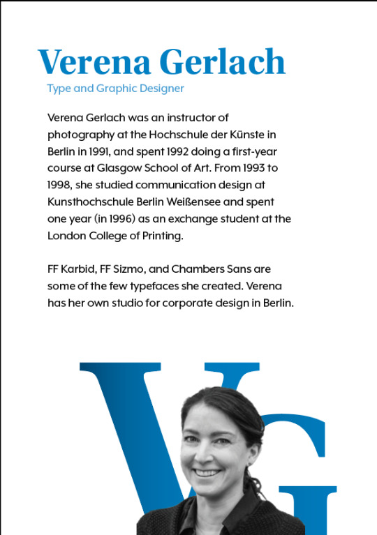
Blue version for Verena.
The photo of Verena Gerlach that’s used here, is originally from: https://www.fontshop.com/designers/verena-gerlach
Red VS Dark Aqua
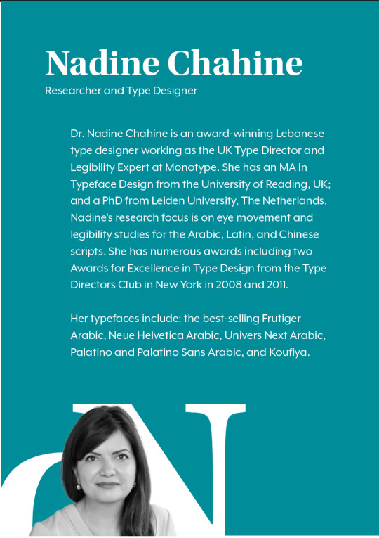
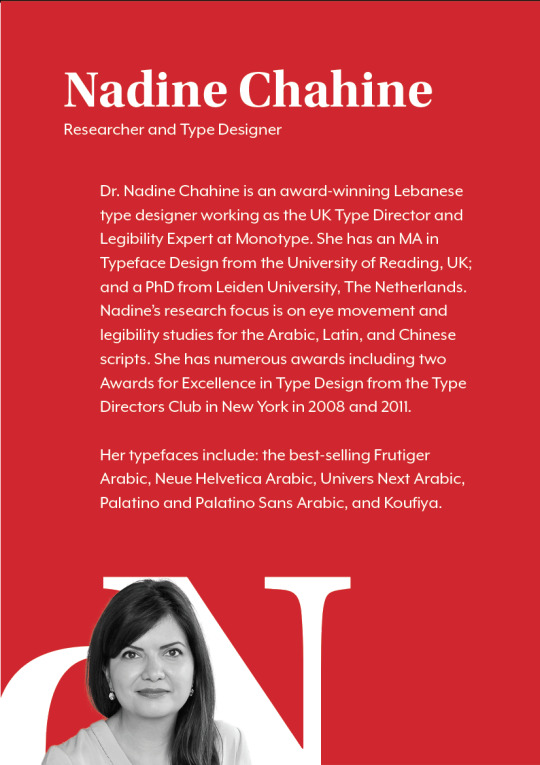
The photo of Nadine Chahine (used in the design) is from http://www.eyemagazine.com/feature/article/reputations-nadine-chahine
0 notes
Video
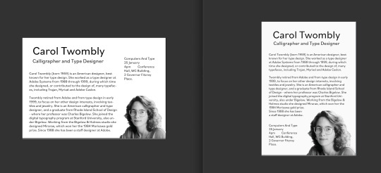
NOTE: Carol’s Twombly’s photo (that’s used in the design) is not mine, and is originally from: http://luc.devroye.org/fonts-26216.html
===========
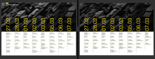
I chose to test layouts with Carol first because her page had the most amount of text. At first, I included her event timetable, which made everything too condensed as a brochure. Later I learnt from classmates that we didn’t have to put the event times in each person’s page and can just compile them all at the back.
I started with letters from Carol’s name floating behind the text, then the letters gradually made its way down. Later when I referred back to my research and found the one with colored blobs behind a person’s photo, I trialled doing the same thing but with her initials instead.
0 notes
Text
Orientation: Landscape VS Portrait
Note: Carol’s Twombly’s photo (used in the design) isn’t mine, and is originally from: http://luc.devroye.org/fonts-26216.html
In my previous booklet trials, I considered using landscape orientations so I tested them out. I originally thought the landscape orientation will allow more space (which it did) but it looks like it has more content than the portrait version (even though both contain the exact same texts).
0 notes
Text
Color Research
Color research on other typography conferences. I’ve found most of them are in warm colors (red, orange or yellow) and paired with black and white.
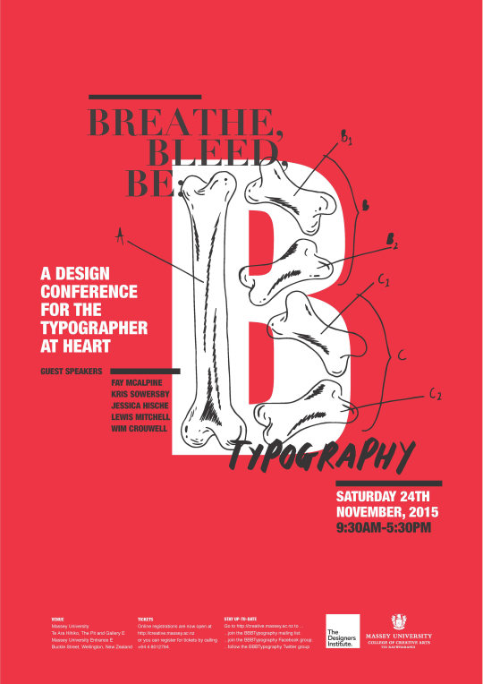
Image Above From: https://www.behance.net/gallery/26011357/Breathe-Bleed-Be-Typography-Conference
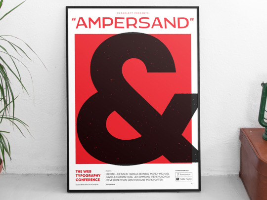
Image Above From: https://dribbble.com/shots/4666325-Poster-design-Ampersand-2018-The-web-typography-conference
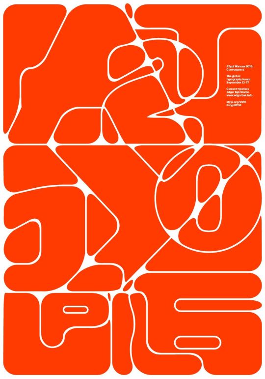
Image Above From: https://www.pinterest.nz/pin/514114113713943578/
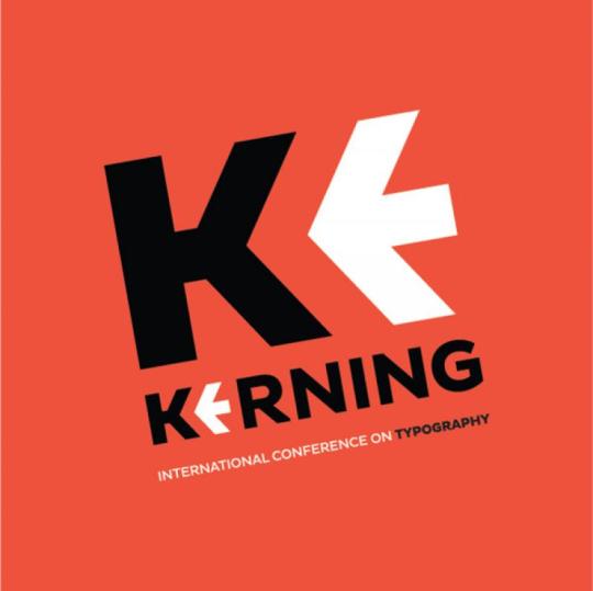
Image Above From: https://ifworlddesignguide.com/calendar/858-kerning-international-conference-on-typography
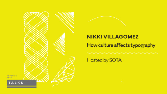
Image Above From: https://www.threebearstheory.com/work/typecon-2015/
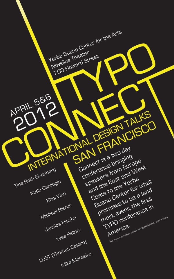
Image Above From: https://www.coroflot.com/DKVCreative/Connect-Typography-Conference-San-Francisco
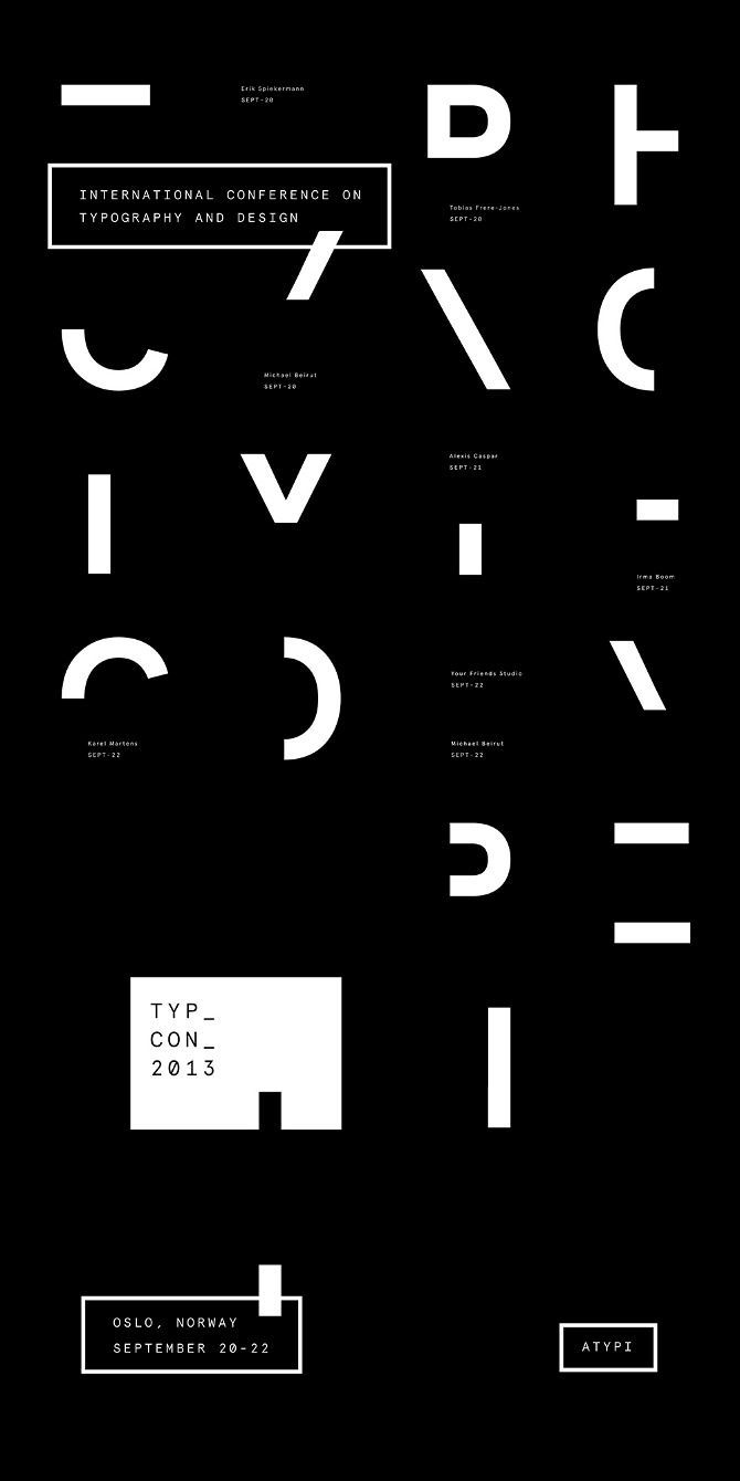
Image Above From: https://www.pinterest.nz/pin/369435975656383293/
Image Above From: https://www.pinterest.nz/pin/369435975656383293/
0 notes
Text
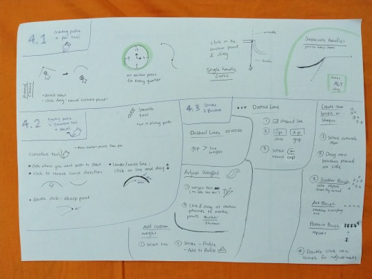
Pen VS Curvature Tool Practice
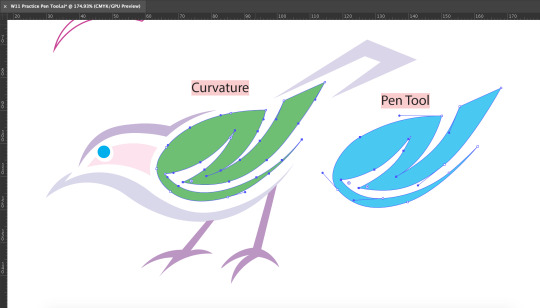
First time using the curvature tool. I’m finding that pen tool is quicker at making accurate complex shapes, but the curvature tool is great for making adjustments for existing shapes.
0 notes
Text
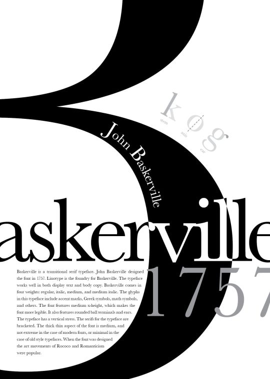
More Scaled Type Examples (layout research)
Here’s some more scaled type poster treatments that I might try:
Design above is from: https://medium.com/@ttang1/project-3-type-hierarchy-14b8f64befc4
Design above is from: https://www.pinterest.nz/pin/807270301926769235/
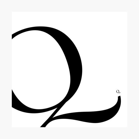
Design above is from: https://www.redbubble.com/i/poster/Scaled-Letters-Q-by-daphneplante/22572657.LVTDI
Like how this design scales up the letter to the point where it looks more like a shape/illustration rather than type. Might try this.
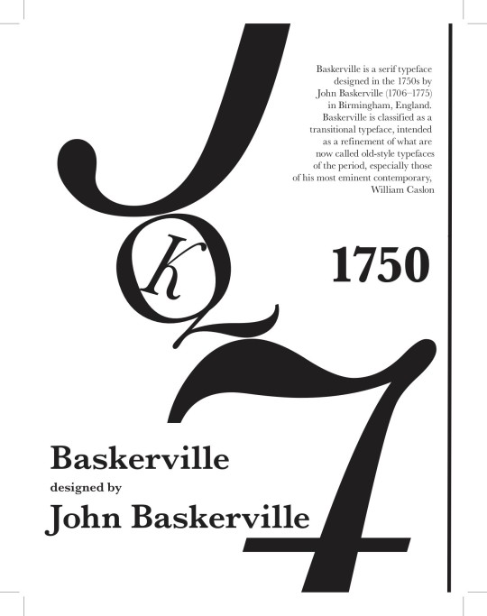
All three designs below is from: https://issuu.com/ltgillette/docs/baskerville_v7
Letters all pushed to the side
Layered Outlines
Linking letters
0 notes
Text
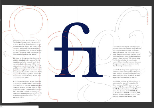
Layout Research : Diff Scaled Text
This method of treating serif typefaces is eyecatching whilst maintaining its professional look. I think I will model my publication after this style:
Designs below are from: https://www.behance.net/gallery/87080811/Summer-Showcase-2019
0 notes
Text
Typeface Choosing
For display, I’m thinking of these three typefaces from Adobe Fonts:
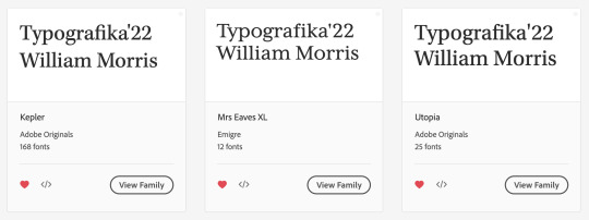
So far, I’m liking Kepler and Utopia most.
For body copy, I want a neutral sans serif. So I’m thinking of these two from Adobe Fonts:
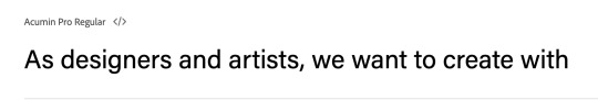
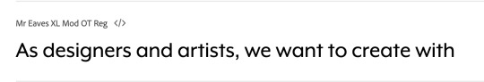
Mr Eaves seems to be giving off a more approachable feeling that’ll encourage readers to attend the event. So for now, I’ll choose Mr Eaves.
0 notes
Text
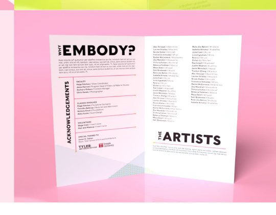
Layout Research _ Sideways Text
The sideways text in this examples ‘why’ & ‘the’ (in the headings) and the ‘acknowledgements’ seems interesting. Might be able to use it for the events timetable.
Design below from: https://www.behance.net/gallery/96924853/Embody-Wearable-Art-Show-2021
0 notes
Text
Layout Research: Angled Banner
I like the angled banner approach. This might work in my brochure if I put the name or event time in a banner like this.
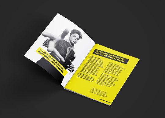
Photo from: https://www.behance.net/gallery/86878677/Platon-Magazine-Design-(Concept)
LATER UPDATE:
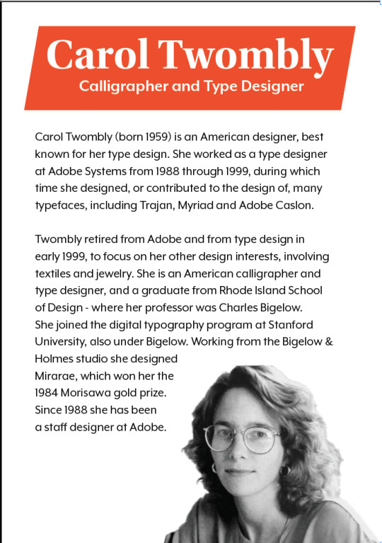
Carol’s Twombly’s photo is not mine, and originally from: http://luc.devroye.org/fonts-26216.html
This banner method doesn’t seem to be working in terms of style. It seems too young, and not very mature for my audience
0 notes
Text
Table Practice
Left: George’s example
Right: My practice
0 notes