
mi6011ikepearson
MI6011 - Professional Creative Production 1
35 posts
Don't wanna be here? Send us removal request.
Last Seen Blogs

missmothership
Miss Mothership


onesibold
Favourite Paintings

classicalsatanism-blog
Classical Satanism

Video
MI6011 FINAL FILM - “SARAH ICHIOKA: CHANGE IS NECESSARY”
my response to the brief;
thank you for following the development of this project~

hero image
A3 WRITTEN SUMMARY – “MI6011: IKE PEARSON”
PROBLEM
Ichioka is an Urbanist; and with that comes an understanding of how humans interact with the environment they live in; through my research I was introduced to concepts that questioned the way in which our current unsustainable lifestyle can be altered to allow both ourselves and future generations to live longer and prosper more
PROCESS
After researching the speaker (Sarah Ichioka) I read through a variety of articles, and studies to better understand the broader material, and used my insights to design a film uses juxtaposition between bright corporate visuals and much darker, moodier shots to address the severity of the subject matter
PROPOSAL
The problem at hand is one that needs to be addressed, and the way to do that is to reach as wide of an audience as possible – I made a film that is watchable, using simple visualisation of what is quite a complex topic to allow a broad public to watch, and be further intrigued to look into the subject matter; through the tonal shift towards the end that emphasises the severity of the subject matter.
DESIGN DOCUMENT – “MI6011: IKE PEARSON”

0 notes
Video
Ņ̸̲̼̖͇͖̖̯͈̅͂̈́͛̇͠͠͝Ę̵̪͚̗͙̭̮̼̭͉̎͆̃̎̍C̴͇̫̖̍̃͝ͅẼ̸̘̺̼̔̈̈́͒̓͝Ś̷̳̠̘͇̞͙̥̒̂͂̇̉͠.EXE
[ this is not the final film;
referring back to the RSA brief,
we are not allowed to adjust the audio, in any way,
nor adjust the maximum/minimum film length.
this film is an alt. I made while editing the final film, for a bit of editing practice.
the music comes from a piece I composed for my friend Tommy’s final animation, so don’t worry about that - I am the author of it, and all the sound effects were either recorded by me, are royalty free, or came from the original RSA approved material
(Sarah Ichioka’s: Change is Neccessary)
I left it here as a lil’ something extra,
( as well as hopefully pick me up some extra marks ;)
I hope you enjoy~ ]
0 notes
Video
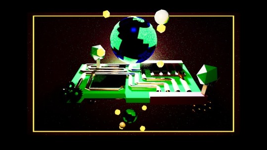
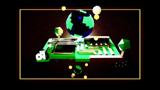
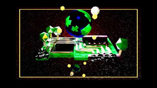
SHOT 13 - “MAJMIN”
bridging the gap can be a challenge; but with almost 130 years of waiting for change - we’ve got no time left to sit around; we have to be the ones to make a difference, before things are truly too late..
through the work of Ichioka, and others like her - urbanists have been studying human habitats, researching into ways to design places we can live, that advocate for the betterment of all life on earth - instead of the way things are currently set up, where the rich stay rich, and the rest struggle for their place in the world.
TWO DIVIDED WORLDS - “THE PROCESS OF MAKING”
when designing this shot, my main principle was a desire to really play into the “majority, and minority” aspect and showcase the replicate the separation between these two worlds.
I decided to showcase this through designing a scene that had two earths; one large, resting above the motherboard - with light shining on them, combining nature and artificial systems like gears and wires sprouting as a showcase of the fact that they are not the minority - a subclass who although being perceived at the top are in fact drowning under the burden of technology, living in darkness due to their perceptions of a division between them and everyone else.
the microchip was a challenge to get to look right, but I’m glad I took the extra time to get it to look the way it looks, now - as it encapsulates the vision I had for the shot, when imagining it in the storyboard and design phases.
of course, from this logic - texturing and lighting were the two most important processes to achieving success for this shot:

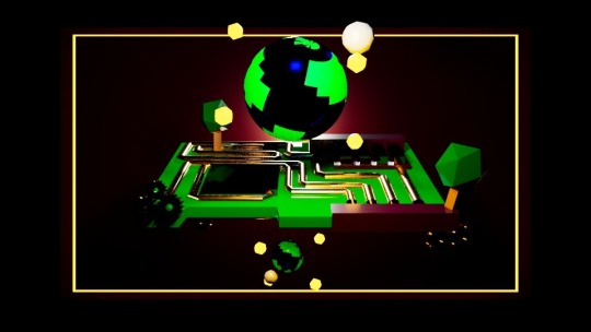
I started by applying some basic textures to each element of the models, to garner an idea of what sort of scene I was working with.
with the element all lined up, with my design work - I began to set up a lighting system that further my vision, and allow me to adjust the attributes of each texture to my liking..

I started by breaking the lighting system; by putting in an amount above what would typically be used, and from there it was a process of adjusting it until I found the sort of area that allowed me to showcase my flair for the more dramatic..
I went through multiple lighting rigs to try and find the best set up - adjusting the attributes accordingly - with an emphasis on showcasing the way in which the sun rises from behind the microchip
originally I was set on using the silhouettes for the “majority” earth - but when running animation tests, I thought it made the “minority” earth look like the positive, and vibrant - so I decided to make the green more visible, by placing a simple three point lighting system around the larger earth;
with the continents visible, it was time to spruce things up
I started by creating lighting systems for all the elements that were invisible up until this point (mostly gears) and began adjusting the textures of each asset until I reached the sort of vision I was envisioning through my designs.
it was important to me to showcase the importance of merging technology with nature, rather than outright replacing it - as humans are more likely to be agreeable when elements that are enjoyed through both are implemented, as you can’t have one without the other - instead having people accustomed to the positives that come from both sides of life.
BEAUTY SHOTS - “ALTERNATE ANGLES OF THE SCENE AT PLAY”
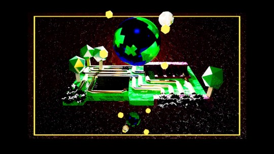


MajMin was designed to be the Yin-Yang of urbanism - blending elements from both the natural and artificial, in a low-poly style that’s simplicity is readable to a general audience, whilst showcasing the drama from such a serious subject matter..
EXPLAINING THE SHOT - “JUSTIFYING ITS EXISTENCE”
where divides exist - there is always the possibility of overcoming said gap - and though people like to be divided, as it gives them a sense of belonging, in what can only be described as a harsh, and unforgiving world, there will always be those who see the bigger picture.
whether you are the “maj” or the “min” of the scene - when designing the shot, I was sure to design it to feel warm, and hopeful, so that no matter which side of the argument you’re on, you’ll feel spoken to.
the majority earth is larger, more prosperous and thriving - living in light, as they are reaping the benefits of everything the world has to offer: both from natural elements like the trees, and the more artificial (gears, microchip, etc.)
Ichioka speaks passionately of designing a community that puts care for all life, no matter who they are - this is the visual representation of such a concept.
should you make the active decision to turn away from the film, and do nothing, you’re repeating another 130 years of negligence to what’s going on;
you are the minority earth.
its swim or drown, and the choice is yours.
0 notes
Video
SHOT 12 - “A REALISED MINDSET”
plunged into darkness, and tasked with finding new purpose for the work, we’ve done - we are invited to witness the result of our species’ greed, in its full swing, as a shred of hope blooms from the mountains of paper, from the unfulfilled promises of the past..
the optimist in me likes to think that there is still time to turn things around, and have a positive impact on the world we inhabit - so rather than leave things on a depressing note: I left things open ended, with the blooming of a singular flower, from the piles of discarded paper surrounding it.
FROM THE RUBBLE - “THE PROCESS OF MAKING”
originally, this was designed to be my final shot - with the imagery of a flowering earth, amongst reminders of our mistakes being a powerful point to end on, but I felt that repurposing the imagery, as a “realised mindset” was a much smarter move, to add a layer of depth to what would have otherwise been a very bland shot, while removing a distracting layer of complexity from shot 13
in essence, the shot comprises of large paper mountains; that consist of multiple extruded cubes, duplicated and resized, that when combined with the low light make for convincing assets that really emphasise the sort of sense of scale between the chance at humanity prospering, when continuing at this rate, and failing - and thus the flower, and us, dying.
BEAUTY SHOTS - “ALTERNATE ANGLES OF THE SCENE AT PLAY”

EXPLAINING THE SHOT - “JUSTIFYING ITS EXISTENCE”
a realised mindset takes what is both one humanities best, and worst attributes.
our adaptability.
no matter the situation, and how impossible the odds are stacked against us - I guarantee that there are those among us who will persevere; self-sacrificing individuals, who live their life in a way that attempts to protect everyday people from suffering.
climate change has been a known issue, since the early 20th century - where, In 1938, Guy Callendar connected carbon dioxide increases in Earth's atmosphere to global warming using studies that originally conceptualised as far back as in 1896, where scientist Svante Arrhenius predicted that changes in atmospheric carbon dioxide levels could substantially alter the surface temperature through the greenhouse effect.
yet with almost 130 years of proven data - we, as a society turned a blind eye to the knowledge, as the evidence piled up more and more; to an overwhelming amount,
( sound familiar to the shot? ;) )
where now it has been somewhat accepted by politicians, across the globe - yet nothing is done about it.
Ichioka’s words advocate for change - so that another 130 years of negligence don’t have to occur for something to be done about it.

the paper can represent many things; money, capitalism, 130 years of neglected data - but to me, as the designer, it was a representation of humanity’s consumerism.
though people often say they will do something to "solve” climate change, we haven’t - as it is grounded in the way we live our lives;
we consume and consume until there’s nothing left to consume.
we blissfully ignore the atrocities of the world, to separate from the guilt of living “normal” lives
we promise to do something; but discard these promises until they form mountains
the blooming flower is the hope that from our greed, good may still come for the planet - and although small, in comparison to the rest of the stage; it remains brightly lit - as a promise that things will be ok, in the end - if we do something about it.
and that starts by trying.
0 notes
Video
SHOT 11 - “FINDING PURPOSE”
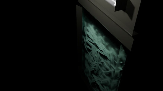
with strands of shredded paper surrounding the scene, extending far beyond the darkness; we watch as we struggle to find new purpose - watching our hard work be shredded in front of us, as things begin to feel very futile..
I love the contrast between shot 10, and 11 - with the light acting as a transition, you’d expect to end up somewhere light, and wonderful, which is what I think is part of what makes this initial juxtaposition so powerful; only furthered through the design of the final two shots.
MAKE IT RAIN - “THE PROCESS OF MAKING”
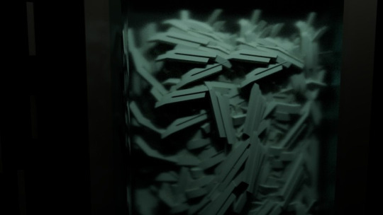
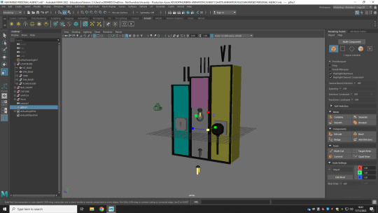
I started the scene by making the basic shape of a shredder, complete with a big red button - that is pressed in, as the book is tossed in from off-screen - beginning the shredding process.
small shreds of paper fall into the box, which is already full - as layers upon layers of more shards fall in the background.
I made sure to be really sparse with lighting - with a single light that shines upon the central focuses of the shot; the shredder and the book - with only subtle lighting on the shreds of paper, which gain their significance as the camera pans down, we plunge into darkness.
BEAUTY SHOTS - “ALTERNATE ANGLES OF THE SCENE AT PLAY”
I think ‘finding purpose’ is one of the more powerful shots, when you take a step back;
if I were to do this project again, I would emphasise its significance more, beyond just a transitional shot by giving it more stage presence.
EXPLAINING THE SHOT - “JUSTIFYING ITS EXISTENCE”
life is a complicated thing.
it’s unique in that, nobody can definitively confirm its purpose; and each individual has their own interpretation of what meaning they devoid from their existence.
however, some people spend their entire lifetime without a sense of purpose;
searching for something greater in the world they find themselves stumbling around in.
through being told to maximise personal agency, and find new purpose - I think that Ichioka is breathing a new sense of purpose into the audience; and inspiring them to rise to the occasion, and be the difference in the world, that they want to see.
when visualising this shot - I wanted to showcase the reinvention, by having the work we have spent so long building up, through the animation - and throwing it into the shredder; with the pieces of paper, a staple in our money-hungry society, being both a reinvention of our work - but also finding new purpose, in the next shot of our film..
0 notes
Video
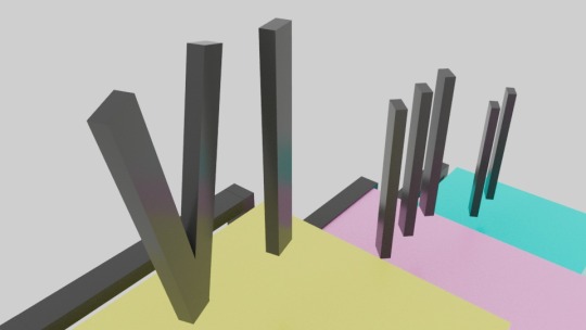
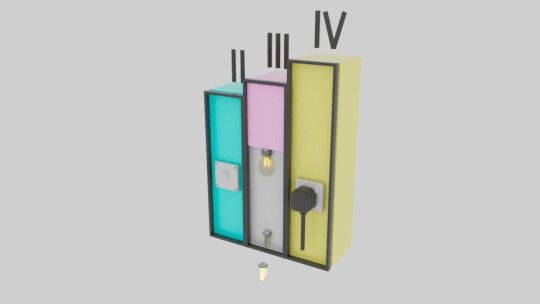
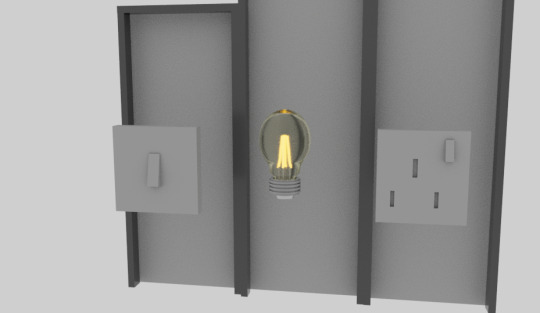
SHOT 10 - “MAXIMISED PERSONAL AGENCY”
taking positive action can come from something as small as switching off and or unplugging a device that isn’t in use, to throwing yourself into the belly of the beast, by dedicating yourself to a cause, becoming an activist, advocating for the right to live a long and prosperous life on earth.
quite literally taking the idea of “the next step” - we see a coloured staircase, that houses three of the most basic, low effort ways that a general viewer could aid in the battle.
SMALL DIFFERENCE, BIG IMPACT - “THE PROCESS OF MAKING”
when originally designing this shot, I liked the idea of using a multi-tier staircase as a play on “step 4″, with the numbers on top “II’, ‘III’, and ‘IV’ respectively - and having it transition lower, to showcase three easy means of going more green.
I chose to use the three background colours from the previous scenes of each step (step 2′s cyan, and step three’s pink) and finished it off with the third of the primary colours, with step 4 being showcased through the colour yellow
I think the most important part of this shot’s success was the black boarders that divide each of the pillars - as they define the shape, further - as well as add a layer of depth to the transitional space, when the camera pans down, into the next shot.
the asset is one that I’m extremely happy with the production of - looking like a product I would actually want to own, as a memento from making this film
BEAUTY SHOTS - “ALTERNATE ANGLES OF THE SCENE AT PLAY”

EXPLAINING THE SHOT - “JUSTIFYING ITS EXISTENCE”
when Ichioka speaks of maximising our personal agency she is attempting to empower the audience, as realising their actions have consequences - and that they, as an individual, are able to make a substantial difference.
I chose to visualise this, in a way that is readable to a general audience; through using energy saving techniques, that are established into most households - as a way to show people that through even the smallest of actions, they have sparked change in the world - and can do more, to aid.
the light burning brighter, from the energy-efficient bulb - consuming the screen, as a visualisation of the small spark that a singular action can have; causing the radiant embers of change to burn brighter and brighter;
this light is, however, the transition to the next part of our film - as when things are at their brightest,
they can only go on one direction..
0 notes
Video
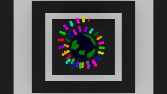
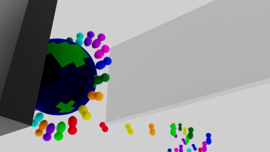
SHOT 9 - “THE CENTRE OF LIFE”
beyond the boarders of what you perceived to be the void, instead was actually a wall - behind it, showcased is the circle of life; with people from all over the world, regardless of shape, size or colour, coming together and uniting for the betterment of everyone, rather than specific individuals
ả̸̻͈̥͍̍s̴̨̏̌̕͜ͅ ̸̻̼̪̈̿t̸̫̼̬͉̉̂ḫ̸̽̊̉́e̸̗̞̪͕͛̀̄̕ ̶̪͙̿̔̋ḟ̶̜̲̗͓͂̕͝ả̵̜̃̊̑ḅ̵̒̽͠r̴͍̝͔͈̋̉͋̚í̶̛̭͖ç̴̭͇̟͘ ̴̭̥̱̟̈̈ö̶̙̔͗ͅf̷̠́̍͋ ̴̙̩͆͐̚y̴̦̲͂̃̂ŏ̸̧̭͙̆û̷̝͍̖̣́r̴̥̋̎ ̴͈͕̻̮̄̽̕͠ò̶̟̙̉̈́͗ͅw̷͎̅n̵̥͉̠̞͗̔͑̕ ̴͚̥̖̀̎̐͜r̴̡̭̄̾ȩ̷̩̹̽̈́͒ä̶̲̩̺͙͆̾̿l̵̢͙͍̺̄̈́i̴̾̽͒ͅẗ̶̡͈̲́̈́̈́͑y̶̛̮̱̱̱̾̿͊ ̶̨̟̟͓̂̿̋b̶̤̗̱̈̓ḛ̷͠c̶̻̯̹̘̀̌̓o̷͎̙͝m̵̢̦̞͌͗é̴̳̻̬s̶͇̿̎͒͗ ̴̰͎̀́̂t̵̬̿̄͗̊ơ̶̡̳̣̈̌͆r̷̺̭̤̘̍n̷̡̧̬̾̕,̵͕͈̎̈́͋̿ ̴̬̣̊o̵͎̍͌ͅn̵̳̾͐l̴̢̹͙̈́̂y̵̡̘̳̘͒̄̚͝ ̸̮̹̞̔̍̌͜ṭ̴̛̆̀ḧ̴̢̨̘̙́̒e̴̡̢̍̍͗n̶͎͊͝͝ ̷̪̊̂̎ẃ̶̹̟́͒i̴͖̩̪͔̓l̷̺͕̓̇͋ͅl̶̻̻̺̑̅̓̀ͅ ̵̞̓ȳ̸͍́̀͜o̶̜̯͎͐͛ü̷͔͇̩ ̶̢̱̄͠b̴̖̝̠͍̿ĕ̴̞͂ ̵̧̩͎̪̾a̶͔̰̲̿̿͜b̷̧̺̔l̷̬͎͂̏ȩ̸͚͇̳̍ ̴̛͍͔̩͒͗t̸͈̞̆̕o̴͚̙̿͝ ̶̘̠͚̑́̿s̶̱̈́e̸͕͉̼͕͆̿e̵̼̞̿̿ ̴̠̗̦̟̇ṯ̷̺͊̽̆h̸̭̠̎͒͌e̵̺̽͊̈́ ̶̩͚̅́̚͜ḃ̶̤͓̩͔́e̴̙͛̌̎ą̶̱̤̿̎̈͆ǘ̷̘̻͆̓t̸̫̥́̎̔y̸͉̘̓́̊ ̸̹͓̮̑̾̅t̶̥̩̲̳̂͆̅̍h̸͍̍a̵̜̙̋̏͗t̸͓̩̥̊ ̵̼̃̏̎̾l̴̖̓͋͝a̶̦̯̲͍̍͂y̵͈͑̒͂s̶̮͆̏̎̏ ̶̧̯̜̅̅͜b̶̢̂̈̈͝è̵͍͉̍͆̏ý̵̼͍͇̩͘͠ȯ̸̪n̸͍̐̎d̸̥͔̥͙͛͆̅̐ ̴̡̳̑ỷ̴̳̝̮̲͛o̶̹͌̾ų̷̙͓̥̑͑̆̀r̸͔͎͋̎̽ ̵̫̮̭̮͑o̷͍͉͆w̵̖͝n̸̹̪̱̂́ ̶̻̹͑̀ç̵͙̻̀͒͗̔o̴̤͆m̵̡̿̽͘p̵̡̮̰͚̃̿ř̷̘e̸̤̱̒̓h̸̠̻͑e̴̫̻͒̀ͅn̶̜̜̱͒̆̇̒s̷̟̊͠i̸͙͓̺͂̓̅͘ò̷͖͓̗̮͛̚n̸̪͔̼͆.̶̮̲̈́̾̆
THE WALLS HIDE SECRETS - “THE PROCESS OF MAKING”
this shot featured more animation that a majority of shots - with the amount of moving components in it making for a fun shot to make, due in part to the clarity in its original design allowing me to transition from 2D to 3D much easier than one would have originally anticipated
I started by modelling the wall, and exporting the earth asset I had used earlier - adjusting the texturing to give a more basic texture, that combined with the less intense lighting rig lead to a much more colourful and simplistic shot that plays into the simplicity of the corporate style I was working to achieve.
with the positioning correct, from the camera; I placed a textureless cube and stretched it to fill the boarders of the screen, adjusting the colour to better match the previous scenes, and figured out the timings; having the ‘doorway’, as I described it in the asset-names, open to reveal the background.
I added some subtle spinning to the earth, which was difficult at first due to the axis, but after figuring things out using good ol’ fashioned mathematics I managed to get the outcome I wanted from this, with it matching the way in which the source material moves.
the final part is what makes the scene, in my opinion - consisting of multiple board-game-esque colourful characters; that pop on screen with energy, float around as if under the effect of zero gravity, and then shrink back into nothingness.
this was achieved through an understanding of the principles of animation that I applied in combination with a clever spacing of key-frames to give the intended effects.
as the figures pop into place, they expand at incredible speed - and once they hit their intended size, I put in simple one frame expansions, that made them appear more bouncy - the same concept was applied when they shrink, for the same reason.
this was labour intensive process - but one that was more than worth it, for the final outcome, in my opinion.
as they reach the end of their path, they serve as a pathway to showcase the circle of figures, that cover the earth;
I was originally going to have multiple rings, but when put into practice this looked overtly distracting, in combination with the background, drowned out the speech, so I opted for a singular ring, instead..
BEAUTY SHOTS - “ALTERNATE ANGLES OF THE SCENE AT PLAY”

EXPLAINING THE SHOT - “JUSTIFYING ITS EXISTENCE”
from Ichioka’s message I attempted to visualise that through the preservation of positive mindsets, we can reach a harmony between all life on earth;
by not putting the people in the centre of the frame, but the earth - and the people instead surrounding it, as we are the inhabitants.
I wanted to use the pathway of figures to showcase how through individual, sacrifice, we can reach this idea of complete tranquility - with an equity between all humans.
the way the figures appear, and then disappear represents the temporality of this - with the end result being worth the hardship, in the end.
the wall being lifted to reveal this is an opening of one’s mind to alternative ideas, than the ones we experience in our daily life.
( the aforementioned “new and recovered mindsets”, and “shaped narratives” from earlier shots. )
0 notes
Video
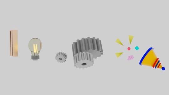
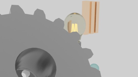
SHOT 8 - “NEW RECOVERED”
another instance of Ichioka listing - and through her speaking in such a manner, I envisioned the ability to use my alternate idea for the “identify, debunk and reject” shot - having the assets appear in a line, and scroll alongside the screen
this is yet another example of a shot, that I’m very proud of - with each of the assets matching the tone of the film, through their soft modelling and exaggerated / energetic movements that really hammer home the visualisation of concepts to a general audience.
LISTING PART 2 - “THE PROCESS OF MAKING”
each of the assets features slight, subtle animation to make the scene feel more alive;
the bronze/copper ‘III’ slightly tilts to face the camera; with its prevalence remaining constant until it is off screen, with it being reminded that this is Ichioka’s third point up until the end of its run-time
the lightbulb’s filaments, slowly and subtly expand to increase the transmission of light through the glass of the bulb, to visualise the process of having an idea; starting when spoken - through its short screen time
the gears turn, as gears tend to do - however they are functionless, so I instead opted for having them turn in alternate directions, in ways that their teeth would never interact with one another; thus showcasing their lack of pupose, as they are “developing” an idea
the party popper shrinks before expanding, and then returning to normal - to convey its sudden explosive movement by employing key elements of squash and stretch from the principles of animation
if you look closely; the confetti from the party-popper are all recycled assets from the last scene;
with not only three yellow triangles - but the red ball, blue square, and pink coil as well, further playing into the theme of upcycling, recycling, reducing and reusing.
BEAUTY SHOTS - “ALTERNATE ANGLES OF THE SCENE AT PLAY”


EXPLAINING THE SHOT - “JUSTIFYING ITS EXISTENCE”
though the visual language for imagine, develop and celebrate is self-explanatory, I feel it still important to highlight, here..
the lightbulb is used for imagination:
a showcase of a cartoonish trope that represents a moment of enlightenment - visualised through the flip-of-a-switch action from the idiom, “to have a light bulb moment”.
I used cogs to represent the process of development as the concept of turning and rotating gears is a good visual metaphor that showcases the process of a step by step process due to them being a system of interlocking parts that work together to achieve their function.
and to celebrate - a party popper; complete with confetti, as you celebrate at a party~
Ichioka’s point alongside this shot, and the following is to hold onto and protect the notions of which are going to best care for all of earth’s inhabitants.
I chose to have these mindsets showcased, encased inside of a bubble, as it is a soft and smooth shape that is using its physical form to embrace the two concepts;
they appear small, in regards to everything else on the screen due to the fact that they are in essence just small things..
but as will be seen in the next shot - they have a big impact
0 notes
Video
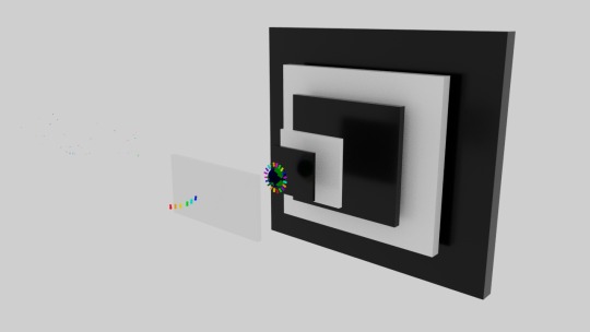
SHOT 7 - “SHAPING A BETTER ARGUMENT”
sometimes in life, to find the solution, you need to be adaptable: and I attempted to showcase some “out-of-the-box” thinking, really leaning into the idea of “shaping” a better argument - by using the three provided assets as a means to problem solve, and complete the shape - by filling in the hole.
the preliminary designing behind the shot was colour - with the solution to the problem being as obvious as possible, again to fit in lines with our corporate-style beginning; that will appear more readable to a general audience.
ADAPTING TO THE SOLUTION - “THE PROCESS OF MAKING”
I found that modelling the piece was an extremely simple, worth-while process - as it turned out nicely, and the real validity in the shot comes from its simple yet effective design, and I think the movement in the frame reflects my artistic vision, and looks visually appealing, too.
the colour scheme was the most important part of this, for me - I had the pink background from the brain transition, and looked for soft pastel colours that worked well - and after experimenting with different colour schemes, I opted for softer versions of the three primary colours - as their sharpness work well to contrast with the brightness of the pink, without it being too harsh.

the only difference between the final shot, and my storyboard was the use of a helix, instead of a star - as I felt it looked a lot nicer, amongst the geometric shapes, when the piece was fully composed.
the sharp edges of the two quadrilaterals in the scene were beveled to make things look softer, and more corporate, without compromising the strong silhouette that makes the shapes identifiable.
BEAUTY SHOTS - “ALTERNATE ANGLES OF THE SCENE AT PLAY”


EXPLAINING THE SHOT - “JUSTIFYING ITS EXISTENCE”
Ichioka’s speech continues from the last shot - with this being the response to her line on how to dislodge previously established biases.
in order to dislodge the story, you need to shape a better argument that makes people want to side with your cause, instead of oppose you, as your view differs from what has been established.
through my designed visualisation, a general audience will be showcased the concepts she discusses:
having the story dislodged, in the scene before, and revealing the cause to be the shaping of a new narrative, in this scene.
0 notes
Video
SHOT 6 - “DISLODGE A STORY”
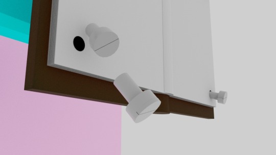
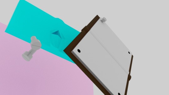
using the pink from the brain as a transition; our next shot takes place in front of a similarly pink background; showcasing the unscrewing of a book to take us to our next step in the stage-play~
when asked to design for dislodging a story; my brain wanted to try something quite literal - and as such I made a simple book model, filled it with four holes, and thought of a way to knock the whole thing over, with a simple unscrewing mishap..
THE SPANNER IS MIGHTIER THAN THE BOOK - “THE PROCESS OF MAKING”
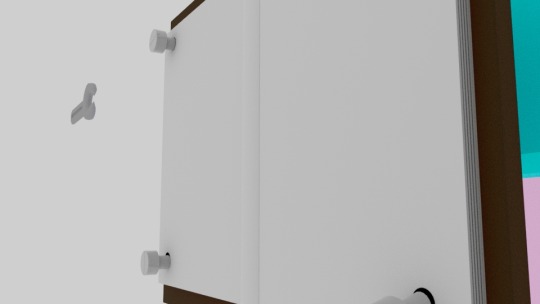
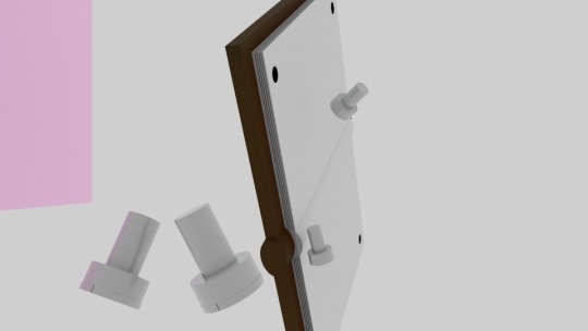
the book asset was relatively simple; in that a book consists of a cover, spine, and multiple pages.
for the cover, I went for a classic leathery look, and made the spine hollow - as a place to hold the pages - which were made from a single cube, that I opted to use the multi-cut tool to shape to look like multiple pages, rather than duplicating multiple cubes.
the screws, are again, recycled assets - playing into the theme of our film; as they have appeared in the alarm, from “urgent!” the see-saw contraption from “tipping net positive” and a few other surprise appearances throughout the film’s run.
the spanner was used as it was the most readable tool for unscrewing in my opinion.
BEAUTY SHOTS - “ALTERNATE ANGLES OF THE SCENE AT PLAY”
EXPLAINING THE SHOT - “JUSTIFYING ITS EXISTENCE”
to dislodge a story, means to take it out of its current position - and in the context of Ichioka’s speech she means that you can’t always convince people to give up their prejudices, especially not by arguing with them.
instead, you have to work hard to raise an argument that they will want to defend - and thus removing and replacing it, from its original position.
I chose to showcase this through the primary focus of a book that has been bolted into place; stationary, but not immovable, as with the right toolset you can dislodge the story, and make way for the next scene, that is shaping your own narrative
0 notes
Video
SHOT 5 - “COGNITIVE NEUROSCIENCE”
despite being insignificant in the long run, this shot is highlighted as its own due to the time taken to model this bad boy, for what is essentially a few seconds of screen time..
I really liked working on this shot - since it allowed me to put some more complex modelling techniques to work, that didn’t take away from the intended corporate style: I’m especially proud of reducing the amount of textures I had - repeating the one used on my “positive orbs” from the “tipping net positive” shot - as the green sludge emerging from the bottom of the brain..
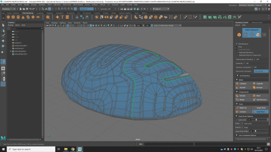
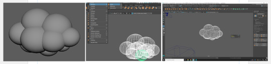
A BIG OL’ BRAIN - “THE PROCESS OF MAKING”
in all honesty - I originally had no idea of how I was going to tackle modelling a brain, when I first thought of this shot, in the design process..
when you think of a brain it is so obvious what it looks like, in your mind, but executing it can be a challenge:
so I started by gathering references, from the internet - and noticed that the seemingly random groves in the brain were not as random as I originally thought - so I began by making the basic shape of the brain, out of geometric shapes, and went from there.
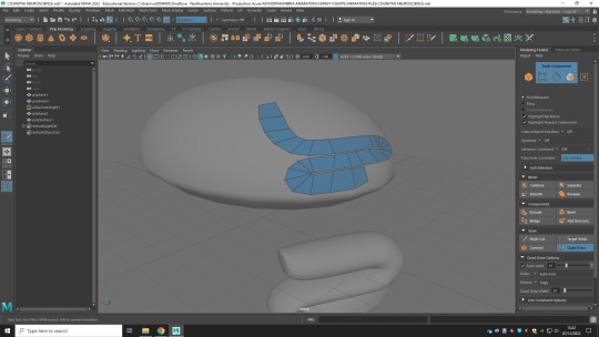
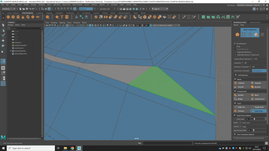
from this basic brain shape, I used the quad-draw tool to draw on some sections that although initially had me worried, weren’t going to work due to the amount of space left to cover, and myself being too delicate in my process:
hung-up on slight imperfections in the curvature, and lines not lining up the way I wanted them to..
but eventually the whole brain was covered; and I was left with something resembling a brain, which I thought would be the end of my process, however I was wrong.
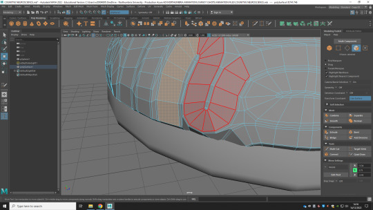
originally when I extruded the face, as I had planned - the brain did not take the sort of shape I wanted; looking a lot more blocky than I had anticipated..
so to rectify this, I decided to experiment with the multi-cut tool, which when holding shift identified my lines and allowed me to indent them further, so I could try extruding them again
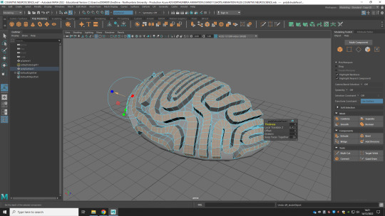
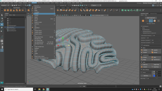
gaining more of the sort of shape I was looking for, I decided it was good enough to smoothen, and from there I duplicated it, mirrored on the other side to give the illusion of a full brain, and textured it in a fleshy pink way
the slime was also done with the quad-draw tool - where i took the final shape, extruded it slightly, and smoothened the shape to give the illusion of a puddle; although the texture of the goop was unable to show the colour - so I opted for making a second, much thinner puddle underneath, that was opaque enough to allow the colour to shine through, in all its gross comedic glory~
BEAUTY SHOTS - “ALTERNATE ANGLES OF THE SCENE AT PLAY”
though another in a long line of tedious processes - I think the results speak for themselves, in the end..


EXPLAINING THE SHOT - “JUSTIFYING ITS EXISTENCE”
throughout all of my projects; I’ve attempted to put a little bit of something funny in there, to give it a little of my own visual flair, and when tackling this brief; it was no different.
with the corporate style identified, and being followed, as a cover for the ending shots - I originally was planning on having blood seep from the brain, to show the cracks in the façade showing; but decided against it, for fear of it taking away from the juxtaposition, as well as taking the stereotypes of a creepypasta; where everything ”becomes hyper-realistic” and “blood” for the sake of eeriness.
I think having the brain drip green slimy goop is cartoony, and a simple way to visualise “cognitive neuroscience” as being a fancy for word for the study in the way that humans think, specifically focused on how it relates to the biology of their brain.
0 notes
Video
SHOT 4 - “DEGENERATIVE MINDSETS”
with a lot of words spoken in a short space of time comes a shot, that when edited with freeze-frames is able to keep up with the task of working alongside Ichioka’s voice to help the audience visualise the sort of process she is speaking about
despite “urgent” and “majmin” both being staples of the project - strong shots that I developed, and am proud to see the end result of - it was this shot that takes responsibility for the direction the project takes; as it was my over-compulsiveness around the listing from Ichioka, here that got me interested in making a corporate style video to match the tone of her voice..
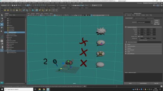
CLOUDS, CROSSES AND CRUD - “THE PROCESS OF MAKING”
this was funnily enough the first scene I started modelling assets for - out of concern that it was going to take the longest, due to the sheer number of assets needed..
a number ‘2′ (funny, I know)
a magnifying glass
a thought bubble
3 forms of red crosses,
(each to better showcase a stage at different speeds of the movement)
a speech bubble
a skull & crossbones
a representation of a paradigm
spikes that match the speech bubble
and topping it all of with a stylised earth~
each asset came with its own difficulties - but using the tools available to me, I was able to get each of them working in the style of the film, pretty easily.
shaping the 2, was tedious, as I started with a singular cube, and extruded the end-face, to create the shape;
( which was much more labour intensive than going to “create<type” and picking a generic sans-serif corporate font. )
the magnifying glass’ lens was invisible at first due to the high exposure from my three point lighting system; so I instead dialled it back a tad, and made the material more opaque
the thought bubble was a simple process of combining the meshes of multiple circles, so that the overlap was deleted, and only the outer shell remained - then adding three grey dots for the elipses, and three more balls to replicate the connection part
the red crosses were all done by hand, so that in motion they looked like they were blurred from moving so fast, as well as the fact that it allowed me to better match the silhouette of the previous asset - for a more seamless transition
the speech bubble was simple; in that it was an elongated circle, along the x axis, and a smoothened cone shape put together,
skull & crossbones were a case of building up shape using basic geometric shapes to match the corporate style
the paradigm was four coloured cubes, turned into a generic pattern
the spikes were a group of cones, that shared a mesh; so they could shrink in sync, without being tedious
and the stylised earth was a sphere, with a marble-blue and rugged noise encoded green, with purple and white subsurfaces applied to it; to give it a unique appearance under the harsh lighting.
I think everything comes together nicely and matches the original storyboard scenes, no real complaints from me~
BEAUTY SHOTS - “ALTERNATE ANGLES OF THE SCENE AT PLAY”


EXPLAINING THE SHOT - “JUSTIFYING ITS EXISTENCE”
when something has become the norm; it can be hard to change that.
in this shot, Ichioka suggests the process in which to make a change:
by identifying the issue,
figuring out a way to solve the issue,
and finally solving the issue
within the context of the film, this method is being instilled in an attempt to take validity away from the pre-established negative mindsets, and systems in place that oppose a positive change, and in turn harm the planet and the people who live on it.
( that’s us~ )
I attempted to showcase this concept through simple, readable visualisation - that when accompanied with the dialogue should effectively convey the message to even the most general audience - with its use of strong, literal imagery, common in corporate/educational films like these.
0 notes
Video
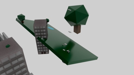
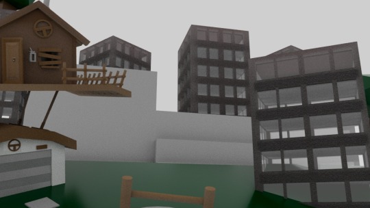
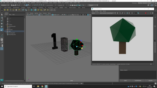
SHOT 3 - “CHANGE IS NECESSARY”
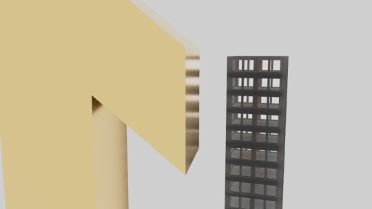
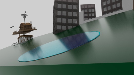
taking its filename from the title of the work - Change is Necessary is a shot that uses clever perspective to showcase the sort of positive change we want to see in the world - with the implementation of greenery into urban areas; which both improves the city’s appearance, but more importantly provides positive effects on the environment
my favourite part about working on this shot was working out the way in which each of the primary line assets (the number ‘1′, the building, the tree) were going to fall into place, concealing the item before it - and getting it to look as smooth as possible; with just the right amount of distance between them so that they are completely concealed, but not too far away that it becomes too large in comparison..
OVERRUNNING THE CONCRETE JUNGLE - “THE PROCESS OF MAKING”
all of the assets were simple enough for this shot - in terms of technical skill.. the difficulty instead lay in the composition of this shot - with the positioning being the “make-or-break” of the whole ordeal.
when converting from 2D to 3D, there always comes the difficulty of a whole other dimension being added.
but through a human understanding of perspective, with closer objects appearing larger due to their increased proximity, and of course the opposite for the other end of the spectrum - I was able to recreate the shot from my storyboard in a fulfilling way.
I felt the initial circular pond I had made, didn’t have the effect of water; so I created a semi-opaque layer and used bump mapping to give it the further the illusion of water, whilst still maintaining the cartoony, simplistic corporate graphics present throughout the film.
I chose to texture the number ‘1′ with a metallic gold, as that is a material that is commonly associated with the number, due to its prevalence in trophies for achievement.
the buildings are identical, and off-grey to showcase the dullness of the current world we live in, consumed by corporate greed - with what was once wild-land, now reduced to concrete, brick and steel..
this is juxtaposed by the green of the natural park, enclosure that is brought into play - bringing some much needed colour to an otherwise dreary environment, to subliminally hint to the audience the positives of Ichioka’s message, beyond just her words.
BEAUTY SHOTS - “ALTERNATE ANGLES OF THE SCENE AT PLAY”
when looking back, I think my only complaint with this shot is it attempts to achieve a lot in a short space of time; which translates into visuals that partly distract from the speech; maybe reducing the amount of movement, with the tiles and the house forming - and having the park be more furnished with shrubbery and trees would both be features I would take into consideration with the element of hindsight..
EXPLAINING THE SHOT - “JUSTIFYING ITS EXISTENCE”
“first we must recognise that change is necessary”
in such a short space of time; I couldn’t have been more literal, with this shot - with it coming in strongly, preaching the good word of the sort of small change that can be instilled into the world, and have a major impact.
as an urbanist - Ichioka studies the way in which humans live, and that includes both the effect they have on their environment, as well as the effect the environment has on them..
my further reading showcased that when compared to rural areas, those living in urban spaces suffer a 40% higher risk of depression, and are 20% more susceptible to anxiety, along with the casual loneliness, isolation and stress - as we, as a species are naturally programmed to want to live in nature.
which is why our eyes are most susceptible to green - and thus, why its mere presence livens up an otherwise dull and dreary scene, and erego why I designed this shot, in this way~
0 notes
Video
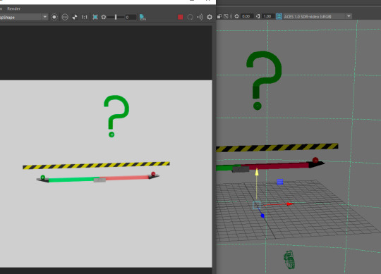
SHOT 2 - “TIPPING NET POSITIVE”
taking the rubber-ball idea from my design process, and running with it; I decided to quite literally tip the scales, and comedically showcase the sort of net-positive impact that Ichioka’s words attempt to employ - with an overwhelming number of rubber balls forcing the negatives to be launched off-screen~
the flow from the transitions both into, and out of this shot, are parts of the film that I really like - as it helps the whole thing feel much more seamlessly connected..
BOUNCING BALLS, AND THE ULTIMATE QUESTION - “THE PROCESS OF MAKING”
my number one priority when working on this shot was making the balls look gooey; so experimenting with texturing for both a red, and green gooey substance, took a majority of the work;
I experimented for a while, trying different approaches - but I came to the final result by creating a thick shiny coat, over a darker subsurface that created the illusion of a gelatine substance; I then duplicated this approach in Green, and after placing the plus and or minus signs respectively, I had completed the majority of the work for this shot;
I used a pastel yellow, as the first of the backgrounds to showcase the slight cooling off, from such a strong “urgent” opening as well as a middle ground to neutralise some of the more vibrant tones from the red and the green’s strong contrast.
the scale was a part in which significant care was taken when animating; not only the obvious finite details such as having the bar react to each of the balls bouncing on it, but more subtle details like the screw turning, as well as the pivot point reaching its maximum point when the final ball bounces off of it, and it is unable to go any higher.
this was employed, through my basic knowledge in the field of physics - to make a more realistic outcome.
furthering this, I made sure to use the fundamentals of animation to make the balls appear more bouncy, as they move around - they expand and compress.
the camera then pans down, as a ball rests at below centre frame, as the top of a question mark falls into place above it - which was something I was very proud of, as it takes the previously established asset and makes something new out of it - the process of reusing being one of the easiest of the primary factors in which humans can help the environment, through daily life
BEAUTY SHOTS - “ALTERNATE ANGLES OF THE SCENE AT PLAY”


again, all in all - this is another shot I’m extremely happy with the outcome of; with plenty of care being given to its production to look as good as it can~
if I were to redo this shot, I would probably make the choice, so that the assets don’t cast shadows, as it can be a little jarring, and I think it somewhat takes away from the very corporate style, by implementing an element of complexity through perceived realism.
EXPLAINING THE SHOT - “JUSTIFYING ITS EXISTENCE”
to be net-positive is not to have an equal amount of good, and bad - as most people I’ve asked interpret it to be..
instead, it is to have a surplus of good~
in the context of Ichioka’s speech, she is asking a rhetorical question about how our society can be better designed to give more back to environment (and somewhat the global economy) than it takes out.
the entire point of this film is to showcase the theme, from the title of the same name; “change is necessary” - and this shot represents the sort of positive change that needs to be seen in order to achieve this;
with an overwhelming number of positives being brought to the table, so much so that the negatives are quite literally drowned out, and tossed aside.
0 notes
Video
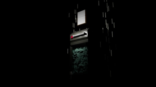
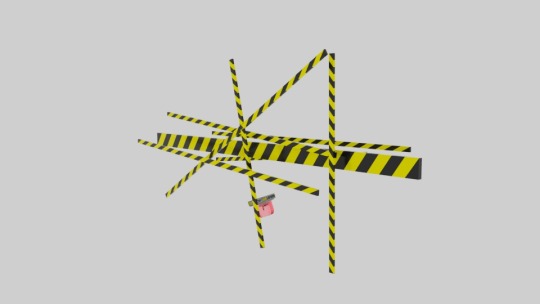
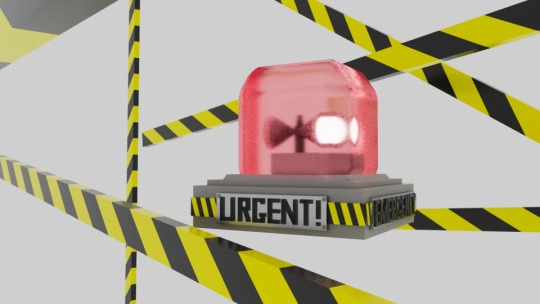
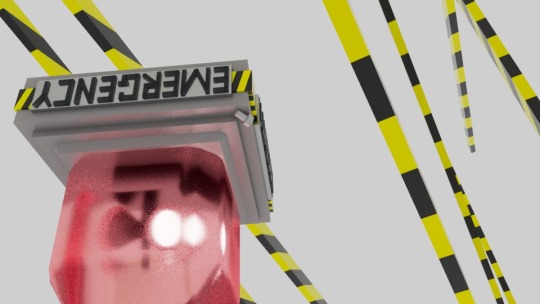
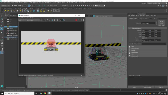
SHOT 1 - “URGENT!”
combining elements from my design process;
I storyboarded the concept of having an glass alarm, with spinning lights, rise from the bottom of the screen; as warning tape frantically spins strings across the foreground - covering a majority of the screen, and acting as a transition into the next shot as a cover for the “net-positive” balance/scale.
the transition was one of the things I’m most proud of in my whole animation; with it syncing perfectly to the next scene, it was a joy to animate - and figuring out the best way to achieve this effect in a 3D environment was a well-worth brainteaser, due to how nicely the shot turned out.
AN ALARM, AND A CAUTIONARY WEB - “THE PROCESS OF MAKING”
I started by making the alarm, itself.
I’m extremely proud of the final result - as it is an asset that both achieves the corporate style I aimed for, as well as looks really good!
simplicity was my main focus, here - and I decided on a design that was readable as an “alarm” without being too generic;
I decided to decorate the alarm, somewhat from my original design, when in Maya; with the addition of text plates which has been bolted onto the sides, as well as strips of warning tape around the perimeter of the base - as I felt this enhanced the design of the asset, further.
the alarm consists of three major elements:
the glass cover,
the base
and the spinning lights
I opted for making my own textures, as funnily enough the presets were not corporate-looking enough, in my opinion - and didn’t work with as well, with the lighting set-up I had constructed
I opted for more of a frosted glass-esque design for the glass cover of the alarm, as normal glass allowed the light to pass through too easily - and had an unwanted effect on the environment: as the spinning lights were causing singular frames of red light to appear, where they shouldn’t - so I adjusted the exposure accordingly.
the hardest part of this was animating the spinning lights, but after a Maya crash - I decided to just parent them to the rod, and make that spin instead; which although somewhat janky, is not noticeable in the final outcome, in my opinion, due in part to the frosted glass, but mostly because the transition covers the falling alarm, imperfections included..
I used a lot of size and perspective tricks to make the strings of emergency tape look more exaggerated; to add to the cartoony aesthetic of (the majority of) the film.
animating them was easy, as after modelling them using the multi-cut tool, and texturing each box, I expanded them on the x-axis, making them longer, while moving them in the direction of expansion; a form of squash-and-stretch, to create the illusion of them being moved, at speed.
BEAUTY SHOTS - “ALTERNATE ANGLES OF THE SCENE AT PLAY”

all in all, I think this is one of my strongest shots in the film.
I think that is serves its purpose as being an interesting and visually stimulating establishing shot, that sets the tone for the rest of the animation, in all the best ways.
if i were to redo the shot, in a different project, I would have implemented specular lights through slightly opaque cone assets, that showcased the beams of light, shining from the alarm - but due to the brief, not allowing us to alter the audio, or timings of Ichioka’s voice, I think the shot, created is the better option
EXPLAINING THE SHOT - “JUSTIFYING ITS EXISTENCE”
for too long have people excuses to remain unaware, and turn a blind eye to the atrocities that go on by removing themselves from the issue at hand, rather than face it head on..
“it’s just a part of daily life, in the world we live in; we can’t change that!”,
“it’s all corporate nonsense! climate change is a myth the earth is still cold, so how can global warming be real?!?”,
“it’s not like my effort alone will make a difference, anyway..”
this, and many more much like it, are the words of defeatists, who refuse to take accountability for our species’ actions.
when push comes to shove, it’s important to move with a sense of urgency - and that was the most important thing for me, when I was designing this shot:
I wanted to convey the desperation in Ichioka’s pleas for a better future, the alarm comes in with energy, the tape stretching to the next shot does so with extreme urgency - to showcase that time is truly of the essence, here..
0 notes
Text
EXPLAINING THE FILM - “JUSTIFYING ITS EXISTENCE”
I’m, currently at a stage in the project where I have finished animating almost all of the shots for the film; exporting them as I go.
but before creating separate blog posts explaining each of the animated shots, and showcasing the film put together in its full glory - I wanted to use this space to talk about some of my thinking behind the film as a whole,
since I don’t really know where else I’ll be able to put forward these sorts of thoughts..
THE INSPIRATION
I have a particularly fond memory, of one specific birthday, where me and my family drove up to Dubai, with my closest friends - to visit a theme park called “SEGA Republic”
youtube
me and my friends would ride the rollercoaster “SpinGear’ so often, on that day that we could quote the entirety of the informational video that played before boarding, by heart..
( we were the cool kids at school, clearly )
but with these introductory sequences, they have always had a somewhat creepy tone to them, to me - with them usually explaining the sort of terrible things would happen if you don’t follow their specific instructions, such as falling out of the ride, getting caught in machinery, and other such means..
the way Ichioka speaks in this brief is informational, to say the least - and as such, I think this is where the comparison has been drawn from;
with a focus on making a film that uses the severity of the subject matter as a way to make its final shots more impactful, by disguising the rest of the film as a (well animated) yet simplistic corporate video.
TONAL CONTRAST - “ENDING ON A HOPEFUL MESSAGE”
the final two shots are significantly different; than what is previously showcased - in a deliberate attempt to send a more impactful message to viewers.
but the tonal contrast isn’t a deterrent - far from it; instead we end on much darker shots, with the light of the sun shining upon the two planets; as though the balance for the timeframe of action is drawing to a close, there is still time to make a difference.
DUALITY - “MIXING CORPORATIONS AND HUMANITY”
there’s a lot of duality in my film:
bright and dark
majority and minority
tech and nature
etc, etc.
which I think is a significant factor in why it has turned out the way it has - with its difference from other approaches being the way it showcases the juxtaposition between each of these opposing elements being an expansion of the primary motivation for the piece’s direction.
COVER FOR SOMETHING GREATER - “IT HAS ALL BEEN A STAGE-PLAY”
I wanted every asset to be movable; including the backgrounds; which it is revealed in the “all life” shot, has been a cover for something bigger, the whole time..
with the background assets having been a cover, for something greater; the darkness that lays beyond is a harsh reminder of the dark subject matter, masked behind the colourful visuals and Ichioka’s cheery disposition
again another factor playing into the duality of it all.
0 notes
Text
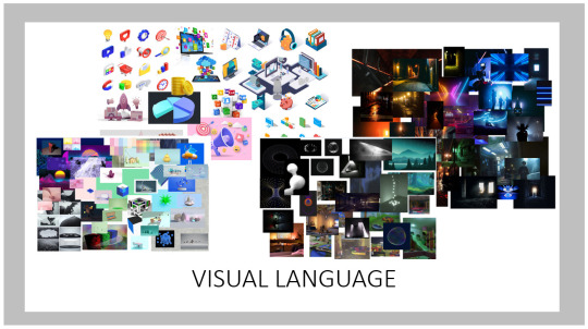
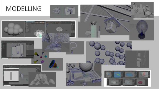
ADDING A THIRD DIMENSION - “MODELLING ASSETS”
going from 2D to 3D can be a challenge - but through the use of simple graphics, I was able to design and model assets that look straight out of a corporate video; complete with smooth edges, beveled ridges, and bright colourful texturing, that will enhance the film.

the first thing I did was refer back to my research - taking design elements from my mood-boards, and a rewatching of the films I showcased, earlier in my blog.
I noticed that the assets in these sorts of films were soft - with a use of geometric shapes, and basic texturing, as the films need simple models that are easy to understand;
so I modelled after this design principle - having large, cartoonishly-exaggerated assets, that focused on readability through their relation to the strong iconography and having strong silhouettes that present the object they are modelled after.

as you can see, I’ve already made some strong leeway with modelling assets - and will make blog posts for each of the shots, explaining my thinking behind them, the process behind making them, etc.
0 notes