mi6011ellawatson
Professional Creative Production
41 posts
Don't wanna be here? Send us removal request.
Last Seen Blogs

studio-roses
Studio Roses.

bloiffy
Bloiffy was here

wavelikewhat
wave like what

dobdfelmagad
Untitled

matabang-tiger
Matabang-Tiger
Text
act together
I wouldn't say I was happy with it but I do think there are aspects that I like. I like the scene with the car and the scene with the red liquor light. Though the rain is just faint I think it was a nice addition to the scene. Overall there could have been more movement, I am not much of an animation student. Maybe I am just lazy.
I hope it was ok for me to add sound in the background, I feel it is a very important part of an animation, it adds so much to the story you are trying to tell and it would feel unnatural to see rain or a train carriage without the sounds along side them. I didn't add too much as I didn't want to distract from the main voice and it also is pretty quiet in the background. I like that I added the sound of an argument that links up with the comment on talking to each other and the room light turning on in the background.
1 note
·
View note
Text
Evaluation
Overall I am fairly happy with how this project turned out, it could have been improved but I am trying to not be overly harsh on myself. I am glad that I did not take the brief too literally, I would have really struggled with motivation if I had done. I just did not feel any connection to either of the texts. Perhaps I made it a little too much of my own concept, this is something I should work on really.
I am glad that I used a combination of After Effects and Procreate, I think together they work nicely. Procreate allows me to draw with a wide range of tools, brushes and much greater detail but lacks the animation tools that AE has. It wouldn't work so well if I created animation with far more movement, my work is pretty still, almost illustrations. I have tried programmes such as TV paint but I just find it so tricky, I cannot seem to even draw anything let alone animate. Having such freedom on procreate has spoiled me.
There definitely are better scenes within this animation. I do like the New York type scene with the red light, I like too that I linked up the light turning on with the comment on people talking to each other. I did also layer a very faint sound of arguing in the background. I also do like the drawing within the shadow time-lapse scene. Overall I think the animation in that one isn't great, it is far too fast, but I do like the scene. I wish I could have improved it looking back.
0 notes
Text
Final Image
I quite like how this image turned out. It was one of the first drawings that I did that ended up not working out, not as it was at first anyway. I do not have too much to say on it, looking at it now it could be better, especially the shadows.
0 notes
Text

PDF
I do like how my pdf turned out. It was an accident to export it as a double page but upon looking at it afterwards I realised the smaller drawings in the corners worked nicely as a double page spread, because of this I decided to add to them meaning the would spread slightly further across, going onto both pages. Doing the final pdf is usually my favourite part to be honest, I really like curating mood boards and layouts.
0 notes
Text
Shadow Animation
Here is one of the shadow animations for one of the last animations to go into the final piece. It was done very simply on procreate using the original as a background reference. I exported it as this white background so that when I place it over the animation on after effects using just a multiply blending mode and ca change of opacity it will hopefully work nicely as a shadow. I do perhaps think it is a little too fast, it is a time lapse but still I think I could improve the speed.
0 notes
Text

Individual Drawings
Just some of the individual still drawings that are included in the final animation. Though you cant see the colour in most of these I am glad that I did end up finally adding a small amount.
1 note
·
View note
Text


WIP
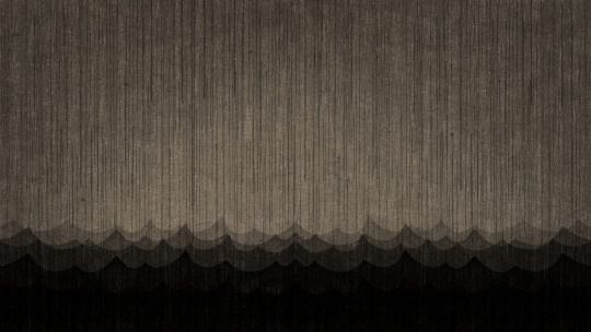
Here is just a slight explanation of how the lighting/rain worked in various scenes. As for the lighting I have already slightly explained this but I just used layers with the light cut out. I found this worked a lot better than putting the light on top of the darkness. As for making the light fade in I had to reverse the darkness, this way I could layer then together and fade the inner piece out gradually. It looked too unnatural having the light turn on/off in an instant.
The rain is literally just a load of white lines that I animated in After Effects. By duplicating the layer a few times and just key framing the positions of them all I was able to create a loop. The rain effect in AE itself felt like both a bit of a cop out and also it didn't match the style of the rest of the animation.
Lastly the wall shown here literally is just a repeated brick pattern that I drew. I played around with blending modes and different texture layers.
0 notes
Text
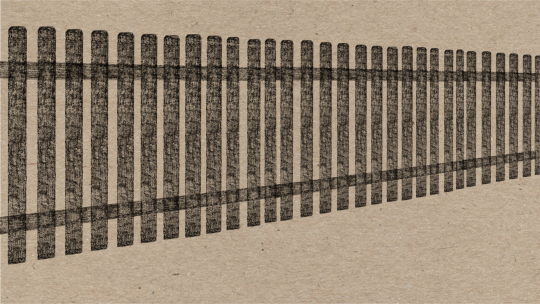
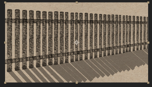
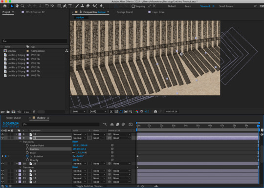
Fence Shadow
Here is the final fence shadow time-lapse, safe to say I won't be using it, it looks terrible. Regardless I am fairly happy with the idea? I think it could have been interesting if it had worked properly and I do really like animating with shadows and light. I think that if I had included 3D in the process it may have worked, I really felt I needed a reference to just see how the actual shadow would move. If you modelled the fence in Maya/Blender and then used a moving lighting source you could create your own reference.
0 notes
Text
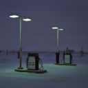
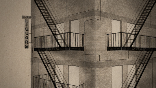
Liquor Sign Light
I think I have finished this scene now and I feel fairly happy with how it turned out. I hope to add some slight argument like sound effects once the light turns on inside the window/doorway, this could overlap the talk of putting people into a room together possibly. I do not want the words of the argument to be at all audible, just a very faint background noise. It is not about the argument itself, just the environment and feeling of the shot and its link to the text. I used the same technique as that of all the other examples, I found adding light on top of the scene in the form of a white shape just didn't work, I did not want to add on top of the darkness, I wanted to take away from it. To create this I just make a solid colour shape layer in procreate that is missing the area where I want the light to shine. In after effects I will use this layer and one that is just full darkness, swapping them over when it comes time for the light. To get the light to fade on rather than just appear suddenly I just select and reverse the light layer and colour in the gap on a separate layer, creating a jig saw type piece to fill the gap whilst the light fades in. In after effects I can then keyframe the opacity of this piece over a second or so. Sounds complicated when ex
1 note
·
View note
Text
Rain Alone
Here is the separate rain layer that I added on top of the last scene. It was really simple to create, I just drew an A4 page of lines dotted around like you see here. I took that into after effects and filled a 16:9 page by just repeating the initial image. I then merged those layers and started to keyframe the position, moving from the very top of the page to the bottom. From that I duplicated the layer and had this one follow afterwards. After merging these again I had a complete cycle that I could repeat over and over. I used a dark background with white rain so that it layered nicely over the image. I at first actually used a green background so that I could key it out but I found this also tinged the rain an odd colour. I instead used a lighten blending mode so that only the white would show over the scene. I slightly player around with the opacity as it seemed a bit too bold at first but once changed I think it works pretty well. I had given the rain simulation on after effects a go too but it both felt like cheating and also did not really match the drawing style of my work. This rain here isn't necessarily accurate but fits the overall feel better.
1 note
·
View note
Text
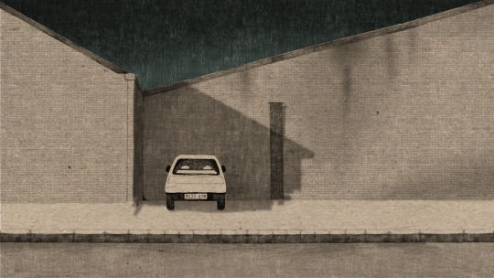
Rain and Light
I again made this too dark, I keep doubting myself when making it thinking it looks too light on my own computer so I will have to just export it once changed and see if it looks any better. I really like the turquoise colour in the background of this image and I also like the way that the lights from the car look on the ground. I still need to figure out the rough narrative of this however as I do not feel car lights just turn on like this? I am thinking of adding a car beep - like someone opening the doors - just before the lights go on. I do not want to show a person, only the moment before. I was going to have an alarm going off but I just didn't think it worked as well, you can see that example a few posts back. I added the rain at the end just to add a little more to the scene and I feel it worked quite nicely. I will post this layer separately so I can explain how I created it.
1 note
·
View note
Text
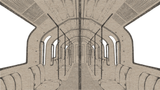
Inner Train
Again too dark - will lighten
Here is the almost finished internal train scene, all I need to do is lighten it slightly as upon re-watching on a different screen it looks much too dark. Clearly I have my brightness turned up way too high on my computer at home. I added a small amount of warm lights to act as ceiling lights on the train, I tried to link the movement up with the movement of the train but it did not work perfectly. I don't however believe this is too big of an issue anyway as you really cannot tell. I also very slightly changed the brightness of the lights throughout but again not a noticeable amount, I at first wanted it to be more noticeable but then it ended up feeling like there was actually far too much happening. I will use the same technique when creating the animation of the train from a front on angle, also hoping to use the same window view. I will use the background that I did for this but change the angle again using the basic 3D tools in after effects.
1 note
·
View note
Text
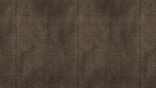
View from Window
Here is just the very simple view that we will be able to see through the trains windows. Since I am looking somewhat at the concept of liminal spaces I decided to go for a space literally between destinations, somewhere very impersonal. Though my concept quite loosely connects to the text I am trying to communicate the distance and disconnect between people that the narrator talks about but show it physically instead of relating it emotion and communication. Showing isolated spaces void of character, effected by periods of time and seemingly in between. I feel tunnels are one of these spaces.
Overall it was very simple to create, I use a repeated brick pattern that I already have saved on procreate and use selection techniques to select parts to then rub out of a larger pencil shape, creating the indents between bricks where the pencil has been rubbed away. I layer different textures such as charcoal and pencil to create a weathered effect and lay all these layers on top of my normal paper texture background. I added the red line based on the few reference videos I found and also to add an additional small amount of colour.
1 note
·
View note
Text
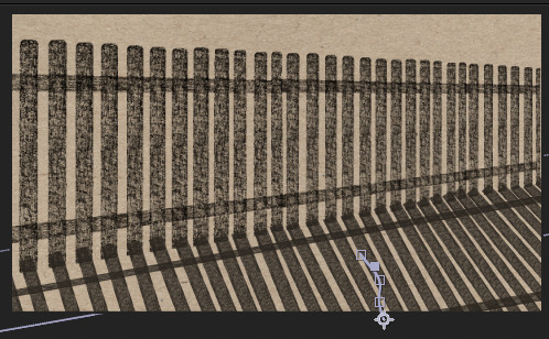
Shadow Test - Pre-merging
This kind of worked but not particularly well. This is before flattening the layers, obviously at the moment you can see where the shadows overlap which is not as a shadow should actually look. By merging/flattening the layers this issue is solved. In this test I purely was experimenting with the movement of the shadows themselves, it was slightly fiddly as I in the end had to move each on its own, I did try moving them all as one and it just did not work. I need to even each one out as the lengths are not correct, some being longer than others.
I had an idea the other day about a technique that may work, though one I probably will not have the time to try out. I was trying to figure out how to generate the correct shadow movement. I can try find similar examples online but they are still different and I can try just picture it but that would probably be even more off. I could try create my own time-lapse if I really wanted too but that would just be silly to try recreate. I was mainly at a loss as of what to do then thought I could actually use Maya. Make the fence in Maya which would literally take minutes and then use a light source and camera to cast and track a shadow moving. Surely that would be really helpful? Again I do not think I will get round to doing this but I think it could have worked?
0 notes
Text

Shadow - Process
Here is the process behind creating the shadow animation, I felt I should take some wip screenshots as it was one of the more fiddly ones to create. You can see in the last image how it will look when I merge all the layers, it looks far more like a shadow than when they all overlap each other. I moved each post individually, it was not as annoying as it sounds. I had tried move them as a group but the angles had to be slightly different with each one due to perspective so it just didn't work. I keyframed the position and scale of each one and though it it isn't perfect it did work much better than the original attempt. I do not really know how else I could approach it however? It is very difficult to even picture how shadows even move, obviously we cannot see them moving really in our day to day life anyways so any examples we do have need to be in video form (this meaning also that examples are limited)
0 notes
Text
White Light Only - Better than red (again to dark will fix)
I have decided that not using the red light on top of the white light works far better. I want to remain with very limited colour in the scenes, I was at first going to have no colour apart from the brown paper but upon adding the red light to the scene of the New York style building I realised the small amount of colour really added to the scene. Within this scene I added a slight turquoise blue tint to the sky behind the building, you cant actually see it too much in this scene with it being too dark but you can in the earlier version. I think this is enough colour, it doesn't need the additional red light. I also need to decide whether I will be putting tail lights on also, I suppose this would be more accurate? I don't drive though so to be fair I have no idea. I did try to find examples of car lights/hazards/alarms going off but its actually pretty difficult to find examples. Every video I did find was a tutorial on fixing them not just what it was that it actually looked like.
0 notes
Text
Red Light - Failed
This did work to an extent but upon exporting I found out it was way too dark. I will redo it using the same techniques but lighten the dark layer over the top quite significantly. For this version I actually layered a physical image over the top rather than just a shape layer. The difference being that the image I layered over had a cut out light section meaning that instead of the light being placed on top of a dark image it is cut out from the darkness showing the original image underneath. To create the light going on and off I reversed the darkness creating a patch to fill in the gap for when the light is off, this means it can slowly fade in and out. I think I may actually remove the red light however and only have the white light going on and off.
0 notes