
meganfrance-portfolio
folio"
Research into and inspiration of publications and portfolios.
28 posts
Don't wanna be here? Send us removal request.
Last Seen Blogs
thryonomys
Paleontology & Paleoecology

henry-and-the-seven-lords
Let's Simp Together!

daretodreamav-blog
Dare To Dream

somebeauscifi
Some beautiful sci-fi

nosfagratu
pool boy at castle thorn
Photo
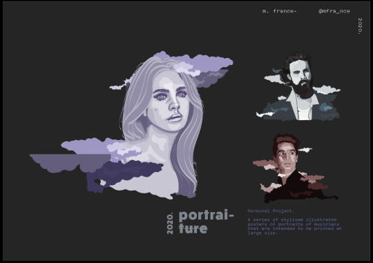
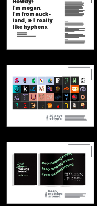
Initial illustration section of the portfolio. To fit the illustration series into the grid system but it didn’t end up looking vey good. Not only was the page super busy but also the smaller illustrations of the right are too small.
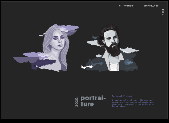
Next development was to simplify the page. However, this lost the feeling of this being a series. also, did not fit with the rest of the page layouts in the portfolio.
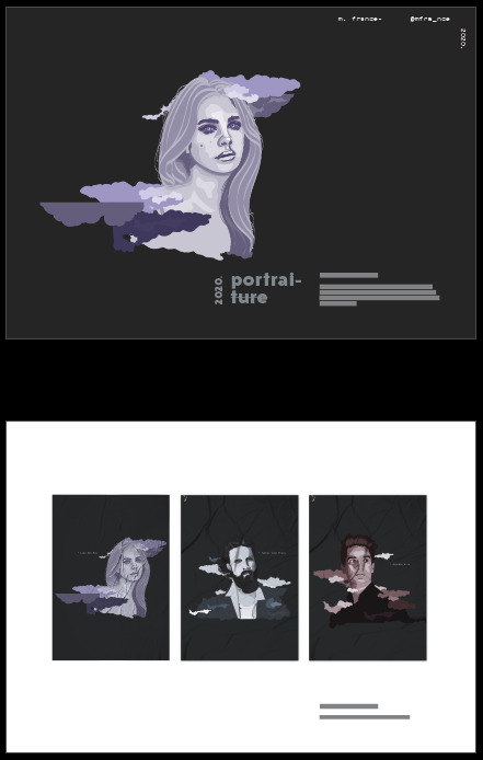
The solution was to create two pages. This was by creating a mockup of the posters in the second page. This both fits in with the grid system, neatly displays them and shows the series of posters in situation.
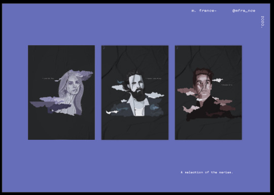
I popped a coloured background on this page just to create some more interest.
0 notes
Photo
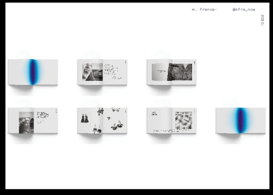
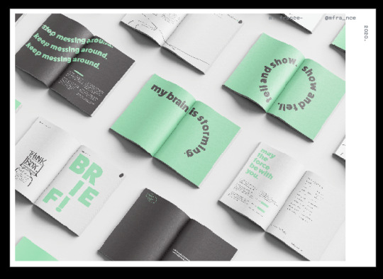
The initial photograph displayed the seven spreads in my section of the She’Her group publication. However, in displaying all seven , it made the double pages too small to see any detail.
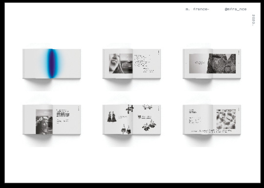
SO I deleted on page. This meaning the box they sat in was more contained and it was easier to enlarge and fit on the page.
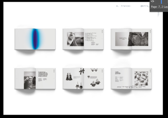
They were made bigger just to show more detail.
0 notes
Photo
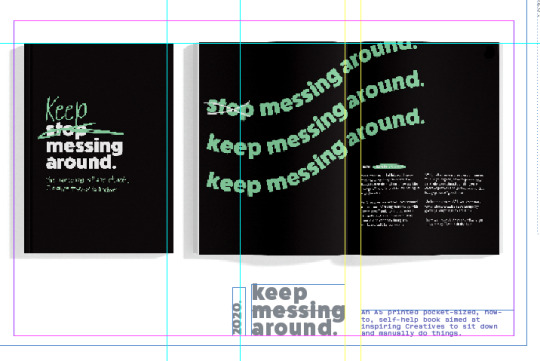
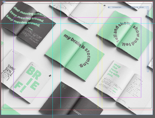
In wanting to do something more interesting with the heading than just being a standard font, I was playing around with putting vertical bars through text.
I found putting bars through all the words or just through the year made it look like I was saying that this is incorrect information i.e. It wasn’t made in 2020 or no it’s not called this.
So I found the best solution was to have it purposefully used in one line of text or on selected words. This made it look less like an accident and more of a choice.

0 notes
Photo

This fit within the grids set up - the 2/3 and 1/3.
However, something about it seems off - maybe there is too much negative space around the outside of the square of image but not the same amount inbetween which makes it off balanced.
Furthermore, what is the point of including this if the sqaures are so small that you cannot actaully see what they are.

In order to make them bigger but still have it somewhat fit the page, the order and shape of the box they were contained in had to be changed. This also breaks the grid set up as they runs along the lenght of the page rather than sitting in the thirds. But that is ok as it sits in the same margins so is still somewhat in the same grid.
0 notes
Photo
As you can see, guides were set up to create a grid to line up elements on the page. The grid is set in thirds with - most of the time, one element sitting in 2/3′s of the page and something else in the other third.
This did however mean that often and most of the time, elements did not reach right to the margin.
This spread purposely mimicked this is being short however, it ended up looking like something went wrong.
This was changed to be a full bleed image.
0 notes
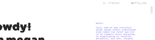
Photo
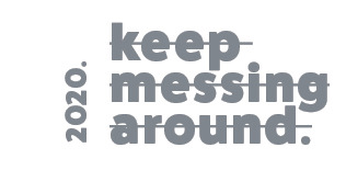
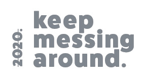
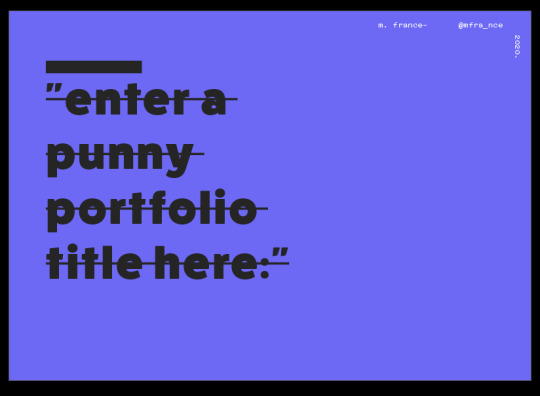
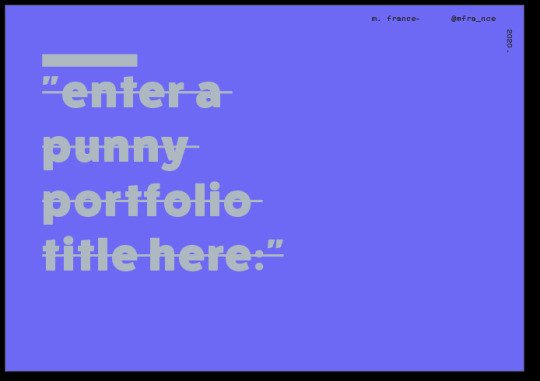
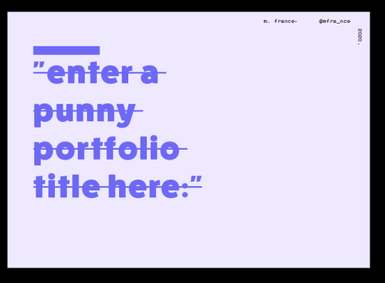
Large, eye catching, bright and bold text. This is clear and attracts the viewer while still being visually interesting.
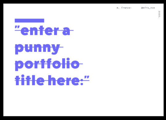
This same technique I have used for the cover of the portfolio. I quite like the minimal or more simple cover with heaps of negative space.
Colour variations:
Using the colours in the colour palette I created, I played around with colours. Deciding in the last test- being quite similar to the first development but the background is lightly more blue than a clean white was the way to go. As this was not over powering but was still interesting.

0 notes
Photo
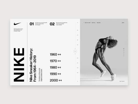

From:
https://dribbble.com/shots/6974553-Nike-Timeline?utm_source=Pinterest_Shot&utm_campaign=ws-design&utm_content=Nike+-+Timeline&utm_medium=Social_Share
Although this is a website - I like the use of headings along the top margin of the page. In the portfoilio, this could maybe be sitting on one side of the page rather than across the top so it dosen’t look like a website.
Example from my portfolio of this being used:
0 notes
Photo
Image from https://issuu.com/projektowanie_graficzne/docs/martyna_milewska_portfolio_2020
The use of large, bold, text in the portfoilio is eye catching but its an effective way of showing more info without it being so body copy heavy.
0 notes
Photo

https://www.behance.net/gallery/104683123/Twins-Digital?tracking_source=search_projects_recommended%7Cportfolio
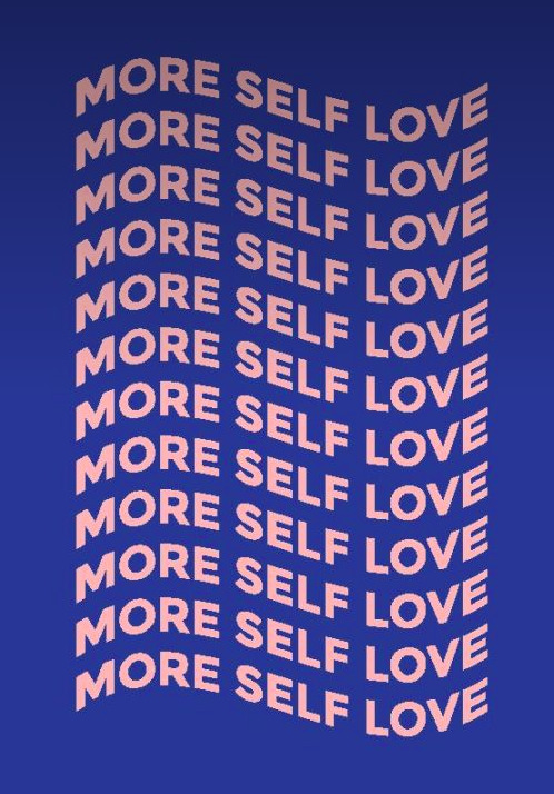
Quite a minimal front cover but due to the large text and the bold colour it’s eye catching.
0 notes


Link
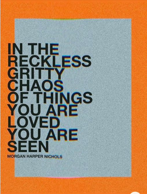
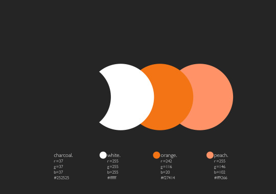
The orange and minty blue work well together however what really drew me into this poster was they large text. This is something that I could further explore in my portfolio.
0 notes
Link
The peach is a good alternative to using white. The blue and pink is maybe slightly too obvious. But I like not using white as an idea.
0 notes
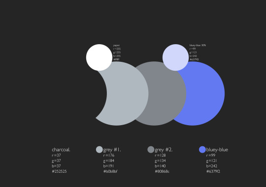
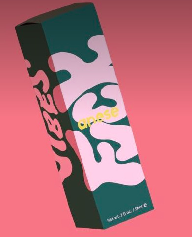
Photo

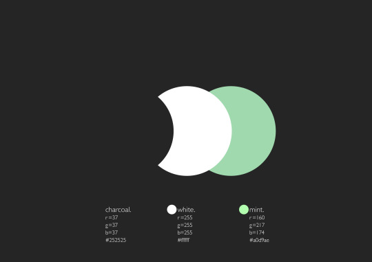
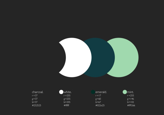
Potential colour scheme. I like the greens but not to sure of the pink. This is not a colour I usually use and might therefore not be suitable.
0 notes
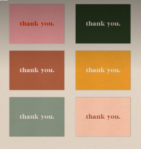
Link
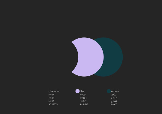
Colour scheme. The dark green is a nice alternative to black. Has the sae effect but is less harsh.
0 notes
Photo

From Natália Dias.
https://www.behance.net/gallery/100687021/Teu-Job?tracking_source=search_projects_recommended%7Cpurple
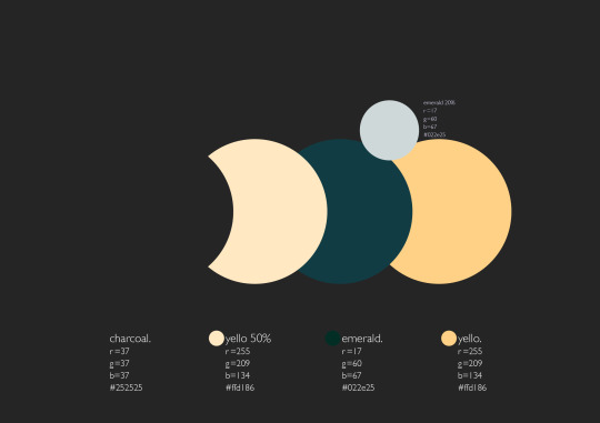
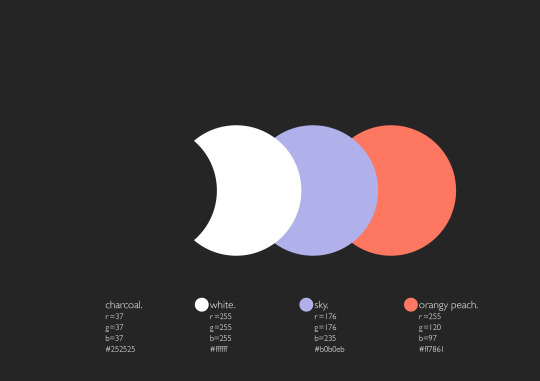
More so the colour combination of the purple and orange than the pink. The purple is calming but the orange draws the eye in.
0 notes
Link
More muted colours. Have a peaceful feeling rather than being all encompassing.
0 notes