
Last Seen Blogs

yngdiny
𝕐ℕ𝔾 𝔻𝕚𝕟𝕪

fuyusuru-blog
浮遊する冬

shadowlight501-2
🍰 Ah-ha! I See absolutely nothing 🍓

tetrabura-tt
Hello there, I'm Tetra

quickwips
All My Writings on the Wall
Text
I am far from a good video editor or movie maker, but her I am trying to show the positive impact having my daughter has made for my life. Instead of looking forward to my next night out, I look forward to seeing her smile and and us grow together.
0 notes
Text
Virtual Sketchbook #4
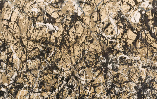
How did Jackson Pollock go from studying with Thomas Hart Benton and using abstract imagery in his paintings to removing all imagery in his famous “drip” paintings?
Jackson Pollock met Thomas Hart Benton while studying at the Art Students League. Pollock admired Benton’s rhythm structures and his ability to showcase the contrast of light and dark colors. After his time with Benton, Pollock began studying different applications and ways to create art. At David Alfaro Siqueiro’s workshop, Pollock learned new ways to use a multitude of material to apply paint. Pollock also studied Navajo sand painting, possibly influenced by his south-western upbringing, which was made by dripping sand on the ground from above. This “drip painting” is Pollock’s signature style. Pollock was also interested in Surrealist’s interest in the unconscious, maybe leading him towards the trance-like state he entered when creating his work. As he learned, his work evolved from narrative abstract to unrecognizable content. The evolution of the artist’s work can be seen once he stopped naming his paintings, instead numbering them. While Pollocks style shifted dramatically after his time learning under Benton, Benton’s stylistic eye-catching colors and bold lines are still seen influences Pollock’s work.
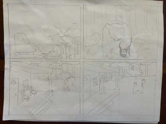
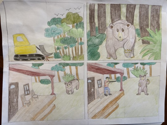
2.) Art Project:

0 notes
Text
Virtual Sketchbook #3
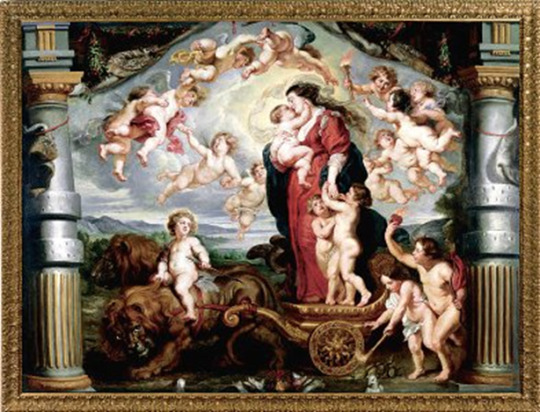
The Triumph of Divine Love by Peter Paul Rubens, 1625. Accessed 03/26/2024 https://ringlingdocents.org/divine.htm.
Describe Visual Qualities:
The Triumph of Divine Love by Flemish artist Peter Paul Rubens is a oil on canvas painting. The massive size is very eye-catching with a height of 17ft (518.2cm) and width of 12.6ft (386.1 cm). At first glance the painting consists of cheery and bright colors that create a joyful feeling. The main subject is Charity at the center, holding one of her children, highlighted with the lightest part of the painting. Two more of her children stand next to her as they ride a chariot pulled by two lions, which show contrasting shadows at the bottom of the piece. The borders also show contrasting shadows that work to pull viewers’ attention towards the center. The artwork possesses a variety of subjects such as Charity (who resembles Mother Mary), twelve putti flying in the air (winged children, Cupids), three more grounded putti one of whom is riding a lion holding an arrow, two lions, a pelican piercing its own breast to feed its young, and two intertwined snakes. The varying subjects do not create a chaotic effect, instead a sense of unity is felt through the placement of light and dark areas as well as the central focal point.
How does work make you feel:
During my visit to the Ringling Museum of Art, The Triumph of Divine Love piqued my interest the most. Its size and complexity first caught my attention. I’ll admit I am not the biggest fan of old religious art pieces, but the beauty of this painting cannot be denied. The central focal point of the female figure cradling her baby with a look of fondness and joy reminded of my maternal feelings of love for my own baby. Viewing the piece inspires feelings of happiness and contentment. I also felt a sense of happiness while viewing the work.
The upbeat tone versus other more graphic sad scene of most paintings of this era is what made me admire it.
Research:
Peter Paul Rubens created The Triumph of Divine Love in the 17th century. Rubens was one of the most well-known Baroque artists of that time. Rubens was commissioned by Archduchess Isabella, “to design the 20 cartoons for the tapestry series of the Triumph of the Eucharist for the convent of the Descalzas Reales in Madrid” (Vlieghe).
The Triumph of Divine Love was one of this series. As a devote Catholic, Ruben incorporated allegory of religious event into many of his works. “Europeans had so linked the body of Christ with the body social and political that the Eucharist became "the emblematic focus of the struggle" between Catholics and Protestants…” (Harrie). In the Eucharist cycle, the artist focused on portraying victory of good over evil. Specifically in The Triumph of Divine Love, Rubenscreates a scene of celebration after, “the defeat of evil in the world by religious or divine love” (Anderson).
Personal Critique:
After my research I view Ruben The Triumph of Divine Love in a much different way. The symbolism shown throughout tells a story of, as the title refers, triumph. The putti are a way to show profane love. The snakes intertwined at the bottom represent evil with the flaming heart above as the “Sacred Heart” referring to Jesus’s love for humanity. The positioning of these symbols infers the defeat of evil with faith. Prior to this project, I lacked knowledge to identify the meaning behind the subjects. The painting is a clear representation of the cultural ideals of that time, and I have learned a great deal from looking into the purpose of its creation. The skill needed to execute this timeless piece of art shows the mastery Rubens possessed and why he was one of the best artists of the 17th century. I can only imagine the effect of seeing all of Rubens’ Eucharist series together.

Selfie of my in the beautiful Ringling Courtyard.
Cites Sources:
Anderson, Robert. The Triumph of Divine Love, 2000, accessed 29 March 2024, https://ringlingdocents.org/divine.htm.
Harris Jeanne. Discussion of Léonard Limosin's enamel Triumph of the Eucharist and of the Catholic Faith, Sixteenth Century Journal; Spring2006, Vol. 37 Issue 1, p43-57, 15p, accessed 29 March 2024, https://web.p.ebscohost.com/ehost/detail/detail?vid=5&sid=657838c2-4aef-4ee5-9605-b9bffb78a770%40redis&bdata=JkF1dGhUeXBlPXNoaWImc2l0ZT1laG9zdC1saXZl#AN=509859203&db=hus.
Vlieghe, Hans. "Rubens, Peter Paul." Grove Art Online. 2003. Oxford University Press. Date of access 29 Mar. 2024, https://www.oxfordartonline.com/groveart/display/10.1093/gao/9781884446054.001.0001/oao-9781884446054-e-7000074324?rskey=4WqXlf&result=1.
1 note
·
View note
Text
Virtual Sketchbook #2
Journaling:
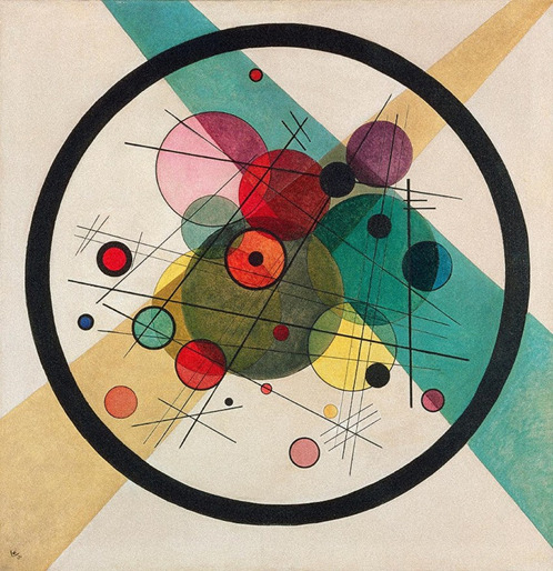
Unity brings everything together and creates a sense of harmony throughout the work. Variety is more about creating a range of different components to the work. A work strictly focused on unity can seem dull, while too much variety may come off as scattered. In Circles in a Circle (1923) by Wassily Kandinsky, you can see both qualities. The unity is the circles and lines throughout, and the variety is the differences in size and color.
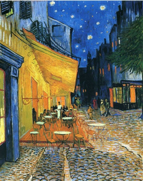
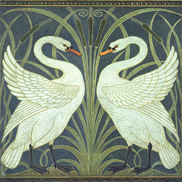
Balance has two versions, but each work has an equal distribution of visual elements. Symmetrical balance has matching sides, almost mirror images. Asymmetrical is not symmetrical of each side and is more about creating equilibrium with the sizing, placement, and visual weight of each different part of the work. Café Terrace at Night by Vincent van Gogh is an asymmetrical example. Van Gosh uses the dark blue in the sky to balance the brighter yellow of the café. The following work Swan, Rush and Iris by Walter Crane is an example of symmetrical balance, which are perfectly mirrored swans.
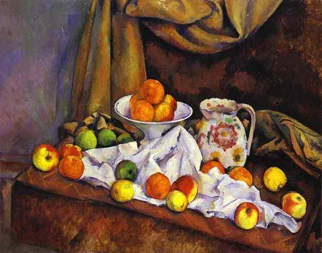
Emphasis is used to draw the viewer’s attention to the central point. The artist can accomplish this through color intensities, sizing, and positioning. Subordination helps the artist complete the work while removing attention from unimportant areas by creating neutral areas that don’t grab the eye. Paul Cezanne’s Still Life with Compotier, Pitcher, and Fruit uses emphasis in the bright colors and positioning of the fruit, with the dull colors of the background and table being subordination.
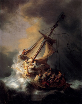
The use of directional forces is another method to pull the eye to where the artist has made the focal point. This is done by implied or actual lines going towards the direction of the center of the piece. In Storm on the Sea of Galilee by Rembrandt, we see the lines made by the ships post drawing the eye to where the action is, the water colliding with the boat.
Repetition is the use of repeating elements to create a harmonious flow to the work.
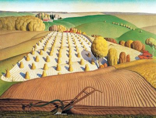
Rhythm is created using the repetition of elements to imply fluidity. In Fall Plowing by Grant Wood, we can see repetition in the plants, trees, hills, and lines of the field. The rhythm is achieved by the placement of these repeating patterns, creating a direction flow towards the back of the painting.
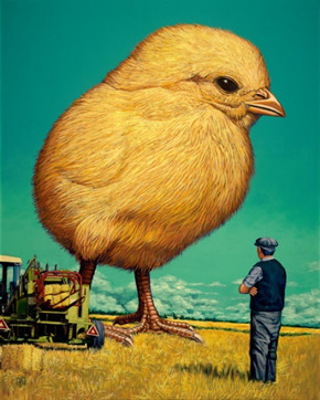
Scale is the size of one object compared to other separate objects. Proportion is the size relationship between objects as pieces of a whole. Jeff Jordan showed both properties in his work Art Curiosity. The scale of the chick is comically larger than normal, while all the proportions of body parts are accurate.
Connecting Art to Your World:
The color of the sky has always influenced my mood and attitude of the day. One example that sticks out to me is the day after Hurricane Ian. The storm had covered the world with toned down hues of gray, green, and brown. It was like the saturation of bright, colorful Florida had been shaded with gloom. As the day passed, the grayness had been replaced with a beautiful sunset. The dark skies were now filled with an ombre of different hues of blues and pinks, changing my gloomy mood to hopeful. I even took pictures that day and you can see the how contrasting the morning and night was.


The color scheme of my life would be hues of blue. My favorite color has always been blue, and I tend to love everything in that range (purple included). From the sky to the ocean, every shade of blue is pretty to me.
Art Project:

4. Discussion:
Group 3: Photography
Portrait:
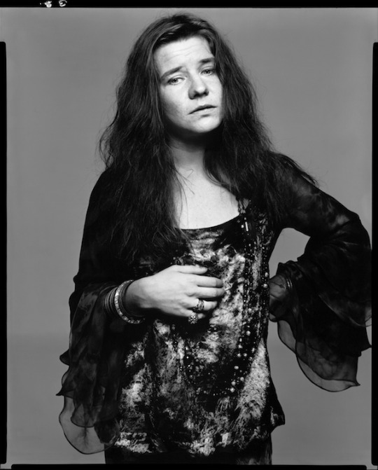
Richard Avedon, Janis Joplin, 1969, https://www.avedonfoLinks to an external site.uLinks to an external site.ndation.org/Links to an external site.the-workLinks to an external site..
This is a portrait of musician, Janis Joplin, taken by Richard Avedon. Joplin's downwards gaze give the impression of sadness or lack of care about taking the photo. Her hand placement on her hip is in somewhat of a defiant stance. Joplin appears to not be wearing any makeup, indicating she prefers to express herself in other ways other than the beauty standards of that time. Her natural, untamed hair and style highlights her free-spirited personality. This portrait of Janis Joplin is a good visual representation of the type of artist that she was, care-free and not conforming to the societal expectations of the 1960's.
Landscape:

Daniel Kordan, Japan fall, https://danielkordan.com/portfolio-item/japan-fall/Links to an external site..
This landscape photograph was taken by Daniel Kordan in the fall time in Japan. The various natural elements of leaves, water, trees, and a mountain come together and create a serene image. The photographer perfectly positioned the camera in the center of leaves that give the illusion of a heart surrounding the mountain.
Still Life:

Krista van der Niet, Bezem, https://museemagazine.com/features/2020/12/3/krista-van-der-niet.
This still life photograph is the end piece of a broom, with two glasses of water on either side, and a rolling pin standing straight up on top of it. The photographer, Krista van der Niet, enjoys staging everyday item in a humorous, aesthetically pleasing way. Putting the rolling pin in place of where the broom handle should be adds a twist to normal everyday items. The artist staging selection makes even the most mundane things interesting to look at.
0 notes
Text
Virtual Sketchbook #1
1.) Five facts about Jackson Pollock and his work Autumn Rhythm No 30:
Jackson Pollock made his first “drip” or “action painting” in 1947, where he lays the canvas on the floor and used multiple methods of applying paint including drips, splatters, and brushworks from above.
Another one of Pollock’s paintings (No. 5, 1948) became the world’s most expensive painting of that time selling in May of 2006 for 140 million dollars.
Pollock had a movie Oscar winning movie made about him titled, “Pollock”.
Autumn Rhythm No. 30 was bought for $20,000 from Pollock’s estate following his untimely death at the age of 44 in 1956.
Autumn Rhythm No. 30 is currently at the Metropolitan Museum of Art.
My first thoughts when looking at Autumn Rhythm was that it seemed chaotic and a little overwhelming. Having little exposure in art and not fully comprehending intentions when it comes to abstract work, I felt like I wasn’t understanding what the artist was trying to convey. But the more I looked at it, I began to see the flow and movement in the patterns of paint. After researching the art piece and its creator, Jackson Pollock, I have come to learn that what I first saw as chaos is the opposite. Pollock purposefully and intentionally made each stroke, splatter, and drip the way that he wanted, making the abstract painting a uniquely beautiful piece or artwork.
Autumn Rhythm (No. 30) Jackson Pollock
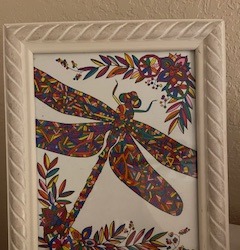
2.) This is from a picture from a coloring book my mom finished while she was receiving treatment at Moffitt Cancer Center. She had just undergone a bone marrow transplant that required a very potent dose of chemo that left her unable to talk, walk, stand or do much else. She was, however, able to create the picture. She was fighting for her life and was still able to put bright, hopeful colors into it. This was an incredibly difficult time for my family and despite the odds, my mom pulled through and beat leukemia. I have this up in my room as a reminder of the strength it took to get through that time and to always try to look on the bright side.
3.) My name is Mary. I am a 29-year-old Caucasian female (recently turned 29, 30 is still aways away 😊). I am from Fort Wayne, Indiana. My family used to vacation in Siesta Key and always dreamed of living in Florida. We finally were able to move to North Port in 2018. My favorite thing to do when I don’t have much going on is puzzles. My friends call me an old lady because I would rather stay in doing puzzles than go out most times. I have been a bartender/server since I was 19, which is long enough. I am very ready to finish college and begin on a new career path. A unique part of me is that I aspired to be a professional photographer, specializing in landscapes, architecture, and animals. My original major at SCF was Digital Photography, but after I became pregnant with my first child in 2022, I decided to switch to a more stable profession in the medical field. I hope taking Art Appreciation will allow me to learn more about my creative side and I can continue pursue photography as a hobby.
4.)

1 note
·
View note