
maxisdezign
Maxis Dezign
Software Workbook for Adobe Software: Illustrator, Photoshop & InDesign
30 posts
Don't wanna be here? Send us removal request.
Last Seen Blogs

wooyoungisbaby
wooyoung enjoyer

showbusiness1331
Без названия
bitchin-ass-pants
MindYaBusinessYaHear
my-candy-love-confessions
Castiel_UwU

turkishactors
Turkish Actors
Text
OVERALL REFLECTION:
At the beginning of the course Toby got us to write down where we feel we sat with our skills and knowledge for each of the adobe software we looked at. I had originally said:
AI: 2/10 - PS: 7/10 - ID: 2/10
I would now say Im more like:
AI: 7/10 - PS:8.5/10 - ID:7/10
I know that there is so much more I can learn and do on the Adobe software, but my skills, knowledge and confidence on the apps have grown significantly.
I'm especially proud of my Illustrator penguin, the PhotoShop adjustments edits I did, and my InDesign mock-up book we did in class.
I think I could've done better on my Illustrator homework where I did a butterfly, I should've added a shadow on a second wing.
And I feel I couldn't down better on the homework where we added more elements to the jumping man image.
This course is amazing, and has BY FAR taught me the most about the Adobe software that anywhere else has.
I had been a Design student in high school, I'd done media studies too, and even Digital technology, I even went onto you tube and other sources for tutorials, but this by far has significantly boosted my skills.
My next steps are to:
- Keep doing and using the skills I've learnt to engrave it into my head.
- Stay on track with my assignments (there were a few times I feel behind it the writing part for this)
- Experiment more with what I've learnt, and other features on the adobe software.
- Show my designs off to my friends, family and classmates. I need to get more confident at sharing my work as a designer.
------------------------------------------------------------------------------
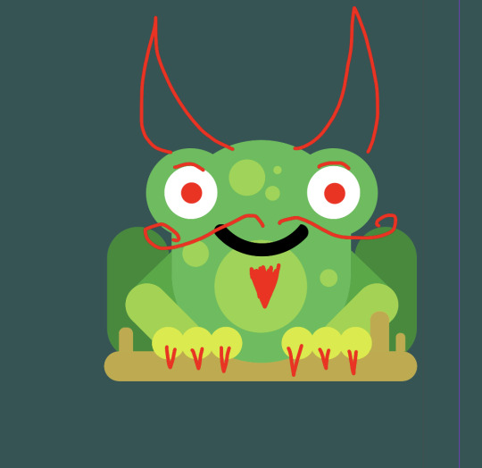
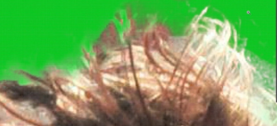
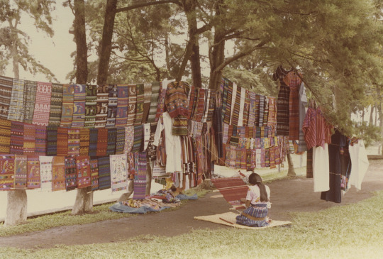
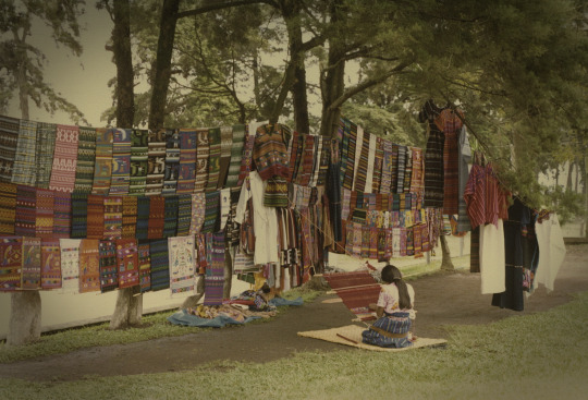
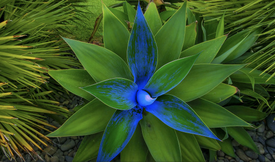
(Below is my Zuko(Avatar: The last Air-bender) penguin which I modified for a friend.)

1 note
·
View note
Text
Ai Pattern
HIDE THE ANNOYING TOOL BAR:
Press the 3 dots of the right side of the bar
press 'hide bar'

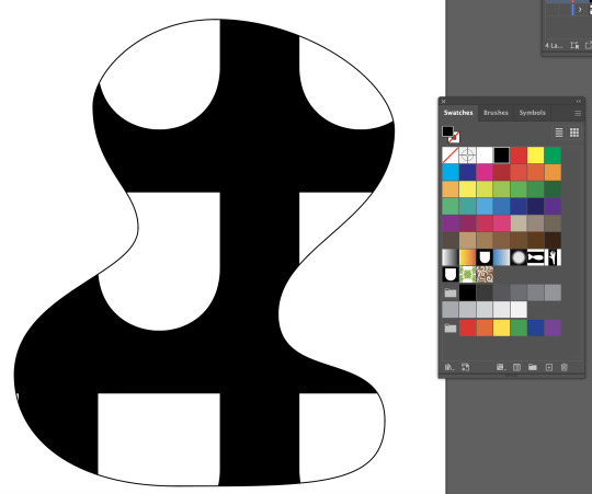
CHANGE SWATCHES SIZE:
To change the view of my swatches menu, press the ham burger menu this will appear and then press 'large thumbnail view' to see the swatches bigger, and not smaller.
MAKE THE PATTERN:
Draw something with pen tool (in the example I made a shield/scale shape
Fill this drawing with white fill and a black stroke.
Put a black box fill black no stroke box around the drawn shape.
Then select both the drawn shape and the box.
Then drag the selected into the swatches menu, this create the pattern.
I can now fill anything with my pattern.
A pattern will be shown as anything that I put inside the black square / Anything selected into the swatches menu.

FILLING THE PATTERN:
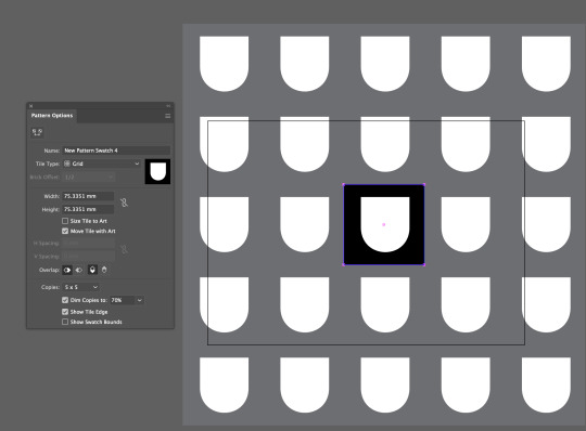
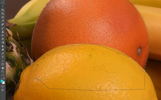
I made a curvy shape to paste my pattern into using the pen tool. (IMG1)
Then click into the curvy made shape with the move tool (v) and select the pattern i've made from the swatches menu. (IMG2)
Double click the pattern in the swatches panel to see the pattern options, this will allow me to change the offset of the shapes, and type of shape it is etc... (IMG3)
This works for more than just squares.
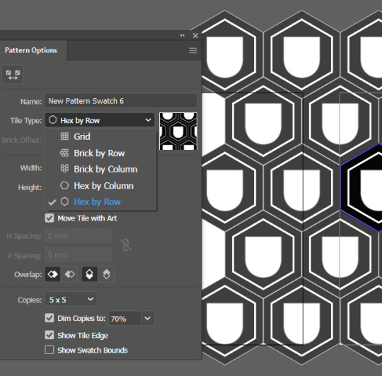
After making a pattern from a square, we then made another one from a hexagon.
Where I put my scale/shield shape into a black hexagon, made it into its own swatch, and then added the pattern to a shape.
By going into the Pattern Options, I can also offset the placement of the hexagons. (IMG 4)

ARTBOARDS:
Select artboard tool
Select old art board and drag it out
Hold shift + option it will create new art board
EXPORTING:
Before exporting image pattern to InDesign must go object -> expand!
Then command + c from The pattern file, and in InDesign press command + v to paste it.
REFLECTION:
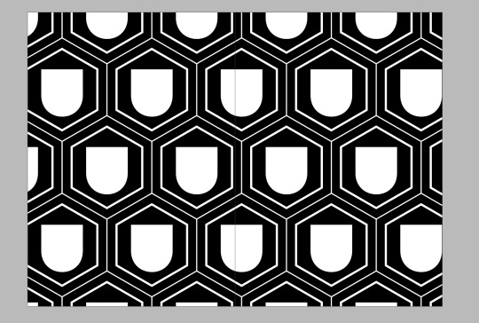
I found the process quite simple to follow, and it was easy to pick it up. I enjoyed learning how to make patterns, and this will definitely become useful in the future. If anything, I wish I had tried it with something more interesting than a shield/scale, but I'm still proud of how it turned out, especially the hexagon one looks extra nice with the white line around the shape.
Next steps: I want to practice making patterns again but with much more complicated pattern designs.
0 notes
Text
Indesign last session
When making a book, make sure pages are divisible by 4.
Each piece of paper is worth 4 pages
(fold a piece of paper in half, you'll have the left / right, and the other side of the paper too) = 4 halves.
Hold command + select outside of text box to deselect everything
W = preview the page(s)
Shift + X = Swap fill e.g, clear fill, black stroke -> black fill, clear stroke
While dragging, hold option to duplicate the thing I'm dragging.
Type -> fill with place holder text
Shift + option + command + v = paste in place OR right click
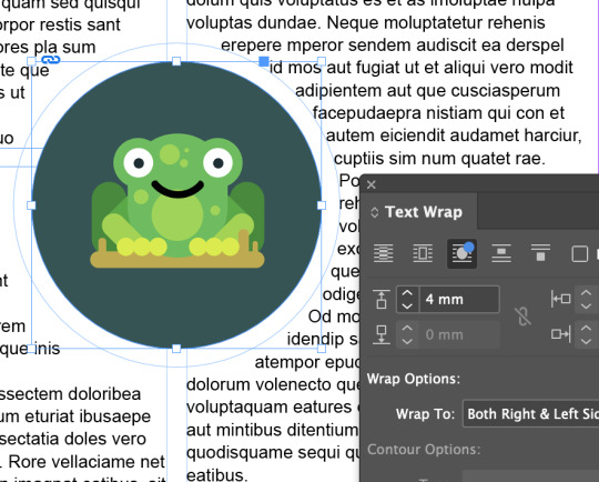
Window -> Text wrap = text wrap options (wrap text around more text)
Select a text box with move tool (v) then in control panel is a column area, type in the number of column you want there.
Drag B-parent pages down to the pages i want to be effected by it instead of A - parent.
Select text and hold option + use arrow keys to change the spacing between lines (up down space)
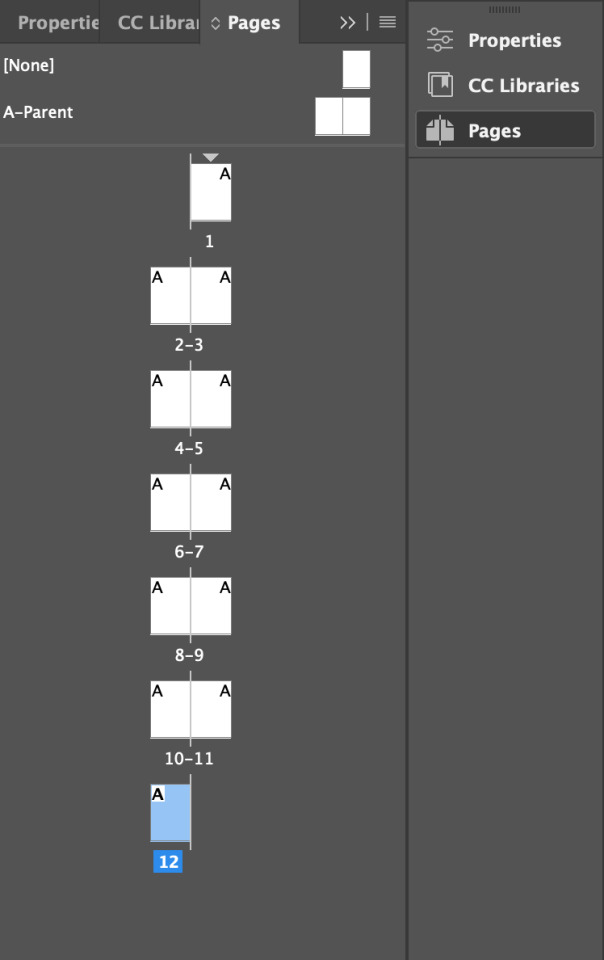
PAGES MENU:
Th pages menu is where we can see the pages we have in out InDesign file.
Double click to go to the page.
If you put something on a parent page, it will apply that thing to all the pages.
The [none] pages are the pages which the parent page does not apply to.
When you make a B-parent page, you need to apply all the pages I want connected to the B-parent individually. Otherwise all the pages will be like the A-parent page.

TO MAKE A NEW PARENT PAGE:
Click both pages A. (shift click, or press the a-parent words)
THEN press new layer - this when create new parent layer B
OR Drag the A parent pages to make a b-parent page which will copy everything from the A parent page.
Drag the [none] page on top of the pages you want to not be connected to the parent page.
PAGE NUMBERS:
Go to A-parent page, then add page numbers at the bottom of the pages, e.g, 'Page 1'
Then highlight the number for the page, e.g, '1'.
Then press: Type > insert special character > marker > current page number. (IMG below)
This will mean that every page will now say the page number it is.
(it will say 'page A' in the parent page, because it is parent page A)
To change the margins of pages at the same time:
Click + shift click (select both parent pages)
Then, Layout -> margins and columns -> change settings.
The chain feature clicked will change the aspects individually.
The chain full (unclicked) will modify all the settings together.

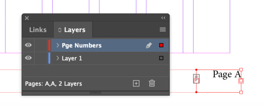
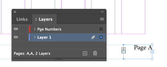
Make a new layer
Highlight page number (shift click to select multiple)
Then get the small blue square on layer panel and drag up to the new layer named 'page numbers' to put the page numbers into the new layer.
Go into move (v) tool then in control panel see:
I pressed align to page.

Centering boxes and entering text is different.
Left is boxes (img 1) right is text (img2)


This red icon here means there is text in the box which cant be seen (too much text in tiny box)
I can link one text box to another.
Click the red plus icon on the text box (shown below and then click the new text box which i want to connect the original text box with.

REFLECTION:
I am finding InDesign very fun to use. This book we made in class was easy to catch along to using the different page types and and the controls of InDesign.
I am very excited to make a book as our next task!
0 notes
Text
File Naming Technique
ALWAYS HAVE NICE CLEAN FILE NAMING FOLDERS!!
FOLDER ORGANISATION:
Start with the base subject, e.g, DESIGNFUNDEES
Slowly get more and more speciffic, e.g, SOFTWARE
Then get more specific e.g, PRJ, IMG, OUT, DOC
NAMING FILES:
Start with 2 digit numbers, 00, 01, 02....
Then describe what your doing
E.g, 00cutoutman, 01saturatedman, 02addedsquares
Example below:
DESIGNFUNDEES
SOFTWARE
PHOTOSHOP
PRJ
(the project) NAME: 00cutoutman
0 notes
Text
InDesign


HOW TO CHANGE MESUREMENT MODE:
InDesign -> Preferences -> Units & Increments (IMG 1)
Change the Horizonal and vertical ruler units to Millimeters.
I clicked 'T' to get to the text box and then I dragged form the top left to bottom right on the screen, to change the whole screen to a text box (excluding the margins)
~ When I press Move tool (V), then I can edit in a design way. But if I don't press move tool (V), it'll think I'm trying to type on the text box.
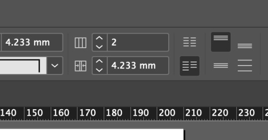
HOW TO CHANGE COLUMN NUMBER:
Select the selection tool (V), and in control panel there will be that square with lines (in image below, it says 2)
Change the number in the box to change the number of columns made.
HOW TO FILL TEXT BOX WITH RANDOM LATIN TEXT:
Type -> fill with placeholder text (2nd from bottom)
HOW TO USE PARAGRAPH STYLES: (IMG BELOW)
Window -> style -> paragraph style
Double click the [basic paragraph]
I used 'Basic character format' to make changes to the font, from a serif(curvy tails) to sans serif(blocky)
I also changed the font size and leading point.
Leading is the gap between the lines.

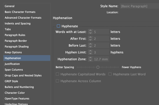
HOW TO REMOVE HYPHENATION: (IMG BELOW)
Double click basic paragraph
Go to hyphenate, unlick the hyphenate button
HOW TO MAKE BOLD // ITALIC TEXT ETC: (IMG BELOW)
Click regular(control panel top bar) and change it.
PARAGRAPH STYLES:
Highlight text
Press + on paragraph styles and then double click into the new style, modify the text as i wish e.g, for a heading, enlarge and bold.
Then to change other text to fit in with the new style, highlight area of text and then click the new paragraph style button, and this will connect it to have the same style as everything else selected in that layer.
The effect will be applied to any text between two return buttons.
MAKE SURE you pressed return after the line you wish to make a heading.
By pressing return, it will treat that as a 'paragraph'. By not pressing return, it will treat everything as that paragraph. (example below is what'll happen if you don't press return - it'll effect he whole text section in that paragraph.

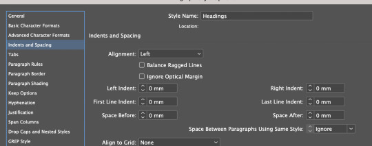
INDENTS AND SPACING:
Space before: means the space before a paragraph
Space after: means space after a PARAGRAPH, not the line.
BULLET POINTS:
In paragraph styles, new layer.
Go to 'Bullets and Numbering'
Selected list type is bullet (could be numbers)
Then it showed like this: (IMG BELOW)
So i fixed this by changing the indents, left indent +3 and first line indent is -3

ONE LINE CHANGES:
Despite this line being in a paragraph, with paragraph styles, I can still change things individually from the control panel if I highlight a specific amount of text: I added more space before for this line.
(IMG BELOW)

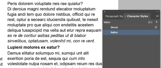
CHARACTER STYLES:
Character Styles t plus button, then rename to italics,a nd then selected italics in the basic format chaacetr section.
cagarcetr styles will only work on the sleected area, and not the whol prgaarph, lie aparagarph styles do.
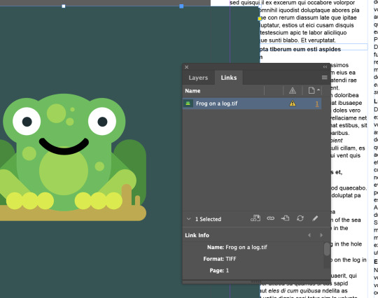
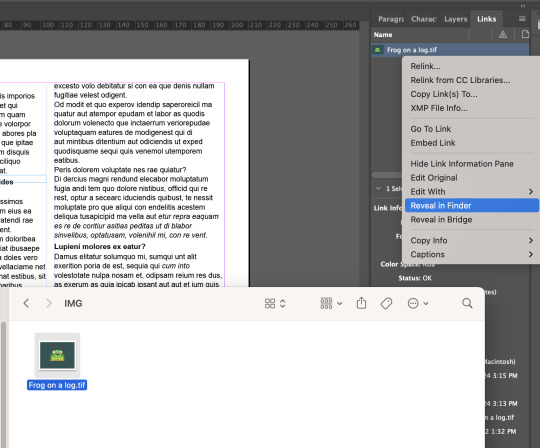
LINKED PHOTO FILES:
If you have a photo in InDesign that you modified somewhere else e.g, photoshop.
Then you can refresh your photo development. Window -> links.
Then press the refresh button bottom right of the links panel. This will refresh the picture.
Right click the picture. Press 'reveal in finder', the image will be found in photoshop, so you know what image to work on in other applications to fix it. Only command + save, not command + save shift. NO SHIFT. Save as the same file.
Don't drag the image by the round circle in the middle. If you do, then it will only move the image around the frame its in, which will crop it.
You need to press selection tool (v) and then move the image (NOT FROM THE CIRCLE).
HOW TO RESCACLE:
I + AN IMAGE within its frame
Shift + command = rescale an image
Shift = crop the image, but keep the original frame shape
Command = scale an image (not evenly)
Option = Centers the framing
Shift + Option = Centers and keep the same frame shape.
Use direct selection tool (a) to adjust where image sits in the frame
~ can use to little arrow keys to so this.
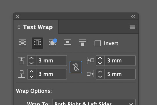
Window -> Text wrap
This second icon, (shown below) will cause the text to be pushed around it, no text will be behind the image.
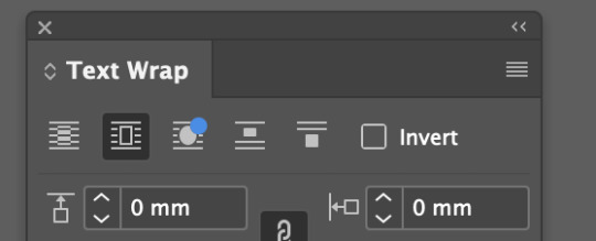
Click the chain option in the middle, (so its got a cross in it) if I want to change the distances round the image separately. (Shown below)
Make an ellipse tool (stoke only) draw a circle around the image.
Click image, press command + X (this cuts out the image.)
Then right click the frame of the stroke circle, then click paste into now i have an image inside a shape.
The third option, 'wrap around option shape' will wrap around the object shape. It is possible to modify the handles of the text border shape. (shown below)


REFLECTION:
I've learnt how to change measurement settings, change number of columns, change the size of the gutter gap, how to fill a text box with Latin gibberish, how to use paragraph and character styles, remove hyphenation, add spacings, indents and bullet points, and how to add in a linked image.
Before this lesson I didn't know how to use InDesign. I have a small lesson on how to use it last year, but I didn't understand it so I didn't touch InDesign last year.
But this lesson helped teach me the crucial basics and now I feel a lot more confident + I actually really enjoyed using InDesign as it feels very relaxing to use.
0 notes
Text
InDesign - Shortcuts
Important Keys:
'Space' = pan around
Z = Zoom (left is out, right is in)
t = type tool
v = selection tool
a = Direct selection
w = preview
return = create new paragraph
Shift + return = 'Soft return', brings the word down, but does not create a new paragraph.
Important Words / Terms:
Column: The vertical line sectioning of word.
Gutter: The gap between the columns of words.
Paragraph: Anything that ends in a return / enter key. is treated as a 'paragraph' to InDesign
file -> place -> click
That's is the instruction on how to place an image!
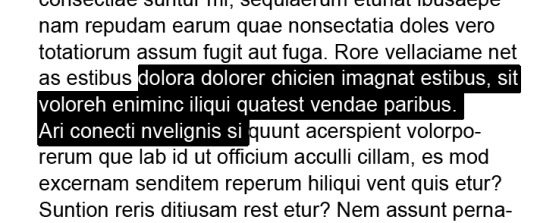
Widows: Paragraphs which end with one line with 2 words only.
(IMG below)
Orphan: The paragraph end with one line with one word only.
To fix, either change the font spacing of the last sentence, the while paragraph or add a space further up in the paragraph to push a word down the lines, so its not just one words or two by itself.
To move around the text:
Command + side arrows to jump words at a time.
Command + up/down to move through paragraphs at a time.
Only side arrows = one letter at a time
Only up/down arrows = up down one line a time
To highlight the text:
While in the text box, hold shift and then press any of the arrow keys to highlight across the text.
Hold command + shift while moving the arrows and it will highlight one word/punctuation at. a time. While holding shift command and doing up/down arrows it does a paragraph at a time.
(IMG Below)
0 notes
Text
RGB vs CMYK
RGB is the light / screen projector way
CMYK is the printing way
0 notes
Text
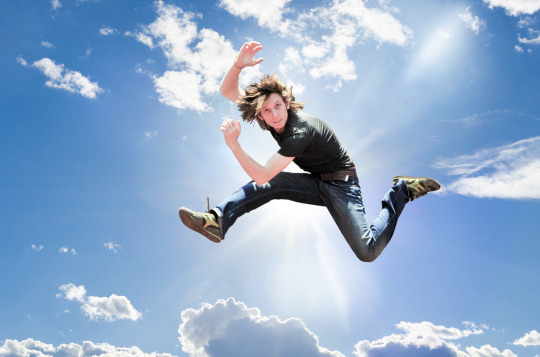
Photoshop Homework
BACKGROUND:
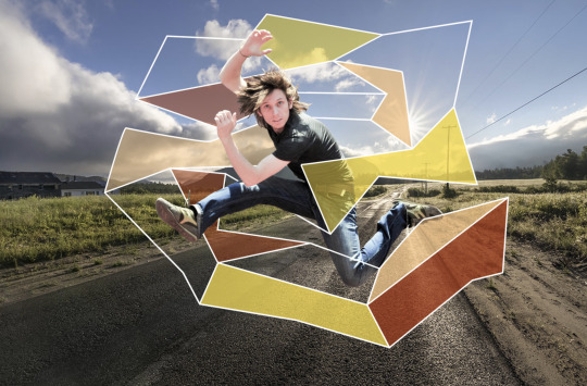
The task was to use the jumping man image from Thursday's class and add 2 vector images and 2 raster images.
First, I put a new background behind the man. I made a new layer, at pasted a sky image and resized it to fit.

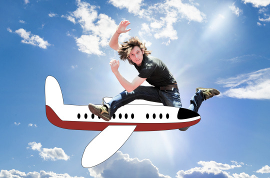
AEROPLANE: Vector Image #1
The first vector image I made was a aeroplane. I made this by using the pen tool and using hybrid, corner, broken and curved points. I then used the pen tool to make the wings and the front window. I then used the elliptical tool to make aeroplane windows - I copy and pasted the shape to make lots.
I made a copy of the aeroplane layer, and I then used the pen tool to make the red design shape. I opened up the pathfinder window (wndow -> pathfinder) and I selected the red design while on the moving (v) tool, I then pressed 'shift' and the aeroplane shape to select them both. With them both selected I then pressed the Pathfinder window and this caused the red design to merge to the plane shape.
I then saved the AI file to 'MyFinder' and then uploaded it into PS to work on it there.
I opened the file and dragged it into the photoshop file with the jumping guy.
I used he moving tool to adjust where the aeroplane was so it fit nicely.
I then used the object selection tool and quickly selected the aeroplane. I then erased the mans leg using the eraser tool so that it looked like the plane was flying through his legs.


BAG: Vector Image #2
I made a bag in AI using the shape tool and the pen tool. I used a rectangle shape tool to make the main bag shape, and then I curved the corners. I did the same with the bag button.
I used the pen tool to do the lid of the handbag and the bag straps.
I opened up the stroke window (window -> Stroke) and I made the stroke thicker and changed the colouring to match the part of the bag.
I then saved the AI bag drawing, and then opened it in PS. I dragged the bag image into the jumping man thing I'm working with.
I re-sized the bag using the moving tool (v). I then used the object selection tool on the man and then went onto the bag layer, to erase the bag in the man area where his hand should be over the bag handles.


BIRD: Raster Image #1
I searched for a bird image, because I wanted to put wings onto the back of the jumping man.
I copied the bird image and pasted it into PS.
I used the object selection tool as a good starting point, as it got the bulk of what needed doing, done for me automatically.
I then created a new layer with the bird selection and another new layer with the colour pink, this pink would act as a greenscreen, so I could see what was showing up in the bird selection easily.
I then zoomed in (using z and spacebar) around the outline of the bird, and cut out everything I didn't want using the lasso tool (I held option while using to remove the lasso tool).
Once I'd cut everything out so only the wings remained, I then blurred the edges of the wings so the bird cut out wasn't so crispy and harsh at the edges.
I then flipped the bird image by going into image -> image rotation -> then flip. I did this so that the bird wings would be the right way when I put them onto the jumping man's back.
I then dragged the bird wing layer onto the original PSD I was working on, and then I readjusted the size of the wings to fit the man's back.
I then realized the bird wings looked really weird, so I modified the colour of the bird wing by using the colour balance to modify the colour tones to appear more natural, and I used the curves adjustment tool to change the brightness and contrast of the wings.


AEROPLANE: Raster Image #2
I found the plane image from Google.
I then made a copy of the plane layer and then selected the plane by using the object selection tool.
I then added a mask to the layer and used white brush to add to the selection and black brush to remove from the selection.
I removed the wheels from the plane image so that the plane would appear to be flying when I transport it to the jumping man PSD. I also removed the edge tips of the plane wings, because the pixel image was too small, so the plane tips looked far to thin and unrealistic, so I removed them.
Once I'd finished the cut out I blurred around the edges to make the edges less crispy sharp, and more softer.
After this, I realized I had put the mask on a layer with the whole plane image, instead of just the plane selection. So I quickly dragged the mask down to a layer with only the plane so I could move the plane to the jumping man PSD.
When I added the plane to the jumping man PSD I then had to add both curves adjustment and the colour balance adjustments to help the plane fit in better with the background. I made the plane slightly brighter, and blue-er toned.
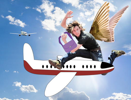
REFLECTION:
I definitely feel that I could've done a better job with this homework. I feel that my graphics were a bit basic. The purple handbag is my least favorite because it doesn't seem to fit in with the man's direction and looks very out-of-place. I am however, quite satisfied with the plane part of the piece.
I am proud of myself for picking up the Illustrator skills as fast as I have. And although I felt the graphics could've been better, I am still proud of the skills such as; pen tool (with the different types of lines), elliptical/rectangle tool, pathfinder panel, transporting and uploading files to another, selection tools, eraser tool, stroke tool, zoom tool, layer tool, blur tool, curves, colour balance and masking tools.
My next steps are to just keep using all these tools, so I remember how to, with confidence.
0 notes
Text
Photoshop
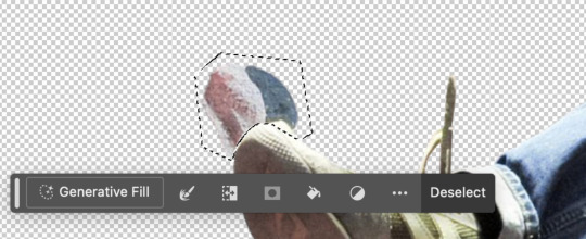
CUTTING OUT THE MAN:
Make a duplicate of my original photo (drag image to the new layer button)
Use the object selection tool to select the man. This will roughly select the man in the image - this is a great starting point.
Add a layer mask to the selection made.
Turn off background layer on original layer, now I can see just the selection I've made.
Now I'm adding a green backdrop to make it easier to see my selection of the guy. I used green because its complimentary to the pinks in his skin.
I then used the pen tool to cut out the wall sticking out from the leg of the man. (IMG below - mine))
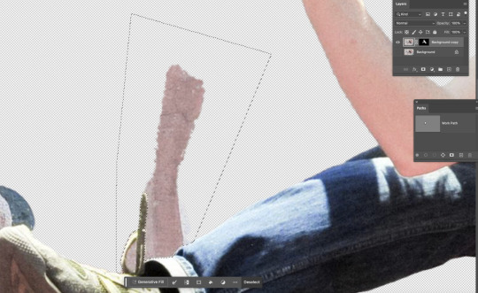
Then open the paths layer and press command + click the viewing square (shown below (IMG1 - Toby's)
Then make sure black is the foreground colour, and select layer mask. The select option + delete, which will fill in the selection of the wall i've made with black(in the mask), which means it'll disappear from view. (IMG2 - mine)

Then I used the Polygonal lasso tool to remove the wall background from the inside of the shoe string and from the end of the shoe.
Then press option + delete again. (shown below IMG 1 - Toby's,
IMG2 - mine)

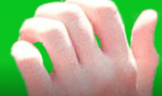
I then noticed some of the man's arm wasn't showing up, so I used the polygonal lasso tall to go around the area of where his arm should be, and then once I'd selected the area I went into the masking layer and then fill it in white. White = 100% opacity. (Shown below IMG 1 - Toby's)
I fixed the hand by using the lasso tool to remove the spaces between the fingers. (IMG2 - Toby's)

I used the brush tool to erase around the hair. I used different types of brush (soft and hard), different sizes and changed the opacity. to help get the bits and pieces I did and didn't need. (IMG1 - Toby's)
I can also change to view inside the mask if I want to see the levels of the different opacities. (IMG2 - Toby's)

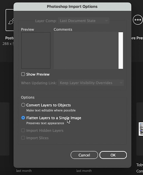
Once ive finished cutting the man out I saved the file in PS. (IMG 1 - Mine)
I then moved to AI. When I loaded it up in AI, I made sure to select the 'flatten layers to a single image' option. (IMG 2 - Toby's)

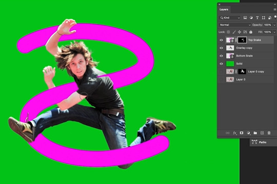
MAKING THE 'S':
IN ILLUSTRATOR...
Make a new layer, turn off the fill. Make the stroke a bright colour.
Draw a backwards 's' with the pen tool. (IMG 1 - Toby's)
Fatten the stroke line so it is visible. (IMG 2 - Toby's)
Then make sure the stroke has curved edges in the stroke menu.
I then saved the backward 's' as its own file. (IMG 3 - Toby's)


IN PHOTOSHOP...
I then went into PS and loaded the backwards 's' file into the original PS file with the man.
So open the 's' file, I went to file -> Place linked -> find the image
Then a menu will appear, make sure I change the option "Bounding Box" to "Media Box". Media box wont crop the image at all. (IMG1 - Toby's)
Then press 'return/enter' after it gets pasted in - this is to confirm it.
Make a copy of the backwards 's'
Put one 'S' layer underneath the man cut out, and the other 'S' layer above the man cut out.
Make the backwards 's' top layer have a masking layer and fill in this layer fully black so it turns invisible.
Then get a white brush and draw over some parts of the man so that, that part of the 's' is going over the man. (IMG2 - Toby's)

CHANGE THE 'S':
IN ILLUSTRATOR...
I then went back to AI, and re opened the 's' file i worked on.
This time I create a new layer and make a big grey box as the new background to me 's' (so i can see what I'm about to do)
I make a new layer and i call it 'wireframe' - i will make a wireframe graphic art design in this.
I then put on the pen tool, white stroke, no fill.
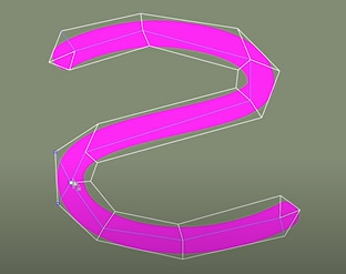
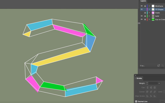
I then went around the outside of the 's' shape and added a wireframe graphic design in the 's' shape. (IMG1 - Toby's)
Then make a new layer to use this to fill some spots with coloured blocks.
I used the coloured swatches panel and fill option with the pen tool to create the coloured blocks around the wireframe os the 's'. (IMG2 - Toby's)
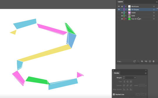
I then turned off the view of all the layers, except for the wireframe and the coloured blocks. I did this so that when I save the file, only the wireframe an coloured blocks would be seen in the file. (IMG3 - Toby's)
IN PHOTOSHOP...
Since i saved the new 's' design file it with update the changes in the PS file because the 's' file is linked into the photoshop one, so any changes are applied to it. (IMG below - Toby's).
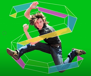
I then added a background image.
I went to google, and copied the background into the PS document and then adjusted it to fit. (IMG below - Mine).
REFLECTION:
I found cutting out the man quite fun and it was easy to follow along how to do that. I enjoyed learning the different ways of the lasso tools, pen tool, using the masking layer, or changes the brushes and opacities.
I struggled a bit with the 's' part, but I understand the concept of making a shape, adding blocks / details, changing opacities, using the pen tool, modifying the strokes, and how to use a top and bottom layer of the same object + the masking tool to make objects appear like they are interacting with another.
I also have learnt how to add a linked file that changes.
The part I think i need to work on, would be working around cutting out hair, just so I can get better at making it less chunky, and more natural of a cutout.
I forgot to take many screenshots during the class session, and then when I removed the USB drive, it hadn't saved properly. Because my USB stick has some issue with it apparently (I need to get it looked at) Because I lost my file I only had a set amount of screenshots to work with for this reflection on Tumblr. SO to help me explain and show stuff, I used screenshots from Toby's recording to help me see for future reference on what we did in class.
- I did mention when its my photos and when its Toby's
0 notes
Text
photoshop

HOW TO GET THE CONTROL BAR:
window -> control


EXPLANATION OF ABOVE:
The images above show me experimenting with the tools in photoshop. Tools such as brush tool (soft, hard, different sizes and opacities) as well as the different shape tool and keys which can be used with them.
0 notes
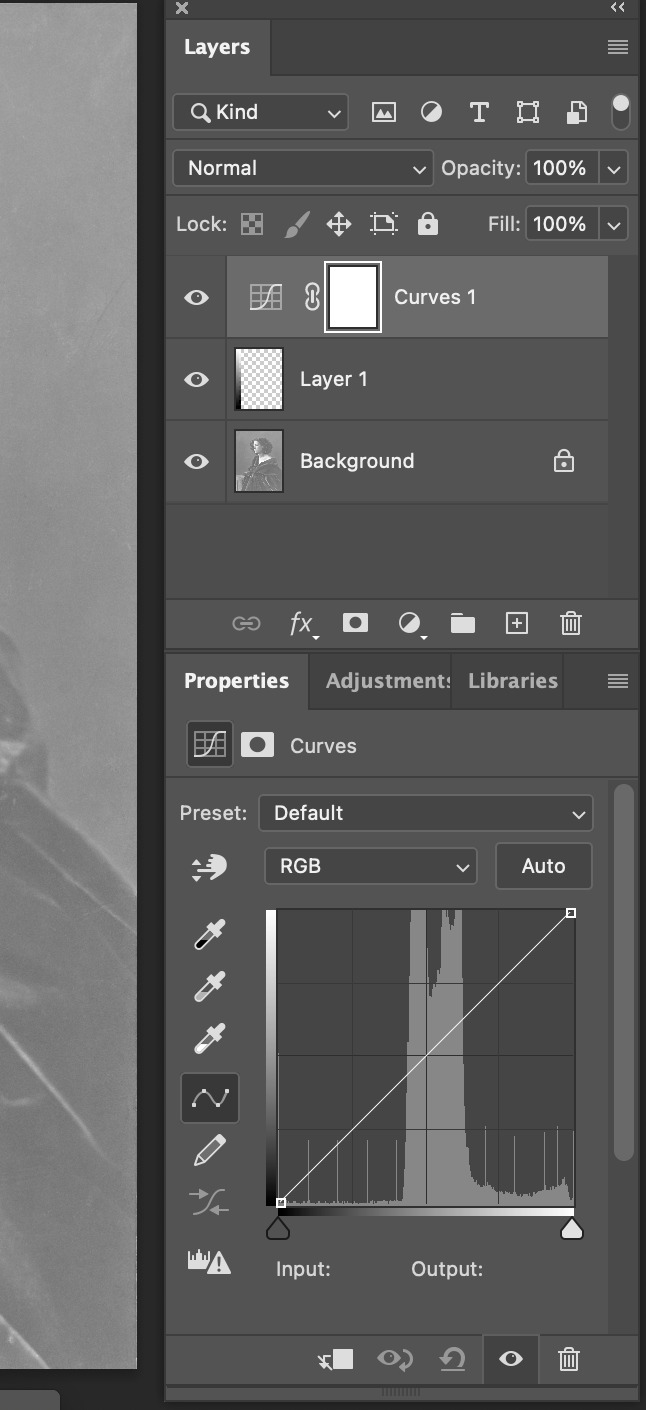
Text
Photo adjustment more
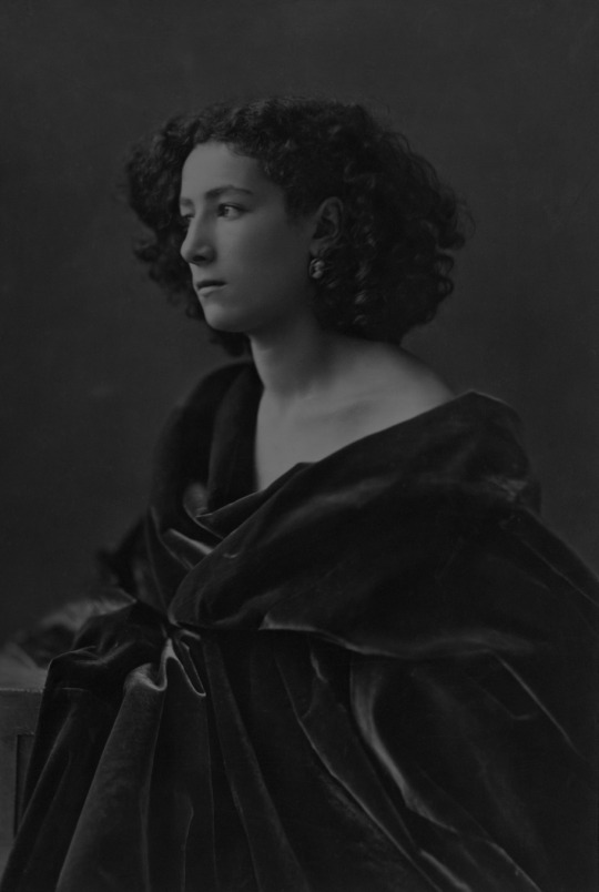


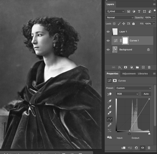
HISTORICAL WOMAN:
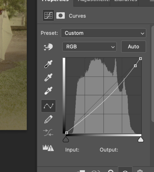
I put on the curves adjustment and lightened the image by pulling the line up closer to the top of the graph.

Traditional Girl:
This image is very light tinted and the background behind the trees in gone. My teacher even said he wasnt sure if we could fix the photo, but we tried.
First i applied many of our common adjustments such as curves, I made it darker. (IMG1)
Hue/Saturation, i made it more saturated. (IMG2)
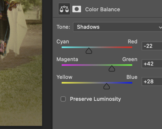
Colour balance, i tried to get rid of the yellow tones, and add more natural greens. (IMG3)
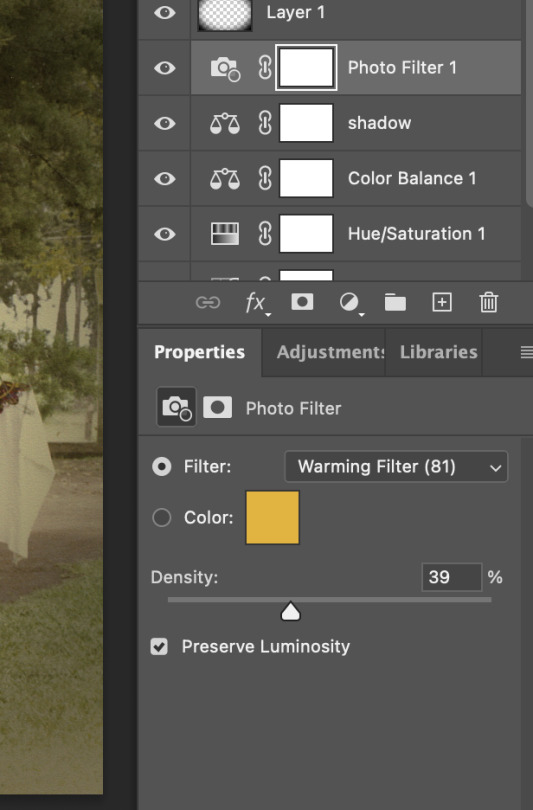
Aftwards we decided it still wasnt good enough, so we went into adjustments and added a photo filter, giving the whole imge a slight orange tone. (IMG4)
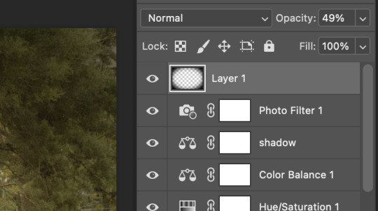
We finished off by giving it a vignette. To do this we made a new layer, covered this whole new layer in black. We then made an eclipse selection in the middle of the covered black screen, and aftrwards we pplied a blur tool around the edges, so the vignette would blur between the image and the black border. (IMG5)
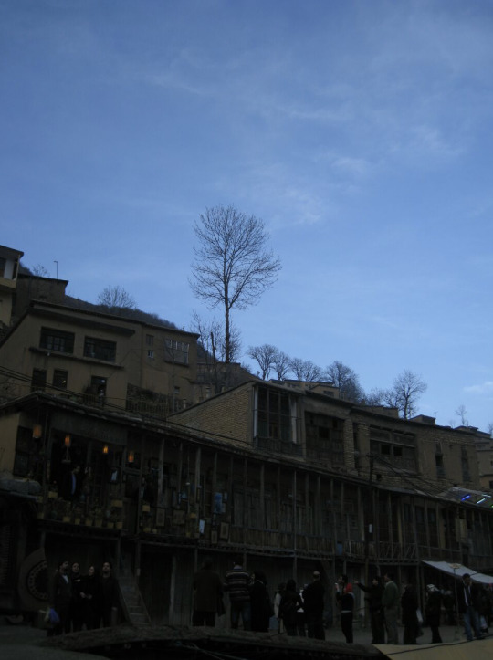


BUILDING:
The building was dark and the sky was bright.
So I added a curves layer and made the building a lot brighter. I put a mask on the photo. I then put a gradient on the mask so that the building was white and the sky was black inside the mask. This meant that the brightened adjustment would only apply to the building, and would fade out in the sky.
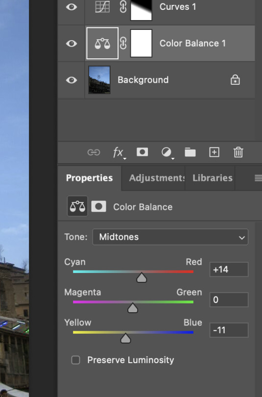
I also added colour balance adjustment to make the buildings more orange tones.
0 notes
Text
photoshop adjustment


OLDER MAN:
I adjusted the photo and applied colour balance to remove the blue tones fromt he image, and add slightly more orange tones.

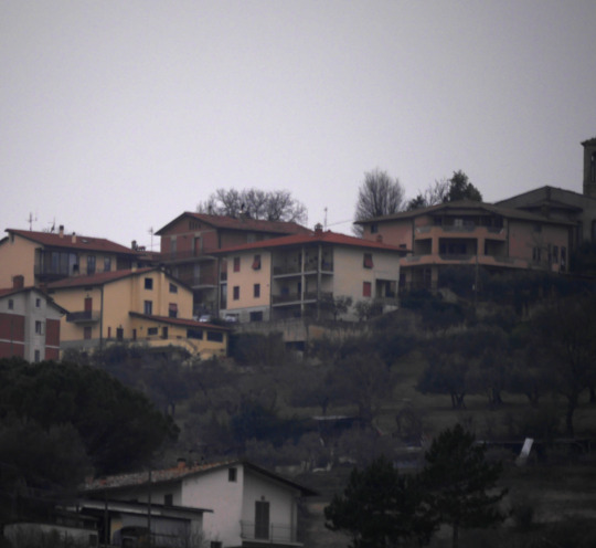

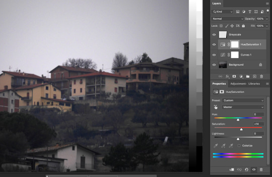
HILLSIDE HOUSES:
The original photo was very dark and moody, and the landscape was not easily seen.
To combat this I went to adjustments and went to curves to adjust to brightness an contrast of the image, so that things we're more easily seen, and it was a lot brighter.
I also went into the hue and saturation adjustment and made the buildings a bit more tinted in colour so it appears less desaturated.


RIVER:
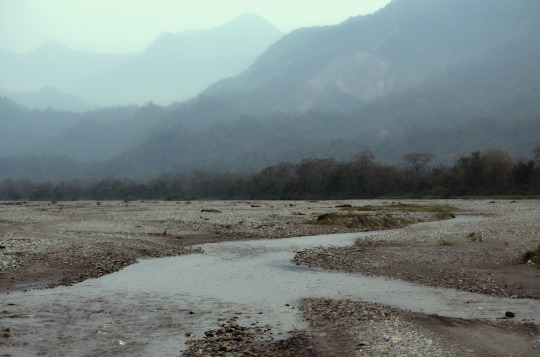
I used the Hue/Saturation adjustment tool to desaturate the photo as it was too bright blue. (IMG1)
I then used the colour balance adjustment tool to edit the colour to remove the greens and blues and add more reds and oranges to neutralize the tones and allow the image to appear realistic. (IMG2)
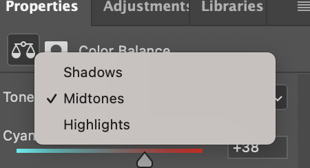
I changed the colours for the midtones, shadows and highlights.
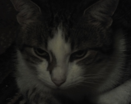


CAT:
I applied the curves adjustment to the photo to brighten it up and make it more visible. (IMG1)
I applied the hue/saturation adjustments so that the colouring of the cat stood out a normal ammount.
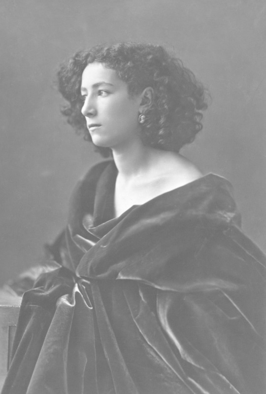

HISTORICAL WOMAN:
I put on the curves adjustment and darkened the image by pulling the line down closer to the bottom of the graph.
REFLECTION (on all photo adjustments):
I've used photoshop for design the past few years, but I used it for typographic and graphic design elements, not for Photo adjustments. So it was really interesting to use a platform I'm so familiar with in a new way!
I found learning about using the photo adjustments and things for Photoshop very interesting, and due to my prior knowledge with the software it was very easy for me to pick up on what to do.
I loved experimenting and trialing out what happens to the photos when I change things.
I found the curves tool very fun to use because it was simple, but very effective.
I enjoyed using the gradient mask feature as it was something I had wanted to learn back from last year.
For colour balance I feel that I should experiment more with this, as I was just changing all the colours until it looked good, but I feel that familiarizing myself with what the mid-tones, shadows and highlights of different colours ACTUALLY do individually might help me in the long run.
I love using the hue/saturation adjustments, those are adjustments I have understood and used for many years.
Photo filter is also a new one for me, but I can definitely see its benefits for creating a good atmosphere.
The vignette was a super cool trick to learn, and definitely could help in the future with bordering and centering things.
Overall, I'm quite proud of how I did with this, and I'm very happy with how easily I picked it up.
0 notes
Text
3. Penguin - Progress

To change the colour of the working/guide lines. Double click the layer icon (square icon with the layer image). Then there is an option to change the colour of the lines.

While on the fill option, press '/' to remove the fill.
Then to add the control panel, go to window -> control the tool bar will appear.
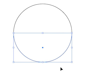
Get elliptical tool. hold shift to make a perfect circle.
Then press 'a' for the direct selection tool. Select the bottom half of the circle by dragging over it.
Then press command + x to cut out the selected area to make juts a semi circle.
Then press shift + command + v to paste the area I just cut out, back into the exactly the same spot it just was - except now the part I have selected is separated (IMG2) to semi circles.
Now drag using the V tool the semicircle down, but hold shift while dragging it, so it stays in line with the top semi circle.
Now use direct selection tool, (a) and drag select both end of the semi circles on the left. (as shown in IMG 3) then press command + j. Command + j will join the two selected end points together.
~ Another way to select both end points is by using direct selection tool (a) and click the anchor point of one end, and then shift + clicking the anchor point of the other end. Then will select both points. this is especially helpful when the points I want to connect cant all be selected in a box shape by dragging.


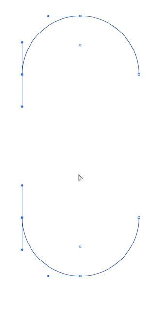
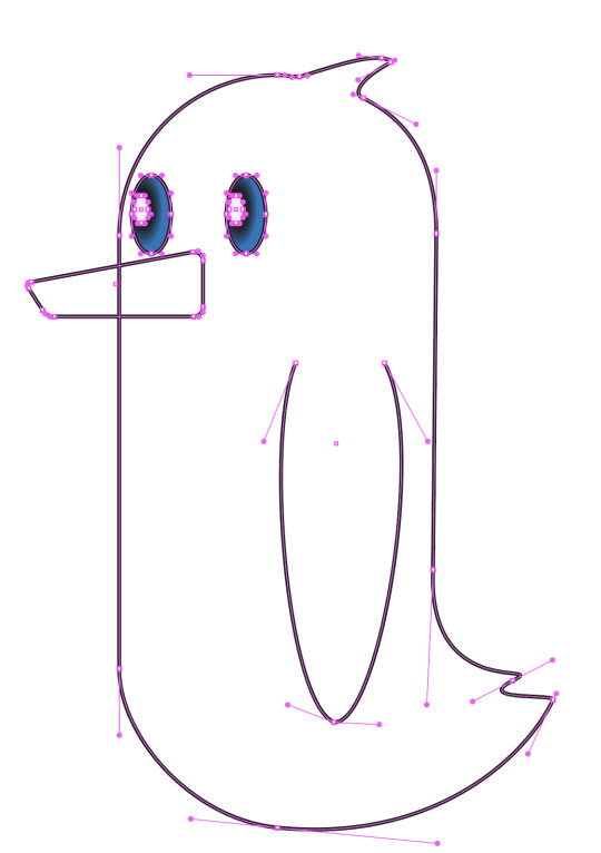
Then to make a tail onto our basic penguin shape.
Press +, this will take us to the add anchor point tool. Press where I want to add the tail.
Now press direct selection tool (A), and then drag out the new anchor point I added.
Use the direct selection tool to move around the handles and the anchor points ~ You can hold shift to keep the movement in line.
Also use the add anchor point (+) tool to add more anchor points to help create the penguin tail shape I want.
To add a feather on top of the penguin head, do the same thing with the tail but now on top of the head.
You can also hold option, to make a broken anchor point if needed.
REMEMBER TO SAVE DURING THE CREATING PROCESS
Use the pen tool (p) to make a wing for the penguin.
I used the curves pen tool and then I adjusted the handles to fix it up, to make it better to the shape of my penguin.
Select rectangle tool, to make a beak.
Sue the direct selection too (A) to move the points if the beak, one corner at a time. to get move of a break shape.
If you click the corner of the rectangle with the direct selection tool (A) then a small circle will appear inside the shape by the corner. This small circle when dragged, with round off the edges of the shape.
I used this feature to round off the corners of the beak, so it wasn't as sharp and pointy.


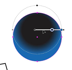
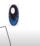
THE EYES:
I went to the window menu and selected gradient and swatches to bring out their menus I need to make the eyes for the penguin.
Swap around the fill and stroke colour, so the fill is black, and the stroke is nothing.
Press elliptical, make a circle (use shift)
Go to the gradient window, and then make sure that the fill is on, and the stroke is off. then press the middle gradient option (radical gradient)
Two ways of colouring:
GO to swathes and hold and drag until the gradient circle under the bar (make sure it shows the green plus)
OR
Double click the circle under the bar and custom make a colour.
I made me penguin eyes be blue on the outside, and black in the middle.
I then dragged the black circle under the bar, to the middle of the bar, so there was more black in the eyeball center, and less blue. This also make the gradient in the eye more harsh and not as faded
Change the location f the gradient.
I clicked the gradient tool on the left column, and the white line appeared. I then grabbed the white line (while still on gradient tool) and then I dragged it up. Then then dragged my gradient upwards and not direction in the middle.
Press command and anywhere to remove the selection of the eye.
Then pressed v to select the eye again normally and to add a stroke to the eye. I then pressed the stroke icon, and click the black colour to add a black stroke. I set my stroke to 4 pixels
HOW TO CHNAGE THE DOCUMENT MEASUERMENT MODE:
illustrator -> preference -> units
Then in this menu I can always change the type it measure in (pixels is recommended by Toby)
To change the shape of the eye forma circle to oval, I pressed move tool (v) and the dragged inwards, so that it became an oval.
At this point we decided to add a white spot into the eye
So I Stopped selecting the eye and then changed my fill to white, and stroke to nothing. I then created a small elliptical tool in the eyes.
~ I can hold space to move the location of the shape while I move it.
TO then copy the eye ball I have made, i press v then drag over both the eyeball and whole piece then press command + G. command + G groups the elements together so that they move and can be changed together.
If I double click, on the group I can still move around each element individually, but if I don't double click then it acts as a group.
To duplicate it, press V and then drag the eyeball to the left, but hold option while doing this. By pressing option down in the process, this causes a duplicate to be made.


FOOT:
First I used the pen tool to make the top half of the foot shape. (IMG1)
Then I drag my move tool (v) over the half foot. And then I press O, to get the reflect tool. Then I clicked on the right open end, then I held down option and shift and clicked on the left open end once, and the tool reflected the foot shape. This makes a copy of the half foot, and flips it. To connect the two half foot's, use direct selection too, (a) and then drag over the two open points on the right, and then press command + J to connect them (like what I did in the beginning for the penguin body). AND i did the same for the left side of the two half foot's. (IMG2)


To make the foot have a 3d effect I make a copy of the foot by pressing shift and option while dragging the foot down to make a duplicate.
Then you can see I have used the (a) tool to select the top part of my foot line. I then press delete to delete that part of the line.
I did the same thing to each of the top lines, So it looks like I've made a shadow.
Then made a duplicate by holding option, and put the copy just above the first one. I will then join the open end points together using the command + j trick I have learnt. I click a point using the (A) tool, and the shift click the next one, and press command + j to connect the points.
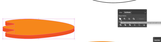

Then use v tool and select both the full foot, and the foot shadow, and the press shift + x to swap the clear fill and black stroke to a black fill and clear stroke.
Then select the shadow part and change the colour to a dark orange fill. and select the full foot and change it to a light orange fill.
Now the full foot layer is underneath the shadow layer, which looks weird, so to put the full foot layer on top, I selected the full foot (light orang) and clicked object -> arrange -> bright to front.


To make an outline around the whole edge of the foot:
Make copy (hold and drag with option key), then to make it all one object I pressed window -> pathfinder.
Then I selected the foot (v tool) and then I pressed the unite option. (IMG__) The unite button in pathfinder, does its best to make all objects selected into one object.
~ Can go into wire frame mode, by pressing command + y to see all the line. As i could see from both feet elements, the one I used unite on, only has a base outline, whereas the copy of the foot still has many lines.
If i still see unwanted lines after doing 'unite', then I can go into the wireframe mode (command + y ) and then use the marquee tool to delete the unwanted lines. (IMG1)
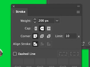
Now with the entire foot selected, I will swap the stroke and fill around, so the foot has a stroke but not an outline. I then changes the outline of the foot to a black, 4 pixel outline, to match the rest of the penguins stroke.
Then I dragged the outline for the foot over the regular foot, but it didn't look quite right, so I went to the stroke menu (Window -> stroke)
Inside the stroke menu there is a 'corner' section, I pressed the middle option (round join), this meant that my corners are now rounded and not pointy.
And then in the 'align stroke' section I pressed the outside option, so that the stroke would be on the outside, This meant that the stroke wouldn't cover any of the foot, and would instead outline what is there. (IMG2)
Go to illustrator -> preferences -> general -> make sure that 'scale stroke and effects' is off, otherwise when I scale things, the stroke and effects will adjust too.

LEG:
Make two eclipses, then do what I did with the penguin body and make two halves and then join the edges together to make tiny pole shape.
I then filled this shape in the same orange colour as the op of the foot.
I then selected the body of the penguin, I shift selected the beak, wing, and main body shape. I then fill it all in white a white fill, and m=increased the stroke to 4 pixels to match the feet.
Then I selected the foot and leg stick with the V tool, and then i grouped them together. I then go object -> arrange -> send to the back to put it behind the body of the penguin.
I then drag the leg over while holding option to make a copy of the leg.
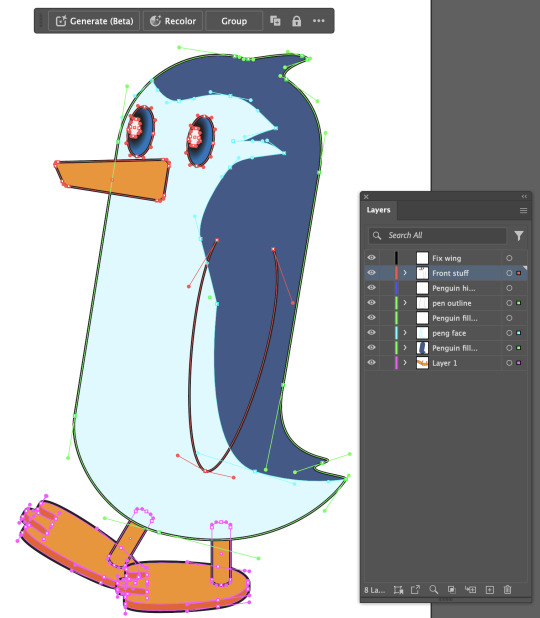

SHADOW + LIGHTING (+ bowtie)
After I made the penguin, I needed to add more details such as Lighting and shadow!!
To add shadows to the penguin body, I made a copy of the penguin body outline and I filled it in with black (shift + x)
I then went into line mode with Command + y, so i could see all the elements of the penguin. (the black was covering it)
I then could see all the lines, without being blocked my colour. (IMG1)
I then drew the bottom shadow, and the top highlight on the penguin.
I then went out of line mode command + y, and then I shift + clicked both the bottom shadow and the body outline. (IMG2)
With both selected, I then went to the Pathfinder tool and selected the 3rd, 'Intersect' option.
This meant the penguin shadow was now in line with the body shape, which you can see in IMG 3. In IMG 3, I had also filled in the shadow outline, and made it a super dark blue in colour. I then lowered the opacity to 15%, so it appeared like a shadow.

I then selected the circle highlight selection, changed the fill to white, and then lowered the opacity to 30%, to create the highlight effect on the penguins head. (IMG 1)
For fun, I also decided to make a little bow-tie for the penguin. I did this using 2 rectangles, which I turned into triangles and the elliptical tool, with a black stroke and grey fill. (IMG 2)

REFLECTION:
I was doing really well and was ahead of the class using the penguin tutorial online until it got to putting an outline around the foot, I had an unusual stroke line sticking out. I tried to figure it out, and erase/delete the line but I couldn't and anything I did made it worse.
So I waited for the class to be where i was to do it with Toby, thinking I'd possibly made a mistake somewhere. (image below shows my original foot)
Overall I'm very proud of my penguin, and this exercise definitely helped familiarize me with the tools and what they do + how to use them. Some of this things I learnt which have helped me the most from this lesson is the pathfinder panel, and the join tool.
0 notes
Text
Photoshop - heading
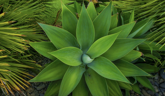
Leaf cut out + colour:
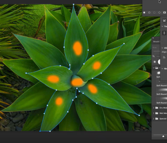
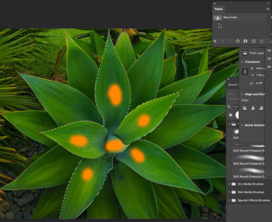
Use pen tool (p) and raw over the area I want to work with to make a path.
~ You can tweak the path by press 'A' and modifying the anchor points and moving the handles. (IMG1)
Then to chnage the path from a path to a selection, you need to open the 'Paths' window. Go to Window -> Paths.
Then press command + click on the thumbnail image of the paths window to turn the path into a selection.
Now you have selcted soemthing using a pen tool (IMG2)

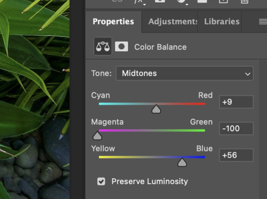
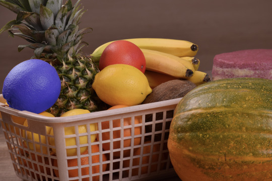
After making this into a selection I then changed the selection of the leaves by using colour balance and I made the leaves fade blue.
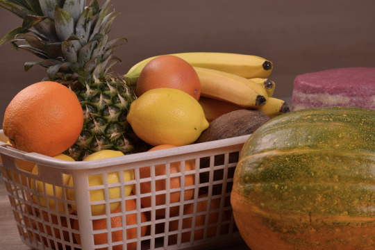
Fruit colour: Select an area
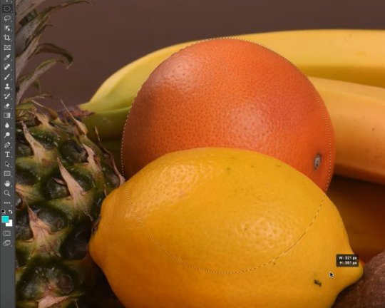
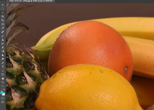
I used the elliptical marquee tool to highlight the orange roughly.
~ I can use the spacebar to move the selection around while making the selection.
I then used the elliptical tool to remove part of the selection by holding down option while making an elliptical shape over the area I didn't want apart of the selection.
I then went over in finer detail of the orange selection by using the polygonal tool. I used this tool to draw custom lines of the areas I did and didn't want to be apart of the selection (shift to add, option to remove from the selection)


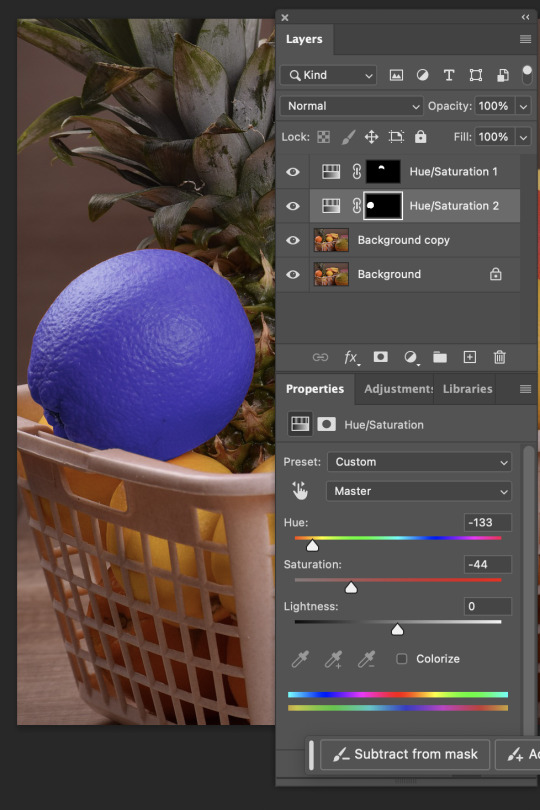
After making this selection more accurate and fine, I then modified the colour of the orange, I decided to make it red tones. (IMG1)
We then picked a second orange and this time used the object selection tool to select it quickly.
We then applied the colour balance adjustment to the selection layer.
This effect goes onto all the layers. But there is a button (IMG2) when it is clicked it will not have the effect (e.g, colour balance) on every layer below (white square with little arrow).
This is found in the adjustments layer, properties section at the bottom of the window. I then did the same thing with another orange, except this time I made this 2nd orange become blue (IMG3)
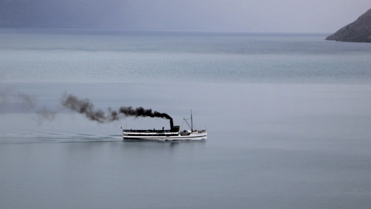
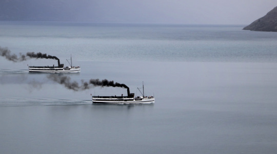
Ship duplicate:
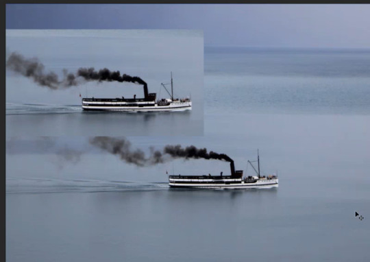
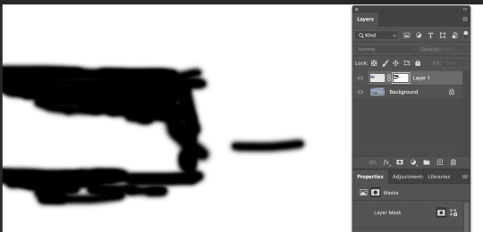
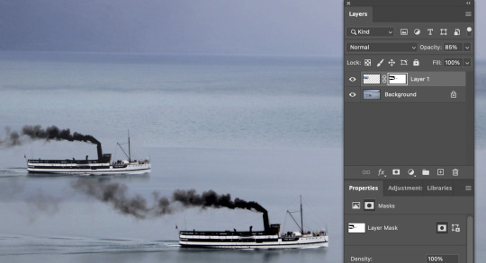
Use masquee tool to select the boat
Command + J to copy and paste the selected area on a ne wlayer by itlsef.
Move the new layer to another spot on the water (to look like two boats)
Press the masking icon (japanese flag) to turn the copied boat into a mask.
Use thw brush tool to help blend in the image and get rid of excess parts of the image you dont want.
~ White brush = 100%. Black brush = 0% opacity. Grey brush = some opacity (closer to black, less opacity, closer to white more opaxity.)
Ypu can also use the soft and hard brushes to chnage how the image fades from one to the other. I used the softer brush so the water from both images faded into eachother more.
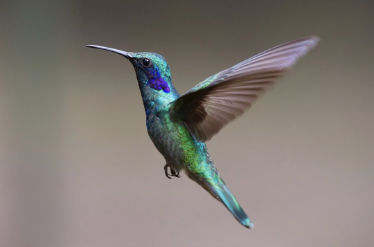
Hummingbird: Cutout & Paste
I created a duplicate of the bird image to work with as a spare.
I then used the object selection tool to quickly select the bird shape from the background, but this object selection tool made some errors, so I had to fix them.
I made a new layer and made it a dark green colour to help me easily see the mistake and things I need to work on with the outside of the bird selection. (green screen)
After looking a the green screen image bird (IMG1), I then realized the wing ends of the bird were quite sharp and not very realisic, so it would've looked weird when I paste it into the new photo background.
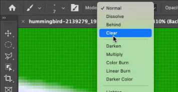
To fix up the shaping of the bird cut out I made a mask layer of the bird (IMG2)
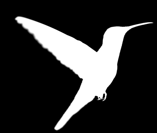

I used the pen tool and went along the bird wing. I drew the line very close to the edge of the bird wing, because I didn't want any of the original background still in the cutout image of the bird. (IMG1)
We then went onto the masked layer and coloured the wing section in white (so it fully showed), and coloured the exterior of the wing section in black (so it was invisible). (IMG2)
This then made the wing very crisp, so I had to change that. I could tell it was very crisp because I had created a greenscreen layer to help me see what I was working with against something. (IMG3)
To do this I used the blur tool to blur the edges of the wing of the bird, so that the shape of the bird looked more natural and less crispy and unrealistic when it was put into the new photo background.
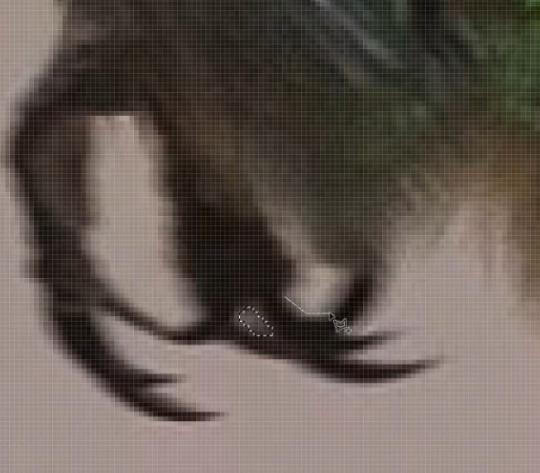


I then went around the bird shape and made sure everything was properly cutout using the pen tool so that when I placed the bird image on the new background it would only contain the bird, and nothing else. I removed a bit of dark background below the beak, and between the toes of the bird. (IMG1)
The background can also blend into the photo and/or effect the colouring of the image so I re-coloured some parts of the bird such as the top of the bird head and underneath and belly I used the brush tool and used the lighten and dark effect to change how the brush was applied. (IMG2)
I then flipped the picture of the bird so that the bird image would face in a better direction for the new background image. I did this by going to Image -> image rotation -> Flip image (IMG3)
I then adjusted the lighting on both the bird image and the background image to better fit and blend in with each other (IMG4)

REFLECTION:
I loved doing the leaf cut out one, because I enjoy using the pen tool and I also enjoyed using the colour balance tool to make the plant appear to have a fading blue power stemming form the middle!!
I was easy, but helpful and I enjoyed learning what I could do.
The fruit activity was super helpful in teaching me the different ways to use selection tools, what works best and why, and what I prefer.
I prefer starting the the object selection tool, and then cleaning it up afterwards with the pen/lasso tool.
I found the boat activity very fun because it was as if I was creating something new all together. I have also always wondered the technique of copying something and making it fade into the background smoothly, so it was great to see how to do it using the different opacities and brush tools.
The humming bird was definitely the hardest, more complicated one of the 4 different tasks.
But this task proved to be super helpful when moving onto doing more photoshop cut out (such as the jumping man).
It was good to know the techniques of changing the colours of some edges, to remove unwanted light and shadow sources to help blend things in, and also to learn the techniques of blurring the edges of the moving wings to fade in better!
Overall I enjoyed this lesson a lot and learning various skills, tricks and techniques of the different possible ways to manipulate photos in photoshop!
0 notes
Text
4. Photoshop - Homework
The task was to select 4 images, 2 B&W and 2 Colour and adjust the photo using what we learnt in class. I accidentally did 4 colour images, so I did a total of 6 photo adjustments.

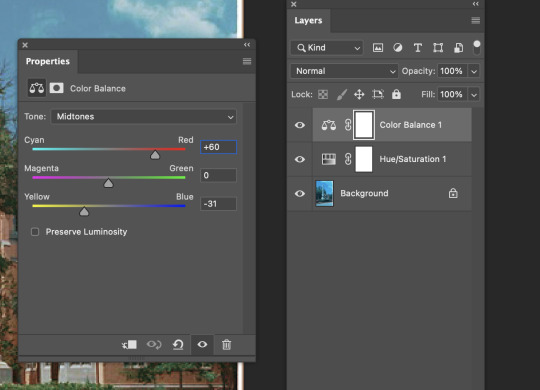


Photo 1: The photo originally had a very strong blue hue tint to it, so I have corrected the photo so that the original colours are easily seen. The adjusted photo, does appear like an older style photo as the colouring is a little 'worn down', as if it is a memory photo from an album.


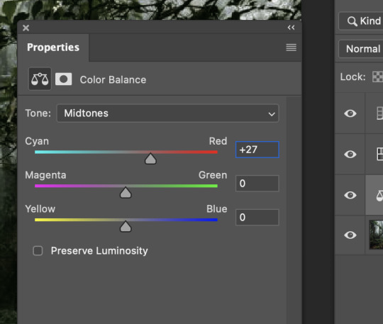
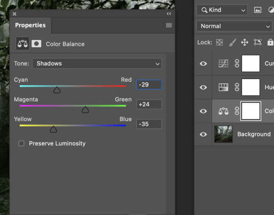
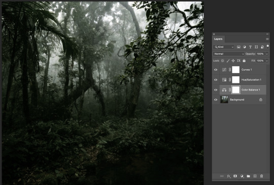
Photo 2: I wanted to make the forest appear spooky and more mysterious. To do this, i darkened the image, desaturated it and then added green tint in the colour balance options.

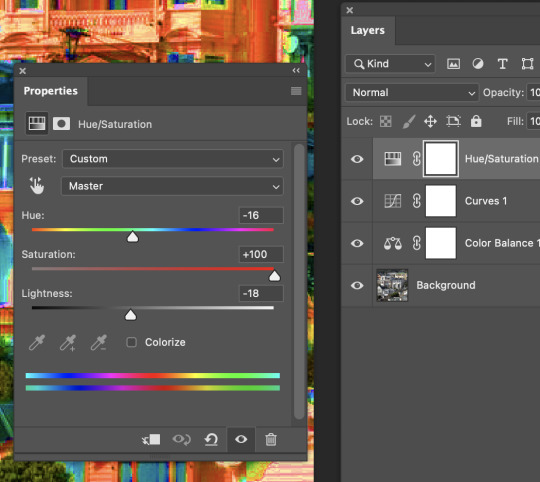

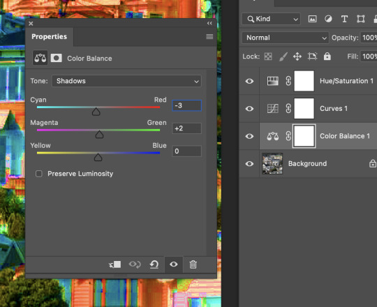
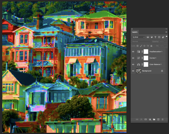
Photo 3: I wanted to make a hip, colourful, unrealistically vibrant image. I selected a normal image of some houses and put the saturation all the way up. I also adjusted the colour balance option to get a nice hue of blues and greens, with contrasting oranges and reds.
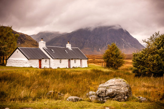
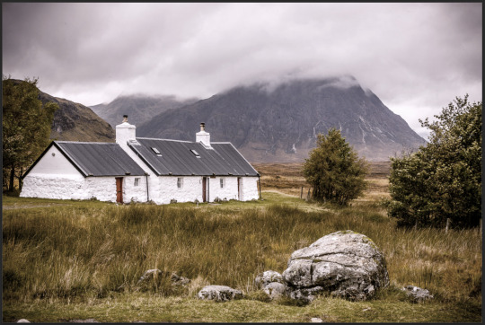


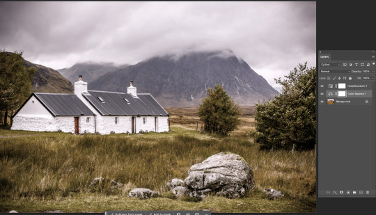
Photo 4: The original photo just didn't fit right with me, the colouring was very bright, but the photo itself appeared quite desolate and lonely so I decided to make the colours match the vibe i felt from the photo. I saturated it, and used colour balance to add blues, cyans and a little green to counter the once warm image, making it appear colder and more dull.

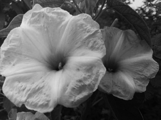

Photo 5: I thought these B&W flowers looked a bit flat, and I wanted to give them a bit more depth with modifying the exposure and shadows.
I made a very subtle change, but I think it was worth it. I added a gradient mask which allowed me to then use the curves filters to make the bottom right darker, and the top left more brighter. I felt that these changes gave the flowers more depth as the shadows of beneath the flowers are now far more pronounced.

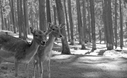
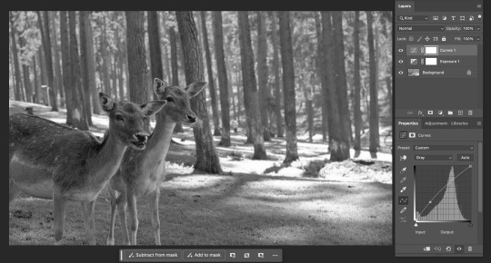
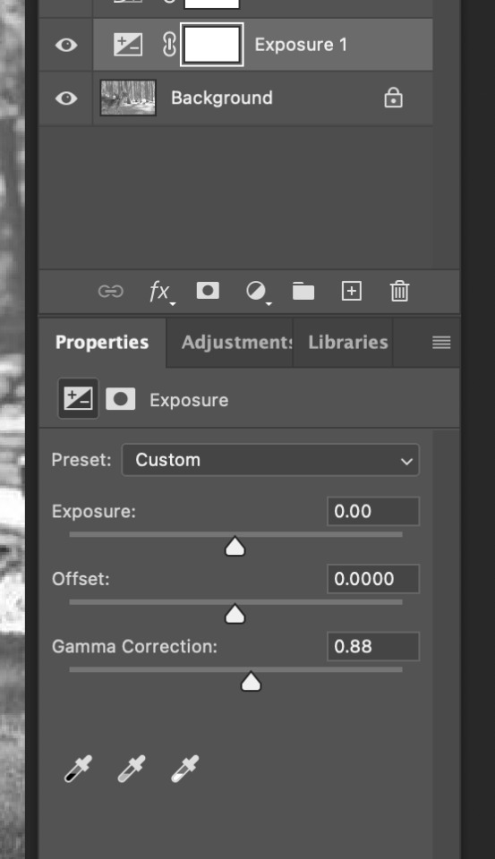
Photo 6: I felt that thing beautiful photo of deer was too bright/white. It needed to be darkened and have some shadows brough out more. So I used the curves adjustments to make the darker tones more pronounced in the image. But I also did some experimenting of my ow, and tried out the exposure adjustment and slightly modified the gamma correction, just enough to help bring out extra details and spots.
REFLECTION:
I have found a new love for editing photos. This is honestly so much fun, its easy, relaxing, and its just great to repurpose and allow bad photos to show better colours and moods.
I loved creating new atmospheres and helping some photos stand out more in the details.
I am proud of each of my pieces, and I now might need to help my friends edit of of their photos for social media xD
This was my favourite homework task.
0 notes
Text
4/5/6. Photoshop - Terminology
Histogram = Graphs . The beginning of x value is dark, the end of the x line in light.
~ The higher up the y scale, the more of that coloured pixels there are
https://moodle.op.ac.nz/pluginfile.php/1972969/mod_resource/content/1/Colour%20Lecture%202.pdf
Hue = The colour / colour family
Tone/ Saturation = More saturation = more pure / more intense. Less saturation = More grey / less intense
Value:
Shade = (Add black / Remove brightness / give value)
Tint = (Add white / add brightness / give value)
Transparency:
Appears like white/grey chessboard
Curves
Colour balance
Photo filter
Hue saturation
~ Can add a mask on any
0 notes
Text
4/5/6. Photoshop - Short cuts + keys
z = Zoom (Drag mouse left/right)
~ Hold space to drag
Command + m = curves feature
command + d cover screen in full colour
x = Toggle between foregorund/backgroudn colour
b = brush tool
e = erase
[ = deccrease brush//eraser size
] = increase brush / eraser size
Chnage opacity: 1 = 10% ~ 9 = 90% ~ 0 = 100%
Option + Click = colour picker
Option + hold = more accurately pick colour
Option + delete = will fill selection with foreground colour
Delete + Command = Will fill selection with background colour
Command + A = Select all
Command D = Deselect
W = Object selection tool
L = Lasso tool
Command + Z = Undo
Command + Z + Shift = Redo
Shift + Command + I = Invert selection
p = Pen
~ Option to break nchor point
~ Space to move nchor point
~ Cant convert to staright point, must just click next to anchor point to make handle not curve it.
Marquee tool + command + j = Copy the selected area on a seperate layer by itself
Command + T = transform gizmo
While selecting with transform tool: ~ Hold Shift to move however you wish.
~ Hold option to keep in same spot (just scale)
When selecting a selection with v, hold option and drag to duplicate
While selecting (marquee tool)
~ Hold shift = Add to selection shape
~ Hold Option = subtracts from selection shape
~ Hold Space = Move the selection shape
While using move tool (v), photoshop will move whatever is under your curser, this could be selection or layer.
~ If I hate it I can press 'auto select' check box to turn that feature off.
On layers pnael, tiny jaapn flag = creat mask
~ White = visible
~ Black = unvisible
1 note
·
View note